How to Use the Radial Gradient Function in CSS?
 FREE
FREE

Overview
I’m sure you’ve heard of it or seen it before, but what is the radial gradient CSS function? The radial gradient css function is used to create a smooth transition from one color to another. To use the radial gradient function in CSS, you'll need the following: a circle or container element, an image, or a combination of both. This article is going to explain the radial gradient function and how to use it in CSS.
A radial gradient is a type of gradient that builds on the linear-gradient function in CSS. The radial gradient css function is used to create a gradient that radiates from an origin point, with the size and shape of the resulting area controlled by two or more color stops.
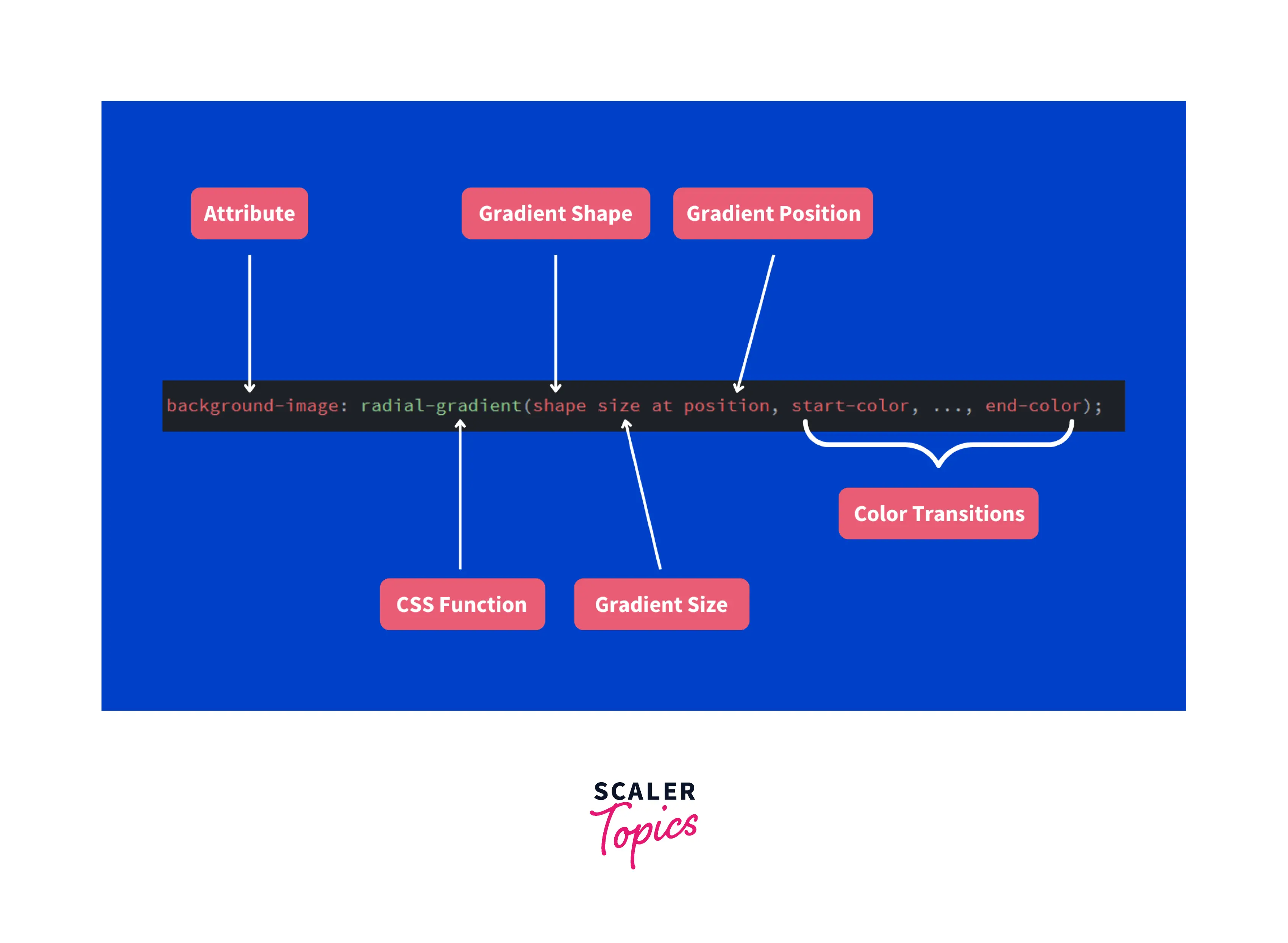
In CSS, you can create a radial gradient using the radial gradient css function. This function takes several parameters:
- The first parameter is always where to start the gradient (where 0,0 is in relation to the page). In this case, we want to start at 0 so we will leave this out.
- The second parameter is how far out from 0 we want our gradient to go. We'll do 50px so that it goes from 50px from 0 (which is 50px from left) to 100px from 0 which is 100px from left).
- The third parameter is how many colors we want in our gradient. We'll do 2 here so that there are two colors used for the transition of our circle. You can also use 3 or more colors if you want!
Pre-requisites
- Basic HTML and CSS knowledge will be beneficial but not required.
Learn about HTML and CSS
Syntax
Quick Example: For this example, we utilize all the parameters of a radial gradient, i.e., shape, size, position, and colors.
Result:
Values/Parameters
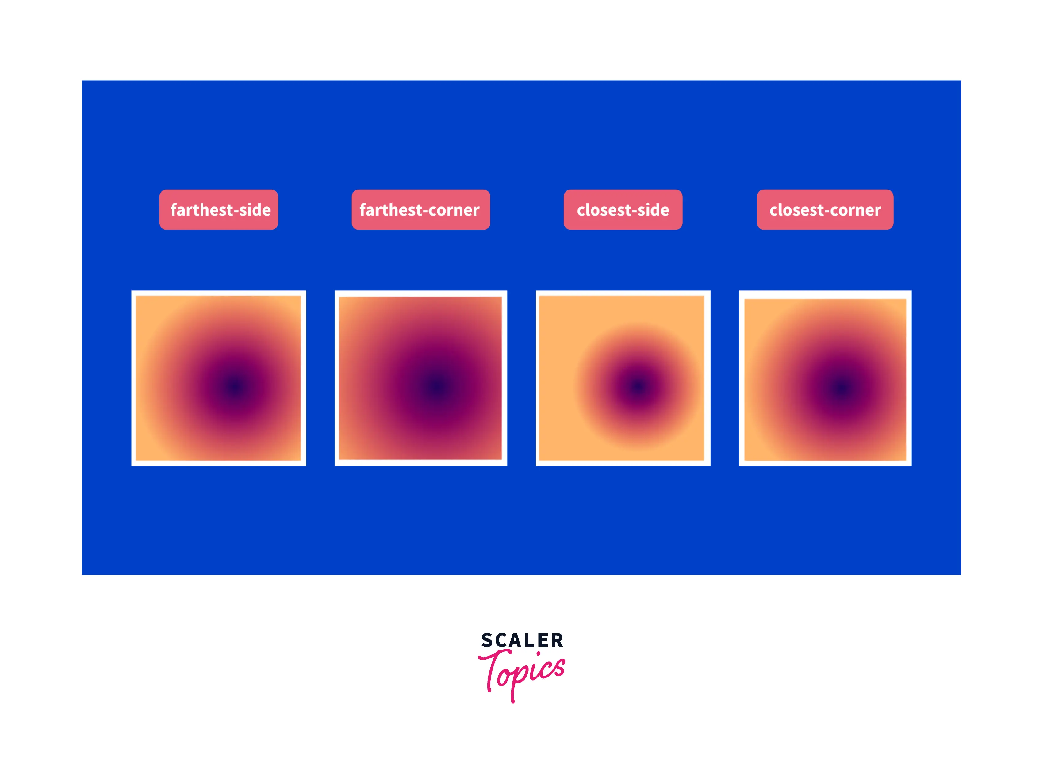
The radial gradient css function has four parameters.
1. Shape The gradient might be elliptical or circular in shape. The default shape is an ellipse.
2. Size The gradient's size (ending shape) can be set to one of four values: farthest-corner, closest-side, closest-corner, and farthest-side. The "farthest-corner" size is the default.
3. Placement Set the gradient's location. The default setting is "center."
4. color You can specify as many colors as you want, but at least two are mandatory.
Only the beginning and ending colors are essential among these four parameters. The remaining fields are optional and have default values.
Transform Your Career
Choose from our industry-leading programs designed for career success
Modern Software and AI Engineering Program
Master full-stack development with AI integration

 +1000 more
Modern Data Science and ML with specialisation in AI
Advanced data science techniques with AI specialization
+1000 moreAdvanced AIML with Specialisation in Agentic AI
Deep dive into AIML with focus on Agentic systems
+1000 moreDevOps, Cloud & AI Platform Engineering
Build and manage AI-powered cloud infrastructure
+1000 moreAI Engineering Advanced Certification by IIT-Roorkee
Premier AI engineering certification from IIT-Roorkee
Example
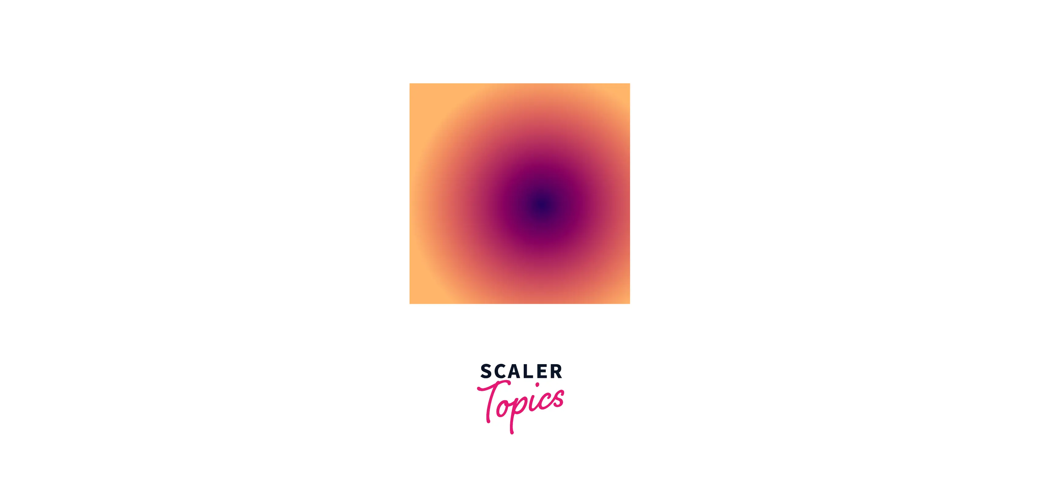
a. Simple gradient
Let's create a simple gradient with default values.
HTML Create an empty div in HTML.
CSS Give that div some height and width. Include colors (at least two) in the CSS radial gradient function and leave the other parameters at their default values.
Output:
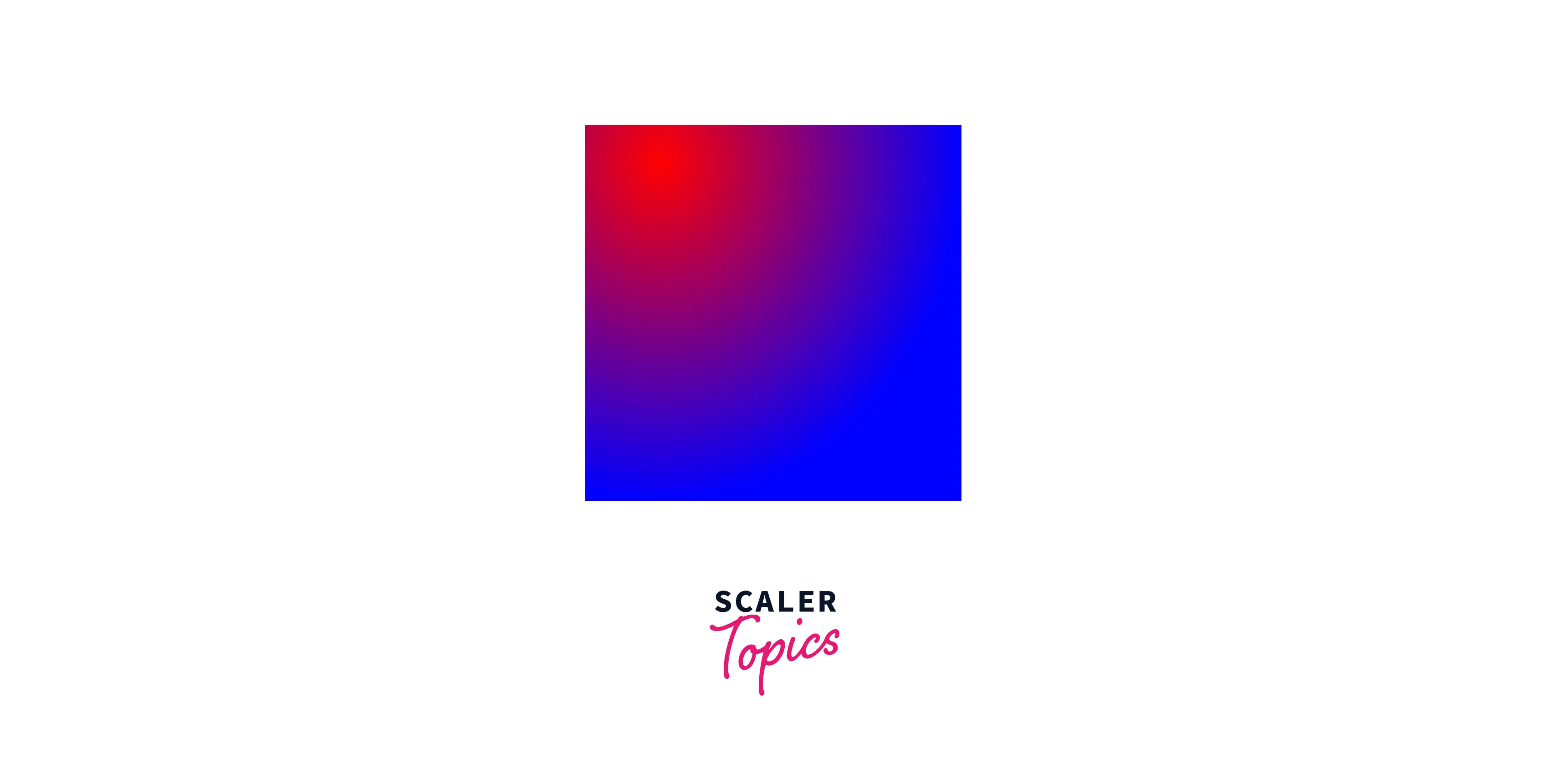
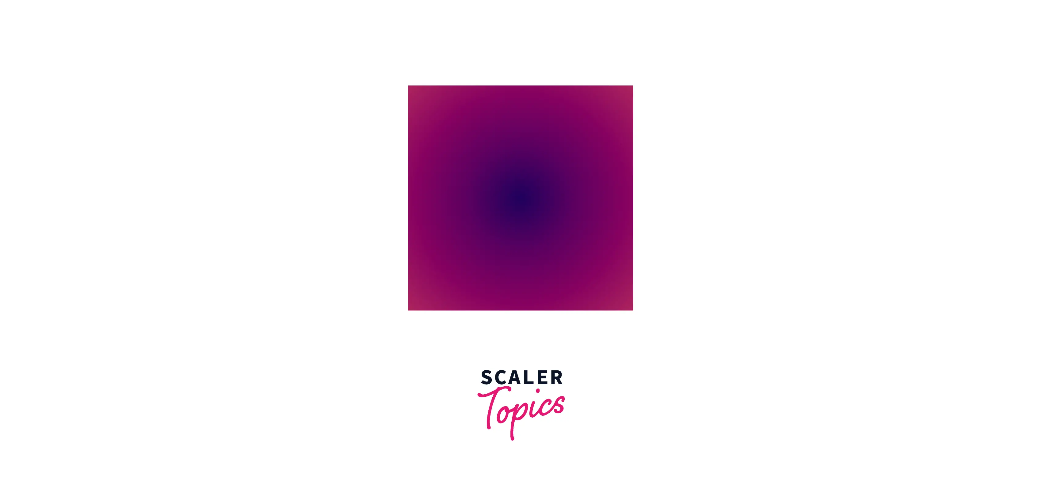
The circular gradient in the output shown above is made up of the colors red (the starting color) and blue (the ending color). By default, it is centered and has the size - farthest-corner.
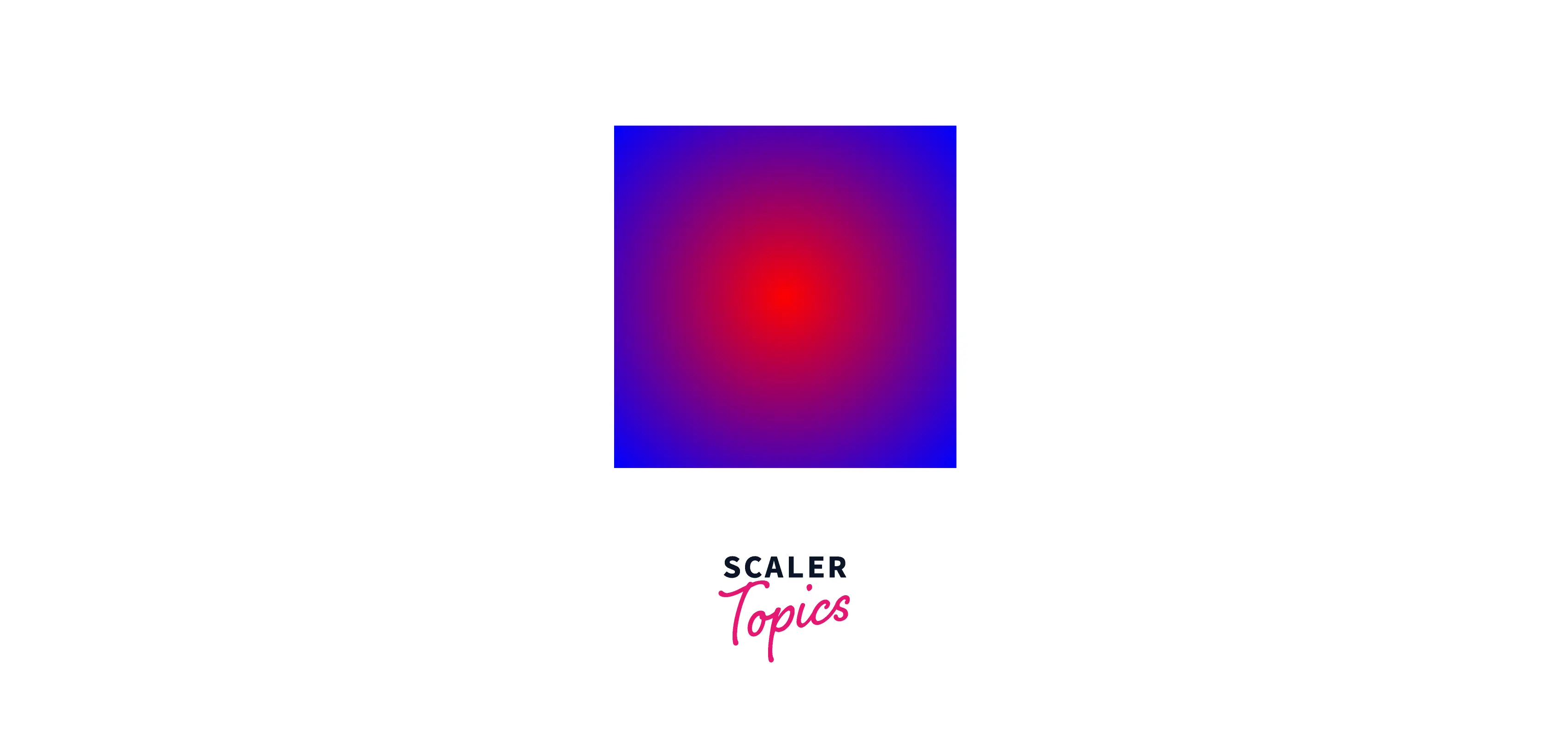
b. Non-centered gradient
Let's modify the position of the gradient with the position parameter.
HTML Create an empty div in HTML.
CSS
Output:
As you can see in the above output, we shifted the gradient's center to 20% from the top left and 10% from the top.
Scaler Placement Report and Statistics
Scaler learners achieved 2.5x salary growth with average post-Scaler CTC reaching ₹23L.
Repeating a Radial Gradient
CSS has a function called repeating-radial-gradient that is similar to radial-gradient. It accepts the same parameters as radial gradient, but the colors repeat indefinitely until the container size is reached.
Example
HTML Create an empty div in HTML.
CSS
Output:
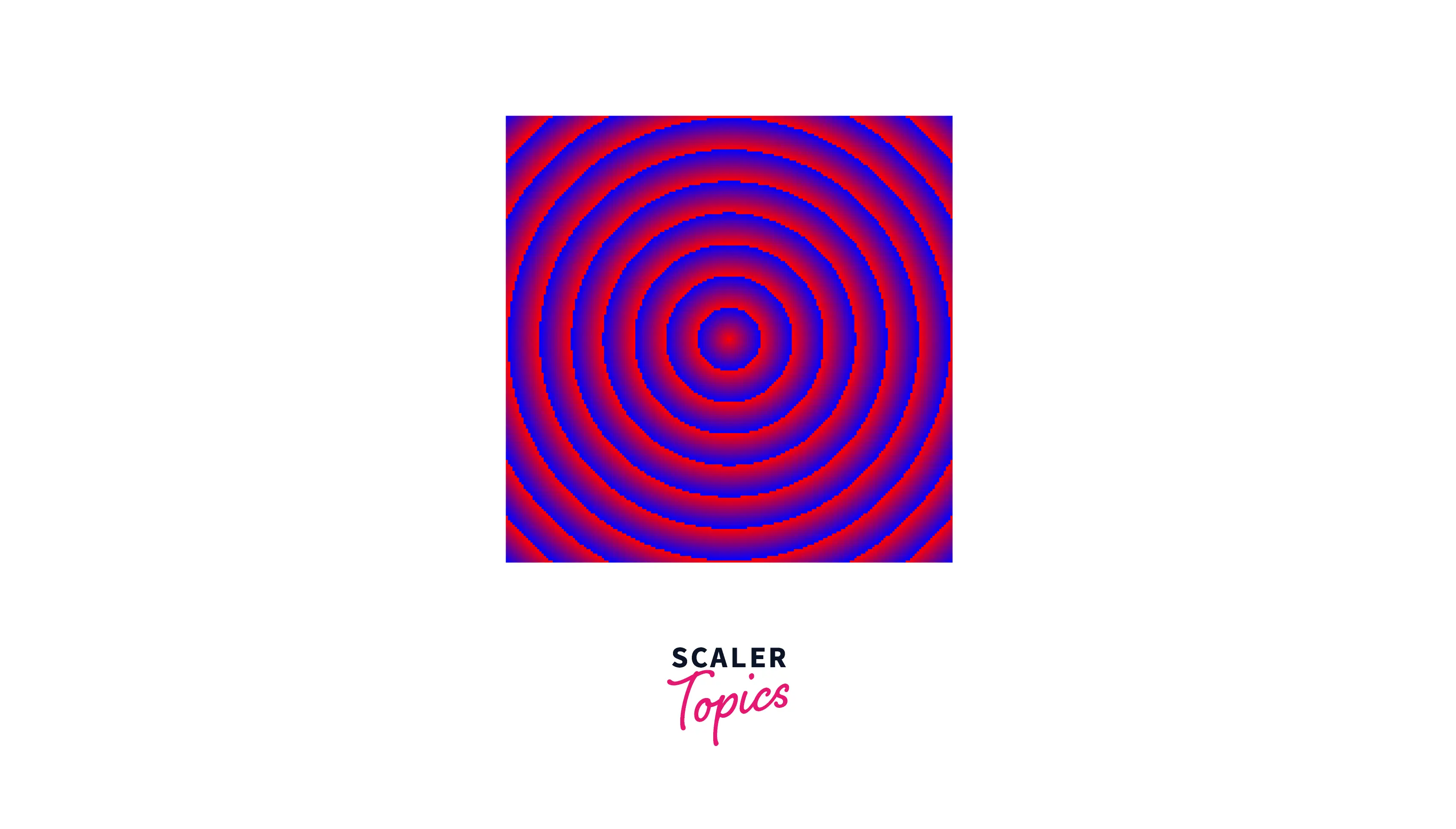
Radial gradient is repeated until it reaches the container size in the output shown above.
Building Background Patterns with CSS Radial Gradient
You can make beautiful circular patterns by using the radial gradient css function. We can generate different results by adjusting the radial gradient function's parameter values.
Let's look at some patterns that you might find interesting.
Simple pattern
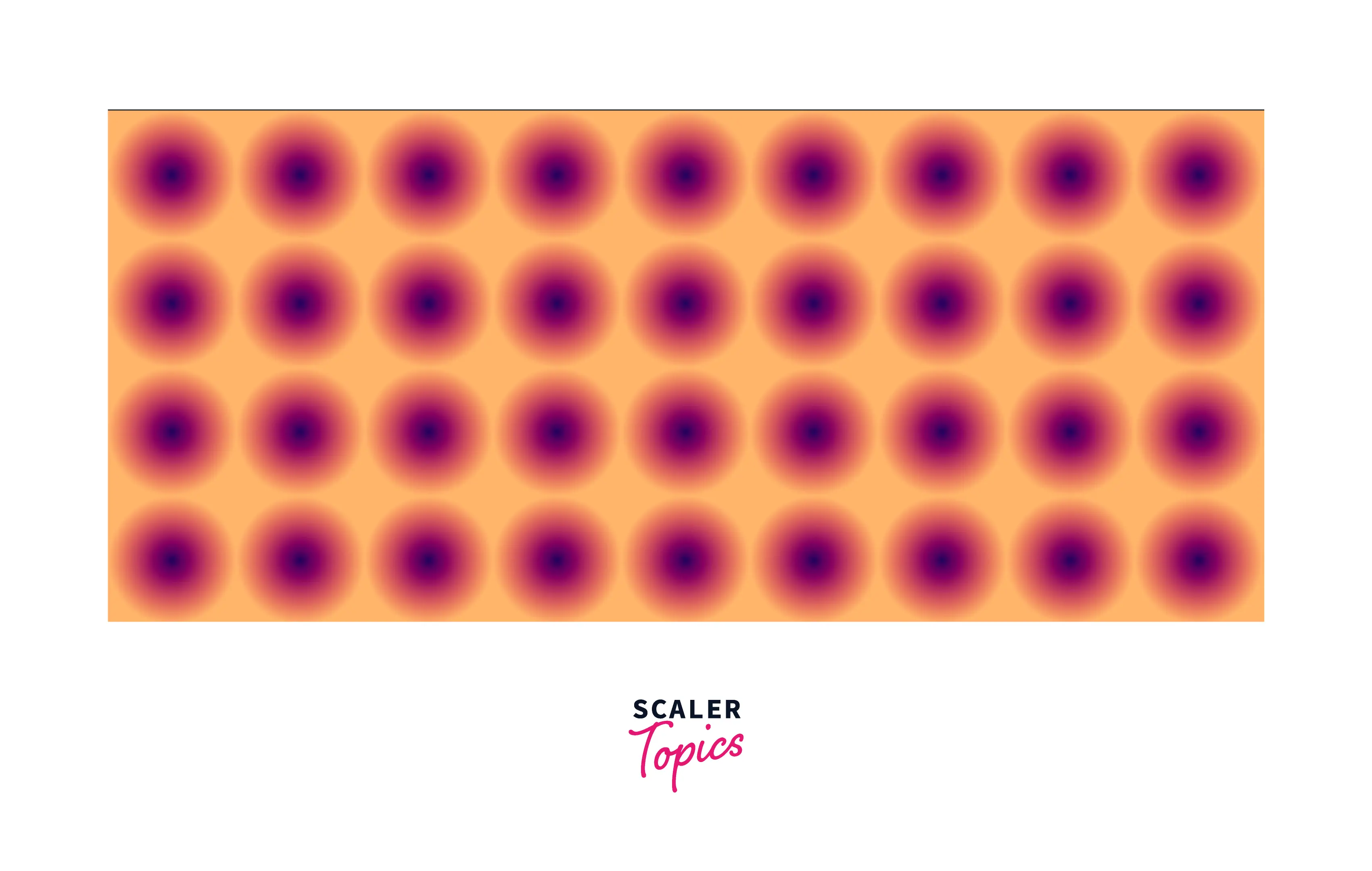
Here, we give a circle a radius of 50% and set the container height to '100px.' The above pattern is produced by these two configurations.
Below is the code for the above pattern:
Turn Learning into Career Growth
Circular Zig Zag
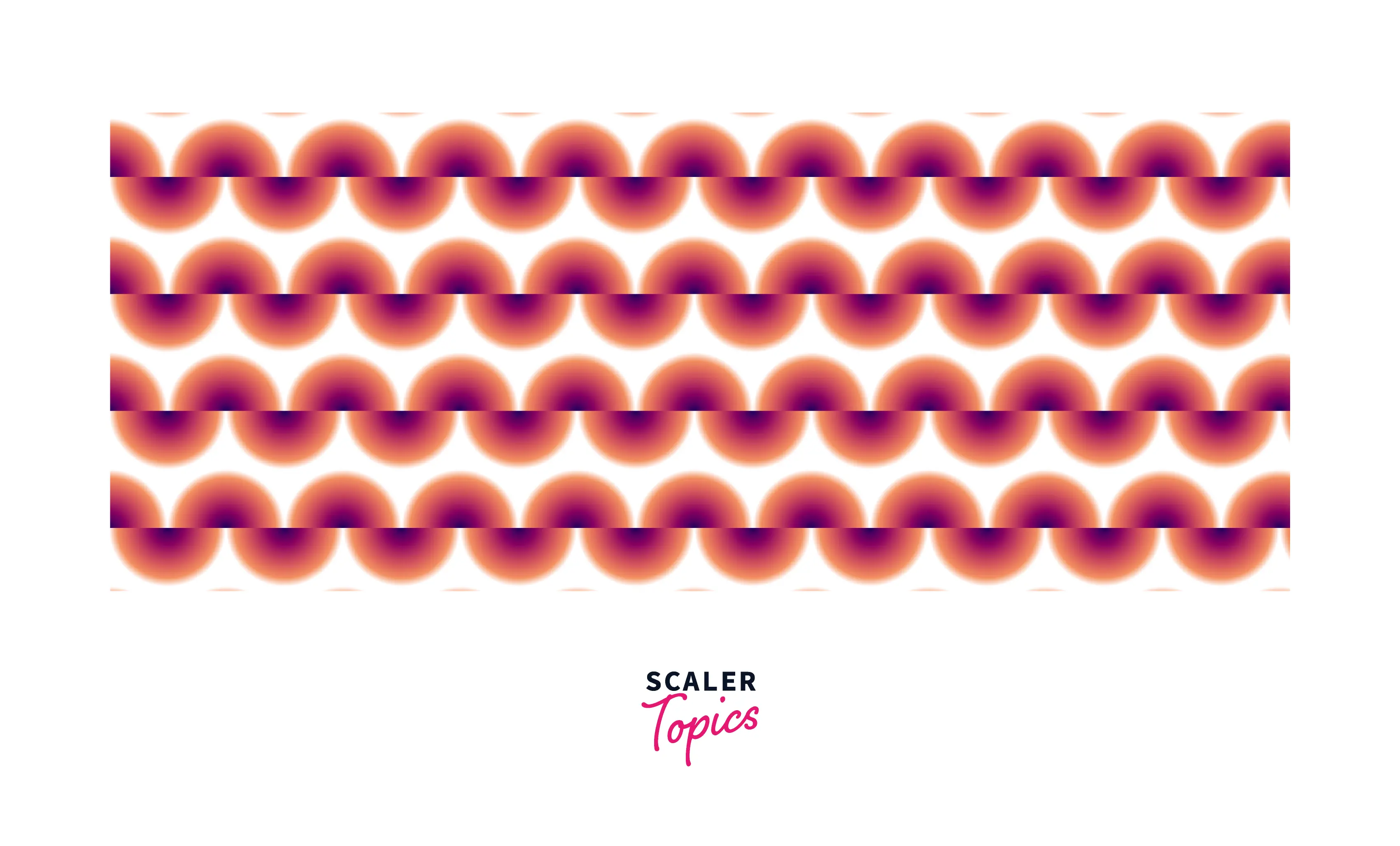
Using two radial gradient css functions that overlap each other, a circular zig-zag pattern can be generated. Then we divide each gradient in half and move the second gradient by half the size of the gradient.
Bullseye board
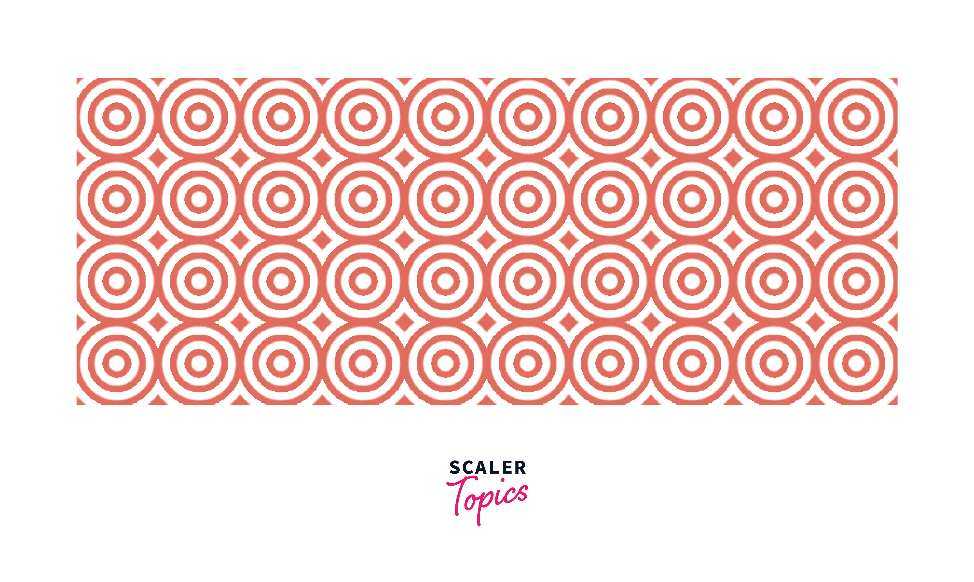
The bullseye board pattern is easily created using repeating-radial-gradient() and a combination of transparent and main colors.
More Examples
Let's see a few more examples.
Simple Circle
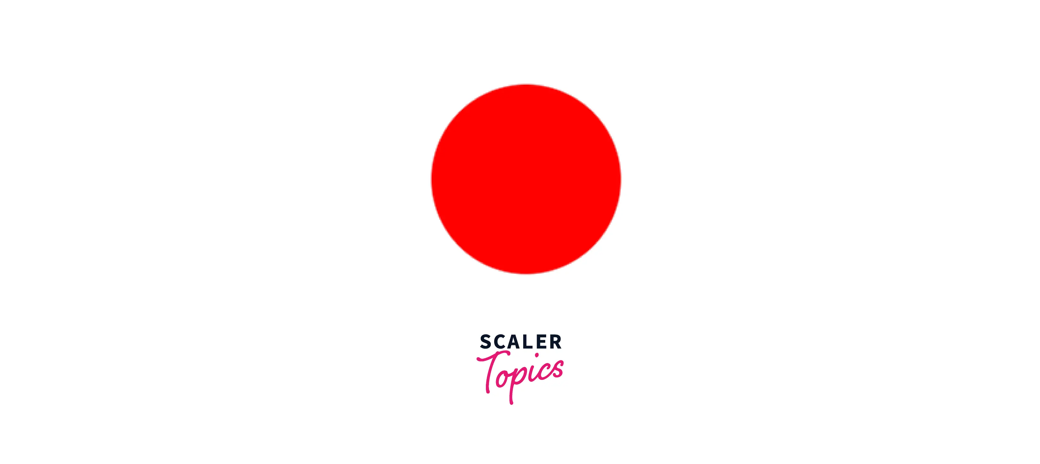
By making the final color transparent, you may make a simple circle with the radial gradient css function.
Simple Ellipse
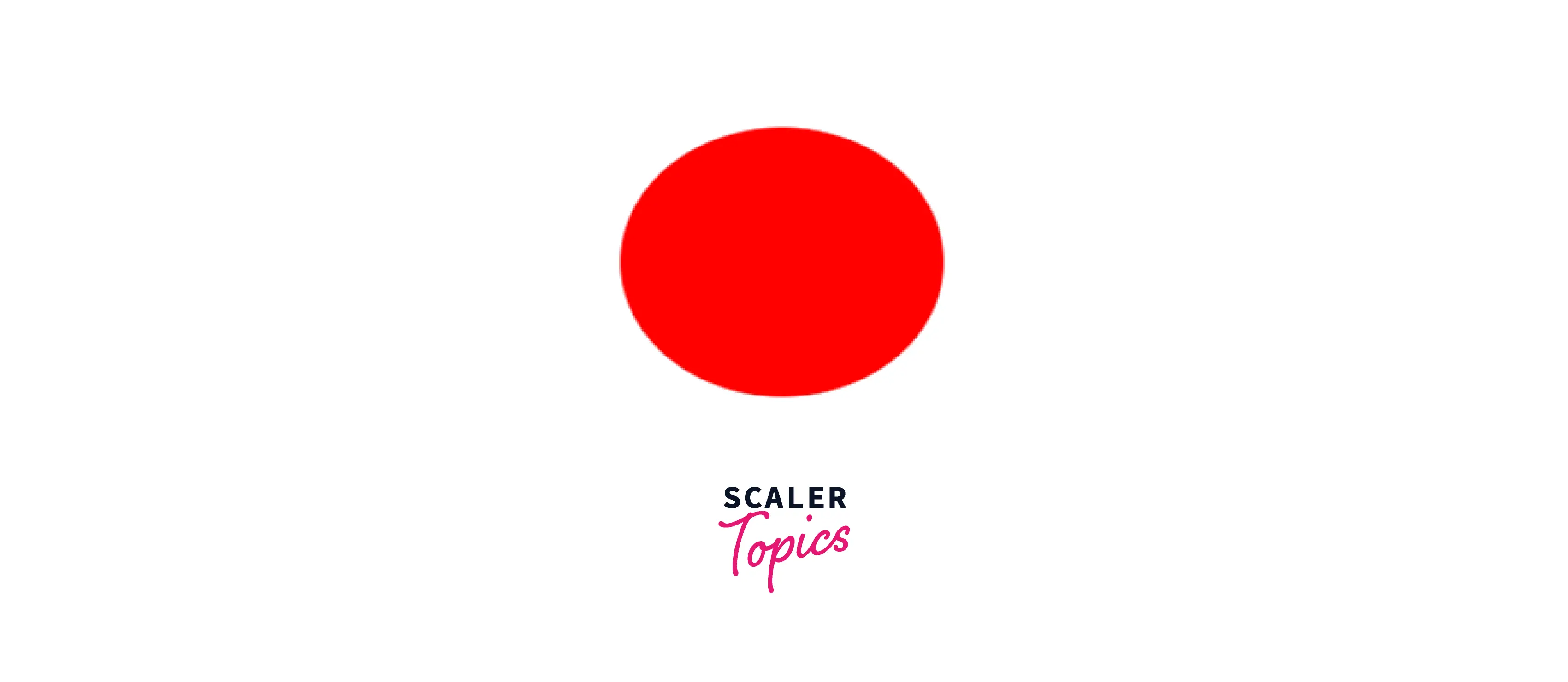
You may make an ellipse by changing the shape from a circle to an ellipse.
Evenly-spaced colors
Using the default values for all attributes, create an equally spaced color gradient.
Conic gradient

Conic gradients are similar to radial gradients in that color transitions occur at an angle around a center point.
Browser Compatibility
The radial gradient css function is supported by all the popular browsers. Only the at syntax is not supported by Safari.
Conclusion
Let us review what we have learned.
- The radial gradient function is used to create a smooth transition from one color to another.
- To use the radial gradient function in CSS, you'll need the following: a circle or container element, an image, or a combination of the two
- We saw examples of simple, non-centered, and repeating radial gradients.
- We made a few patterns with radial gradients.
 Google
 Amazon
 Microsoft
 Flipkart
 Adobe1200+ more