


Most people who find their way to Power BI arrive from one of two directions, either they have been doing things in Excel that Excel was not really designed for, or someone in a meeting asked them to ‘put it in a dashboard’ and they had to figure out what that meant.
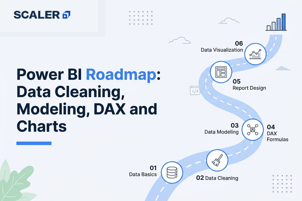
This roadmap covers the full workflow, from data import, Power Query, data modeling, DAX, visualization, and publishing, to portfolio projects and analyst interview readiness.
Before you begin though, remember that Power BI is not just a drag-and-drop chart tool. The visuals are the last 20% of the work. The other 80% is data cleaning, modeling, and getting your measures right. A roadmap that skips that is setting you up to build dashboards that look fine and answer the wrong questions. Start with the free Power BI Tutorial at scaler.com/topics/power-bi/ to cover foundations alongside this guide.
The Power BI Learning Roadmap at a Glance
| Stage | What you are doing | Core topics | What you can do after |
| 0 | Understand the tool and its place in analytics | BI basics, reporting, dashboards, use cases | Explain what Power BI is and where it fits |
| 1 | Check prerequisites | Excel basics, SQL basics, data tables, charting logic | Know which gaps to close before starting |
| 2 | Understand the Power BI ecosystem | Desktop, Service, Power Query, data model, visuals | Navigate Power BI and understand each layer |
| 3 | Import data from real sources | Excel, CSV, SQL databases, web sources | Load and connect multiple data sources |
| 4 | Clean data with Power Query | Transformations, data types, duplicates, merging queries | Prepare analysis-ready data from messy sources |
| 5 | Build a data model | Relationships, cardinality, star schema, date tables | Create a model that makes DAX easier and faster |
| 6 | Learn DAX basics | Measures, calculated columns, CALCULATE, time intelligence | Calculate KPIs, revenue, growth, and margins |
| 7 | Create visual reports | Charts, slicers, filters, drill-through, visual hierarchy | Build interactive reports that answer business questions |
| 8 | Build dashboards | Sales, finance, marketing, HR, executive dashboards | Complete portfolio-ready Power BI dashboard |
| 9 | Publish and share | Power BI Service, workspaces, refresh, permissions | Share reports with teams and stakeholders |
| 10 | Build portfolio and prepare for interviews | Projects, case studies, interview questions, storytelling | Analyst-ready portfolio and interview readiness |
Why Should You Learn Power BI?
Because Excel pivot tables have limits, and at some point you will hit them. Power BI connects to multiple data sources at once, handles millions of rows without melting your laptop, refreshes automatically, and lets you publish interactive dashboards that non-technical stakeholders can actually use without asking you to re-run the report.
Power BI is used across sales, finance, marketing, HR, and operations. It sits at the intersection of data cleaning, modeling, and communication which is exactly the skill set analyst roles require. For Excel users it is a natural progression while, for SQL learners it is where queries turn into something visually useful. For career changers, the output is immediately tangible.
→ What Power BI is and how it works
→ Free Power BI Tutorial covering the full workflow
The Take: What Should You Know Before Starting Power BI?
Power BI does not require coding. But it is significantly more useful and makes more sense, only if certain foundations are in place before you start though.
• Excel basics, know your tables, formulas, filters, sorting, pivot tables. Most Power BI concepts have an Excel equivalent and the familiarity helps.
• Tabular data thinking, a thorough understanding of rows, columns, keys, and what a clean data table looks like versus a formatted report.
• Basic SQL — SELECT, WHERE, JOIN, GROUP BY. Not required on day one, but Power BI pulls data from databases constantly in real analyst work. SQL makes you far more useful.
• Business metrics — knowing what revenue, margin, conversion rate, churn, and headcount mean. Power BI helps you visualize these; you need to understand what they are first.
• Basic charting logic — bar vs line, what a KPI card is for, why pie charts are usually wrong.
Coding is not required. Python, R, and advanced statistics are useful later if you go further into data science, but they are not Power BI prerequisites.
→ SQL Tutorial for data extraction and querying
Stage 1: Understanding the Power BI Ecosystem
Power BI is not one thing. It is a set of components that work together. Understanding what each piece does before you start saves a lot of confusion later.
| Component | What it is | When beginners use it |
| Power BI Desktop | The free Windows application where you build reports. | Where you spend 90% of your time learning and building. |
| Power BI Service | The cloud platform at app.powerbi.com for publishing and sharing. | When you want to share a report with someone or schedule data refresh. |
| Power Query | The data transformation engine inside Desktop. | Every time you import data — this is where you clean and shape it. |
| Data Model | The set of tables, relationships, and measures behind your reports. | Built in Desktop. Good models make everything downstream easier. |
| DAX | Data Analysis Expressions — the formula language for measures. | When you need calculations beyond basic aggregations. |
| Reports | Collections of visuals connected to a data model. | The main output you build in Desktop and publish to Service. |
| Dashboards | Pinned tiles from multiple reports in Power BI Service. | For stakeholder-facing, high-level views across reports. |
Key distinction: Power BI Desktop is where you build. Power BI Service is where you share. Reports (built in Desktop) and dashboards (pinned tiles in Service) are different objects, quite the confusion that trips up beginners more than it should.
→ Power BI components explained
Stage 2: Importing Data from Excel, CSV, SQL, and Web Sources
Getting data into Power BI is straightforward. The ‘Get Data’ button connects to Excel files, CSVs, SQL Server, MySQL, PostgreSQL, SharePoint, web pages, REST APIs, and dozens of other sources. For beginners, you should start with Excel and CSV files.
What matters more than the import step is understanding what you are importing. Real data is rarely clean, whether it be caused by blank rows, inconsistent date formats, text in numeric columns. Connecting takes five minutes. Figuring out what is wrong and fixing it is the actual work and it can take hours.
→ Full Power BI Tutorial with import and transformation
Stage 3: Cleaning and Transforming Data with Power Query
Power Query is where most of the actual work happens, and it is where most beginners spend the least time. This is the first mistake.
Bad dashboards are almost never a chart design problem. They are a data quality problem. Wrong totals, double-counted rows, missing date ranges, incorrect category names, null values appearing as zeros, all of these start in the data, not in the visual. Power Query is where you fix them.
Core Power Query skills to learn:
• Changing and validating data types, dates that imported as text, numbers stored as strings.
• Removing duplicates and blank rows especially in dimension tables.
• Splitting and merging columns, a full name column into first/last, a date-time into separate date and time.
• Filtering out rows you do not need such as test records, cancelled orders, summary rows that will double-count.
• Appending and merging queries, combining multiple files or joining tables before they reach the model.
• Replacing values and fixing inconsistencies. (‘UK’, ‘United Kingdom’, and ‘U.K.’ should be one value.)
The one rule worth internalizing here is that fix data in Power Query, not in Excel before importing. Power Query records every step in the Applied Steps panel, the fix is documented, repeatable, and survives the next refresh.
Stage 4: Building a Strong Data Model
This is the stage that separates people who can make dashboards from people who can make dashboards that are actually correct. The data model determines how your tables relate, which direction filters flow, and what your DAX measures can access.
The concept to internalize first is the star schema. One central fact table (sales transactions, order records, web events) surrounded by dimension tables (date, product, customer, region, employee). The fact table has many rows and numeric measures. The dimension tables have fewer rows and descriptive attributes. Relationships go from dimension to fact, one-to-many.
| Model element | What it is | Why it matters |
| Fact table | Transactional data — sales, orders, events | Contains the measures you will aggregate (revenue, quantity, clicks) |
| Dimension table | Descriptive context — products, customers, dates, regions | Provides the slicing and filtering for your visuals |
| Relationship | Link between two tables on a matching column | Controls how filters propagate across tables in reports |
| Date table | A dedicated calendar table | Required for time intelligence in DAX — without it, DATEADD and SAMEPERIODLASTYEAR break |
| Cardinality | The nature of the relationship (one-to-many, many-to-many) | Many-to-many relationships can cause filter ambiguity and wrong totals |
Always build a dedicated date table which means it should be continuous, have no gaps, cover your full date range, mark as a date table in Power BI. Every time intelligence calculation depends on it.
Stage 5: Learning DAX for Measures and KPIs
DAX (Data Analysis Expressions) is the formula language for measures and calculated columns. Syntax looks like Excel functions. The evaluation context is different and that difference is what confuses most beginners.
Start with measures, not calculated columns. A measure is calculated at query time based on the filter context of the visual whereas a calculated column is computed row by row when the data model loads. Most of the useful analytics work happens through measures.
| DAX concept | What it does | Beginner example metric |
| SUM / AVERAGE | Basic aggregation | Total Revenue = SUM(Sales[Amount]) |
| CALCULATE | Modifies the filter context | Revenue YTD = CALCULATE([Total Revenue], DATESYTD(‘Date'[Date])) |
| COUNTROWS / DISTINCTCOUNT | Count rows or unique values | Number of Orders = COUNTROWS(Sales) |
| DIVIDE | Safe division that handles zeros | Profit Margin = DIVIDE([Profit], [Revenue]) |
| IF / SWITCH | Conditional logic | Flag high-value orders above a threshold |
| SAMEPERIODLASTYEAR | Year-over-year comparison | Revenue LY = CALCULATE([Total Revenue], SAMEPERIODLASTYEAR(‘Date'[Date])) |
| FILTER | Returns a filtered table | Used inside CALCULATE for complex conditions |
CALCULATE is the most important DAX function. Every useful measure eventually uses it. Mental model: CALCULATE([measure], filter1, filter2) evaluates the measure in a modified filter context. Once that clicks, most DAX starts to make sense.
Start with business metrics that matter such as revenue, margin, YTD totals, month-over-month growth. Do not try to master advanced DAX before building dashboards. Learn it in response to actual reporting problems.
Stage 6: Data Visualization Principles, Not Just Charts
Power BI has 30+ built-in visual types plus a marketplace of custom visuals. The challenge is not in finding a chart but in choosing the right one and using it well.
| Visual type | Best for | Common misuse |
| Bar / column chart | Comparing categories | Using it for time trends with too many periods |
| Line chart | Trends over time | Connecting non-continuous categories with a line |
| Card / KPI card | Single metric headlines | Showing too many on one page with no hierarchy |
| Table / Matrix | Detailed row-level data | Using it as the main visual when a chart would be clearer |
| Donut / pie chart | Part-to-whole (only 2-4 categories) | Using it for 10 categories — nobody can read it |
| Scatter chart | Correlation between two measures | Overplotting with thousands of unlabeled points |
| Map visual | Geographic distribution | Using when location is not the actual question |
| Slicer | User-controlled filtering | Adding too many slicers that conflict with each other |
Visual hierarchy: the most important metric largest and highest, supporting detail below. Color carries meaning and you can use it to highlight, not decorate. White space should not be wasted. Titles should state the insight, not just name the metric.
‘Sales by Region’ is a label. ‘North Region leads Q4 revenue, up 22% YoY’ is a title. One tells the viewer what to look at. The other just names the chart.
→ Power BI visualizations guide → Data visualization principles
Stage 7: Building Your First Power BI Dashboard
A sales dashboard is the standard first project and it covers revenue aggregation, time trends, regional breakdowns, product analysis, and year-over-year comparison. Every major DAX pattern and visual type in one project. The sequence:
• Define the business question first. ‘Show me sales’ is not a question. ‘Which product categories missed their Q3 target, and in which regions?’ is a question.
• Choose and prepare the dataset, either a real one or a clean public dataset from Kaggle or Microsoft’s sample data.
• Clean in Power Query, fix types, remove duplicates, standardize values, build the date table.
• Build the star schema model, the fact table connected to date, product, region, customer dimensions.
• Create core measures: total revenue, total cost, profit, margin, year-over-year growth, month-to-date.
• Build the visuals and these should be one page per theme (overview, product analysis, regional breakdown, time analysis).
• Add slicers for year, quarter, region, and category. Test that filters work correctly across all visuals.
• Validate totals against a known source. A dashboard that looks good but has wrong numbers is worse than no dashboard.
Before publishing: verify totals match source data, filters reset correctly, drill-through navigates right, and every visual has a readable title. The QA step is skipped constantly and it always shows.
Stage 8: Publishing and Sharing Reports in Power BI Service
Publishing from Desktop to Power BI Service is one click. What comes after is worth understanding.
Power BI Service is where reports become collaborative: shared workspaces, scheduled refresh, view vs edit permissions, and row-level security (each user sees only their slice of data).
For most learners: publish, share a link, set up a refresh schedule. Gateway configuration, deployment pipelines, and capacity management are BI developer territory which are not required at analyst level.
→ Power BI architecture and service
Output: Power BI Projects Worth Building for Your Portfolio
A certificate tells someone you completed a course. A documented GitHub repository, with a proper problem statement, data source, transformation steps, model design, DAX measures, dashboard screenshots, and written insights, tells them you can do the work.
| Level | Project | What it should demonstrate |
| Beginner | Sales performance dashboard | Data import, Power Query cleaning, bar charts, line chart, slicers, KPI cards |
| Beginner | Retail store analysis | Category comparison, store-level breakdown, time trends, filters |
| Intermediate | Finance dashboard | Revenue, expenses, profit, margins, variance analysis, DAX measures |
| Intermediate | Marketing campaign dashboard | Conversion rates, channel ROI, campaign comparison, funnel metrics |
| Intermediate | HR analytics dashboard | Attrition, hiring trends, department breakdown, demographic analysis |
| Advanced | Executive KPI dashboard | Bookmarks, drill-through, clean layout, high-level storytelling, targets vs actuals |
| Advanced | SQL database to Power BI | SQL extraction, database connection, model refresh, scheduled publishing |
| Advanced | Multi-page analytical report | Star schema model, 10+ DAX measures, navigation, conditional formatting |
Pick a dataset from a domain you know, whether it be retail, finance, or even HR. Domain familiarity helps you write sharper insights and defend the dashboard in interviews.
→ Structured Power BI projects with case study feedback
Power BI Learning Path by Career Goal
| Who you are | Start with | First project | Next step |
| Excel user | Power BI Desktop, Power Query, basic visuals | Sales or finance dashboard | DAX basics, SQL basics |
| Student / fresher | Data import, cleaning, visuals, slicers | Retail or HR dashboard | SQL, interview prep |
| Business analyst | KPIs, dashboard design, storytelling | Executive KPI dashboard | DAX + stakeholder reporting |
| Aspiring data analyst | SQL + Power Query + modeling + DAX | Sales and marketing portfolio | Python, statistics, case studies |
| SQL learner | Database connections, model relationships | SQL database to Power BI project | Advanced DAX, refresh, sharing |
| Working professional | Role-specific dashboards, business metrics | Department-specific dashboard | Portfolio and interview readiness |
| Data science aspirant | Power BI for reporting, then SQL and Python | Analytics dashboard | ML/data science path |
Questions of the Hour: Power BI Interview Preparation
Power BI interviews test whether you understand the tool or just ran a tutorial. Expect conceptual and practical questions.
Topics that come up most:
• Power Query vs DAX — what each is used for, which one you use first. Confusing them in an interview is a clear signal you have not used Power BI much in practice.
• Measures vs calculated columns — when to use each, why measures are generally preferable for aggregations.
• Star schema — why it matters, what a fact table is, why many-to-many relationships cause problems.
• CALCULATE — what it does, what filter context means, a simple example.
• Time intelligence — how to calculate year-over-year change, why a date table is required.
• Row-level security — what it is, high-level setup. How to walk through a project: problem, data source, model, measures, dashboard, and the business insight it revealed.
Most interviewers ask ‘walk me through a Power BI project.’ A clean answer, with a business question, model design, measures, and a specific insight the dashboard revealed, separates candidates who used Power BI from candidates who know it.
→ Scaler’s Data Analyst Course for structured interview preparation
How Long Does It Take to Learn Power BI?
| Learning milestone | Realistic timeline | Notes |
| Setup, import, basic visuals | About 1 week | Faster with Excel background |
| Power Query and data cleaning | 1–2 weeks | Slower without prior data experience |
| Data modeling and relationships | 1–2 weeks | Star schema needs practice to click |
| DAX basics and core measures | 2–3 weeks | CALCULATE takes repetition to get right |
| First complete dashboard | 3–6 weeks total | Integrates all skills above |
| Portfolio and interview readiness | 2–4 months | Depends on SQL strength and project depth |
Excel users move faster through the early stages. Where people slow down is DAX filter context and this is not an intelligence issue, just a concept that requires building several dashboards before it clicks.
→ Free Power BI Tutorial for self-paced foundations
→ Data Analyst Course for structured timeline with projects and mentorship
Free Power BI Learning vs a Structured Data Analyst Course
| Free tutorials | Structured Data Analyst course | |
| Best for | Power BI basics, simple dashboards, early projects | SQL + Excel + Power BI together, career transition |
| Cost | Free | Paid, with mentorship and placement support |
| Projects | Usually demo-scale | Real-world, portfolio-ready, mentor-reviewed |
| SQL coverage | Separate, disconnected | Integrated with Power BI workflow |
| Interview prep | Self-directed | Structured with mock interviews and feedback |
| What is missing | Business context, data storytelling depth, SQL integration | Nothing if analyst career path is the goal |
Free resources are genuinely enough to learn Power BI mechanics. Scaler’s free Power BI Tutorial at scaler.com/topics/power-bi/ covers import, Power Query, modeling, DAX, and visualization with hands-on practice.
Where free falls short: when SQL, Excel, and Power BI need to work together with real datasets, mentor feedback, and interview preparation. Power BI alone is a tool. Combined with SQL and real projects it is an analyst skill set.
→ Scaler’s Data Analyst Course
Want to hear from people who have already made the switch? Read what our alumni have to say about how the course shaped their data career: Scaler Reviews
Frequently Asked Questions
What is the best Power BI roadmap for beginners?
Start with the Power BI ecosystem, then move through data import, Power Query, data modeling, DAX basics, and visualization in that order. Build a sales or retail dashboard as your first complete project. Do not start with DAX or advanced visuals before the model is clean.
Can I learn Power BI without coding?
Yes! Power BI does not require programming. Power Query uses a point-and-click interface. DAX looks like formulas, not code. Python and R integration exist for advanced users but are not required for data analyst or business analyst roles.
Do I need Excel before learning Power BI?
Not strictly, but it helps. Excel familiarity with tables, formulas, and pivot tables gives you a framework for understanding Power BI concepts. If you have never worked with tabular data in any form, spend a week with Excel first.
Do I need SQL for Power BI?
Not on day one. For CSV and Excel projects it is not required. For real analyst work, connecting to databases, querying before visualization, SQL is necessary. Most serious Power BI roles involve databases.
What is Power Query in Power BI?
Power Query is the data transformation engine inside Power BI Desktop and here is where you clean and reshape data before it reaches the model. Every import goes through it. Learning it properly is arguably more important than DAX for most analyst roles.
What is DAX in Power BI?
DAX (Data Analysis Expressions) is the formula language for measures and calculated columns. Similar to Excel functions but evaluates within filter contexts defined by the model and visuals. Start with SUM, CALCULATE, and DIVIDE before time intelligence.
How long does it take to learn Power BI?
Simple dashboards: 1 to 2 weeks. Complete dashboard with clean data, model, and DAX: 4 to 6 weeks. Job-ready portfolio with SQL: 2 to 4 months. Excel users move faster; beginners need more time on modeling.
What projects should I build in Power BI?
Start with sales (covers the full workflow). Then finance or HR for different DAX patterns. Portfolio minimum: one SQL-sourced project, one with time intelligence, one executive KPI dashboard with bookmarks and drill-through.
Is Power BI enough to become a data analyst?
Power BI is one tool. Analyst roles also need SQL, Excel, and increasingly Python. Power BI alone is valuable; alongside SQL and real business problems is what job descriptions require.
Should I learn Power BI or Tableau first?
Power BI for Microsoft-ecosystem roles and India/South Asia job markets. Tableau for US and European enterprise roles. Visualization and storytelling skills transfer between both tools.
What should I learn after Power BI?
SQL, then Python (pandas for data manipulation), then statistics. That sequence moves you from BI tool user to full data analyst.