Shadow CSS | CSS Shadow Effects
 FREE
FREE

Overview
Shadow CSS is a great method to make our website more appealing. CSS Shadows are a visual effect that consists of a drawing that resembles an object's shadow; these shadows provide a 3-dimensional appearance to the object. In CSS, mainly the text-shadow and the box-shadow property is used to add shadows to texts and elements.
Transform Your Career
Choose from our industry-leading programs designed for career success
Modern Software and AI Engineering Program
Master full-stack development with AI integration

 +1000 more
Modern Data Science and ML with specialisation in AI
Advanced data science techniques with AI specialization
+1000 moreAdvanced AIML with Specialisation in Agentic AI
Deep dive into AIML with focus on Agentic systems
+1000 moreDevOps, Cloud & AI Platform Engineering
Build and manage AI-powered cloud infrastructure
+1000 moreAI Engineering Advanced Certification by IIT-Roorkee
Premier AI engineering certification from IIT-Roorkee
CSS Shadow Effects
The shadow effects enhance the design and style of the text and the elements by adding shadows to them. These effects can be applied to HTML elements or texts by specifying their x-label, y-label, blur radius, spread value, and color. The elements can be division tag(<div>), image tag(<img>), paragraph tag(<p>), or any such HTML tags.
CSS Shadow Property
CSS shadow has mainly two properties: the CSS text-shadow property and another is CSS box-shadow property. CSS Shadow Property adds a shadow effect around the web page's text or HTML elements.
Both the text-shadow and box-shadow properties of CSS are discussed as follows:
Turn Learning into Career Growth
CSS text-shadow property
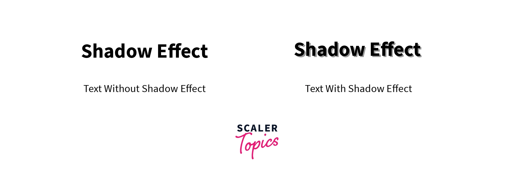
The Text-shadow property is used to decorate the text of the viewport by adding shadows. It provides an additional attraction to texts on websites.
 Syntax:
Values:
-
X- label:- It is a compulsory field that specifies the horizontal shadow position. Negative x-label values are also allowed. To shift the shadow on the right side, put the positive x-value, e.g.: 3px, 3rem, 3em. Similarly, to shift the shadows on the left side, enter the negative x-values, e.g.: -3px, -3rem, -3em etc.
-
Y-label:- It is also a compulsory field that specifies the vertical shadow position. Negative y-label values are allowed. To shift the shadow on the lower side, put the positive y-value, e.g.: 3px, 3rem, 3em. Similarly, to shift the shadows on the upper side, enter the negative y-values, e.g.: -3px, -3rem, -3em etc.
-
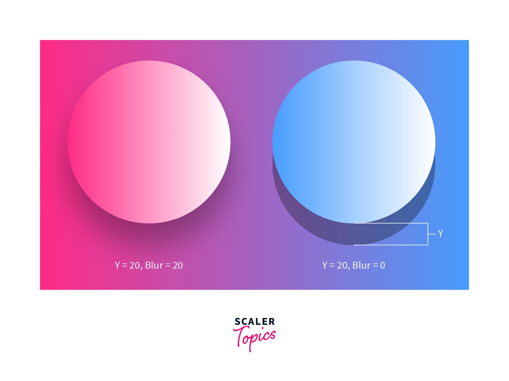
Blur Radius:- It is an optional field that blurs the shadow. Its default value is 0.
-
Color:- It is also an optional field that specifies the color of the shadow. Any of the CSS colors can be used to change the color of the shadow.
-
None:- It ensures that there is no shadow.
-
Initial:- It sets the properties to the default values.
Example: The simplest way to add shadow is to specify the x-label and y-label.
Code:
Shadow effect: by updating the x and y labels only:

Example: In this example, color is also specified with the x and y labels. Any CSS color can be used to modify the color of shadows.
Code:
Shadow effect: Shadow color changed to sky-blue

Example: This example puts the blur effect on the shadow.
Code:
Shadow effect: 3 pixels blur value specified to the shadow.
Example: This text shows the black shadow with the white text.
Code:
Shadow effect: white text color with black shadow

Example: More than one shadow effect can be given to the text by providing the values separated by a comma.
Code:
Shadow effect: two shadow effects are specified, separated by a comma.

CSS box-shadow property
The box-shadow property is used to decorate HTML elements of the viewport. Every single HTML element is treated as a box by CSS. These boxes can be given multiple shadow effects with CSS's box-shadow property. Some examples of HTML elements are anchor tags, heading tags, image tags, and many more. Syntax:
Values:
-
Inset:- It is an optional field. By specifying this keyword, the shadow is created over the element instead of a shadow created below the element. i.e., the shadow effect is produced at the top of the element or box(in CSS).
-
x-label:- It is a compulsory field that specifies the horizontal shadow position. Negative x-label values are also allowed. To shift the shadow on the right side, put the positive x-value, e.g.: 3px, 3rem, 3em. Similarly, to shift the shadows on the left side, enter the negative x-values, e.g.: -3px, -3rem, -3em etc.
-
y-label:- It is also a compulsory field specifying the vertical shadow position. Negative y-label values are allowed. To shift the shadow on the lower side, put the positive y-value, e.g.: 3px, 3rem, 3em. Similarly, to shift the shadows on the upper side, enter the negative y-values, e.g.: -3px, -3rem, -3em etc.
-
Blur radius:- It is an optional field that blurs the shadow. Its default value is 0.
-
Spread:- It is also an optional field, which helps in the spread of shadow up to a specified size.
-
Color:- It is also an optional field that specifies the color of the shadow. Any of the CSS colors can be used.
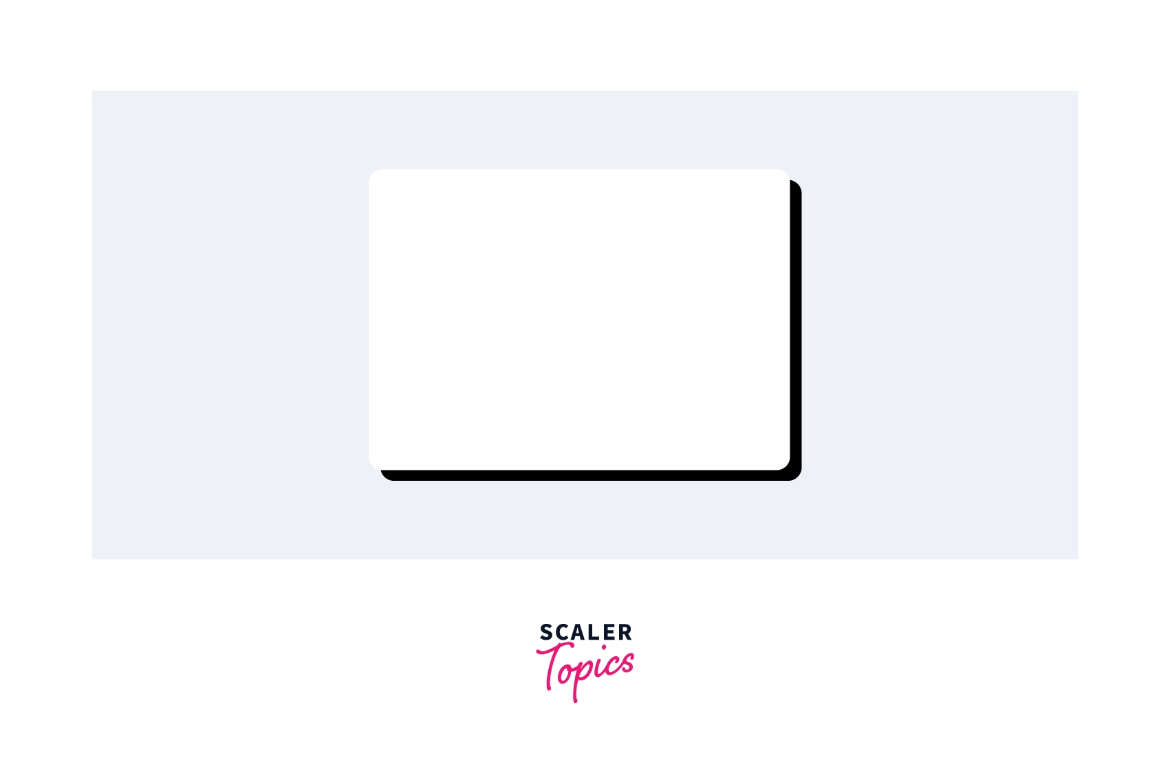
Example: The box-shadow property adds a shadow to the elements on the web page. Shadow effect is given by specifying x and y labels.
Code:
Shadow effect: shadow is produced by updating the x and y label with a default black color.
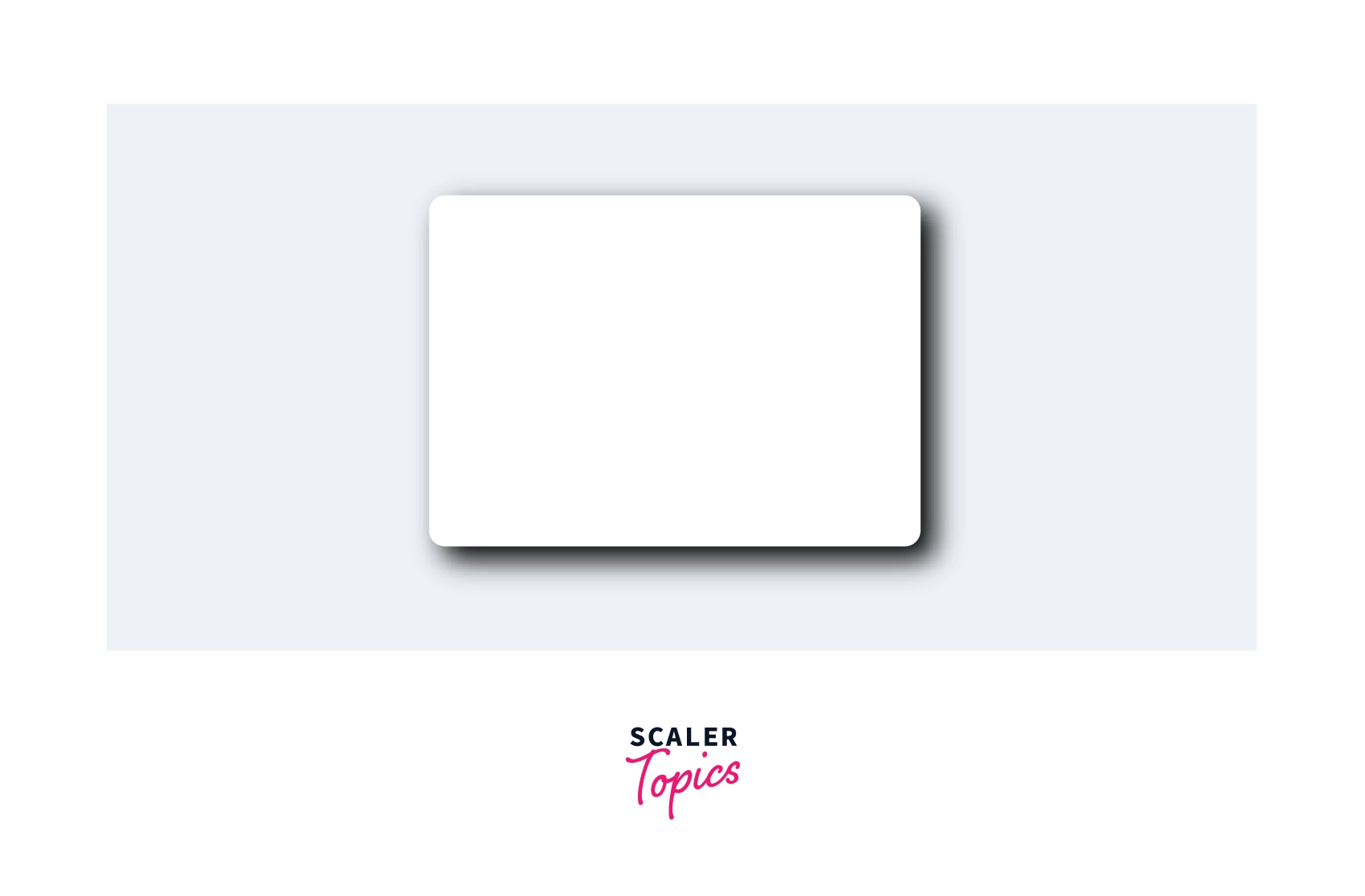
Example: Apply a blur effect to the shadow.
Code:
Shadow effect: A blur value is given to the shadow by 5 pixels.
Example: Any CSS color can color the shadows to make them more attractive.
Code:
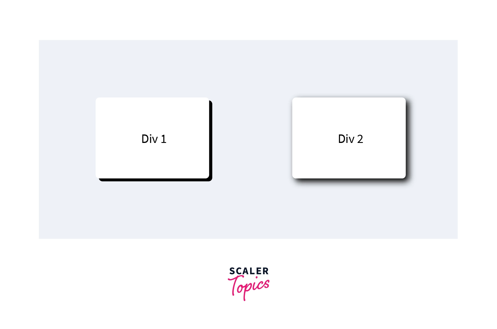
Shadow effect: Gray color shadow is produced over Div 1 having no blur value and Div 2 having blur value. One can choose any color of shadow according to the requirement.
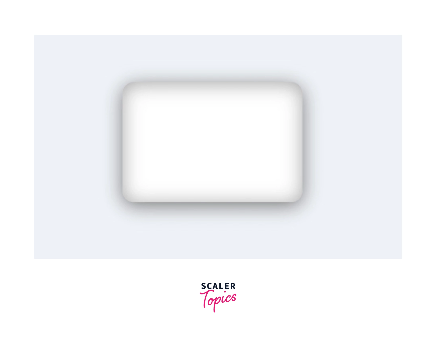
Example: More than one shadow effect is given by specifying the values separated by a comma.
Code:
Shadow Effect: The super smooth shadow effect is given to the box by specifying more than one shadow value separated by a comma.
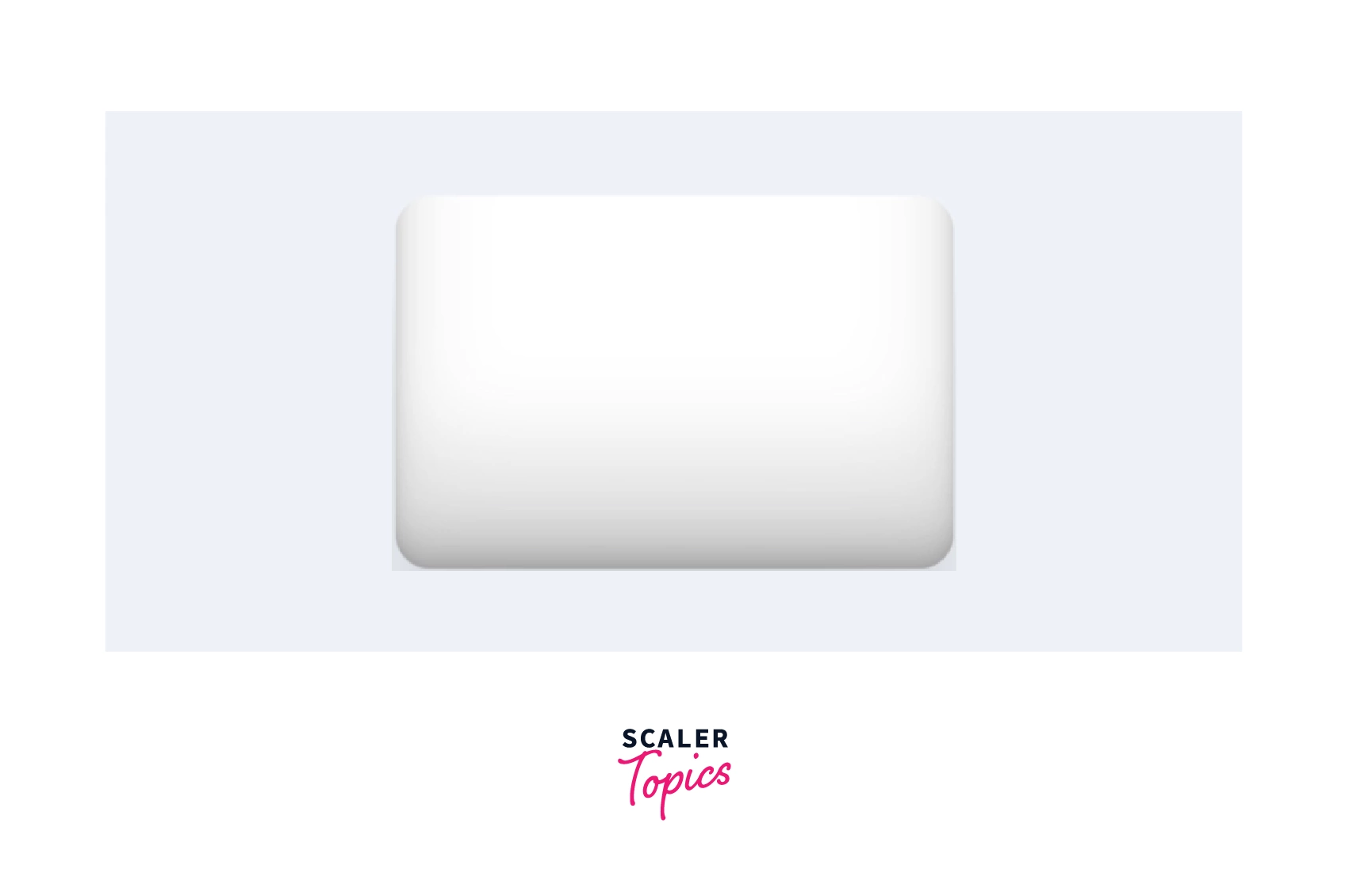
Example: Inset keyword, add the shadow inside the box.
Code:
Shadow effect: Shadow is produced inside the box.
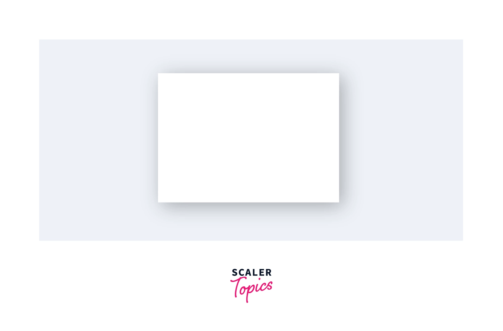
Example: The shadows can be added anywhere around the box or division according to the choice, whether inside or outside the box.
Code:
Shadow Effect: Shadow is produced inside and outside the box.
Example: Shadow effect on images.
Code:
Shadow Effect: Three-dimensional effects are given to images’ appearance.
Conclusion
-
Shadow CSS makes the web page or website more graceful by adding shadows.
-
Shadow CSS has two main properties.
- Text-shadow - indulge shadow effect to the text, add multiple visual effects, and can also add boundaries to the text.
- Box-shadow - indulge shadow effect to the boxes, makes the box look a bit lifted, boundaries can also be given, and many more visual effects. These boxes can be any HTML element or images, e.t.c.
-
Shadow effect is shown to text by updating the x-label, y-label, blur radius, spread value, and color values.
-
Similar to text-shadow, Box-Shadow effects are also shown to the HTML elements, images, or even videos by updating their x-label, y-label, blur value, spread value, and color value.
 Google
 Amazon
 Microsoft
 Flipkart
 Adobe1200+ more