How to Make an AlertDialog in Flutter?
Overview
One of the most significant features we implement to warn consumers of crucial information is the Alert Dialog in Flutter. It forces the user to recognize the scenario or action he is about to do. Flutter's Alert Dialogue is quite simple to develop. The most common application of Alert Dialog in Flutter in an app is when a user wants to depart the app; we are generally prompted with a confirmation box whether we want to leave the app or not. This article will go through the alert dialogue box in further detail.
Dialog vs Alert Dialog vs Simple Dialog
| Dialog | AlertDialog | SimpleDialog |
|---|---|---|
| The Dialog is the finest kind of conversation you can have. It just requires one child, so you can use your full imagination to style it whatever you want. Aside from that, it operates in the same way as AlertDialog and SimpleDialog. | The AlertDialog is the simplest way to present information to the user that requires a response. It's a straightforward widget containing a title (header), content (message), and a set of actions (one or more buttons). When compared to the CupertinoAlertDialog, the AlertDialog has a few more attributes. For example, the icon property allows you to place an icon on top of the header. Use the showDialog function to activate the widget. Set the barrierDismissible value to false if you don't want users to be able to exit the dialogue by touching anywhere outside of it. In this instance, you must ensure that the dialogue is closed using Navigator.of(context).pop(). | The SimpleDialog allows you greater flexibility in designing your dialogue. A title and a list of children are the only basic attributes. Its primary function is to allow you to pick from a list of alternatives. With the SimpleDialogOption widget, you may add numerous selection choices instead of a button bar at the bottom. The SimpleDialog, like the AlertDialog, is activated by the showDialog() function. The SimpleDialog allows greater flexibility in designing the dialogue, with a title and a list of children as the only basic attributes. |
Alert Dialog and Scrolling
By default, alert dialog in Flutter resize to fit their children. If the material is too large to fit vertically on the screen, the dialogue will display the title and actions while allowing the content to overflow. This is rarely wanted. To avoid overflow, consider utilizing a scrolling widget for content, such as SingleChildScrollView. Because the dialogue tries to adapt to the material, the content must enable reporting its intrinsic aspects. This implies that widgets that are rendered lazily, such as ListView, GridView, and CustomScrollView, will not function in an AlertDialog unless they are wrapped in a widget that imposes a specific size, such as a SizedBox. Consider utilizing Dialogue directly for finer-grained control over dialogue size.
Properties of Alert Dialog
The AlertDialog widget's primary attributes are as follows:
Title
This property specifies the title of an AlertDialog box at the top of the AlertDialog. It is usually best to make the title as brief as possible so that the user understands its purpose quickly. In AlertDialog, we may write the title as follows:
Action
It appears beneath the content. For example, if a button to choose yes or no is required, it is described just in the action attribute. In AlertDialog, we may add the following action attribute:
Content
This attribute defines the AlertDialog widget's body. It is a text type, but it may also include any form of layout widget. In AlertDialog, we can utilize the Content property as follows:
ContentPadding
It provides the necessary padding for the information within the AlertDialog widget. In AlertDialog, we can utilize the ContentPadding property as seen below:
Shape
This feature specifies the geometry of the alert dialogue box, which can be a curve, circle, or any other shape.
Types of Alert Dialog
The AlertDialog is a straightforward widget containing a title, content, and a set of actions. It has a few more attributes, such as an icon property, and can be activated by the showDialog() function. The alert dialogue may be classified into several varieties, which are listed below:
- Basic AlertDialog
- Confirmation AlertDialog
- Select AlertDialog
- TextField AlertDialog
Now we'll go over each kind one by one.
Basic AlertDialog
This alert tells users of new information, such as a modification in the app, new features, an urgent issue that demands acknowledgment, or a confirmation message to the user of whether or not an activity was successful.
Confirmation AlertDialog
The confirmation alert dialogue prompts the user to confirm a certain option before proceeding with the program. If a user tries to remove data in an application, it is best to confirm the operation first in case the user pushed the wrong button.
Select AlertDialog
This sort of alert dialogue offers a selection of objects that, when selected, take instant action.
TextField AlertDialog
This AlertDialog enables it to receive user input. Alert dialogues are an efficient means of sending vital messages to your consumers, therefore this is a good skill to have in your toolbox. You may even collect user input and utilize it to make decisions in your application by including a text box. In the next example, we will add a text box to the alert dialogue.
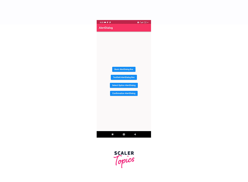
Example App
Create a new project. The Alert Dialogue box is displayed using Flutter's native show Dialogue widget. Your entire code in main.dart file will look like this:
Output: This is how your app will appear.
Conclusion
- The Alert Dialog in Flutter is a feature that provides users with essential information to help them make a decision or select a specific action.
- It is a floating model that should be used for short responses such as password verification, tiny app alerts, and so on.
- The AlertDialog widget in Flutter alerts the user about circumstances that require acknowledgment, with an optional title above the text and a list of actions below the information.
- The notifications are extremely adaptable and simply customizable.
- AlertDialog is a simple widget that has a title, a content section, and an actions section.
- To avoid overflow, consider utilizing a scrolling widget for content, such as SingleChildScrollView.
- Properties of AlertDialog include a title, content section, and actions section.
- The utility function showDialog() is also used to display an AlertDialog.
- To avoid overflow, consider utilizing a scrolling widget for content, such as SingleChildScrollView.
- Widgets that are rendered lazily, such as ListView will not function in an AlertDialog unless they are wrapped in a widget that imposes a specific size.
- The Dialog is a conversation that requires one child and operates in the same way as the AlertDialog and the SimpleDialog.
- It is activated by the showDialog() function.