Angular Components
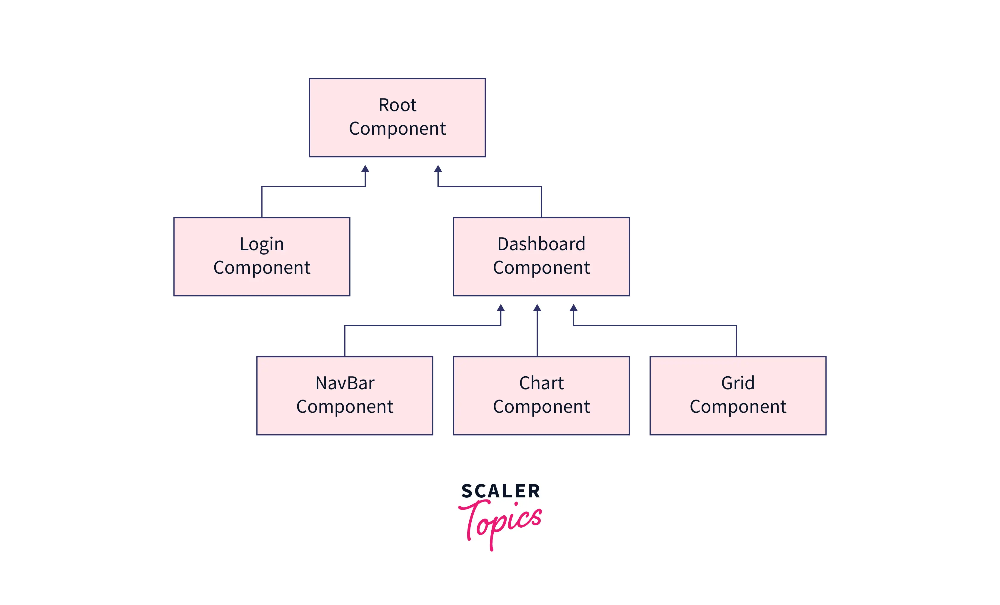
Angular Components, akin to Lego blocks, are essential building units in an application, shaping the user interface. As a key element in the Single Page Application (SPA) framework, Angular views consist of these components, combining HTML, CSS, and JavaScript. Learn to create custom Angular components using Angular CLI in this informative article.
The example shown in the image below could help you understand the application's component structure:
Prerequisites
To create a component, ensure that you fulfill the following requirements:
- Angular CLI
- Angular project. If you don't have a project, create one using ng new <project-name>.
Each Angular Component Consists of
Each component consists of at least one Typescript file .ts with the decorator @Component, inside which many properties can be defined. Some of the most prevalent properties are:
- selector - To get the css selector for the component
- templateUrl/template - To define HTML template of the component
- styleUrls/styles - To define styling of the component
There are lot of other properties that can be used inside @Component decorator, please checkout the list Angular component.
Creating a Component
A component can be created in a variety of ways. The most common approaches are as follows:
- Create a component using the Angular CLI
- Create a component manually by creating files
Transform Your Career
Choose from our industry-leading programs designed for career success
Modern Software and AI Engineering Program
Master full-stack development with AI integration

 +1000 more
Modern Data Science and ML with specialisation in AI
Advanced data science techniques with AI specialization
+1000 moreAdvanced AIML with Specialisation in Agentic AI
Deep dive into AIML with focus on Agentic systems
+1000 moreDevOps, Cloud & AI Platform Engineering
Build and manage AI-powered cloud infrastructure
+1000 moreAI Engineering Advanced Certification by IIT-Roorkee
Premier AI engineering certification from IIT-Roorkee
Creating a Component using the Angular CLI
Following CLI command can be used to create a new component
After running the command, you should see a new folder and a few files inside it. The @Component decorator which holds all of the component's meta data, can be found in the .ts file.
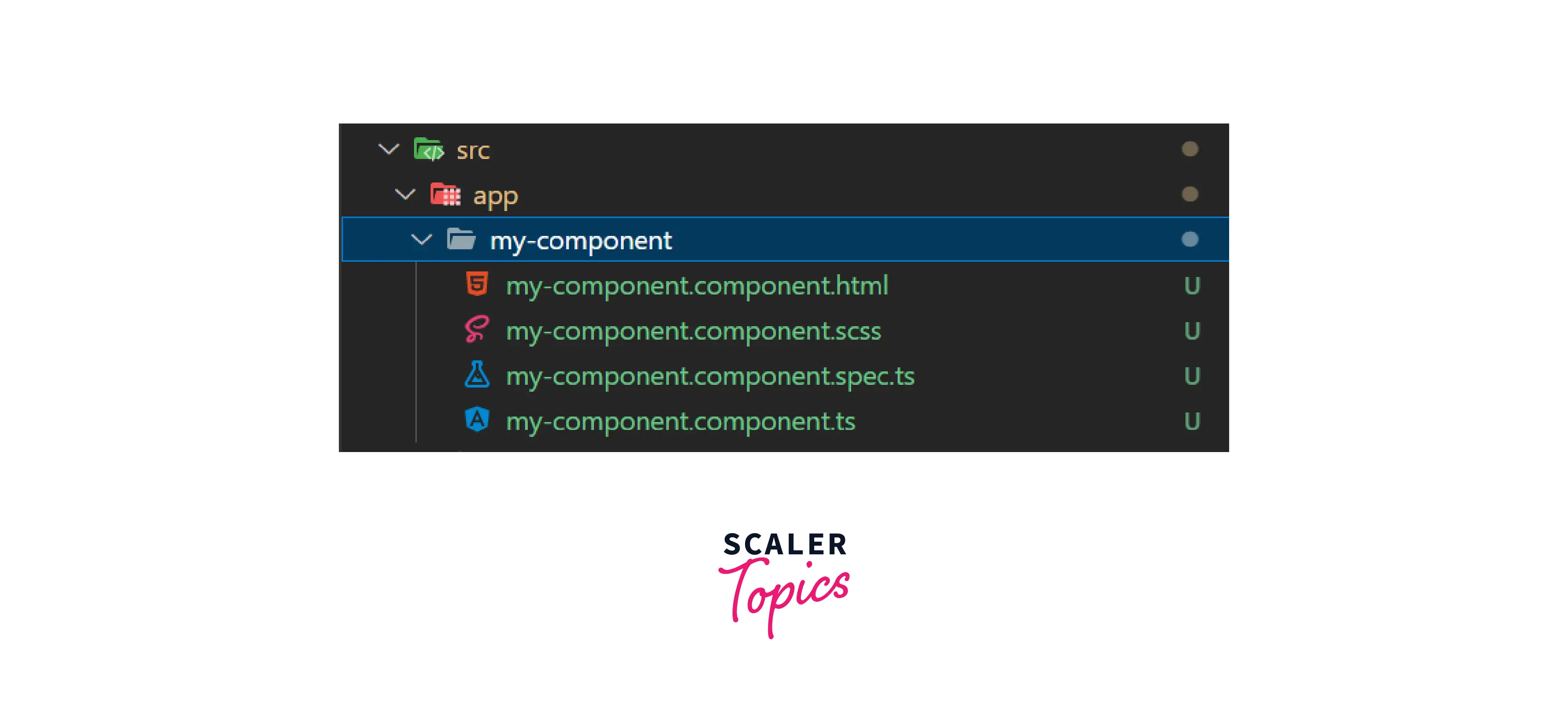
You will also see some changes in app.module.ts file, CLI will add MyComponentComponent in the declaration section.
Creating a Component Manually
- Create a subdirectory under src/app name it my-component
- Create a typescript file named my-component.component.ts and add the code below
- Add the component to the module by importing MyComponentComponent into the app.module.ts file and adding it to the declarations array as seen in the following code:
Specifying a Component's CSS Selector
A selector is used to uniquely identify each component in the component tree and to trigger component instantiation.
The specified selector may be used anywhere in the html file to add the component to the application.
File: app.component.html
Defining a Component's Template
There are two ways to define a component template:
Turn Learning into Career Growth
Inline Template
inlineTemplate flag can be used to create inline template for the component. By default inlineTemplate set to false.
HTML can be added inside the template property in the @Component decorator in the same .ts file.
Scaler Placement Report and Statistics
Scaler learners achieved 2.5x salary growth with average post-Scaler CTC reaching ₹23L.
In separate file
You will get the template file separately if you build a component with the following command:
File: myComponent.component.html
Declaring a Component's Styles
CSS is written in a global file style.css in an Angular application and can be written separately for each component.
Component CSS can be defined in two ways:
Inline - Inside .ts file
The --inline-style flag can be used to create inline style in the component. By default --inline-style set to false.
In Separate File
File: myComponent.component.css
Conclusion
- Angular component is a fundamental UI building piece that may be reused wherever it is needed.
- @Component decorator makes a class as an Angular component
- All the metadata related to a component stay inside @Component
- CSS selector is unique for every component and can be used to add components at any place
- HTML template and styles can be added in the component in two ways inline and in the separate file
 Google
 Amazon
 Microsoft
 Flipkart
 Adobe1200+ more