ReactJS UI Ant Design Form Component
Overview
Forms are an integral part of any website. They are meant to serve for various purposes. Form development can be simplified by using the Ant Design System. The Ant Design is a UI library that aids in building React-based applications. It provides a wide variety of components to create user interfaces. To create forms, we can use the Ant Design Form Component or the AntD Form Component. Apart from the basic form components, it also provides form validation and error-handling mechanisms.
Form Props
Form Props or Form properties are passed to the Form component to customize its nature. It helps us to control the various aspects of forms. The form props in AntD form are:
- colon- It configures the default value of colon for Form.item. It allows to control whether a colon should be added after the label.
- component- It sets the element that renders the form.
- fields- It allows to management and control of the form fields using state management.
- form- It provides access to methods of form control instances created using Form.useForm().
- initialValues- It sets the initial value of the form field.
- labelAlign- It sets the alignment of the text of the labels of the form.
- labelCol- It defines the label layout.
- layout- It specifies the form layout.
- name- It specifies the name of the form.
- preserve- It keeps the value of the field even after it is removed.
- requiredMark- It specifies the style for the required mark to indicate mandatory fields.
- scrollToFirstError- It automatically scrolls to the first field where the error has occurred after submitting.
- size- It sets the size of the field components.
- validateMessages- It provides a validation prompt template.
- validateTrigger- It specifies the configuration when field validation is triggered.
- wrapperCol- It provides the layout for input controls.
- onFieldsChange- It is a callback function triggered when a field is updated.
- onFinish- A callback function triggered after submitting the form and successfully verifying data.
- onFinishFailed- A callback function triggered after submitting the form and failing to verify data.
- onValuesChange- A callback function triggered when the value is updated for a field.
Form.Item Props
The Form.Item is a component in AntD, that is used to control individual form elements. The Form.Item props in AntD form are-
- colon- It is used alongside a label.
- dependencies - It sets the dependency field.
- extra - It denotes an extra prompt message.
- getValueFromEvent - It obtains a value from an event.
- getValueProps - It obtains Additional props with a subcomponent.
- hasFeedback - It is used to specify the validation status icon to validate status.
- help - It denotes the prompt message.
- hidden - It specifies if we want to hide the Form.Item.
- htmlFor - It sets the sub-label htmlFor.
- initialValue - It is used to configure the sub-default value.
- label - It denotes the Label.
- labelAlign - It sets the alignment of the text of the label.
- labelCol - It defines the label layout.
- messageVariables - The default validation information of a field is defined by this prop.
- name - It specifies the name of the field.
- normalize - Before passing the component value to the form instance, it is normalized first.
- noStyle - It does not use any style and is a pure field control.
- preserve - It keeps the value of the field even after it is removed.
- required - It displays the required style.
- rules - It specifies the rules to validate the field.
- shouldUpdate - It implements the logic of custom field update.
- tooltip - It is used to manage the configuration of the tooltip.
- trigger - It specifies the instant to collect values from the children nodes.
- validateFirst - For a field, it tells whether to stop validation on the first rule of error.
- validateStatus - It denotes the status of validation.
- validateTrigger - It specifies the instant to validate the children's node values.
- valuePropName - It denotes the children's node props.
- wrapperCol - It provides the layout for input controls.
Form.List Props
The Form.List props can be applied to the Form.List components in the AntD library. The Form.List props in AntD form are-
- name- It specifies the name of the field.
- rules- It defines the validation rules for the list.
- initialValue- It sets the list's initial value.
- children- It returns the content of the list.
Form.ErrorList Props
The Form.ErrorList Props is a component in AntD that is used to display the errors that are related to fields. The Form.ErrorList props in AntD form are-
- errors- It denotes the list of errors.
Form.Provider Props
The Form.Provider props are used to manage the values and states for various form elements. The Form.Provider Props in AntD form are-
- onFormChange- A callback function is triggered when the function of a subform field is updated.
- onFormFinish- A callback function is triggered when there is a submission of the subform field.
Creating React Application and Installing Module
Let us understand the step-by-step process of creating a React application and installing the AntD module.
-
First, create a folder and open it in an IDE like Visual Studio Code. Then use the given command to create a React application.
-
Now move to the app created above(appname) by the following command.
-
Install the Ant Design Form component i.e., AntD by the following command.
-
Under the src folder, you will find the app.js file, where the code has to be written. We will create a form using the following code.
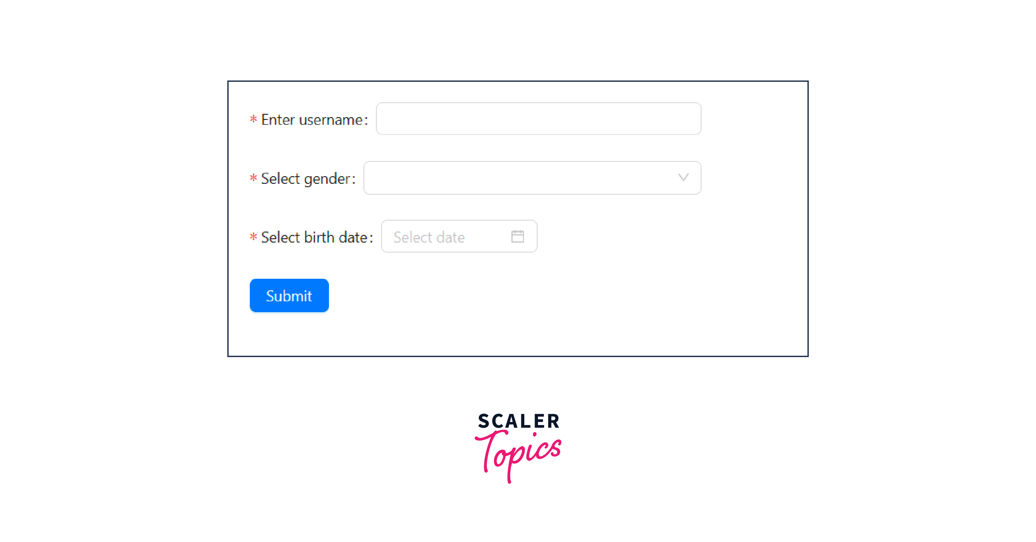
Output
A AntD form is created. After running our code, the following can be seen on the browser.
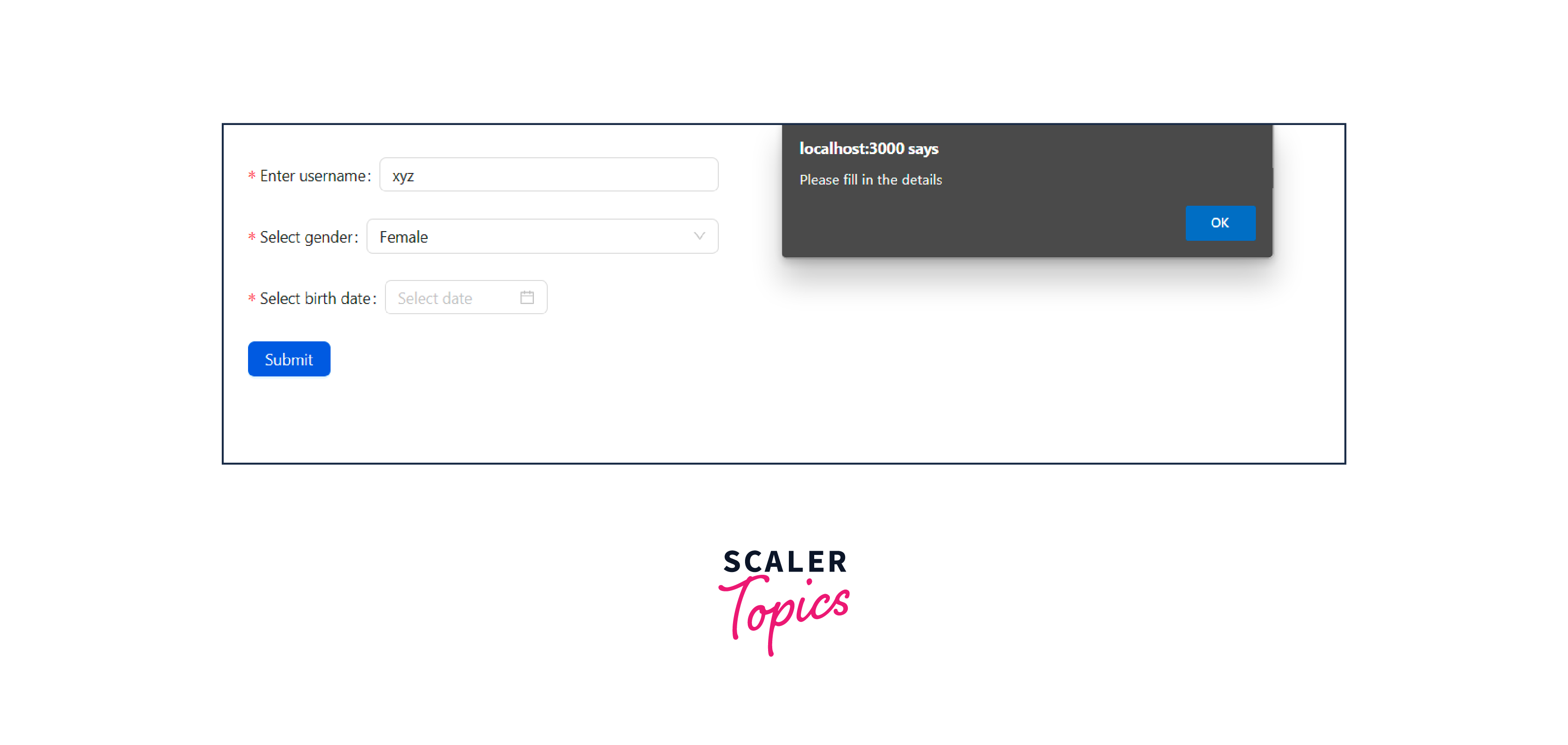
An alert is displayed if all the fields are not completed.
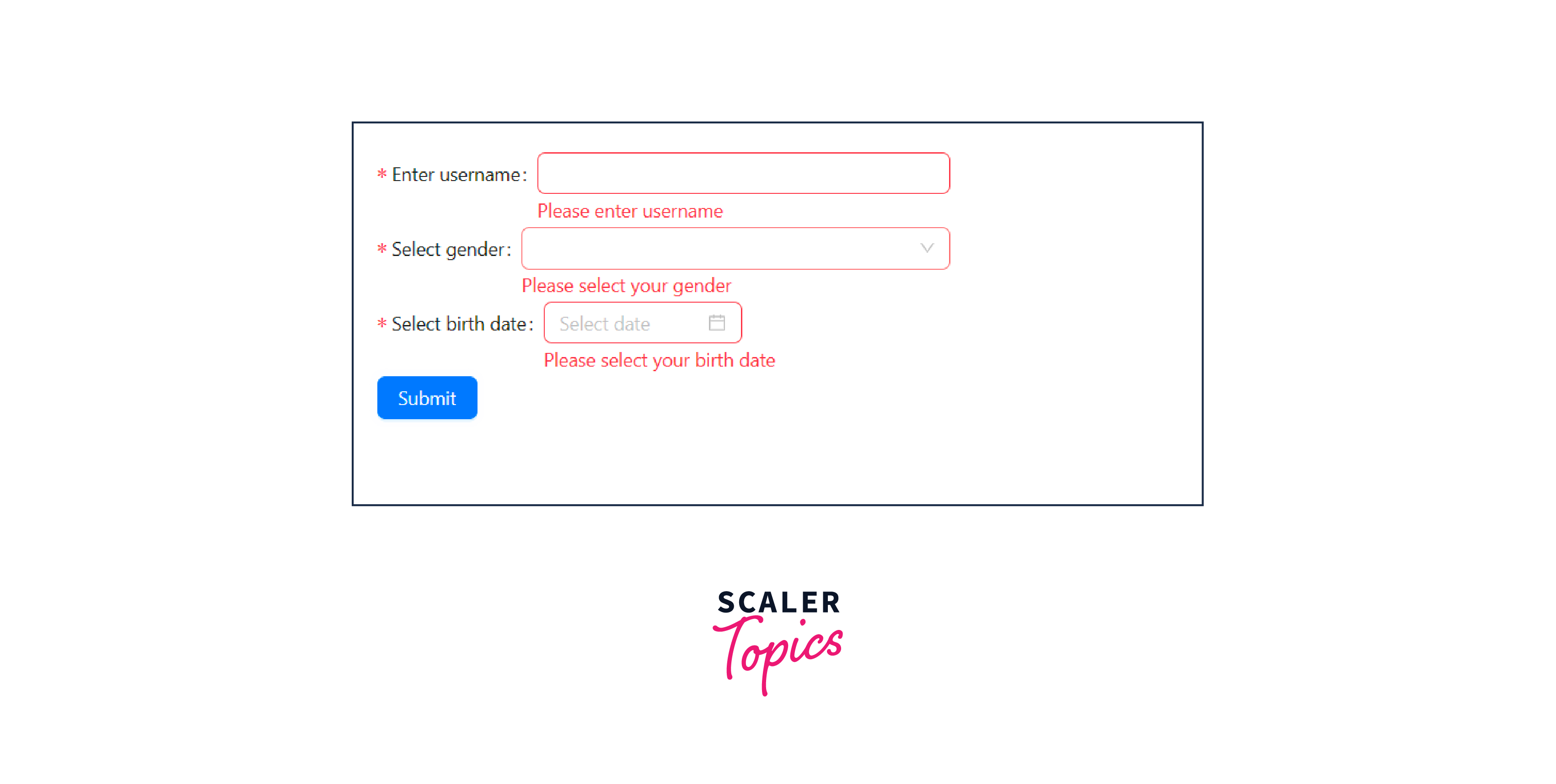
Also, if the fields are not submitted, the required warning is displayed.
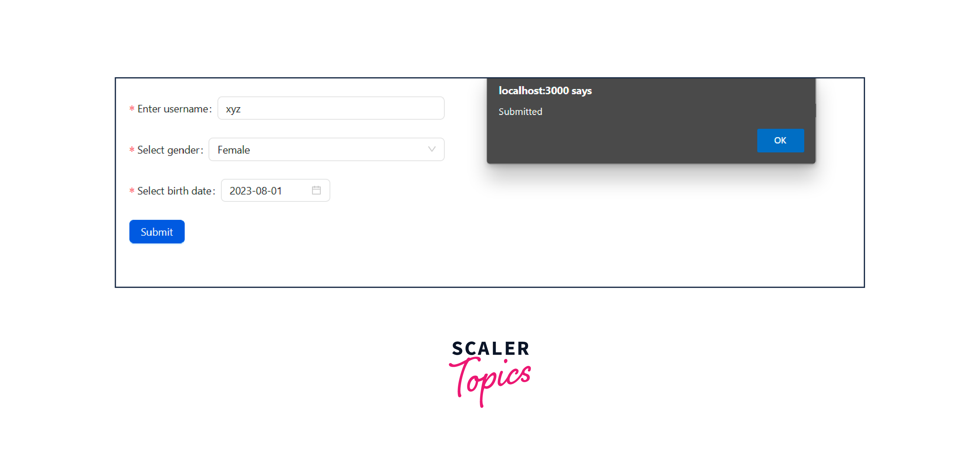
After all the fields are entered and the form is submitted, this message is displayed.
Conclusion
- Form development can be simplified by using the Ant Design System. The Ant Design is a UI library that aids in building React-based applications. It provides a wide variety of components to create user interfaces.
- Apart from the basic form components, it provides form validation and error-handling mechanisms.
- Form Props or Form properties are passed to the Form component to customize its nature. It helps us to control the various aspects of forms.
- The Form.Item is a component in AntD form, that is used to control individual form elements.
- The Form.List props can be applied to the Form.List components in the AntD library.
- The Form.ErrorList Props is a component in AntD form that is used to display the errors that are related to fields.
- The Form.Provider props are used to manage the values and states for various form elements.
- To create a React application and use the AntD library, we have to first download the module using the npm install antd. The various form elements can be used using the AntD library.