Bootstrap Align Right
Overview
Bootstrap is a CSS framework used to design and customize responsive, mobile-first sites. In Bootstrap, the alignment of elements concerning other components and screens becomes very important while designing web page layouts. In this article, we will explore different ways to align elements to the right.
Pre-requisite
The pre-requisites for the articles are as follows:
- float property, grid property, and flex item properties like align-items, justify-content and margin, padding.
How to Align-Right in Bootstrap?
- Adding float-right Class - The .float-right class in Bootstrap uses the CSS float property to place an element on the right. Note that the Bootstrap 4 container is a Flexbox that can prevent the float property from working.
- Using justify-content-end Class - The .justify-content-end class is used on Flexbox containers to align all items on the main axis to the right. Always remember that the container using this class must have its display property set to flex. This is the .d-flex class in Bootstrap.
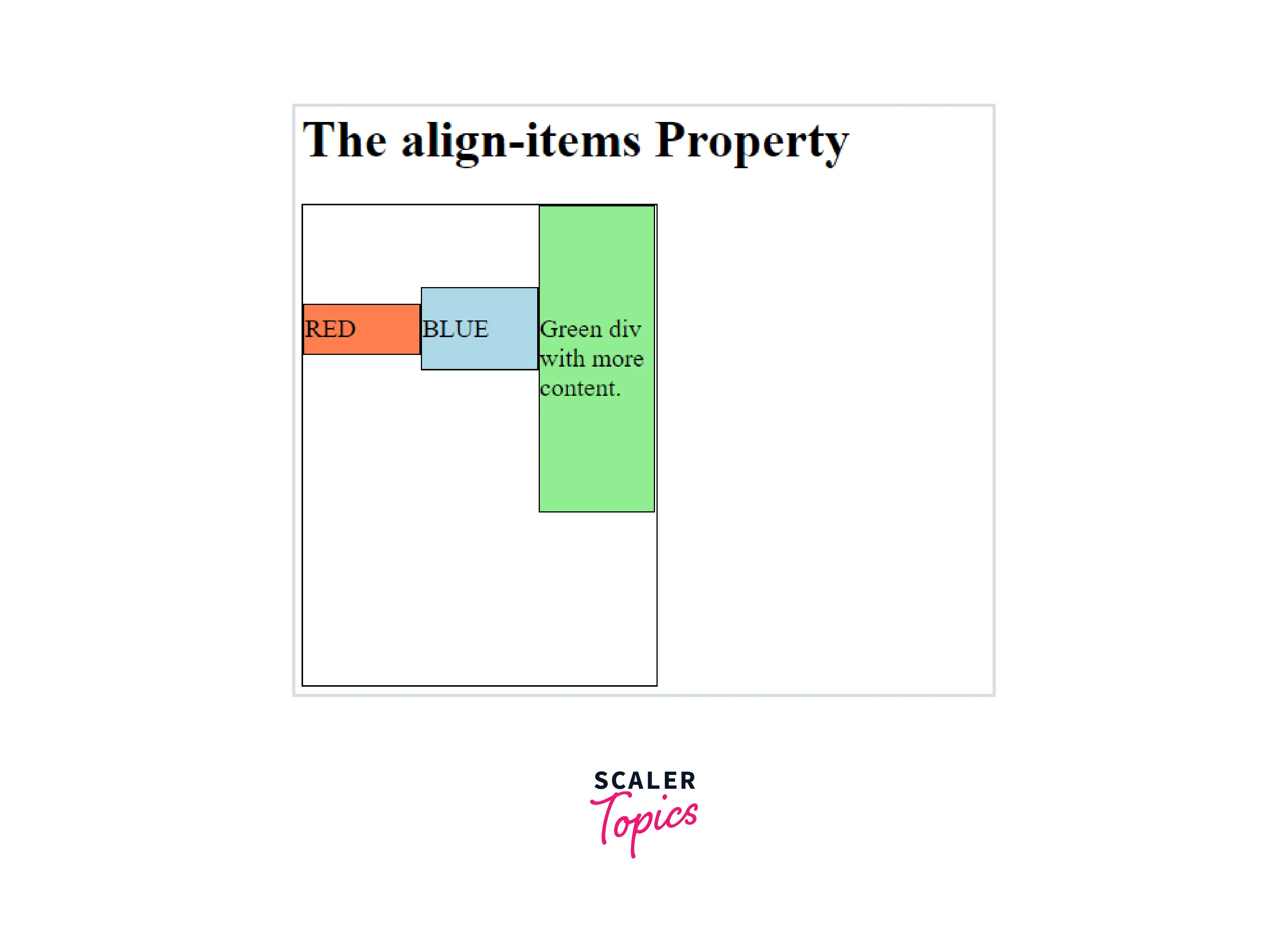
- Adding an align-items-right Class - The align-items-end class is used on Flexbox containers to align all items along its cross axis (i.e., vertically) to the right. The d-flex class is required here, and the flex-direction of the parent container should be set to the column.
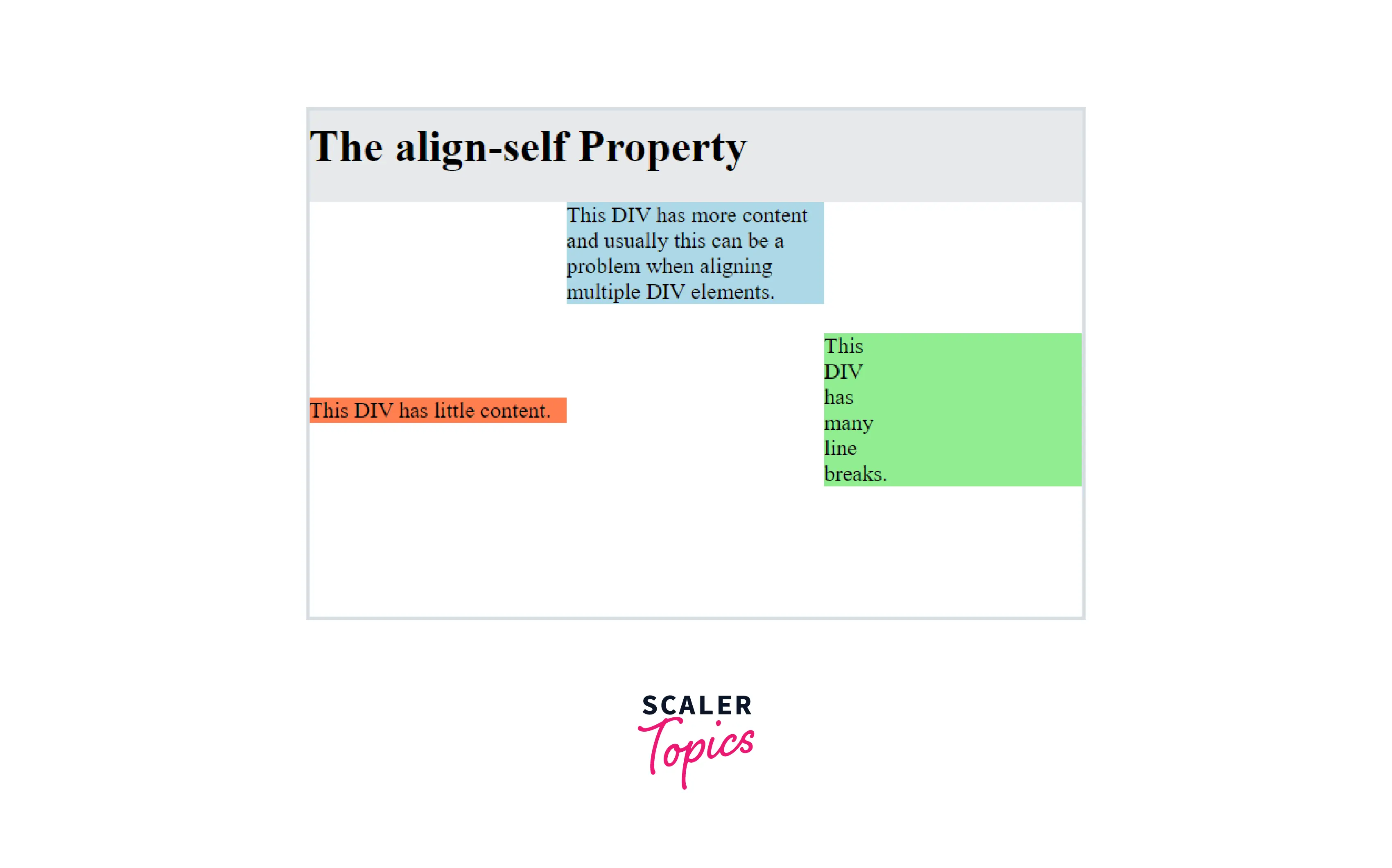
- Using .align-self-end Class - .align-self-end is used to align a single item in a Flexbox to the right.
- Using text-right Class - .text-right aligns text to the right on all viewport sizes. This is mostly used on inline elements.
- Adding ml-auto Class - The ml-auto class is mostly used on columns, navigation bars, and a few other Flexbox children.
Transform Your Career
Choose from our industry-leading programs designed for career success
Modern Software and AI Engineering Program
Master full-stack development with AI integration

 +1000 more
Modern Data Science and ML with specialisation in AI
Advanced data science techniques with AI specialization
+1000 moreAdvanced AIML with Specialisation in Agentic AI
Deep dive into AIML with focus on Agentic systems
+1000 moreDevOps, Cloud & AI Platform Engineering
Build and manage AI-powered cloud infrastructure
+1000 moreAI Engineering Advanced Certification by IIT-Roorkee
Premier AI engineering certification from IIT-Roorkee
Adding Float-Right Class
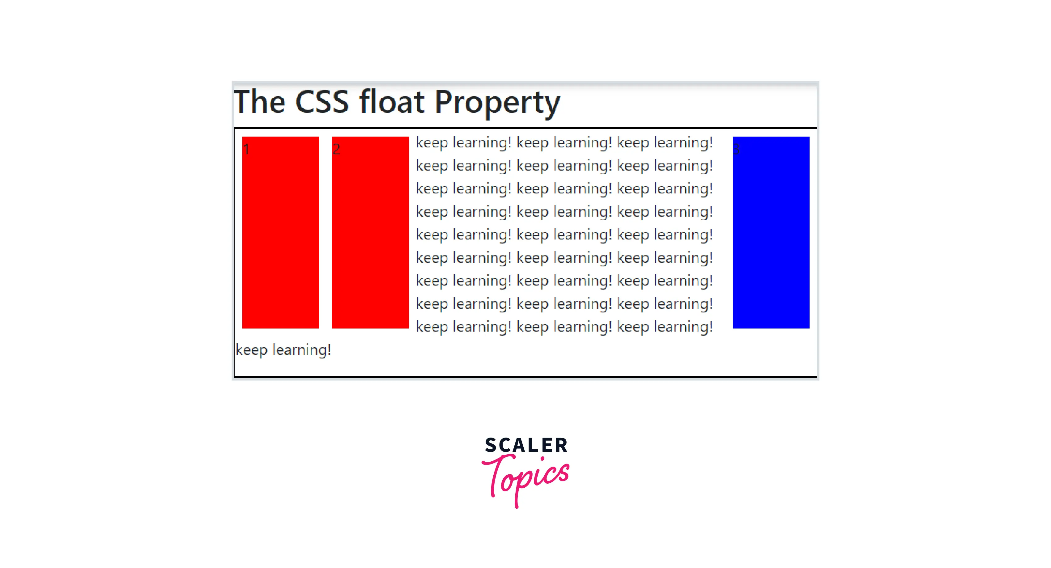
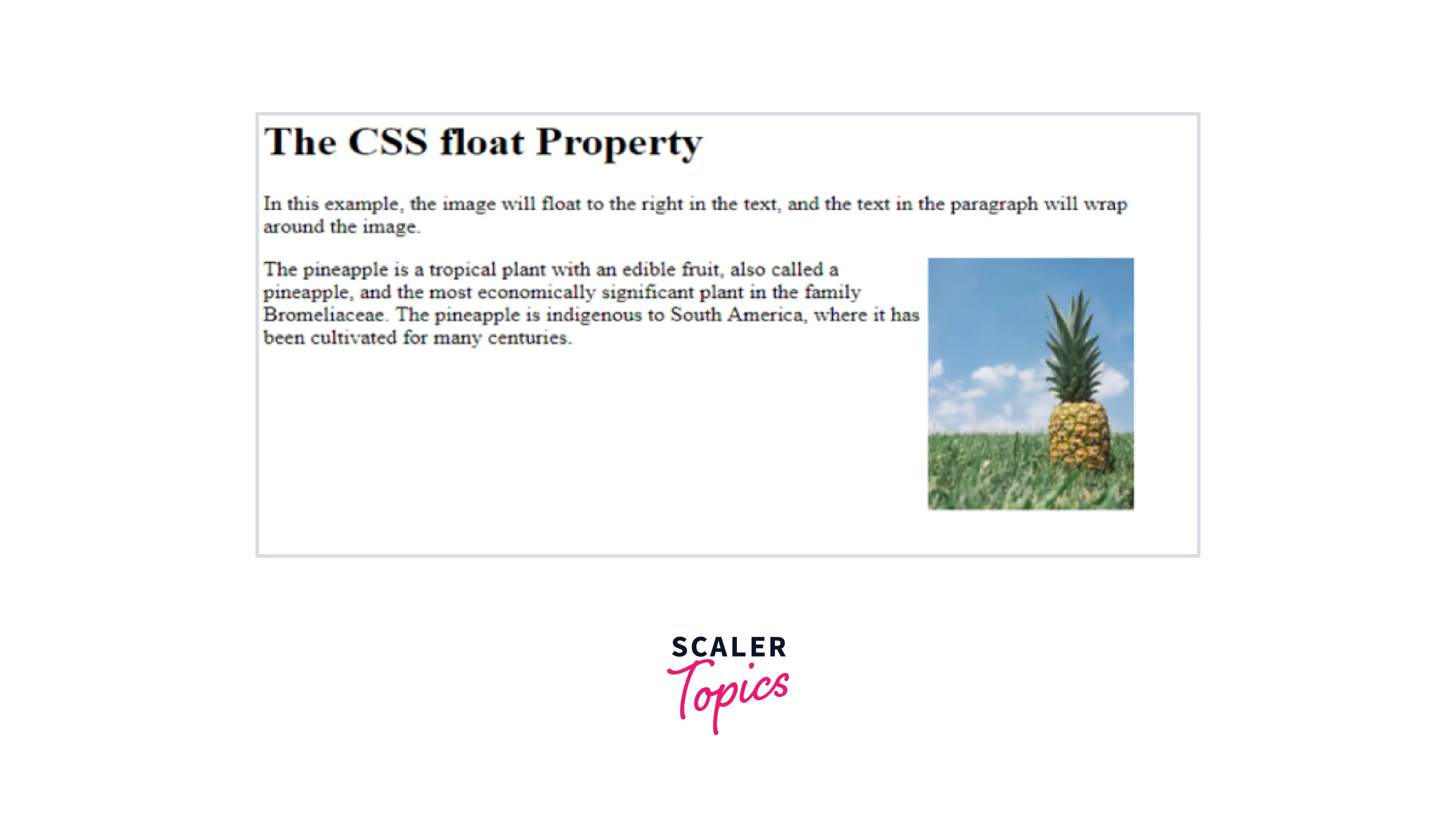
The Float property of CSS allows the texts and inline elements to wrap around it either on the left or right side of the element. This float property of CSS forces the layout elements to float inside the parent element along with which other elements wrap around it. This property usually makes the element float either left, right, none or inherit. The float property of CSS is used in placing an image or any layout element inside the container along with the inline elements that will wrap around it. This property is not used for designing any elements layout instead, it is just used for wrapping text around images.
How Does CSS Float Right Work?
In CSS, the float right property is usually used for specifying the elements that should float and these elements float around it. To avoid this or to clearfix this we use clear property. Let us see the below syntax for this float right property
Examples:
Example 1:
Example 2:
Turn Learning into Career Growth
Flexbox Alignment Utilities
Aligning things in CSS has always been a nightmare. Then Flexbox came and with it the possibility to align items in a way that makes sense! In this section, we are going to share a set of CSS utility classes based on Flexbox that can be used to align things in no time.
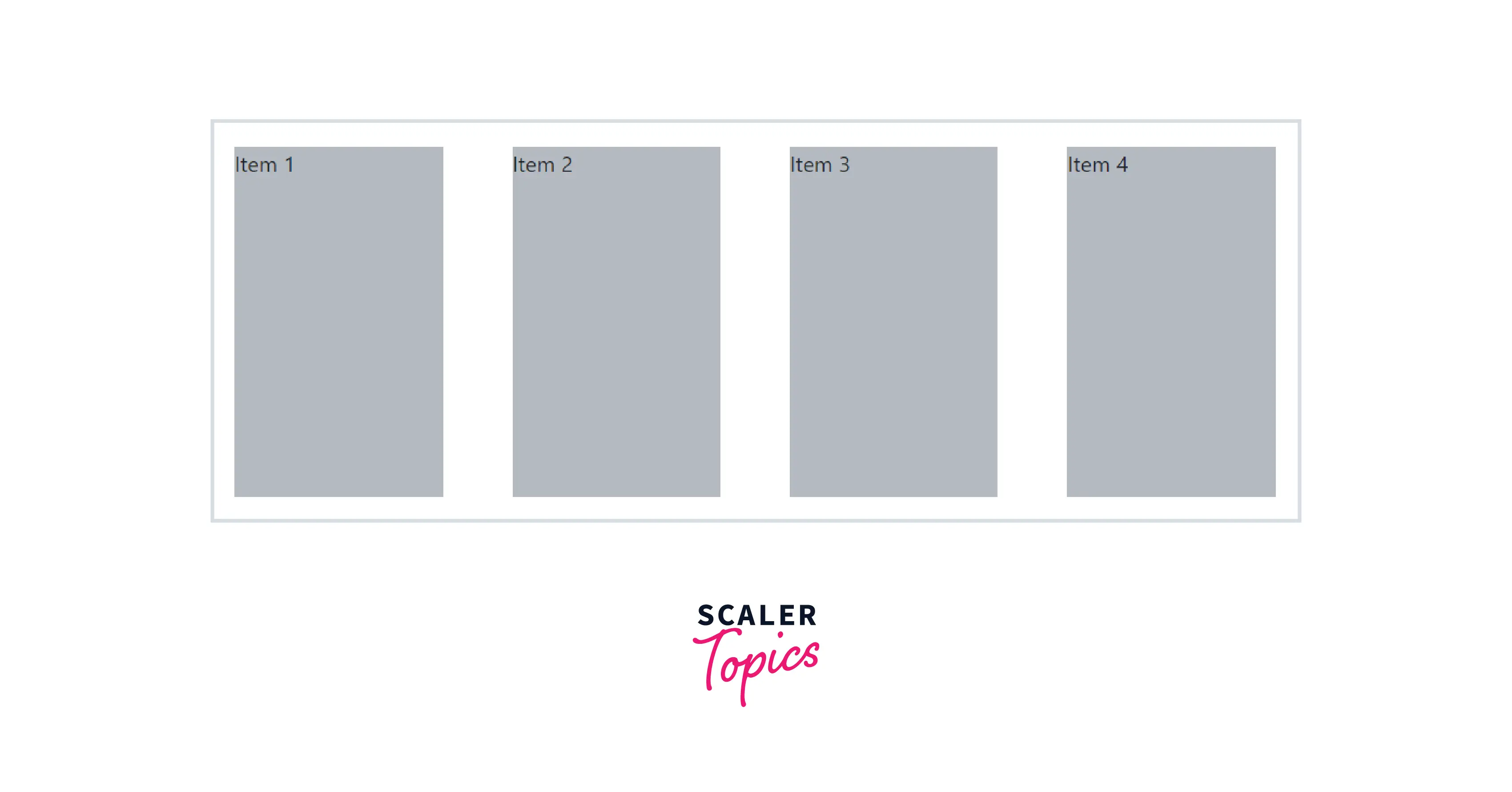
Using the Justify-Content-Between Class
The CSS justify-content property defines how the browser distributes space between and around content items along the main-axis of a flex container, and the inline axis of a grid container. You can simply use the CSS justify-content property with the value space-between to set space between flexbox items. In the following example the flex container has 4 items where each flex item has a width of 20%, and the remaining 20% space is distributed evenly between the flex items.
Example:
Example:
Add a Align-Items-End Class
The align-items-end class is used on Flexbox containers to align all items along its cross axis (i.e., vertically) to the right. The d-flex class is required here, and the flex-direction of the parent container should be set to the column.
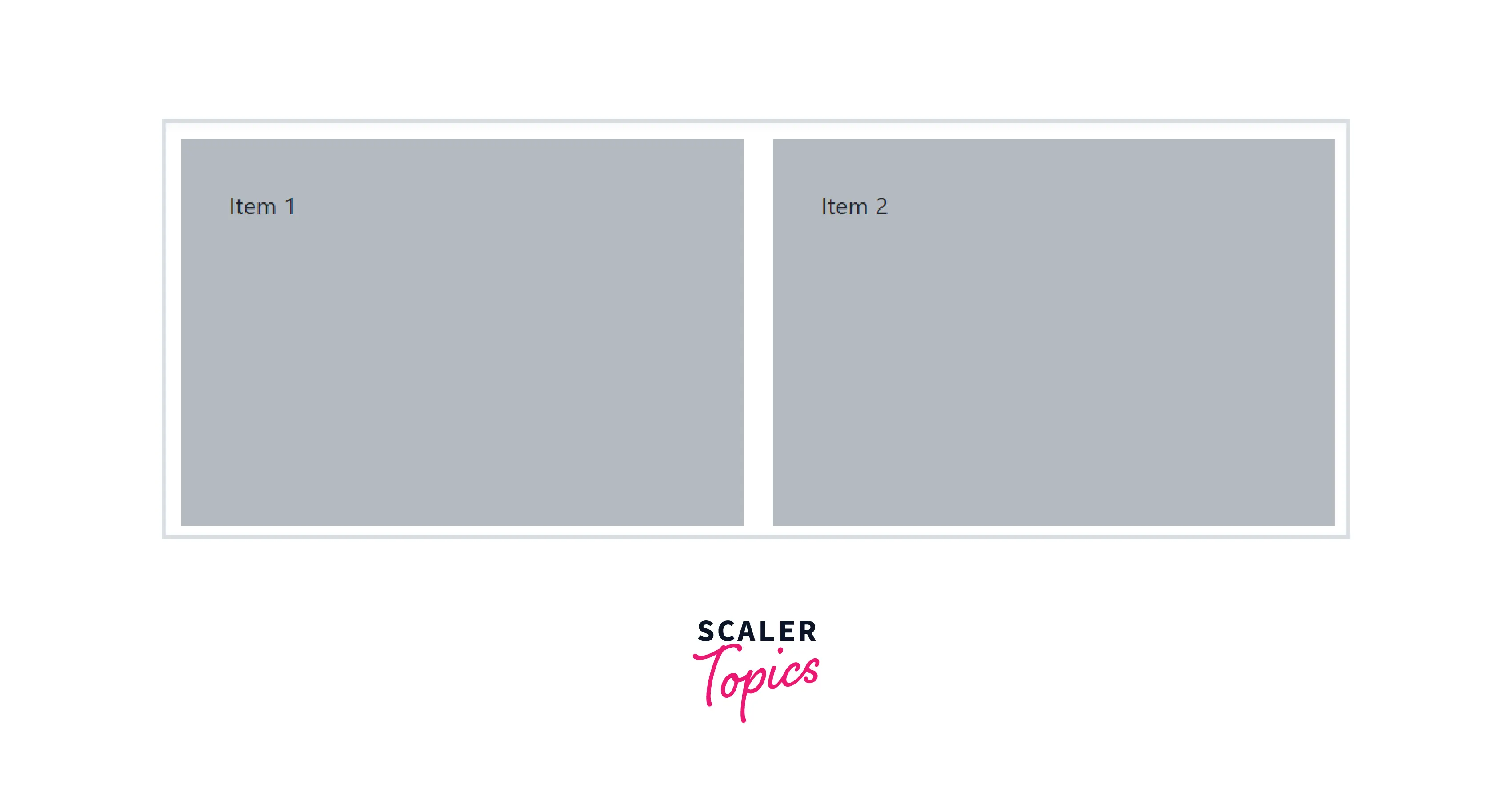
Use .align-self-end Class
The align-self property is a sub-property of the Flexible Box Layout module.
It makes it possible to override the align-items value for specific flex items.
The align-self property accepts the same 5 values as the align-items:
- flex-start: cross-start margin edge of the item is placed on the cross-start line
- flex-end: cross-end margin edge of the item is placed on the cross-end line
- Center: item is centred on the cross-axis
- Baseline: items are aligned such as their baseline is aligned
- Stretch (default): Stretch to fill the container (still respect min-width/max-width)
Example:
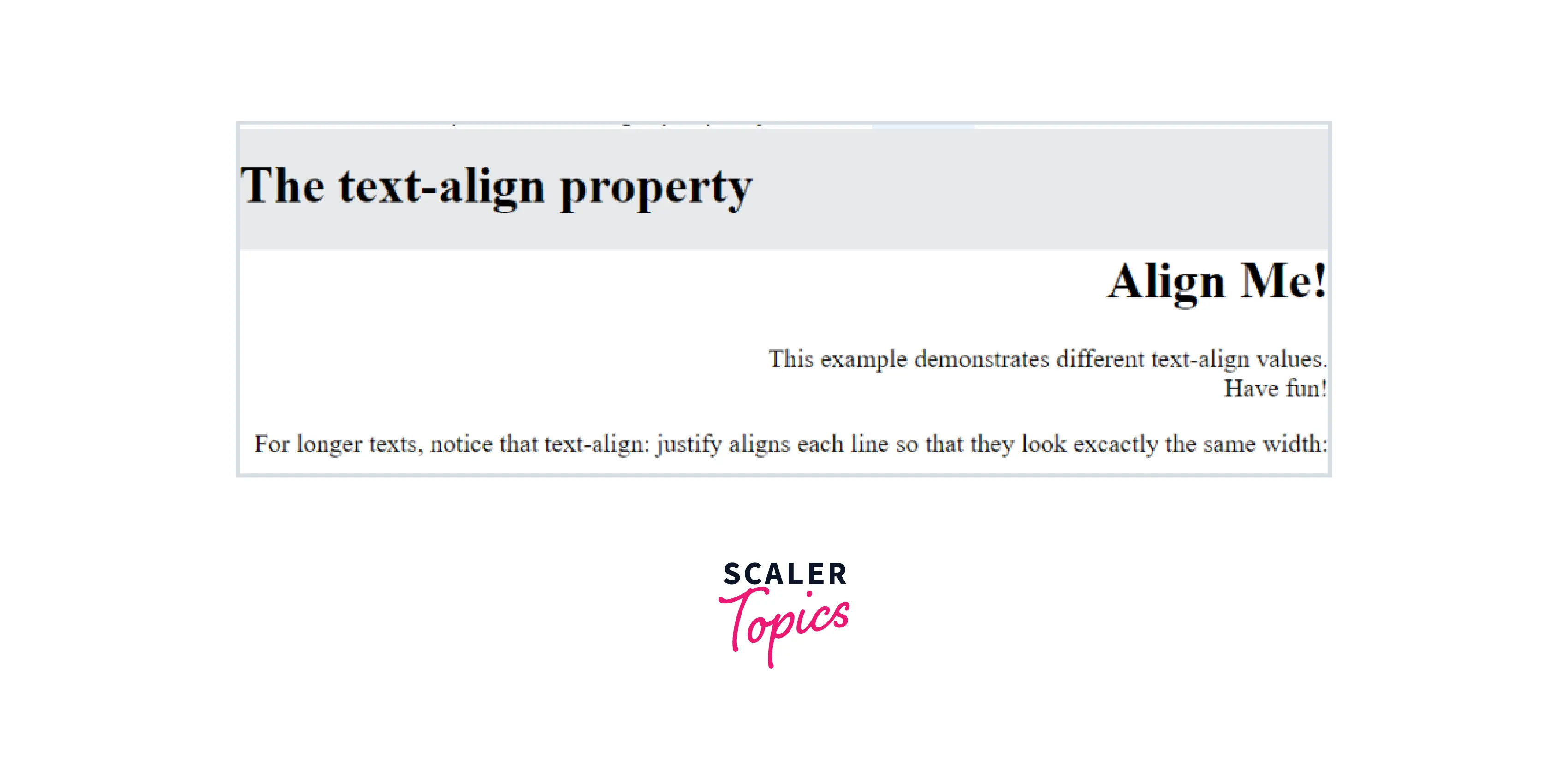
Use Text-Right Class
.text-right aligns text to the right on all viewport sizes. This is mostly used on inline elements.
Example:
Conclusion
- We learnt different ways to align different elements to right in this article.
- We saw the difference between aligning text and components.
- We learnt the implementation of all the major ways to align components.
- We learnt how to use flexbox and grid properties in aligning components.
- We learnt about the justify-content property.
 Google
 Amazon
 Microsoft
 Flipkart
 Adobe1200+ more