Bootstrap Button with Icon
Buttons are pivotal in web design, enabling actions on websites. They are integral to forms, navigation bars, and footers. Bootstrap, a renowned HTML and CSS framework, enhances this functionality with attractive, icon-embedded buttons. Compatible with major browsers like Chrome, Firefox, Internet Explorer, Safari, and Opera, Bootstrap's pre-designed templates simplify creating responsive, visually appealing websites, encouraging user interaction.
Buttons in Bootstrap
Bootstrap provides several predefined buttons each with its properties such as sizes, states, colour etc. You can create buttons on your website using bootstrap with basic prior knowledge of HTML and CSS. To add a button you just have to copy the code of the predefined template of bootstrap and paste that code into the body section of your HTML file.
These are some examples of code for some different default buttons.
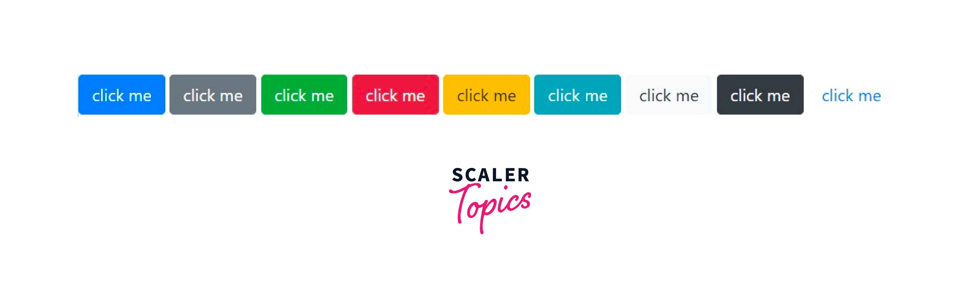
As you can see, In the code given above the only variable which is changing is the class of a button and with that single change, the styling of a button is changing. So, let's find out what these classes are and what their significance is.
Transform Your Career
Choose from our industry-leading programs designed for career success
Modern Software and AI Engineering Program
Master full-stack development with AI integration

 +1000 more
Modern Data Science and ML with specialisation in AI
Advanced data science techniques with AI specialization
+1000 moreAdvanced AIML with Specialisation in Agentic AI
Deep dive into AIML with focus on Agentic systems
+1000 moreDevOps, Cloud & AI Platform Engineering
Build and manage AI-powered cloud infrastructure
+1000 moreAI Engineering Advanced Certification by IIT-Roorkee
Premier AI engineering certification from IIT-Roorkee
Button Classes in Bootstrap
Classes in bootstrap provide the specific styling to the component in which the class is used. In the case of buttons .btn is the class used to create the standard/default button. This standard button inherits the look of a grey button with rounded corners. Here your component is <button> and the class is .btn. Therefore the code of the required button is
Button with Class .btn

However Bootstrap provides a lot more options to style using different modifier classes. These modifier classes help you to change the color of the button and font of the default button created using the .btn class. Let's take a closer look at these modifier classes.
.btn-primary : It provides a blue color to button and white to font. This primary class provides an extra visual weight to the button, which helps get more clicks from the users. It indicates a primary action to the user.
For example:- This VIEW ALL button from an E-commerce website is a button with a primary class.

.btn-secondary

.btn-success : It provides green color to the button and white to the font. This success class indicates a positive or on-track action to the user.
for example:- This PLACE ORDER button is fit for the button with a successful class.

.btn-warning : It provides yellow color to the button and black to the font. This warning class represents a warning or indicates that caution must be taken with a particular action. Example of this class can be while placing an order from an E-commerce website you forget to select the payment option and to click on place order, the website can give you the option to go back to that checkbox and fill it.

.btn-danger : It provides red color to the button and white to the font.This danger class signifies an unrealized mistake or wrong track action to the user. Both warning and danger class indicates that the user must take a look back and check for mistakes.

.btn-info : Info class is used to indicate an information alert. This class is used to create a button that is used to get information from the user.
For example:- A button to edit a profile.

.btn-light : It provides white color to the button and black to the font. It is mostly used for the website's dark version, so visibility and design enhance. Also in the case of a warning class the font color is black which will not be properly visible in dark mode, so there is a need for the light class.
.btn-dark: dark class is just the opposite of the light class. The color of the button is white and the text is black. This class is used in light mode mostly.

.btn-link: This modifier class gives the button a look of a link. The button appears as a link but works as a button. link class is used in articles to create a read more button.

These are the 9 modifier classes you can use to create different buttons according to your need. Apart from these 9 styles of a button, you can create an infinite number of different buttons by combining these classes with other CSS classes.
You can even combine 2 or more different modifier classes in a button element.
For Example:- If you use the link class and danger class simultaneously you will get a button with properties of both classes.

Turn Learning into Career Growth
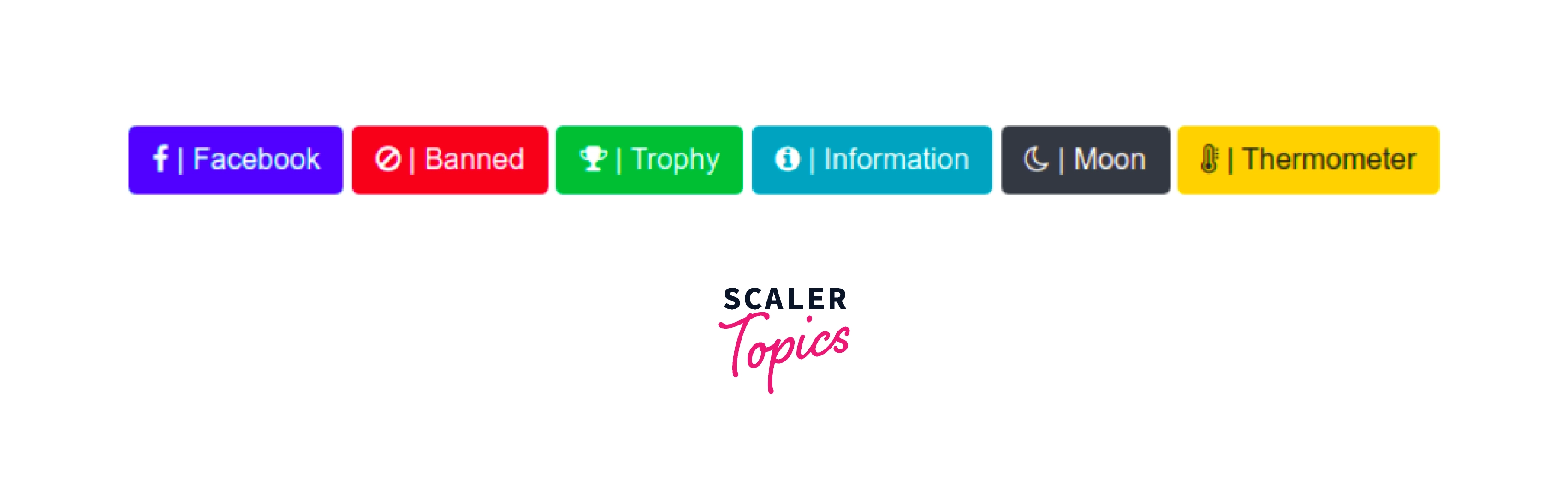
How to Create Bootstrap Buttons with Icons and Text
- First of all, load the Bootstrap 5 CSS and Font Awesome icons by adding the following CDN link in the head tag of your webpage.
- In the second step, create Bootstrap 5 buttons and place Font Awesome icons inside the label tag:
- Now, adjust the button icons with additional CSS styles.
Examples:
Example 1:
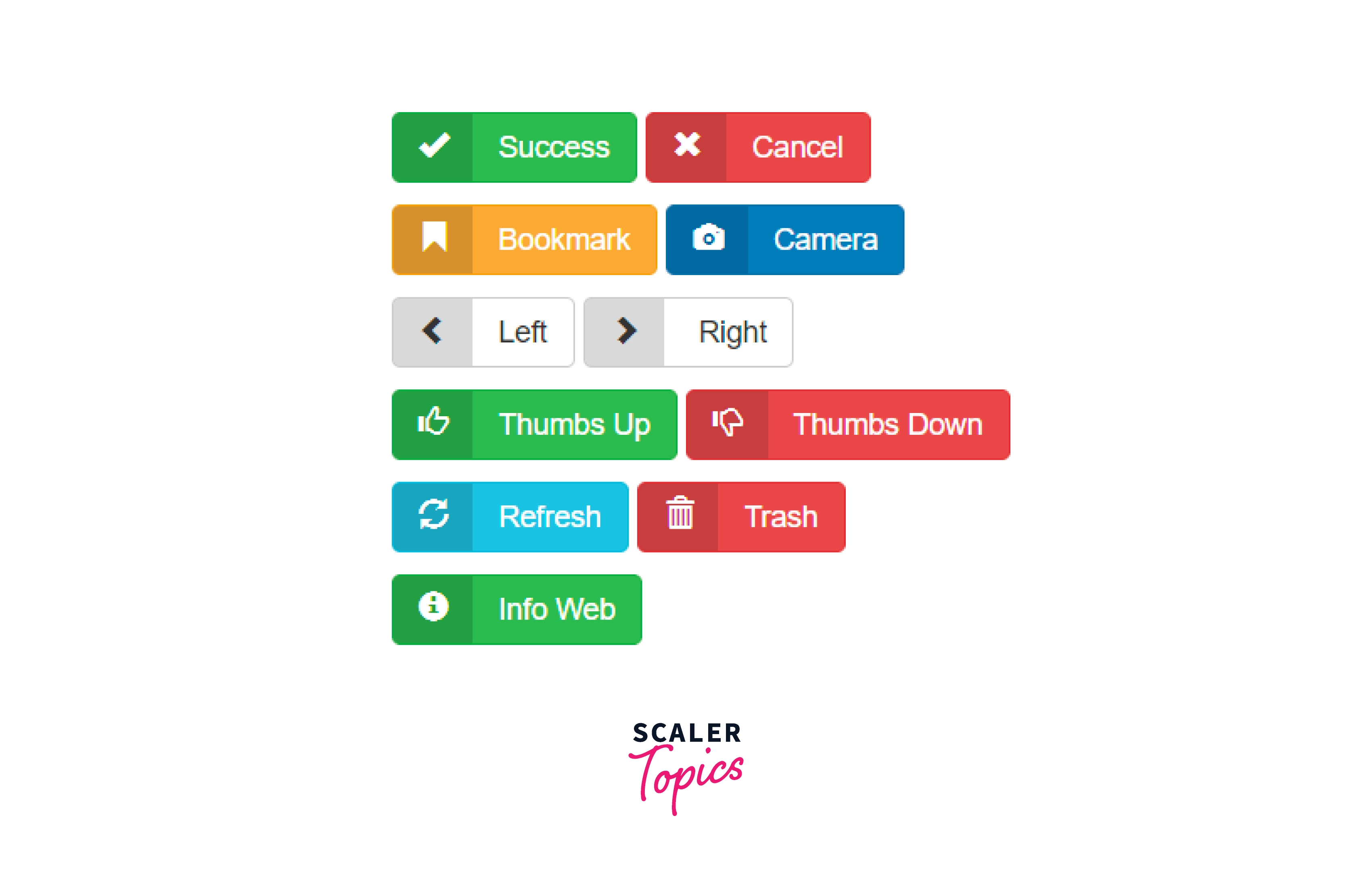
Example 2:
HTML:
CSS:
Conclusion:
- Bootstrap Buttons are one of the most frequently used components.
- A lot of different buttons can be created using bootstrap button classes.
- We can modify the font-color, background-color, border-color.
- We learned how we can use different bootstrap classes along with the .btn class to form different combinations of bootstrap buttons.
- We can change the size and state of the default button using bootstrap.
- We created Bootstrap buttons with icon and text with the complete explanation.
- For icons, we used font-awesome and created multiple buttons with bootstrap.
- Now we can create different combinations of bootstrap buttons with icons from what we have learned.
 Google
 Amazon
 Microsoft
 Flipkart
 Adobe1200+ more