Colors and Backgrounds
Bootstrap 5 Colors utility facilitates the customization of text colors, employing classes such as text-success for green (success) and text-primary for blue (primary). Additionally, contextual classes like text-danger and text-warning allow users to apply informative colors to text, links, and background colors using corresponding classes.
Transform Your Career
Choose from our industry-leading programs designed for career success
Modern Software and AI Engineering Program
Master full-stack development with AI integration

 +1000 more
Modern Data Science and ML with specialisation in AI
Advanced data science techniques with AI specialization
+1000 moreAdvanced AIML with Specialisation in Agentic AI
Deep dive into AIML with focus on Agentic systems
+1000 moreDevOps, Cloud & AI Platform Engineering
Build and manage AI-powered cloud infrastructure
+1000 moreAI Engineering Advanced Certification by IIT-Roorkee
Premier AI engineering certification from IIT-Roorkee
Text Colors
The text colors are used to add color to the text on a webpage. Let us discuss all the text colors that are provided by bootstrap.
- text-primary - It is used to give a blue color to the text and signifies an important piece of text.
- text-secondary - It is used to give gray color to the text and signifies that the text would be a secondary text.
- text-success - It is used to give a green color to the text and signifies success.
- text-warning - It is used to give a yellow color to the text and signifies a warning to the user.
- text-danger - It is used to give a red color to the text and signifies a danger.
- text-light - It is used to provide a light grey color to the text.
- text-dark - It is used to give a dark grey color to the text.
- text-muted - It is also used to give a light grey color to the text and signifies a muted text.
- text-white - It is used to provide a white color to the text.
- text-info - It is used to give a light blue color to the text and signifies an important piece of information.
- text-body - It is used to provide a black color by default to the body of the text.
Now, let us see the usage of these utility text color classes with the help of a code example.
Output:
[IMAGE 1 output-of-the-text-color-utility-classes START SAMPLE]

Therefore, as you can see in the output, the different bootstrap colors have been added to the different text on the webpage.
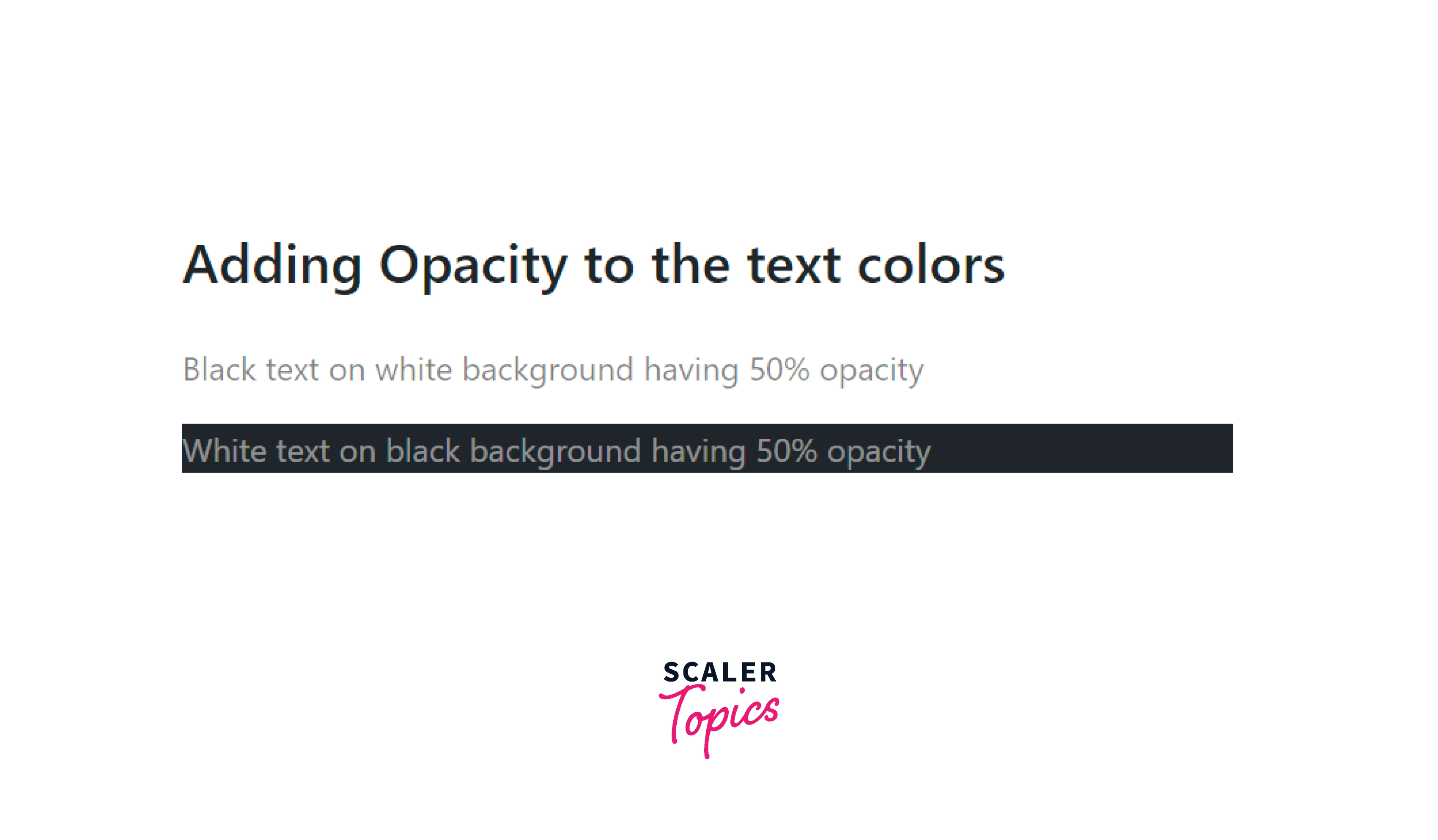
You can also add 50% opacity to the white and black text using the text-black-50 and text-white-50 utility classes.
Let us see the opacity with bootstrap color utilities with the help of a code example.
Output:
Background Color
You can also add background colors to the HTML elements using the different contextual colors that bootstrap provides. However, the bootstrap colors that can be added to the background are the same as the text colors but the difference lies in utility classes.
For example, blue text color can be added using the .text-primary utility class whereas a blue background color can be added using the .bg-primary utility class.
Therefore, we just need to apply a .bg-* prefix before the contextual colors that bootstrap provides.
Now let us see an example of adding different bootstrap colors to the background of the HTML elements.
Output:
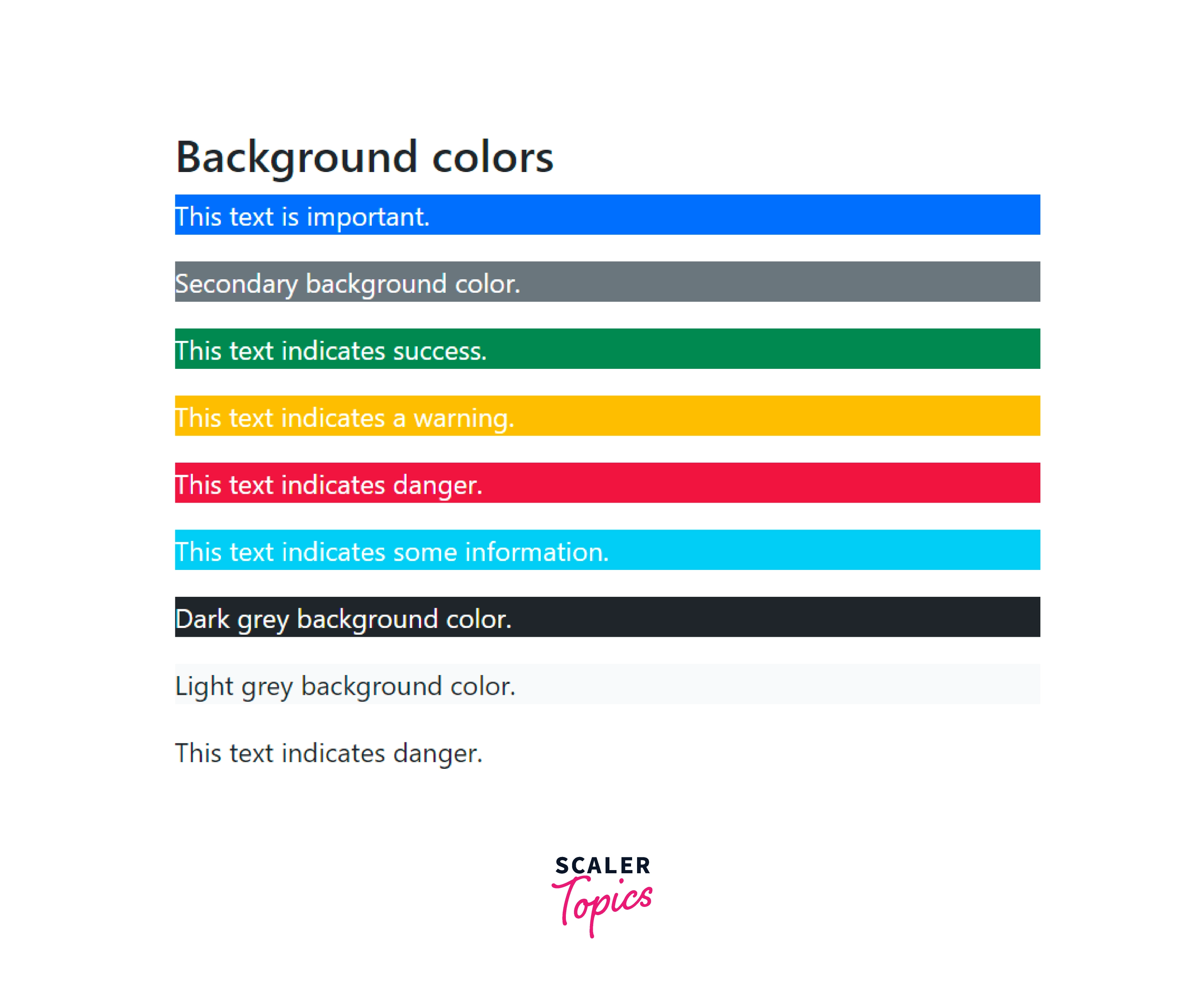
As you can see in the output, the different bootstrap colors have been added to the background of different HTML elements based on the utilities provided to them.
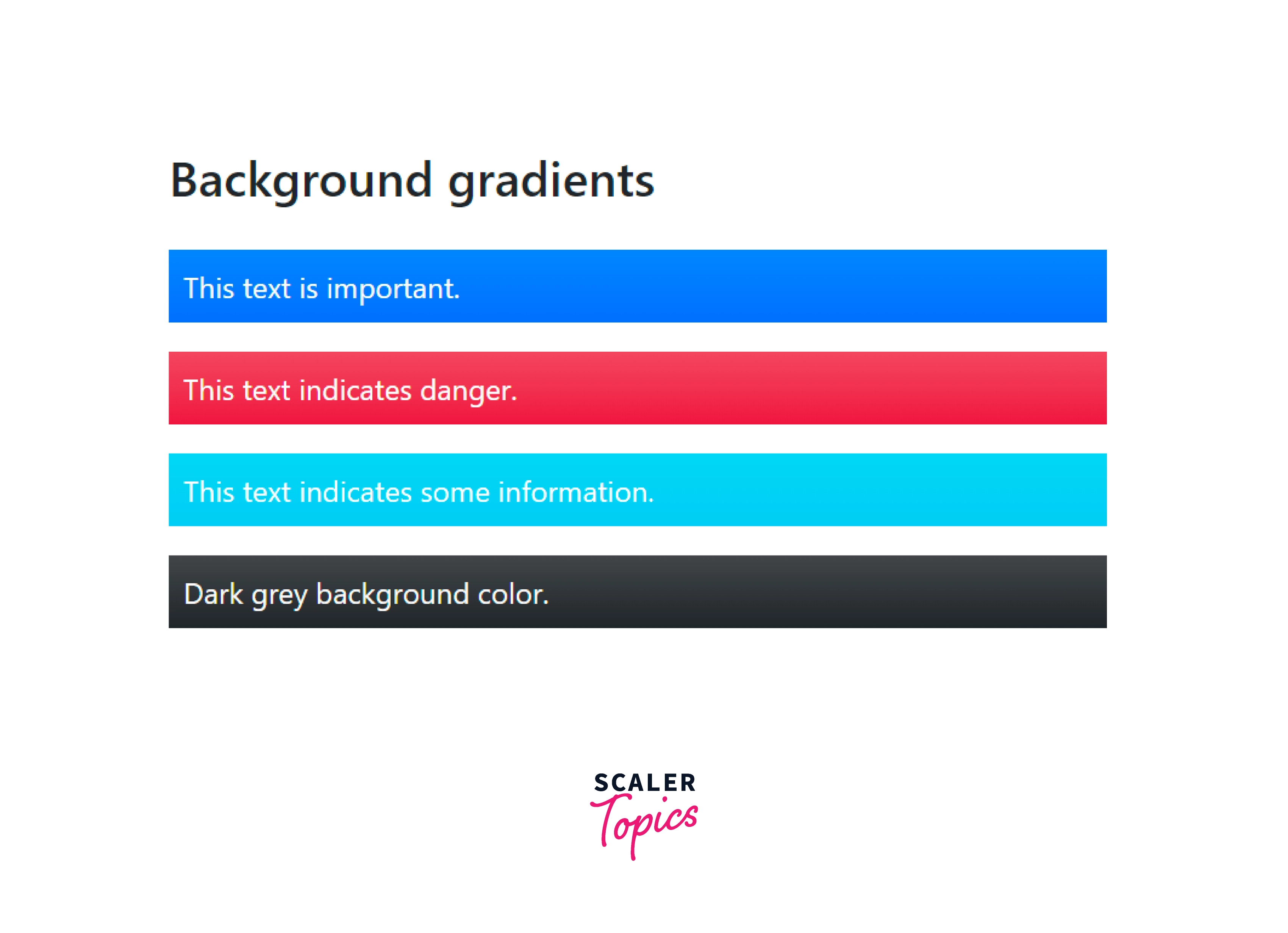
Background Gradient
A gradient is used to display a smooth transition between two more colors. Bootstrap provides a utility class, .bg-gradient that lets you display a linear gradient to the background. This gradient starts with a semi-transparent white color that fades out to the bottom.
Let us see the usage of the .bg-gradient utility class along with bootstrap color utilities with the help of a code example.
Output:
Conclusion
- Colors are a way to add meaning to the content on a webpage.
- Bootstrap provides a variety of contextual classes for different colors such as text-primary, text-success, text-warning, and much more.
- You can add bootstrap colors to a text as well as to the backgrounds of a text or page.
- The text utility classes start with a prefix .text-*.
- The background utility classes starts with the prefix .background-*.
- The variety of colors that bootstrap supports are primary, success, danger, warning, secondary, muted, light, dark, white, and info.
- Moreover, these color utilities are also used to add a hover effect to the links in HTML.
- You can also add a linear gradient in bootstrap using the bg-gradient utility class.
 Google
 Amazon
 Microsoft
 Flipkart
 Adobe1200+ more