Bootstrap Form Inputs
Bootstrap inputs in HTML forms, like text fields, checkboxes, and radio buttons, are essential for collecting user data such as email and password. They can be customized for different formats, sizes, and validations, ensuring efficient data collection in web applications.
User inputs
User Inputs are very necessary such as Name, Email, Password, etc. A form can be used to take these inputs from the user at once. To ease the process for the user, we use various inputs such as radio buttons, checkboxes, select lists, text areas, etc. Using these reduces users' overhead and data can be stored properly and uniformly.
Bootstrap input
Bootstrap Inputs such as text field, password, and text area allows the user to insert values, checkboxes, select lists, and radio buttons let the user select from the given options only, labels are used to guide the user about the input.
Further text fields can be modified using Bootstrap to support input in specific formats only such as email, phone no, URL, etc.
Supported Form Controls
Let us now look at various supported form controls :
Input
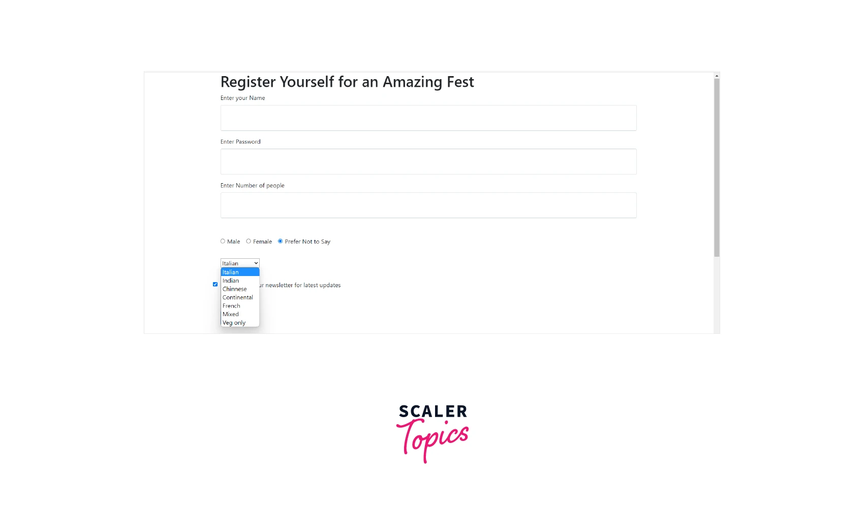
Bootstrap input supports various modes of inputs such as text, passwords, DateTime, numbers, URLs, email, etc. Let us take an example of a form for the fest. It will take the user's name, password in case the user wishes to re-login, and the number of people they wish to register for.
Example :
Output :
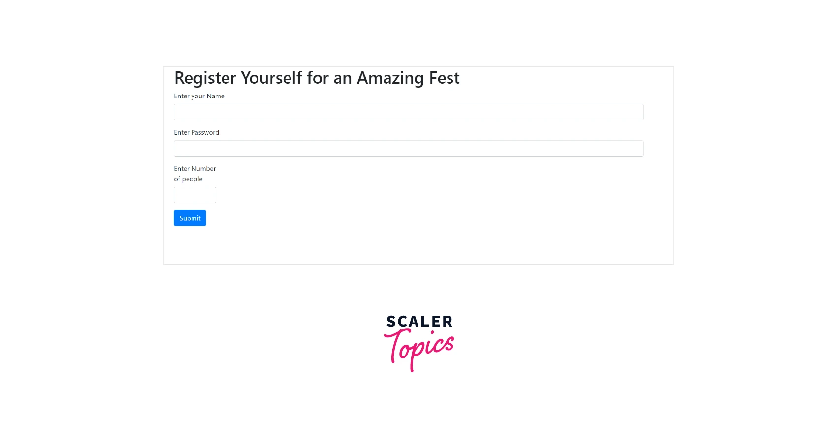
Explanation :
The above code uses an HTML Form tag to define a form. Inside the form, we are importing Bootstrap JavaScript files. Next inside the body section, we are initializing a container class. This container contains a heading of the form. The next element is the <FORM> in which we are using Bootstrap classes form-group as a container and form-control as an element.
It contains 3 inputs name, password, and number. The name input accepts text, the password field hides the user-entered data and the number only accepts a numeric value which the user can increase or decrease using little arrows on it.
Textarea
Now, if we wish to add an element where users can ask their queries or share something about previous fests for the new users we can add the text area in the form made in the previous section from bootstrap inputs. We will be using the HTML tag text area to create a text area inside the form. The rows attribute determines the size of the text area.
Example :
Output :
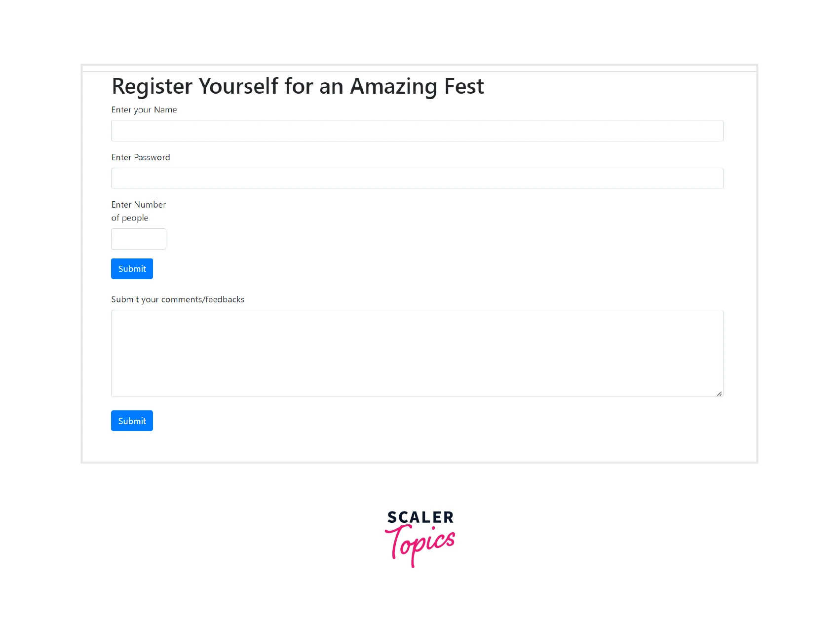
Explanation :
The above code uses the <textarea> HTML tag along with the bootstrap class form-control to display the text area and the rows attribute to define the size of this text area. We have also added a button, once the user is done writing feedback they can click on the button to submit it.
Scaler Placement Report and Statistics
Scaler learners achieved 2.5x salary growth with average post-Scaler CTC reaching ₹23L.
Checkbox
Next, let us say we want the user to subscribe to our newsletter. We use a checkbox right above the submit button, if the user check-ins for the newsletter, we add their details to the newsletter's list.
Checkboxes are used for selecting particular independent choices where either user can select or not select. We will use the class form-check bootstrap class to insert the checkbox and maintain the margin. To label this checkbox, we will be using the form-check-label class. Lastly, to change the state of the checkbox we will use the form-check-input class. Using this class we can change the default of the checkbox to be checked.
Example :
Output :
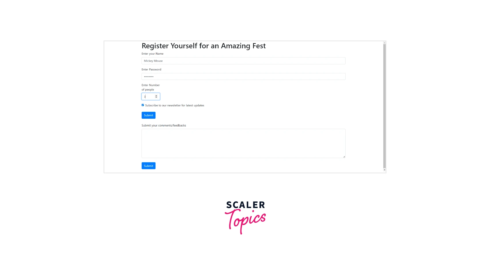
Explanation :
In the above example, the form-check class is used to insert the checkbox in the form. The text near the checkbox is displayed using the <label> that has class form-check-label. To disable the checkbox under certain situations or to initially keep the checkbox checked as in our example, we are using the form-check-input bootstrap class with the attribute checked.
Note :
We can have multiple checkboxes and let the user select more than one.
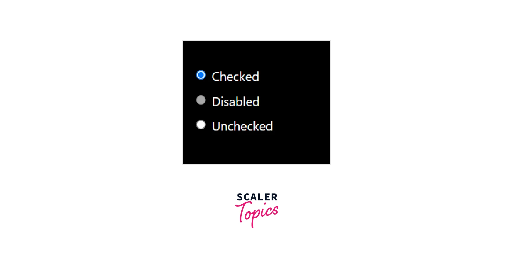
Radio
Unlike checkboxes, radio buttons let the user choose one of the given options from more than one option. It is very much similar to the checkboxes. We are going to use the same classes we used in the checkbox i.e. form-check-input and form-check except we are going to set the type to be radio instead of checkbox.
Let us add a radio-button group that contains 3 radio buttons where the user can select gender. In radio buttons as well we can keep a default radio button selected. Also, we are required to ensure that only one of the checkboxes must be selected.
Example :
Output :
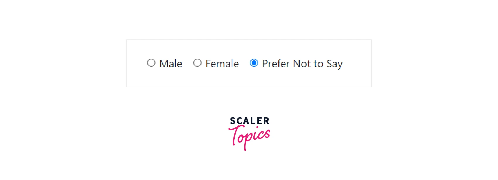
Explanation :
In the example above, we are using radio buttons to let the user select gender. Prefer Not to say is selected by default. Also, as we wish to display all the radio buttons in a single line we are using the for-check-inline class. Only one of the radio buttons can be selected at a time in bootstrap input. The only change in the radio button is its type attribute has the value radio instead of checkbox if we compare it with the checkbox.
Transform Your Career
Choose from our industry-leading programs designed for career success
Modern Software and AI Engineering Program
Master full-stack development with AI integration

 +1000 more
Modern Data Science and ML with specialisation in AI
Advanced data science techniques with AI specialization
+1000 moreAdvanced AIML with Specialisation in Agentic AI
Deep dive into AIML with focus on Agentic systems
+1000 moreDevOps, Cloud & AI Platform Engineering
Build and manage AI-powered cloud infrastructure
+1000 moreAI Engineering Advanced Certification by IIT-Roorkee
Premier AI engineering certification from IIT-Roorkee
Select
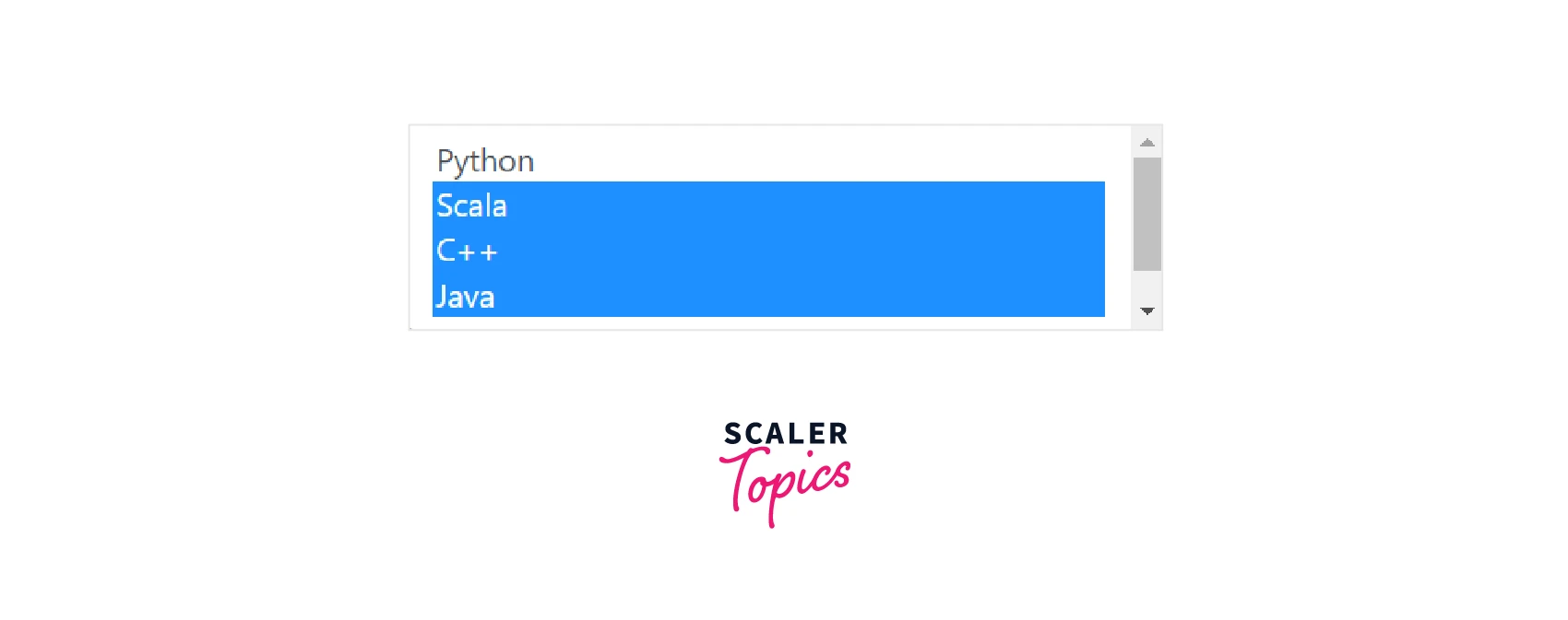
The select list from bootstrap input in form is a list of items from which users can select their choices. For two or three items we can use radio buttons or checkboxes but for the number of items being long, we can always use select lists. There are two types, the first where the user can only select a single item and the second user can select multiple items. To do so they can use the shift or ctrl keys.
In the above example let us add a list of food types to get the user preference for the fest.
Example :
Output :
Explanation :
By default, Italian will be chosen, but the user can change their preferences by selecting another option from the drop-down select list. Here we are using the form-select class of bootstrap.
Bootstrap Input Basic Example
The bootstrap input group can be further customized as per the requirement of the form. Input fields consist specifically of the input fields which are used only to obtain user data. We can utilize bootstrap classes to change their type, size, state, etc.
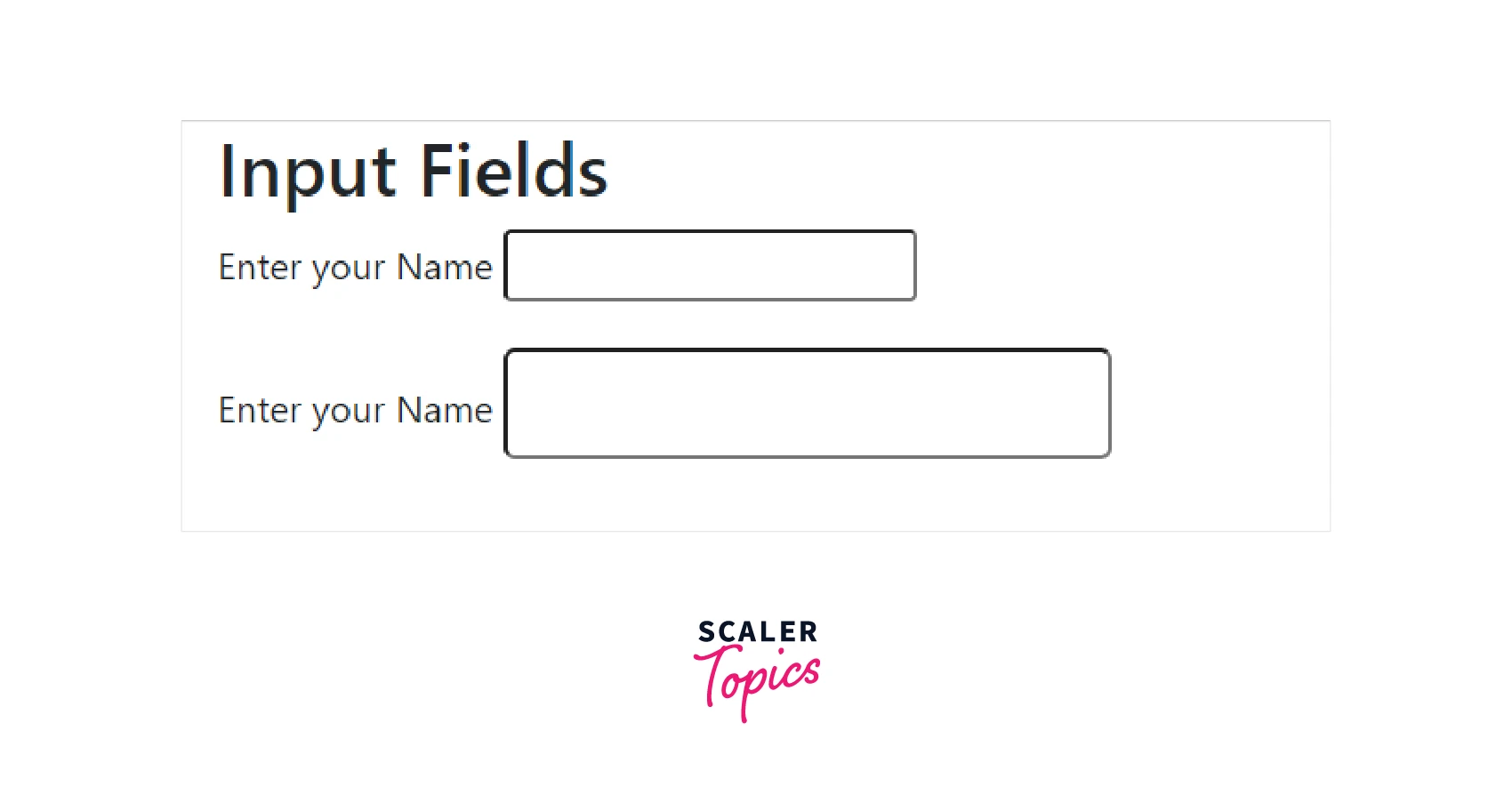
Sizing
The classes form-control-lg, form-control-sm, etc lets us modify the size of the form control elements in the form. Look at the example below of various text boxes with different sizes.
Example :
Output :
Explanation :
We are using two inputs one is small and one is large. By default it takes up the entire row of the webpage, by using form-control-sm and form-control-lg, we can display them along with labels and modify the size of these.
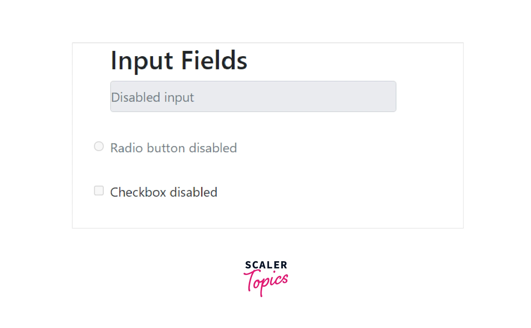
Disabled
We can also disable text fields, inputs, radio buttons, checkboxes, etc to not let the user perform any action on these in bootstrap input. This can be helpful when we don't wish to take input from the user under certain situations.
Example :
Output :
Explanation :
We have used the disabled attribute in the radio button, input, and checkbox. These are disabled and the user is not allowed is used edit any of them.
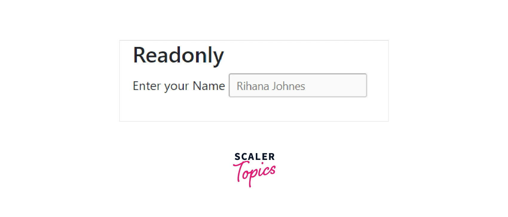
Readonly
The readonly attribute also prevents the user to modify the value of the text input. This is different from disabled as disabled doesn't have a value at all but readonly has a static value that the user in bootstrap input cannot change.
Example :
Output :
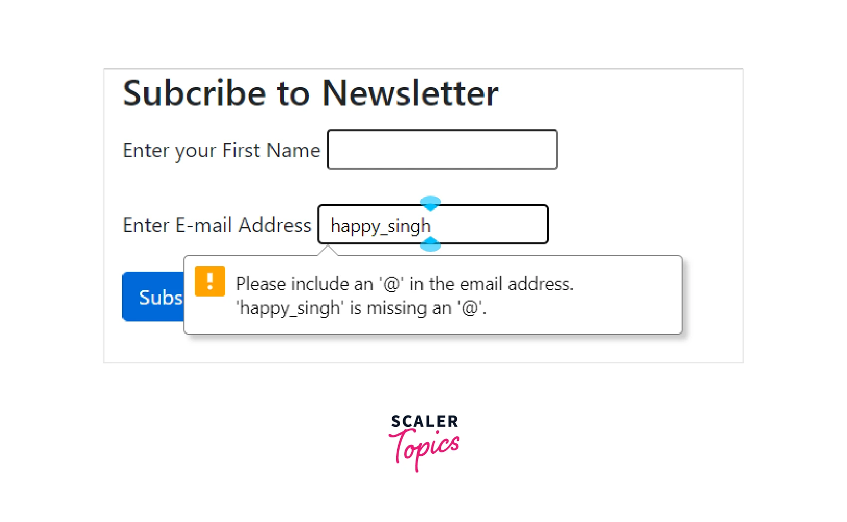
We can set the input to accept email addresses in the form. We will set the input type=email, this will define it to be the email address field. The input entered by the user is validated automatically to ensure the format of the email address.
Example :
Output :
Explanation :
In the example above, the tag shows an error and asks the user to insert the @ symbol.
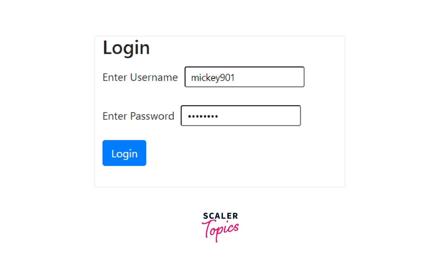
Password
The input type can be set to type = "password"which tells the browser that it is a password and it hides the user input.
Example :
Output :
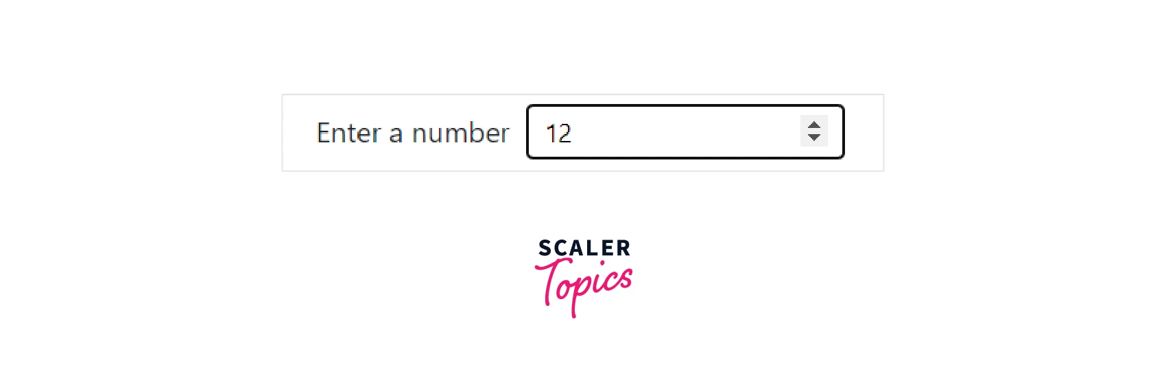
Number
To get numerical value from the user, we can use the type of the input to be number. On hovering over the input field, the user can see the up and down buttons in bootstrap input. Users can increase or decrease the value.
Example :
Output :
Turn Learning into Career Growth
Phone Number
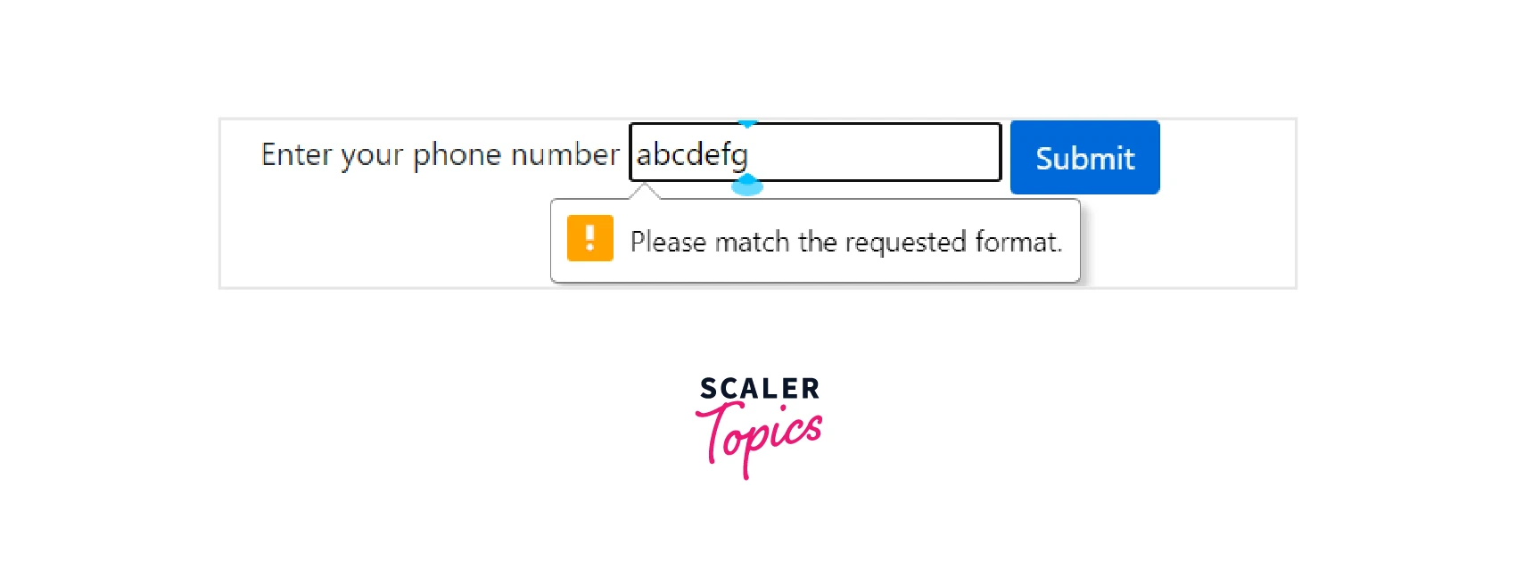
To accept only phone numbers from the user in the input area, we can set the type of the input to be type="tel".
Example :
Output :
Explanation :
As we can see that it generates an error saying match the requested pattern. We set the type of input to be tel. We also use the pattern attribute to define the pattern of the phone number. Placeholder is also used for the user, it shows the users how they are supposed to enter the phone number.
URL
To get URL as input from the user we can set the type of the input type = "URL" which ensures that the entered value is URL.
Example :
Output :
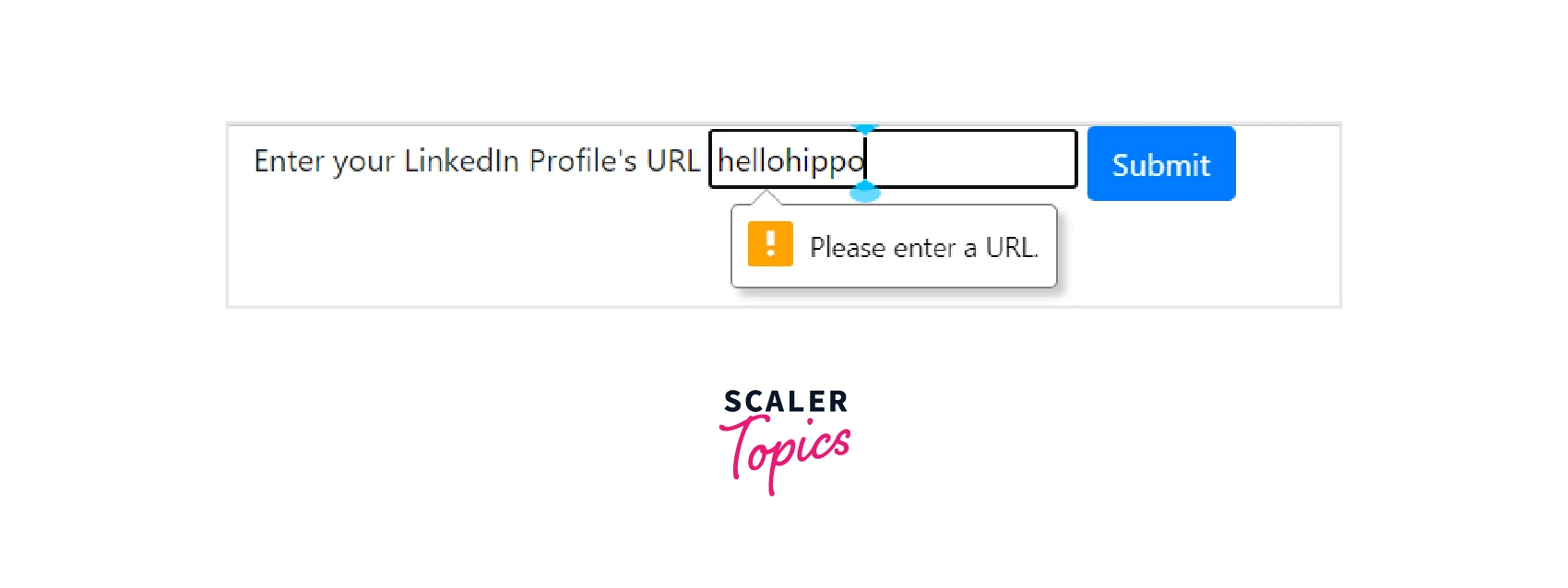
Explanation :
As we can see displays an error saying it is not a URL.
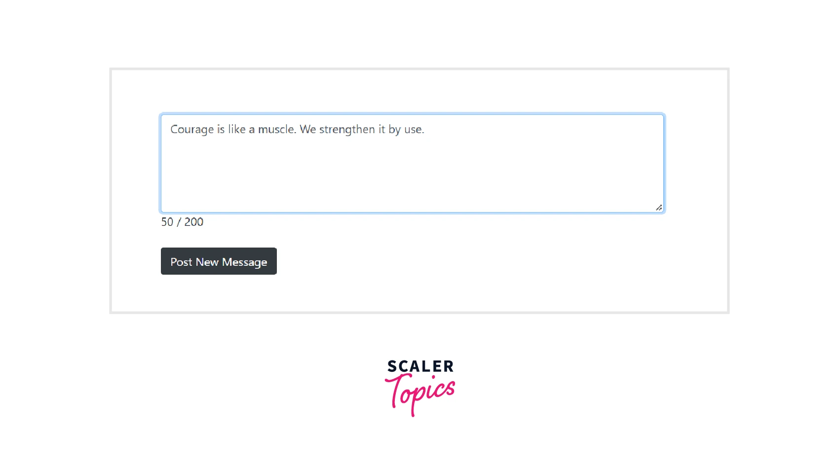
Character Counter
To display the number of characters written by the user and not let them type more than the maximum limit of characters we can use Bootstrap JavaScript.
Example :
Output :
Explanation :
In the example above, we are using Bootstrap input for the text area as well as the button. By default, the number of rows of the text area is 6. As the user starts entering data into the text area the counter at the bottom left corner increases. Once the number of characters reaches the maximum value i.e. 200 in this case, it no more takes any new characters.
In JavaScript, as the user inputs a character in the text area it counts the length of the text in the text area. It then updates the counter at the right corner below the text area. The max_length attribute is set to 200 which doesn't let the user enter more than 200 characters.
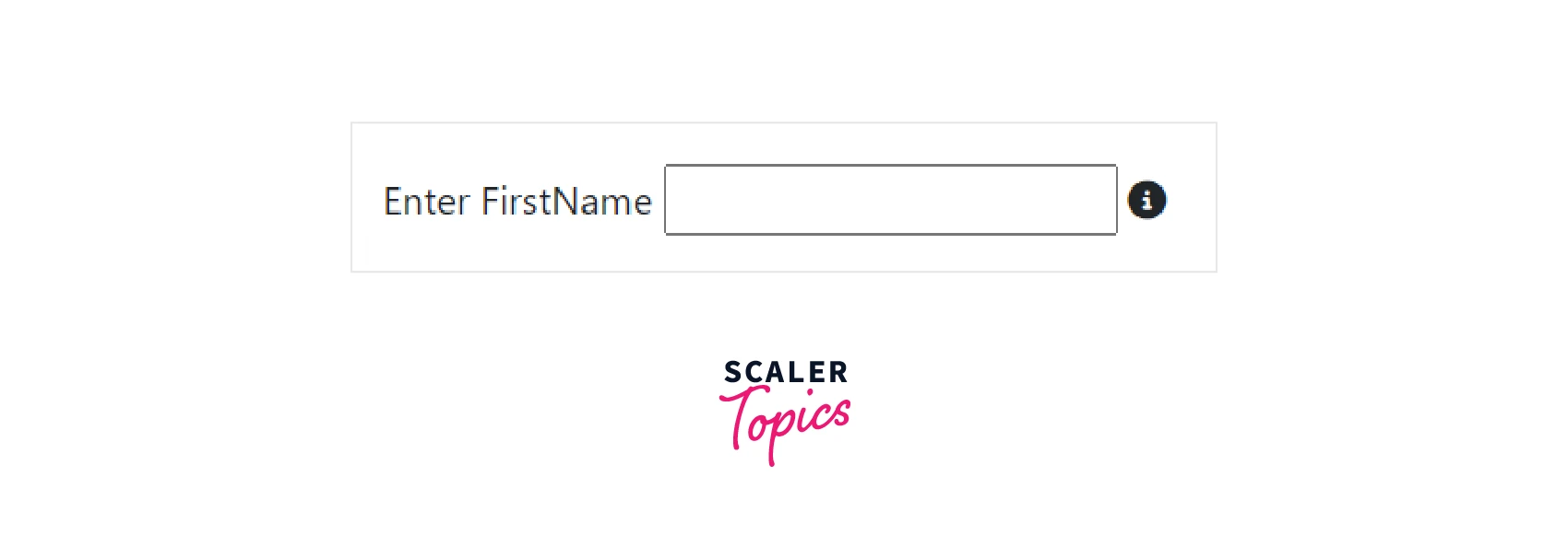
Help Text
Help text is the text below the input that guides the user to enter the correct input.
Example :
Output :

Explanation :
Here, it tells the user how to enter City and Pin into the same input. We are using the form-text and text-muted classes of Bootstrap to show the text as small and a little dull.
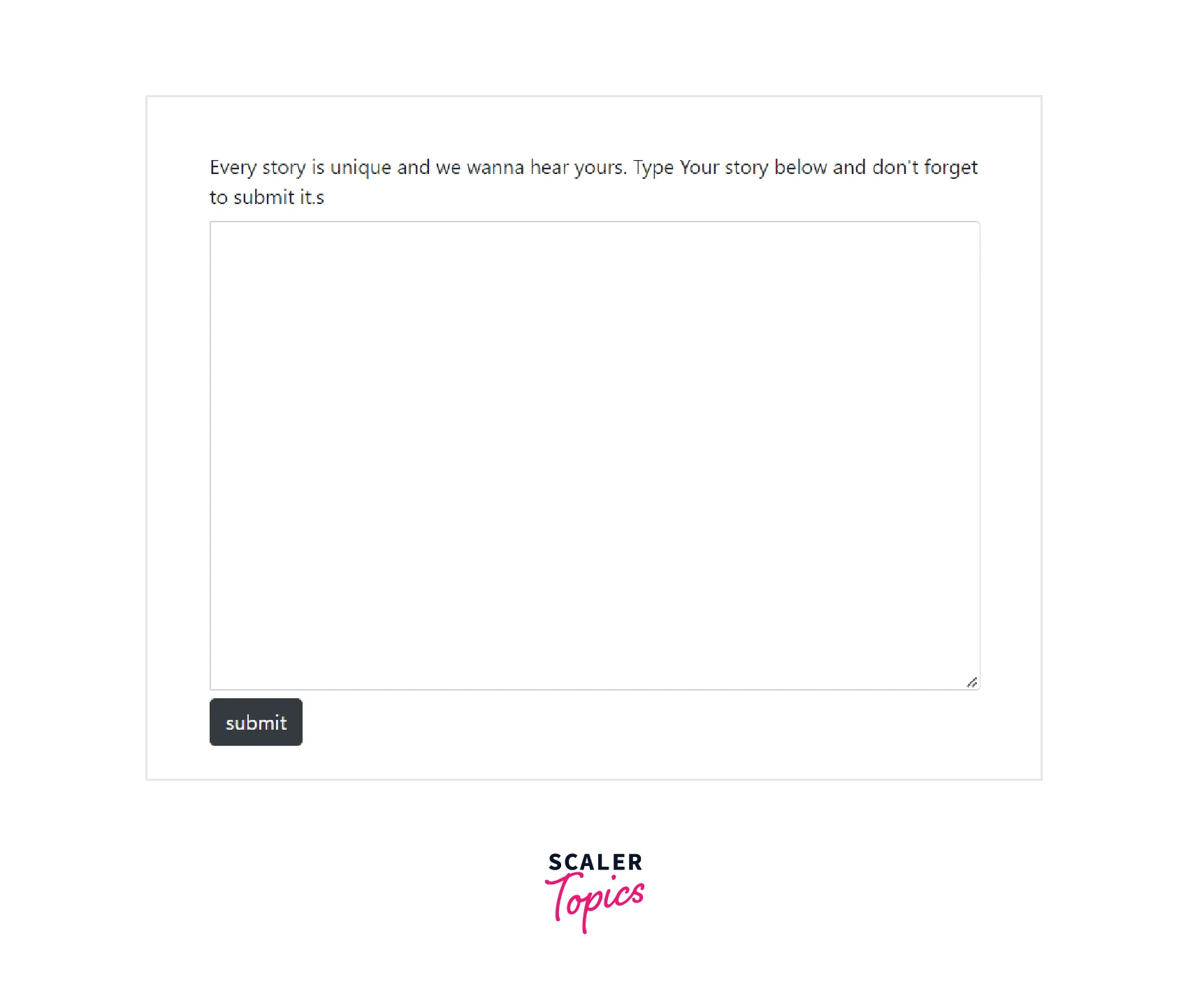
Bootstrap Textarea
Text area can be created using HTML <textarea> tag and Bootstrap class form-control.
In the example below, we are asking the user to share their story in the text area and submit it using the button with bootstrap class btn and btn-dark.
Example :
Output :
Scaler Placement Report and Statistics
Scaler learners achieved 2.5x salary growth with average post-Scaler CTC reaching ₹23L.
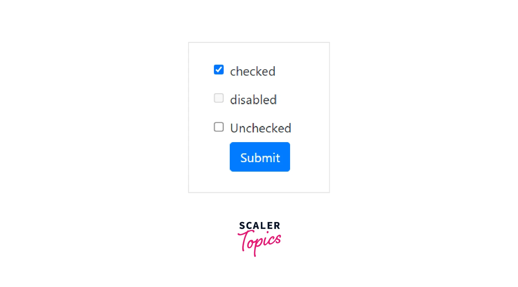
Bootstrap Checkboxes
Checkboxes let the user select more than multiple items from the list. We can use the bootstrap class form-check for the parent container, form-check-label for the label, and form-check-input for checkboxes. The type of input must be set to checkbox.
We can also by default disable or check the checkbox as shown in the example below :
Example :
Output :
Icons
In bootstrap input, we can add icons in the inputs as well. We will use the trailing class in the icon i.e. <i> tag to display the icon on the right side of the input.
Example :
Output :
Explanation :
The icon tag <i> is used to insert an icon in the form.
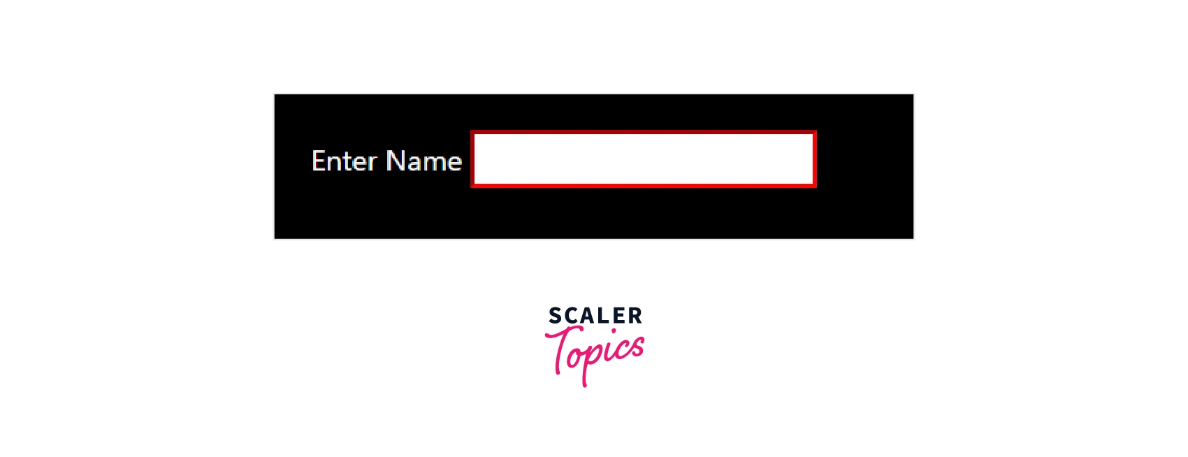
Dark Background
Many times, when a background is dark we can use the form-white to make it display in the dark.
Example :
Output :
Bootstrap Radio Buttons
Radio buttons are the same as checkboxes except that from the group of radio buttons only one option can be selected. We are supposed to set type=radio in the input attribute. We can also have inline form objects form-check-inline.
Example :
Output :
Bootstrap Select List
Select lists in bootstrap input are of two types, single select, and multiple select. Multiple select allows the user to select multiple items from the list whereas, single select allows only one item to be selected. In a single select list, the list expands when the user selects it.
Let us look at an example of the multiple select lists :
Example :
Output :
Explanation :
Here we are using form-control and form-check classes.
Conclusion
- Bootstrap Input is useful to obtain user data using a form. These inputs can be text fields, text areas, checkboxes, radio buttons, select lists, etc.
- Labels are used to label the inputs i.e. guide users to insert the right details in the right input element.
- Radio buttons and Checkboxes are very much similar except that the user can select multiple checkboxes but out of radio buttons they can only select an only option from one from the button group.
- Radio Buttons and Checkboxes are created using form-check classes i.e. form-check-label and form-check-input with the type of input being radio and checkbox respectively.
- Text areas are created using <textarea> tag. Its size can be modified using the rows attribute. It uses the bootstrap class form-control to align with other items of the form.
- Select lists are of two types, single select lists, and multiple select lists. Select lists are used to represent multiple options where it is not possible to display all the options separately in the form.
- Using bootstrap and HTML attributes it is possible to set text fields and text areas readonly. We can also disable text fields, text areas, radio buttons, checkboxes, etc.
- Bootstrap lets us insert icons in forms, and change the size of the elements using the sm and lg classes, and in dark themes it lets us transform the background of the text field to white with the help of the form-white class.
- Bootstrap input supports various inputs such as email, URL, phone number, number, password, character count, helper text, etc. Using this we can restrict user input to be of a specific type.
 Google
 Amazon
 Microsoft
 Flipkart
 Adobe1200+ more