Bootstrap Pagination
Pagination is a crucial component facilitating the organized display of items across multiple web pages. It simplifies navigation through extensive data sets by breaking them into manageable sections. To enhance accessibility, incorporate the <nav> element and assign a descriptive aria-label, particularly when dealing with multiple navigation sections. For instance, in an online shoe store, an appropriate label like "Search shoes" aids screen readers. Bootstrap offers a range of pagination classes to efficiently manage and present web pages, ensuring a seamless and user-friendly browsing experience for websites with extensive content.
Steps to Make Basic Pagination
- On a list group, the .pagination class is used to specify pagination.
- Each pagination item in the group is specified using the .page-item class.
- The .page-link class is used to define the pagination item's link.
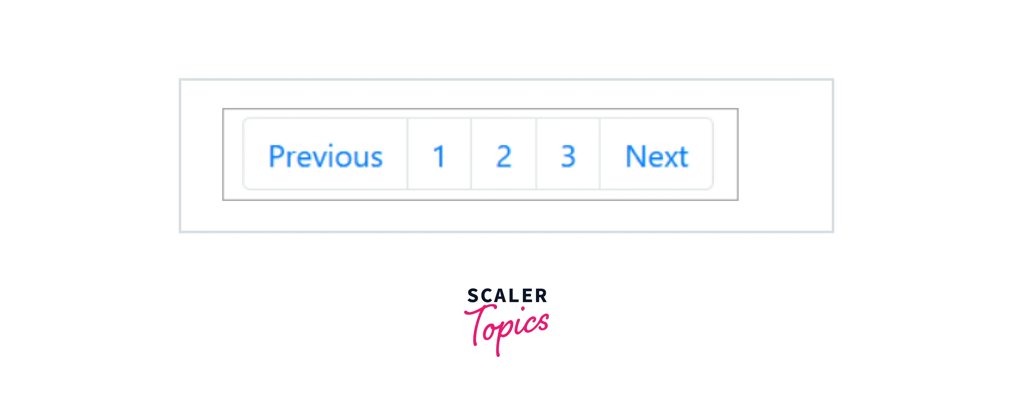
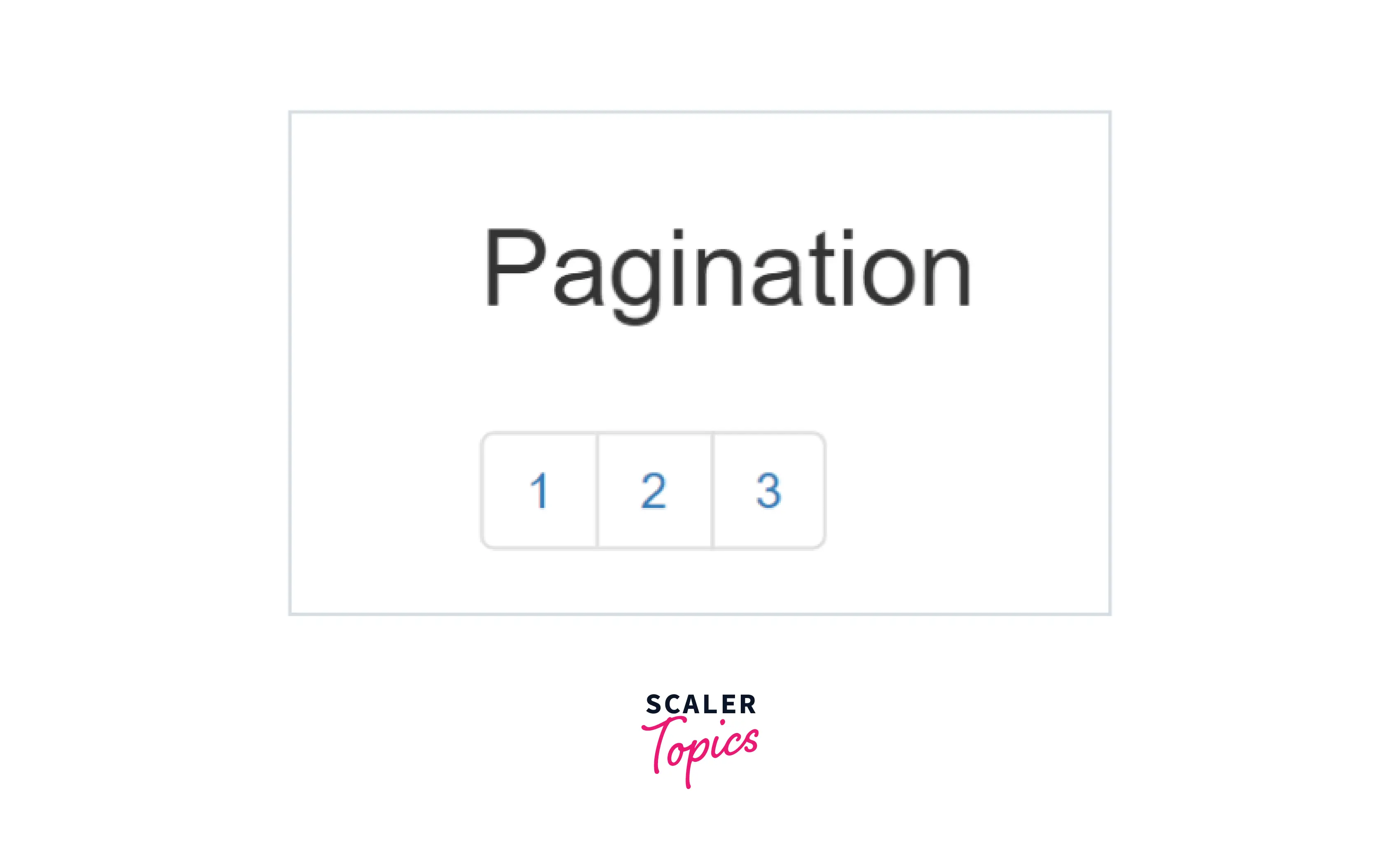
Default Pagination
Add a <ul> element with the .pagination class followed by <li> elements with the .page-item class. Then, add <a> elements with the .page-link class inside the <li> elements to create basic pagination.
Examples:
Working With Icons
You can add icons instead of using words to indicate the previous and next pages.
Examples:
The below programming code shows an example of paging with icons (the previous icon and the next icon). You can try this example by running the below programming code.
HTML Code:
CSS Code:
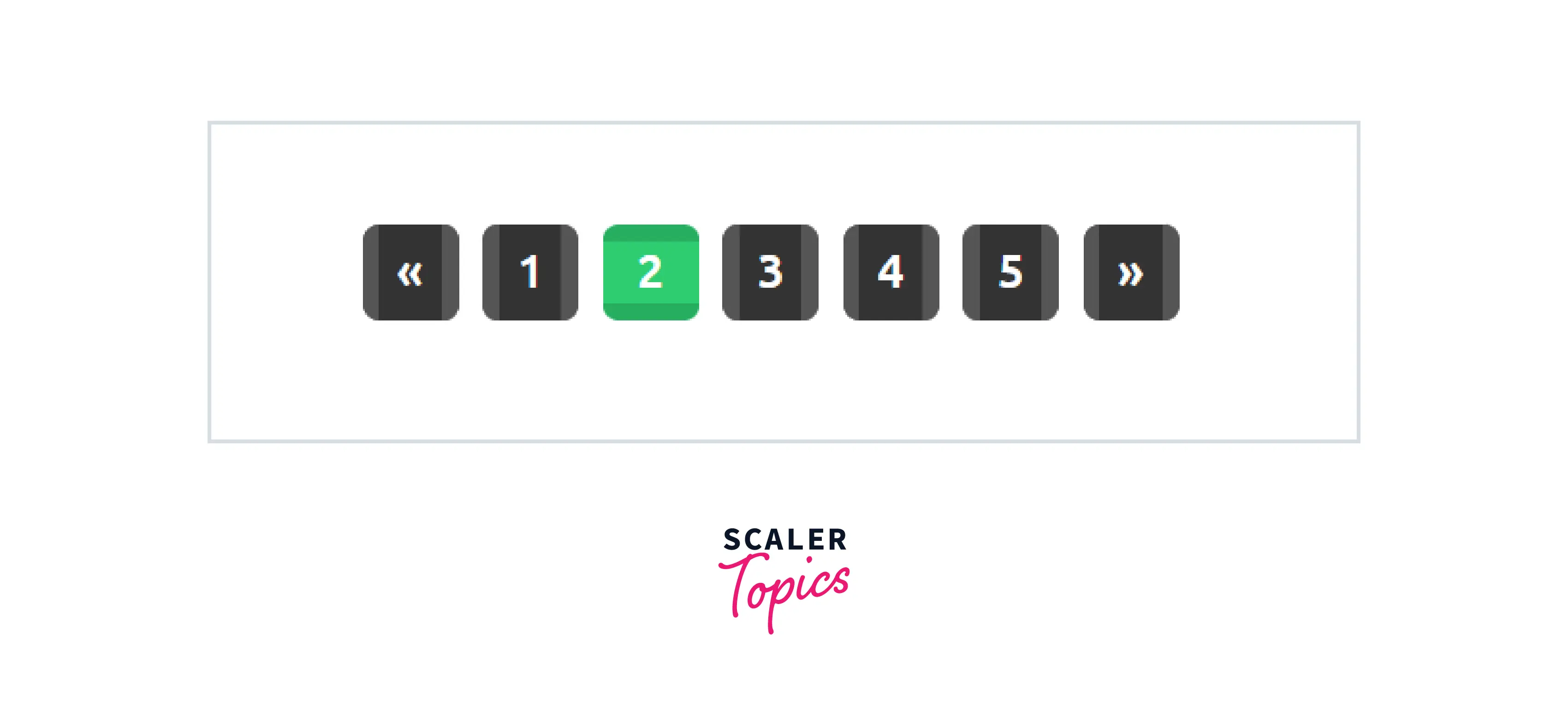
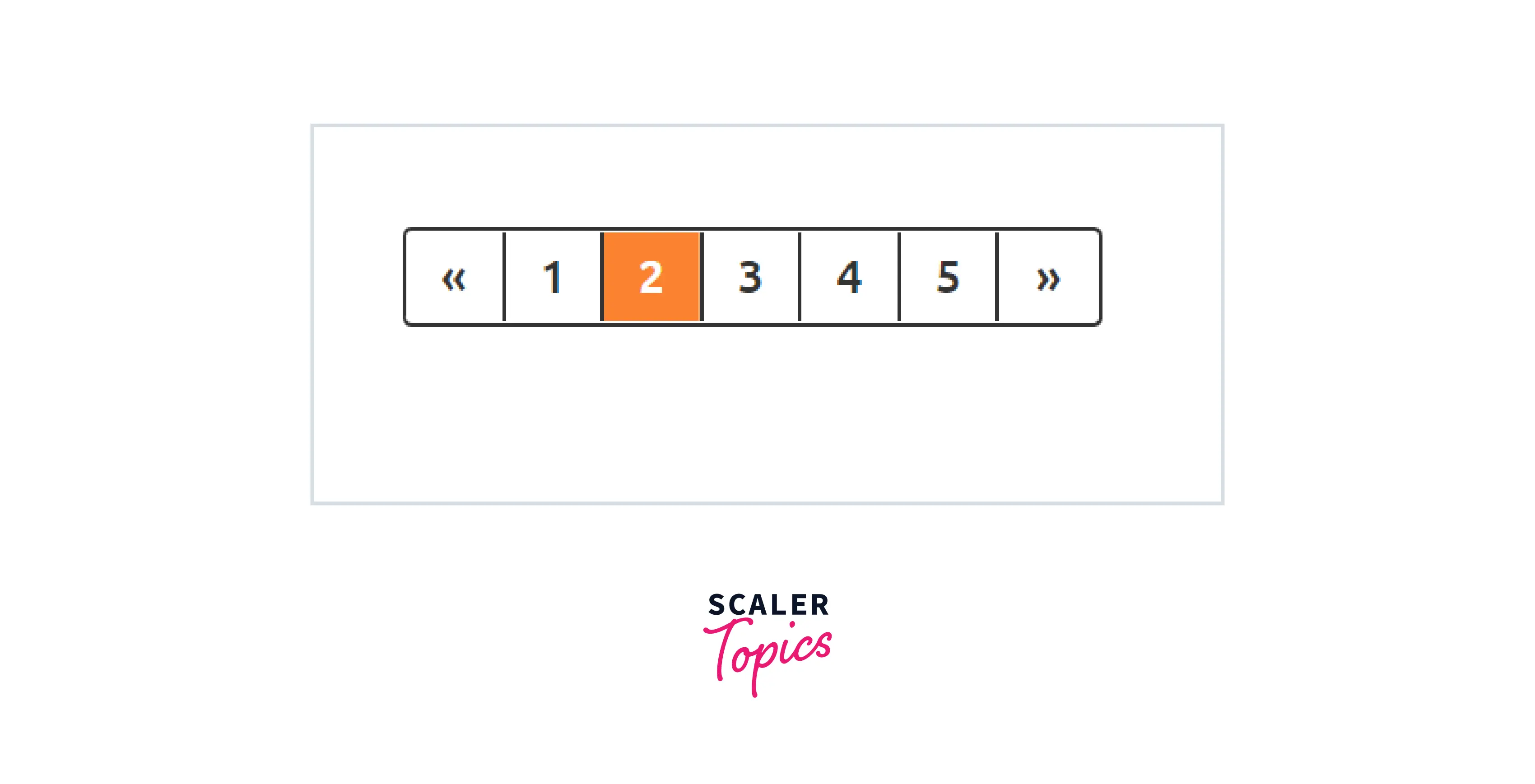
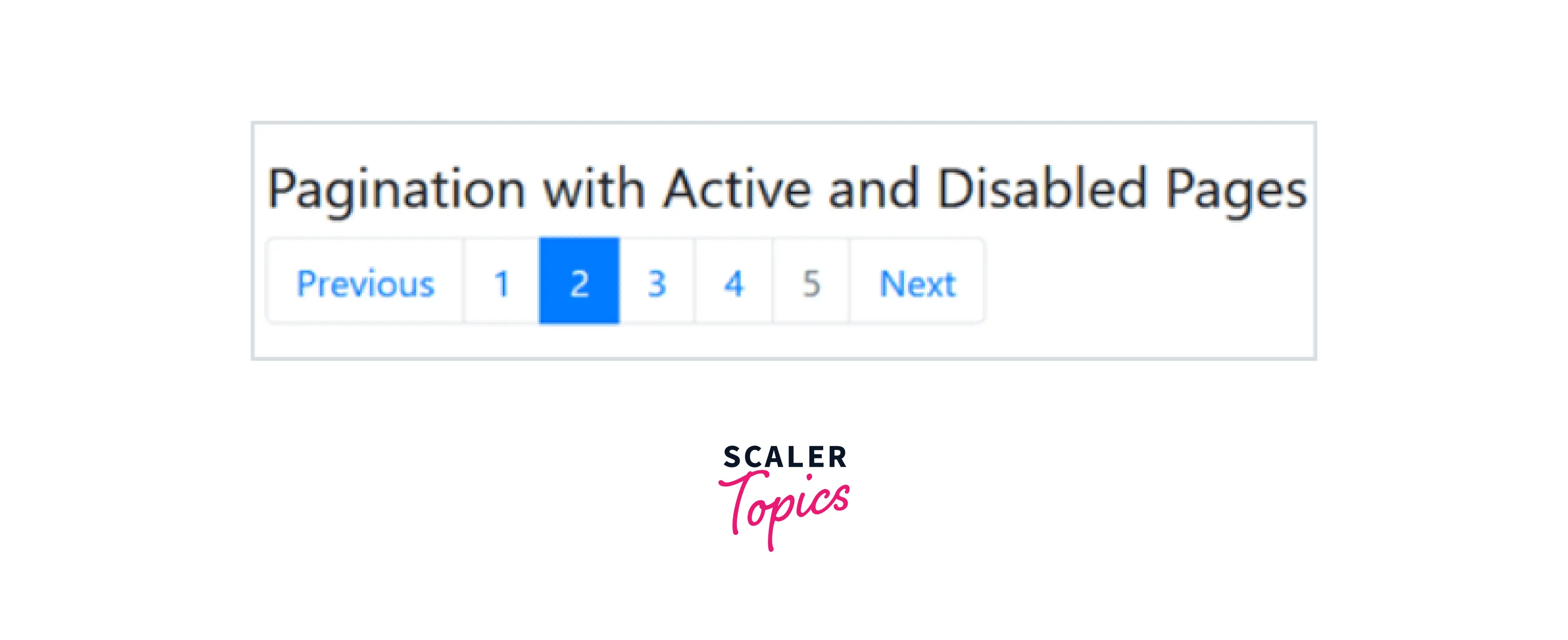
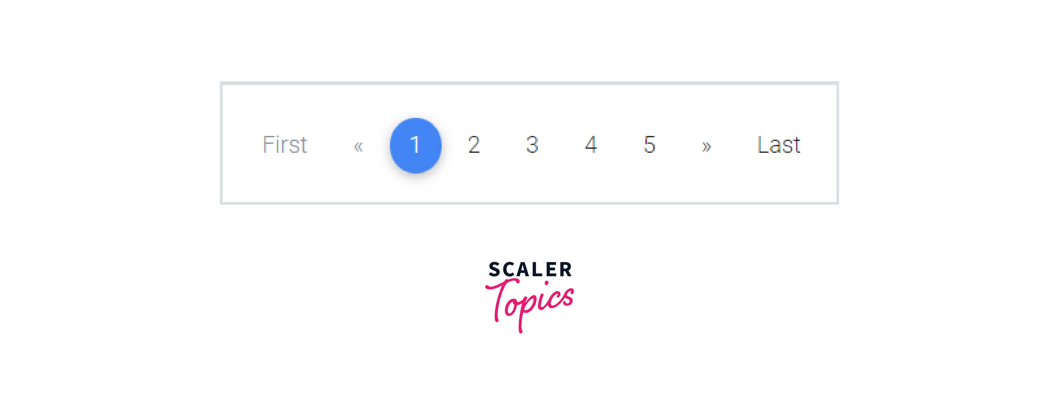
Disabled and Active States
The active state indicates which page is currently active. To make the user aware of which page they are on, add the class .active.
Transform Your Career
Choose from our industry-leading programs designed for career success
Modern Software and AI Engineering Program
Master full-stack development with AI integration

 +1000 more
Modern Data Science and ML with specialisation in AI
Advanced data science techniques with AI specialization
+1000 moreAdvanced AIML with Specialisation in Agentic AI
Deep dive into AIML with focus on Agentic systems
+1000 moreDevOps, Cloud & AI Platform Engineering
Build and manage AI-powered cloud infrastructure
+1000 moreAI Engineering Advanced Certification by IIT-Roorkee
Premier AI engineering certification from IIT-Roorkee
Examples
Example 1:
Html:
CSS:
Example 2: HTML:
CSS:
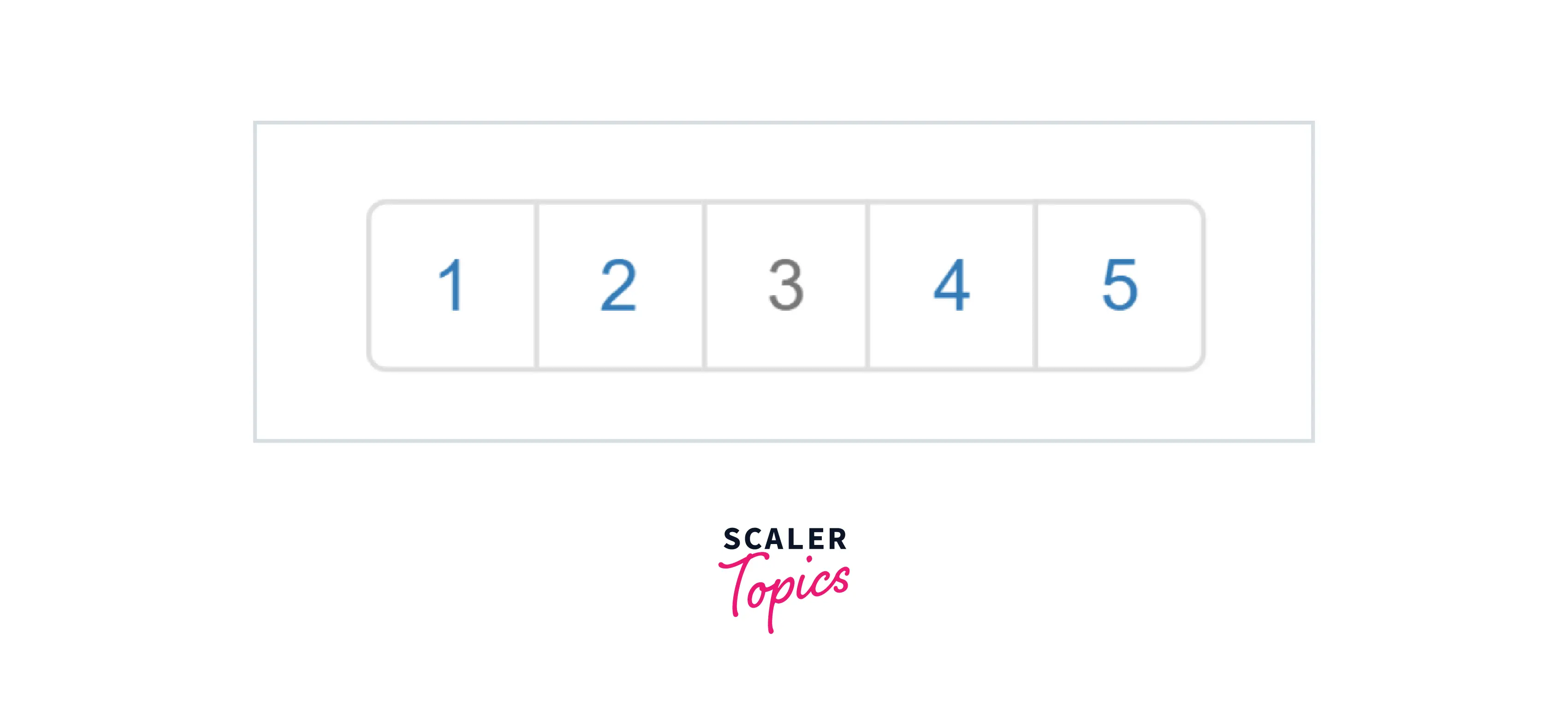
The disabled state indicates the un-clickable current page. If a page is disabled for some reason, we can use the class .disabled.
Examples:
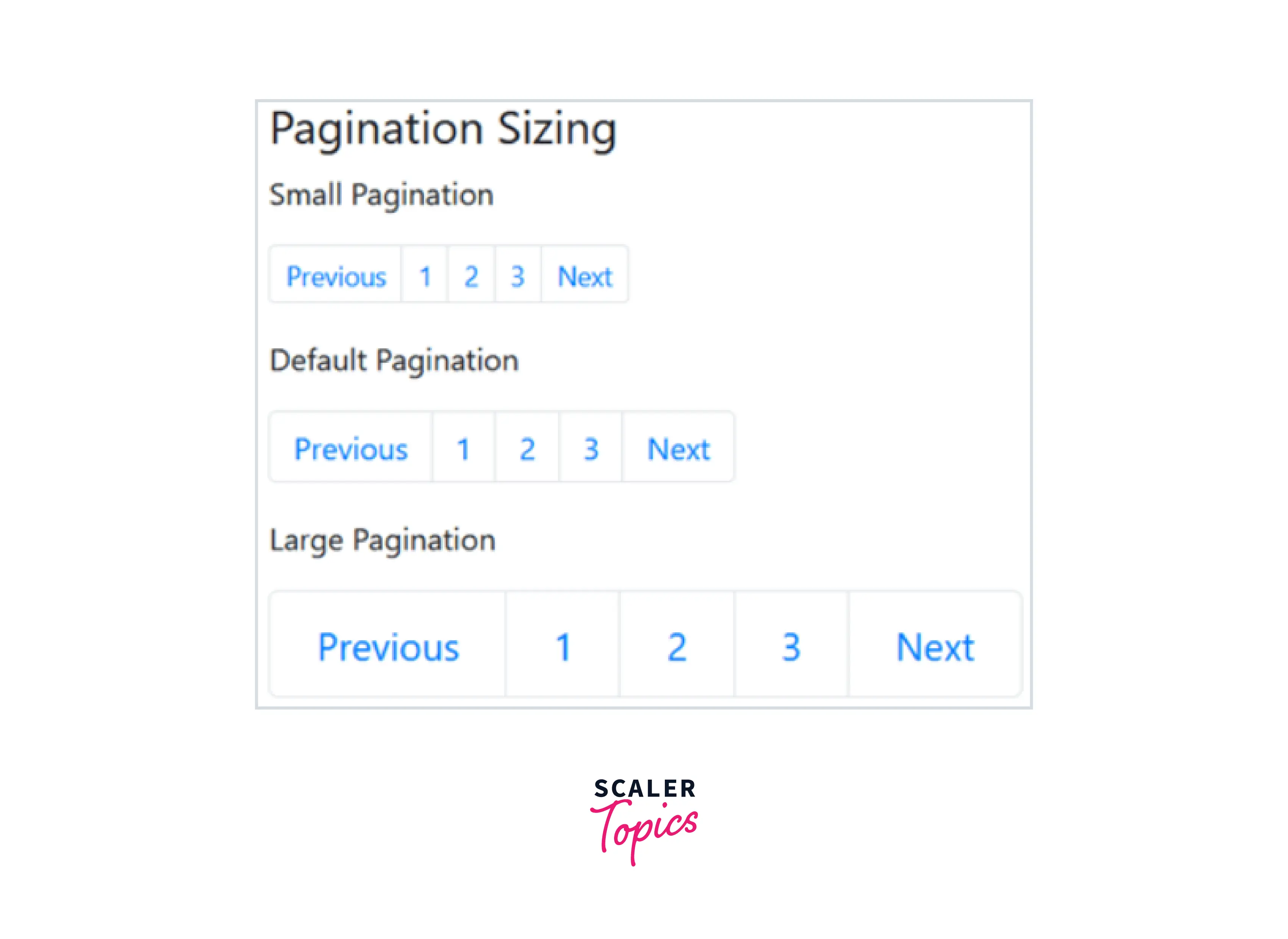
Sizing in Bootstrap Pagination:
Additional classes can be used to change the size of the pagination group to bigger or smaller. We can have three different sizes of pagination that are as follows:
- The .pagination class sets the default size.
- A smaller size is achieved with the .pagination-sm class.
- For a larger size, use the .pagination-lg class.
Small Pagination
Add the .pagination-sm class for small paging. It decreases the font size and spacing of the pagination nav.
Large Pagination
Add the .pagination-lg class for large paging. It increases the font size and spacing of the pagination nav.
Examples:
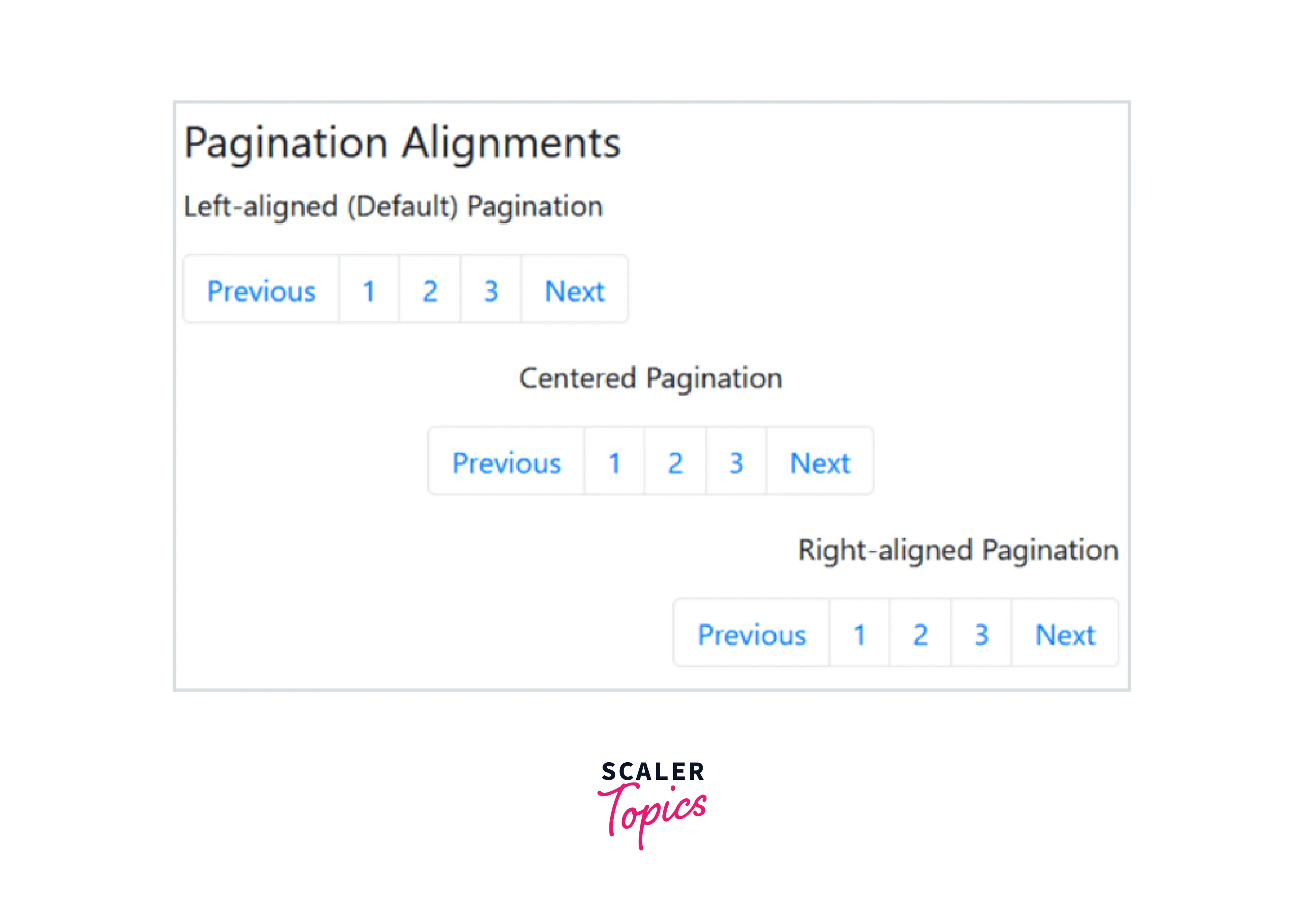
Pagination Alignment
Pagination can be categorized into three groups based on the alignment. The types of alignments are,
- Left alignment
- Center alignment
- Right alignment
Scaler Placement Report and Statistics
Scaler learners achieved 2.5x salary growth with average post-Scaler CTC reaching ₹23L.
Left Alignment
By default, pagination is left-aligned. Therefore, you do not need any additional classes to left-align the paging.
Turn Learning into Career Growth
Center Alignment
Add the .justify-content-center class to center the paging.
Right Alignment
Add the .justify-content-end class to right-align the paging.
Examples:
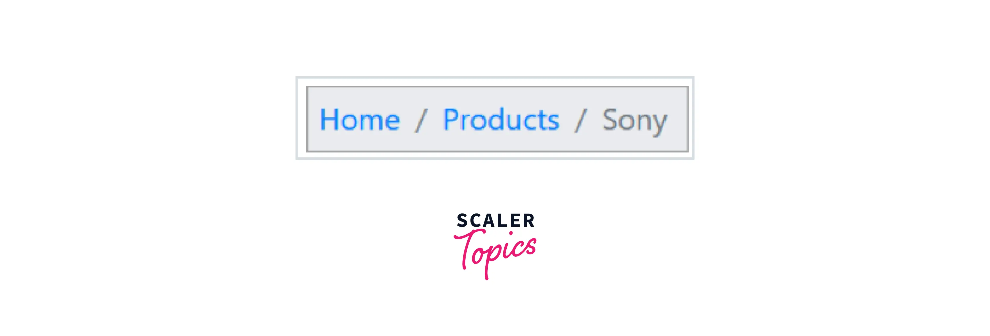
Breadcrumbs
Breadcrumb is a form of pagination. We use the .breadcrumb class and the .breadcrumb-item class to create breadcrumbs. Breadcrumbs indicate the location of the current page within a navigational hierarchy.
How to Create Breadcrumbs:
When you compare breadcrumbs of Bootstrap version 4 with version 3, the .breadcrumb-item class is required on the descendants of .breadcrumbs in version 4.
Inside a <nav> element, add an <ol> element with the .breadcrumb class followed by <li> elements with the .breadcrumb-item class. Then, add <a> elements inside the <li> elements. Add the .active class to show the active item.
Example
Scaler Placement Report and Statistics
Scaler learners achieved 2.5x salary growth with average post-Scaler CTC reaching ₹23L.
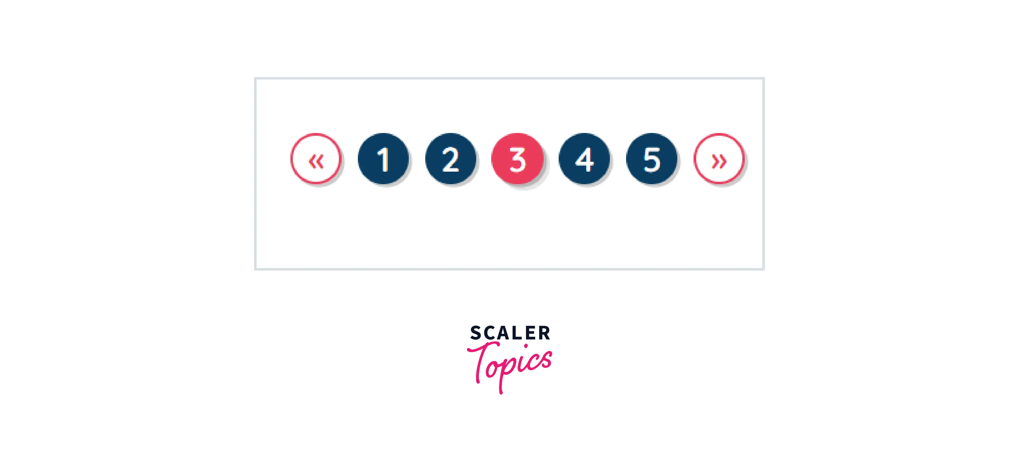
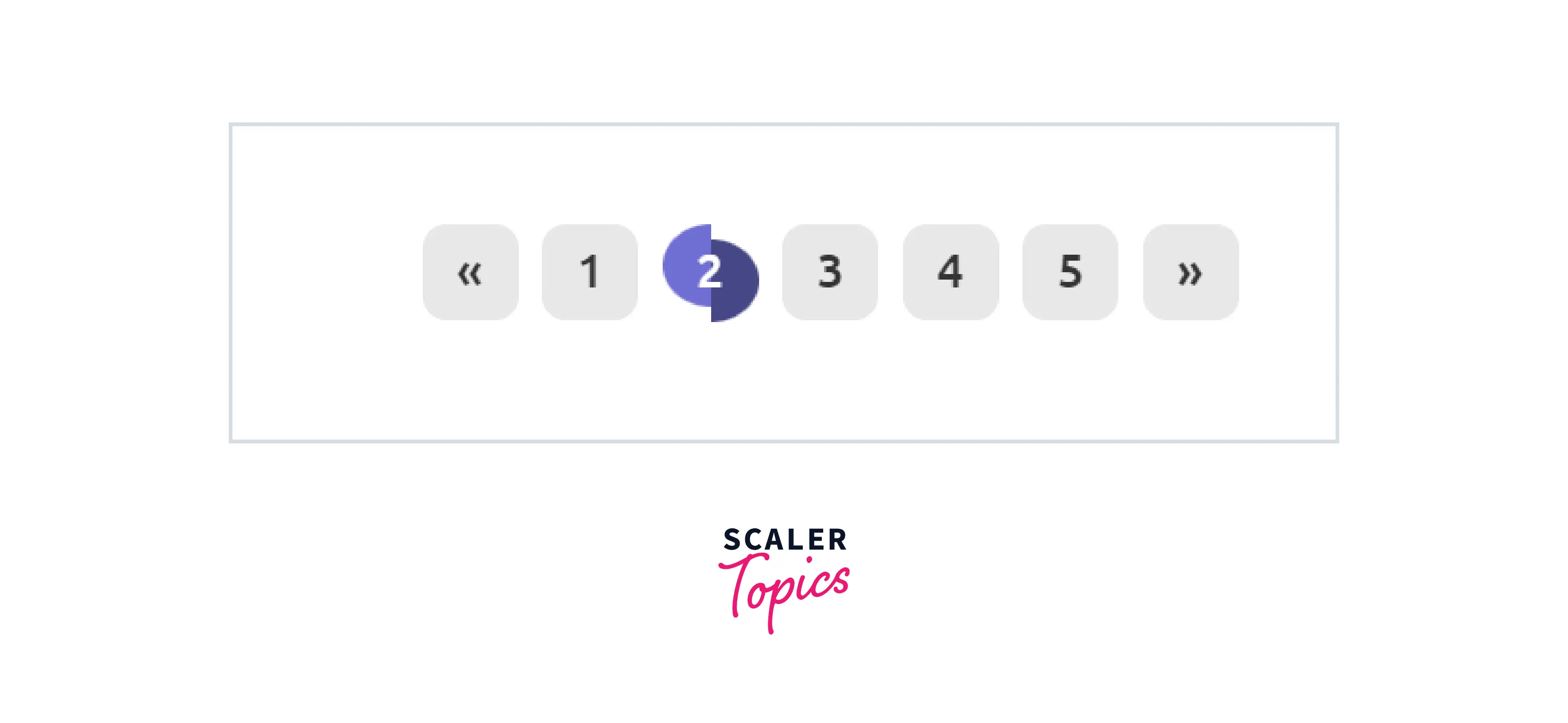
Shape
The way pagination "feels" can be easily altered by changing its style from rectangular to circular. Simply add the .pagination-circle class to the list element.
Examples:
Example 1:

Example 2:
HTML:
CSS:
Example 3: HTML:
CSS:
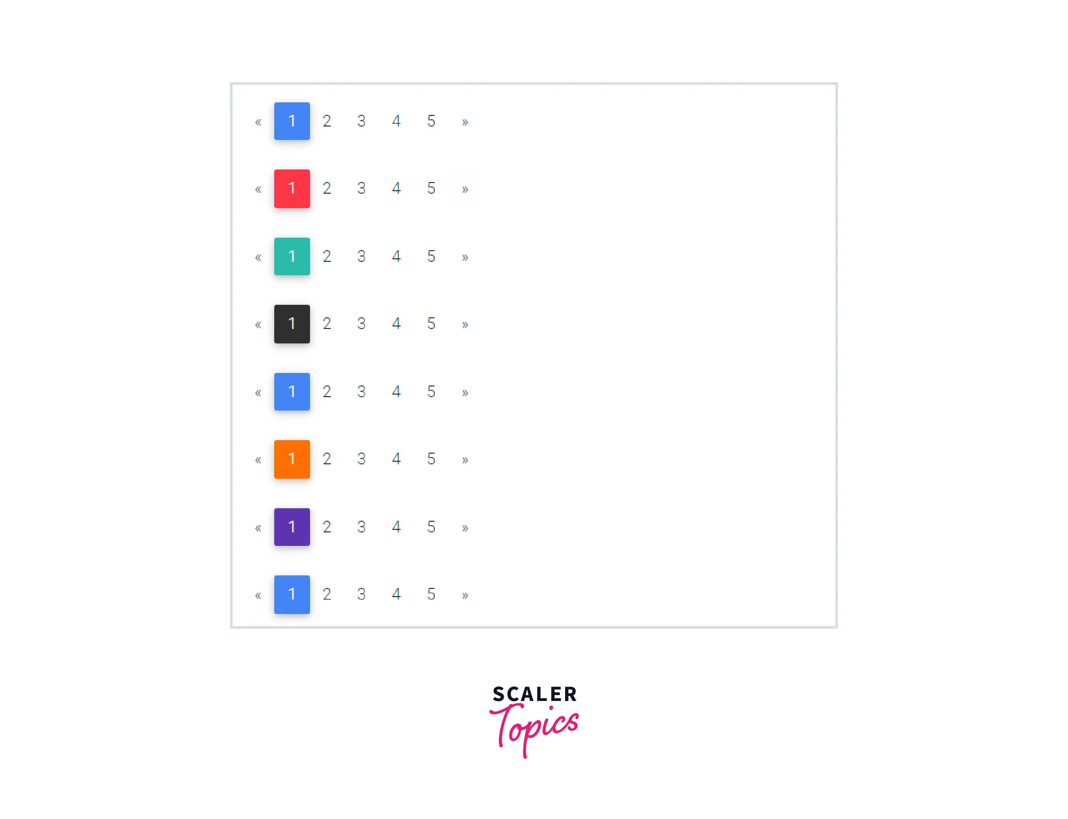
Colors
To change the color of the pagination we can use add different classes in our code, for example, add the .pg-red class to the ul element.
Conclusion
In this article, we've learned about Bootstrap Pagination.
- Pagination is the process of arranging content into separate pages.
- Bootstrap 4 provides various styling options for pagination.
- You can easily change the pagination features such as size, alignment, etc.
- Breadcrumbs are a form of pagination.
- Using Bootstrap pagination we can provide beautiful and effective navigation between different web pages in a website.
 Google
 Amazon
 Microsoft
 Flipkart
 Adobe1200+ more