Bootstrap Sidebar
Bootstrap sidebars, also known as side navbars or off-canvas navigation, enhance website navigation. Although not in Bootstrap's official documentation, they can be customized for responsive, toggleable navigation. Ideal for complex websites, sidebars adapt to various screen sizes and orientations, integrating seamlessly with page layouts.
Basic files
Now before going deeper into making a sidebar, let us look at some basic files that we need to add to the starting template.
Firstly, we need some bootstrap CSS CDN links for styling which gets added in the <head> tag in the HTML file. The CSS CDN links are as follows -
Secondly, we need some Javascript CDN links for creating dynamic components of the sidebar which gets added at the bottom of our project before the <body> tag ends. The JS CDN links are as follows -
Therefore, our starting template for making a sidebar in bootstrap is as follows -
Transform Your Career
Choose from our industry-leading programs designed for career success
Modern Software and AI Engineering Program
Master full-stack development with AI integration

 +1000 more
Modern Data Science and ML with specialisation in AI
Advanced data science techniques with AI specialization
+1000 moreAdvanced AIML with Specialisation in Agentic AI
Deep dive into AIML with focus on Agentic systems
+1000 moreDevOps, Cloud & AI Platform Engineering
Build and manage AI-powered cloud infrastructure
+1000 moreAI Engineering Advanced Certification by IIT-Roorkee
Premier AI engineering certification from IIT-Roorkee
Bootstrap 5 Sidebar Components
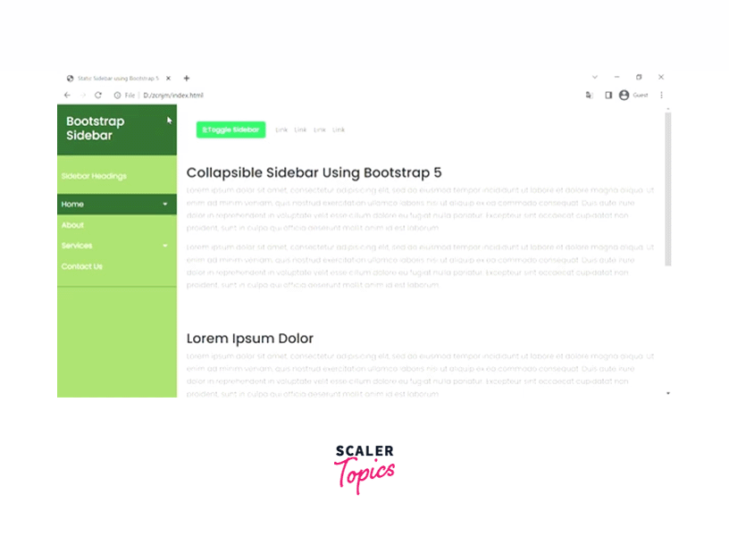
Basic Sidebar: Static Collapsible Bootstrap Sidebar Menu
In this section, we are going to build a static collapsible sidebar menu using bootstrap 5 that scrolls down along with the page.
HTML
Firstly, let us create a basic structure for the sidebar and the content that will be there on the webpage.
In the above code structure, we have a wrapper class that will be given the flex property of CSS. Moreover, we will also give the align-items: stretch property to the .wrapper class so that the sidebar nav would take the entire height as the main content. Therefore, as soon as the main content of the webpage will be increased, the sidebar would also dynamically increase.
Now, let us make the sidebar nav and put some dummy links out there.
In the above sidebar nav, firstly, we have a .sidebarHeader that gives a heading to the sidebar. After this, we have created certain navigation menus such as Home, About, Services, and Contact Us. Two of them are dropdown menus which are created by using certain bootstrap utilities and are explained below.
- Firstly, add the data-toggle = collapse to the link that is holding the dropdown menu.
- Further, we have added class=dropdown-toggle. However, it is an optional class that would show a small triangle beside the dropdown menu.
- The dropdown menu should have a .collapse class as well.
- And the href attribute of the link must contain the id of the dropdown menu preceded by a hash.
- The .aria-expanded=false shows the current state of the collapsible menu.
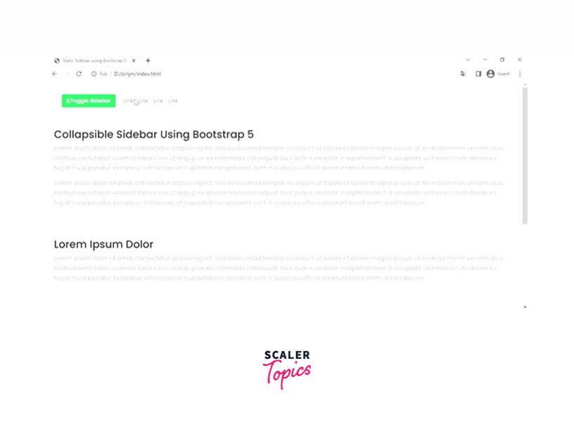
Now, let us add the button that is going to control the toggling of the sidebar nav.
So, the button that is used to toggle the sidebar nav contains a function toggleNav() that will be called as soon as the button will be called.
Let us see the function which is performing the toggling action.
As you can see in the above code, we have stored the status of the sidebar currently whether it is visible on the webpage or not. If yes, then set its display to none otherwise, set the display to block.
That is all we need to make a static sidebar nav on a webpage. Now, let us see the complete code example in which we have added some of the dummy content and external styling of the web page to make the UI look attractive.
HTML
CSS
Output:
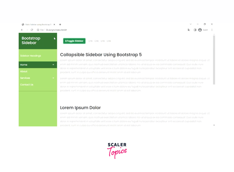
Basic Sidebar: Fixed & collapsible Bootstrap Sidebar Navigation
In this section, we will be making a collapsible sidebar just as we previously discussed but this one would remain fixed when the users scroll the page.
Since the approach is very similar to the one that we have previously used, therefore, we will use the same code example with a few changes.
CSS
In this CSS code, we need to remove the align-items: stretch property since it stretches the content vertically. Also, as the main content of the page is scrolled, the height of the sidebar will be the entire viewport height.
Therefore, we have set the height to 100vh and have position:fixed property to fix the sidebar on the top left corner of the webpage.
Below is the code segment for the same.
Therefore, by doing these changes in the previous code, our sidebar will be fixed on the side even when the main content extends or scrolls.
Javascipt
In the javascript functions, the changes are given below.
Output:
Scaler Placement Report and Statistics
Scaler learners achieved 2.5x salary growth with average post-Scaler CTC reaching ₹23L.
Advanced Sidebar: Fixed Scrollable & Collapsible Bootstrap Sidebar with a Transparent Overlay
In this section, we will learn how to make a fixed collapsible sidebar with a transparent overlay.
To elaborate more, the sidebar will be appearing on the left whereas the main content will have a transparent overlay when the sidebar is open otherwise the main content will take the full width of the screen.
We are going to continue with the code segment that we have talked about in the first section and make some changes to achieve the transparent overlay functionality.
This time we will have two buttons for opening and closing the sidebar. Therefore, will have two javascript functions for the same.
Let us first talk about the HTML changes that we have to make.
HTML
Firstly, we will have a close button on top of the sidebar that will close the sidebar when clicked.
We have given the close button a function closeNav() for implementing the closing functionality and a class .closebtn for styling.
However, the second button also has a function openNav() to open the sidebar.
That was it for the HTML part changes.
Javascript
In the javascript part, we have added two functions given below.
In the open nav () function, we have reserved a width of 250px for the sidebar and the rest for the main content. Also, we have added a background color to implement the transparent overlay on the main content when the sidebar is opened.
On the other hand, whenever the sidebar has closed the width of the sidebar gets 0 and the background color of the main content again becomes white.
CSS
Now, comes the CSS part that needs to change.
Now, let us look at the entire code segment for better understanding.
HTML
CSS
Output:
Advanced Sidebar: Partially Collapsing Static Bootstrap Sidebar
In this section, we will be discussing a partially collapsing static bootstrap sidebar which does not collapse completely but would shrink its contents.
First of all, we will add some font awesome icons to the sidebar menus after which we will change the CSS styling for the .active class to shrink the contents of the sidebar.
HTML
Let us see the HTML part of the partially collapsing static bootstrap sidebar. However, it is very similar to the above examples with some changes.
In this code segment, we have added some font awesome icons beside the sidebar menus and have added a button with the .toggleNav() function to toggle the sidebar.
Javascript
In this javascript part, we have implemented the function toggleNav() which is given below.
In this code segment, we have stored the status of the sidebar in a variable MenuStatus, it is not visible then display it completely otherwise display the sidebar based on the styling which has been applied to the .active class of the sidebar.
CSS
Now, let us see the CSS part in which we have done some styling that is needed for the partial sidebar.
However, the styling is very similar to what we have done in the previous sections but we have introduced the sidebar.active class styling for various parts of the sidebar.
First of all, the .sidebar.active has a width of only 100px and the text will be aligned to the center. However, the bootstrap sidebar heading is shrunk with the BS heading and is displayed as a block element using the sidebar.active .sidebarHeader span selector.
The h3 element of the sidebar is displayed not displayed by setting its display to none. After which the padding and the margins are adjusted to fit in the area.
Output:

Conclusion
- Sidebars are vertical navigation bars that let the users navigate to hundreds of links in a complex website.
- Sidebars can be collapsible, static, fixed, and partial based on the need of the user.
- Collapsible sidebars are implemented using the Javascript functions.
- For a static sidebar, we use the align-items:stretch property to stretch the sidebar as per the main content of the website.
- However, for a fixed sidebar, we need to set the height of the sidebar to the viewport height and use the position: fixed property of fix the sidebar.
- For adding a transparent overlay on a webpage, we have added a additional styling in the javascript function by setting the background color of the content as light grey when the sidebar is opened and otherwise white.
- For a partial sidebar, we have added an additional . active which is triggered only when the user clicks on the toggle button.
 Google
 Amazon
 Microsoft
 Flipkart
 Adobe1200+ more