Bootstrap Utilities for Layout
Overview
Bootstrap is a free and open-source framework that is used to build the responsive, mobile-friendly, layout of a website. It is a collection of certain ready-to-use components of HTML, CSS, and Javascript that help us quickly design our webpage. Bootstrap provides certain utility classes that are used for making different responsive layouts so easily.
Introduction
Bootstrap has introduced many utility classes to style an element quickly without using any of the CSS code and make responsive and mobile-friendly layouts. There are different utility classes for different elements such as borders, colors, alignment, spacing, visibility, and much more.
Basistrap is a CSS framework that provides us with already built CSS codes in the form of these utility classes that are used to style our elements easily.
Scaler Placement Report and Statistics
Scaler learners achieved 2.5x salary growth with average post-Scaler CTC reaching ₹23L.
Utilities / Helper Classes
Utility classes are built-in classes that already contain the code of how to style a particular element. Therefore, you just have to use them wherever needed to use that functionality for the particular element.
They are also known as the helper classes as these classes help in styling the HTML elements quickly and easily without using any CSS code. Now, we will be discussing the different bootstrap utilities for layout.
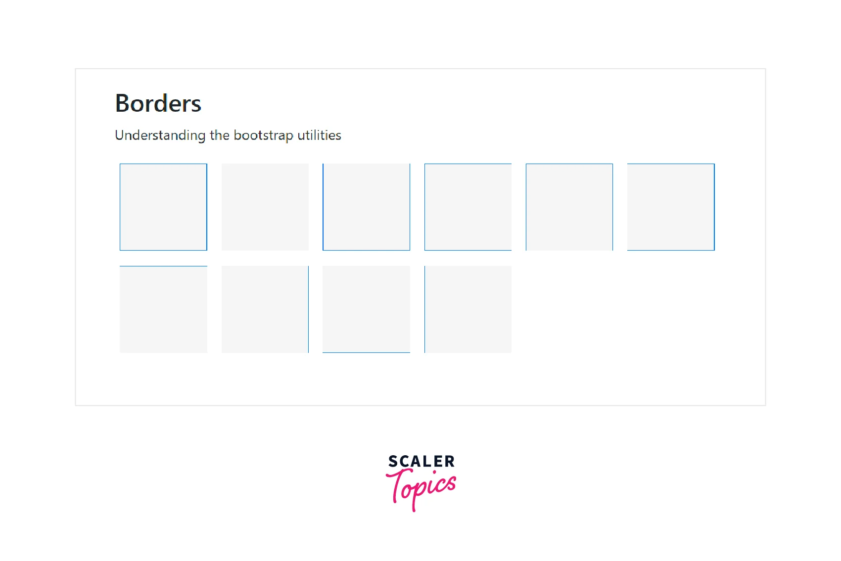
Borders
The different border utility classes are used to add or remove a border from a particular side of an HTML element.
Below are the different utility classes for adding or removing the border from the sides of an element -
- border - Adds the border on all four sides of an element.
- border-top - Adds a border only on the top side of an element.
- border-bottom - Adds a border only on the bottom side of an element.
- border-start - Adds a border only on the left side of an element.
- border-end - Adds a border only on the right side of an element.
- border-0 - Removes the border from all four sides of an HTML element.
- border-top-0 - Removes the border from the top side of an element.
- border-end-0 - Removes the border from the right side of an element.
- border-bottom-0 - Removes the border from the bottom side of an element.
- *border-start-0 - Removes the border from the left side of an element.
Let us see a code example to understand these utility classes.
Output:
Border Width
There are five border-width utility classes that add the border of different widths according to the specified values.
You can add any of the utility classes from border-1 to border-5 to change the width of the border of an HTML element. The border-1 utility has the minimum width whereas the border-5 utility class has the maximum width.
Let us see an example to understand this utility class.
Output:
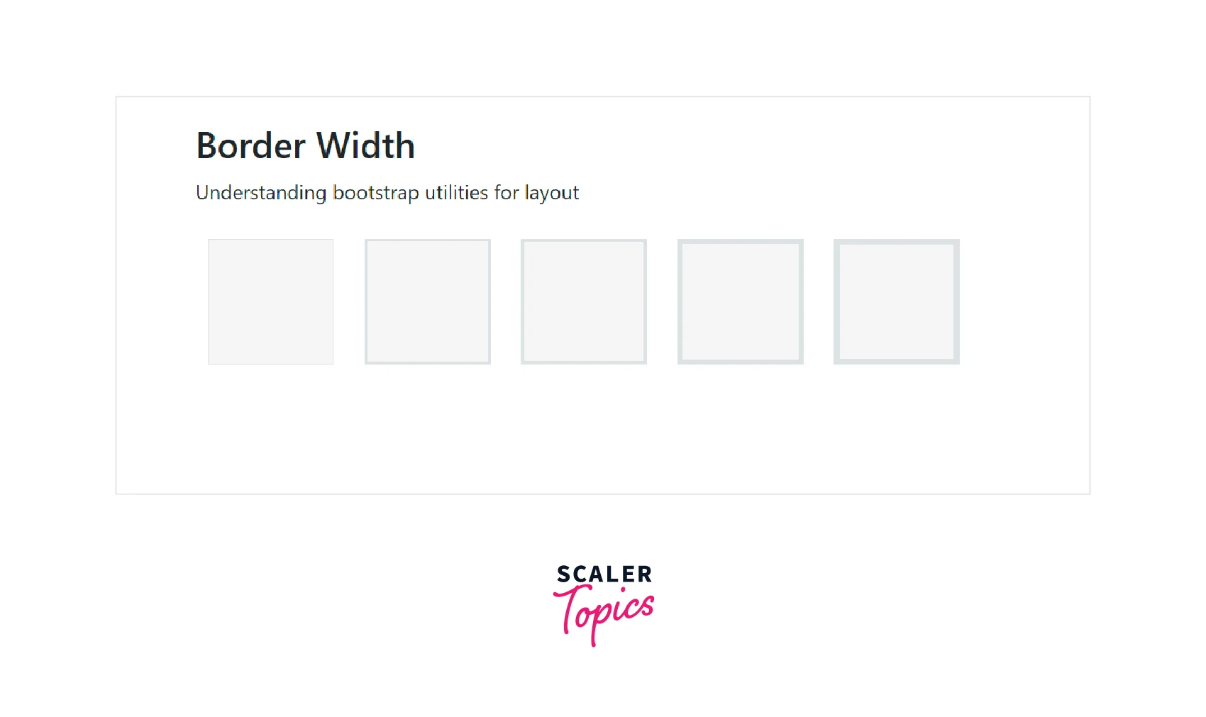
As you can see in the output, the borders of the boxes from border-1 to border-6 go on increasing.
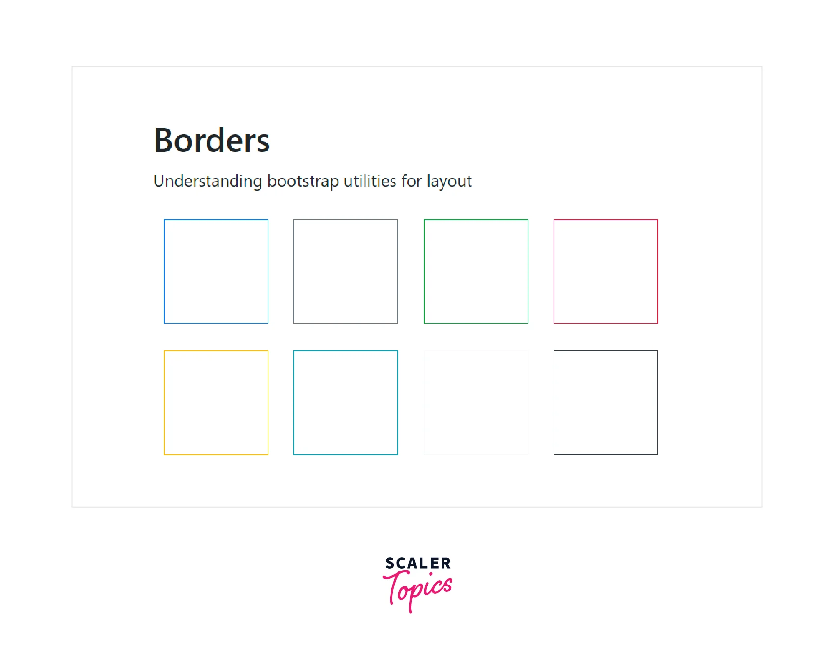
Border Color
Bootstrap provides different contextual classes for adding different color borders around an HTML element.
Below are the contextual classes used for adding different colors.
| Contextual class | Description |
|---|---|
| border-primary | Adds a blue color border around an element. |
| border-secondary | Adds a light-grey color border around an element. |
| border-success | Adds a green color border around an element. |
| border-danger | Adds a red color border around an element. |
| border-warning | Adds a yellow color border around an element. |
| border-info | Adds a light blue color border around an element. |
| border-dark | Adds a black color` border around an element. |
| border-light | Adds a white color border around an element. |
Now let us understand these contextual classes using a code example.
Output:
Transform Your Career
Choose from our industry-leading programs designed for career success
Modern Software and AI Engineering Program
Master full-stack development with AI integration

 +1000 more
Modern Data Science and ML with specialisation in AI
Advanced data science techniques with AI specialization
+1000 moreAdvanced AIML with Specialisation in Agentic AI
Deep dive into AIML with focus on Agentic systems
+1000 moreDevOps, Cloud & AI Platform Engineering
Build and manage AI-powered cloud infrastructure
+1000 moreAI Engineering Advanced Certification by IIT-Roorkee
Premier AI engineering certification from IIT-Roorkee
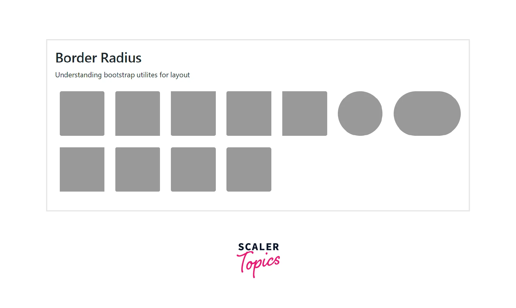
Border Radius
The border-radius utility classes are used to add rounded corners around an element using the .rounded utilities.
Below is a list of border-radius utility classes in bootstrap.
| Utility class | Description |
|---|---|
| rounded | Adds rounded corners on all four sides of an element. |
| rounded-top | Adds round corners only on the top side of an element. |
| rounded-end | Adds round corners only on the right side of an element. |
| rounded-bottom | Adds round corners only on the bottom side of an element. |
| rounded-start | Adds round corners only on the left side of an element. |
| rounded-circle | Used to make an element round in shape. |
| rounded-pill | Used to make an element more rounded with a larger border radius. |
There are some more border-radius utility classes like rounded-0, rounded-1, rounded-2, and rounded-3 in which the border-radius keeps on increasing from rounded-0 to rounded-3, that is, the corners on all the sides keep on becoming more curved.
Now, let us understand these utility classes using a code example.
Output:
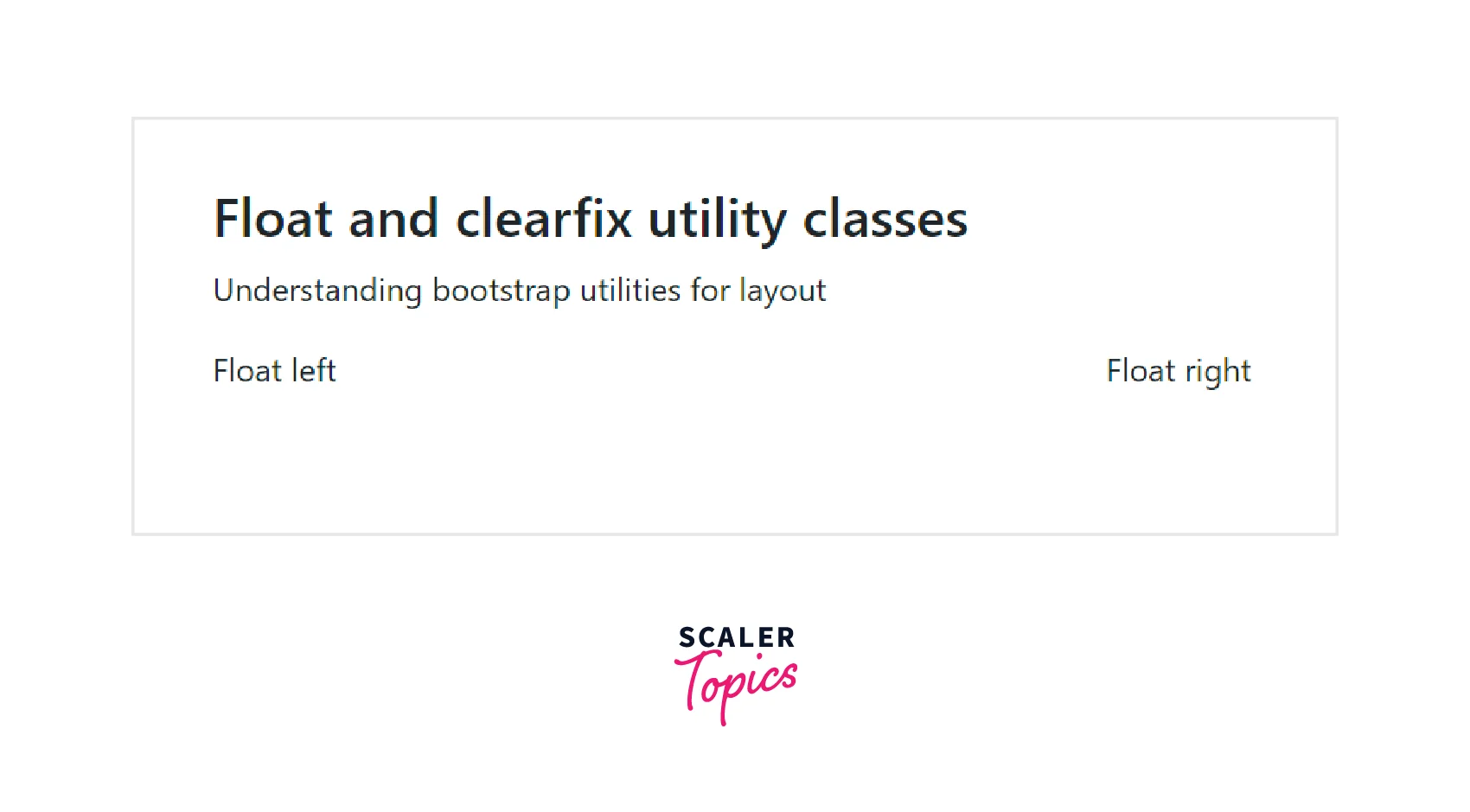
Float and Clearfix
Bootstrap also provides the utility classes for floating an element to the left or right and for clearing the floats as well.
We can use the .float-end to float an element to the right, the float-start to float an element to the left, and the .clearfix to clear the floats for the HTML element.
Now let us understand these classes using a code example.
Output:
Responsive Floats
We can also float the HTML elements based on the screen widths of the devices for which we need the responsive float classes (float-*-start|end) where * can be sm (for devices >576px), md (for >768px), lg (for >992px devices), xl (for >1200px) or xxl (for >1400px devices).
Now, let us understand them using a code example.
Output:
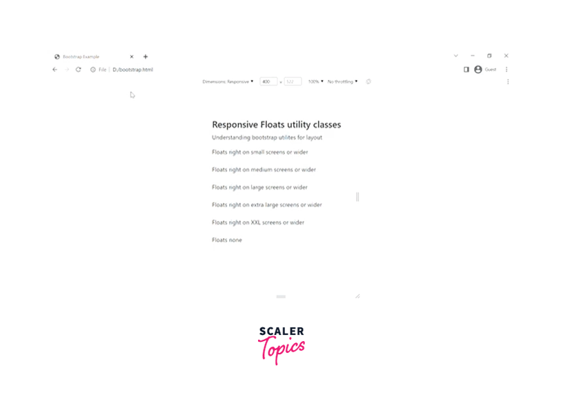
As you can see in the above gif, the first content having the class .float-sm-end will float to the right for smaller devices and wider, and the second content having the class .float-md-end floats to the right for medium devices and wider.
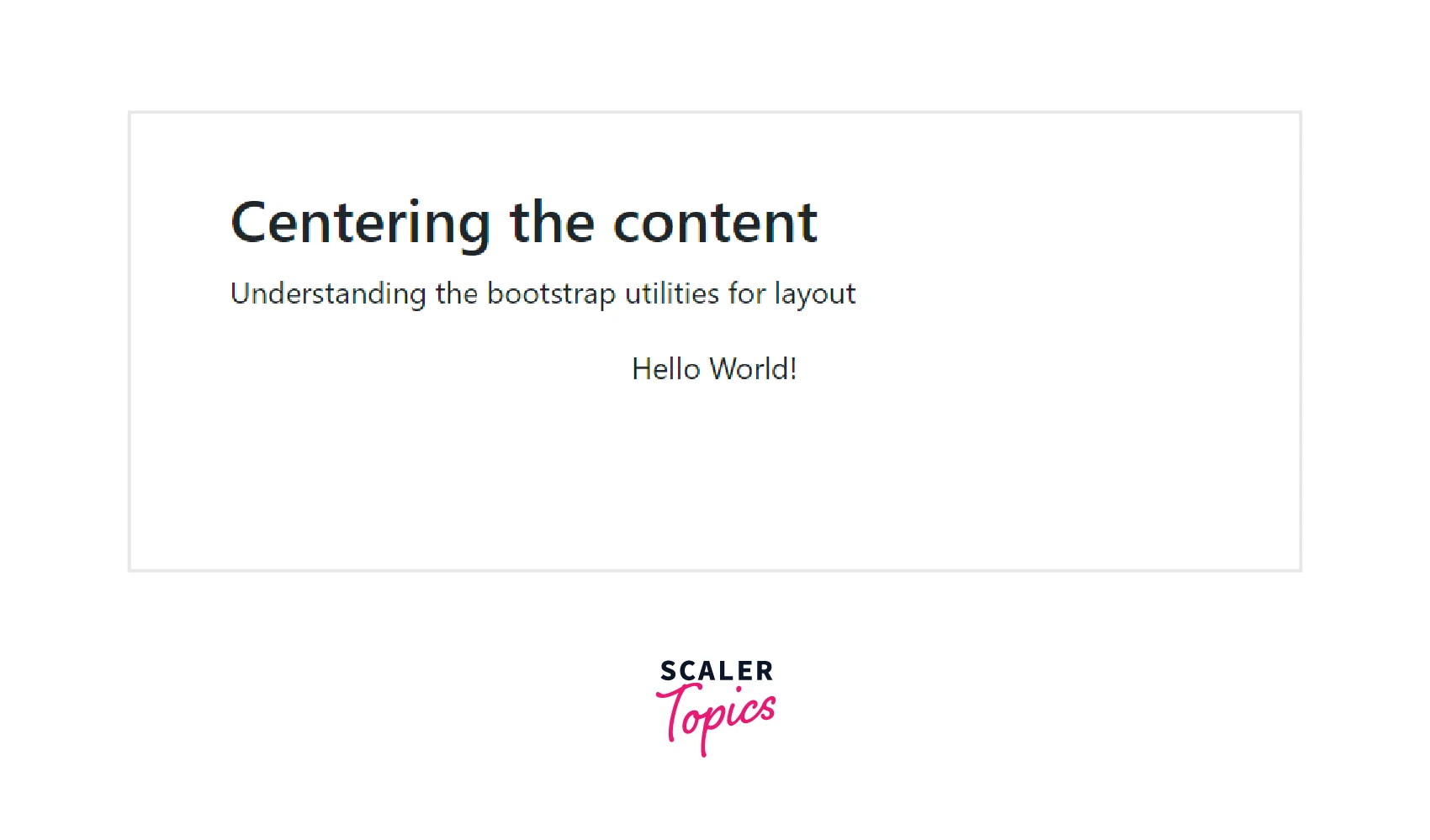
Center Align
The center-align utility class is used to align the HTML element in the center using the .mx-auto utility. This class sets the left and the right margin as auto, therefore center aligning the content.
Let us see the usage of this class using a code.
Output:
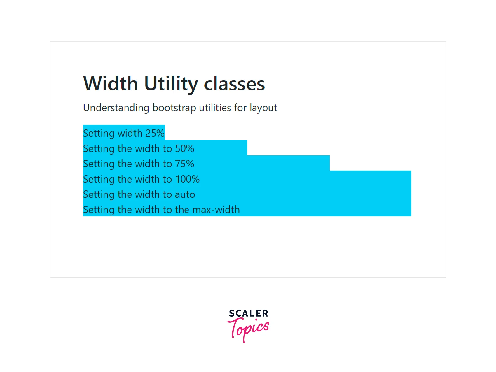
Width
The width utility class sets the width of the HTML element using the w-* class.
Below are the utility classes for adding a width to an element.
| Utility class | Description |
|---|---|
| .w-25 | Sets the width of the content to 25% of the total width |
| .w-50 | Sets the width of the content to 50% |
| .w-75 | Sets the width of the content to 75% |
| .w-100 | Sets the width of the content to 100%. |
| .mw-auto | Sets the width to auto |
| .mw-100 | Sets the width to max-width of 100% |
Now, let's understand these classes using a code example.
Output:
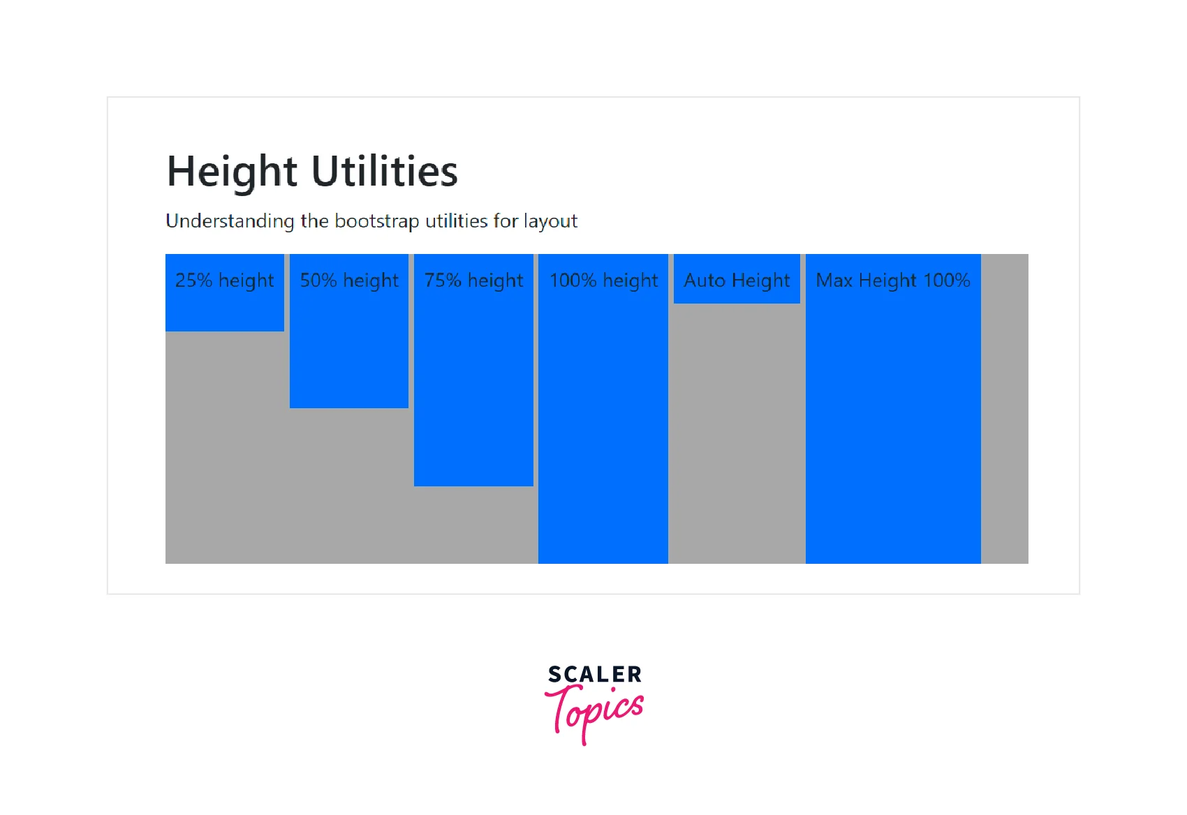
Height
The height utility is used to set the height of the HTML element using the h-* utility class.
Below are all the height utility classes.
| Utility class | Description |
|---|---|
| .h-25 | Sets the height of the content to 25% of the total height |
| .h-50 | Sets the height of the content to 50% of the total height |
| .h-75 | Sets the height of the content to 75% of the total height |
| .h-100 | Sets the height of the content to 100%. |
| .mh-auto | Sets the height of the content to auto |
| .mh-100 | Sets the height to the max-height of 100% |
Now, let us understand these classes using a code example.
Output:
Turn Learning into Career Growth
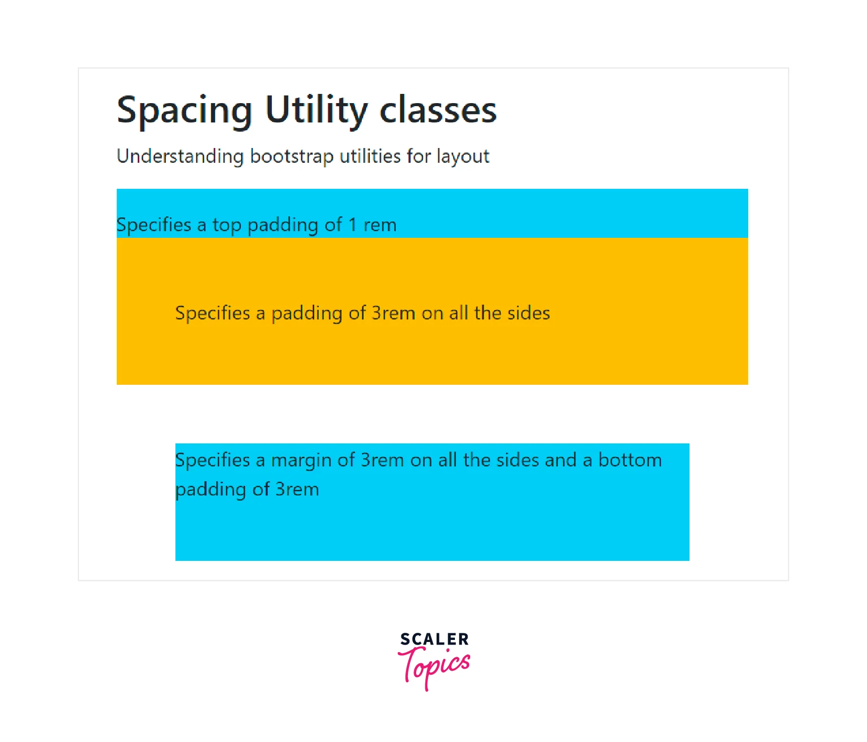
Spacing
Bootstrap provides a large variety of margin and padding utility classes that provide appropriate spacing between the HTML elements. These margin and padding utility classes work for all the breakpoints using the .xs, .sm, .md, .lg .xl, and .xxl classes in bootstrap.
These classes can be specified in one of the two formats, that is, {property}{sides}-{size} for xs and {property}{sides}-{breakpoint}-{size} for sm, md, lg, xl and xxl.
where the property can take either the value m that sets the margin or p that sets the padding of the content.
where sides can be specified by one of the following -
- t - Sets the margin-top or padding-top.
- b - Sets the margin-bottom or padding-bottom.
- s - Sets the margin-left or padding-left.
- e - Sets the margin-right or padding-right.
- x - Sets both the margin-left and margin-right or padding-left and padding-right.
- y - Sets both the margin-top and margin-bottom or padding-top and padding-bottom.
- blank - Sets the margin and padding on all four sides of the HTML element.
and where the value of size can be specified by any one of the following -
- 0 - Sets the margin or padding to 0.
- 1 - Sets the margin or padding to 0.25rem.
- 2 - Sets the margin or padding to 0.5rem.
- 3 - Sets the margin or padding to 1rem.
- 4 - Sets the margin or padding to 1.5rem.
- 5 - Sets the margin or padding to 3rem.
- auto - Sets the margin or padding to auto.
Now, let us see some of these classes using a code example.
Output:
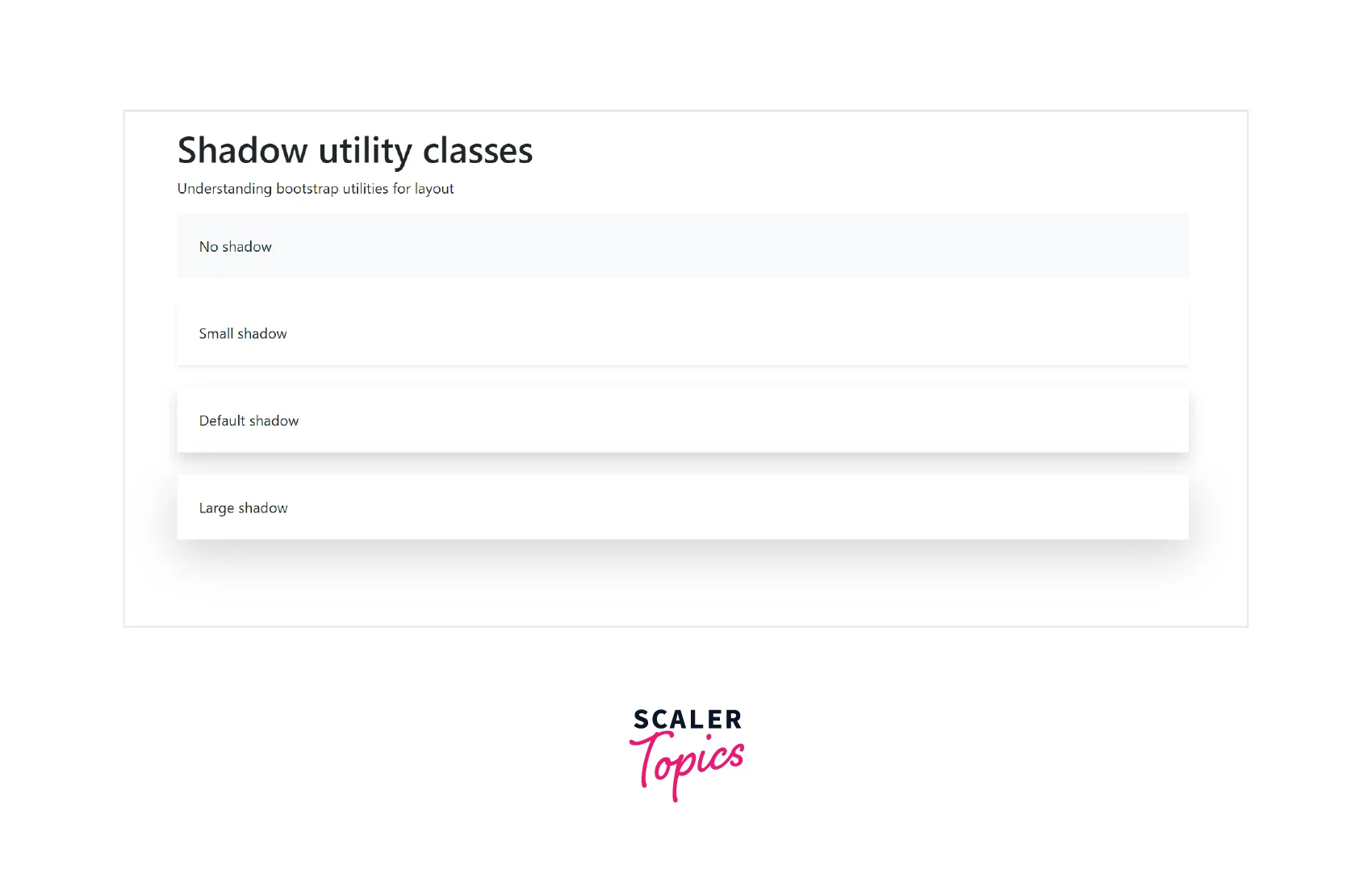
Shadows
The shadow utility classes are used to add shadows to an HTML element. There are four classes namely, .no-shadow that does not set any shadow to the HTML element, .shadow-sm for adding a smaller shadow, shadow for adding default shadow, and shadow-lg for adding a larger shadow to an element.
Now let us understand these classes using a code example.
Output:
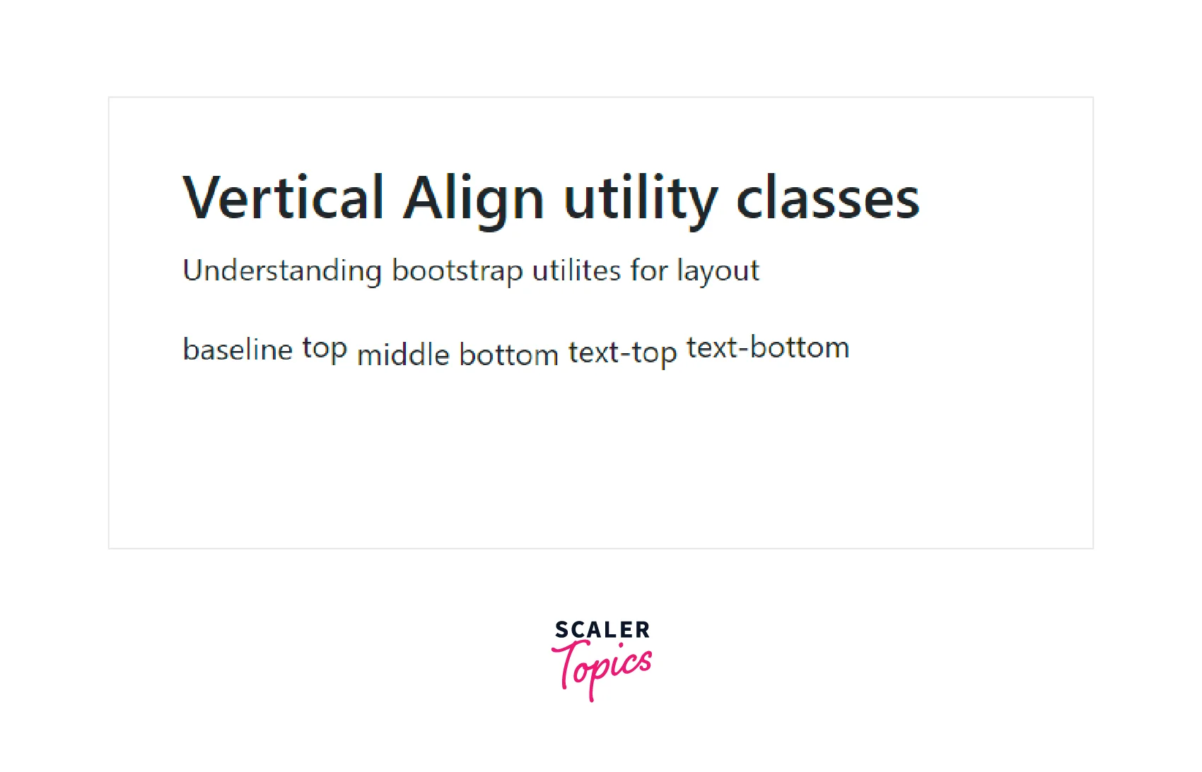
Vertical Align
The vertical-align utility classes are used to easily change the vertical alignment of inline, inline-blocks, inline-table, and table cell elements of HTML.
Below are the utility classes to vertically align an element in HTML.
| Utility class | Description |
|---|---|
| align-baseline | Aligns the HTML element with the baseline of the parent. |
| align-top | Aligns the HTML element with the top of the tallest element on the line |
| align-middle | Aligns the HTML element in the middle of the parent element |
| align-bottom | Aligns the HTML element with the lowest element on the line |
| align-text-top | Aligns the HTML element with the top of the parent element's font |
| align-text-bottom | Aligns the HTML element with the bottom of the parent element's font |
Now let us understand these utility classes using a code example.
Output:
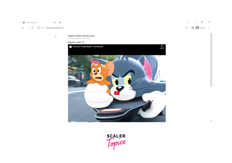
Aspect Ratio
The aspect ratio utility class is used to create a responsive video or slideshows based on the width of the parent HTML element.
We need to specify the .ratio class along with the .ratio-* class to the parent element in which the .ratio-* class contains the aspect ratio of the specified video.
Let us understand this utility class using a code example.
Output:
Visibility
The visibility utility classes control the visibility of an element. There are two classes- .visible is used to make an element visible on the webpage whereas the other one is the .invisible class that is used to hide the content of an element.
Let us understand this utility class using a code example.
Output:
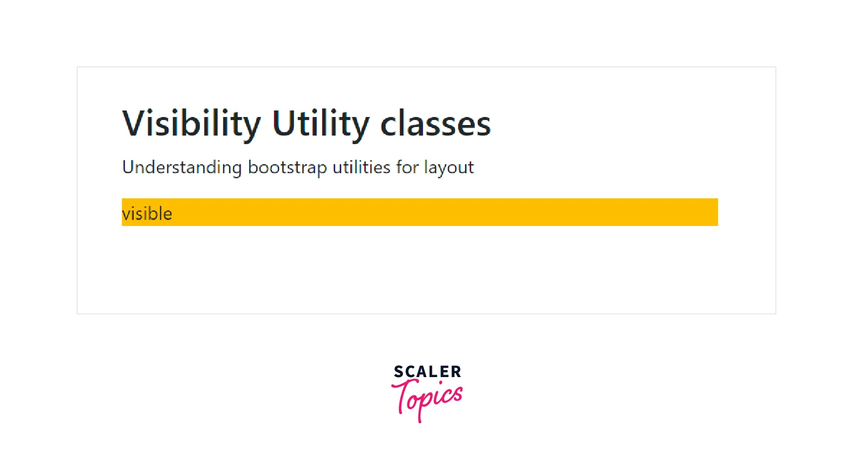
Therefore, as you can see in the above output the content with the .visible class is visible whereas the content with the .invisible class is hidden.
Close icon
To add a close icon to a webpage, you need to use the .btn-close utility class. It is used to add a close icon and is often used in the case of alerts and models.
Let us see its usage in a code example.
Output:
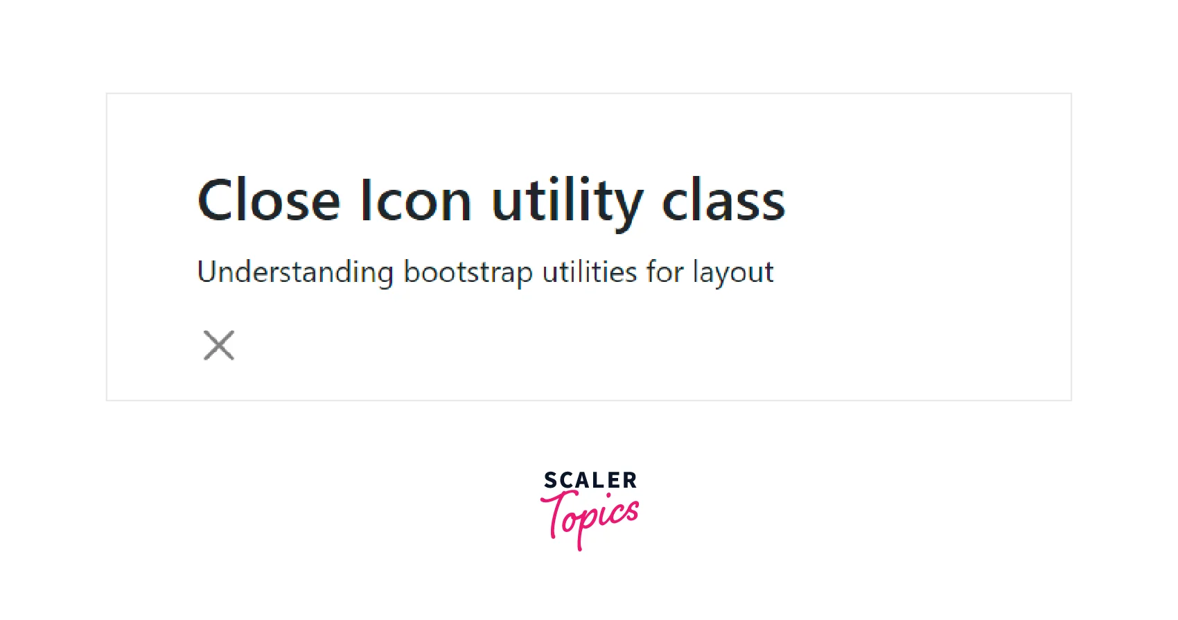
The cross button in the output specifies the close icon.
Screenreaders
The screen readers utility class is used to hide the content of the HTML element for all devices except for the screen readers using the .visually-hidden class.
Let us understand it using a code example.
So the element with the .visually-hidden class will be hidden for all devices except for the screen readers.
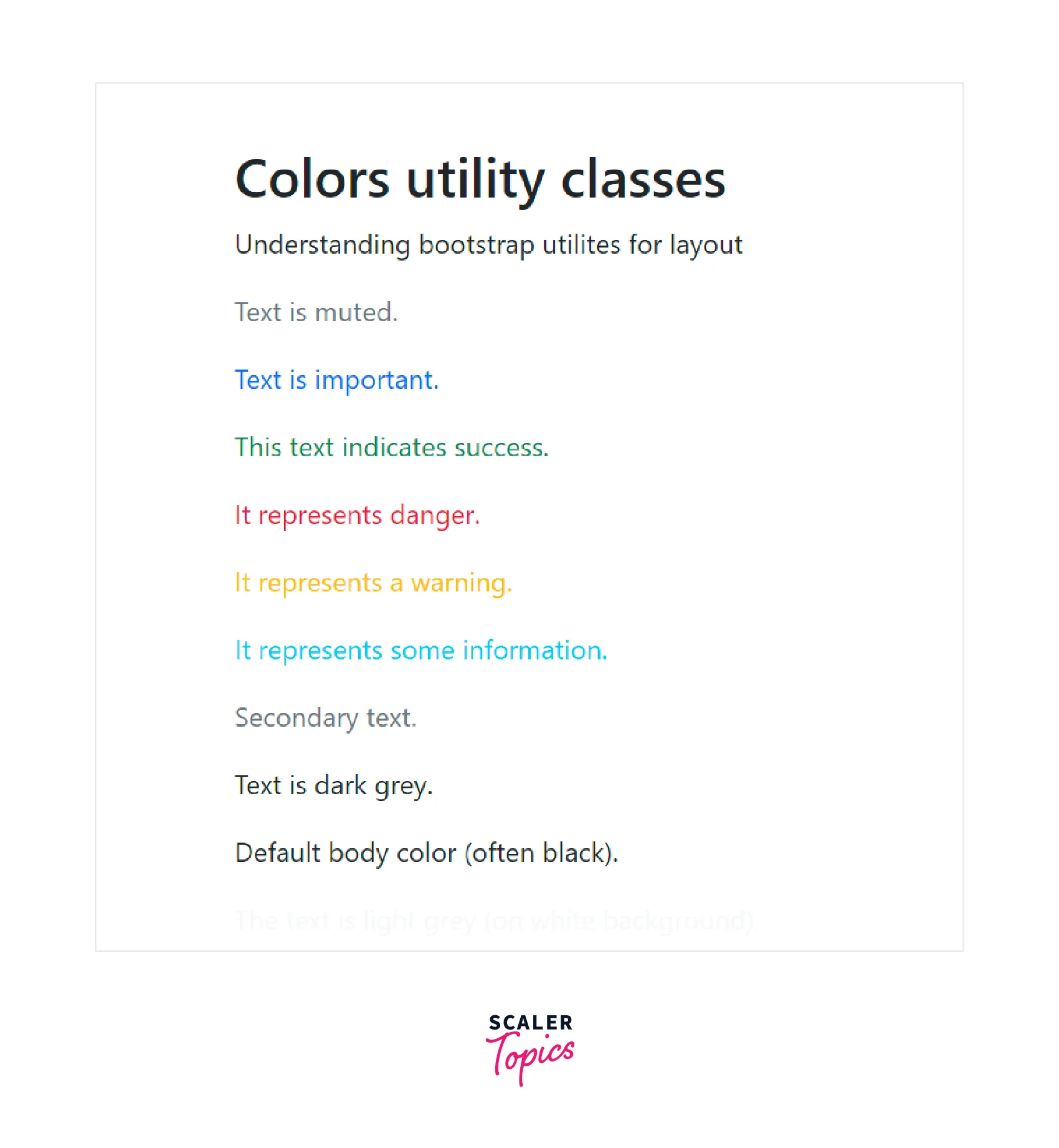
Colors
You can add different colors which are specified using the different utility classes in bootstrap. These color utility classes can be used to specify both the text colors as well as the background colors for HTML elements.
We just need to use the .text-* class for adding a text color. For example - text-primary, text-info.
Below are the mentioned color utility classes in Bootstrap.
| Utility class | Description |
|---|---|
| text-muted | Adds a light grey shade to the content |
| text-primary | Adds a blue color to the text |
| text-success | Adds a green color to the text |
| text-danger | Adds a red color to the text |
| text-warning | Adds a yellow color to the text |
| text-info | Adds a light blue color to the text |
| text-secondary | Adds a slighter dark shade of grey to the text |
| text-white | Adds a white color to the text |
| text-dark | Adds a dark grey to the text |
| text-light | Adds a lighter shade of grey to the text |
| text-body | Adds the default body color to the text preferably black. |
Now let us understand them using a code example.
Output:
Scaler Placement Report and Statistics
Scaler learners achieved 2.5x salary growth with average post-Scaler CTC reaching ₹23L.
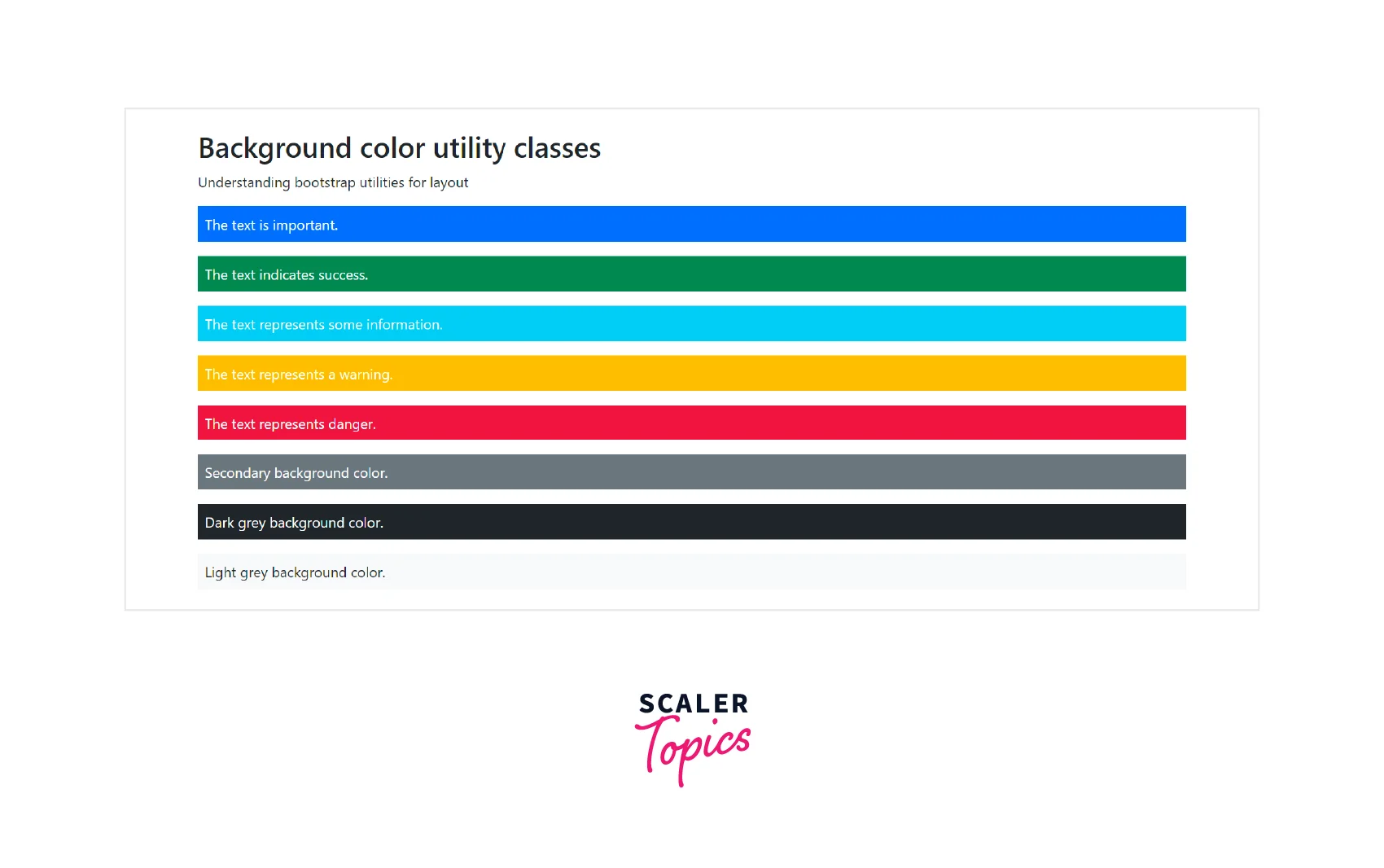
Background Colors
The utility classes for different background colors are similar to colors utilities with a .bg-* class in them. For example - .bg-primary, .bg-success.
Let us see a code example for the same.
Output:
Conclusion
- Bootstrap provides many utility classes so that we can style the HTML elements quickly and easily without using any CSS code.
- We can add or remove the borders from an HTML element using the .border, .border-start, .border-end utility classes.
- There are certain contextual classes in bootstrap that are used to specify a particular color to an HTML element such as bg-primary, bg-warning, and much more.
- Bootstrap also provides width, height, float, clearfix, aspect ratios, visibility, spacing, and alignment utility classes for styling the HTML elements.
- Therefore, bootstrap includes dozens of utility classes for showing, hiding, aligning, and spacing content that can be used as per the requirement without using CSS code.
 Google
 Amazon
 Microsoft
 Flipkart
 Adobe1200+ more