Bootstrap Float Right
Overview
While designing any website, aligning the elements is one of the important and tricky things that a developer needs to take care of CSS provides certain floating properties to float the HTML elements to a particular side and align them according to the needs of the user. However, Bootstrap is a popular CSS framework for making responsive and mobile-first websites, also provides certain utilities for floating the elements to left, right, or in the center.
Introduction to Bootstrap Float Right
The Bootstrap float right is used to float a particular HTML element to the right side of the page. It is used to align an HTML element to the right side of the page. Therefore, for aligning an element, we just need to use the .float-right utility class with the element that needs to be floated and our job will be done.
Moreover, you can also float these elements based on the size of the device screen for which bootstrap provides certain other utilities such as .float-sm-right, .float-md-right, etc. All these utility classes will align the element to the right only if the device screen matches the specified one.
Transform Your Career
Choose from our industry-leading programs designed for career success
Modern Software and AI Engineering Program
Master full-stack development with AI integration

 +1000 more
Modern Data Science and ML with specialisation in AI
Advanced data science techniques with AI specialization
+1000 moreAdvanced AIML with Specialisation in Agentic AI
Deep dive into AIML with focus on Agentic systems
+1000 moreDevOps, Cloud & AI Platform Engineering
Build and manage AI-powered cloud infrastructure
+1000 moreAI Engineering Advanced Certification by IIT-Roorkee
Premier AI engineering certification from IIT-Roorkee
How Does Float Right Work?
The float right works by using the .float-right utility class for normal viewport screens in web applications. However, the responsive float class works by using the .float-*-right utility where * can be xs, sm, md, and lg. The responsive float right is used based on the device width and size of the device screens.
Syntax
The syntax to float an HTML element to the right is as follows:
However, to include the float-right utility, you need to include the relevant bootstrap CDN links inside the head tag. Moreover, you can use this float-right utility with any HTML tag like <h1>, <p>, <div>, etc.
The Responsive Float Right
The responsive utility classes provided by bootstrap to float an element to the right are as follows:
| Syntax of the Utility class | Description |
|---|---|
| class="float-xs-right" | The content will be shifted to the right for extra-small devices. |
| class="float-sm-right" | The content will be shifted to the right for small-sized devices. |
| class="float-md-right" | The content will be shifted to the right for medium-sized devices. |
| class="float-lg-right" | The content will be shifted to the right for large-sized devices. |
| class="float-xl-right" | The content will be shifted to the right for extra-large devices. |
Turn Learning into Career Growth
Examples of Bootstrap Float Right
Now, let us discuss some examples to use the float right utility classes with the help of code examples.
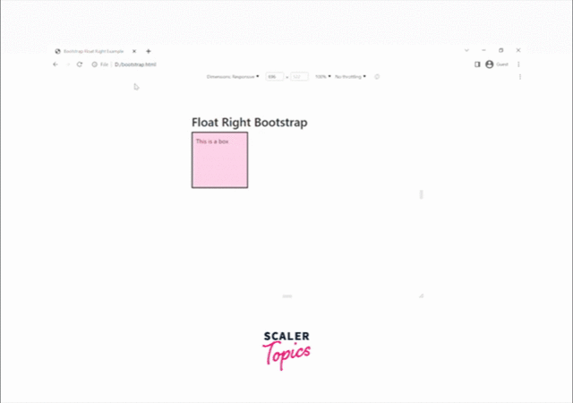
The Basic Class, With class=”float-right”
Now, let us understand how to use the basic class=".float-right" to float an element to the right of a page with the help of a code example.
Output:
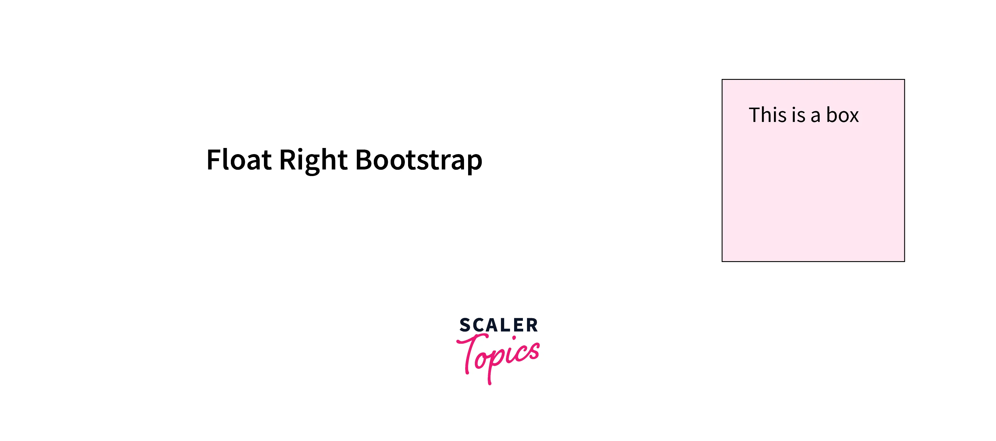
As you can see in the above output, the box is shifted altogether to the right side of the page just by using the .float-right utility.
The Responsive Float-right Example
Now, let us see an example of a responsive float-right utility for medium-sized devices with the help of a code example.
Output:
As you can see in the above output, as soon as we switch to a medium-sized screen or more, the box is automatically shifted to the right, otherwise, it stays on the left.
The Responsive Float Right for All Screen Size
Now, let us see an example of the responsive float right utilities for all screen sizes with the help of a code example.
Output:
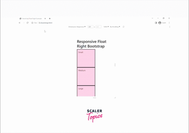
As you can see in the above output, based on the screen sizes, the boxes are shifted to the right side of the screen.
Conclusion
- The bootstrap float right is used to float an HTML element to the right side of the screen.
- The responsive float right utilities are used for floating the elements to the right based on the screen width and sizes.
- The basic class for floating an element to the right is .float-right whereas responsive floating right classes are .float-sm.right, .float-md-right, .float-lg-right, etc.
- The responsive floating classes work for the specified screen size and above and have no effect when the screen size is smaller than the specified size.
 Google
 Amazon
 Microsoft
 Flipkart
 Adobe1200+ more