Button CSS
 FREE
FREE

In HTML, the <button> tag creates buttons, which can be styled using CSS. Buttons enable user interaction, such as responding to click events, and are widely used in web design. They serve various purposes, such as submitting forms or triggering dialog boxes. Buttons can be created in three ways: using the <button> tag, <input type="button">, or an <a> anchor tag styled to resemble a button. This guide will cover styling buttons with CSS, applying various properties, adding animations, and exploring pre-built CSS button libraries for enhanced user interaction.
1. Using < button > Tag :
In HTML, the <button> tag is used to define a clickable button. The content is submitted using the <button> tag. Inside <button> element we can put text and add ( <br>, <i>, <b>, <img>, <strong>) etc.
The following table represents the different attributes of buttons.
| Attribute Name | Value | Description |
|---|---|---|
| Type | button | State the type of Button |
| Type | Submit | Type of Button used for submitting data |
| Type | Reset | Type of Button used for Resetting all the data of form |
| Name | name | State the name of the button |
| Value | text | State an initial value for the button |
| autofocus | autofocus | State that a button should automatically get focus when the page loads |
| disabled | disabled | State that a button should be disabled |
| form | form-id | To specify which form the button belongs to |
| formaction | URL | State that where to send the form data when the form is submitted. Note : Only for button type= "submit" |
| formmethod | get/post | State how to send the form-data (which HTTP method to use). Note : Only for button type="submit" |
| formtarget | self, blank, parent, framename, top | State that where to display the response after submitting the form. Note : Only used for type="submit" |
By Specifying the type attribute of a Button, we can tell the browser what type of a button. There are three types of button attributes :
1) Submit : On click of this button, the form data will transfer to the URL/page mentioned in the form action attribute.
2) Reset : On click of this button, all the fields will be empty.
It is as shown in the image given below :

Default Button: Here, we couldn't mention any class or id for our Button, So any CSS Style is not applicable for that particular Button. This is called the Default button.
Syntax :
Example : Different types of Buttons
Output:

2. Using < input > Tag :
Using the <input> tag, we can simply create a button by adding a value of input type as a button and style it using CSS. Inside <input> we can not add any tag like <i>, <b>, <br>, <strong>,<img> as <button> tag.
Syntax :
3. Using < a > Tag :
We can design a button by applying different CSS Styles on the <a> tag.
Syntax :
Example : Create CSS Buttons using different HTML tags
Output:

Transform Your Career
Choose from our industry-leading programs designed for career success
Modern Software and AI Engineering Program
Master full-stack development with AI integration

 +1000 more
Modern Data Science and ML with specialisation in AI
Advanced data science techniques with AI specialization
+1000 moreAdvanced AIML with Specialisation in Agentic AI
Deep dive into AIML with focus on Agentic systems
+1000 moreDevOps, Cloud & AI Platform Engineering
Build and manage AI-powered cloud infrastructure
+1000 moreAI Engineering Advanced Certification by IIT-Roorkee
Premier AI engineering certification from IIT-Roorkee
Basic Style of CSS Buttons
1. Button Colors :
We can add a background color to a button using the background-color property and set the font color using the color property in CSS.
Syntax :
Example: To set the background color and font color of a button in CSS
Output :

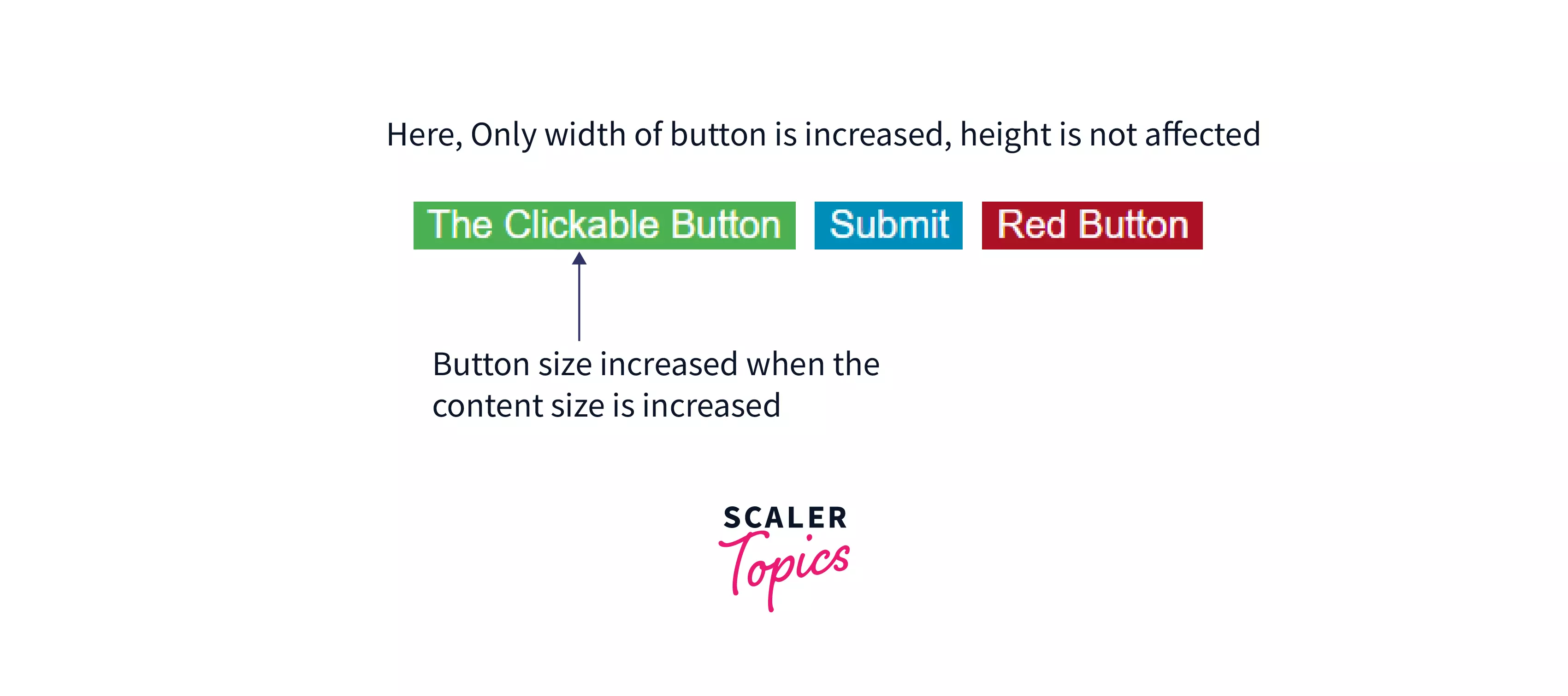
2. Button Sizes :
We can change Button size using different ways. The default size of a button is based on the content of a button. The width of a button will automatically increase when the content inside button is increased, As per the following image :
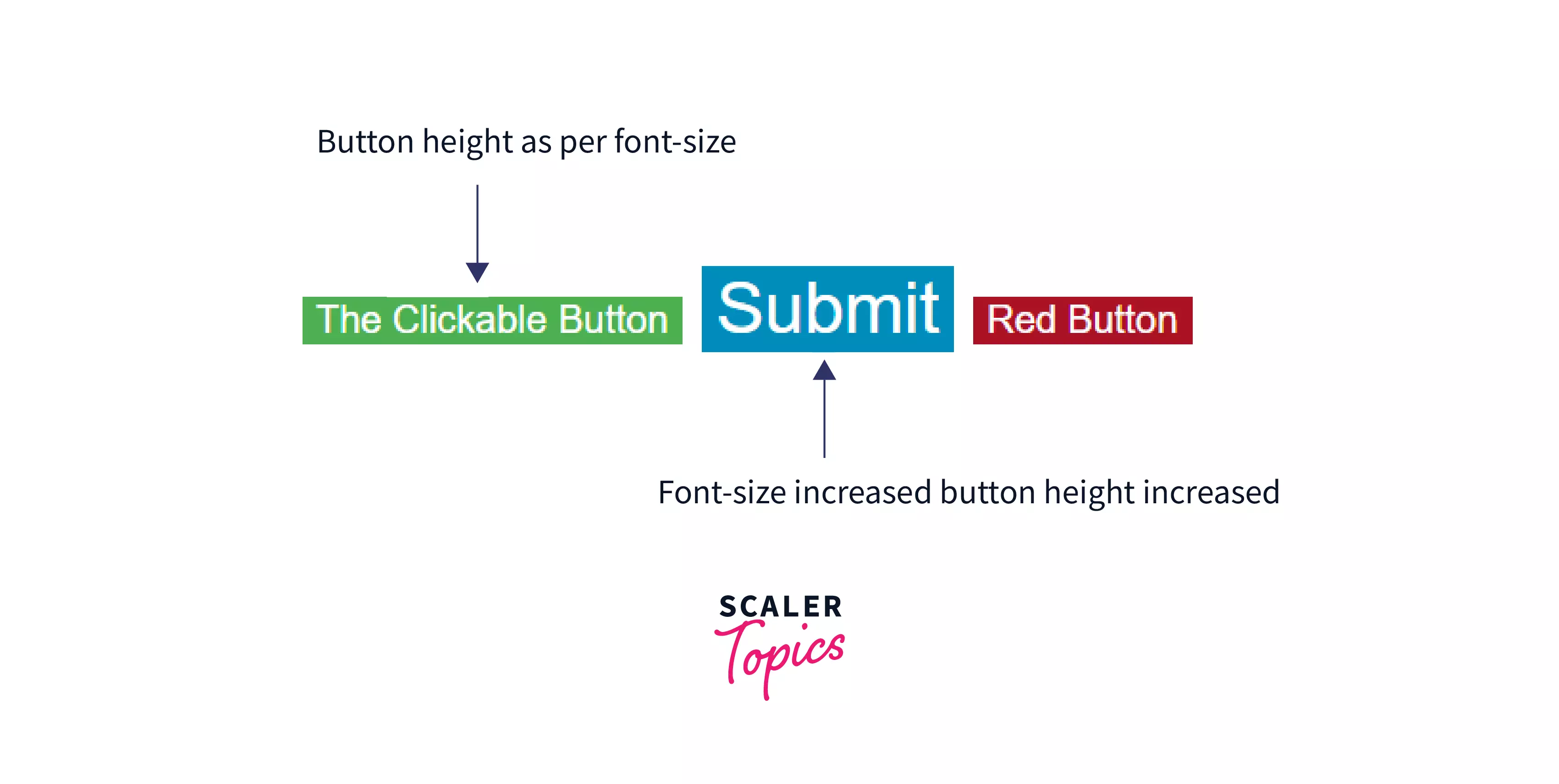
1) Using font-size property :
In CSS, Button height will automatically change increase/decrease when we change (increase/decrease) the font size of the Button.
Syntax :
Example : CSS Button sizes using font-size property
Output :

2) Using padding property:
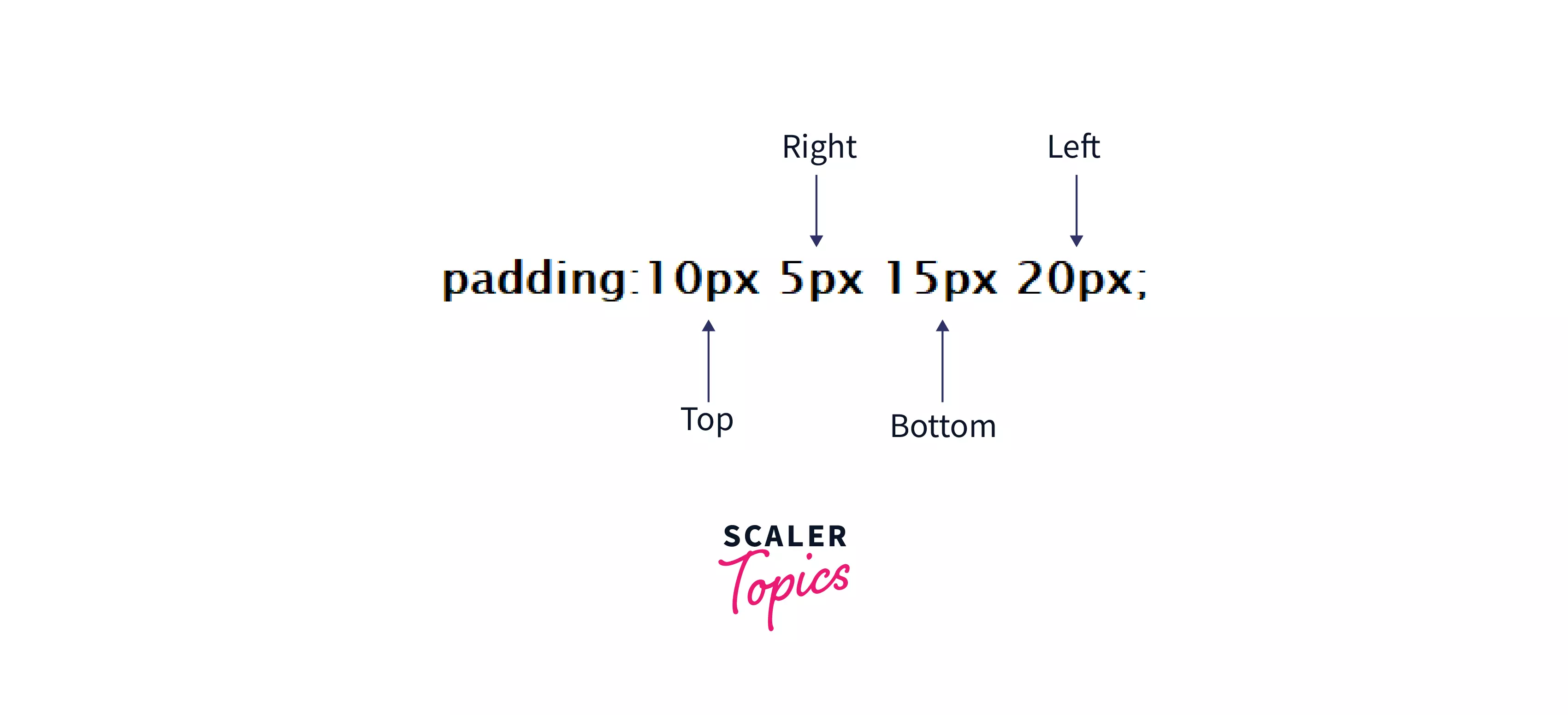
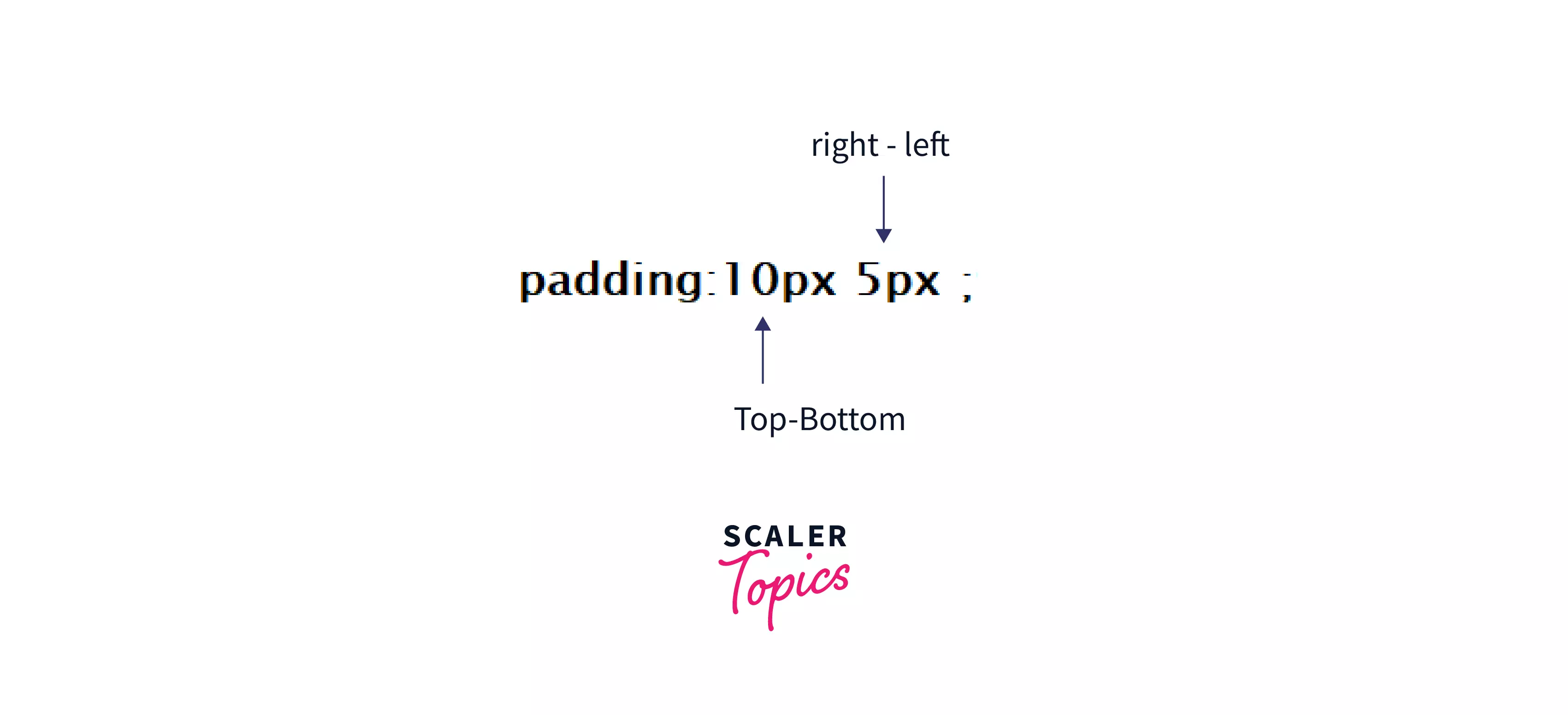
In CSS, Padding can create a space between the content and border of an element. Also, it creates extra space inside the element. Button size width and height will automatically change (increase/decrease) when we change the value of the padding property.
Following are the different syntaxes and values of padding property,
-
If the padding property has four values :
-
If the padding property has three values :

-
If the padding property has two values :
-
If the padding property has one value :
Example : CSS Button sizes using padding property
Output :

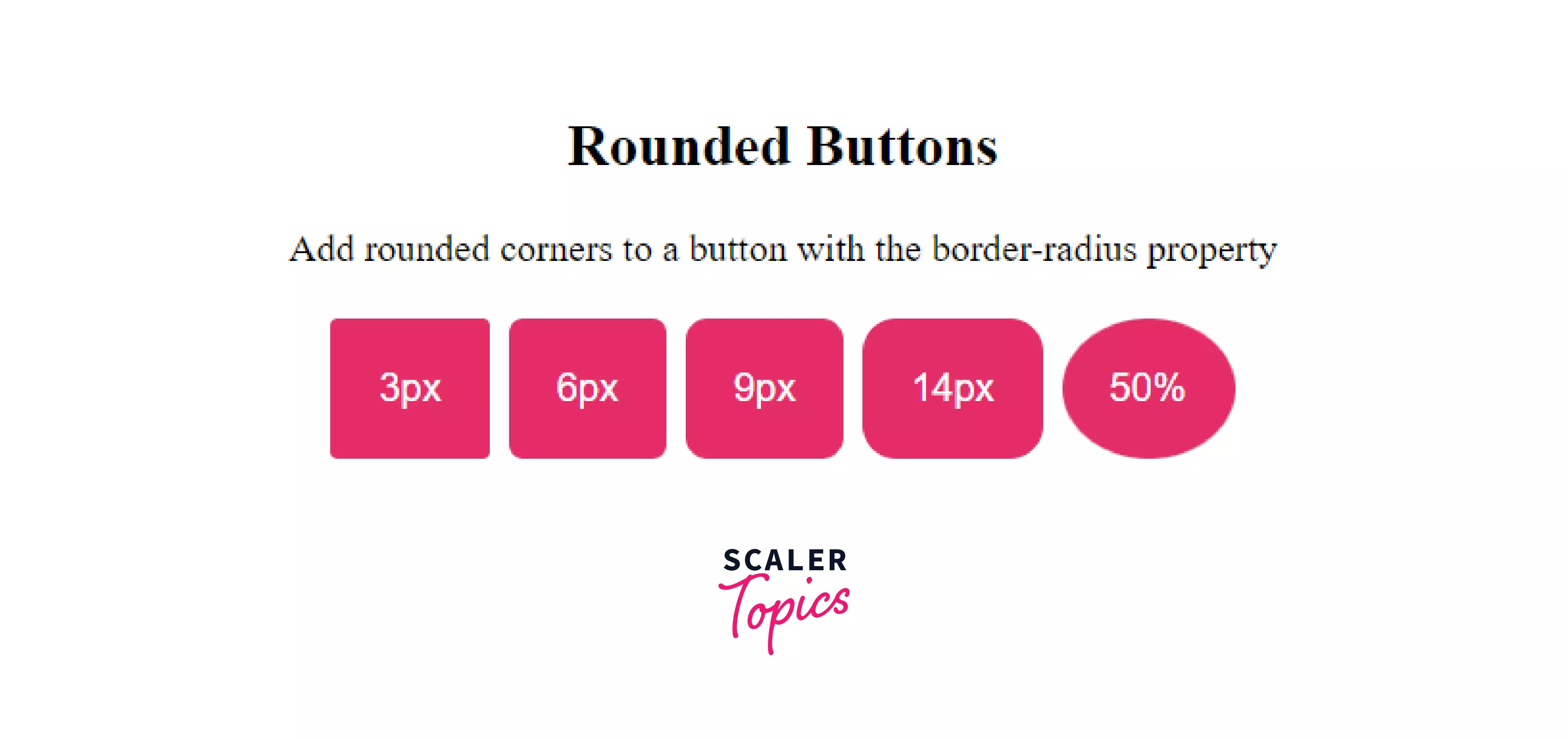
3. Rounded Buttons :
We can make a Rounded Button in CSS using the border-radius property. We just have to add this property in button style, and it makes the Button rounded as per the value of the border-radius property. We can assign a value in pixels(px) or in percentage(%) to border-radius property in CSS.
Syntax :

Example: Give a curve or make rounded CSS Buttons using the border-radius property.
Output:
Turn Learning into Career Growth
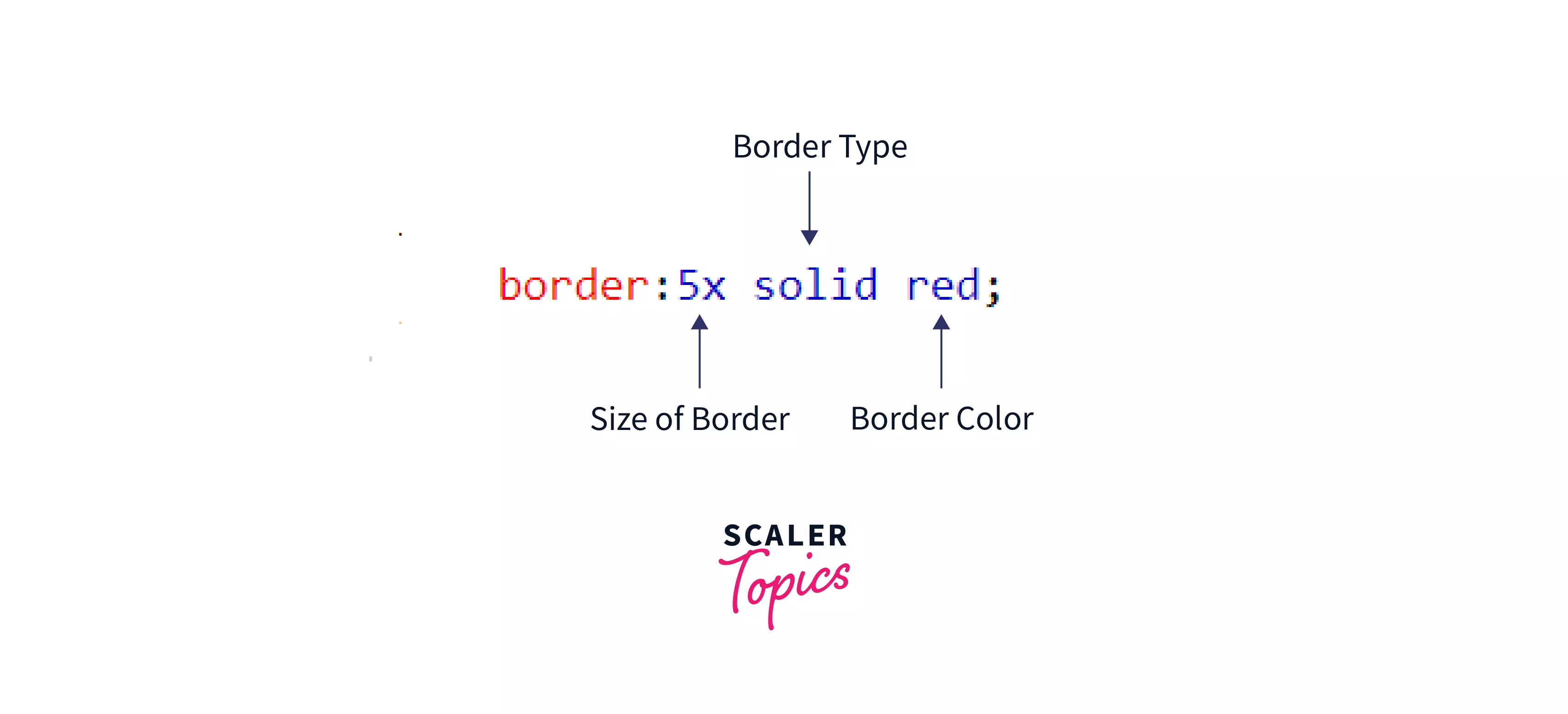
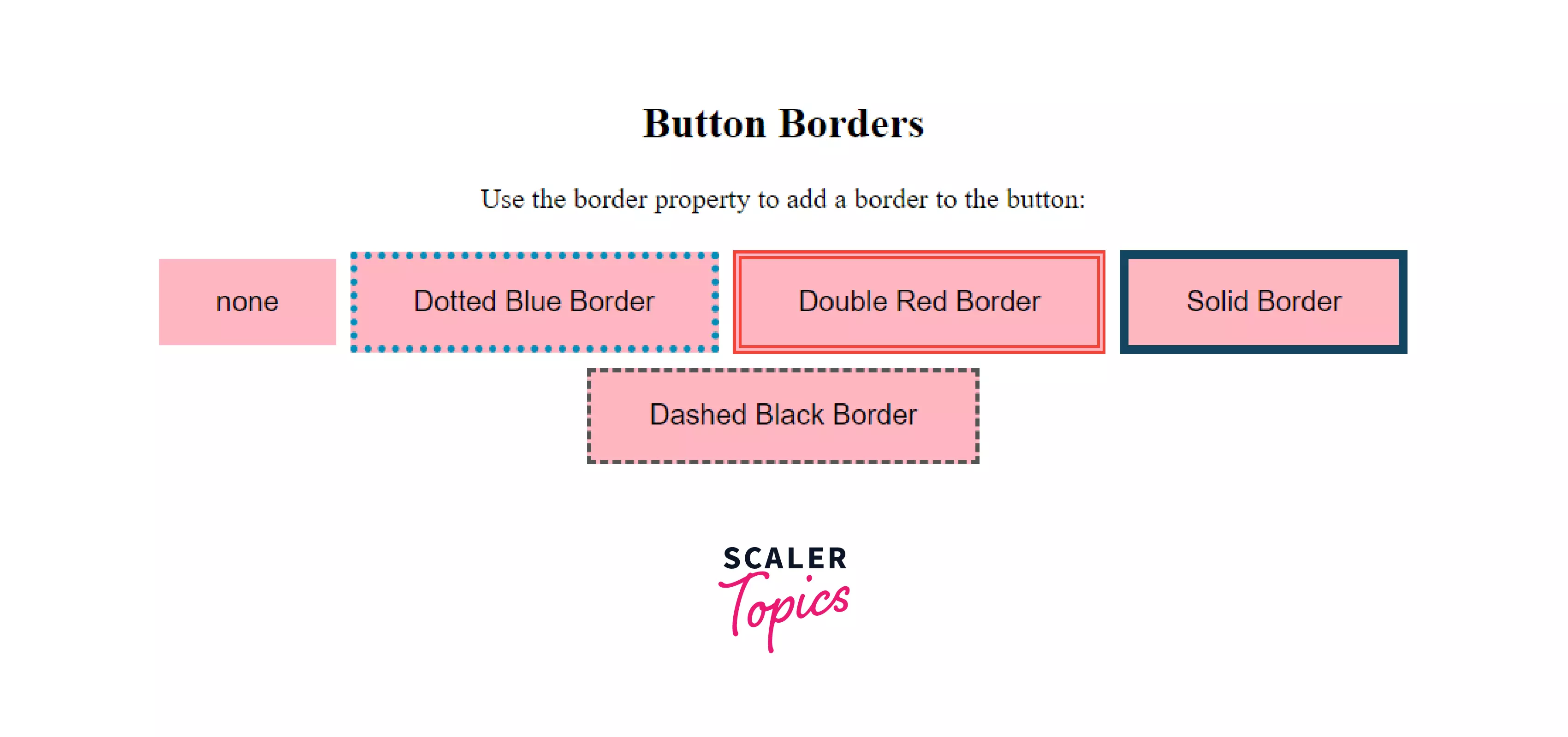
4. Button Borders :
We can add borders to the Button in CSS by adding the border property in button style and style Button border using different types of border properties like border color, border type, border size, etc.
Syntax :
Example: Different types of Borders on CSS Buttons using border properties
Output:
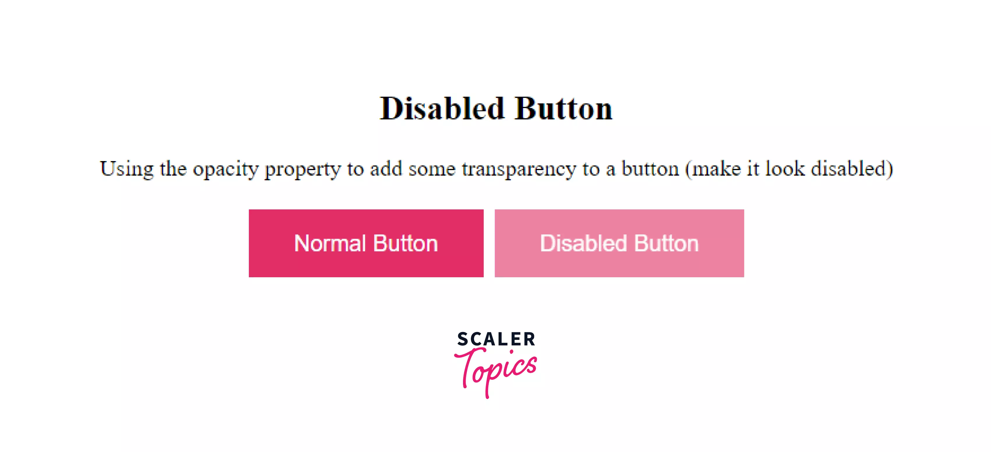
5. Disabled Buttons :
A Disabled Button is an unusable and unclickable Button. We can create it by using two ways,
-
By using the disabled attribute of the <button> element
Syntax :
-
By using different CSS properties: To create a disabled button, We need to use the opacity property to add transparency and make a button look like a disabled button and a cursor property with a value not-allowed. It will display a no parking sign when the mouse hovers over the Button in CSS.
Example: Make Disabled Button using different CSS properties on CSS Buttons.
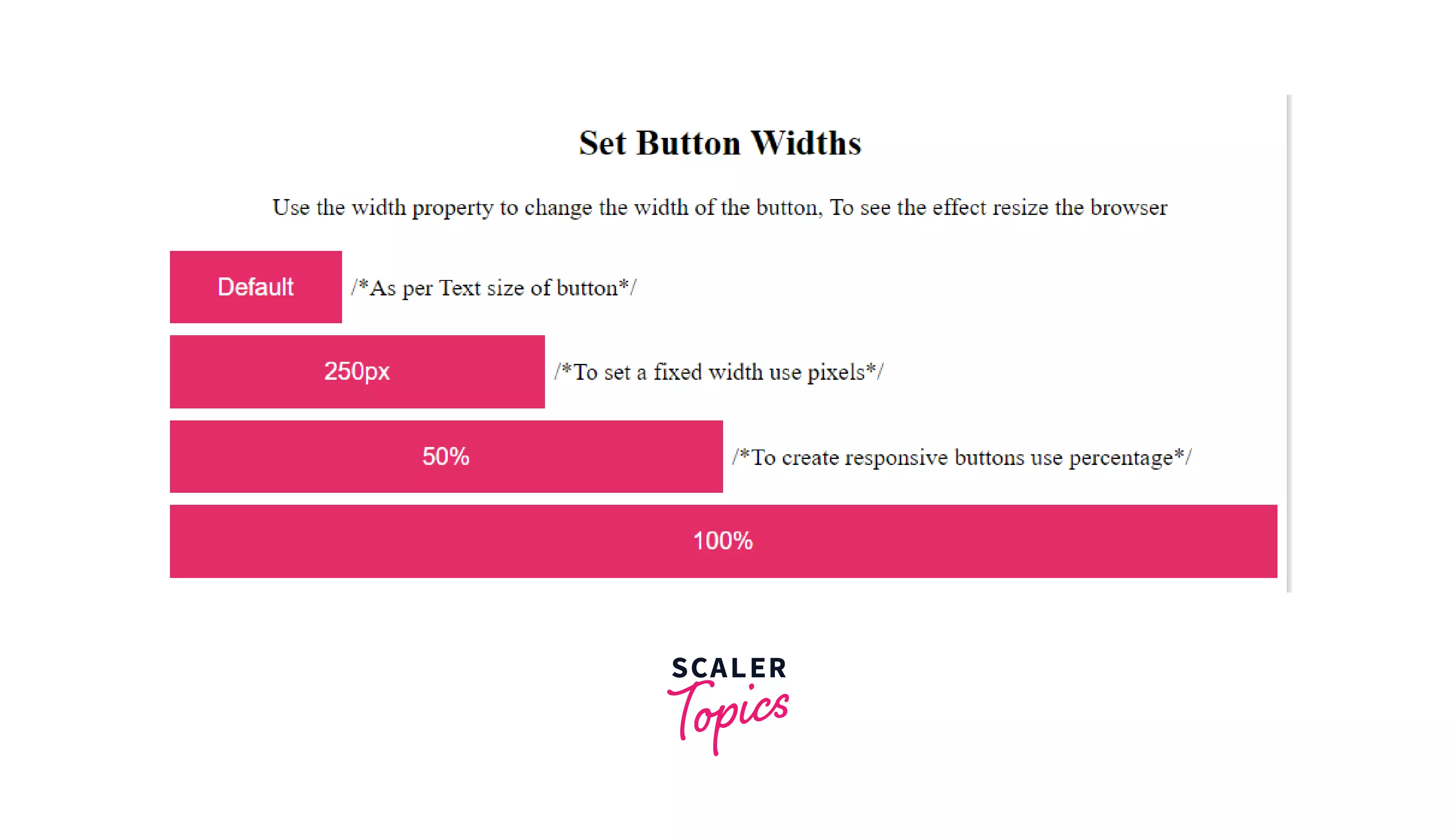
6. Button Width :
The default size of the Button is determined by the size of the text inside the Button. We can change the width of a button using the width property in CSS Button. The value of width will be in percentage or pixels.
Syntax :
Example : Customize Button Width using the width property in CSS Buttons
Output :
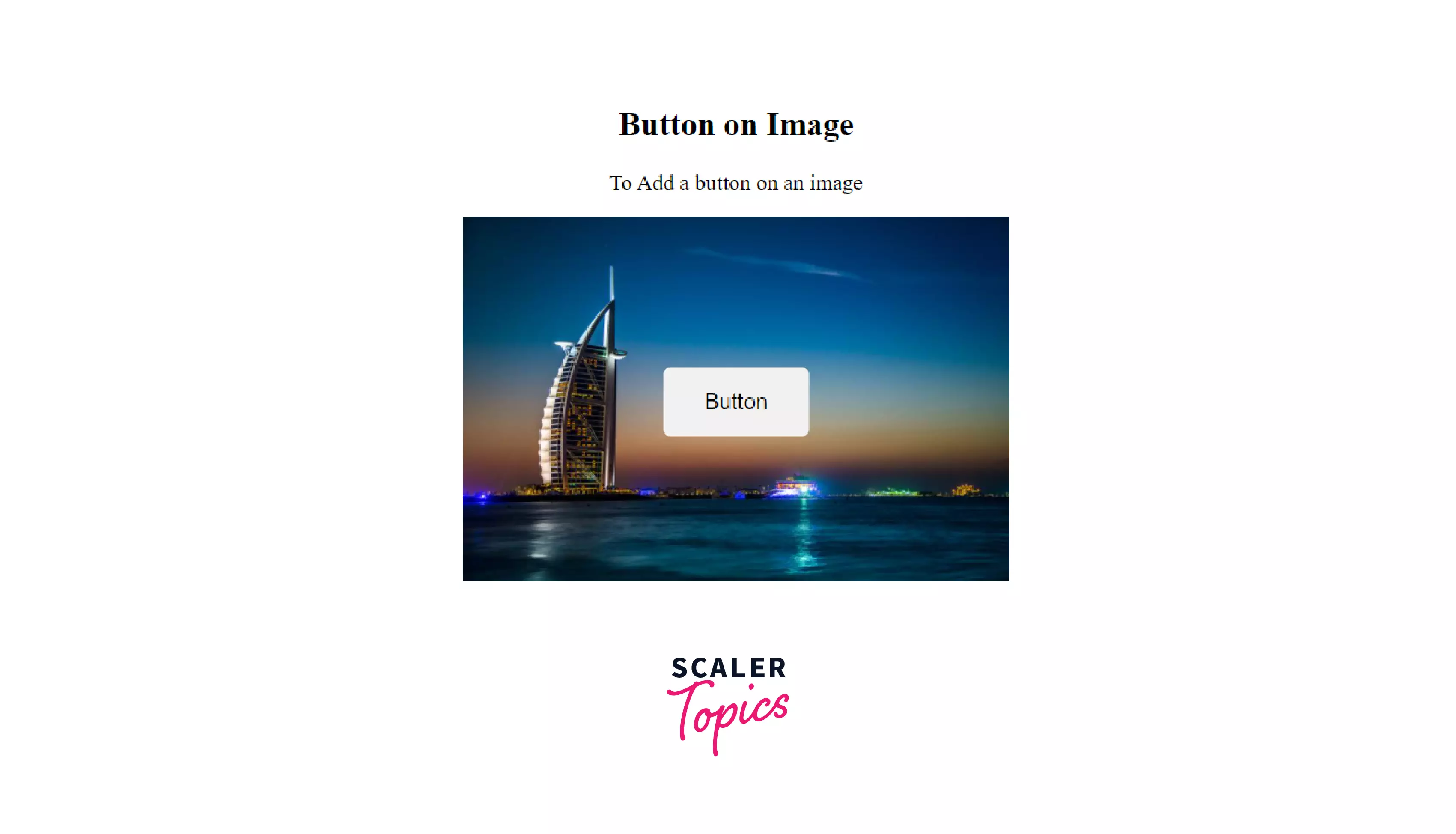
7. Button on Image:
We can add a Button to the image by using HTML elements and CSS Properties. To add a button to the image, we have to take one <div> tag and set its position: relative in CSS. Then add an image using the <img> tag and sets its width:100%, so that image can fit in the container. After that take <button> and make its position: absolute and use other CSS properties for other customization.
Syntax : General Code Snippet for Button on Image
Here following is an example of it,
Example: Button on image with different using different CSS properties in CSS Buttons.
Output :
Scaler Placement Report and Statistics
Scaler learners achieved 2.5x salary growth with average post-Scaler CTC reaching ₹23L.
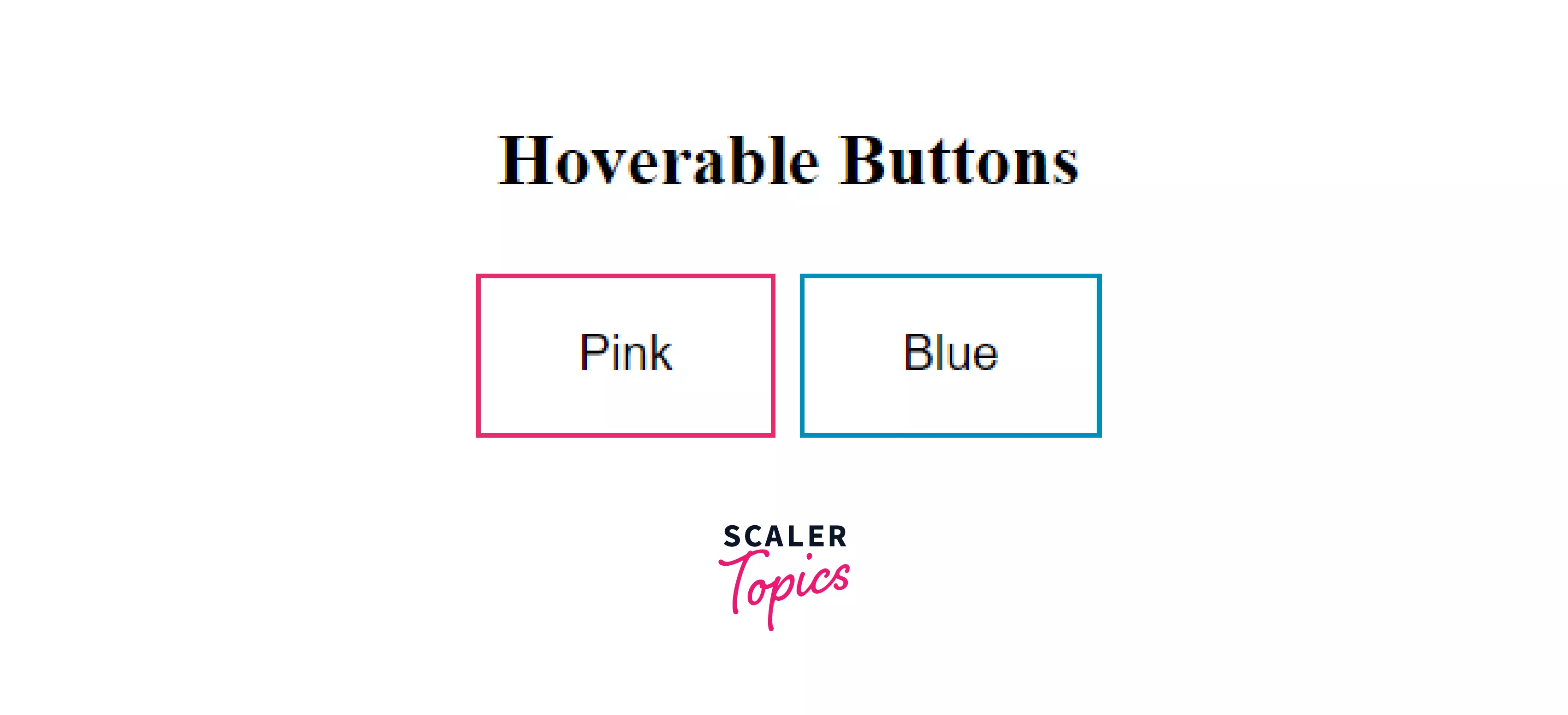
8. Animated Button :
We can add different types of Animation to the CSS button. Like
- Color change when mouse hover on Button,
- Display the pressed effect by clicking on it,
- Create a shadow when the mouse hover etc.
We can add these Animations by applying different types of CSS properties.
The followings are some examples of Animations.
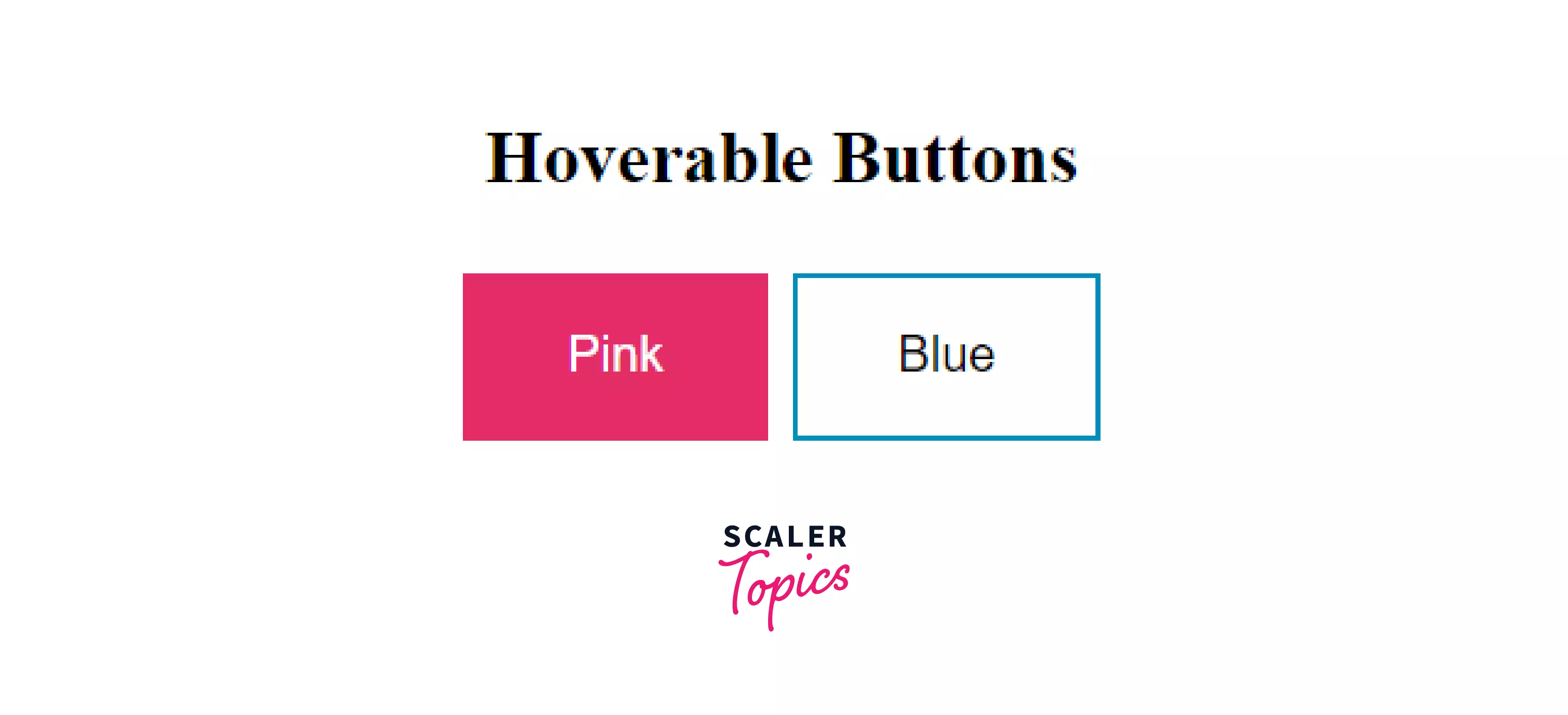
Example 1: Change the color of a button when the mouse hovers on it
For this : hover selector is used to change the style of a button when the mouse hovers on it. To determine the speed of the hover effect, we use the transition-delay property.
Syntax :
Example :
Output: Before hover effect
Output: After hover effect
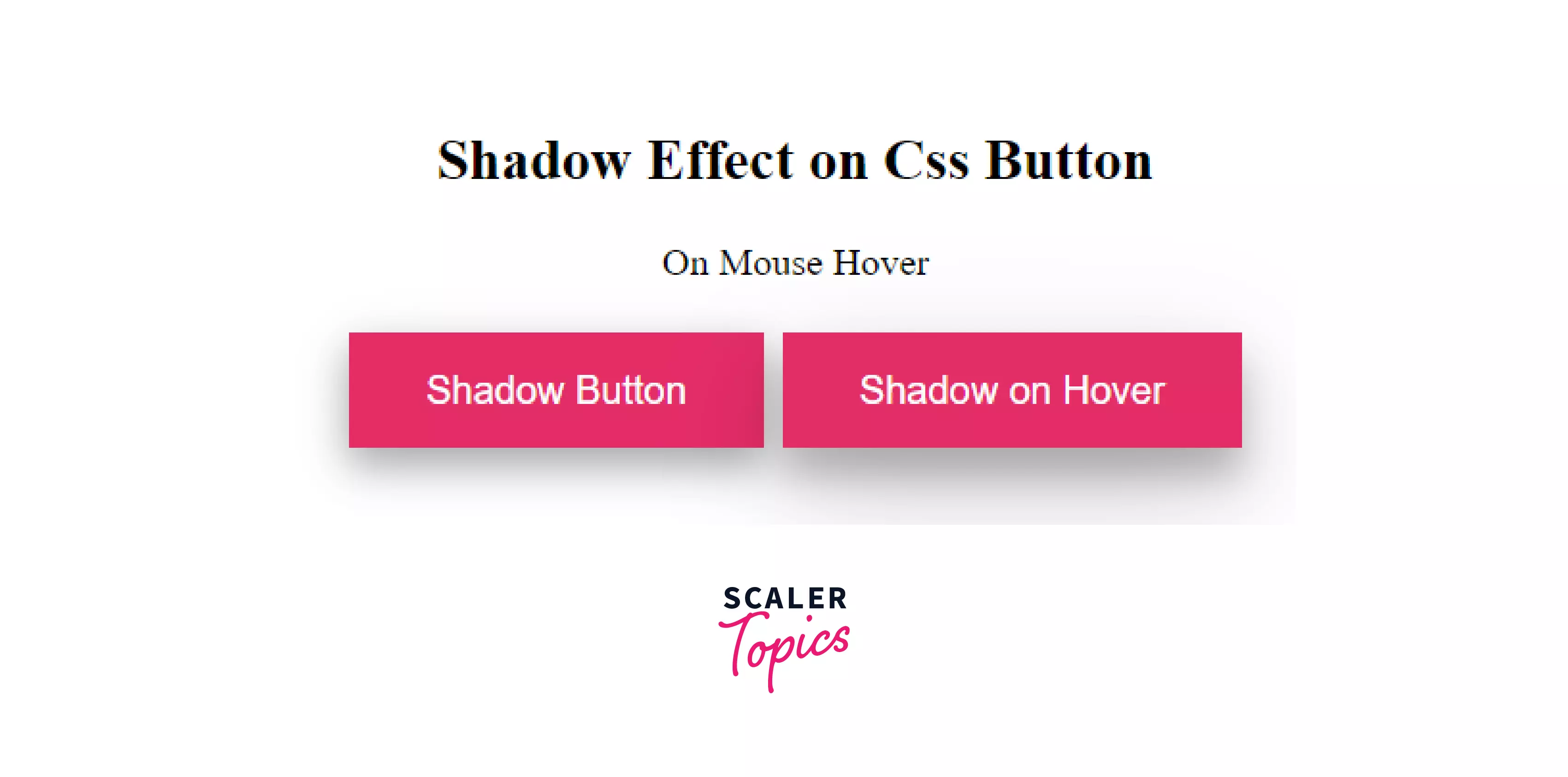
Example 2: Shadow effect when mouse hover on Button in CSS
This box-shadow property is used with its different types of values. like,
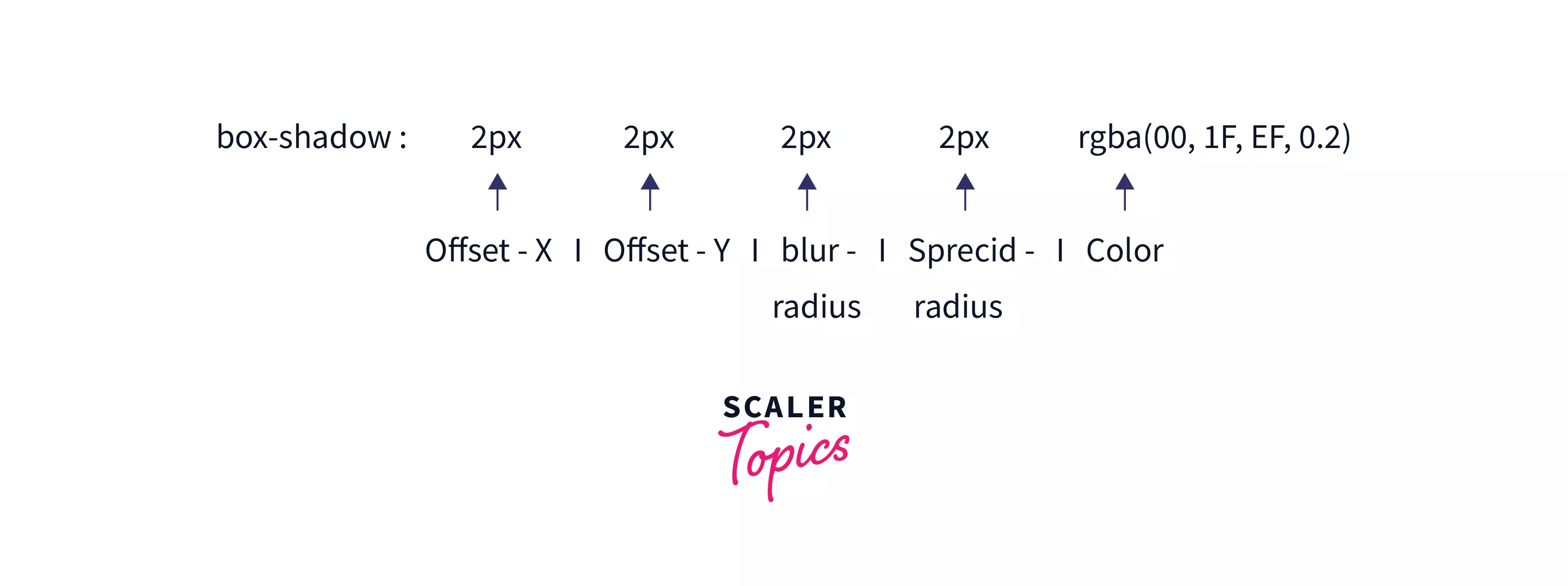
Syntax :
Example 3: Shadow effect when mouse hover on Button in CSS
Output :

Scaler Placement Report and Statistics
Scaler learners achieved 2.5x salary growth with average post-Scaler CTC reaching ₹23L.
Conclusion
- A Button is an HTML element that is a very important part of a Webpage for user interaction.
- There are various types of style buttons using CSS style, Classes, and Packages.
- To change the size of the Button using font size and padding property.
- To change the shape of the Button using the border-radius property
- To make the disabled Button by increasing or decreasing the opacity of the Button in CSS.
- To change the width of the Button using the width property in CSS Button.
- To get button on image using <image> tag, transform,top,bottom, right, left, position properties in CSS button
- To get Animations on Button using : hover selector,box-shadow property
 Google
 Amazon
 Microsoft
 Flipkart
 Adobe1200+ more