Churn Prediction in Telecom Industry

Overview
Customer churn, also known as customer attrition, refers to the process of customers stopping the use of a company’s product or service. It is an important area of analysis for companies in the telecom industry because customer churn can have a significant impact on a company's revenues and profitability. In this article, we will build ML models to predict customer churn in the telecom industry.
What Are We Building?
In this project, we will use the churn dataset provided by IBM. You can download the dataset from here. IBM provided customer data for the Telecom industry to predict the churn of customers based on demographic, usage, and account-based information. It consists of around 7000 records and 21 columns. The feature Churn represents whether the patient has churned or left the company or not. Our objective is to build a machine learning-based solution to predict the churn of customers in advance based on their demographics, service usage, and other information.
Pre-requisites
- Python
- Data Visualization
- Descriptive Statistics
- Machine Learning
- Data Cleaning and Preprocessing
How Are We Going to Build This?
- We will remove any inconsistent or erroneous records from the dataset during the data cleaning stage.
- We will perform exploratory data analysis (EDA) using various visualization techniques to identify underlying patterns and correlations.
- We will perform cluster analysis to segment the customers who have stopped the service or churned.
- Further, we will train and develop a Decision Tree, Random Forest, and XGBoost model and compare their performance.
Transform Your Career
Choose from our industry-leading programs designed for career success
Modern Software and AI Engineering Program
Master full-stack development with AI integration

Modern Data Science and ML with specialisation in AI
Advanced data science techniques with AI specialization
Advanced AIML with Specialisation in Agentic AI
Deep dive into AIML with focus on Agentic systems
DevOps, Cloud & AI Platform Engineering
Build and manage AI-powered cloud infrastructure
AI Engineering Advanced Certification by IIT-Roorkee
Premier AI engineering certification from IIT-Roorkee
Requirements
We will be using below libraries, tools, and modules in this project -
- Pandas
- Numpy
- Matplotlib
- Seaborn
- Sklearn
- xgboost
Scaler Placement Report and Statistics
Scaler learners achieved 2.5x salary growth with average post-Scaler CTC reaching ₹23L.
Building the Churn Predictor
Import Libraries
Let’s start the project by importing all necessary libraries to load the dataset, perform EDA, and build ML models.
Data Understanding
- Let’s load the dataset in a pandas dataframe and explore variables and their data types.
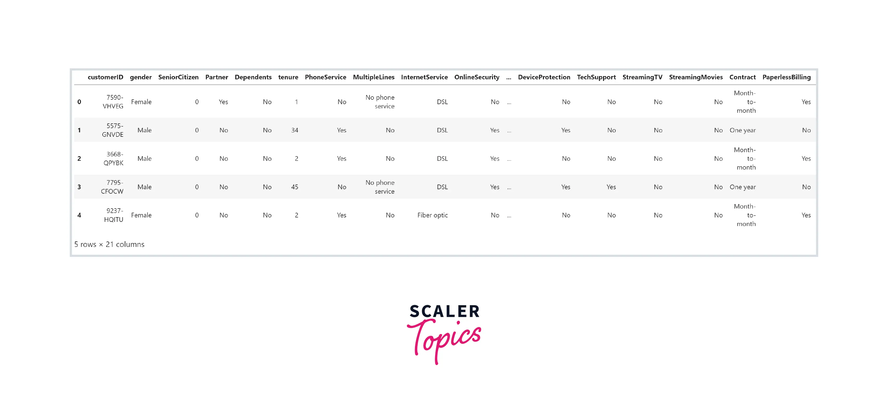
Output:
- As we can see, this dataset has 21 features, with a mix of categorical and numerical features.
Turn Learning into Career Growth
Data Cleaning
- As you can see in the above figure, the datatype of the TotalCharges feature is an object, but it should be a float64 as it is a numeric feature. It is because some of the values in this feature are just empty strings. In this step, we will remove records containing empty strings in the TotalCharges feature.
Exploratory Data Analysis
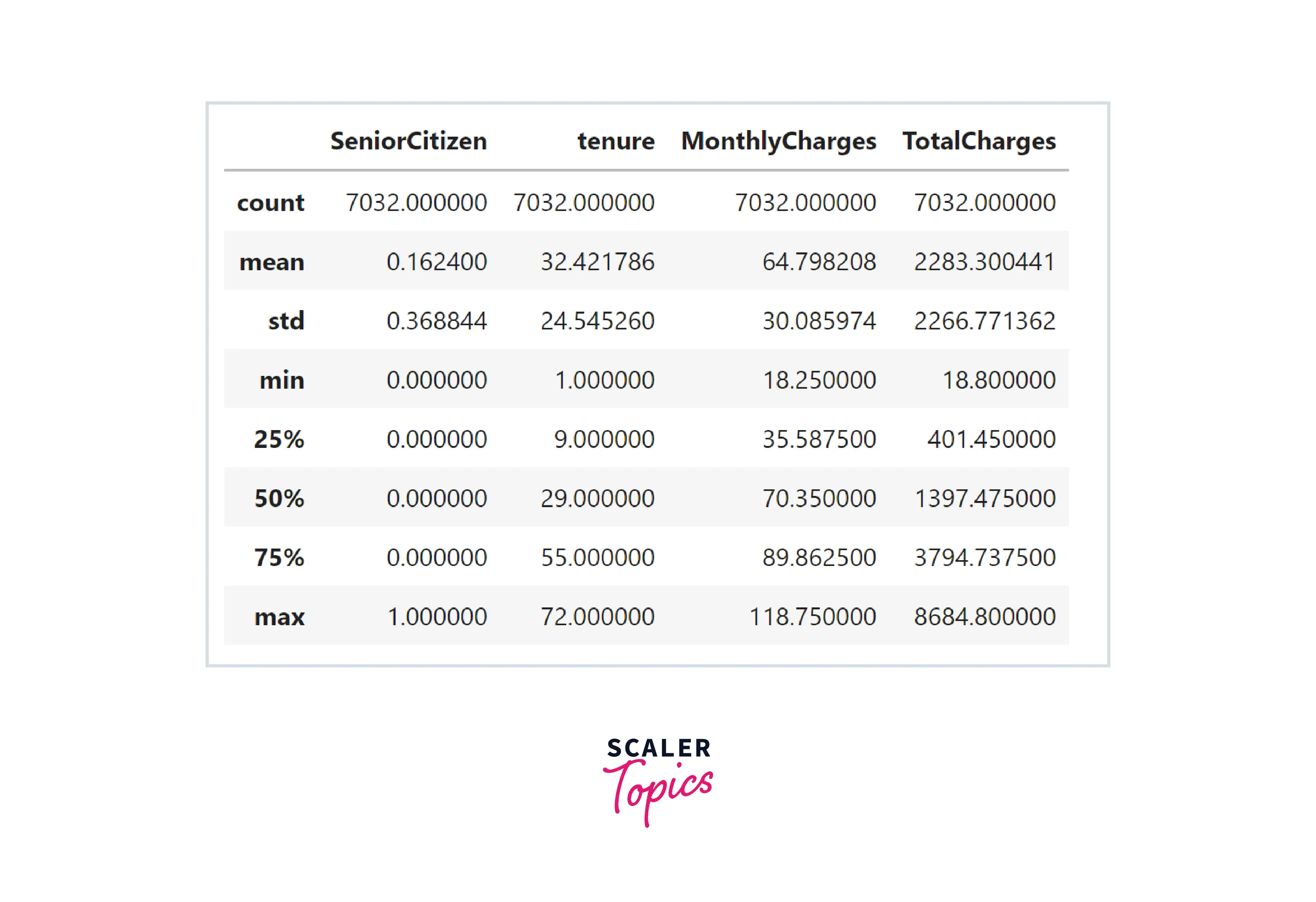
- Let’s explore summary statistics of the numerical features in the dataset. As you can see in the below figure, the mean tenure duration is 32 months, the average monthly charges are 64, and the average total charges are 2200.
- Let’s explore the distribution of the labels in target variables, i.e., the ratio of the customer who churned vs. did not churn. In this dataset, around 26% of the records belong to customers who churned and stopped their service use.
Output:
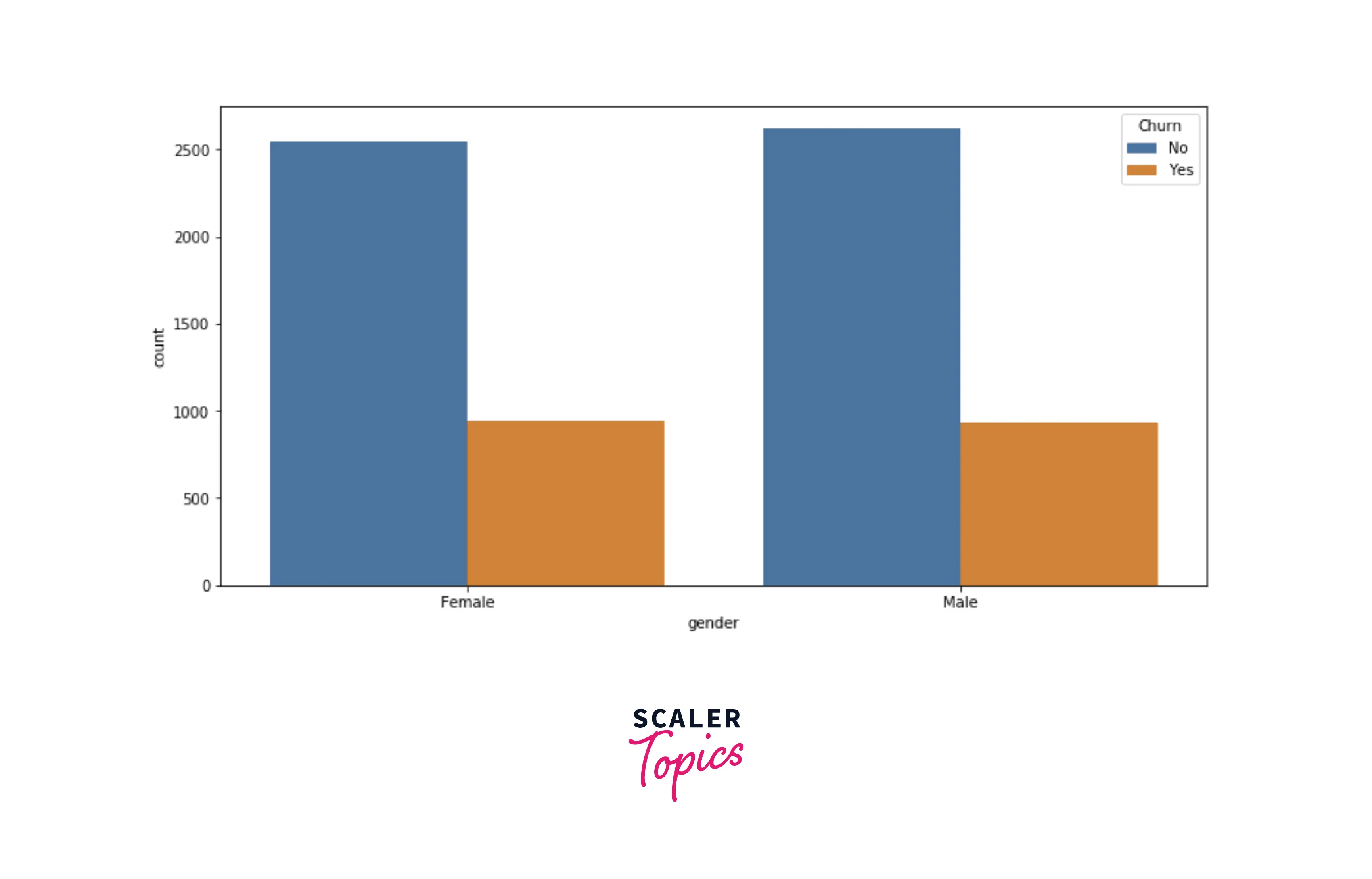
- Let’s explore the distribution of the gender in the dataset. Both gender, male and female, have equal distribution for both target labels.
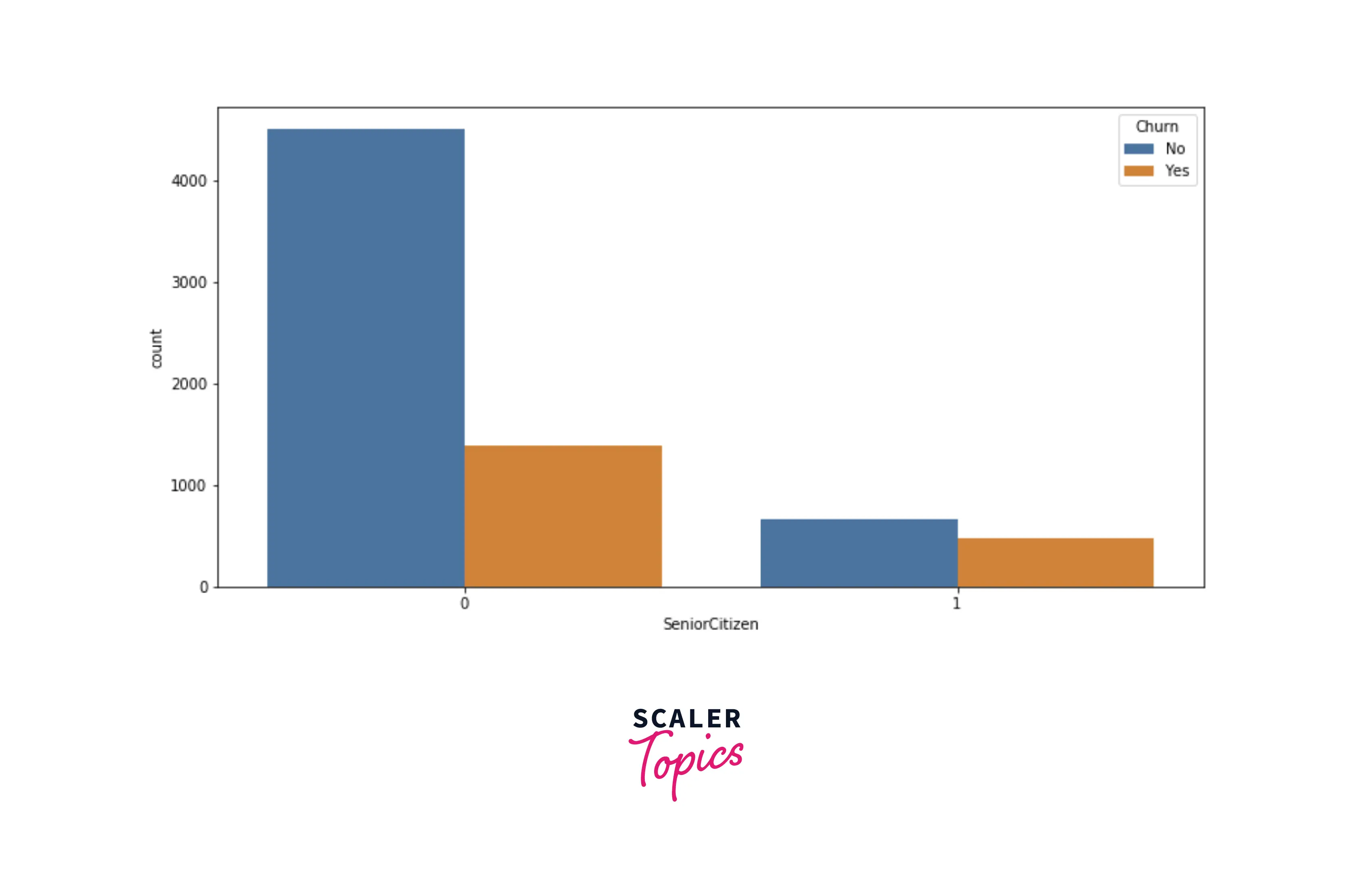
- Now, we will explore the distribution of the senior citizen class based on the target variable. As you can see below, senior citizens are likelier to churn than non-senior citizens.
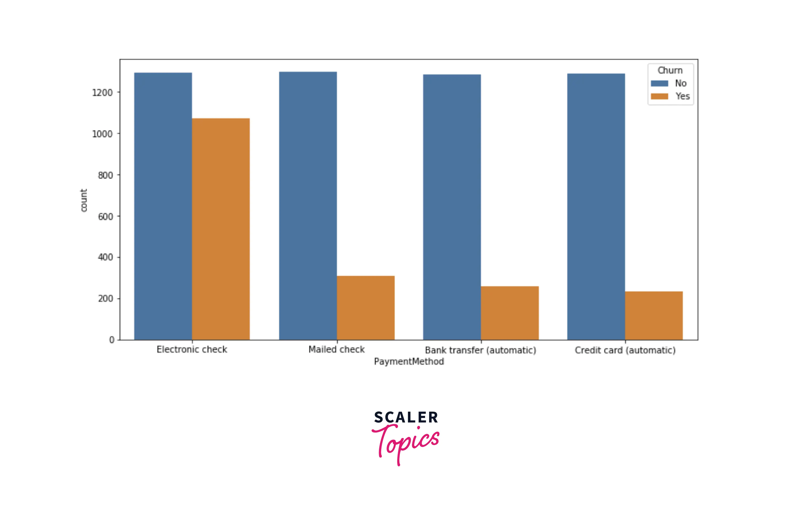
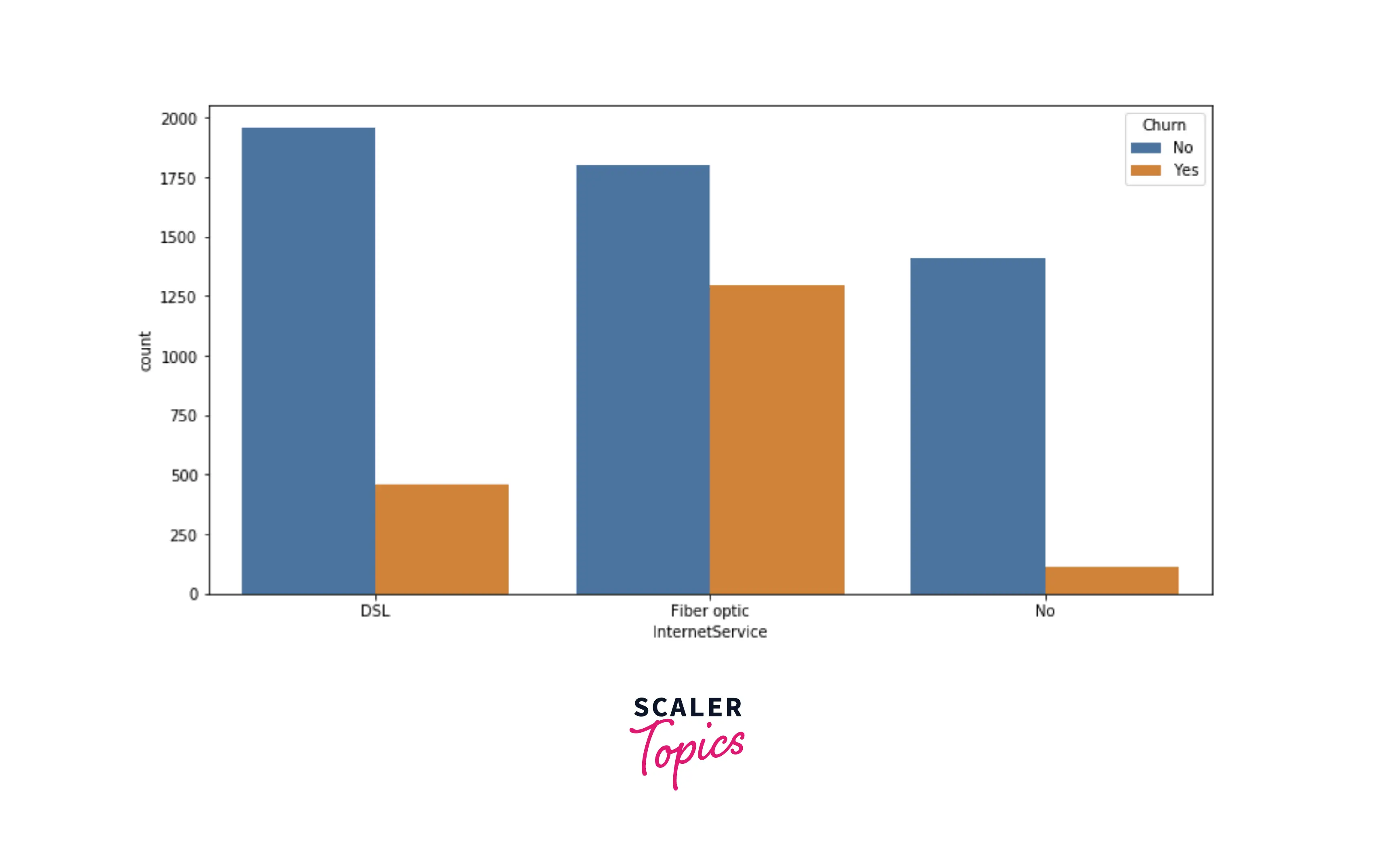
- Now, we will explore the distribution of the payment method and internet services features. As you can see in the figures below, people having electronic check methods and having fiber optic as internet services are highly likely to churn compared with other sets of people.
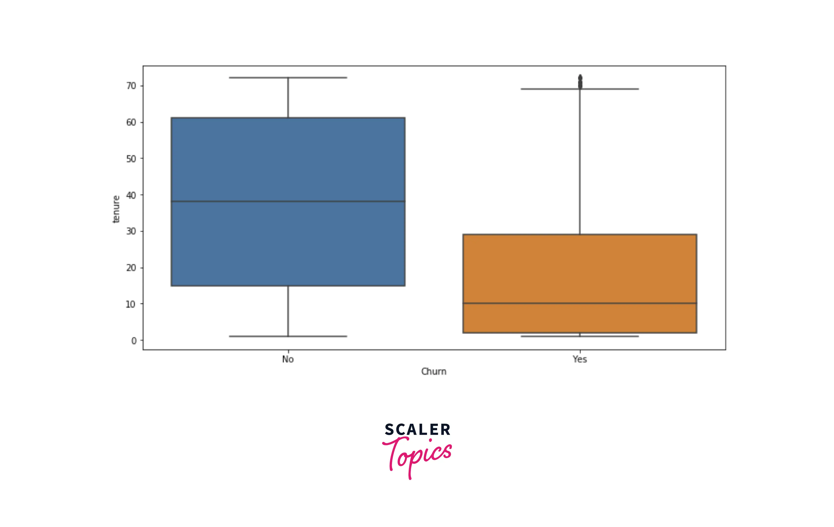
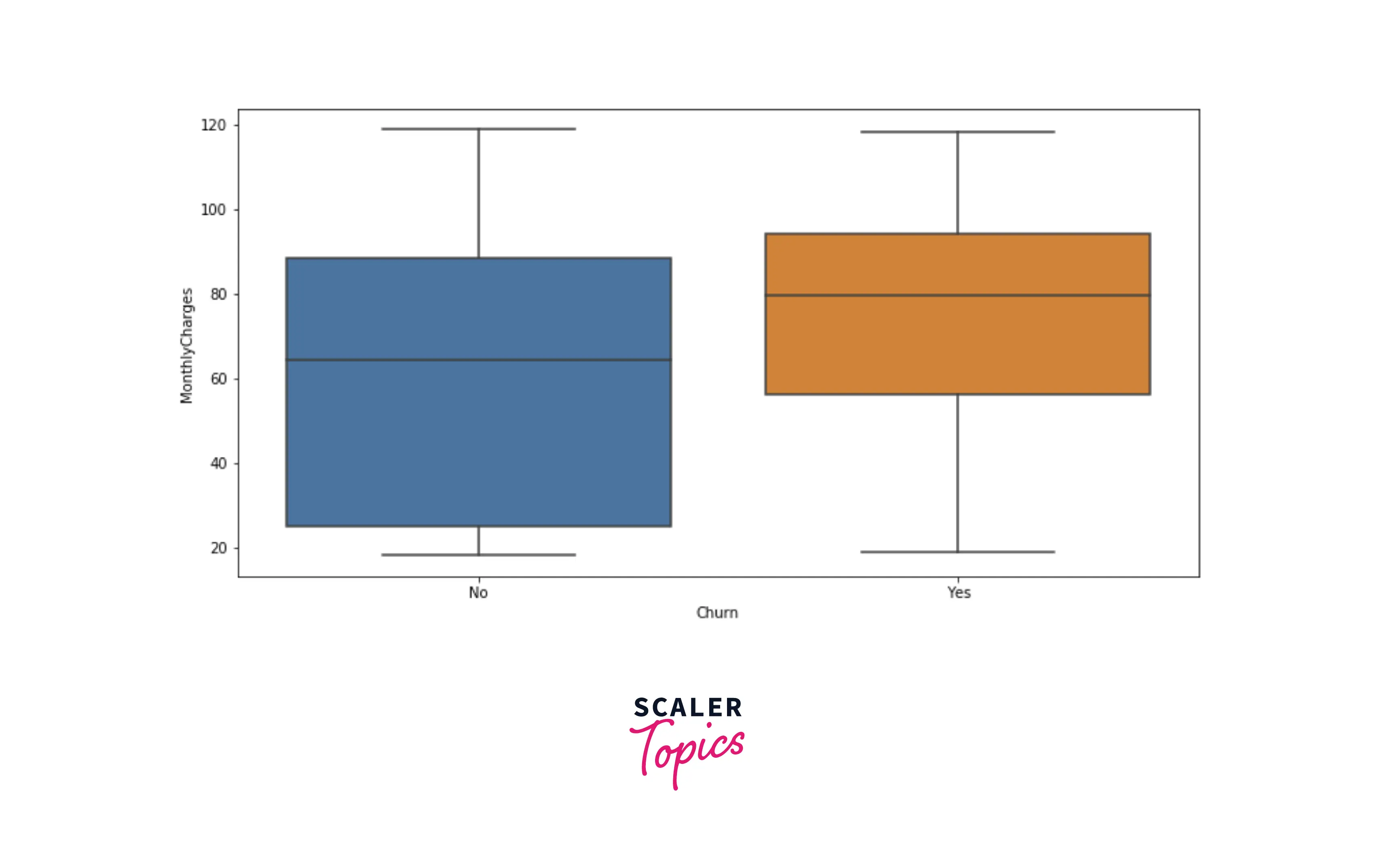
- Now, let’s explore distributions of numerical features, tenure, and monthly charges, using box plots for each target label. As you can see below, people with low tenure are likely to churn compared with people with higher tenure. Also, customers who churned are more likely to have higher monthly charges.
Cluster Analysis
- In this step, we will analyze the customers who churned using cluster analysis. We will cluster or group the churned customer based on two numerical features, tenure and monthly charges. Post clustering, we can analyze the characteristics of each cluster or group.
- For clustering, we will use the K-Means model, and to estimate the number of clusters, we will use the elbow curve method. Let’s plot the elbow curve to identify the optimal number of clusters in the data based on two features.
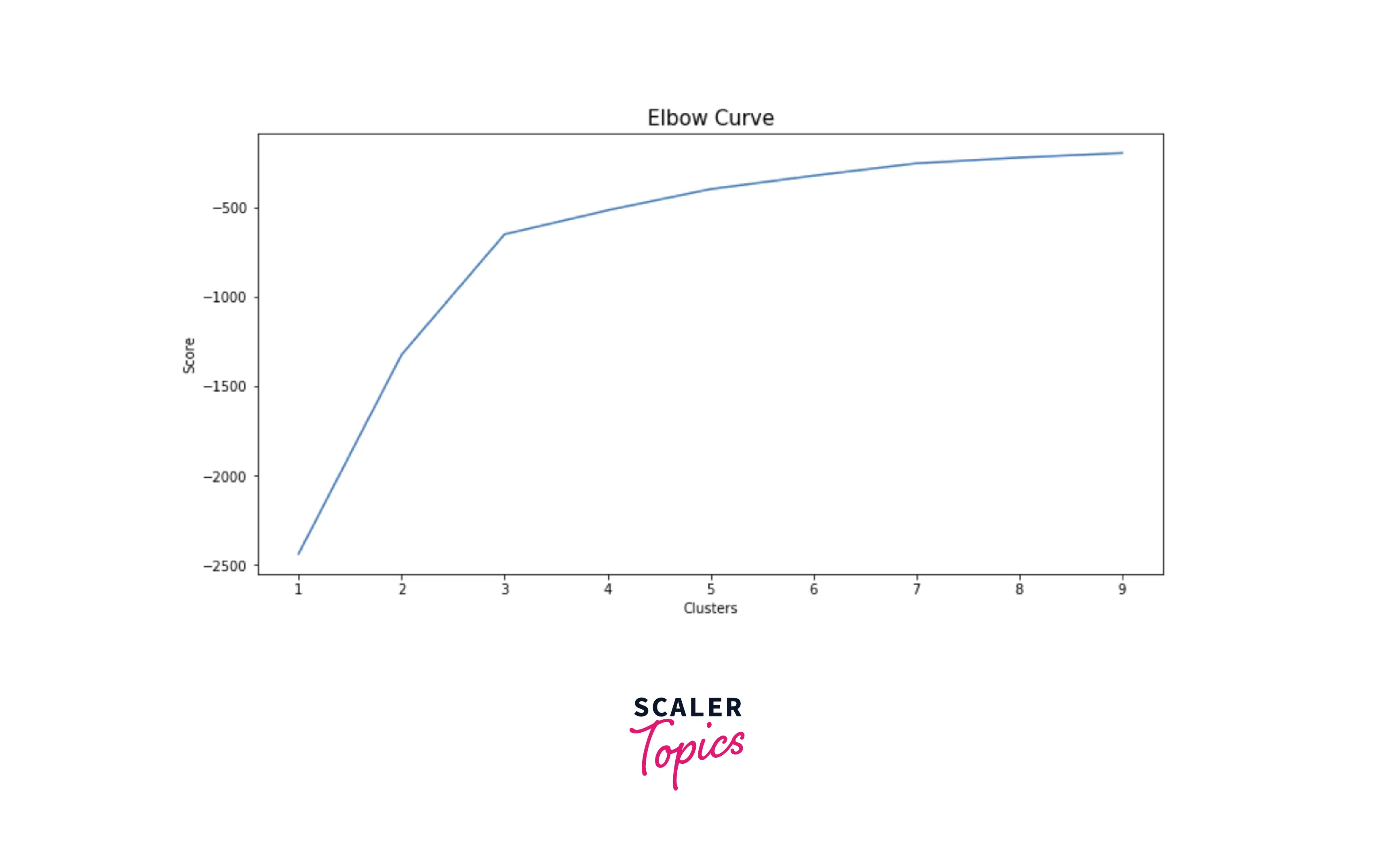
- Based on the elbow curve shown in the above figure, we can set the number of clusters to 3. Let’s cluster the customers into 3 groups based on tenure and monthly charges.
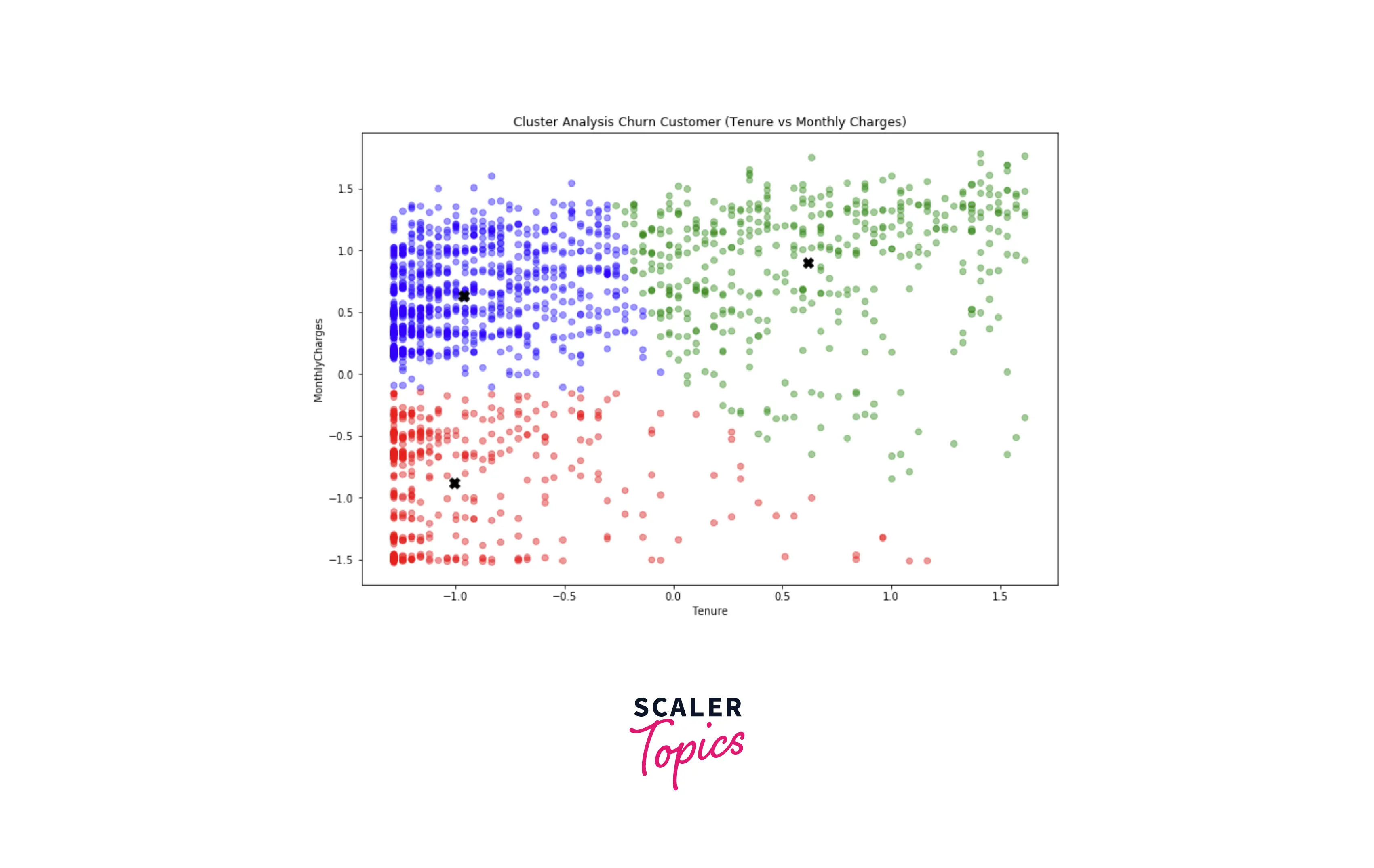
- So, based on the above figure, we can divide the churned customers into 3 groups -
- Customers with low tenure and low monthly charges (Red)
- Customers with low tenure and high monthly charges (Blue)
- Customers with high tenure and high monthly charges (Green)
- If you further analyze each group and its characteristics, you can conclude that -
- The Red group (Customers with low tenure and low monthly charges) are mostly male and have dependents.
- The Blue group (Customers with low tenure and high monthly charges) are mostly female or senior citizens.
- The Green group (Customers with high tenure and high monthly charges) are mostly male, have partners, have dependents, or senior citizens.
- Now, let’s develop classification-based machine learning models to predict the churn in the next step.
Data Preprocessing
- Before developing, we need to one hot encode all the categorical features in the dataset. Also, we will create a train and test data set with an 80:20 ratio.
Scaler Placement Report and Statistics
Scaler learners achieved 2.5x salary growth with average post-Scaler CTC reaching ₹23L.
Developing the ML Models
- Let’s first train a simple decision tree classifier and evaluate its performance. In this project, we will use accuracy, precision, and recall scores to compare and evaluate the performance of the ML models.
Output:
- As we can see in the above figure that accuracy is 79%. The precision and recall for the positive class are 60% and 54%, respectively. Let’s build a Random Forest classifier next and check whether we get any improvement in accuracy, precision, and recall score or not.
Output:
- With Random Forest, we got an accuracy of 78%, slightly less than the decision tree. This model's precision and recall score is 68% and 29%, respectively.
- So, we can conclude that we get better precision using Random Forest, but with decision tree recall/coverage is better. So, you can choose the best model for the project based on which metric you want to measure the performance, whether precision or recall.
What’s Next
- You can analyze the characteristics of the groups in cluster analysis based on other features, such as internet usage, payment methods, etc., and derive more insights.
- You can try out the XGBoost model to check whether it improves precision or recall.
- You can perform a grid search-based hyperparameter tuning to come up with the best hyperparameter combination for a given model.
Conclusion
- We examined the churn dataset by applying various statistical and visualization techniques and derived insights.
- We performed cluster analysis on the churned customers and analyzed the characteristics of each cluster.
- We trained and developed two ML models - Decision Tree and Random Forest. We concluded that Random Forest works best for precision and Decision Tree is better for recall.