Data Visualization

Overview
Data Visualization is the graphical representation of data using visual elements such as charts, graphs, etc. Data Visualization helps understand underlying trends and patterns, derive meaningful insights, and convey information in a way that is understandable and pleasant to the eye.
What is Data Visualization
In the 21st century, data has become the most crucial asset for any organization worldwide. It has become paramount for organizations to process large amounts of data and become data-driven in their decision-making and strategic planning processes. So it has become more critical than ever for business stakeholders, employees, and data professionals to understand data and its impact.
Organizations store data in various databases, typically in tabular format. Data Visualization can be defined as the process of converting this data into a graphical representation using various visual elements such as charts, graphs, etc. Data Visualization helps understand underlying trends and patterns and derive meaningful insights. It can also help communicate findings easily to the non-technical audience and business stakeholders.
For example, companies build dashboards on sales data to quickly understand the increasing or decreasing sales trends, and identify which products are working well or badly in which regions, consumer segments, etc.
Advantages and Disadvantages of Data Visualization
Let’s review a few of the advantages and disadvantages of Data Visualization below table -
| Advantages | Disadvantages |
| Data Visualization enables effective and interactive communication | Data Visualization cannot be used for detailed information and analysis |
| Easy to detect patterns, relationships, and trends in the data | Information can be biased or inaccurate as it is a summarized version of the data. Also, correlation doesn’t always mean causation. |
| Easy to share information across teams and organizations | It could be costly to translate data into a visual format such as dashboards, graphs, charts, cartoons, etc. |
Common Uses of Data Visualization
A few of the most common use-case of Data Visualization include the following -
- Identify Trends and Patterns - Data Visualization can easily detect underlying business trends or patterns in the data that can further help in decision-making or forecasting.
- Effective Communication - Data Visualization helps communicate insights and findings to the business stakeholders and non-technical audiences effectively.
- Track Business Metrics - Organizations prepare dashboards using Data Visualization tools and can track various business metrics, KPIs, etc., to check business health and optimize their strategies.
Why is Data Visualization so Important in Data Science?
Let’s explore some of the reasons why Data Visualization is so important in Data Science.
- Trends and Patterns Discovery - As explained earlier, this is the most important benefit of Data Visualization. It is always easier to detect trends and patterns when data is presented in a visual format as compared to data in tabular formats. For example, business stakeholders can easily detect increasing or decreasing trends in the sales of their products using a dashboard.
- Provides a Perspective on the Data - Data Visualization can help Data Scientists gain various perspectives on the Data. For example, it can reveal that higher sales do not always necessarily result in higher profits, a product working really well in a specific consumer segment, etc.
- Data Visualization is Interactive - Data Visualization is a great medium to communicate a data story to an audience in an interactive and engaging manner. The visualization can be used to present the data insights and findings in a way that is easy to understand.
- Data Visualization Ignites the Imagination - Humans are more primed to understand things faster when it is presented in visual formats. This allows a well-prepared and beautiful dashboard to ignite the imagination in a viewer’s mind in ways that textual and tabular data can’t do.
Curious to See These Concepts in Action? Our Data Science Course Provides Practical Insights. Enroll and Transform Your Knowledge into Proficiency!
Transform Your Career
Choose from our industry-leading programs designed for career success
Modern Software and AI Engineering Program
Master full-stack development with AI integration

Modern Data Science and ML with specialisation in AI
Advanced data science techniques with AI specialization
Advanced AIML with Specialisation in Agentic AI
Deep dive into AIML with focus on Agentic systems
DevOps, Cloud & AI Platform Engineering
Build and manage AI-powered cloud infrastructure
AI Engineering Advanced Certification by IIT-Roorkee
Premier AI engineering certification from IIT-Roorkee
Data Visualization in Data Science
In this section, we will explore different kinds of Data Visualization techniques. We will also discuss how you can implement these techniques using a Python programming language using matplotlib and seaborn libraries.
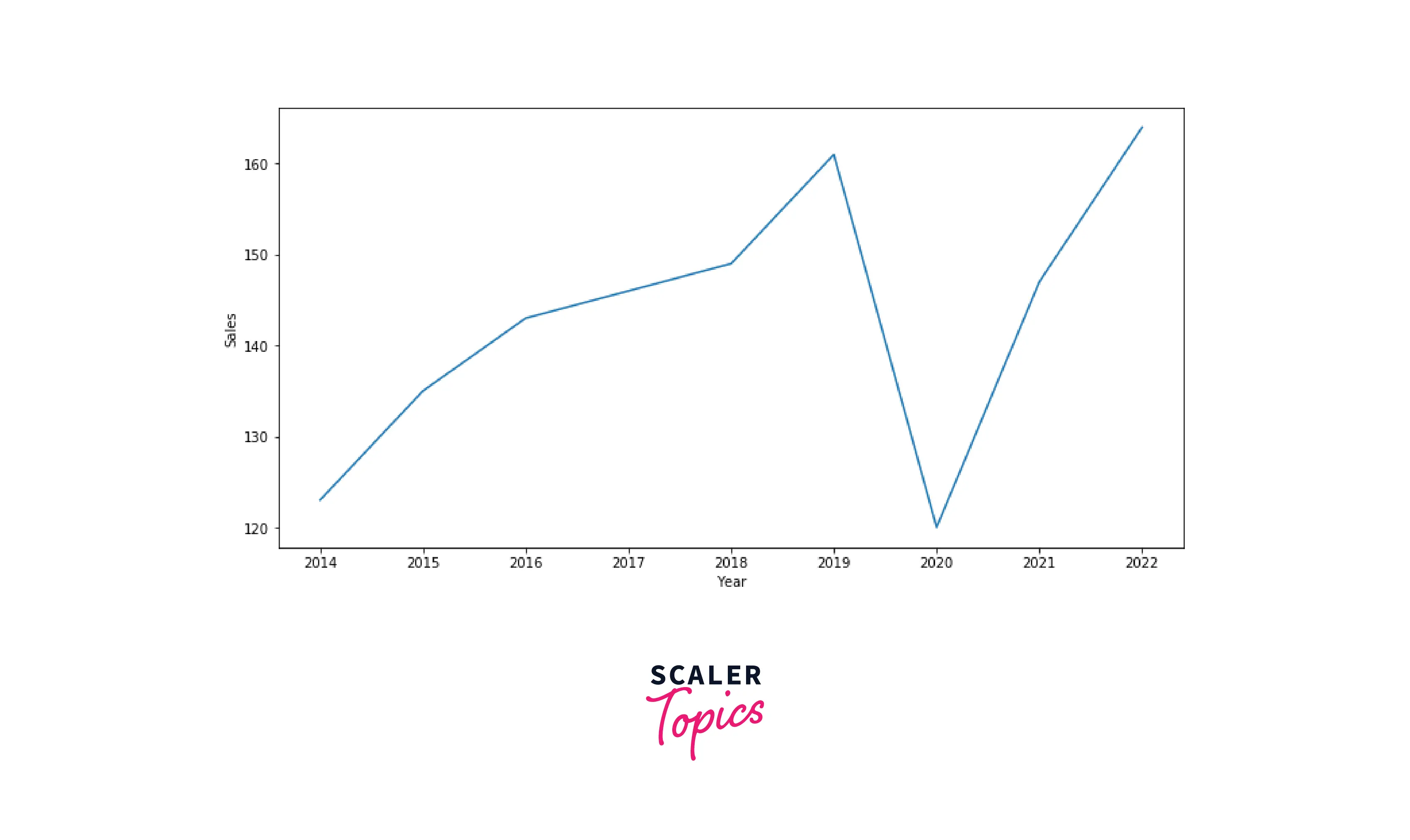
Line Chart
Line charts are one of the most common and basic Data Visualization techniques. Line charts are used to show how a variable evolves with respect to time. It is also used to showcase relationships between two variables, X and Y, on the respective axis. Let’s see how you can build a line chart using the seaborn library below
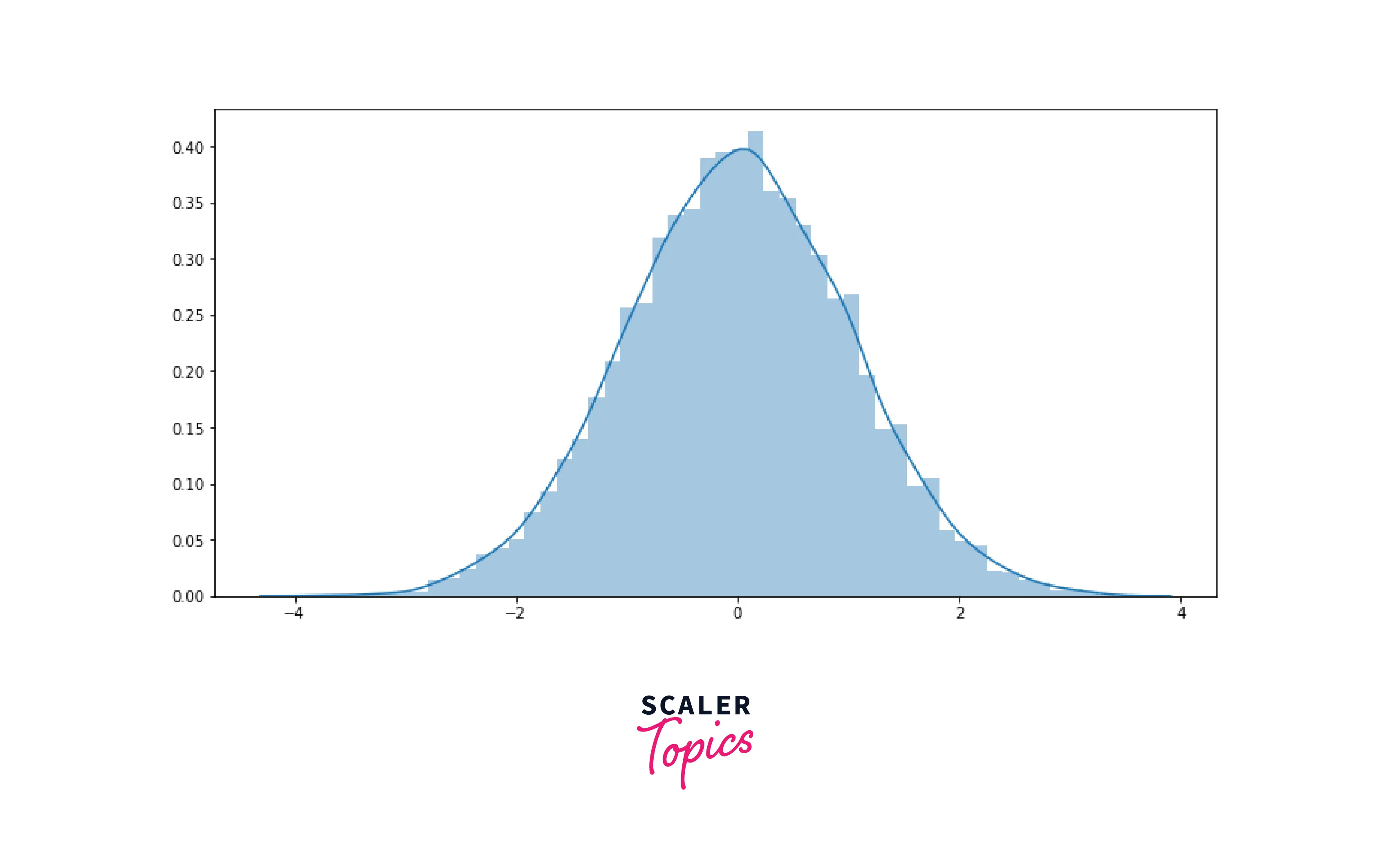
Histogram
Histogram is a very common visualization technique to understand a numerical variable’s distribution. In Histogram, values are translated in bin ranges, X-axis represents various bin ranges, and Y-axis represents the respective bin’s frequency.
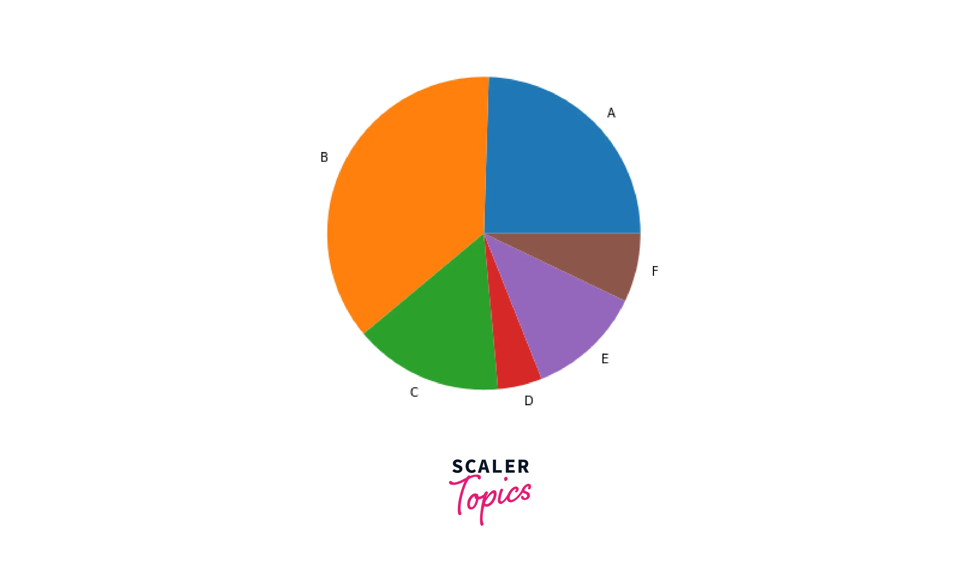
Pie Chart
Pie chart is a visualization technique that plots a series in a circular-shaped graph. It is an effective technique to visualize a variable with few values. The pie chart divides the circular shape into slices, and each slice is called a wedge. The size of the wedges will represent the values of the input feature.
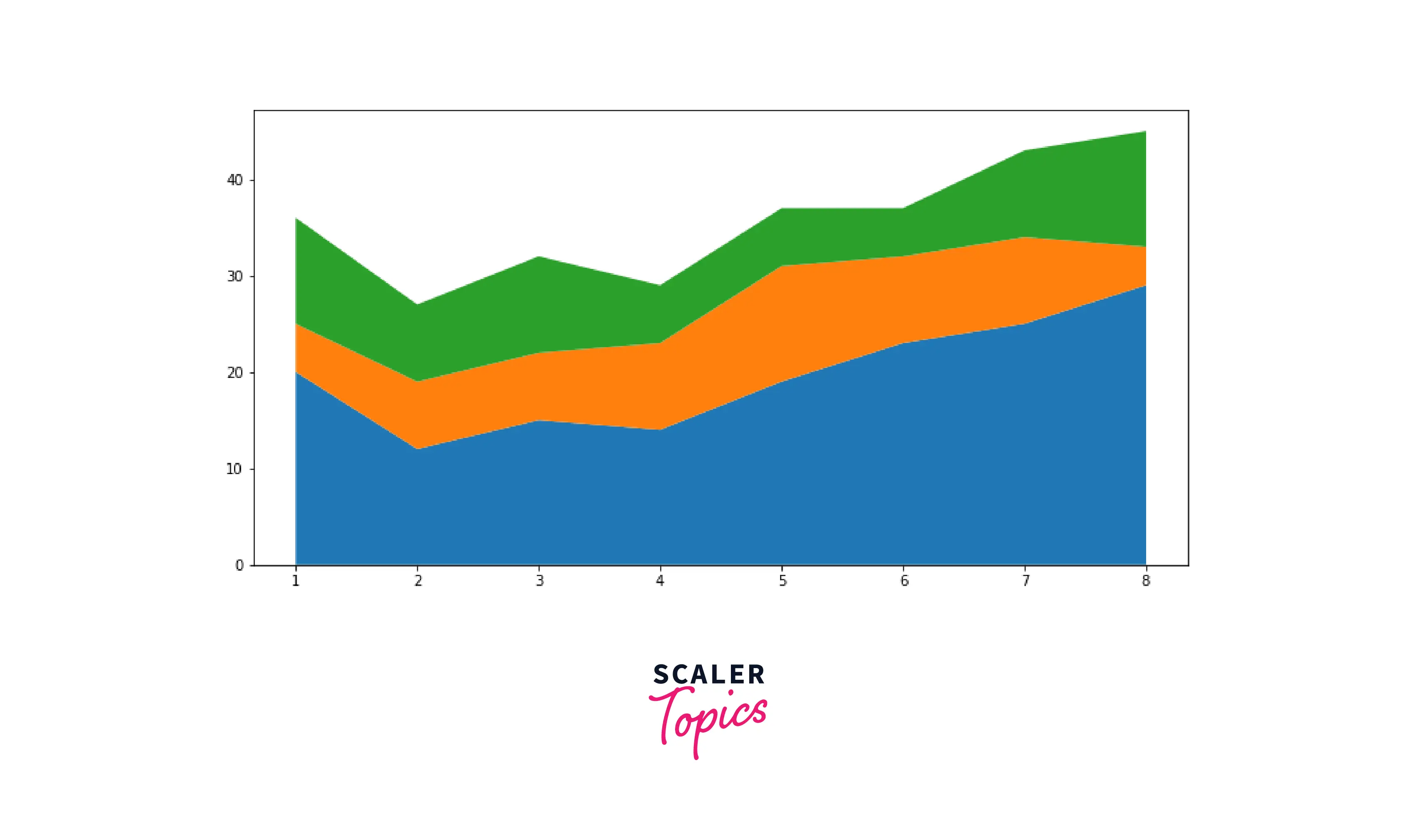
Area Plot
Area plot is very similar to the Line charts, except the area between X-axis and the line plotted is filled with color or shading.
Turn Learning into Career Growth
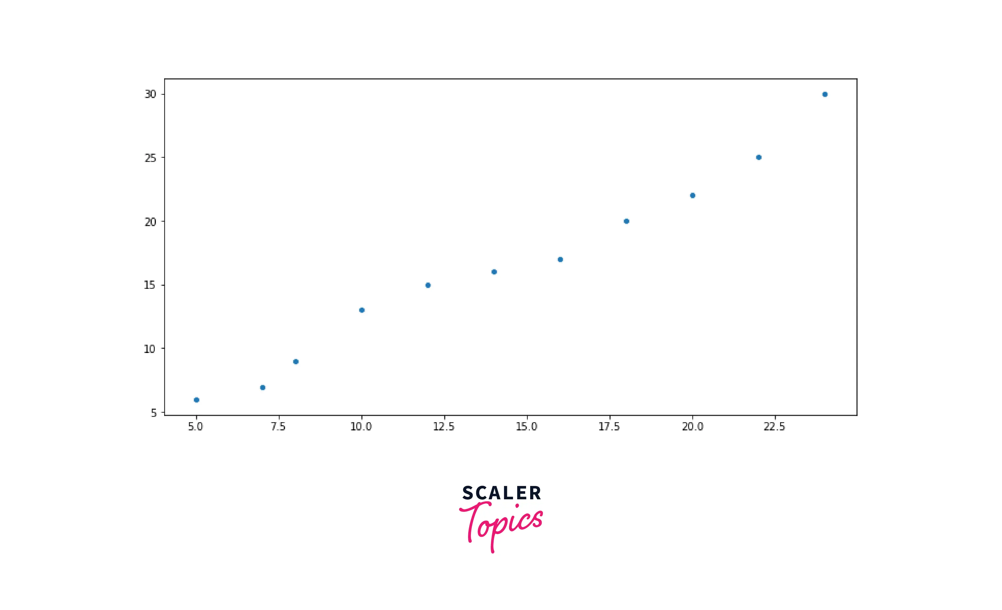
Scatter Plots
Scatter plot is used to explore relationships between two numerical variables. It uses dot and Cartesian coordinates to represent values for both variables. Scatter plots help understand how variables are correlated with each other.
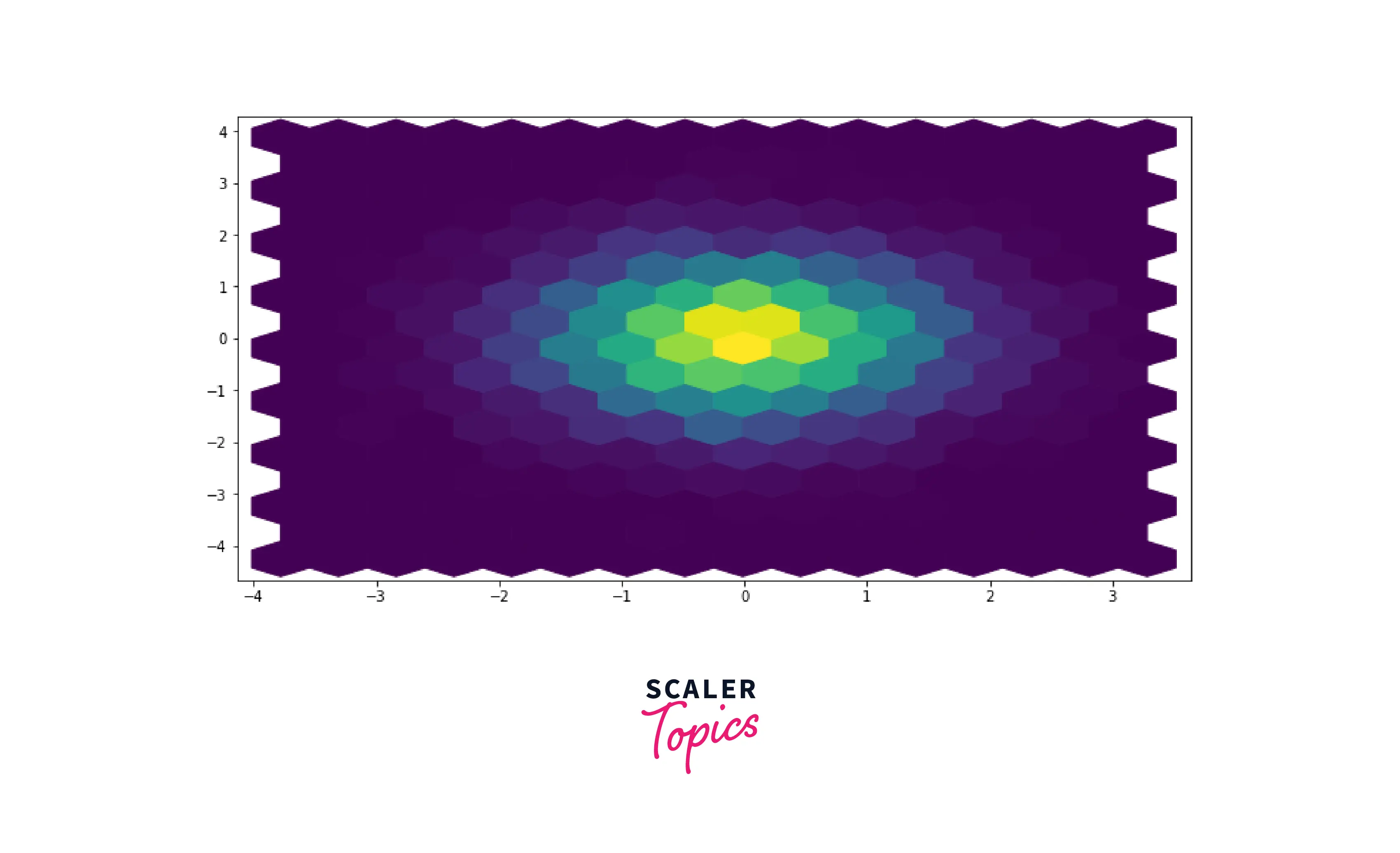
Hexbin Plots
A Hexbin plot is used to represent the relationship between two numerical variables when many data points are present. In the case of scatter plots, a lot of data points will get overlapped with each other. In the Hexbin plot, without overlapping the points, the plot is split into several hexbins/hexagons. The color of each Hexbin denotes the number of points in it, i.e., density.
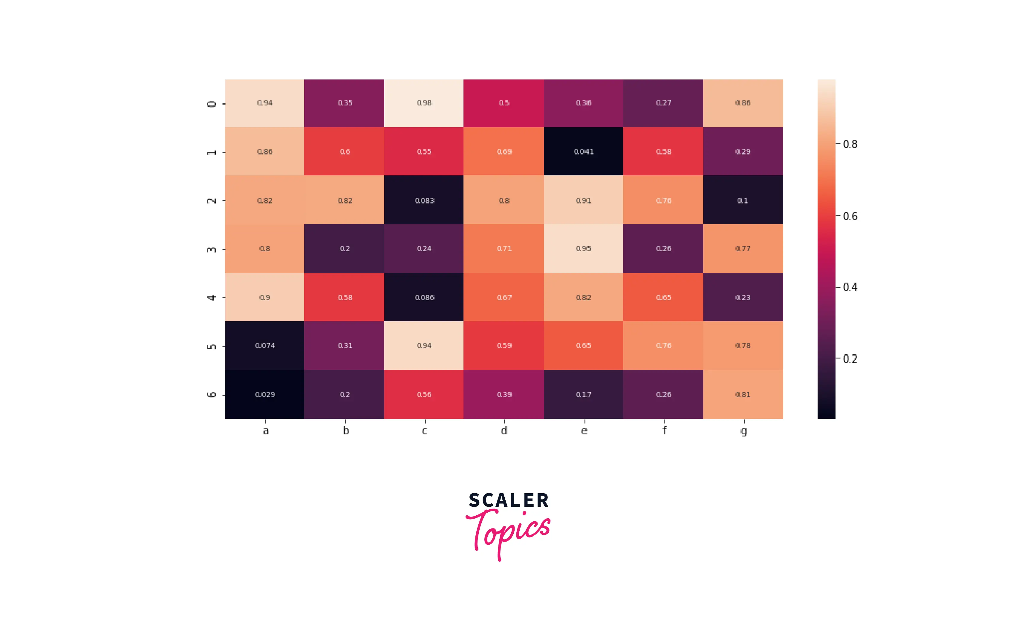
Heatmap
Heatmap is used to generate a graphical representation of the data using colors to visualize the values of a matrix. Generally, it is used to visualize the correlation matrix for a given dataset. It is an effective way to identify which features are highly correlated with each other.
Scaler Placement Report and Statistics
Scaler learners achieved 2.5x salary growth with average post-Scaler CTC reaching ₹23L.
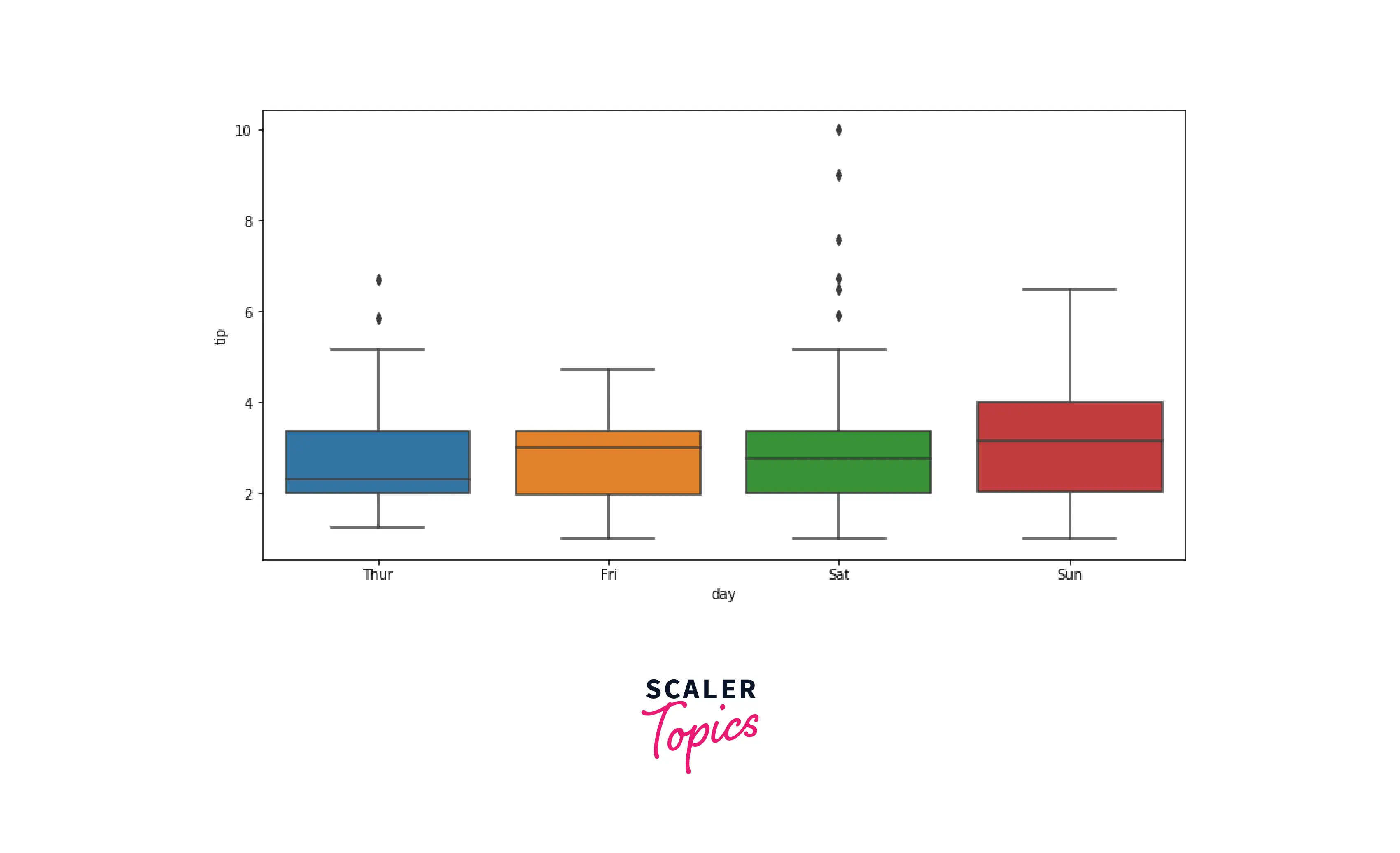
Box Plots
Box plot is used to represent the distribution of the features in the form of quartiles or percentiles. Q1 represents the first quartile (25th percentile), Q2 is the second quartile (50th percentile/median), Q3 represents the third quartile (75th percentile), and Q4 represents the fourth quartile. A Box plot is an effective way to detect outliers in the input feature.
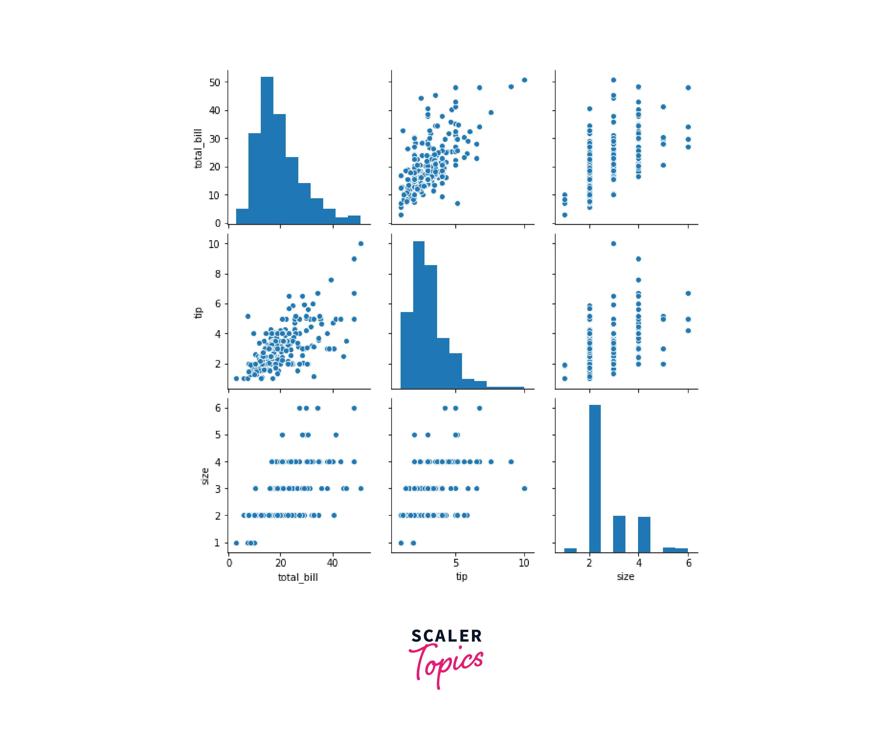
Pairplot
Pairplot generates multiple pairwise bi-variate distributions that are used to analyze how numerical features in a dataset are related to each other. It is similar to a heatmap, but in a pair plot, multiple subplots are created, representing relationships between two variables.
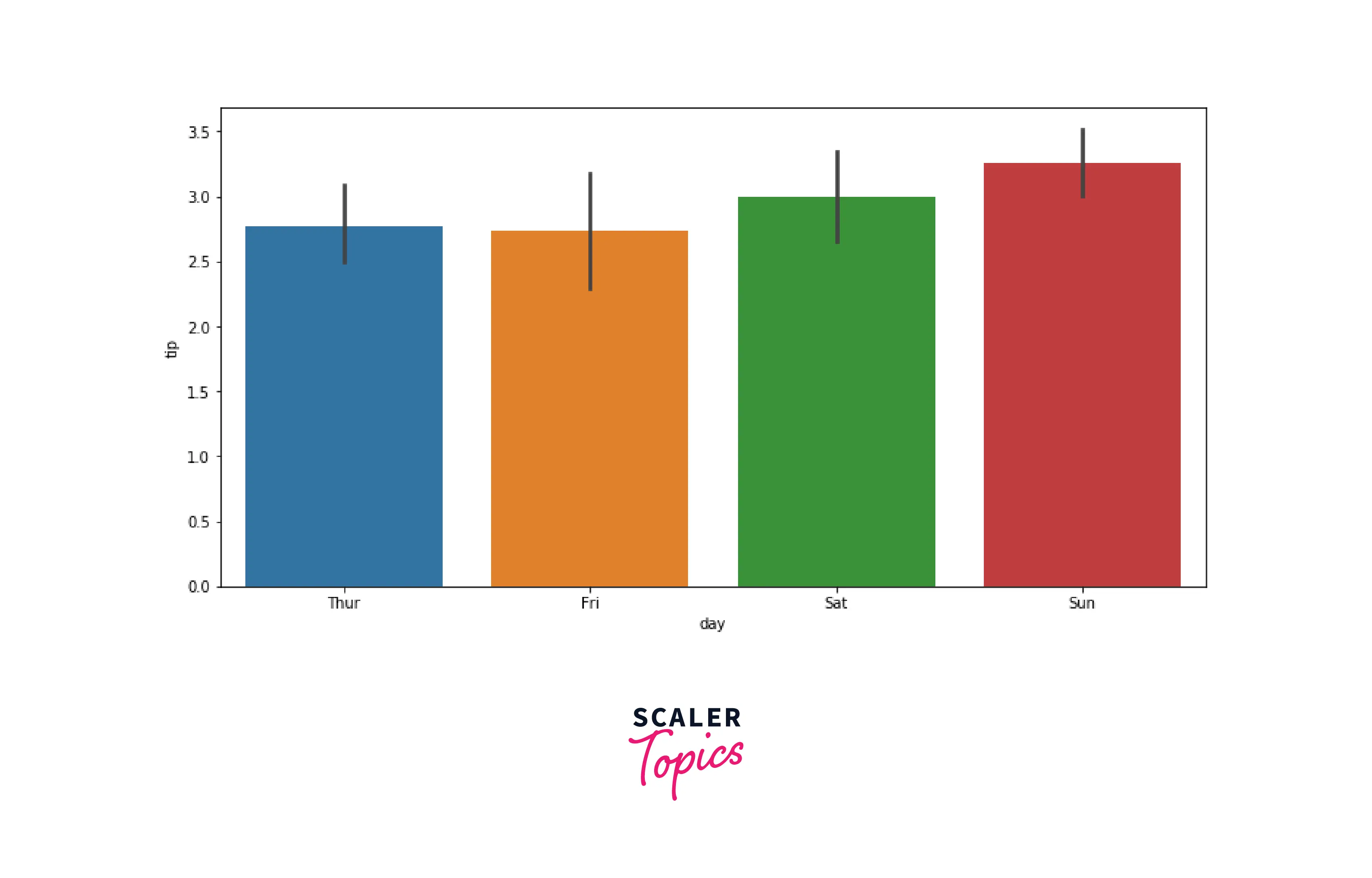
Bar Chart
A Bar chart is used to represent categorical features using rectangular bars with heights or lengths proportional to the values they represent. It can be plotted vertically as well as horizontally.
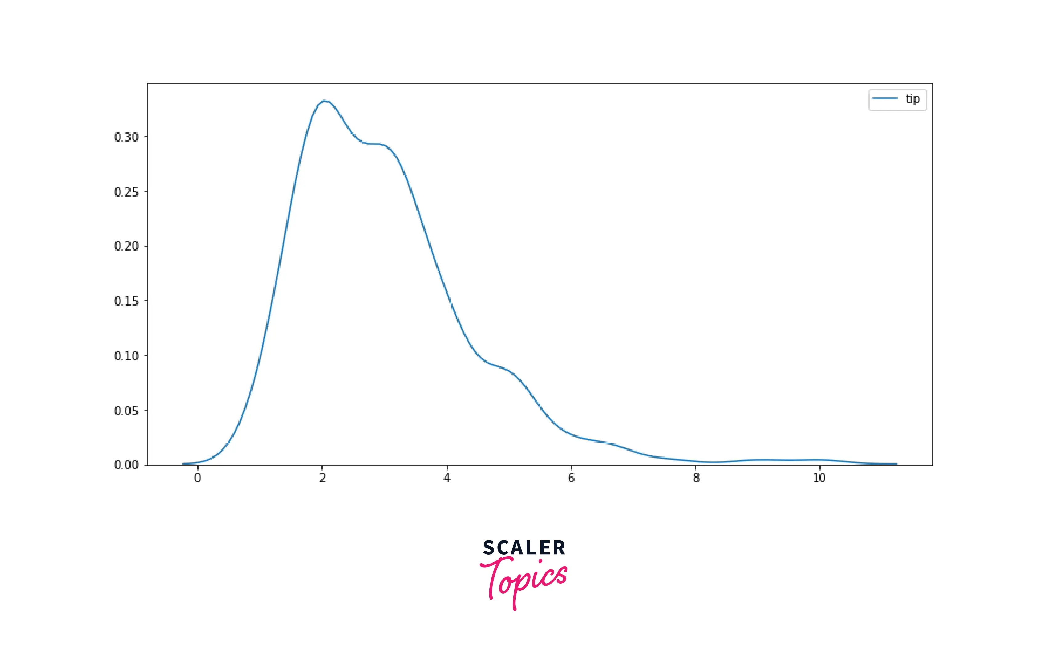
KDE Plot
KDE stands for Kernel Density Estimation. It is used to analyze the distribution of a feature. KDE plot is similar to Histogram, except it represents the data using a continuous probability density curve instead of bin ranges.
Univariate – Bi-variate and Multivariate Analysis
- Univariate Analysis is used to analyze the properties of a single variable. Histograms, Box Plots, etc., are a few of the most common examples of Univariate Analysis.
- Bi-variate Analysis considers two variables simultaneously and analyzes relationships with each other. Scatter Plots, Hexbin Plots, etc., are a few of the common techniques of Bi-variate Analysis.
- Multivariate Analysis will consider more than two variables for the comparison.
Ready to conquer the world of visualization? Our free Data Science course is your launchpad to a rewarding career in this data-driven era.
Conclusion
- Data Visualization is used to convert tabular datasets into graphical formats using visual elements such as charts, plots, maps, etc.
- Data Visualization helps identify implicit patterns and derive insights from the data. It is a powerful and effective way to communicate findings in an interactive and effective manner.
- You can perform univariate, bi-variate, or multivariate analysis using various techniques such as histograms, scatterplots, heatmaps, etc.