Exploratory Data Analysis in Python

Overview
Exploratory data analysis (EDA) is a process of analyzing and summarizing a dataset in order to understand its characteristics and relationships better. It is an iterative process that involves performing statistical analysis (correlation, descriptive statistics, etc.), visualizing the data, identifying underlying patterns and trends, and deriving insights from the data. It is a critical step in any Data Science project, as it helps you understand which features will be useful for the ML model development. In this article, let’s perform exploratory data analysis on a dataset and derive insights from it.
What Are We Building?
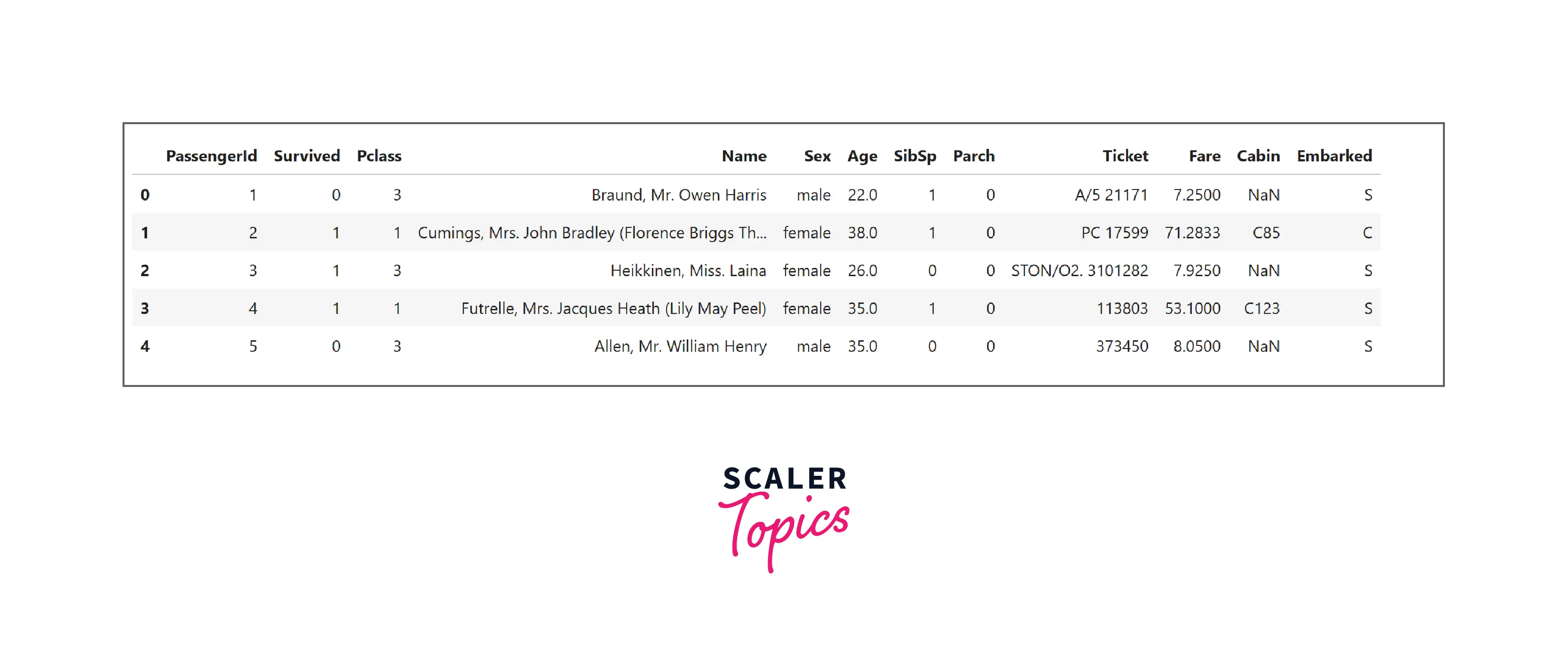
In this project, we will use the titanic dataset that contains the details of onboarded passengers. The feature survived represents whether the passenger survived or not. You can download the dataset from here. It consists of details of 891 passengers, such as passenger class, gender, age, fare, survived, etc. We will perform exploratory data analysis (EDA) on this data to identify underlying patterns and derive insights.
Pre-requisites
- Python
- Data Visualization
- Descriptive Statistics
Transform Your Career
Choose from our industry-leading programs designed for career success
Modern Software and AI Engineering Program
Master full-stack development with AI integration

Modern Data Science and ML with specialisation in AI
Advanced data science techniques with AI specialization
Advanced AIML with Specialisation in Agentic AI
Deep dive into AIML with focus on Agentic systems
DevOps, Cloud & AI Platform Engineering
Build and manage AI-powered cloud infrastructure
AI Engineering Advanced Certification by IIT-Roorkee
Premier AI engineering certification from IIT-Roorkee
How Are We Going to Build This?
- We will load the dataset and will explore it using various descriptive statistics techniques.
- Further, we will perform univariate and bi-variate analyses to identify underlying patterns and trends.
- Finally, we will derive insights by grouping the data and analyzing the correlation heatmap.
Requirements
We will be using below libraries, tools, and modules in this project -
- Pandas
- Numpy
- Matplotlib
- Seaborn
Dataset Feature Descriptions
The description for the features present in this dataset is -
- PassengerId - Unique ID of the passenger.
- Survived - Whether the passenger survived or not.
- Pclass - This feature represents the class of the passenger’s reservation, i.e., class-1, class-2, class-3.
- Name, Sex - these represent the name and gender of the passenger.
- Age - Age of the passenger.
- SibSp - It represents the number of siblings or spouses of a person onboard.
- Parch - Similar to SibSp, it represents the number of parents or children of a person onboard.
- Ticket - It is the ticket number of the passenger.
- Fare - The cost of the ticket.
- Cabin - It is the cabin number of the passenger.
- Embarked - It represents the location from where the passengers embarked on the ship. In this feature, S represents Southampton, C represents Cherbourg, and Q represents Queenstown.
Doing the Exploratory Data Analysis
Turn Learning into Career Growth
Import Libraries and Loading Dataset
Let’s start the project by importing all necessary libraries to perform exploratory data analysis and loading the dataset.
Descriptive Statistics
- First, we will understand the data by exploring its data types and how many NULL values are in the dataset.
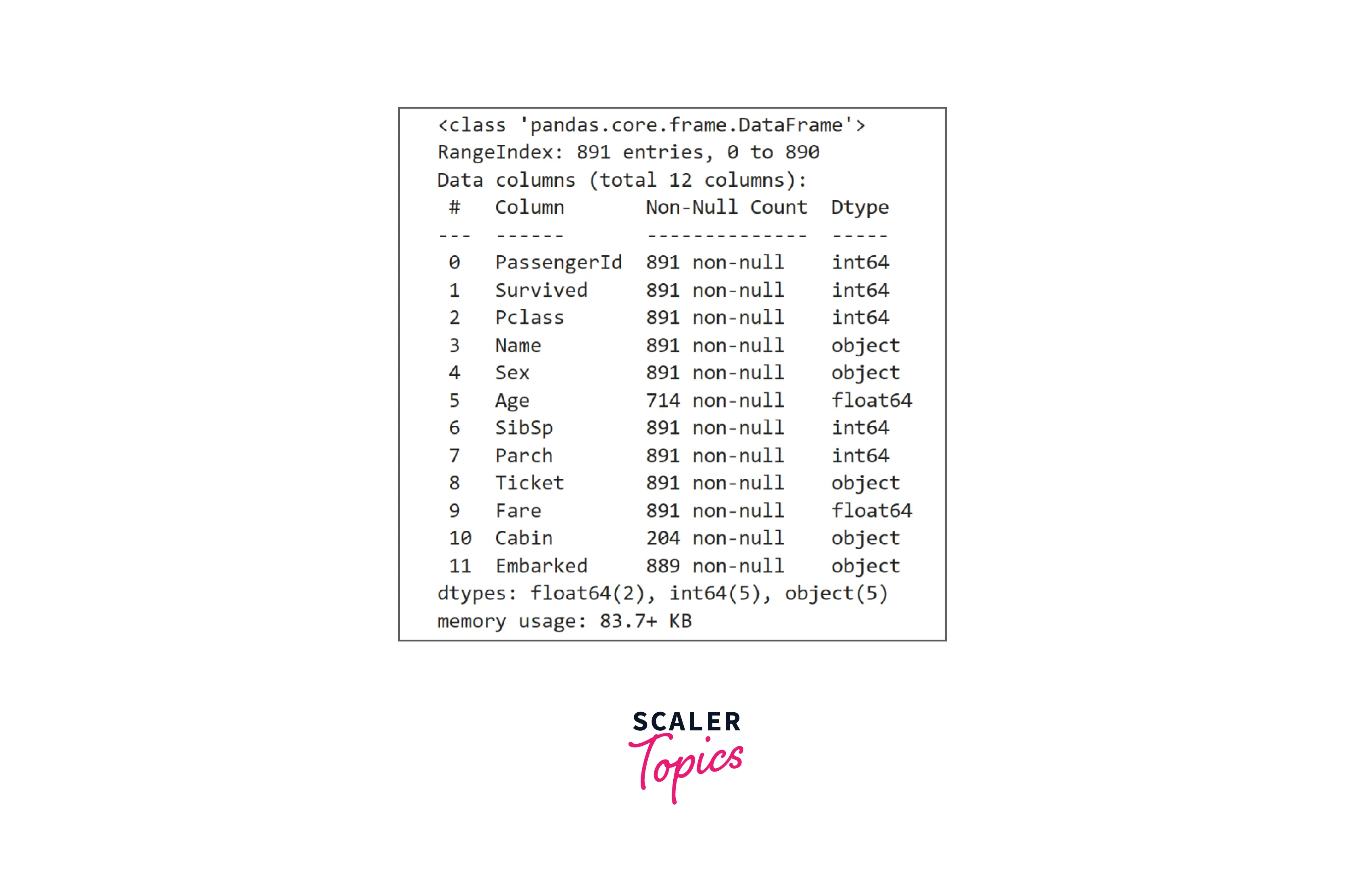
- As we can see, this dataset contains a mix of categorical and numerical features. The features Age and Cabin contain missing values. Now, let’s explore the numerical features using descriptive statistics.
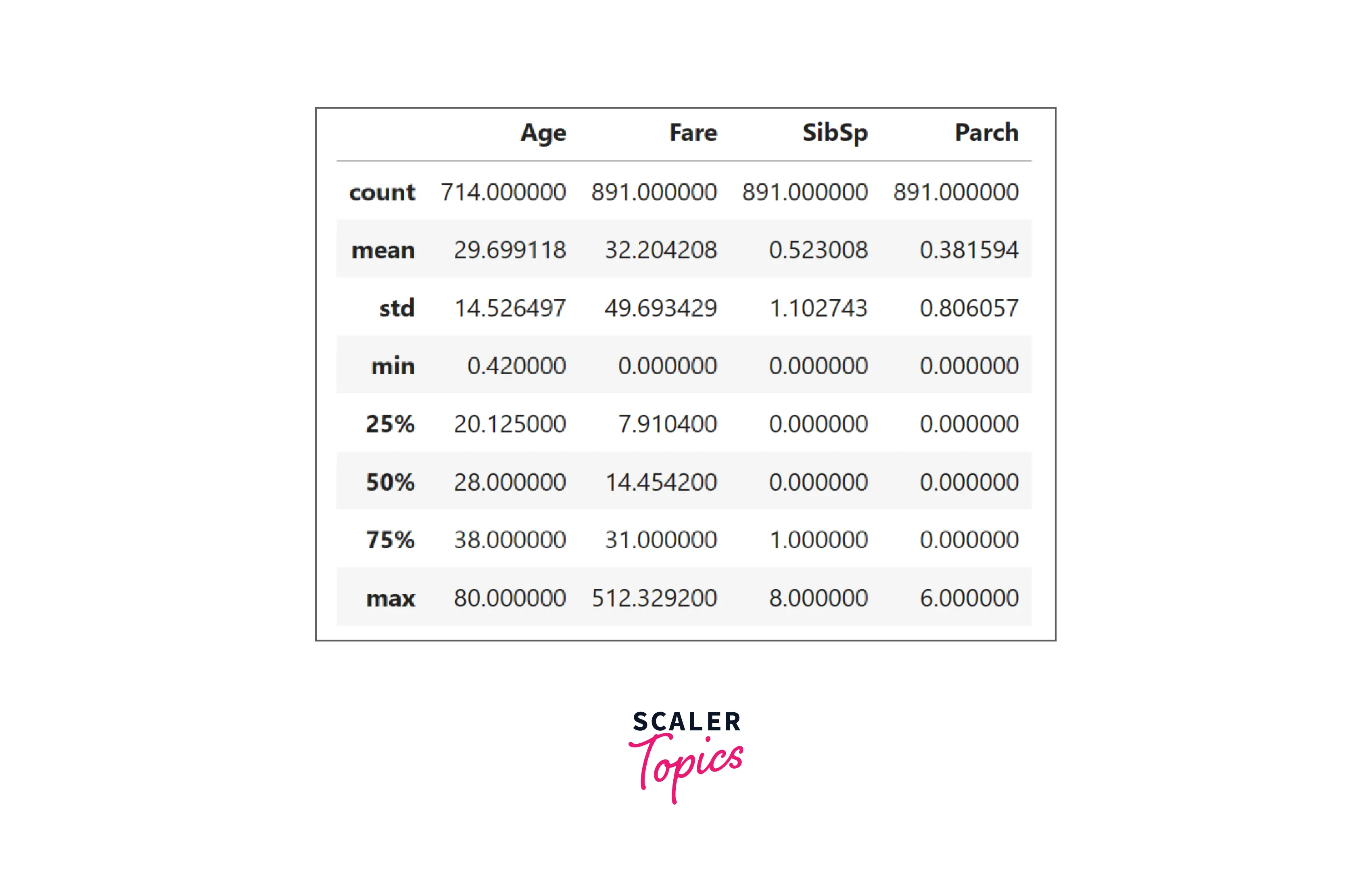
- As seen in the above figure, the mean age of the passengers is around 30 years, the average fare of the tickets is around 32, the maximum number of siblings or spouses onboarded is 8, and the maximum number of parents and children onboarded is 6. Let’s perform a univariate analysis of the features in the next step.
Univariate Analysis
- In this step, we will explore the distribution of each feature using various visualization techniques. We will use a count plot for categorical variables, and for numerical variables, we will use histograms. Let’s explore the target variable Survived and its distribution.
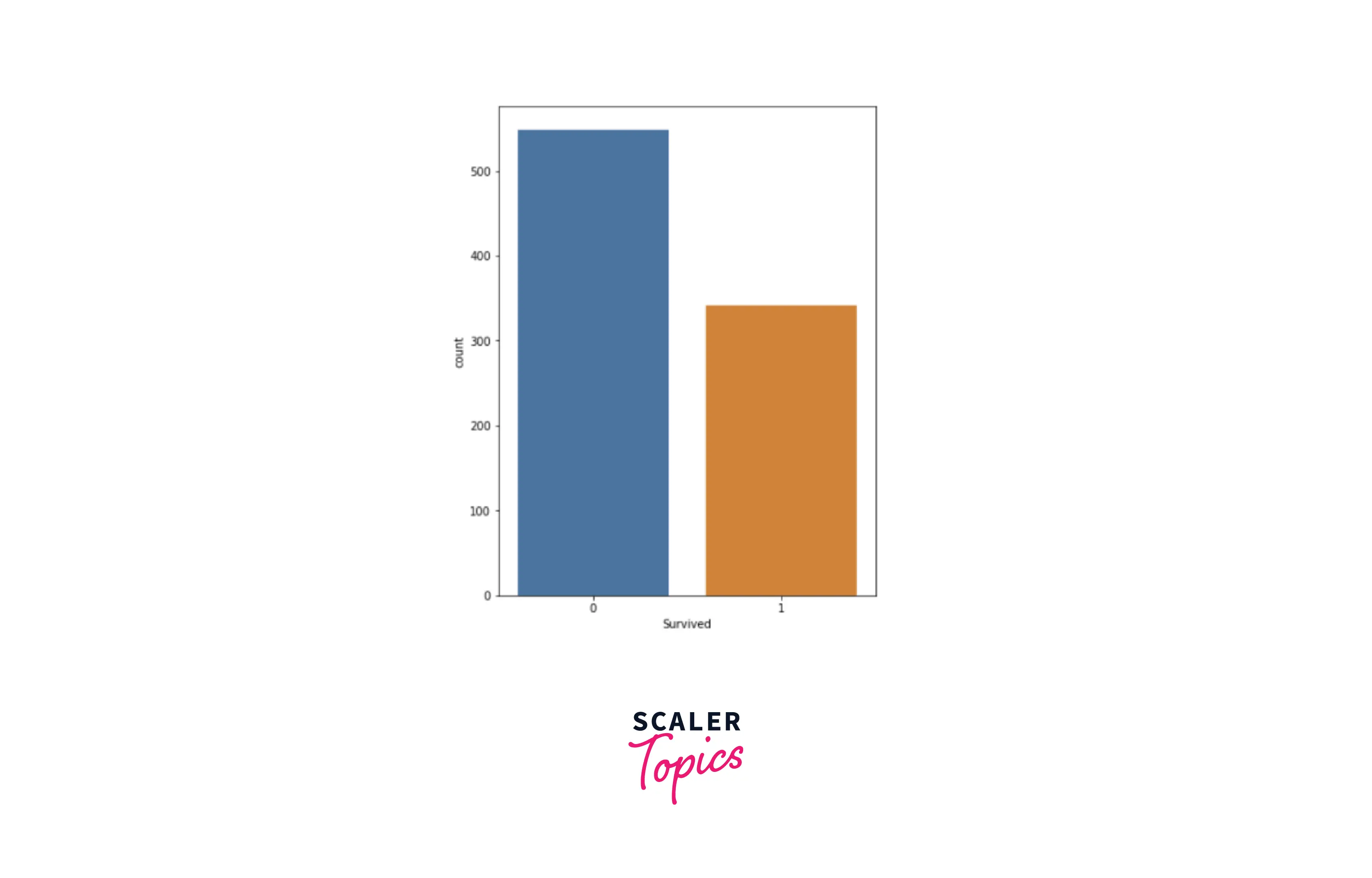
- As we can see, around 40% of the patients survived out of 891 passengers in the dataset. Let’s explore passenger class features and their category distribution.
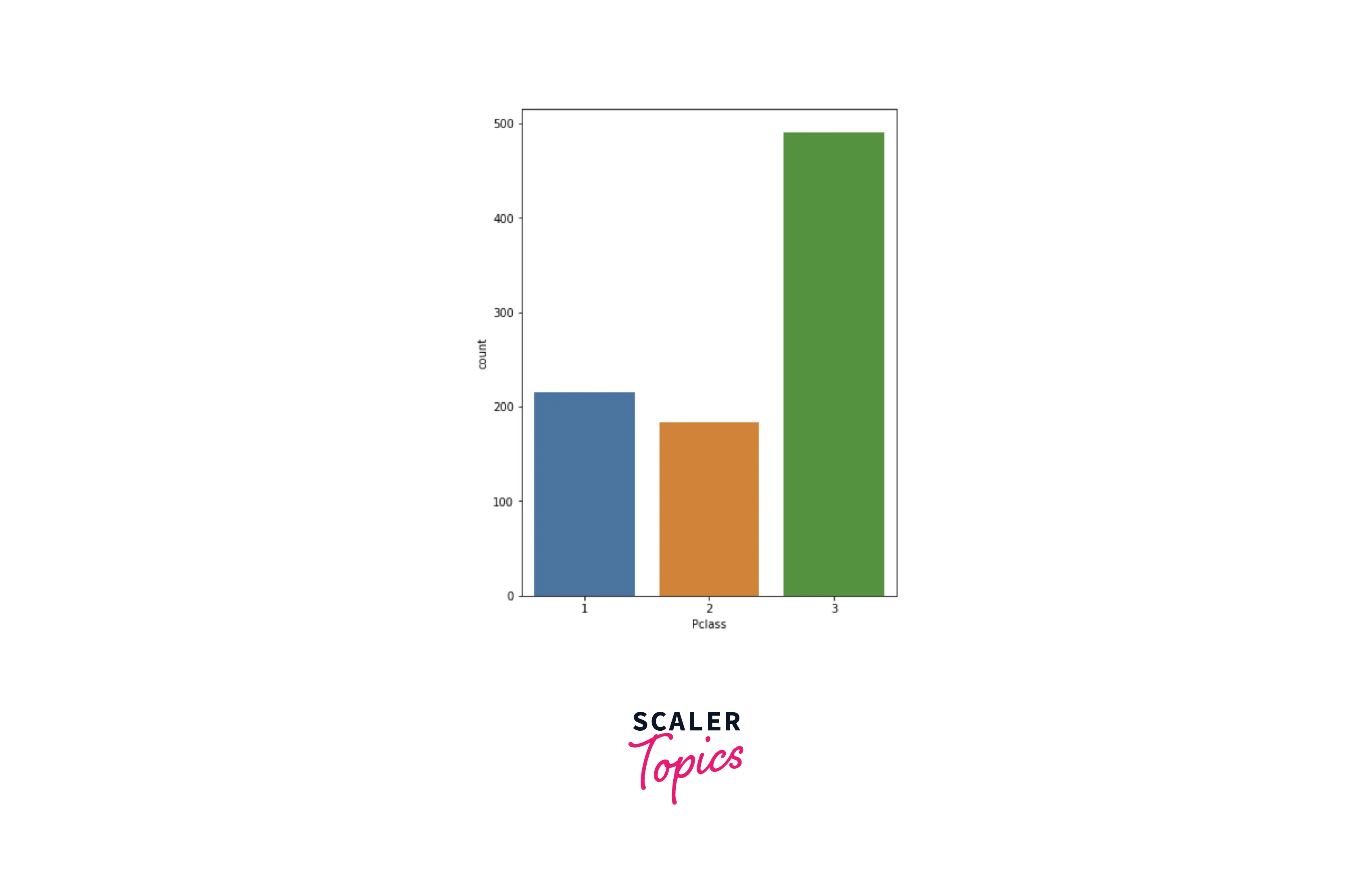
- We can see in the above figure that most of the passengers were from class-3 and the least number of passengers were from class-2. Let’s explore the Embarked feature and its category distribution.
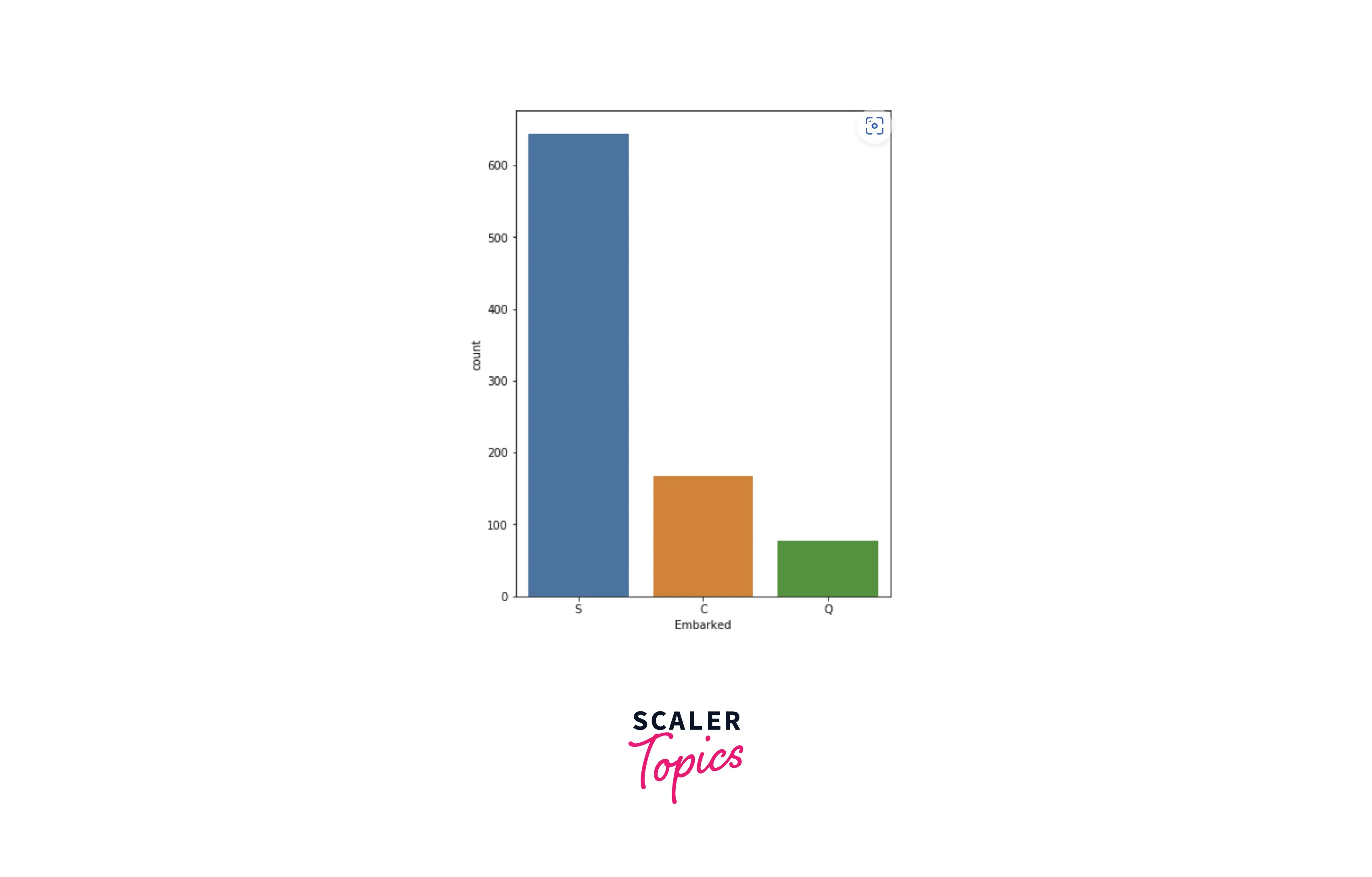
- From the above figure, we can see that the maximum number of passengers (around 72%) embarked from Southampton and the least number of passengers embarked from Queenstown. Now we will explore the gender distribution of the passengers.
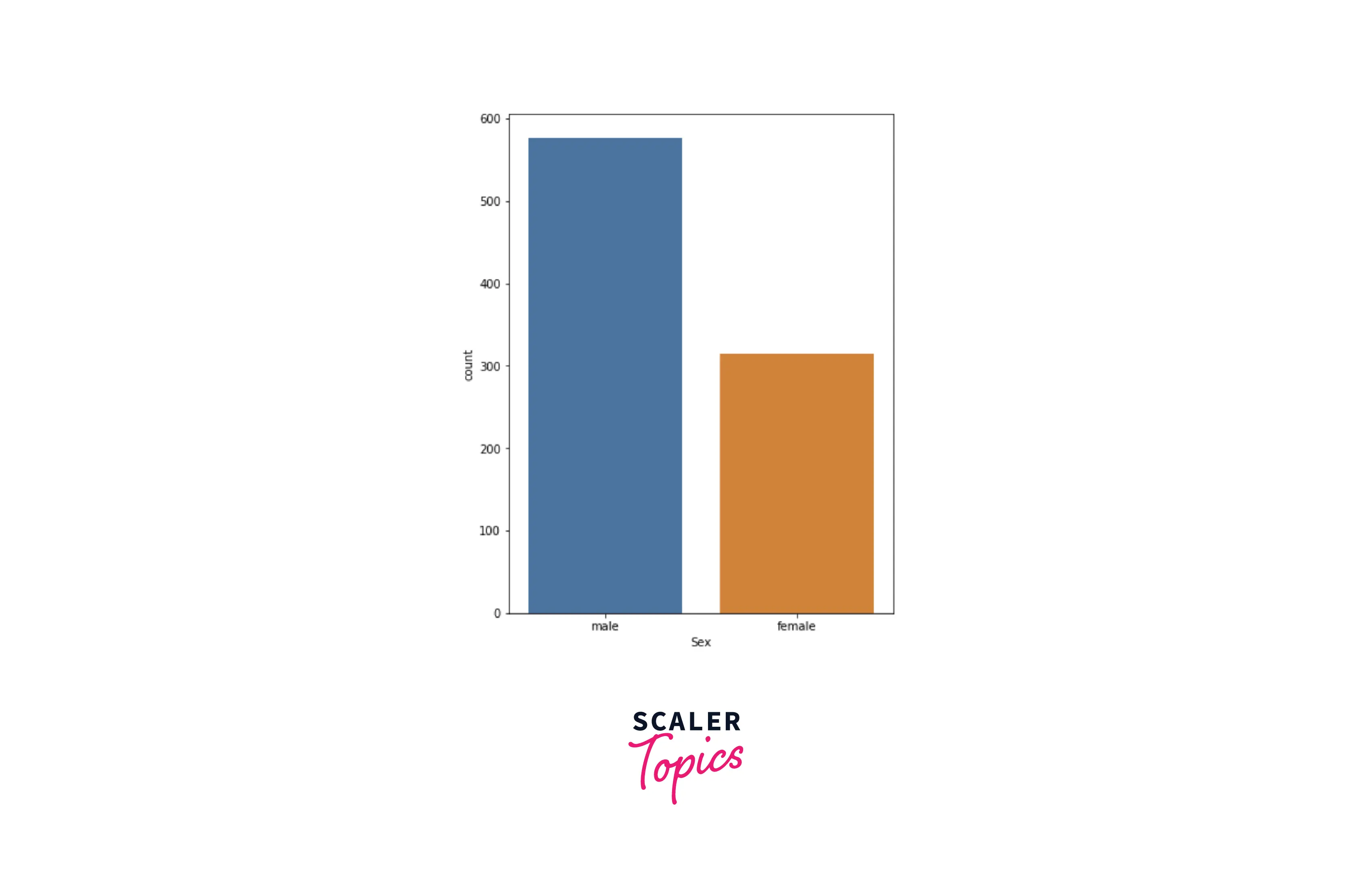
- From the above diagram, we can see that most of the passengers (around 64%) were male and the rest of them were female. Now we will move toward the numerical variables to explore them. First, we will explore the distribution of age among passengers.
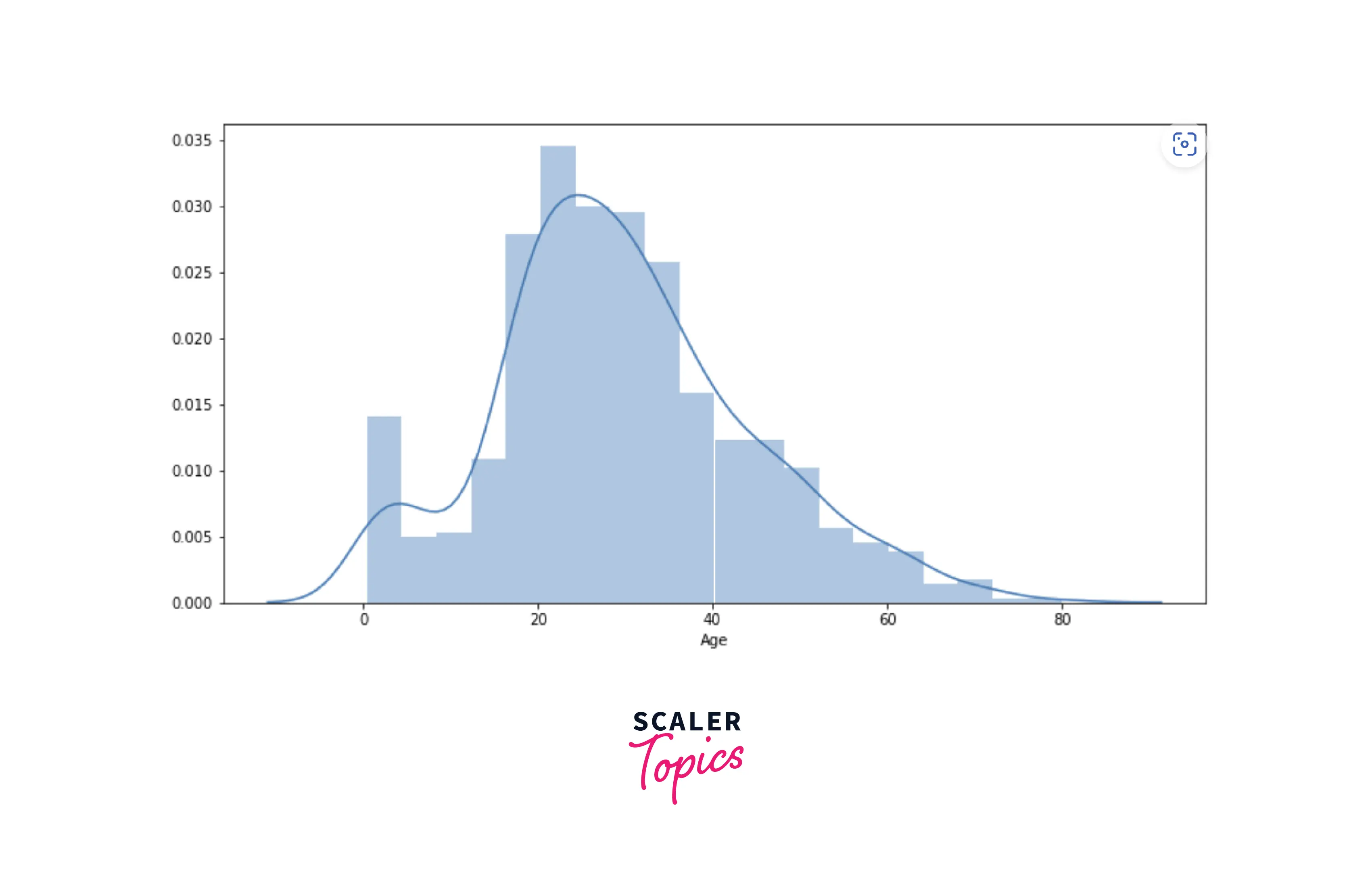
- We can see in the above diagram that most of the passengers were between the ages of 20 and 50. Similarly, let’s explore the histogram of the Fare feature.
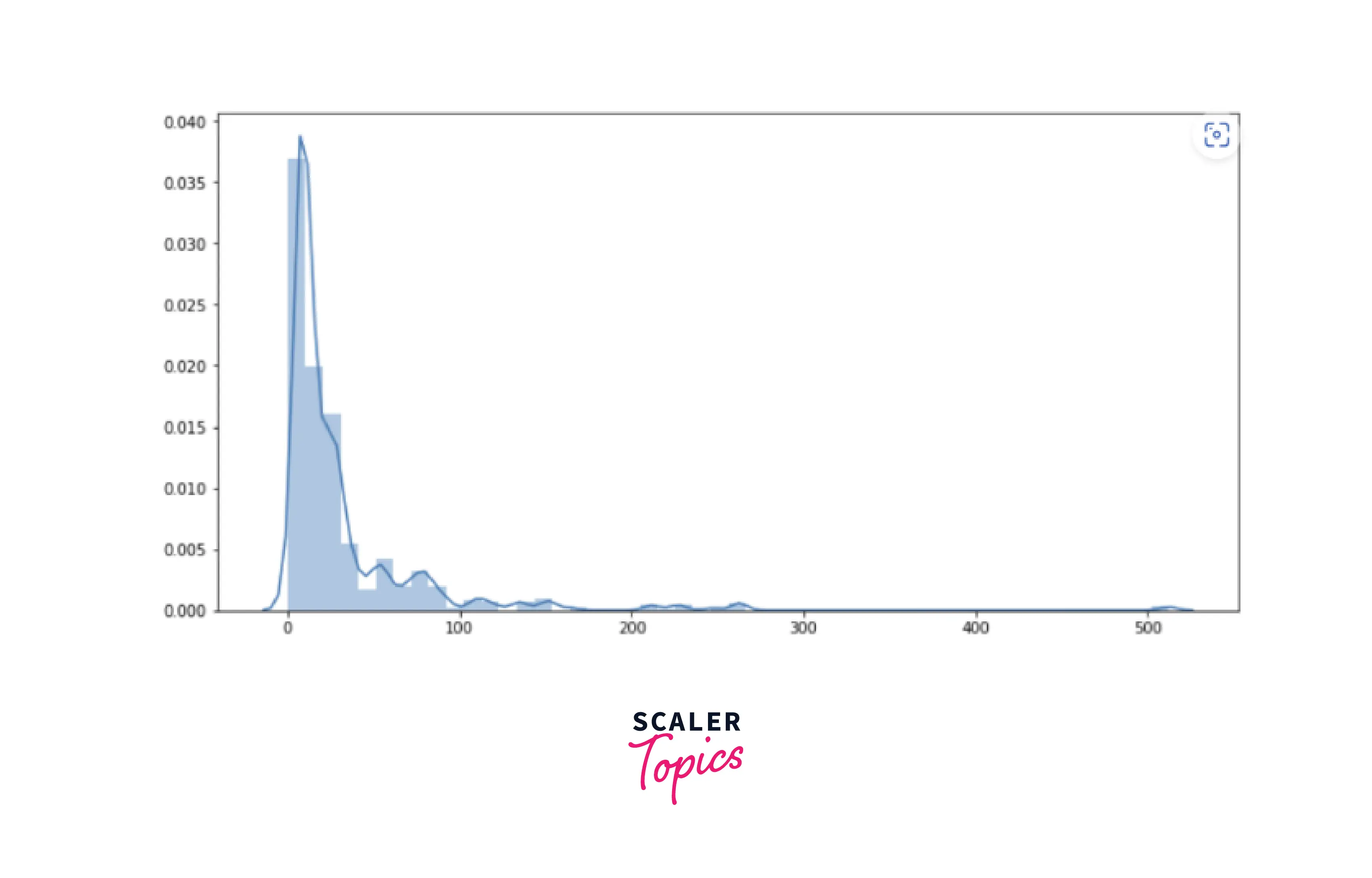
- As we can see, the maximum number of passengers paid the fare below 50 for the journey. In the next step, we will perform a bi-variate analysis of the features.
Bi-variate Analysis
- Bivariate analysis is a statistical method used to examine the relationship between two variables. It is used to determine if there is a significant association between the two variables and to identify the strength and direction of the relationship. In this step, we will perform bi-variate analysis using various visualization techniques, such as box plots, scatter plots, bar plots, etc. Let’s explore what Fare distribution looks like for each passenger class.
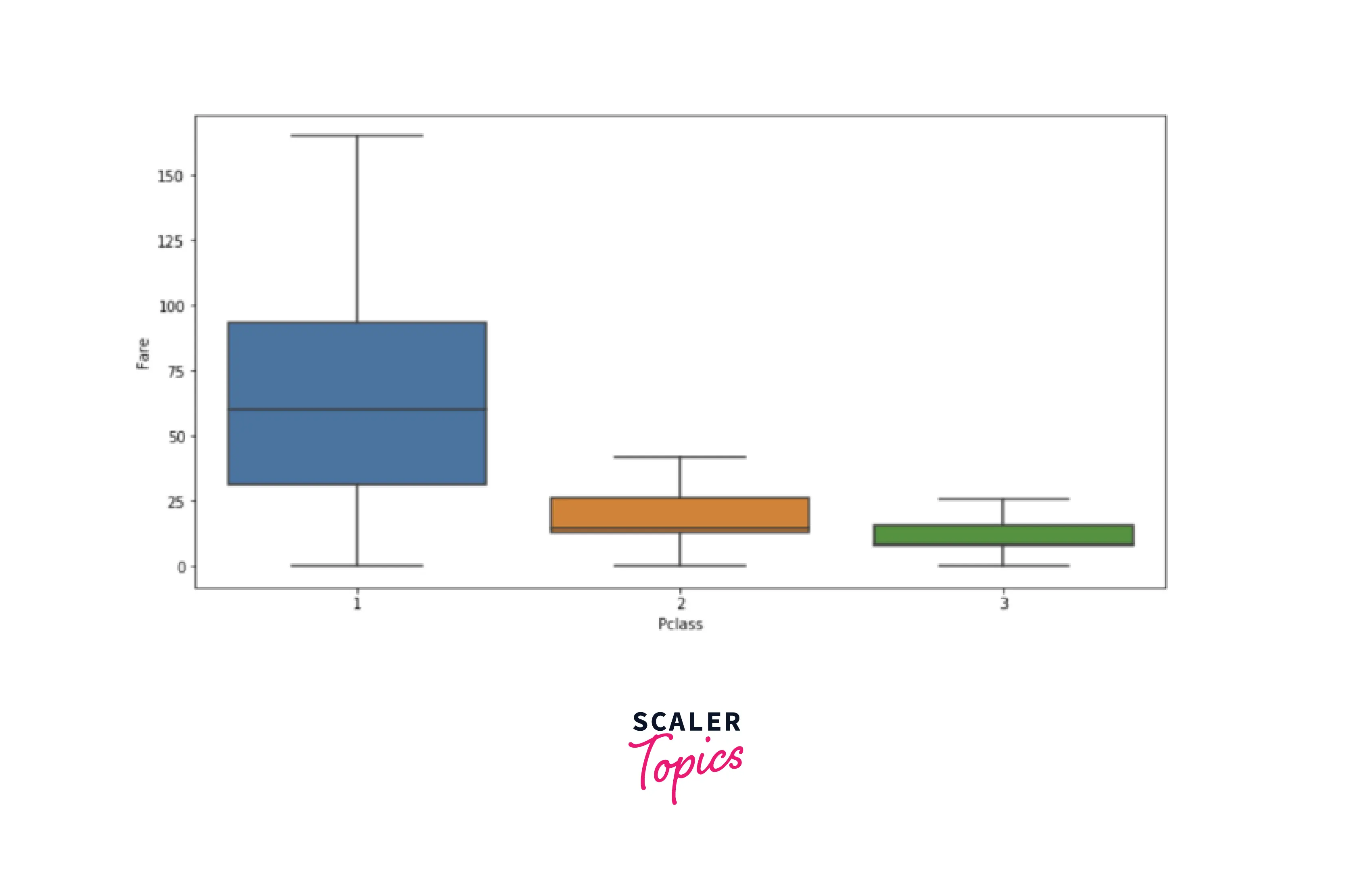
- As we can infer from the above diagram that class-1 has the highest fare and class-3 has the lowest fare. From the univariate analysis, we also observed that the highest number of passengers belonged to class-3. So, we can conclude here that class-1 belonged to rich and upper-class passengers. Now, let’s explore the distribution of surviving passengers based on each passenger class.
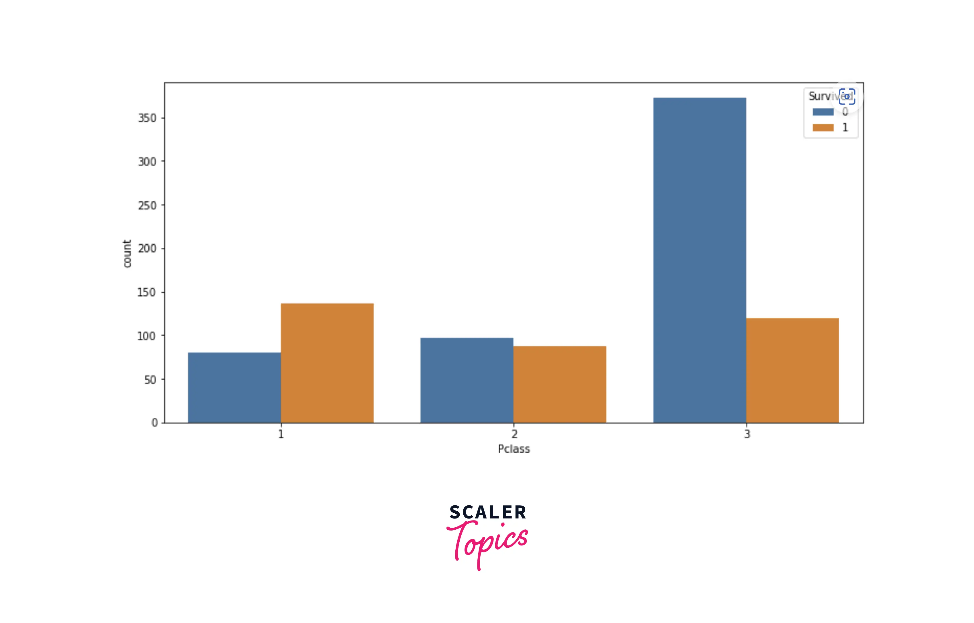
- As we can see, in class-1, the number of surviving passengers is higher than passengers who could not survive. We can conclude here that passengers from class-1 and class-2 were given priority in rescue over passengers from class-3. Now, let’s explore how gender plays a role in the survival of passengers.
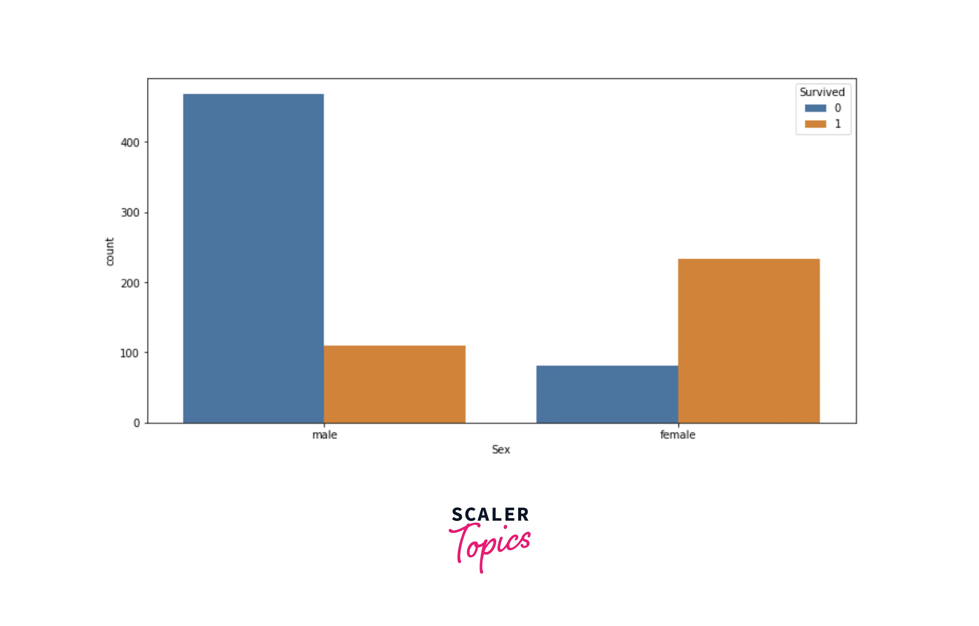
- We can conclude from the above figure that females were given higher priority in the rescue, which seems intuitive as well. Now, let’s explore the scatter plot between Age and Fare.
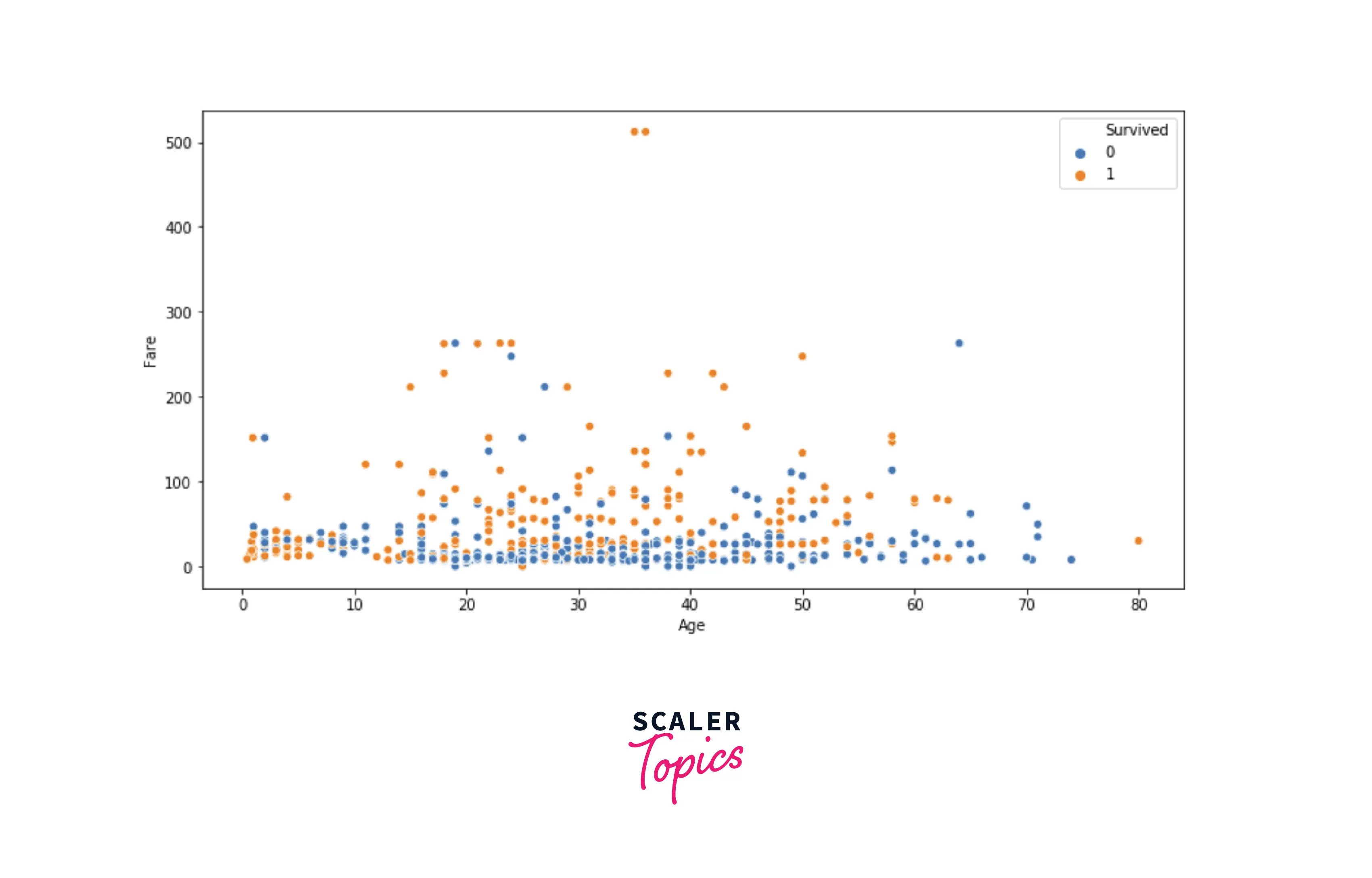
- Insights from the above figure -
- Children (age of between 0-8) had the higher chances of survival, as generally children and females are given priority in the rescue.
- As age increases, chances of survival increase with the fare. It means that in adults, chances of survival were higher if you paid a higher fare.
- Now, in the next step, let’s explore the dataset by grouping it.
Scaler Placement Report and Statistics
Scaler learners achieved 2.5x salary growth with average post-Scaler CTC reaching ₹23L.
Grouping Data
- Group by is a method in pandas that can help us understand the effect of different categorical attributes on other data variables. Let's explore the average age and fare for male and female passengers based on their survival status.
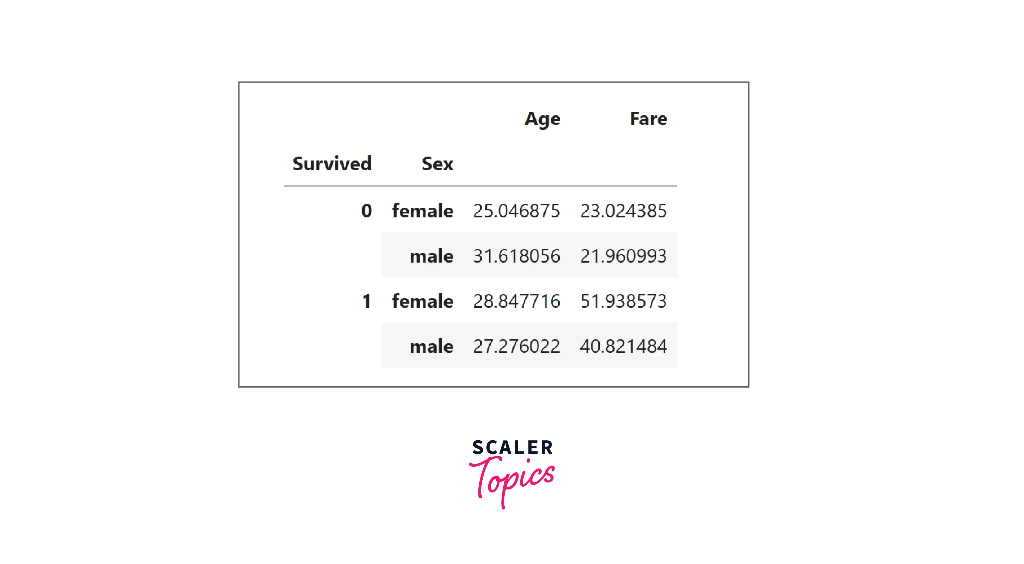
- Insights from the above table are -
- The average age of surviving female passengers is higher, and the average age of surviving male passengers is lower.
- The average fare is way higher for surviving passengers, irrespective of their gender.
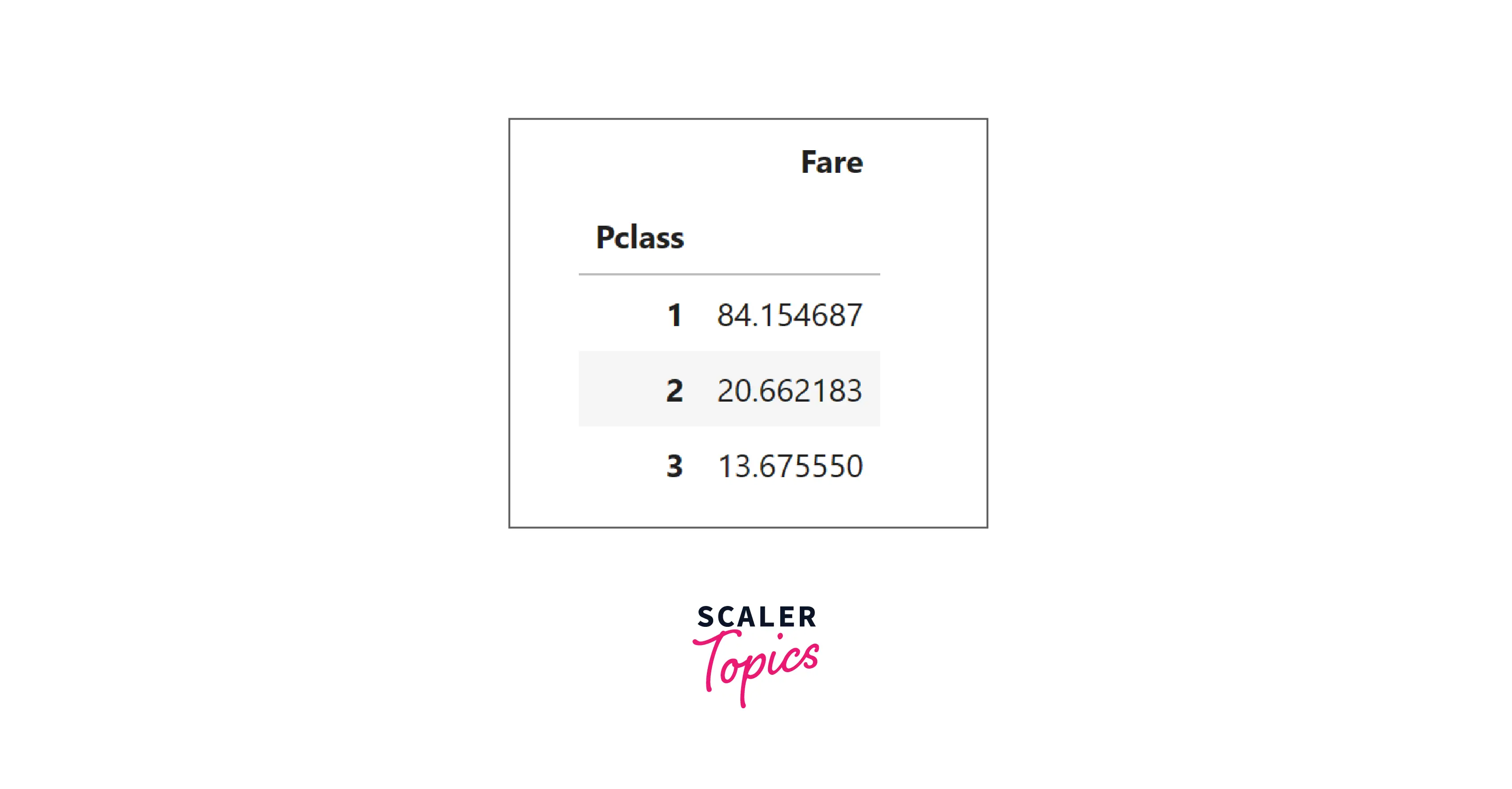
- Let’s explore the average fare based on each passenger class. As you can see in the below results, the average fare is highest in class-1, and the average fare is lowest in class-3. This is also consistent with our findings from the bi-variate analysis.
Correlation
- Correlation is a statistical measure that describes the strength and direction of the relationship between two variables. It is used to determine how closely two variables are related and to identify the relationship's strength and direction. We will use a heat map to visualize the correlation between variables.
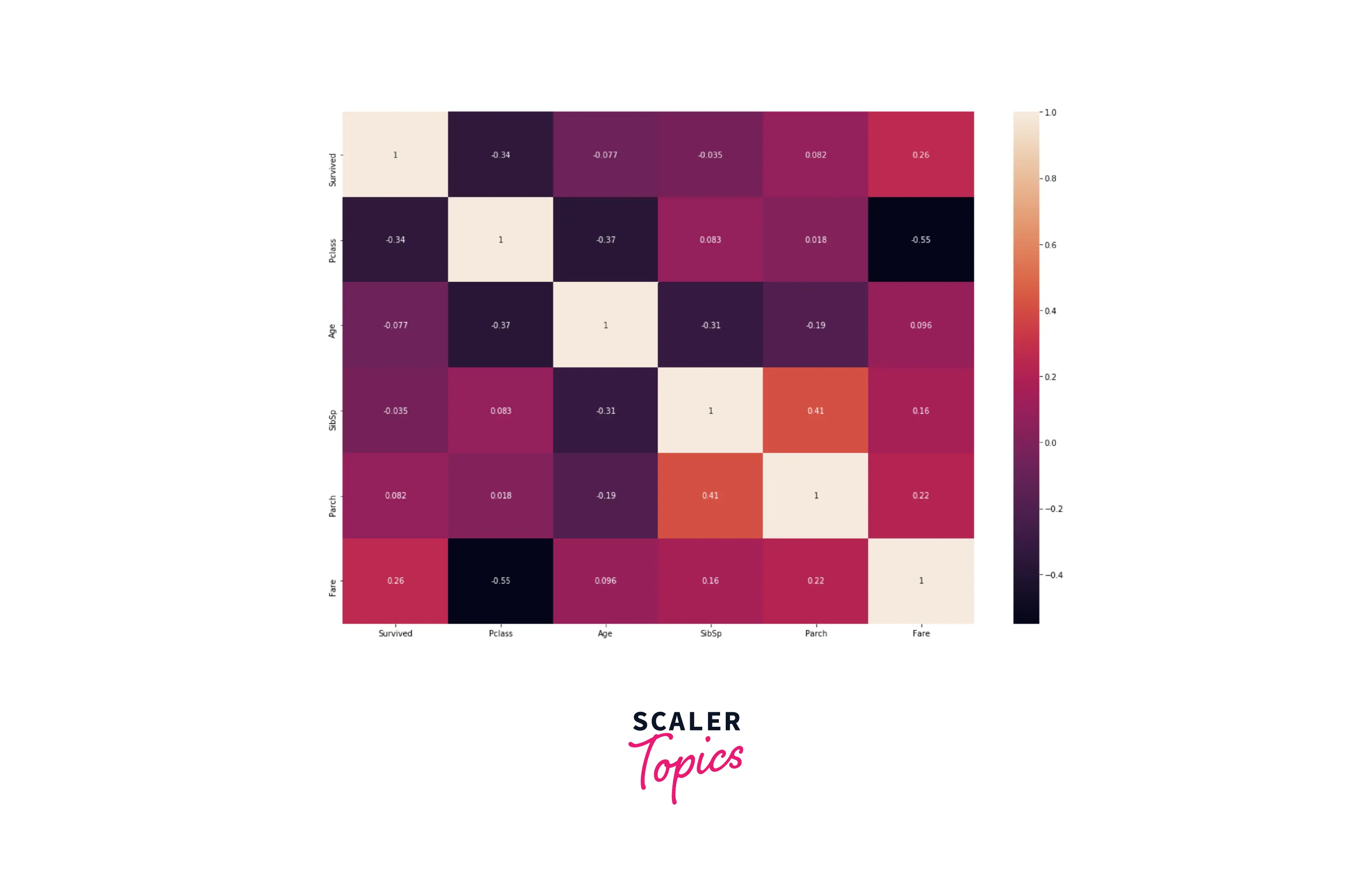
- Insights from the above correlation heat map are -
- Most of the variables have no correlation with each other.
- The passenger class has a moderate negative correlation with the fare, which is consistent with our previous insights. We can recall that class 1 had the highest fare and class 3 had the lowest fare.
Conclusion
- We loaded the titanic dataset containing details of passengers along with their survival status.
- We performed exploratory data analysis (EDA) on this dataset using various methods, such as descriptive statistics, univariate, and bivariate visualization, grouping the data, and correlation.