Uber Data Analysis

Overview
Uber is a ride-hailing company that relies heavily on data science and analysis to support its day-to-day operations and provide hassle-free rides and deliveries to customers. Data science is a critical component of Uber's operations, and the company invests heavily in its data science and technology capabilities. Some of the key use cases of data science in Uber include - dynamic pricing, driver assignment, safety, fraud, customer experience, etc. In this article, we will extensively explore a dataset of Uber rides.
What are We Building?
In this project, we will use a dataset containing the Uber rides of a single user in 2016. You can download the dataset from here. It consists of 1155 Uber rides with details like start time, end time, miles, location, category, etc. We will perform exploratory data analysis (EDA) on this data to derive insights.
Pre-requisites
- Python
- Data Visualization
- Descriptive Statistics
Transform Your Career
Choose from our industry-leading programs designed for career success
Modern Software and AI Engineering Program
Master full-stack development with AI integration

Modern Data Science and ML with specialisation in AI
Advanced data science techniques with AI specialization
Advanced AIML with Specialisation in Agentic AI
Deep dive into AIML with focus on Agentic systems
DevOps, Cloud & AI Platform Engineering
Build and manage AI-powered cloud infrastructure
AI Engineering Advanced Certification by IIT-Roorkee
Premier AI engineering certification from IIT-Roorkee
How Are We Going to Build This?
- We will perform data preprocessing and feature engineering on the dataset to handle missing values and create new features.
- Further, we will apply various descriptive statistics and data visualization techniques to identify underlying patterns and derive main insights.
Requirements
We will be using below libraries, tools, and modules in this project -
- Pandas
- Numpy
- Matplotlib
- Seaborn
Building the Uber Data Analysis Project
Import Libraries
Let’s start the project by importing all necessary libraries to load the dataset and perform EDA on it.
Turn Learning into Career Growth
Data Understanding
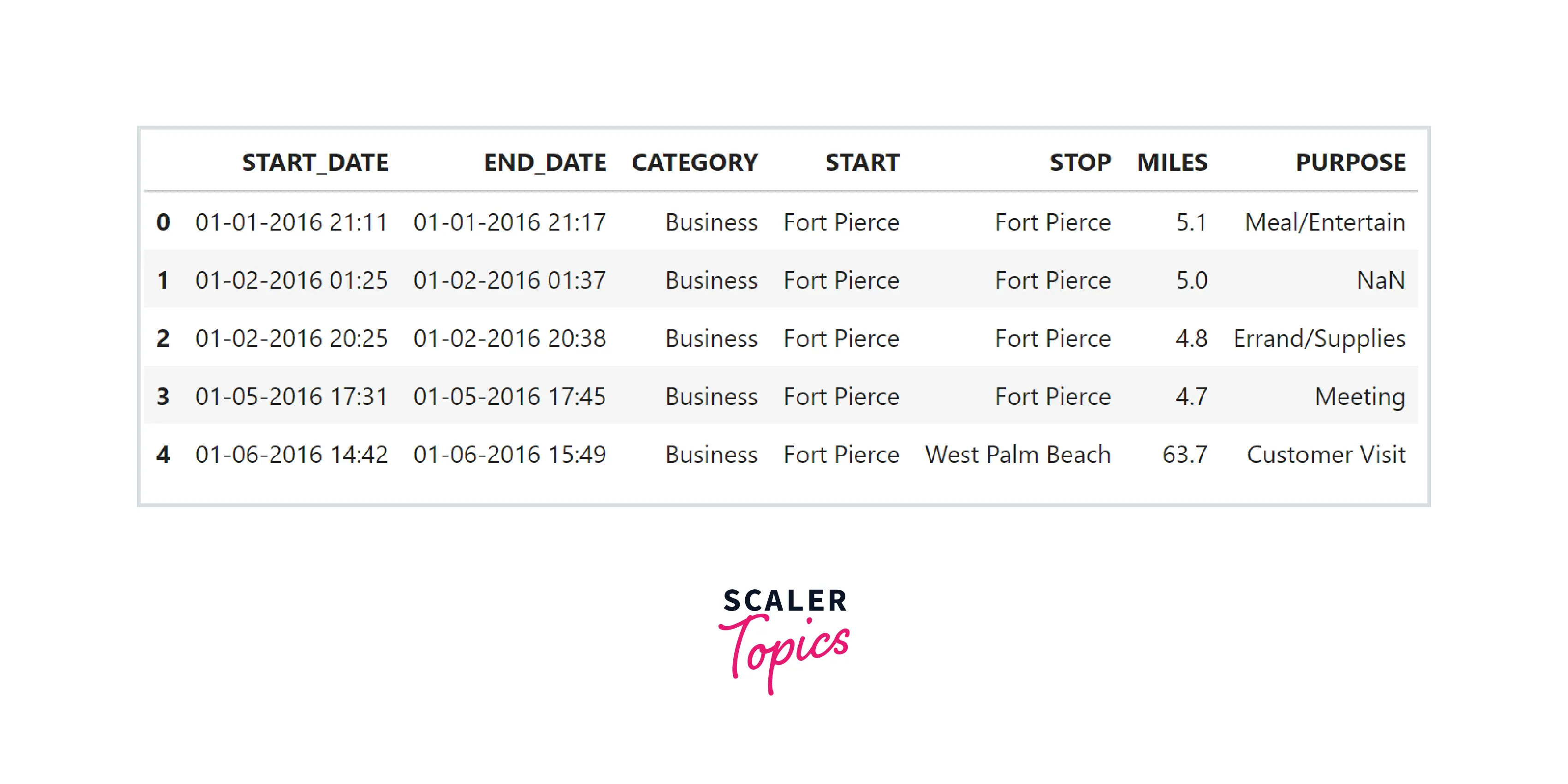
- Let’s load the dataset in a pandas dataframe and explore variables and their data types.
Output:
- As we can see, this dataset has 7 features, 6 objects (strings) and 1 numeric. These features represent start time, end time, category, start location, end location, miles, and purpose of the ride.
- Maximum NULL values are present in the PURPOSE feature, and 1 NULL value is present in features END_DATE, CATEGORY, START, and STOP.
Data Cleaning
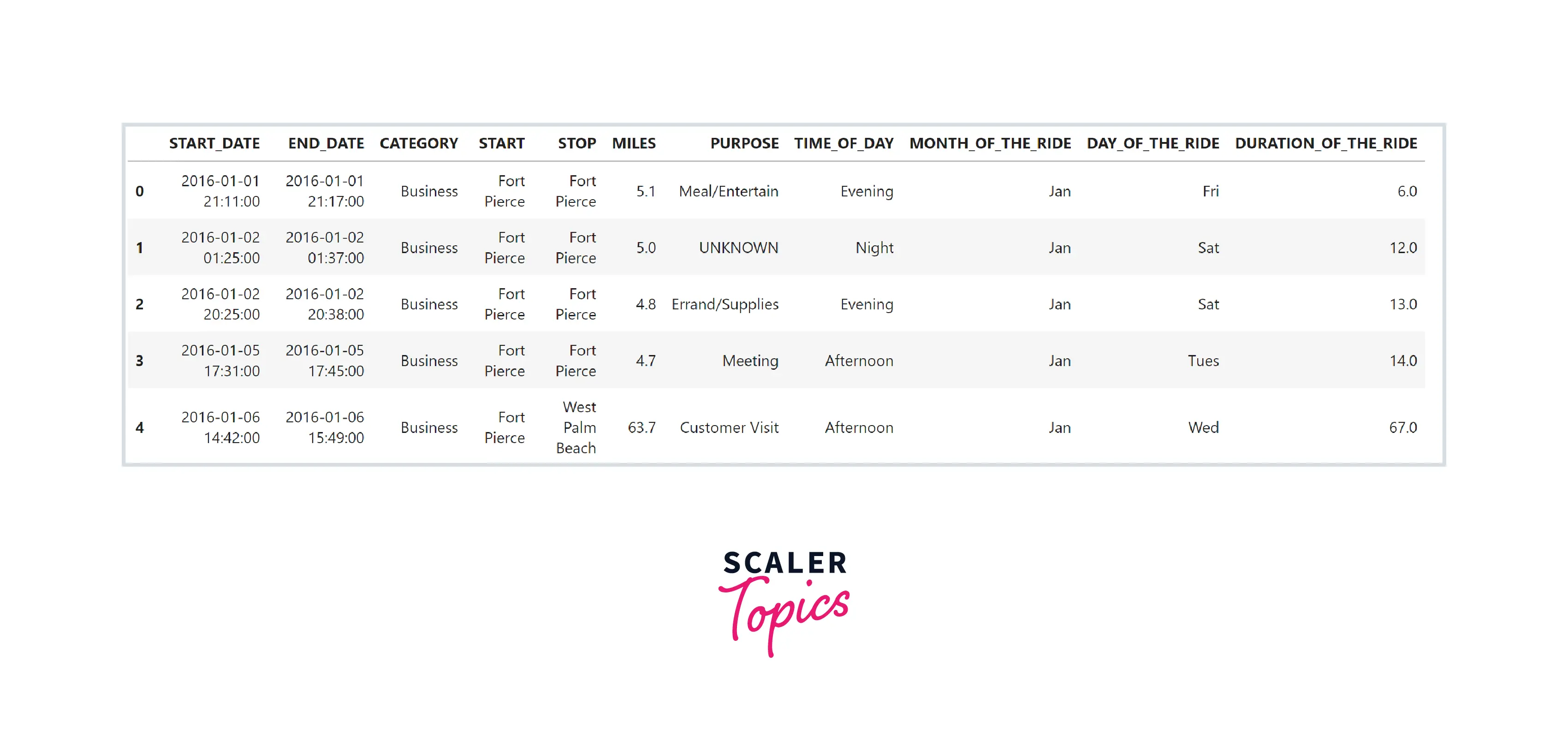
- In this step, we will remove inconsistent records and handle missing values. We will replace NULL values in the PURPOSE feature with the UNKNOWN string. We will drop one record containing a NULL value in the remaining feature.
Output:
Data Preprocessing
- In this step, we will perform multiple preprocessing and feature engineering steps, as mentioned below -
- START_DATE and END_DATE to be converted into datetime format.
- Create a new feature representing the time of the day - morning, afternoon, evening, or night.
- Create a new feature representing the day of the week, such as Monday, Sunday, etc.
- Create a new feature representing the month of the ride, such as March, June, etc.
- We will calculate the duration of the ride by subtracting the end time and start time of the ride.
Data Exploration
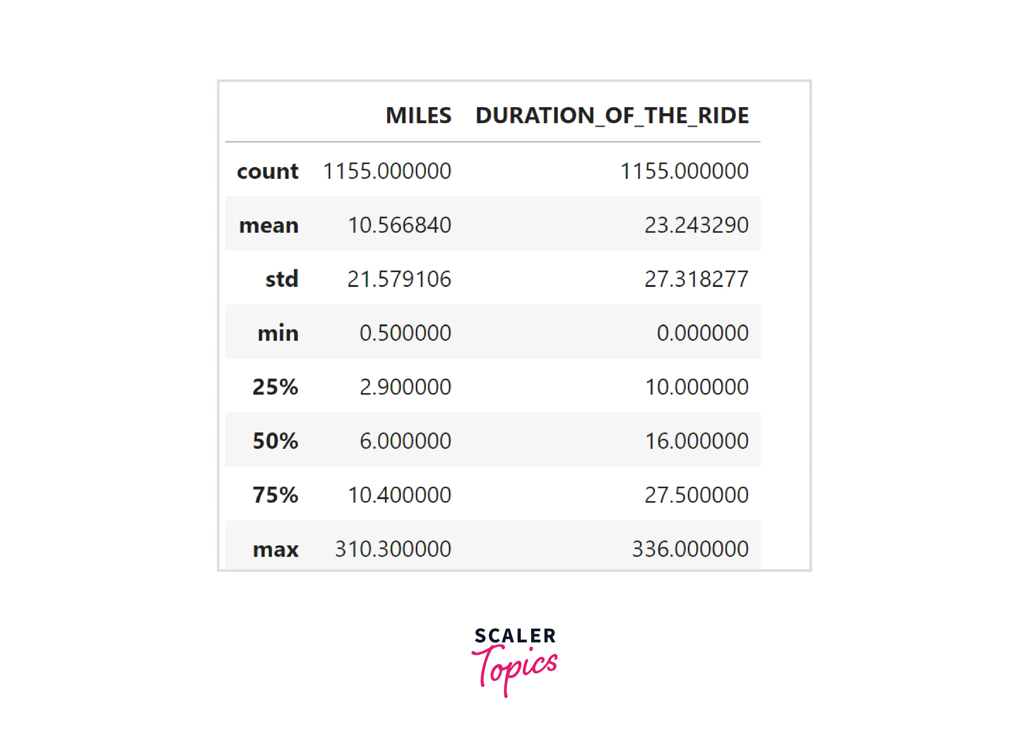
- Let’s explore summary statistics of the numerical features present in the dataset. As we can see below, the mean miles of a ride are 10.56, and the mean duration of a ride is 23 minutes. The maximum number of miles of a ride is 310, and the max duration of a ride is 336 minutes.
- Let’s explore the minimum and max values of the START_DATE feature. As we can see below, this dataset contains rides for the entire year 2016.
Output:
- There are four categorical features in the dataset - CATEGORY, START, STOP, and PURPOSE. Let’s explore the count of unique categories in each feature.
Output:
Scaler Placement Report and Statistics
Scaler learners achieved 2.5x salary growth with average post-Scaler CTC reaching ₹23L.
Data Visualization
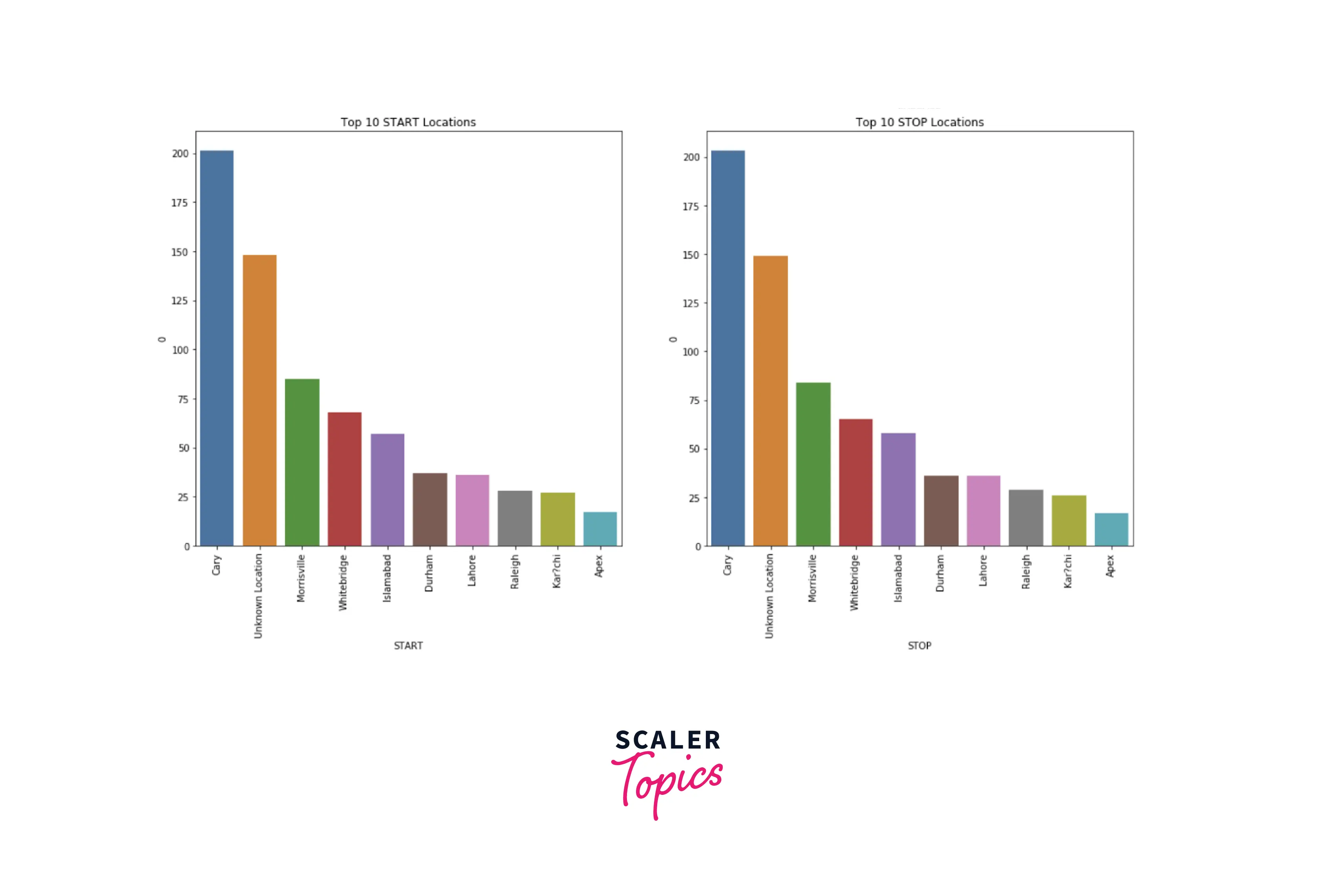
- In this step, we will explore the data by using various visualization techniques. First, let’s explore the distribution of categories in CATEGORY and PURPOSE features and the top 10 locations for START and STOP.
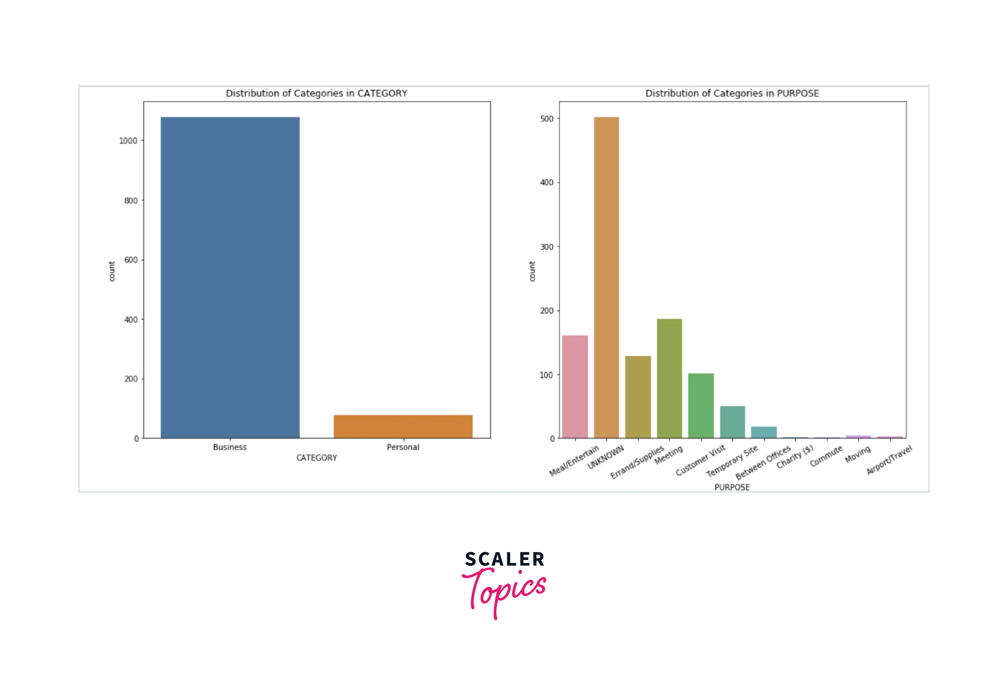
- Insights from the above figures can be summarized as -
- There are two categories for each ride - business and personal. Most of the rides (around 90%) belong to the business category.
- Top 4 purposes of the ride are - meeting, meal/entertainment, errand/supplies, and customer visit.
- Top 4 locations for both start and stop are - Cary, Morrisville, Whitebridge, and Islamabad.
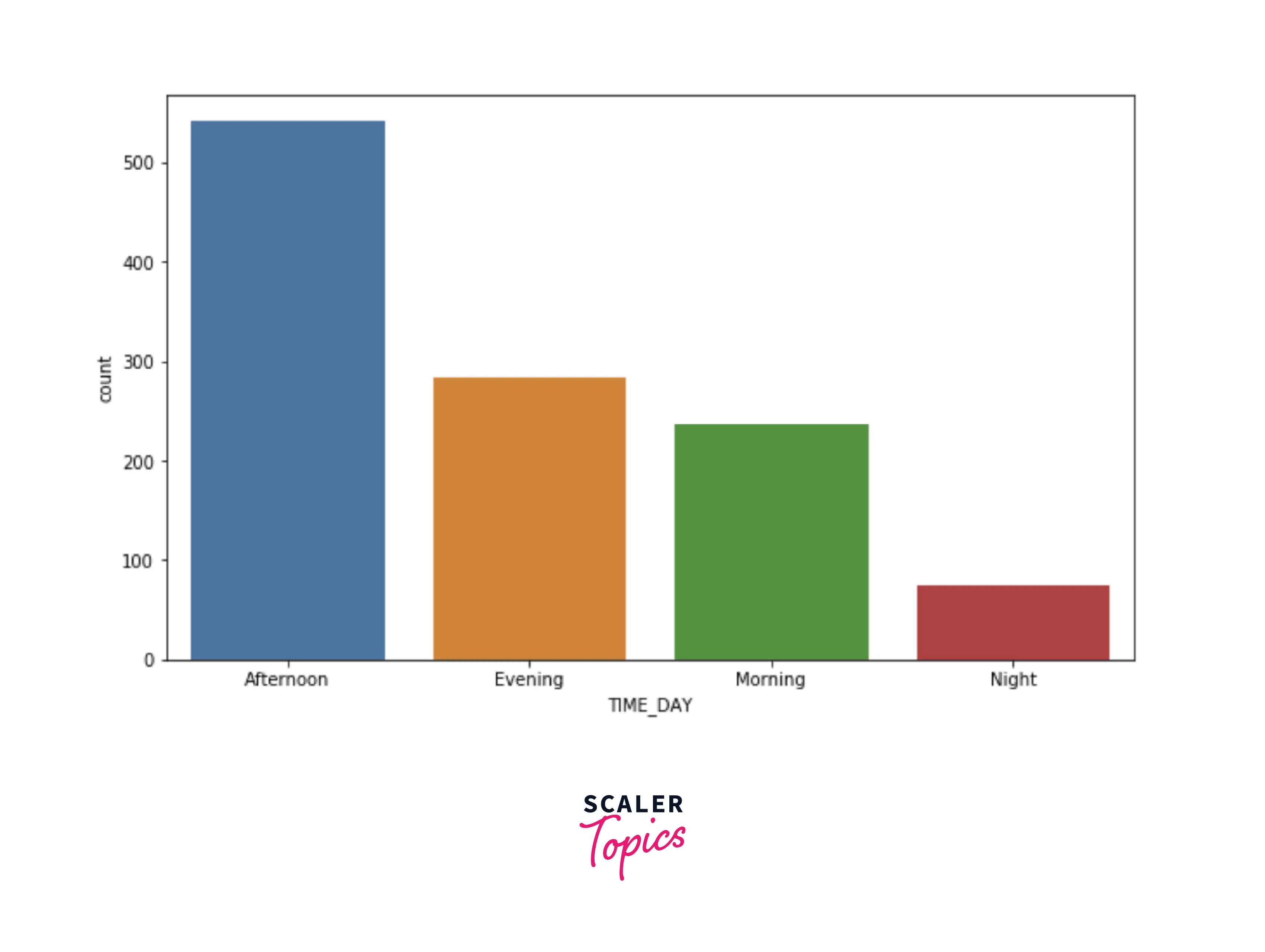
- Let’s explore the count of the rides based on the time of the day. As we can see below, most of the rides are started during the afternoon, and the least number of rides are started at night.
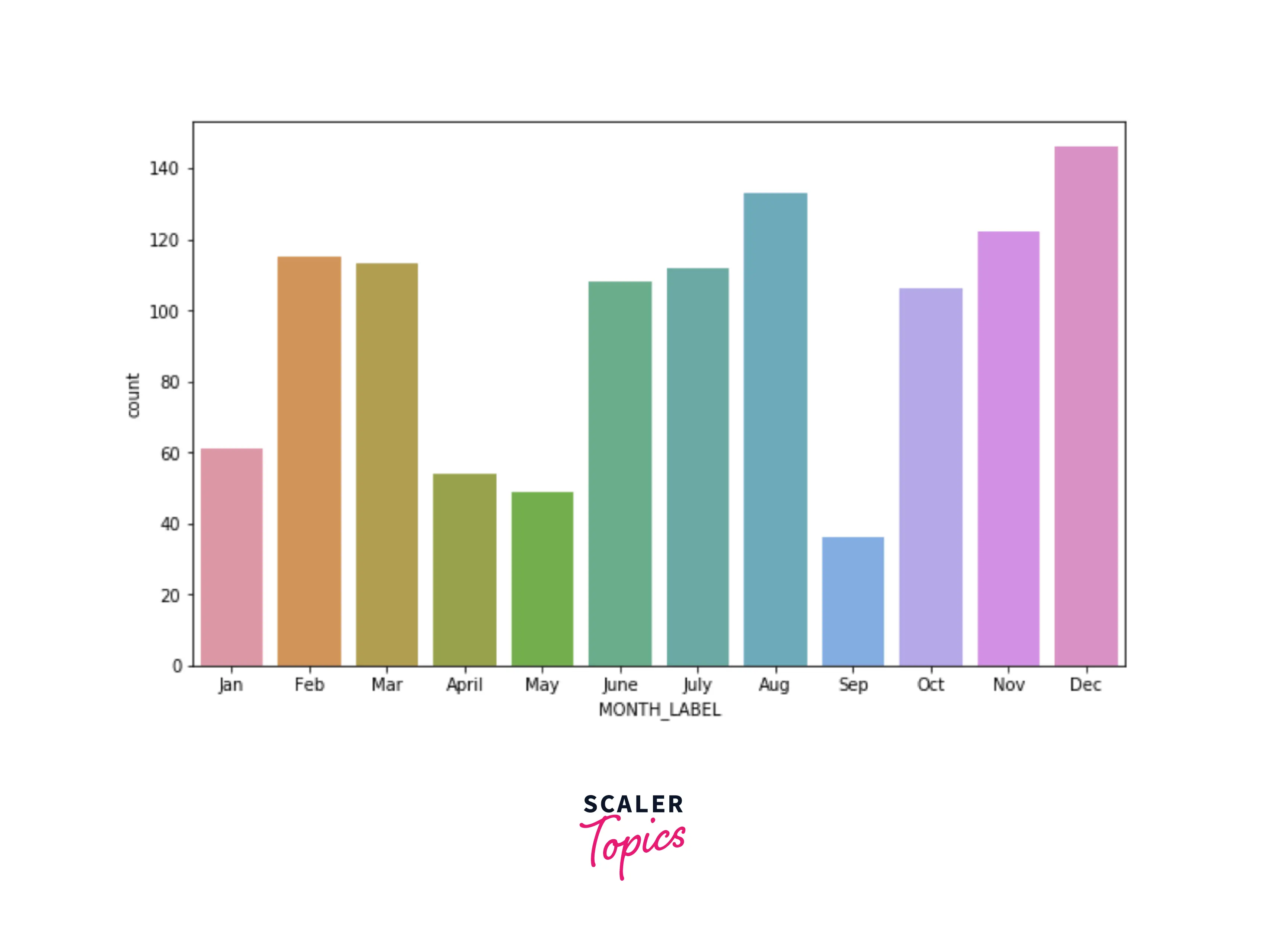
- Let’s explore the count of the rides based on the month of the day. As we can see below, most rides were completed during December, November, and August. A good number of rides are also distributed across Feb, March, June, and July. September has the least number of rides.
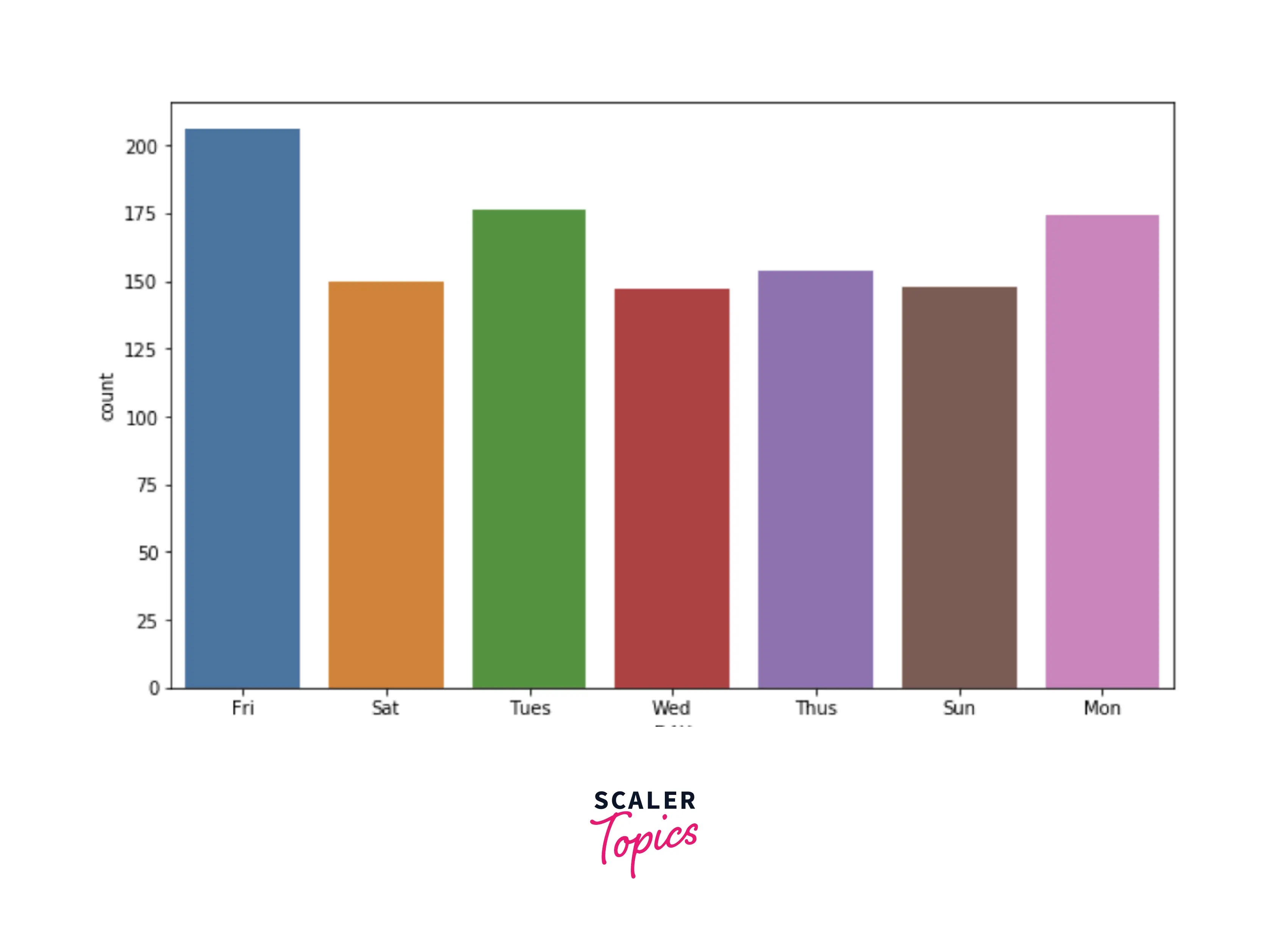
- Let’s explore the count of the rides based on the day of the week. As we can see below, the maximum number of rides are requested on Friday, and Wednesday has the least number of rides.
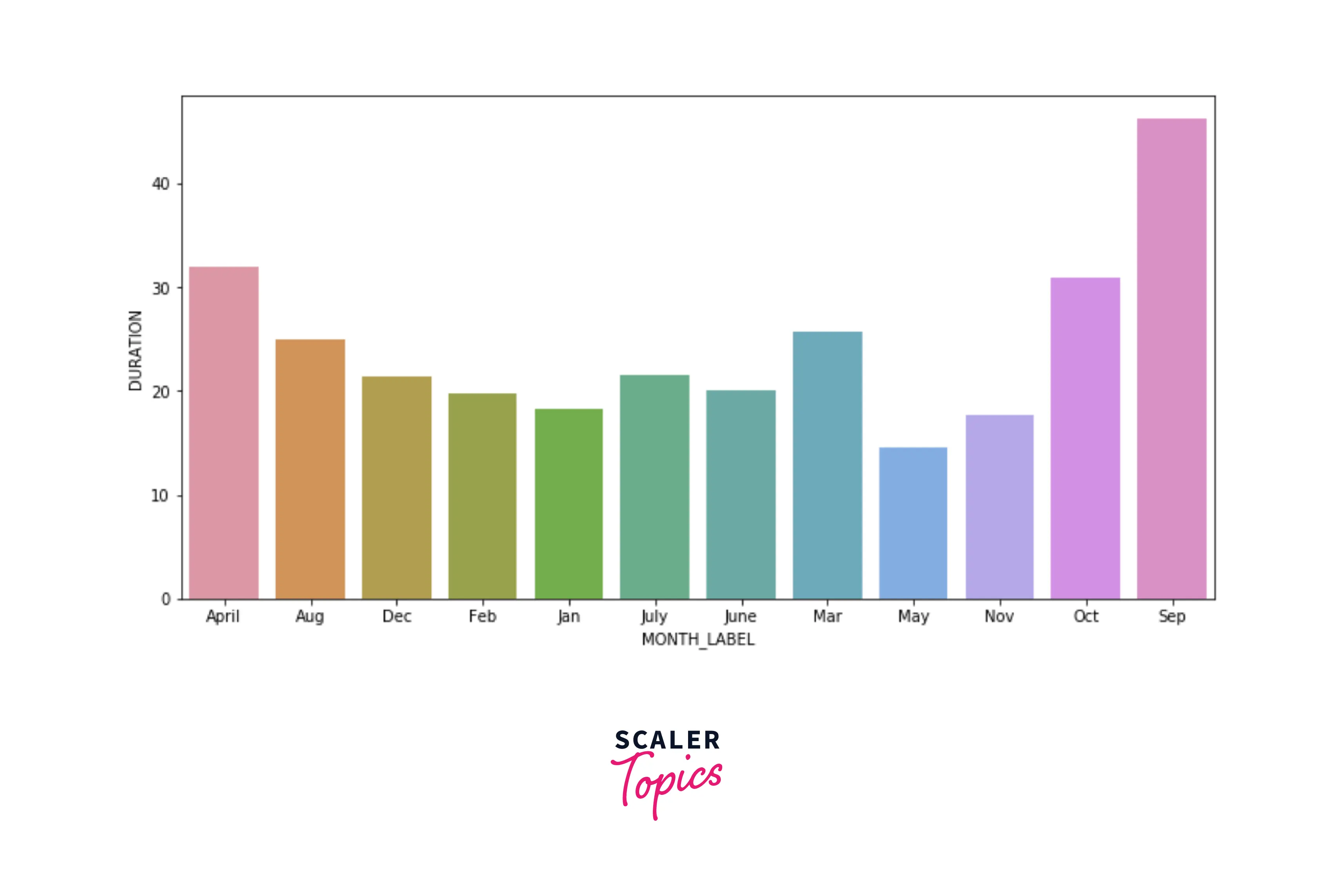
- Let’s explore the average duration of each ride based on the month. As we can see below, September has the highest average for the duration but has the least number of rides based on the previous explorations.
- In this step, we applied various visualization techniques to explore the distribution of categories in the categorical features. We also explored trends of the ride count based on time, the month of the day, and the day of the week. We also explored the average duration for each month.
Ready to transform your analytical skills? Our free data science course equips you with the tools to uncover insights and drive meaningful change.
What’s Next
- You can explore the average duration of the rides based on the time of the day and day of the week features. A similar exercise can be performed for the miles of the ride as well.
- You can identify any underlying patterns by plotting a scatter plot of the durations and miles feature.
- You can one-hot encode the categorical features and build a heatmap to identify the correlations.
Conclusion
- We loaded the dataset containing Uber rides and performed data cleaning and data preprocessing steps.
- We applied various descriptive statistics and data visualization techniques to perform EDA on the data to generate insights from it.