GridView in Android
Overview
A GridView in Android is a versatile UI widget that arranges data in a grid-like fashion, typically used to display images, text, or other items in rows and columns. It provides a scrollable grid layout, allowing users to view a large number of items efficiently. Developers can customize the GridView's appearance and behavior, including the number of columns, item spacing, and handling item selection.
XML Attributes of GridView
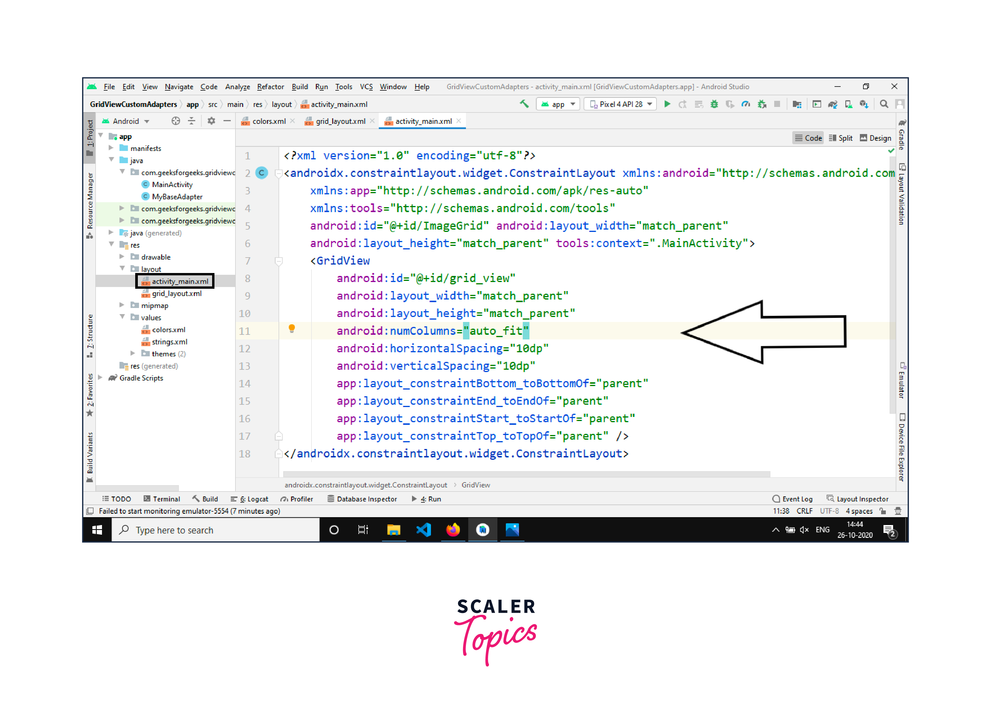
The GridView widget in Android is a versatile UI component used to display items in a grid-like arrangement. It is commonly used for displaying images, text, or other data in rows and columns. When defining a GridView in XML layout files, developers can use several attributes to customize its appearance and behavior. Here's an overview of some important XML attributes of the GridView:
- android:id:
This attribute assigns a unique identifier to the GridView, allowing you to reference it in code for dynamic manipulation. - android
and android:layout_height:
These attributes specify the width and height of the GridView within its parent layout. Common values include wrap_content, match_parent, or specific dimensions like dp or sp. - android:numColumns:
This attribute defines the number of columns in the GridView. You can set it to an integer value to control how many items appear in each row. - android:columnWidth:
This attribute specifies the width of each column in the GridView. You can use specific dimension values or "auto" to automatically size columns based on the content. - android:gravity:
This attribute defines how the items within each cell of the GridView are aligned. You can set values like "center," "center_vertical," "center_horizontal," etc., to control the alignment. - android:background:
It sets the background color or drawable for the entire GridView. - android
and android:longClickable:
These attributes determine whether the GridView is clickable and supports long clicks. Set them to "true" or "false" as needed. - android:choiceMode:
This attribute specifies the selection mode for items in the GridView. Options include "none," "singleChoice," "multipleChoice," and "multipleChoiceModal." - android:listSelector:
It defines the background drawable used to indicate selected items in the GridView when the choice mode is enabled. - android:scrollbars:
This attribute controls the visibility of scrollbars. Options include "none," "vertical," "horizontal," or "both." - android:padding:
It sets the padding around the GridView, specifying the space between the GridView's edges and its content.
Step-by-Step Implementation of GridView in Android Studio
Build an AI-First Career, Master the Complete Skillset
Choose from our industry-leading programs designed for career success
Modern Software and AI Engineering Program
Master full-stack development with AI integration


 +1000 more
Modern Data Science and ML with specialisation in AI
Advanced data science techniques with AI specialization
+1000 moreAdvanced AIML with Specialisation in Agentic AI
Deep dive into AIML with focus on Agentic systems
+1000 moreDevOps, Cloud & AI Platform Engineering
Build and manage AI-powered cloud infrastructure
+1000 moreAI Engineering Advanced Certification by IIT-Roorkee
Premier AI engineering certification from IIT-Roorkee

AI Forward Deployed Engineer Program
Full-stack engineering, production AI and client-facing consulting
+1000 moreStep - 1: Create a New Android Project
Begin by opening Android Studio and creating a new Android project. Follow the wizard to set up the project with the desired name, package name, and other settings. Choose an empty activity template or one that best suits your needs.
Step - 2: Design the XML Layout
In the activity_main.xml file (or any other XML layout file you prefer), define the GridView element. The GridView layout can be customized to meet your requirements. Here's an example XML layout:
Step - 3: Create an Adapter
To populate the GridView with data, you need to create a custom adapter class. This adapter acts as a bridge between the data source and the GridView. You can create a new Java or Kotlin class for your custom adapter. Below is an example of a simple adapter in Kotlin:
Step - 4: Initialize the GridView in the Activity
In your MainActivity (or any activity where you want to use the GridView), initialize the GridView and set the adapter:
Step - 5: Handle Item Clicks (Optional)
If you want to handle item clicks in the GridView, you can set an OnItemClickListener like this:
Step - 6: Run Your App
Build and run your Android application on an emulator or a physical device. You should see a GridView with your data displayed in a grid format.
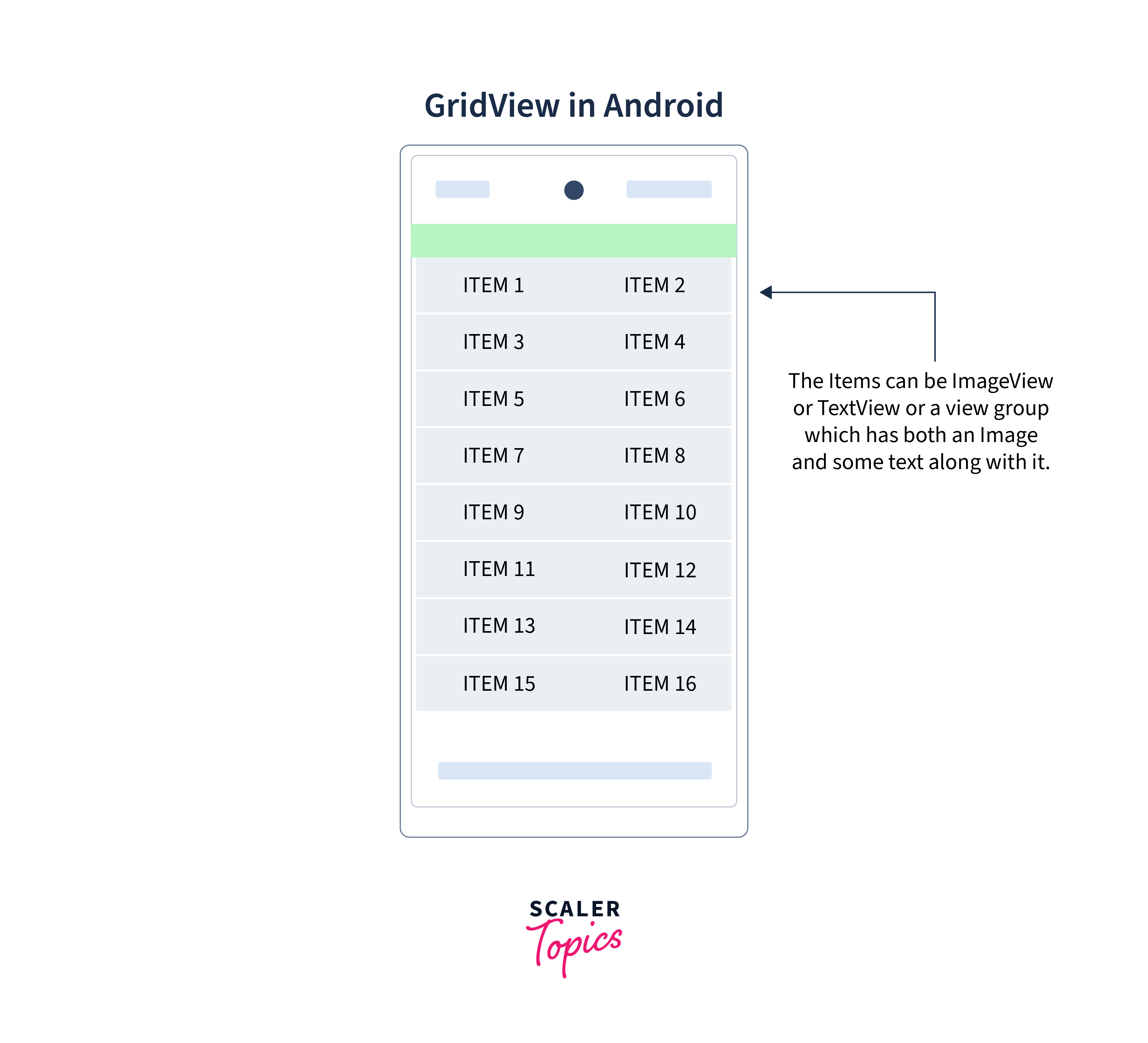
Example of Basic GridView Using ArrayAdapter
Step - 1: Setting Up the Android Project
Open Android Studio and create a new Android project. Choose an appropriate project name, or package name, and select an empty activity or template that suits your needs. Ensure you have the necessary SDK components installed.
Step - 2: Design the XML Layout
In the activity_main.xml layout file, you'll define the structure of your app's user interface, including the GridView. This XML layout will help you visualize how elements are arranged on the screen. Here's a sample XML layout for your activity:
How Scaler Transformed Careers in Different Fields
Scaler learners achieved 2.5x salary growth with average post-Scaler CTC reaching ₹23L.
 Google
 Amazon
 Microsoft
 Flipkart
 Adobe1200+ more
Step - 3: Create an ArrayAdapter
To populate the GridView with data, you need an adapter. The ArrayAdapter bridges the gap between your data source and the GridView, making it display your data efficiently. In this example, we'll use an array of color names. Create a new Kotlin or Java class for your custom adapter, depending on your preferred programming language. Here's a Kotlin example:
Step - 4: Initialize the GridView in the Activity
In your MainActivity (or any other activity where you want to use the GridView), you'll initialize the GridView and set the ArrayAdapter to populate it with data. Here's a Kotlin example:
Step - 5: Handle Item Clicks (Optional)
You can also handle item clicks in the GridView. To do this, set an OnItemClickListener. Here's an example:
Step - 6: Run Your App
Build and run your Android application on an emulator or a physical device. You'll see a GridView displaying a grid of colors based on the data provided in the ArrayAdapter. You can click on items to see the optional click handling in action.
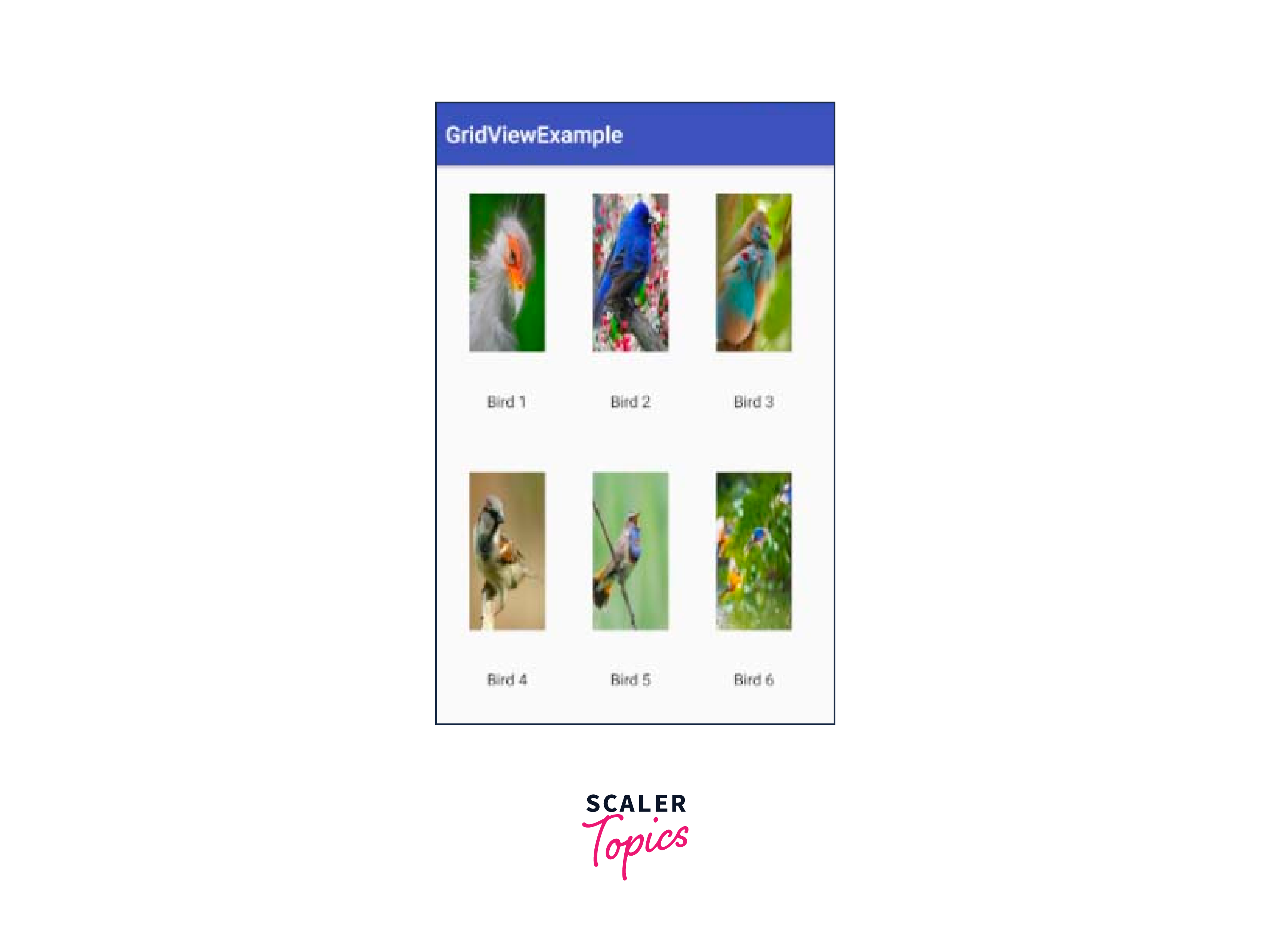
Example of Customizing GridView Using BaseAdapter
Customizing a GridView using BaseAdapter in Android is valuable for creating grid layouts featuring images and text, suitable for displaying structured content like image galleries or product listings. In this example, the CustomGridAdapter class is introduced. It is designed to customize the appearance and behavior of individual grid items.
A custom adapter extending BaseAdapter is employed in Android to exert greater control over the appearance of grid items. It offers flexibility by enabling developers to define custom layouts for each grid item, combining images, text, and other UI elements as needed. This customization enhances the user interface's uniqueness and allows for more tailored user experiences. Data binding capabilities further empower developers to bind data to grid items efficiently, making it a preferred choice for creating diverse and visually appealing grid layouts.
Turn Learning into Career Growth
Step - 1: Set Up the Android Project
Begin by opening Android Studio and creating a new Android project with an appropriate name, package name, and activity. Choose an empty activity template or one that suits your requirements.
Step - 2: Design the XML Layout
In the activity_main.xml layout file, define the structure of your app's user interface, including the GridView. Here's a sample XML layout:
Step - 3: Create a Custom Adapter by Extending BaseAdapter
To customize the GridView, create a custom adapter class by extending BaseAdapter. This adapter will allow you to define how each grid item should be displayed. Here's an example in Kotlin:
Step - 4: Create the GridItem Class
You need a class to represent the items you want to display in the GridView. Create a GridItem class to hold information about each item, such as the image resource ID and text. Here's an example:
Step - 5: Define the Custom Grid Item Layout
Create an XML layout file for your custom grid items. In this example, we'll create grid_item_layout.xml:
Step - 6: Initialize the GridView in the Activity
Now, in your MainActivity (or the activity where you want to display the GridView), initialize the GridView and set the custom adapter. Here's a Kotlin example:
Step - 7: Run Your App
Build and run your Android application on an emulator or a physical device. You'll see a GridView displaying custom grid items, each containing an image and text. Click on items to see the GridView in action.
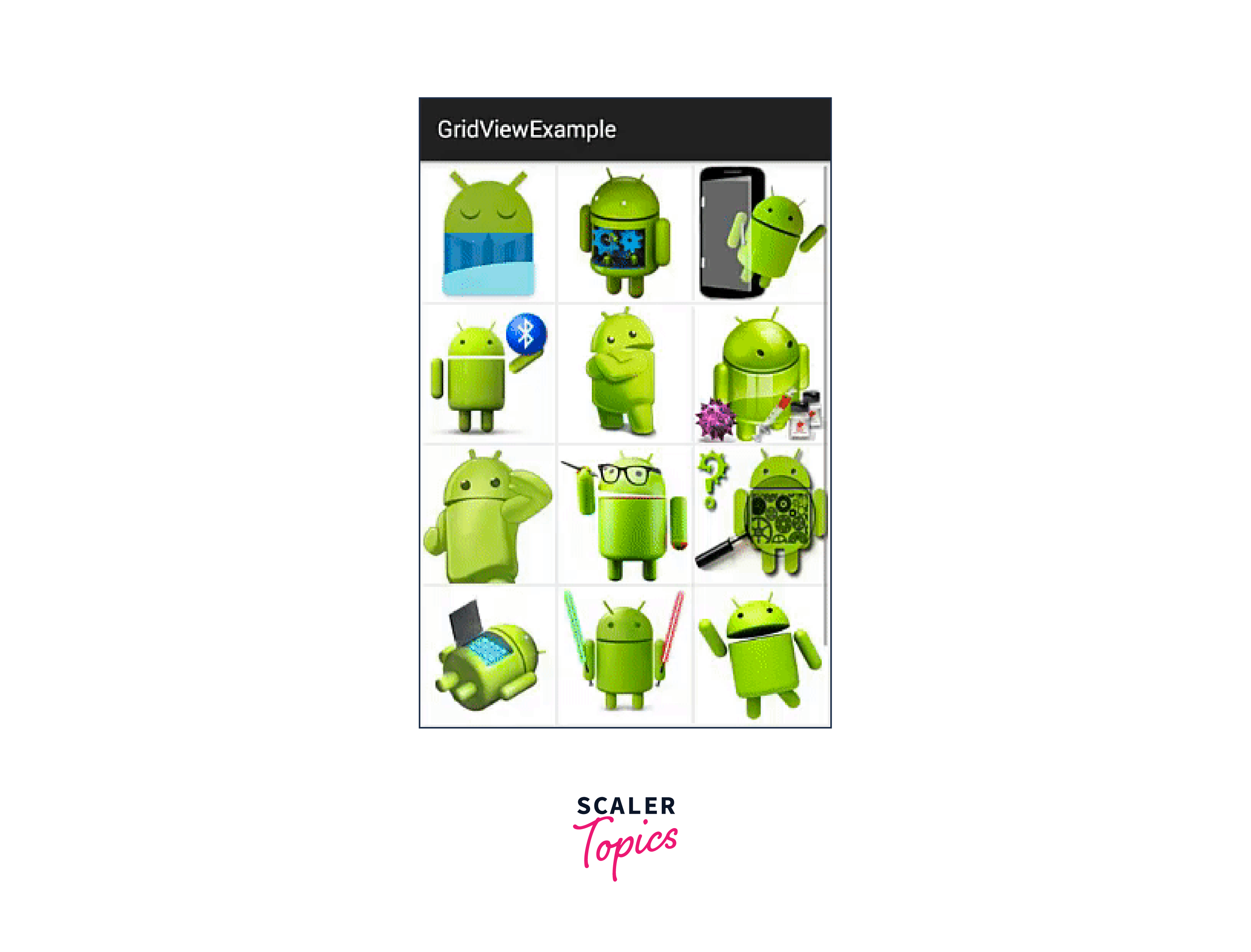
Conclusion
- Grid Layout:
GridView is a ViewGroup that arranges its children in a grid format, allowing for rows and columns of items. - Adapter-Based:
It's typically used with an adapter, like BaseAdapter or ArrayAdapter, to populate and manage the grid's content. - Customization:
Developers can create custom adapters to control the appearance and behavior of grid items. - Scrollable:
GridView supports scrolling when there are more items than can fit on the screen. - Item Clicks:
It allows for item click handling to respond to user interactions. - Dynamic Data:
You can dynamically update the data source of a GridView and notify the adapter to refresh the view. - XML or Programmatically:
GridViews can be defined in XML layouts or created programmatically in Java/Kotlin.