How to Create a Hamburger Menu in CSS?
 FREE
FREE

Overview
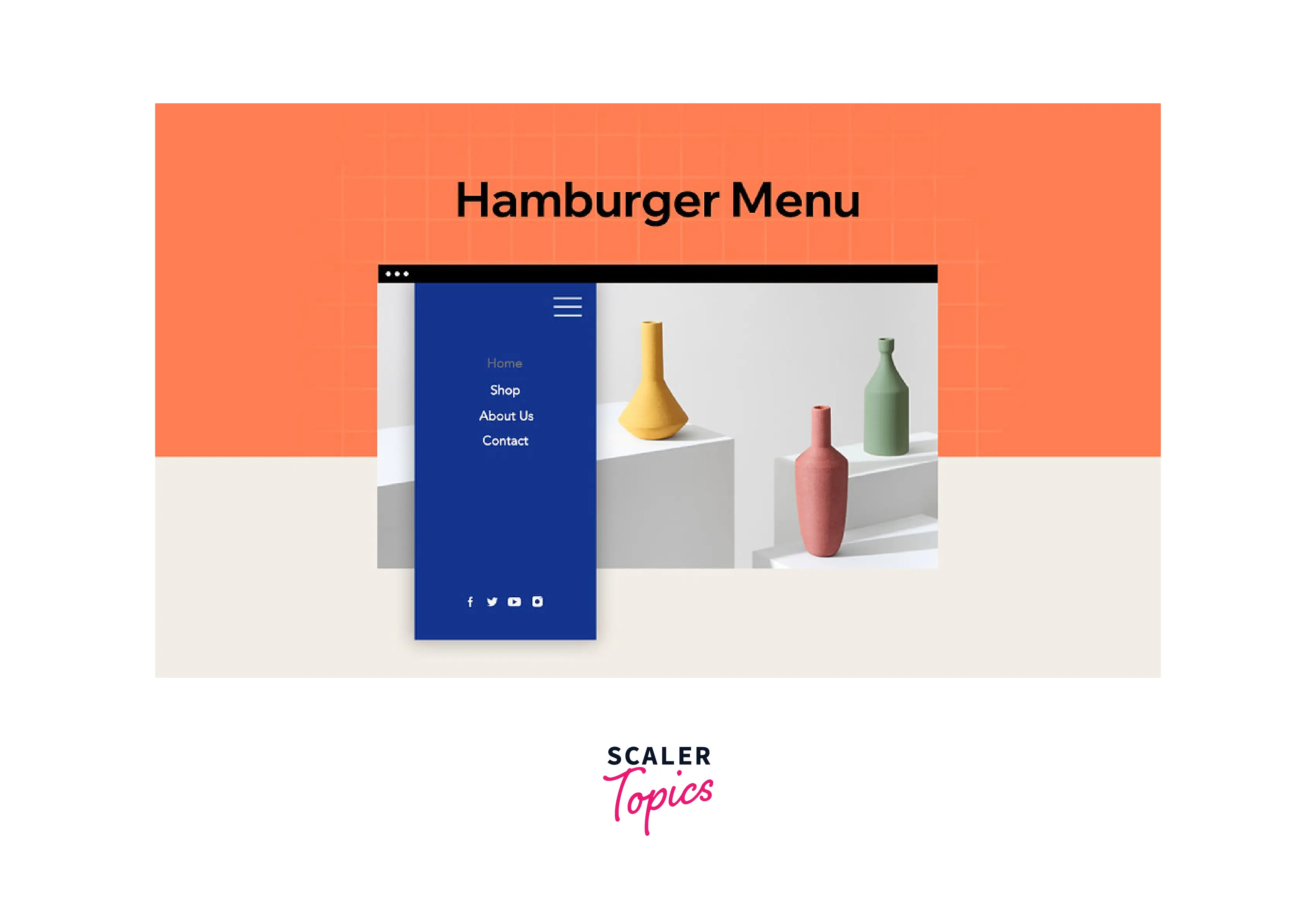
A hamburger menu turns the navigation bar on and off by hiding it behind the button or displaying it. It appears when we click on the icon of three lines, resembling a hamburger. The hamburger menu creates a compact, scalable menu. In this article, we will learn about creating responsive hamburger menus and hamburger icons in CSS.
Pre-requisites
Make sure you understand the following fundamental ideas of HTML & CSS before continuing :
- Flex-box
- pseudo elements
- CSS media queries
- Selectors in CSS
Scaler Placement Report and Statistics
Scaler learners achieved 2.5x salary growth with average post-Scaler CTC reaching ₹23L.
What is a Hamburger Menu?
When the header navigation bar contains too many buttons and links, we may use a hamburger menu to display navigation links on our website. The hamburger menu creates a compact, scalable menu. The menu is referred to as a "hamburger" menu because the hamburger icon looks like a stack of hamburgers. Usually, it is for smaller displays and mobile devices. However, PC websites may also employ CSS hamburger menus.
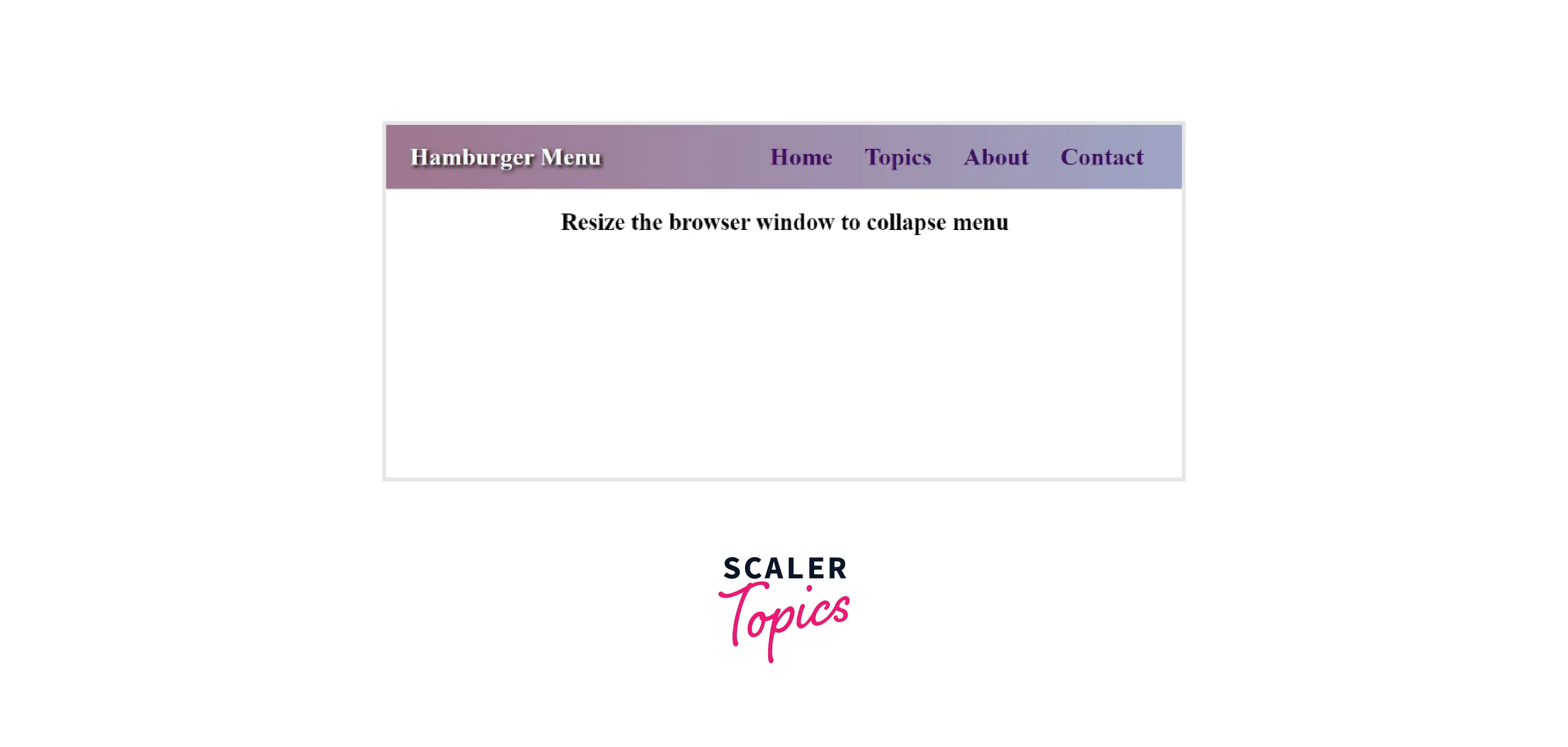
How to Create a Hamburger Menu?
The following example describes how to create a hamburger menu.
Transform Your Career
Choose from our industry-leading programs designed for career success
Modern Software and AI Engineering Program
Master full-stack development with AI integration

 +1000 more
Modern Data Science and ML with specialisation in AI
Advanced data science techniques with AI specialization
+1000 moreAdvanced AIML with Specialisation in Agentic AI
Deep dive into AIML with focus on Agentic systems
+1000 moreDevOps, Cloud & AI Platform Engineering
Build and manage AI-powered cloud infrastructure
+1000 moreAI Engineering Advanced Certification by IIT-Roorkee
Premier AI engineering certification from IIT-Roorkee
1. Structure of a Responsive Hamburger Menu (HTML)
- We have the main navigation menu and a container for creating the hamburger icon.
- The navigation menu consists of a few links.
- Since we are using pure CSS, we will control the state of the icon, i.e., whether to show and hide the navbar using the HTML checkbox.
- We will specify an id for the checkbox and associate it with the label using the for attribute. Clicking the <label> will select and deselect the checkbox. Then we will toggle the checkbox using CSS.
Scaler Placement Report and Statistics
Scaler learners achieved 2.5x salary growth with average post-Scaler CTC reaching ₹23L.
2. Styling the Responsive Hamburger Menu with CSS
- We will style the main menu nav and the hamburger menu-button-container.
- To draw the three lines for the hamburger icon, we'll use the ::before and ::after pseudo-elements. The CSS for this is:
3. Adding Functionality to the Hamburger Menu with CSS
- We will move the top and bottom bars or lines of the icon to the position of the middle line.
- We will hide the middle line.
- Lastly, we will rotate the top and bottom lines 45 degrees in opposite directions to create a cut/cross icon.
4. Responsive Navbar Using CSS Media Queries
- We will add the CSS media queries to make our hamburger navbar responsive.
- We must select a screen width that will toggle a full-width menu and the responsive CSS hamburger menu.
Output
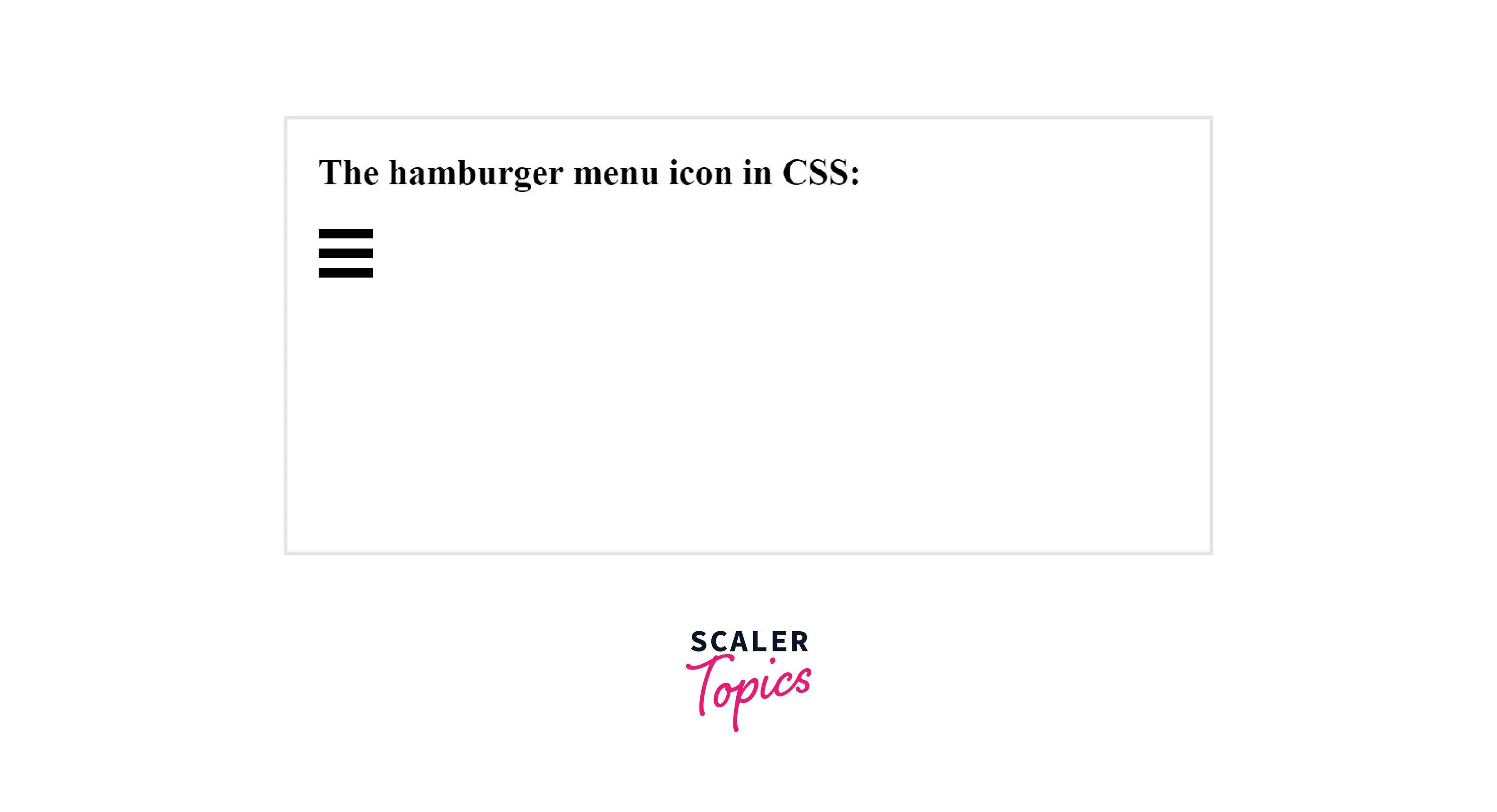
How to Create a Hamburger Menu Icon?
We can even create our menu icon with CSS instead of using the prebuilt icons.
The following example will help us learn how to make a hamburger menu icon:
- Three bars make up the menu icon.
- We'll utilize three div containers and style them appropriately to construct the bar structure.
- We will specify the width and height of the bar and add top and bottom margins to add space between each bar.
HTML
CSS
OUTPUT
Turn Learning into Career Growth
Different Types of Hamburger Menu CSS Designs
We can create various hamburger menu designs, including animated, sliding, centered, and others. After learning about the CSS hamburger menu, let's examine some examples and discover how to make them.
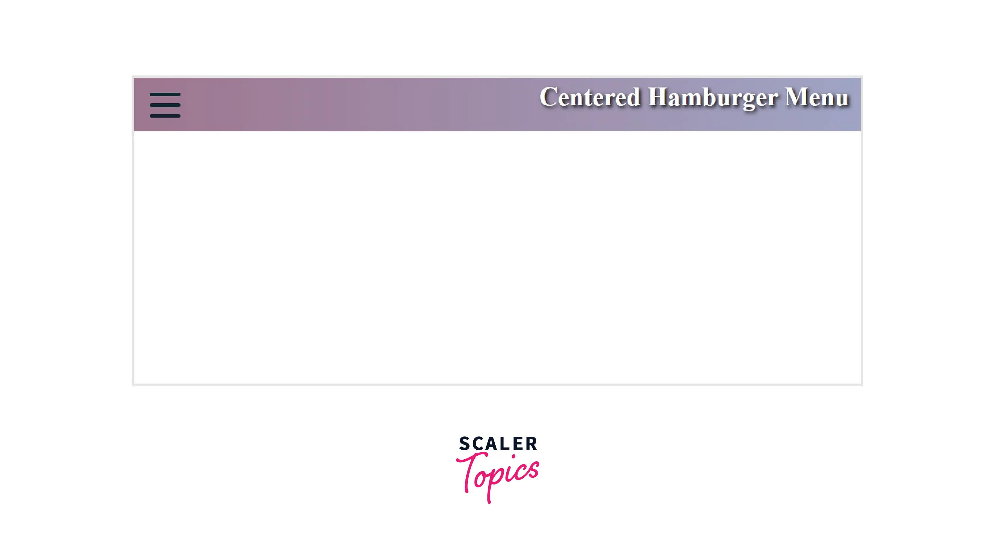
1. Centered Hamburger Menu Css Design
When clicked, the hamburger icon changes into a cross and serves as the close button. The menu slides into view and displays the navigation links in the center.
HTML
CSS
Output
You can visit here to view more
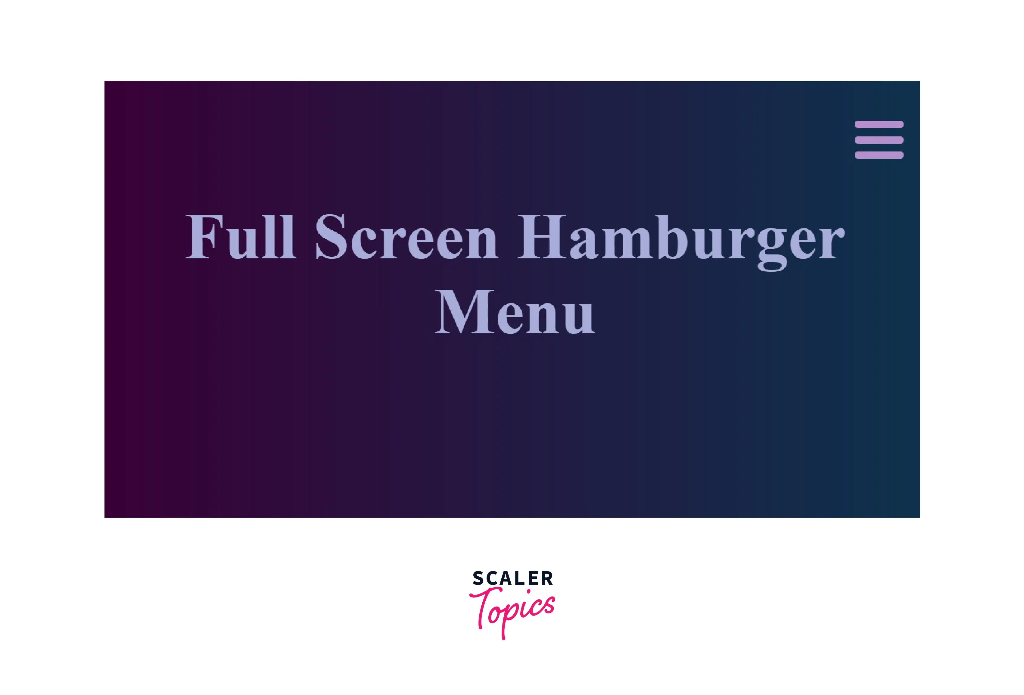
2. Full Screen Hamburger Menu CSS Design
We can create a hamburger menu in full-screen mode. The navigation bar takes up the whole browser window. It comes in handy when the menu has a lot of choices or relevant information.
HTML
CSS
Output
Advantages of a Responsive CSS Hamburger Menu
- Our website must have responsive mobile navigation since a significant portion of the global population accesses the internet using a mobile device.
- Full-width menus are often ineffective on small screens.
- To solve this problem, we can even position the menu vertically, but the user has to scroll past the menu to get the information, which is not ideal.
- No matter where a user is on our website, they can access the navigation bar using the fixed hamburger icon.
Accessibility
Hamburger menu icons can be helpful, although they are not the most user-friendly. It can become accessible to people with disabilities with the aid of ARIA. The screen reader will only recognize the symbol as a "hamburger" and not a menu when we hide our navigation bar and replace it with it. With the help of the subsequent actions, we can make it accessible:
- Hide the menu icon from the screen reader.
- Make sure screen readers know there is a menu bar, so they can click to open it.
An aria-label indicates that a link exists.
Browser Compatibility
The hamburger menu utilizes various CSS fundamentals like pseudo-elements, pseudo-classes, selectors, and transitions. All modern browsers practically support these properties.
| Browser | Version(Above all) |
|---|---|
| Google Chrome | 2.0 |
| Safari | 1.0 |
| Mozilla Firefox | 1.0 |
| Microsoft Edge | 12.0 |
| Chrome Android | 18 |
| Firefox for Android | 4 |
| Opera Android | 10.1 |
| Safari on iOS | 1 |
| OperaSamsung Internet | 1.0 |
| WebView Android | 4.4 |
Conclusion
- A hamburger menu turns the navigation bar on and off by hiding it behind the button or displaying it.
- Three lines that mimic a stack of hamburgers make up a hamburger icon.
- The hamburger menu simplifies navigation on mobile devices.
- By adding the appropriate width and height to a container, we can use it to make a hamburger icon.
- We can also create the icon using pseudo elements and style the top, bottom and middle lines.
- To make our navigation bar responsive, we may use CSS media queries.
 Google
 Amazon
 Microsoft
 Flipkart
 Adobe1200+ more