How to Create a Responsive Header with CSS?
 FREE
FREE

Overview
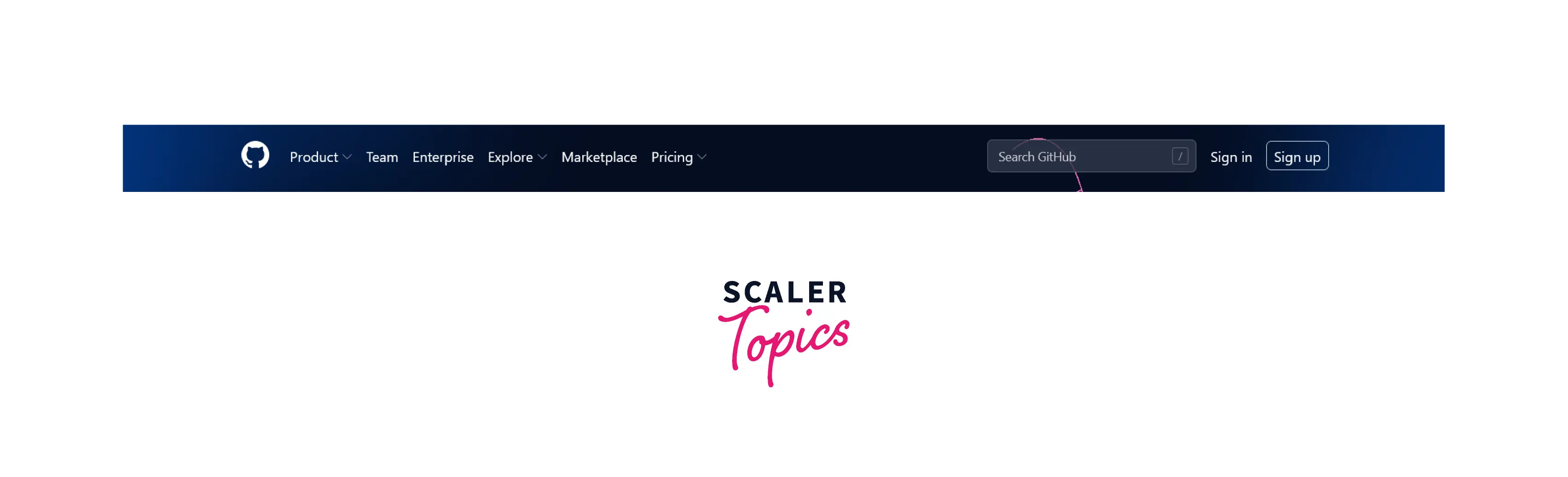
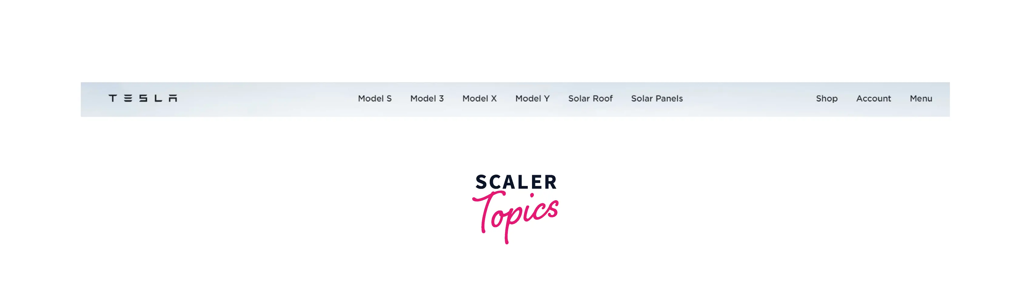
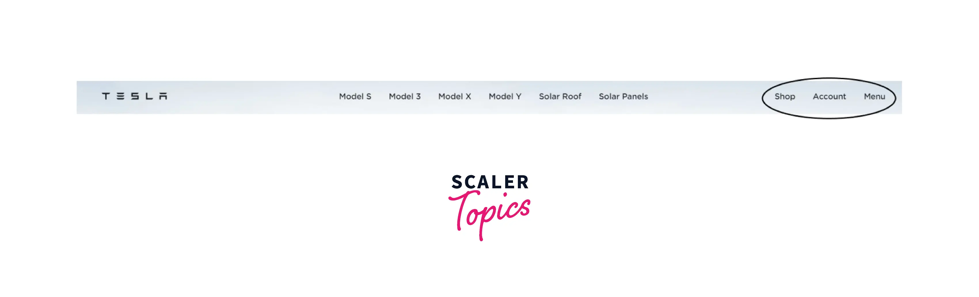
You are aware of the headers on websites, and you know that no matter what the screen size, they precisely match your device. An example of such header design CSS is shown below. Observe that this header changes according to the screen size and perfectly fits the device width.
Header visible on desktop view:
-
Github (Desktop view)
-
Tesla (Desktop view)
Header visible on mobile view:
-
Github (Mobile view)

-
Tesla (Mobile view)

And, many people nowadays prefer to use mobile phones instead of desktops to surf through websites. The headers play an important role to navigate on the entire website and thus it should look clean on all the devices. In this section, we are going to learn how you can too create the header design CSS so that it can look good on all sizes of devices.
Transform Your Career
Choose from our industry-leading programs designed for career success
Modern Software and AI Engineering Program
Master full-stack development with AI integration

 +1000 more
Modern Data Science and ML with specialisation in AI
Advanced data science techniques with AI specialization
+1000 moreAdvanced AIML with Specialisation in Agentic AI
Deep dive into AIML with focus on Agentic systems
+1000 moreDevOps, Cloud & AI Platform Engineering
Build and manage AI-powered cloud infrastructure
+1000 moreAI Engineering Advanced Certification by IIT-Roorkee
Premier AI engineering certification from IIT-Roorkee
Pre-Requisites
The Technique
There is not only a single correct way but many ways to design and build a header design CSS.
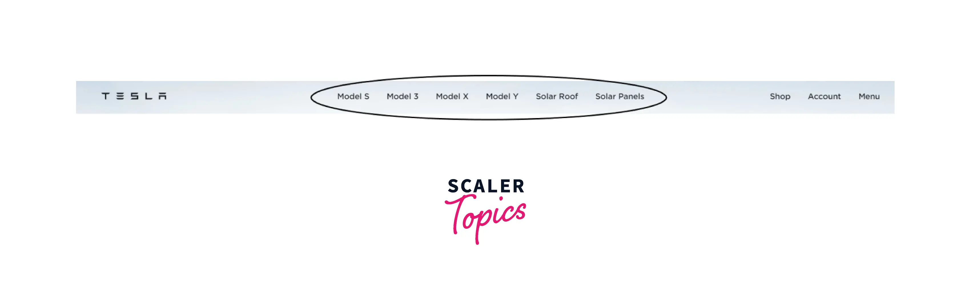
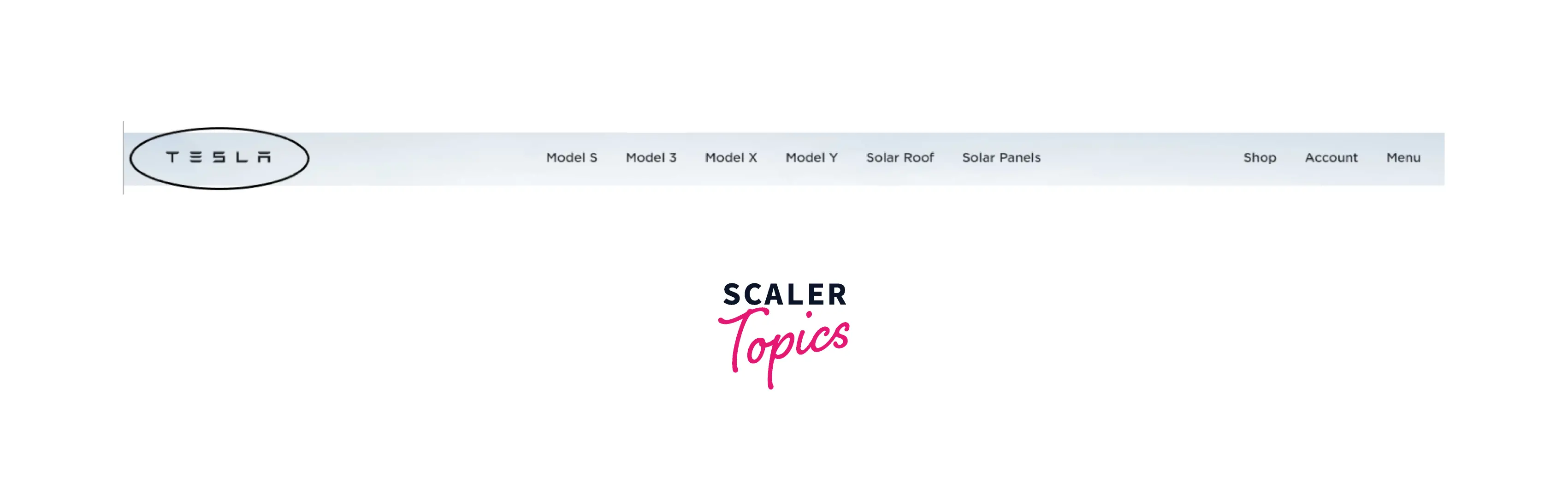
In this article, we are going to build a header using CSS flexbox. The header is separated into three sections and there are some content or links available inside the header to navigate through the website.
The three sections include:
-
Middle section: Contains hyperlinks to navigate throughout the website.
-
Left section: A company logo or the branding of the company.
-
Right section: A call to action button.
Although this is not the only way to design header CSS, in this article we are going to create such headers which follow the above given technique.
Turn Learning into Career Growth
The Code - HTML, CSS, and JavaScript
Now, let's take an example of the header design CSS.
HTML
The above HTML code produces the below output. As shown in the output below, there are no designs or colors present in the header design CSS. As well as, the header is not fully structured appropriately.
Output:

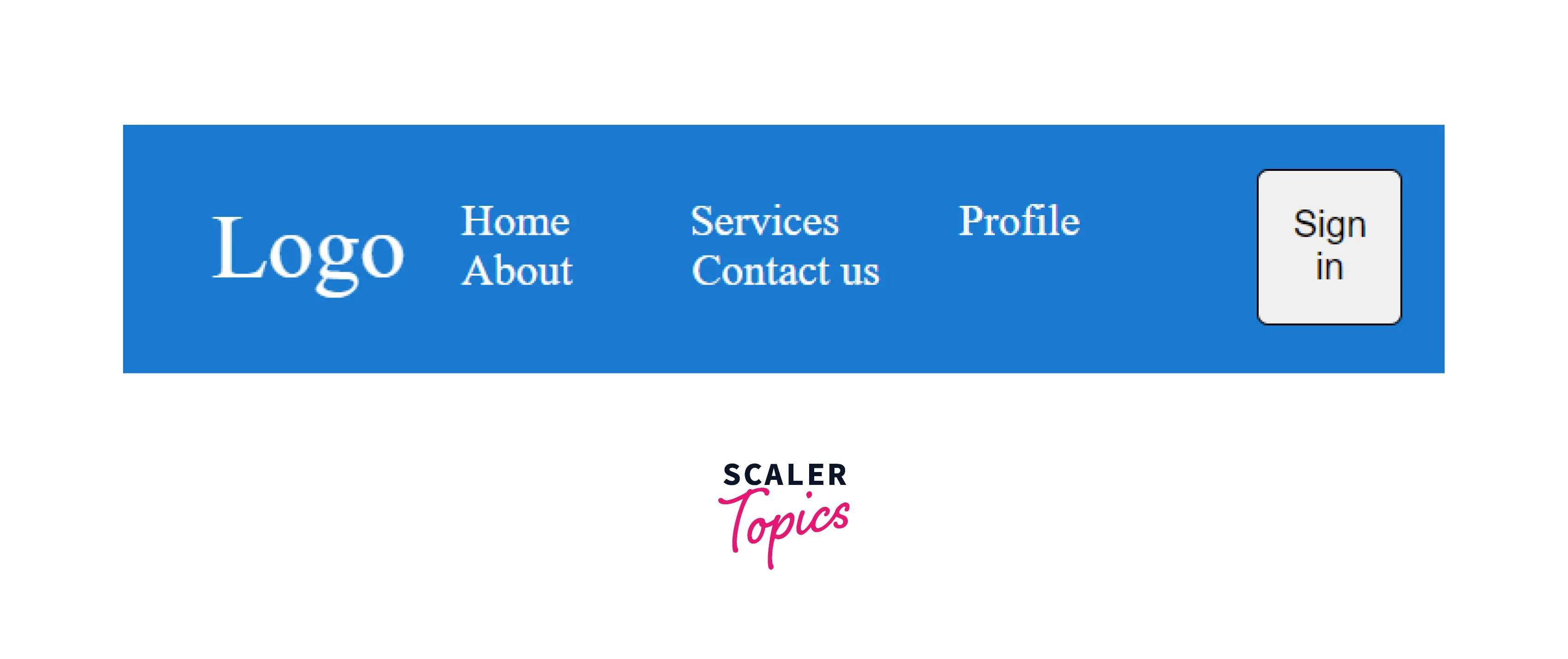
You can apply CSS as shown below to add design, color, and alignment of the header.
CSS
The output of the header with the CSS file attached to it is shown below:
Output:

As you can see in the image below, the header is not responsive yet. When you decrease the screen size the header design CSS breaks and all the content of the header does not align as it was before.
Output:
So, to make it responsive, you need to add a little bit of more CSS which is used to add responsive behavior to the header.
Adding responsiveness
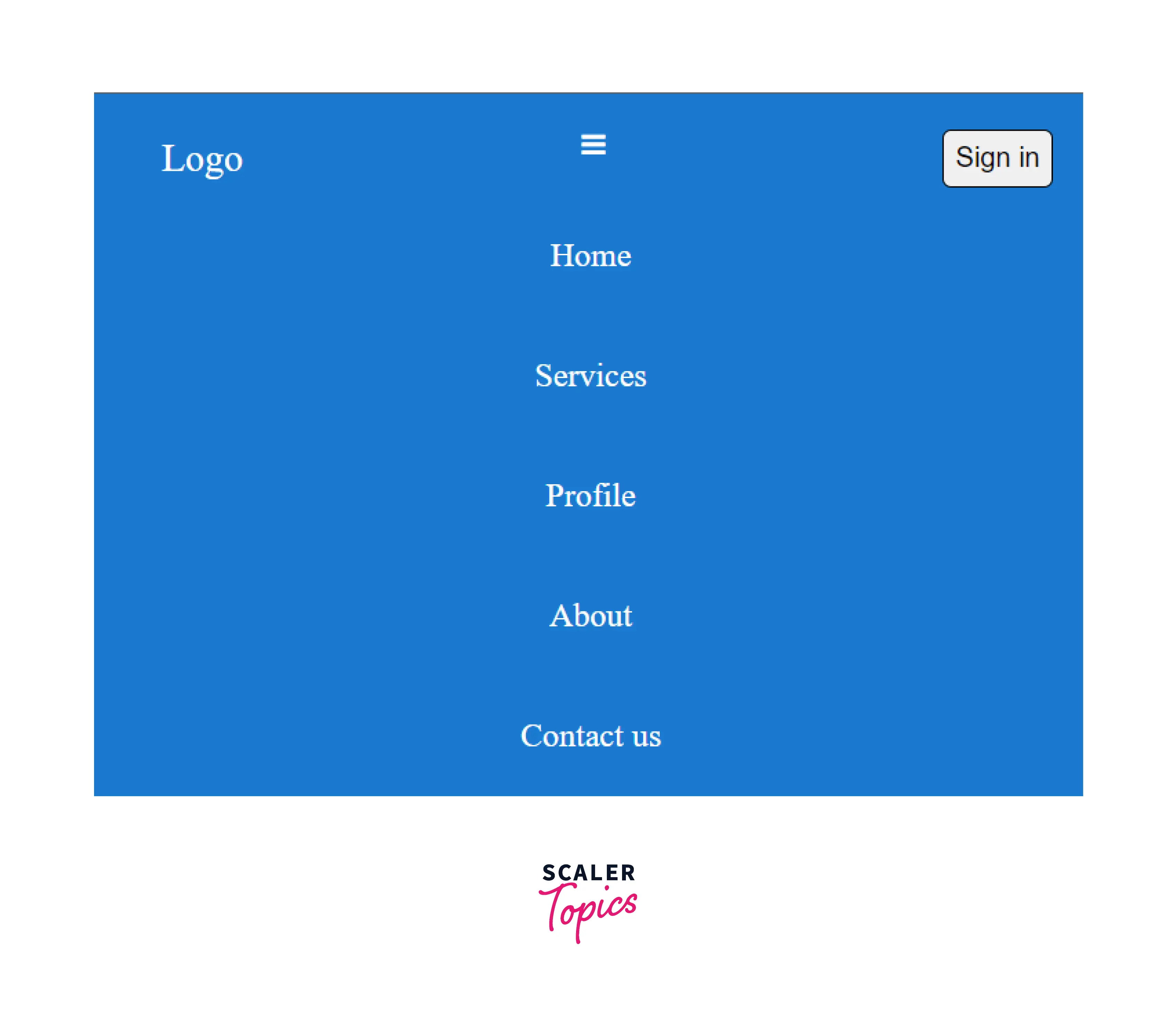
Adding below CSS code to the above programs adds responsiveness to the header design CSS. When the screen size reduces, the header takes a new shape with the hamburger menu.
Responsiveness
Output:

As shown in the output above, the header is restructured according to the responsive design added to the CSS code. The JavaScript is used to open and close the hamburger menu which is shown in the code below:
JavaScript
Output:
Conclusion
- In this article, you learned how to create a responsive header design CSS.
- Responsiveness in the header can be included using various CSS tricks like the flexbox method, media queries, etc.
- In the example above, we have used media queries and JS functionality to add a responsive behavior to the header.
 Google
 Amazon
 Microsoft
 Flipkart
 Adobe1200+ more