Lattice Packages in R Programming
Overview
Lattice packages in R offer a high-level data visualization framework, leveraging the grid package for advanced plotting. It excels in creating conditioned plots, where data subsets are visualized individually. Lattice simplifies the generation of scatter plots, 3D scatter plots, boxplots, dotplots, strip plots, density plots, and histograms, all conditioned on factors or variables. Its strength lies in the ease of customizing graphics, allowing precise control over labels, colours, and themes. Whether exploring multivariate data or summarizing distributions, Lattice equips data analysts and researchers with a versatile toolset for in-depth data exploration and visualization in R.
Lattice Package in R
What is Lattice?
Lattice is an R package that builds on the basic plotting functions and adds a layer of higher-level functions to create complex visualizations with ease. It's particularly useful for creating conditioned plots, which are divided into subsets based on some variable or factor in your dataset. Lattice excels in creating graphics for exploring multivariate data, offering features to create trellis plots, grouped plots, and more.
Lattice is built on the grid package facilitating the creation of scatter plots, 3D scatter plots, boxplots, dotplots, strip plots, density plots, and histograms, all conditioned on factors or variables. Lattice's key strength lies in its ability to visualize data subsets individually, simplifying pattern recognition.
Installing and Importing the Lattice Package
Before using the Lattice package, you need to install it if it's not already installed. You can install Lattice using the install.packages function:
Once the package is installed, you can load it into your R session using the library function:
Getting the Data Ready and Loading It
Lattice is most effective when you have a dataset ready for analysis. To load data into R and prepare it for visualization with Lattice, follow these steps:
- Load the Data: If you have a dataset in a common format (e.g., CSV, Excel), you can load it into R using functions like read.csv or read.table. For example, to load a CSV file named "mydata.csv," you can use:
- Explore the Data: Before creating visualizations, it's essential to understand your data's structure and variables. Use functions like head to view the first few rows and str to examine the data's structure:
- Data Manipulation: Depending on your analysis goals, you may need to manipulate the data, such as subsetting, filtering, or transforming variables. This ensures that you have the relevant data for your visualizations.
- Data for Lattice: Ensure that the data you plan to visualize is in the appropriate format. Lattice functions typically expect a data frame as input, with columns representing variables you want to plot.
Now that your data is ready and loaded, you can use Lattice functions to create conditioned plots and explore patterns and relationships within your dataset.
Different Types of Plots using Lattice Package in R
The Lattice package in R offers a versatile set of plotting functions, enabling the creation of various types of conditioned plots. Here, we explore some of the most commonly used plot types in Lattice.
Scatter Plots in Lattice Package in R
Scatter plots are fundamental for visualizing relationships between two continuous variables. Lattice simplifies this process by automatically conditioning the scatter plots based on a factor or variable. Here's an example:
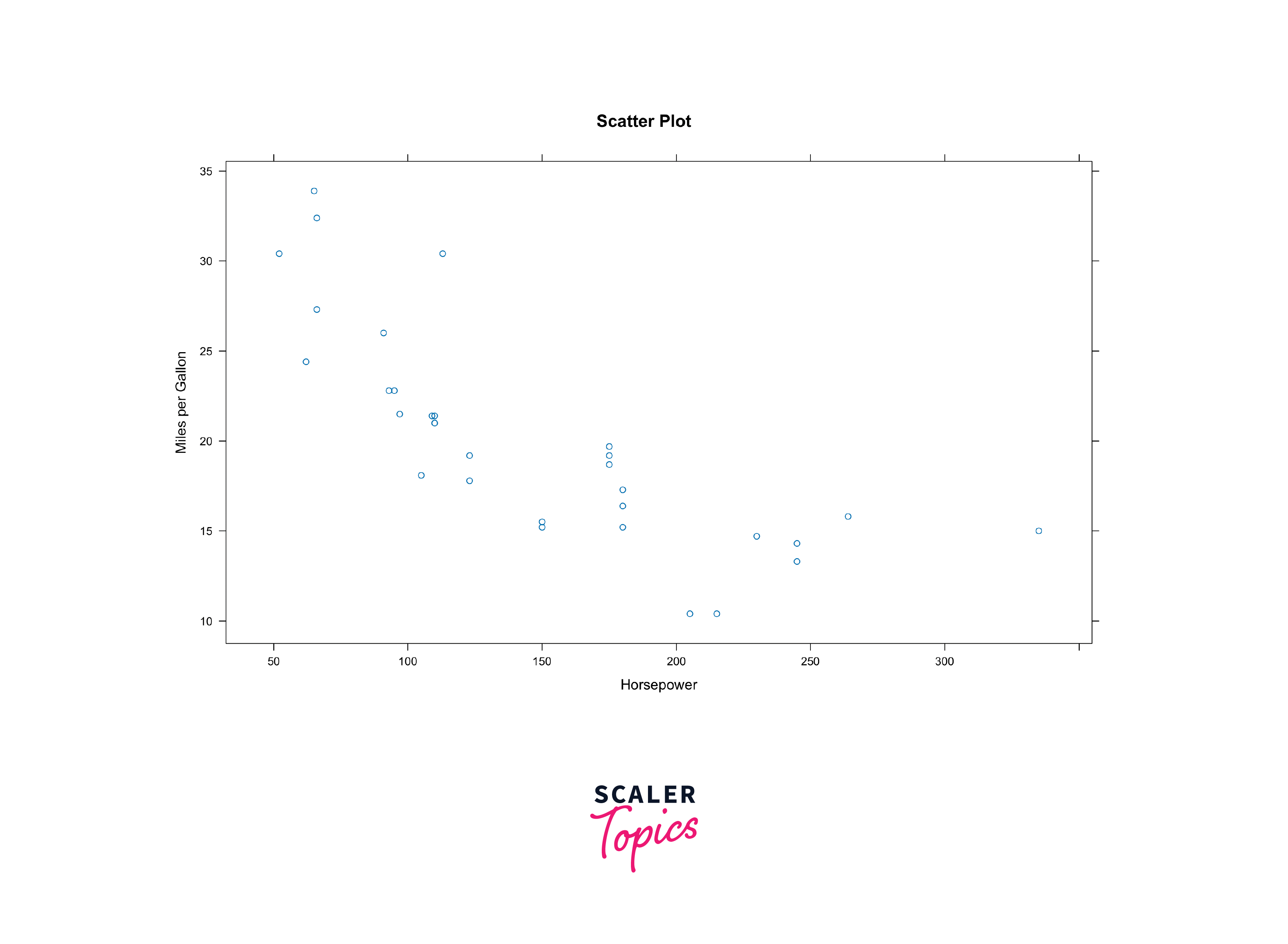
By specifying the conditioning variable, you can automatically generate a set of scatter plots, each corresponding to a unique value of the conditioning variable. This enables you to quickly identify patterns and trends within your data.
Scatter plots are ideal for visualizing relationships between two continuous variables. Choose a scatter plot when exploring correlations or trends in data.
3D Scatter Plots in Lattice Package in R
Sometimes, you might need to visualize data in three dimensions. Lattice can handle this with ease by extending its scatter plot capabilities to three-dimensional scatter plots. This comes in handy when dealing with multivariate data where you want to explore the interactions between three continuous variables.
Below is an example of creating a 3D scatter plot:
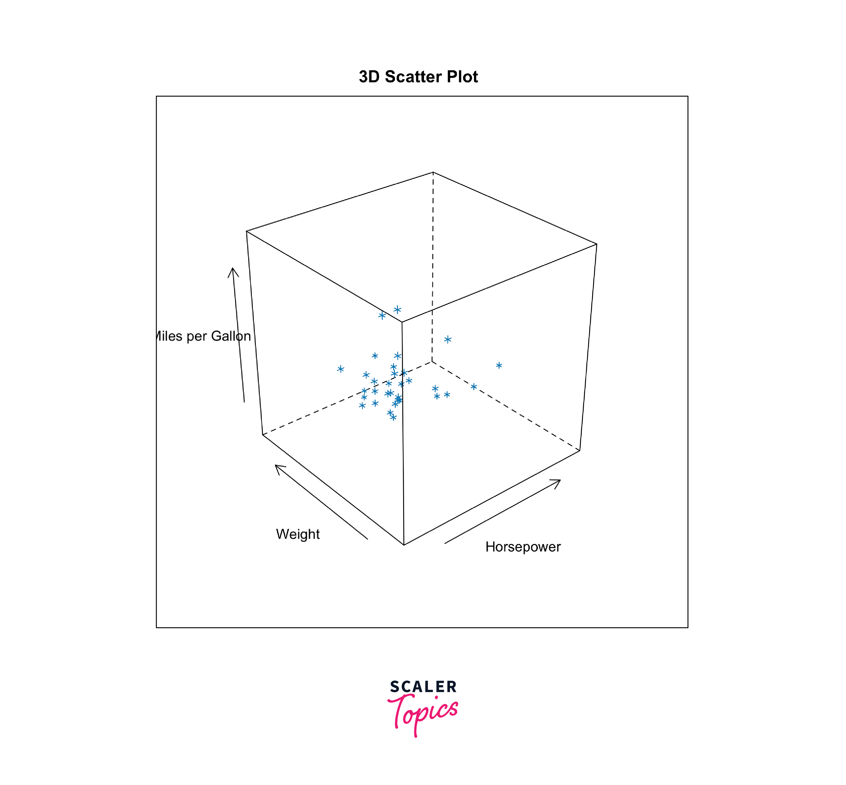
3D scatter plots extend the capability of scatter plots to visualize three continuous variables simultaneously. Use them when examining multivariate relationships.
Boxplots in Lattice Package in R
Boxplots are excellent for summarizing the distribution of a continuous variable. Lattice simplifies the creation of boxplots, allowing you to condition them by one or more categorical variables. This makes it easy to compare the distribution of a variable across different categories or factors in your dataset.
Here's a example demonstrating the same:

Boxplots are excellent for summarizing the distribution of a continuous variable within different groups or categories. They help identify outliers and understand variation.
Dotplots in Lattice Package in R
Dotplots are a variation of bar charts where individual data points are represented as dots rather than bars. Lattice provides a convenient way to create dotplots and condition them based on factors in your data. This is useful when you want to visualize the distribution of a variable and compare it across different categories.
Here's an example to demonstrate the same:
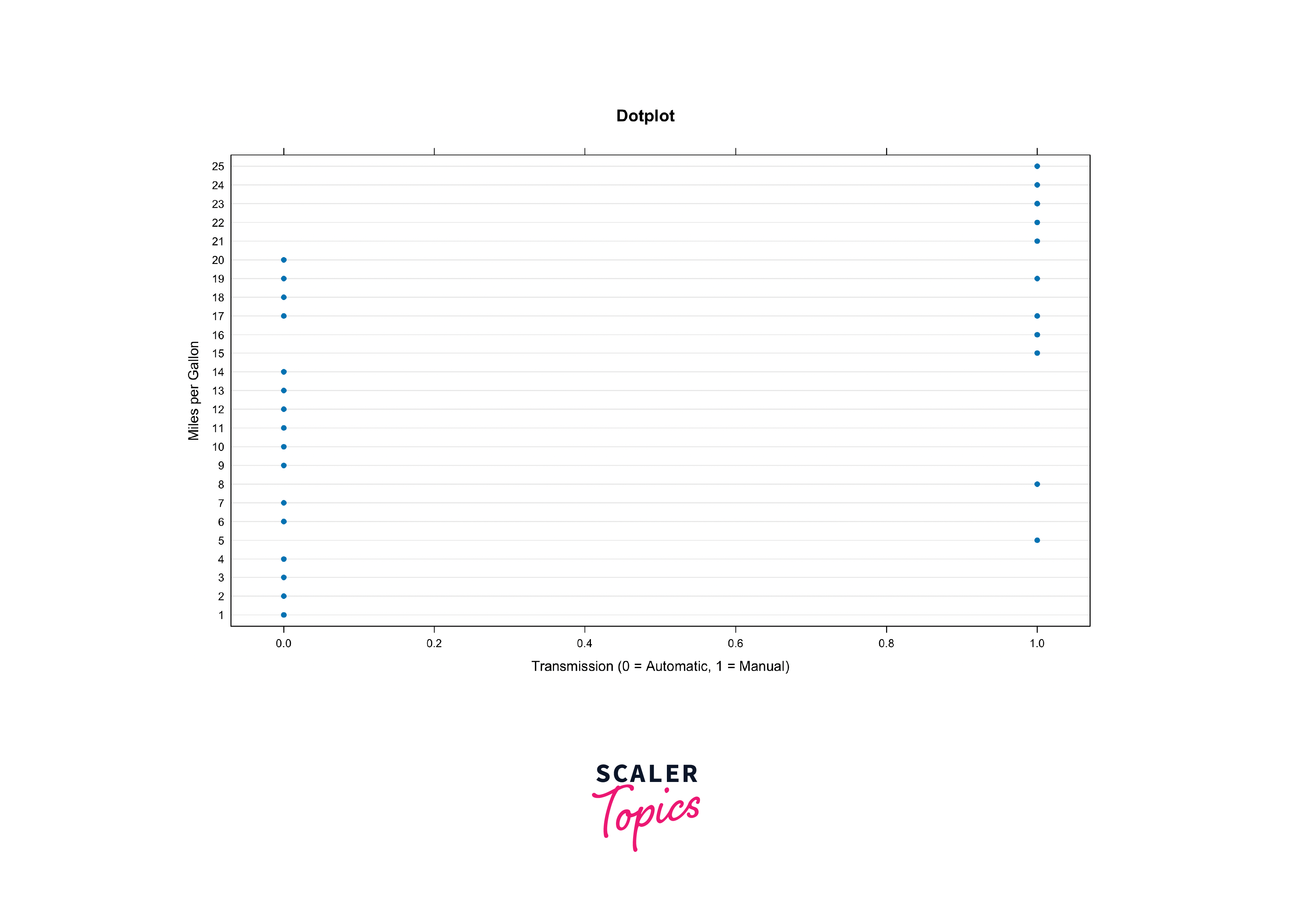
Dotplots are suitable for visualizing the distribution of a single variable or comparing distributions between categories. They are especially useful for small datasets.
Strip Plots in the Lattice Package in R
Strip plots are similar to scatter plots but are particularly useful for visualizing the distribution of a continuous variable within different categories or levels of a factor. Lattice allows you to create strip plots easily, making it a valuable tool for exploring data with categorical variables.
Here's an example to demonstrate the same:
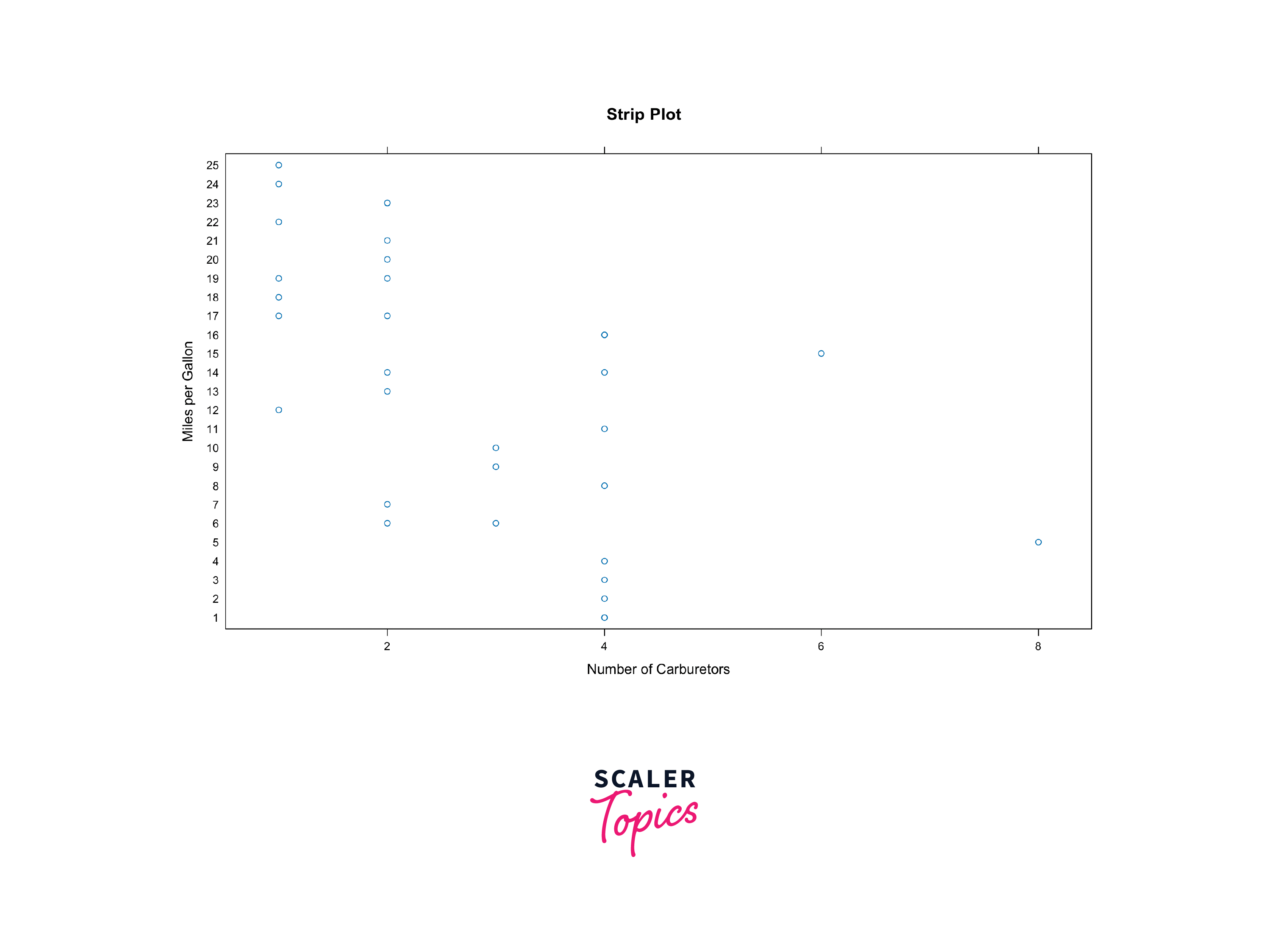
Strip plots are similar to scatter plots and are used for visualizing the distribution of a continuous variable within different categories or groups.
Density Plots in the Lattice Package in R
Density plots are useful for visualizing the distribution of continuous variables. Lattice enables you to create density plots conditioned on one or more factors, helping you uncover patterns and differences in data distributions across categories.
Here's a example to demonstrate the same:
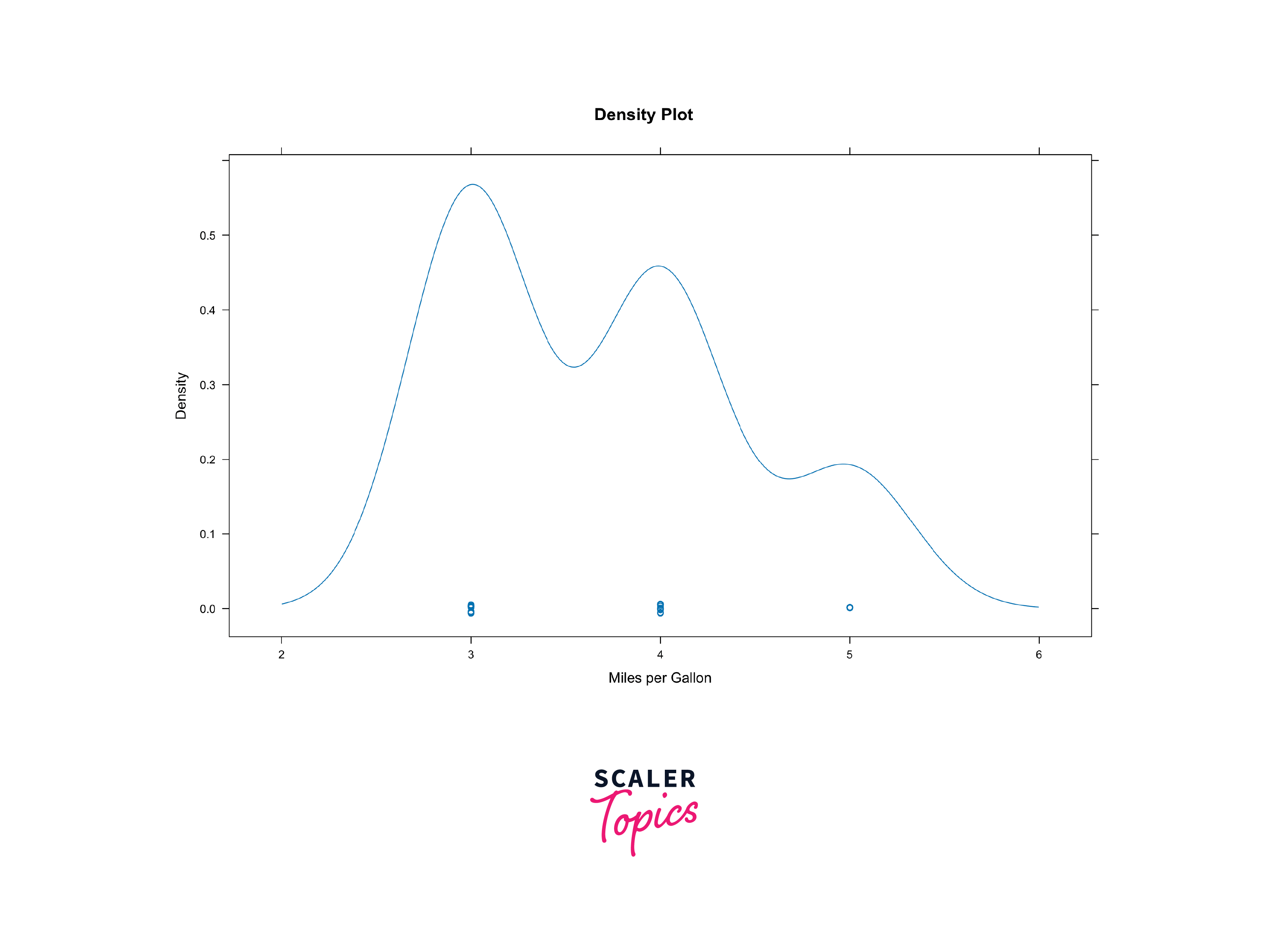
Density plots help visualize the distribution of continuous variables. They are particularly useful for understanding data distributions and identifying peaks and valleys.
Histograms in the Lattice Package in R
Histograms are a staple in data analysis for understanding the distribution of a single continuous variable. With Lattice, you can create histograms conditioned on categorical variables, providing a powerful way to compare distributions across different groups.
Here's a sample to illustrate:
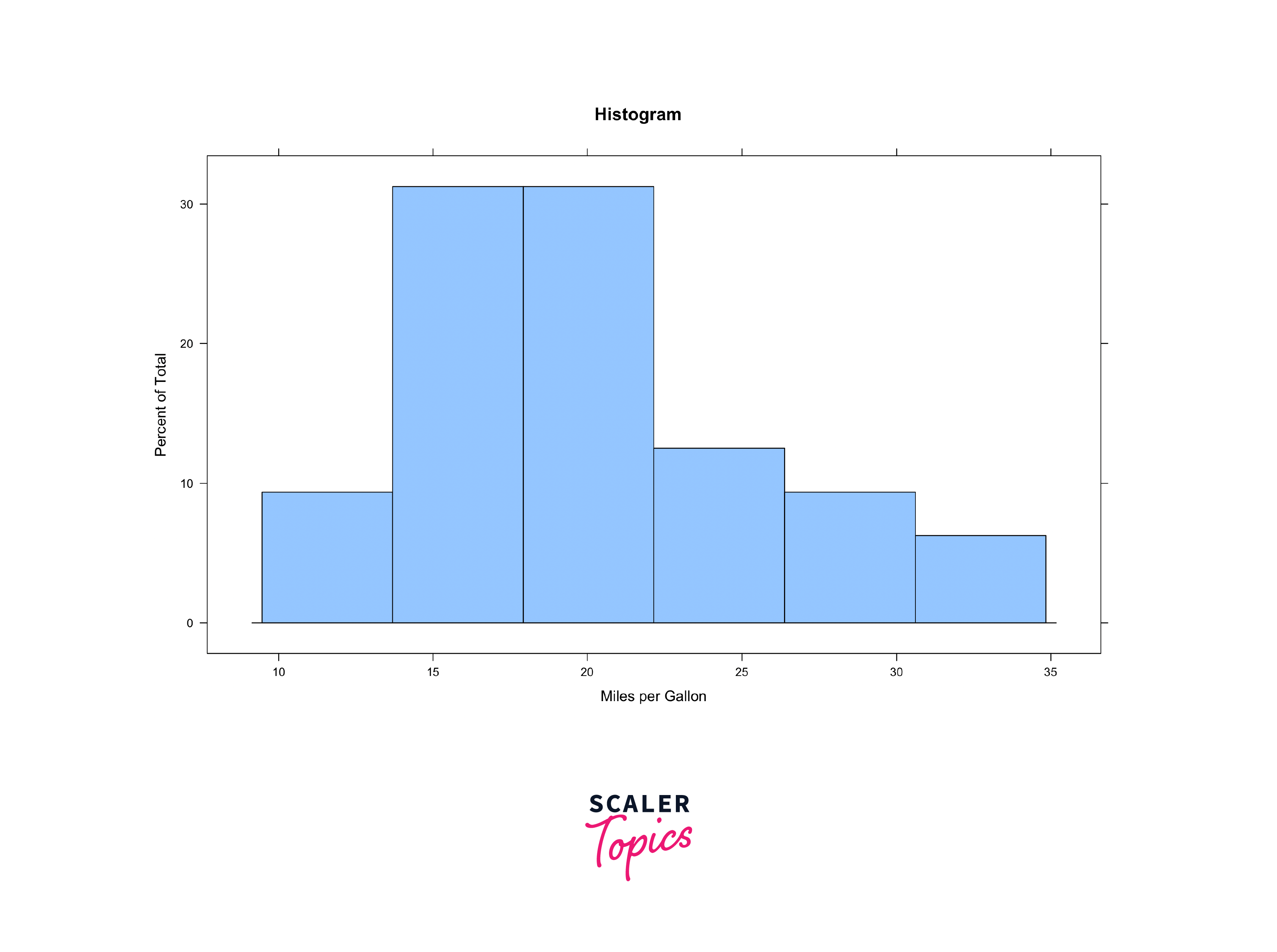
Histograms are essential for exploring the distribution of a single variable, especially when dealing with large datasets. They provide insights into data density and skewness.
Customizing Graphcs using Lattice Package in R
One of the strengths of Lattice is its flexibility and customization options. You can tailor your plots to match your specific needs by adjusting various parameters such as labels, colours, and themes. Additionally, Lattice supports advanced features like adding custom panels, legends, and titles to your plots, giving you full control over the aesthetics and content of your visualizations.
Here is an example of a plot that has customised plots with different colours, labels and more:

Customizing Labels
You can customize axis labels using the xlab and ylab arguments within Lattice functions. For instance:
Similarly, you can customise plot titles with the main argument:
Customizing Colors
Lattice allows you to specify custom colors for various plot elements. Use the col argument to set line or point colors as follows:
Customizing Themes
You can also apply different themes to your plots for consistent styling. The lattice.options function lets you change the default theme as follows:
Adding Legends
Legends provide context to your plots. You can customize legends using the auto.key argument:
Combining Customizations
More often than not, you'll combine multiple customization options to fine-tune your plot. For instance, changing colors, labels, and themes together:
Lattice allows you to further enhance the plots by allowing you to customise the plots further by adding graphics or modifying lattice settings and more.
These are just some of the many versatile customisations that lattice comes with. If you wish to learn and dive deeper into these concepts or further explore the package and try an amalgam of customisations, you can check out the official lattice package documentation HERE!
Conclusion
- Lattice in R simplifies the creation of conditioned plots for data exploration and visualization.
- Lattice in R is a data visualization package with an emphasis on multivariate data.
- Common plot types in Lattice include scatter plots, 3D scatter plots, boxplots, dotplots, strip plots, density plots, and histograms.
- Customization options in Lattice encompass labels, colours, themes, legends, and more, offering full control over plot aesthetics.
- You can create custom panels for advanced customization of your plots.
- Combining multiple customization options allows you to fine-tune your plots to meet specific needs.
- Lattice graphics can be saved in various formats (e.g., PNG, PDF) for further analysis or publication.