3D Bar Plot in Matplotlib
Overview
A 3D bar chart is one of the most widely used graphs for data representation. Of course, we often employ a 2D bar chart, which simultaneously compares two numbers (the x-axis and y-axis). However, the 3D Bar Chart comes in handy when comparing three sets of values or data simultaneously.
We can also visualize the bar's depth with a 3D bar plot. The matplotlib.ax.bar3d() method creates a 3D bar plot.
Introduction
One of the most well-known Python data visualization libraries, Matplotlib, aids in creating animations, graphics, etc., and data visualization. For example, we often plot data in two dimensions when programming. But, we can also plot the graphs in three sizes to better visualize the plots.
This enables us to compare the relationship between three variables rather than two. Unfortunately, due to the bars' additional depth characteristic, 3D bar charts using matplotlib is slightly more complicated. But we can use this feature to add another "dimension" to the plot.
When plotting charts with extensive data labels, multiple categories, and negative data values, 3D bar plots are a perfect choice. However, to maintain the chart’s visual appeal and functionality, it must indicate values on each bar in a 3D bar plot.
How to Create 3D Bar Plots ?
Three-dimensional axes can be formed using the projection='3d' keyword in any basic axis creation method. For example, the function matplotlib.Axes3D.bar() is used to create a 3D bar plot after 3D axes have been made.
By default, the matplotlib will plot every data point in two dimensions. Therefore, we must apply additional functions and attributes to plot the figures in three dimensions.
After importing the required libraries, the first step is to create a figure class and set the figure's projection to three dimensions instead of two. We can create the figure class using Matplotlib’s plt.figure() function. Then, we create the plot's axes using the plt.axes() function and the attribute projection='3d'.
Now that the three-dimensional axes are enabled, we can plot several different three-dimensional plots.
Transform Your Career
Choose from our industry-leading programs designed for career success
Modern Software and AI Engineering Program
Master full-stack development with AI integration

Modern Data Science and ML with specialisation in AI
Advanced data science techniques with AI specialization
Advanced AIML with Specialisation in Agentic AI
Deep dive into AIML with focus on Agentic systems
DevOps, Cloud & AI Platform Engineering
Build and manage AI-powered cloud infrastructure
AI Engineering Advanced Certification by IIT-Roorkee
Premier AI engineering certification from IIT-Roorkee
What is matplotlib.Axes3D.bar() ?
matplotlib.Axes3D.bar() function is used to make 3D bar plots in Python's Matplot library.
Syntax
Parameters
- left :
Required field, 1D array-like To specify the x coordinates of the left sides of the bars. - height :
Required field, 1D array-like To provide the heights of the bars. - zs :
float or 1D array-like To specify the z coordinate (depth) of the bars. - zdir :
{'x', 'y', 'z'} When plotting 2D data, the direction is z ('x', 'y' , or 'z')(ie. the Default is 'z'.) - data :
indexable object, optional All parameters additionally take a string s, interpreted as data[s], if provided. - **kwargs :
other arguments.
Turn Learning into Career Growth
Example
Output:
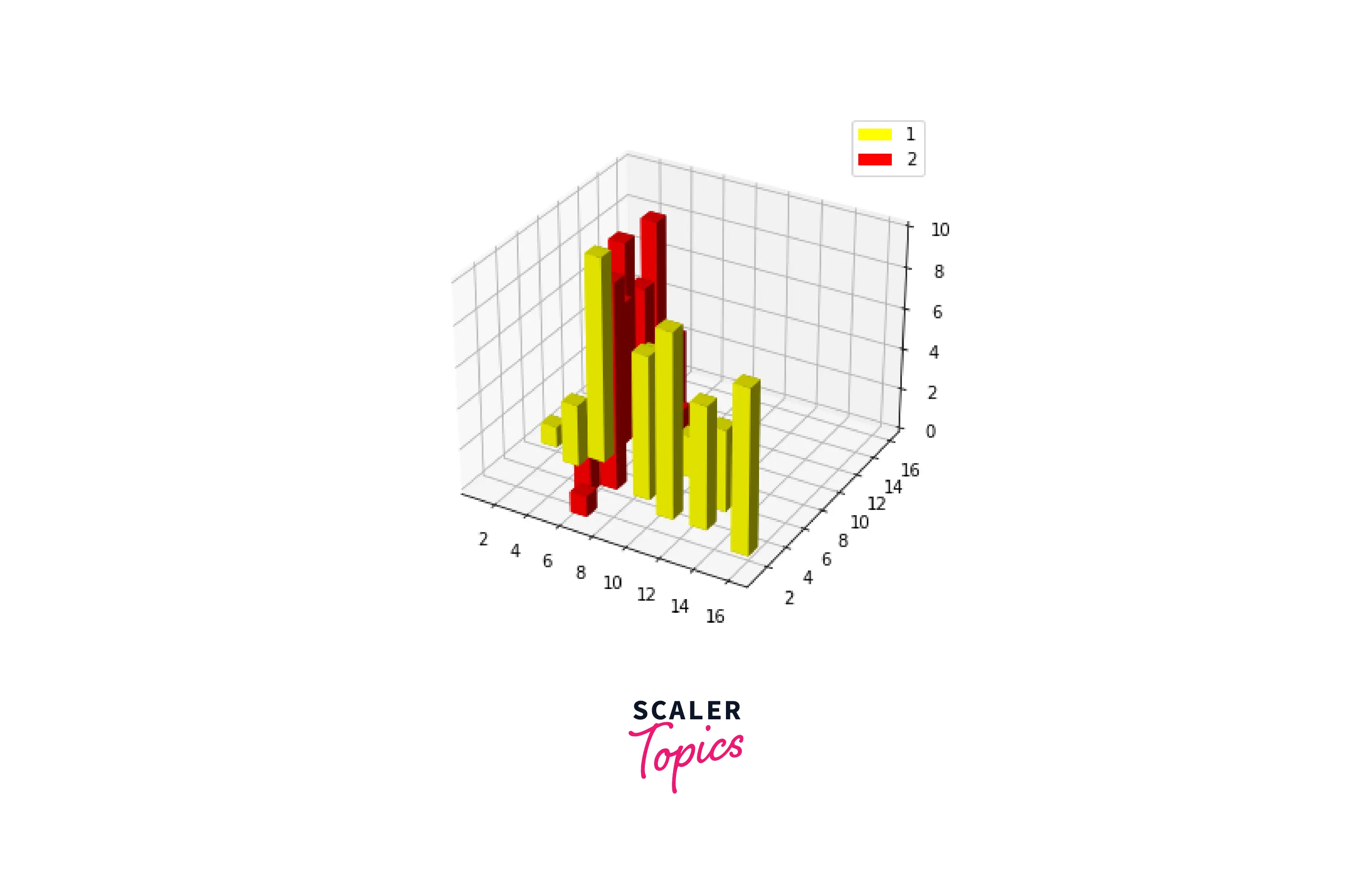
In the above example, we have created two different bar datasets and visualized them using the 3D bar plotting function with distinct parameters.
How to Plot a 3D Bar Plot ?
Here is a demo of how to plot 3D bars with and without shading.
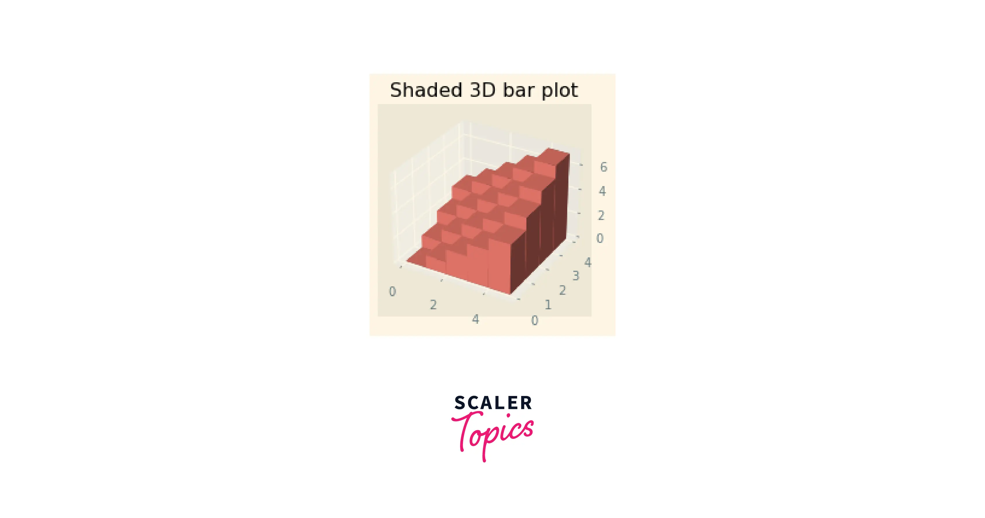
With Shading
The Matplotlib toolkit allows the shading of figures with the shade parameter. True or False are the only two possible values for the parameter.
Output:
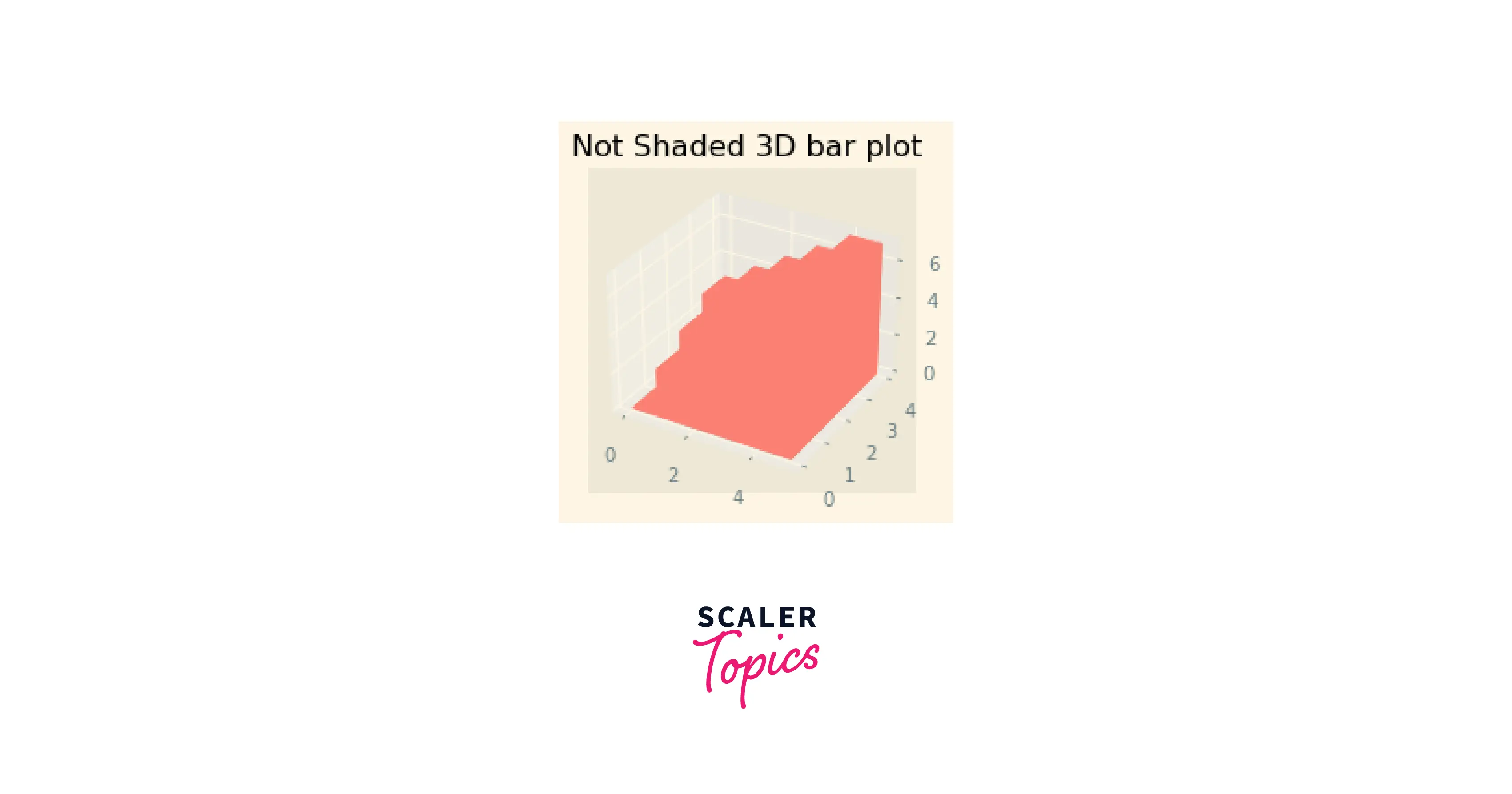
Without Shading
We can plot a 3D bar plot without shading by minor changes to the above code.
Output:
Examples
Here are a few examples of 3D bar plots.
Example 1:
Output:
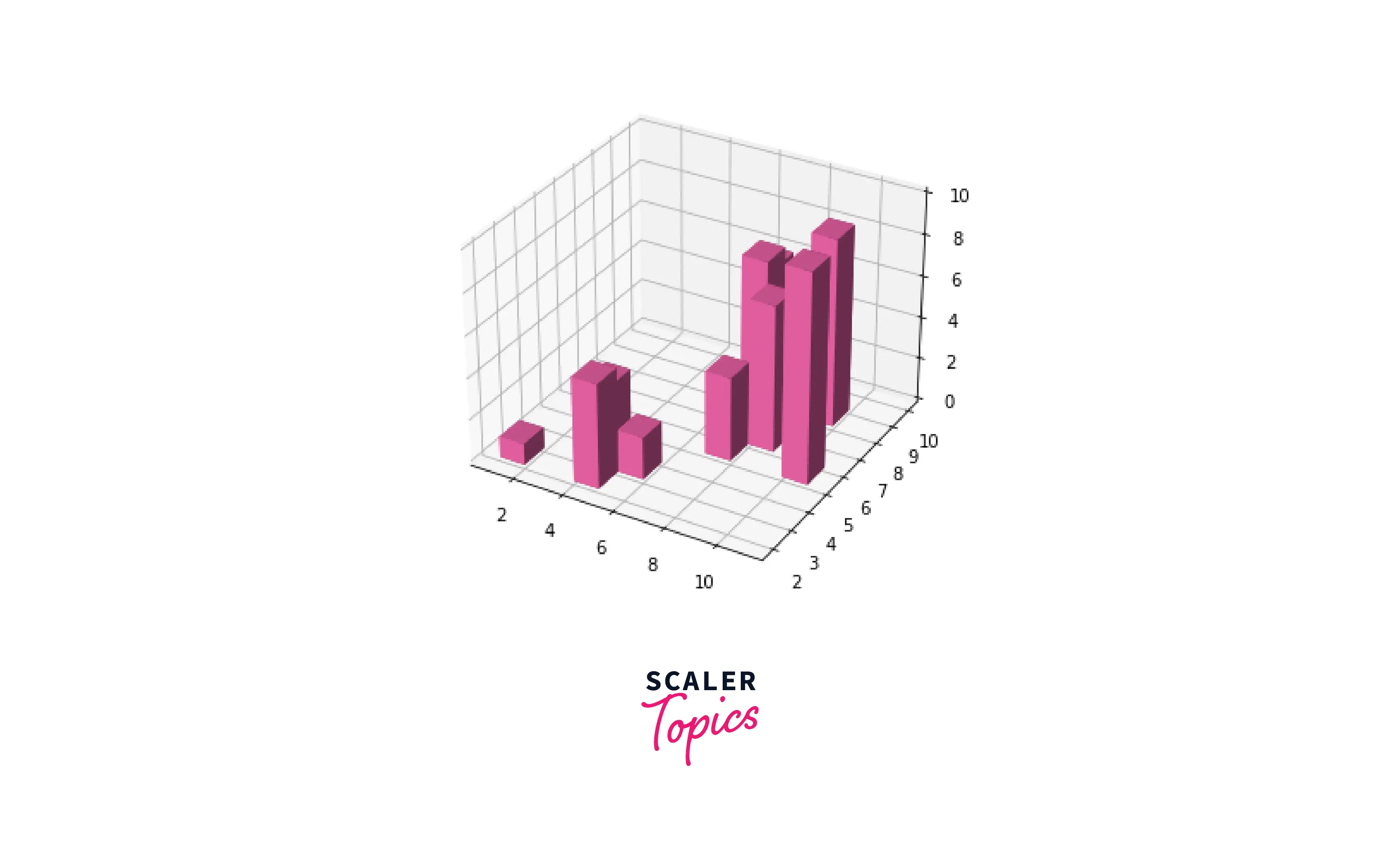
This example portrays a 3D bar plot with a single set of data points.
Example 2 :
Output:
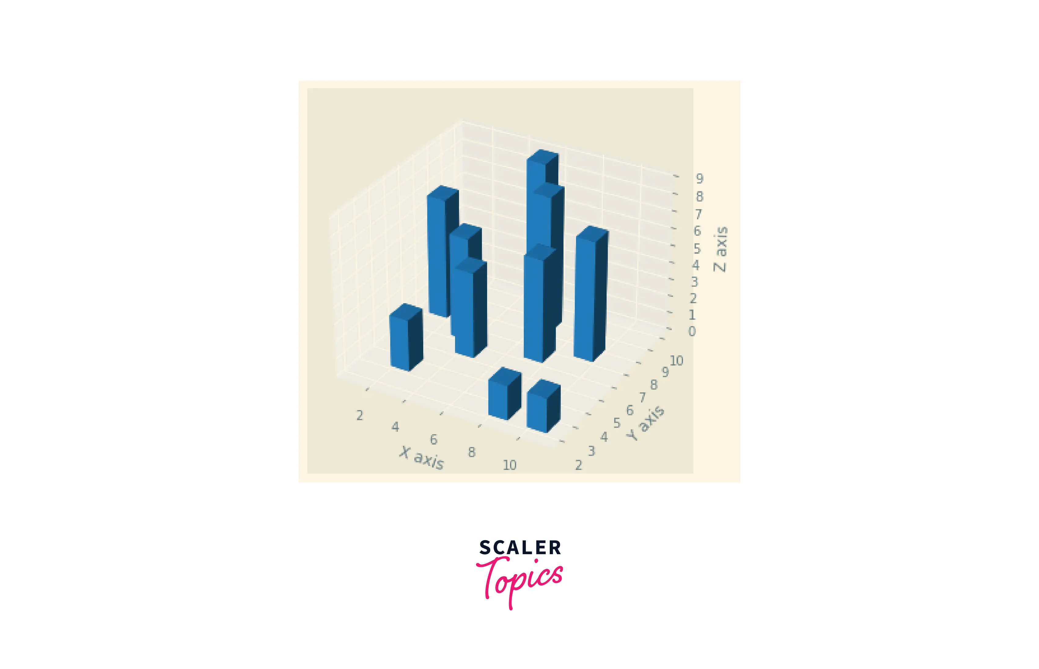
This is an example of a customized 3D bar plot.
Scaler Placement Report and Statistics
Scaler learners achieved 2.5x salary growth with average post-Scaler CTC reaching ₹23L.
Conclusion
- We discussed the attributes and functions associated with a 3D bar plot in Matplotlib.
- The Axes3D.bar() function of matplotlib is used for plotting the three-dimensional bar plot. We can also set titles and labels to the plot using functions associated with the matplotlib library.
- We can change the shade attribute of bar plots by passing True or False in the shade parameter of the function.
- 3D bar plots are perfect for plotting charts with extensive data labels and multiple categories.