3D Curve Plots in Matplotlib
Overview
Python’s Matplotlib library makes it possible to create amazing 3D plots that provide an in-depth data analysis. Various kinds of 3D curve plots in matplotlib can be used based on the type of data to be examined. For example, using the mplot3d package in the matplotlib library, we can plot one-dimensional, two-dimensional, and three-dimensional data.
Introduction
“The key to effective visualization is to create the most detailed, clear, and vivid a picture to focus on”- George St-Pierre.
Although Matplotlib was initially designed for two-dimensional plotting, several three-dimensional plotting tools were added to Matplotlib's 2D structure, producing a unique three-dimensional toolset for data visualization. We are familiar with 2D plots representing two dataset variables in two dimensions. However, when we want to plot data with three variables, we need a 3-dimensional field.
To plot 3D curve plots in matplotlib, we have to import the mplot3d library from the default installation of the Python matplotlib package.
Adding one more dimension to plots can help us visualize more information at a glance and make data more interactive. For example, we plot the data in 2D by calling pyplot.plot() function. But in this case, all we need to do is create an instance of Axes3D and call its plot() method.
Transform Your Career
Choose from our industry-leading programs designed for career success
Modern Software and AI Engineering Program
Master full-stack development with AI integration

Modern Data Science and ML with specialisation in AI
Advanced data science techniques with AI specialization
Advanced AIML with Specialisation in Agentic AI
Deep dive into AIML with focus on Agentic systems
DevOps, Cloud & AI Platform Engineering
Build and manage AI-powered cloud infrastructure
AI Engineering Advanced Certification by IIT-Roorkee
Premier AI engineering certification from IIT-Roorkee
How to Create 3D Curve Plots?
To plot a three-dimensional dataset, first, we will import the mplot3d toolkit, which adds 3D plotting functionality to Python matplotlib, and also we have to import other necessary libraries.
Next, we need to create 3D axes and input data to the axes.
Output:
A 3D axes object was created with ax = plt.axes(projection='3d').Three-dimensional axes can be generated by including the keyword, projection='3d' in any of the standard axis construction techniques.
With the 3D axes activated, we can now plot several 3D curve plots in matplotlib. When the default viewing angle is mediocre, we can modify the elevation and azimuthal angles using the view init method. It is best used for rotating the plot angle.
Matplotlib's mplot3d toolkit offers a variety of 3D charts to enhance the accuracy and interactivity of data visualization. Here we will discuss the Syntax, Parameters, and Examples of Line plots, Parametric plots, Scatter plots, Surface plots, and Wireframe plots.
Now let’s see each of these in detail.
Line Plot
The simplest 3D graph is one with lines and points. Line plots can be created from a set of (x, y, z) triples.
Syntax:
Parameters:
- xs : 1D array x coordinates of vertices.
- ys : 1D array y coordinates of vertices.
- *args : number of non-keyworded arguments
- **kwargs : Other arguments
Example:
This code produces the following trigonometric spiral plot,
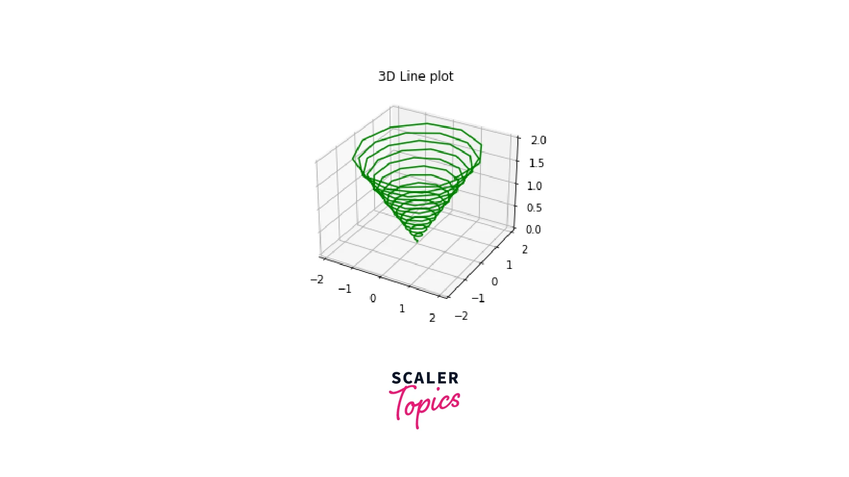
The NumPy linspace function defines the number of steps concerning an interval. For example, linspace(0,2,150) means 150 evenly spaced numbers from 0 to 2 (inclusive). We can set the total number of breakpoints we want in an interval after defining its start and endpoints.
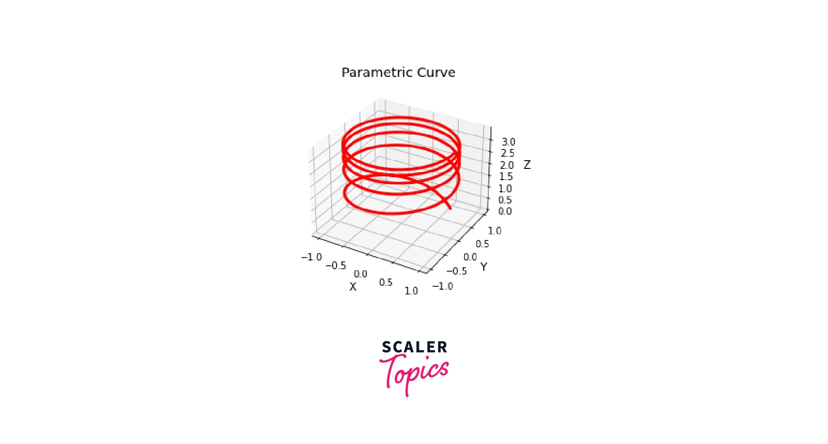
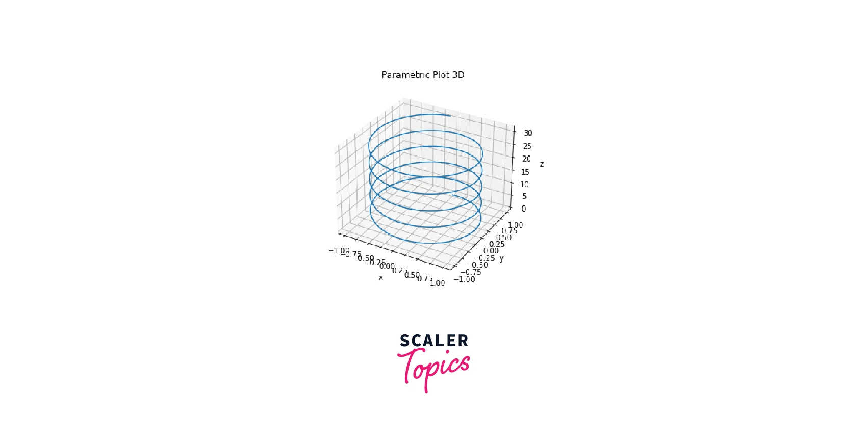
Parametric Plots
A parametric plot is required to compare one function, , with another, . Using matplotlib we can plot a generic, parametric 3D surface.
Syntax:
Parameters:
- scalex
, default: True This parameter determines whether the x axis will autoscale. - scaley
, default: True This parameter determines whether the y axis will autoscale. - data : indexable object, optional. An object with labeled data
Example:
One of the most basic 3D parametric curves is a helix. The parametric equations of a helix are:
Output:
Turn Learning into Career Growth
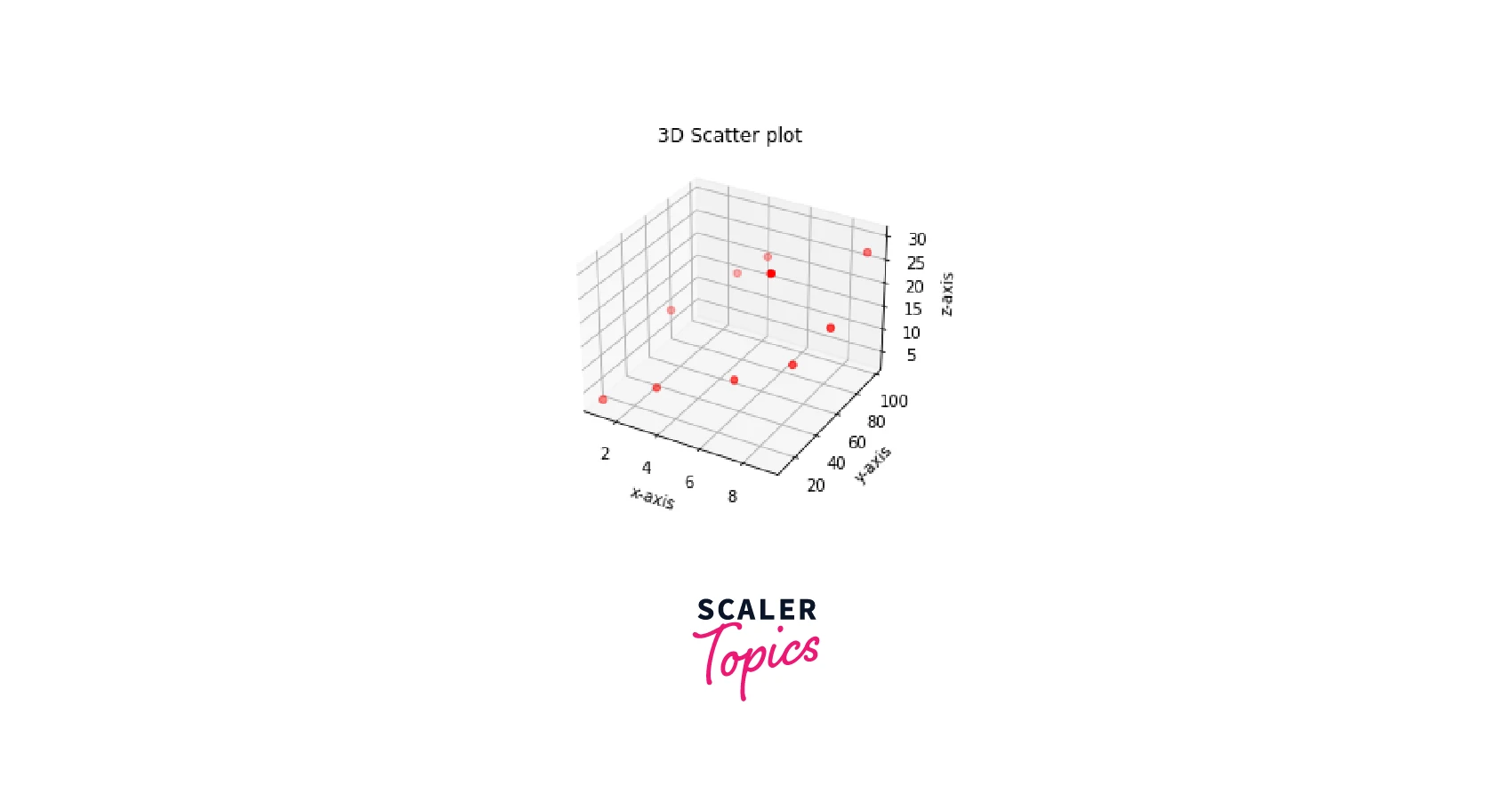
Scatter Plots
For each point in a dataset, one point is depicted in a scatter plot. The coordinates of a point are the coordinates of the corresponding data. With small modifications, three-dimensional scatter plots function similarly to those in two dimensions.
Syntax:
Parameters:
- s -float or array-like, shape (n, ), optional
- c - array-like or list of colors or color, optional
- marker - MarkerStyle, default: rcParams["scatter.marker"] (default: 'o')
- cmap - str or Colormap, default: rcParams["image.cmap"] (default: 'viridis')
- vmin, vmax - float, default: None
- edgecolors - {'face', 'none', None} or color or sequence of color, default: rcParams["scatter.edgecolors"] (default: 'face')
- plotnonfinite - bool, default: False
- linewidths - float or array-like, default: rcParams["lines.linewidth"] (default: 1.5)
Example:
Output:
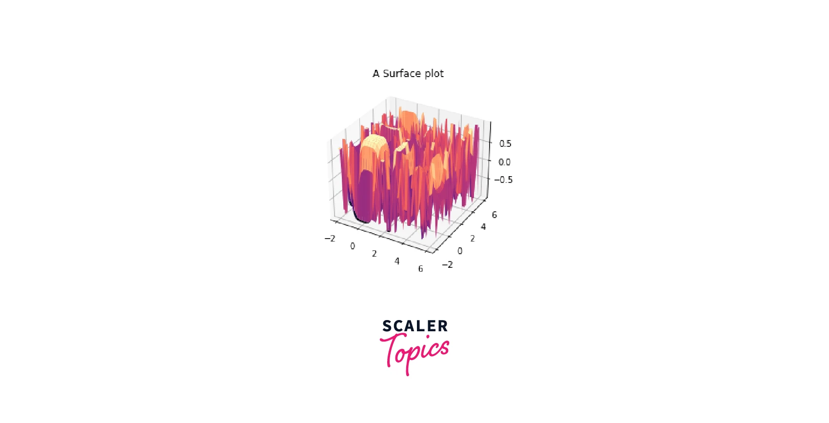
Surface Plots
The surface graph makes visualizing 3-dimensional data distributed over surfaces easier as a filled mesh.
A mesh in Python is represented by the two arrays X and Y, where and define potential (x,y) pairs. Then, a third array, Z, can be made so that . The Python function np.meshgrid can construct a mesh.
Syntax:
Parameters:
- X, Y, Z: 2D arrays Data values.
- rcount, ccount : int Maximum samples used in each direction. If the input data is bigger, it will be downscaled (by slicing) to this number of points. Usually set at 50.
- rstride, cstride : int Minimizing the size of each step. With rcount and ccount, these arguments are mutually exclusive. The other defaults to 10, if just one of rstride or cstride is set.
- color : Color of the surface patches.
- cmap : Colormap of the surface patches.
- facecolors : array Colors of each patch.
- norm : Normalization for the colormap.
- vmin, vmax : float Bounds for the normalization.
- shadebool: default: True Whether or not to shade the facial colours. When cmap is provided, shading is never disabled. lightsource : The lightsource to use when shade is True.
- **kwargs : Other arguments
Example:
Output:
Scaler Placement Report and Statistics
Scaler learners achieved 2.5x salary growth with average post-Scaler CTC reaching ₹23L.
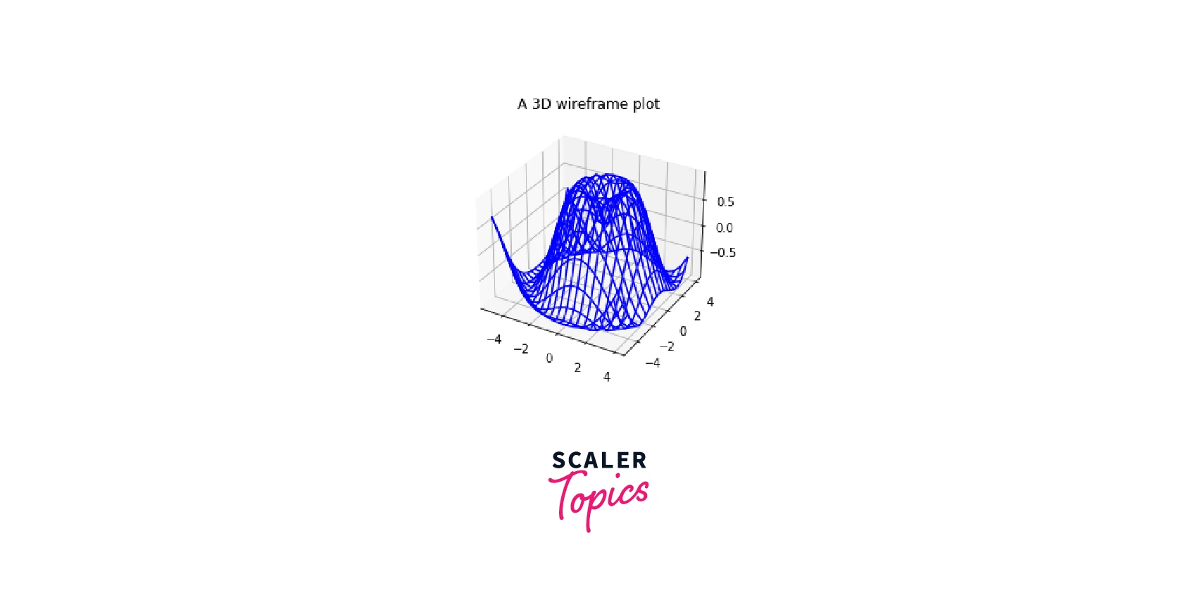
Wireframe Plots
These are 3D curve plots that project a grid of values onto the surface in three dimensions. They are merely wavy lines that form a grid-like structure to display the data's ups and downs. A surface plot is similar to a wireframe plot, except that each face of the wireframe is a filled polygon.
Syntax:
Parameters:
- X, Y, Z : 2D arrays Data values.
- rcount, ccount : int Maximum number of samples used in each direction.Defaults to 50.
- rstride, cstride : int These arguments are mutually exclusive with rcount and ccount. If only one of rstride or cstride is set, the other defaults to 1.
- **kwargs : Other arguments
Example:
Output:
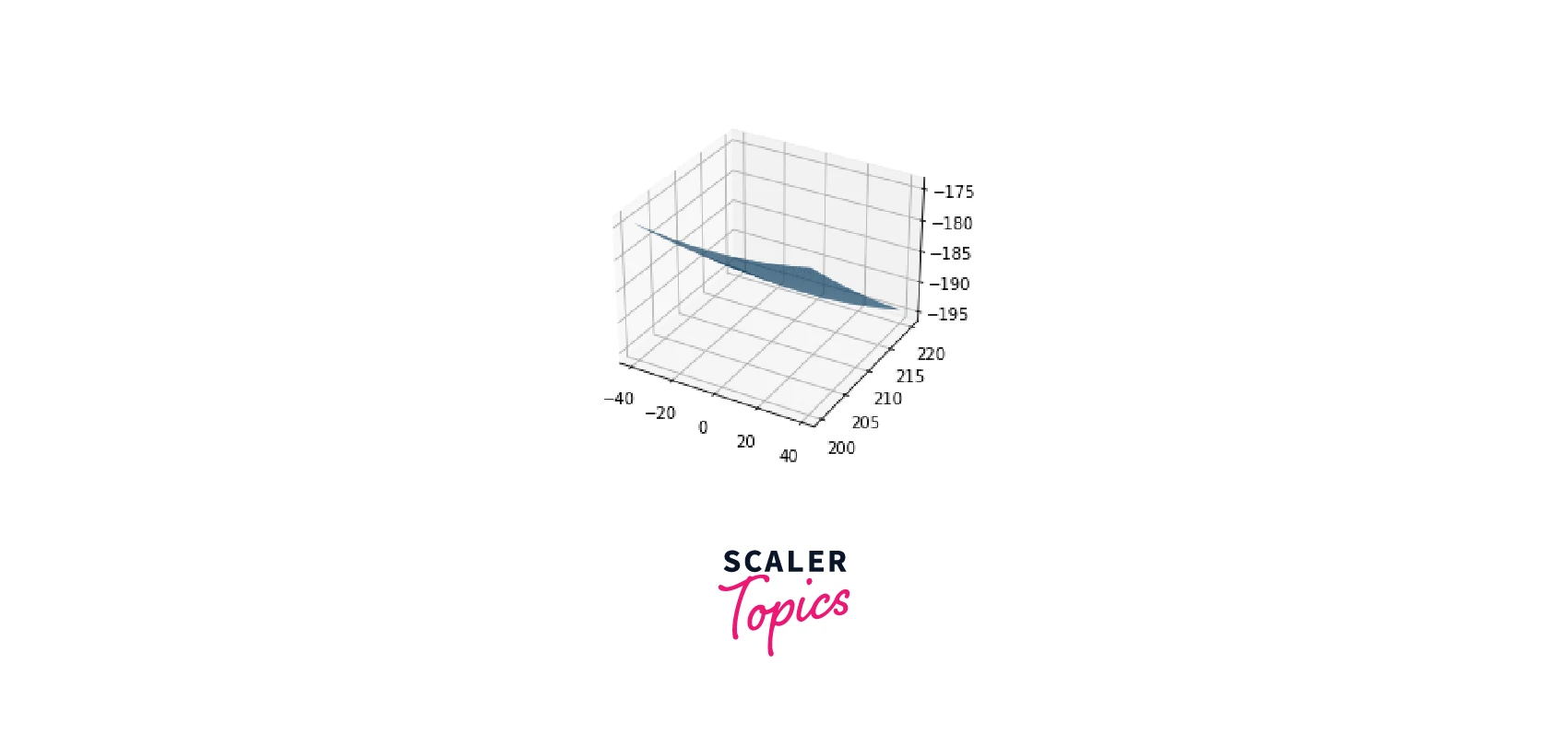
A few more examples of 3D curve plots in matplotlib are given below.
Examples
Example 1
Output:
Example 2
Output:
Although 3D charts help analyze information from various perspectives and provide more depth due to their additional dimension, they also have some drawbacks. For example, it is challenging to compare the values of the various columns, especially with multiple data series charts. Also, there is a chance of missing data in a multiple data chart when a higher value column overshadows a lower value column.
Conclusion
- In this article, we discussed the basic concepts of 3D plotting in Python Matplotlib, carried out using the mplot3d library.
- We looked at how to create 3D curve plots in matplotlib, like Line plots, parametric plots, scatter plots, surface plots, and Wireframe plots.
- We illustrated the above plots using the functions plot() for line plots and parametric plots, plot_surface() for surface plots,plot_wireframe() for wireframe plots and scatter3D() for scatter plots.
- To summarise, Matplotlib's built-in functions and the vast collection of tools allows us to create a wide variety of plots based on different datasets and their required functionalities.
This list is not complete; Python has many more plotting functions. However, this should be enough to get started, in choosing the right plotting functions based on the data to be analyzed.