3D Scatter Plots in Matplotlib

Overview
A 3D Scatter Plot is a mathematical graph and one of the simplest three-dimensional plots used to chart data characteristics as three variables using cartesian coordinates. The purpose of a 3D scatter plot is to compare three data set features rather than just two. The mplot3d toolkit from Matplotlib is used to generate a 3D Scatter plot. This article explains in detail the plotting of a 3D scatter plot in Python's matplotlib.
Introduction
3D scatter plots are wonderful tools for exploring the relationship between dimensional data. In addition, they have been incredibly helpful in exploratory data analysis.
Each visualization created by Matplotlib comprises a Figure object and one or more Axes objects. The Axes objects are the data plots placed on the Figure object's canvas, which serves as the visualization's skeleton.
The ax.scatter3D() method of the matplotlib package is used to create a 3D scatter plot.
Scaler Placement Report and Statistics
Scaler learners achieved 2.5x salary growth with average post-Scaler CTC reaching ₹23L.
Matplotlib 3D Scatter Plot
To create a 3D scatter plot, we can use the matplotlib library's scatter3D() function, which accepts x, y, and z data sets.
Syntax
Parameters:
- x, y: float or array-like The data points.
- s: float or array-like, optional The marker size in points**2. The default is rcParams['lines.markersize'] ** 2.
- c: array-like or list of colors or color The marker colors
- Zdir : {'x', 'y', 'z', '-x', '-y', '-z'}, default is 'z' The axis direction for the zs.
- Depthshade: bool, default: True Whether to shade the scatter markers to give the appearance of depth.
- Data : indexable object, optional
- **kwargs : All other arguments
Code Example
Let's employ the ax.scatter3D() function to make a simple 3D scatter plot.
Output:
- Import the mplot3d toolkit and other libraries required for 3D plotting: NumPy and pandas, for data visualization: pyplot from matplotlib for plotting the data points.
- Define x,y, and z - data coordinates values for plotting.
- By using the scatter3D() method of the matplotlib library, plot the 3D scatter plot.
- We can display a plot on the output screen Using the show() method.
How to Customize 3D Scatter Plots in Matplotlib
Transform Your Career
Choose from our industry-leading programs designed for career success
Modern Software and AI Engineering Program
Master full-stack development with AI integration

Modern Data Science and ML with specialisation in AI
Advanced data science techniques with AI specialization
Advanced AIML with Specialisation in Agentic AI
Deep dive into AIML with focus on Agentic systems
DevOps, Cloud & AI Platform Engineering
Build and manage AI-powered cloud infrastructure
AI Engineering Advanced Certification by IIT-Roorkee
Premier AI engineering certification from IIT-Roorkee
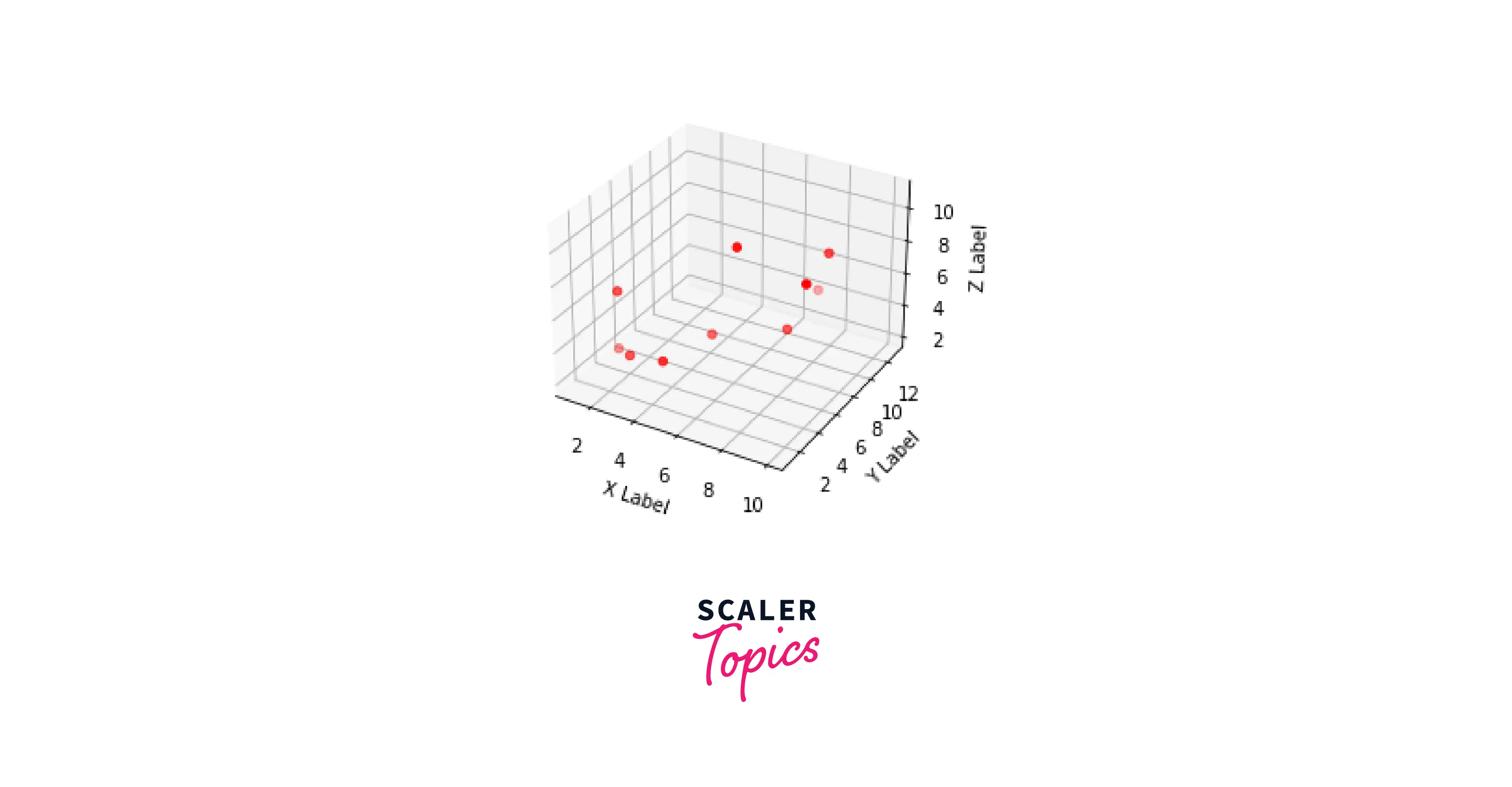
Customize Color in 3D Scatter Plot
A 3D plot can benefit significantly from the addition of colour. This makes it possible for us to understand the third dimension better.
Colorbar
Color bars enhance the understanding of data plots by visually separating dimensions over a range of values.
Using the get_cmap() method, we can create a colormap and plot the colorbar.
Color by Value
By passing color as a parameter in the scatter3D() function, we can color the 3D scatter plots by values.
We must use the c parameter to do this. This function enables us to pass in a single colour or an array of numbers to colour based on value, if we wish to retain the same colour for all points.
Depthshade
Depthshade is a parameter that determines whether to shade the scatter markers to give the appearance of depth. Also, to turn off transparency in the 3D scatter plot, we can use the depthshade parameter.
By default, Matplotlib pyplot's 3D plots will have depthshade=True value. To turn the value off, set the parameter to False.
Background Color
By default, the background color of the pyplot is "White." However, the background color of the plot can be altered using the axis module's set_facecolor() method.
figure(facecolor=’color') method is used to change the outer background color of the pyplot.
For better understanding of these functions, let's take an example.
Output:
Customize Marker in a 3D Scatter Plot
Markers are points in a 3D scatter plot to represent the data points.
Marker size
The argument s in plt.scatter3D() corresponds to markersize and denotes the markersize**2.
The syntax to change the marker size is:
- s: specifies the marker size in points**2.
- marker: specifies the marker style.
Marker Color
To change the marker colour we simply have to pass color as an argument to the scatter3D(). We can also change the edge color of the marker by using edgecolor as an argument in the Scatter3D() method.
The syntax to change the color and edge color of the marker:
- color: specifies the color of the marker.
- edgecolor: specifies the edge color of the marker.
Example:
Output:
Customise 3D Scatter Plot Axis
Axis limits By default, the input values are used to set the range of values on the axes automatically.
Axis ticks We can modify the ticks for each axis of a 3D scatter plot with the following syntax.
set_zlabel() method
The set_zlabel() method is used to add a label to the z-axis of the plot.
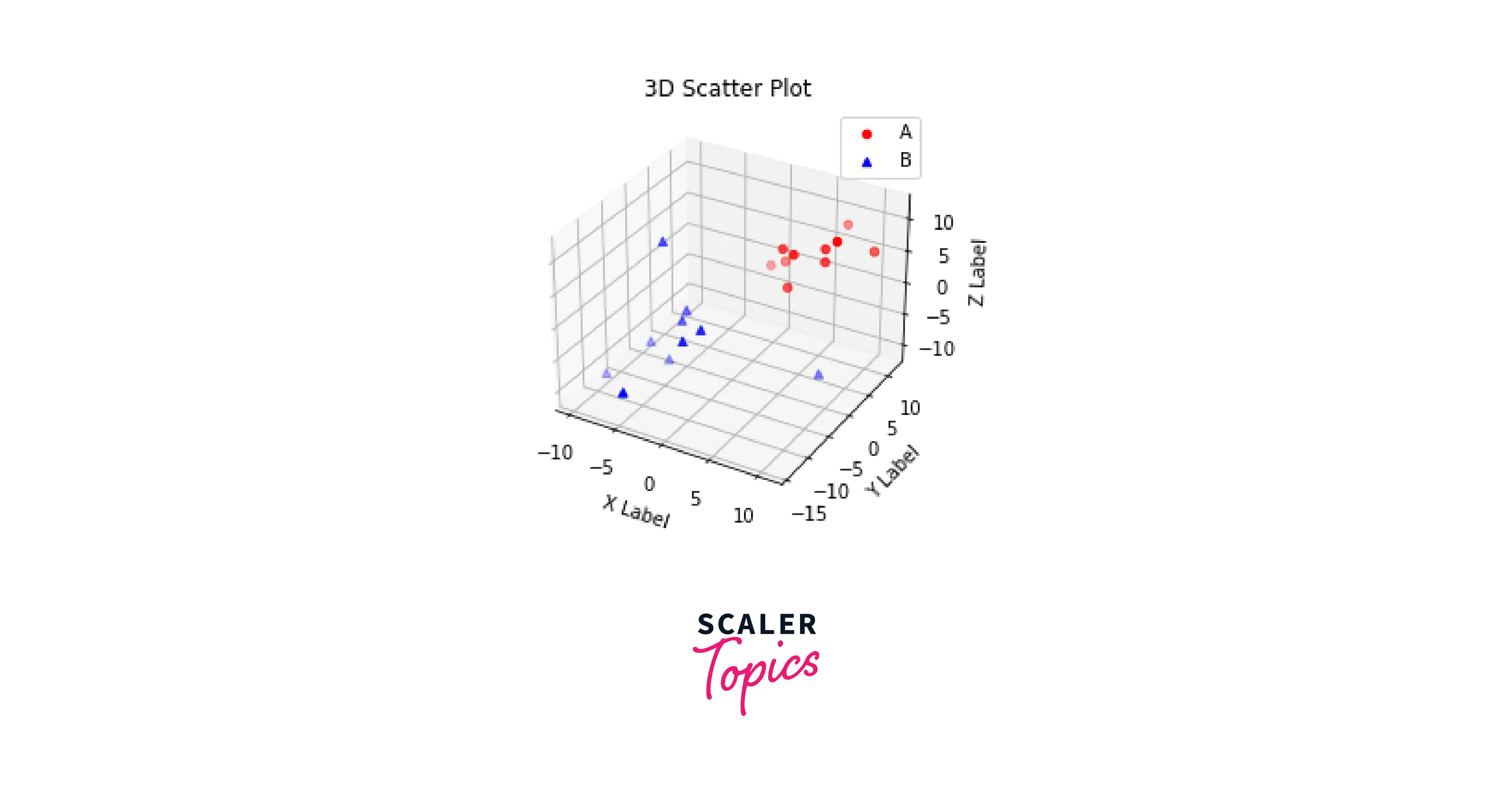
Legend
Adding color alone does not make it possible to tell each of the data values apart. Instead, we can add a legend by passing in legend(True) in the scatter() function. By default, Matplotlib will configure the best location for placing the legend.
ax.legend() method is used to add a legend to the plot.
Label
ax.set_xlabel(), ax.set_ylabel(), and ax.set_zlabel() function is used to add labels to the plot. We pass X-axis, Y-axis, and Z-axis to respective functions.
Here is an example demonstrating the customization of the 3D Scatter plot axis.
The following output will be produced.
How to Rotate a 3D Scatter Plot
Change view angle
Sometimes, we need to visualize the 3D plot from a different perspective, and that's when rotating 3D plot comes into play.
The view_init() method changes the view angle of a 3D Scatter plot. To turn on the interactivity feature in the Jupyter notebook, use %matplotlib notebook.
The syntax to change the view angle is given below:
- elev: to specify the elevation angle in the z plane.
- azim: to specify the azimuth angle in the x,y plane.
Example:
Customise 3D Scatter Plot Title
The matplotlib.pyplot.title() method adds title to a 3D scatter plot.
Matplotlib 3D Scatter Text
Matplotlib's ax. text() method adds text to a 3D scatter plot at a fixed location. We can pass three locations (x, y, z ) where we want the text placed. With the annotate() function, we can specify both the point we want to label and the position for the label.
Turn Learning into Career Growth
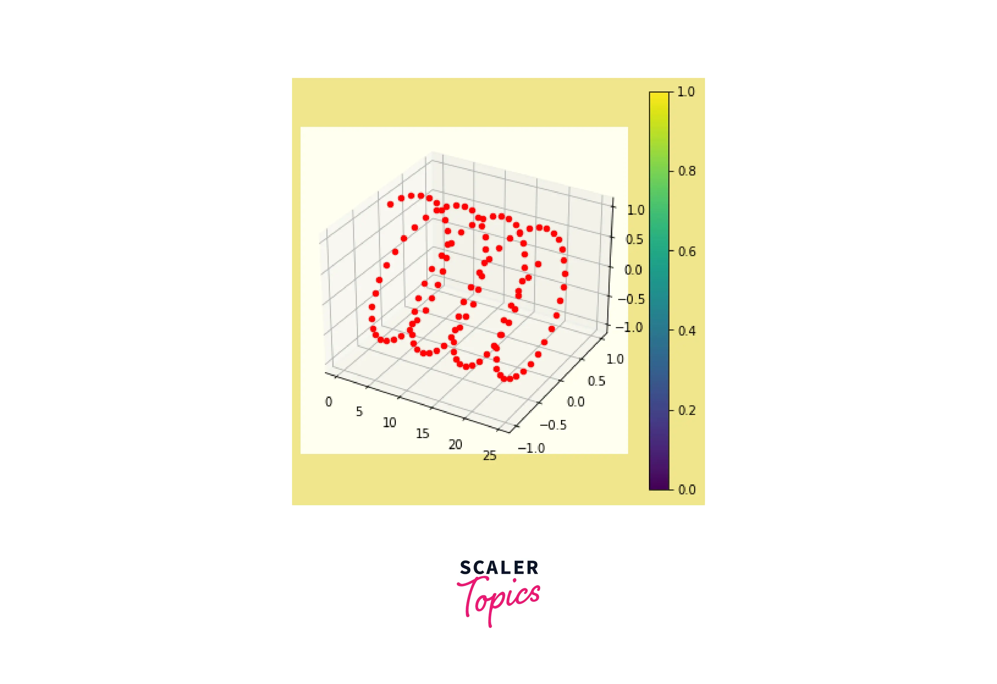
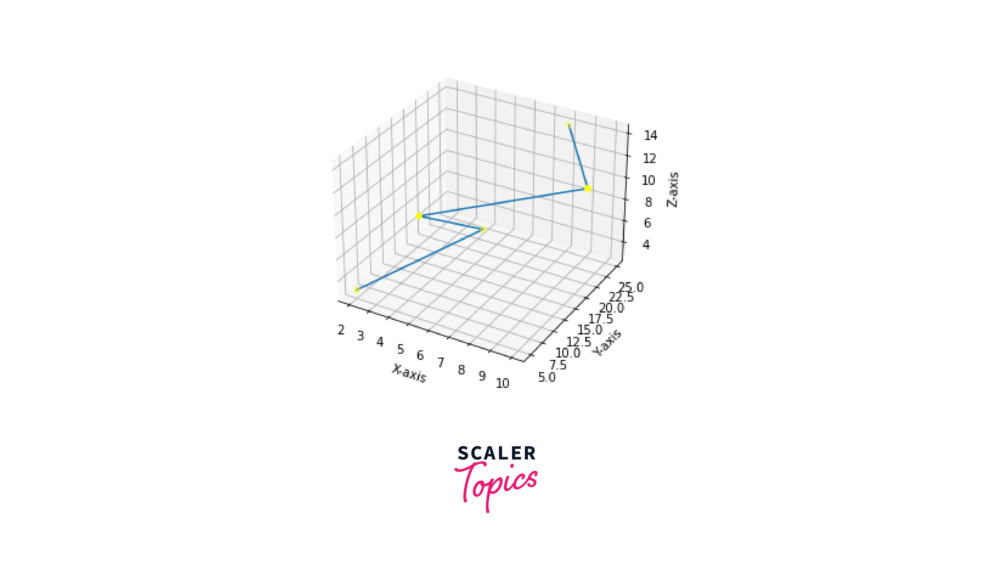
Matplotlib 3d Scatter with Line and Surface.
- To connect the 3D scatter points, we can use the ax.plot3D() method with x, y, and z data points.
Below is an example where we plot a 3D scatter graph with a line:
Output:
- A Surface Plot is a representation of a three-dimensional dataset. The ax.plot_surface() method is used to create 3D surface plots.
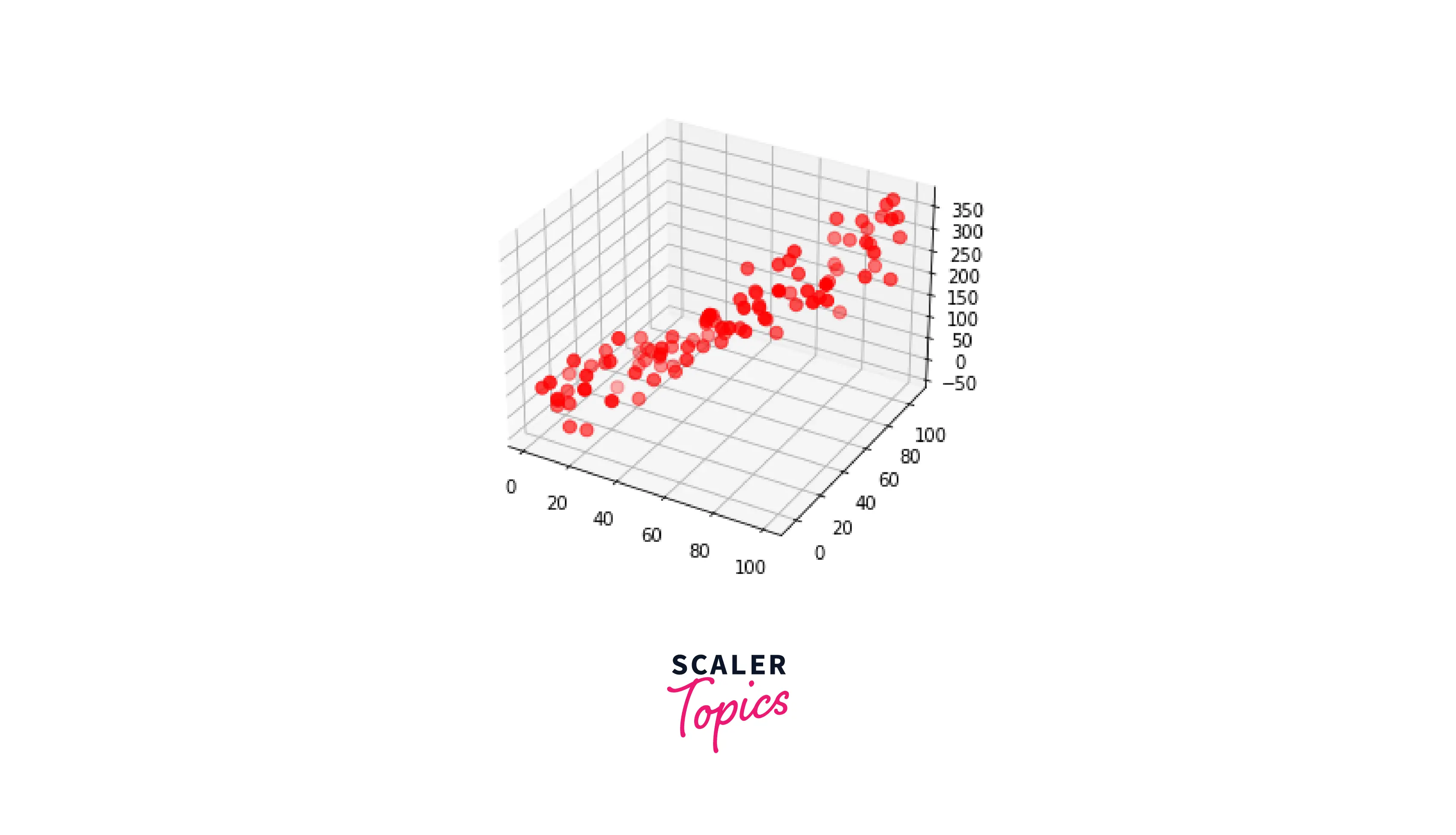
Matplotlib 3D Scatter Transparency
Matplotlib allows its users to customize the opacity of each of the data points. This is done using the alpha parameter. 0 represents full transparency, whereas 1 represents no transparency. By default, the alpha value is 1. It ranges between 0 to 1. We can decrease the transparency by reducing the value of alpha parameter.
Scaler Placement Report and Statistics
Scaler learners achieved 2.5x salary growth with average post-Scaler CTC reaching ₹23L.
Matplotlib 3D Scatter Grid
Sometimes it can be a little challenging to pinpoint the locations of data values with so much blank space around them. This is why using a grid in the plot may be helpful.
By default, all the plots will have gridlines when we plot a 3D scatter plot. Therefore, pass the value of grid() as 'False' to remove gridlines and pass the value 'True' to get it back.
Matplotlib 3D Scatter Size
There are two ways to change the size of the 3D scatter plot:
- Using "plt.figure()" method:
We can pass the figsize parameter to the plt.figure() method to change the size of the plot.
Here, w and h specify width and height, respectively.
- Using "set_size_inches()" method:
The set_size_inches() method sets the figure size in inches.
Syntax:
Axis Limit in 3D Scatter Plot
- To set the axes limits, we can use the xlim() and ylim() functions for the x and y axes, respectively.
- To set the limit of z-axis, we use the set_zlim() method
The minimum and maximum values of variables that will be plotted along the x, y, and z axes are determined by Matplotlib automatically. However, it is possible to set the limits explicitly using these functions.
Zoom Method in Matplotlib 3D Scatter Plot
The axis.zoom() function is used to zoom in or out on the axis.
Syntax:
- direction: This parameter is used to set the value to zoom in (direction > 0) or zoom out (direction <= 0).
Origin
To get the origin of the axes, we can use the np.zeros() method of the NumPy library.
Eg :
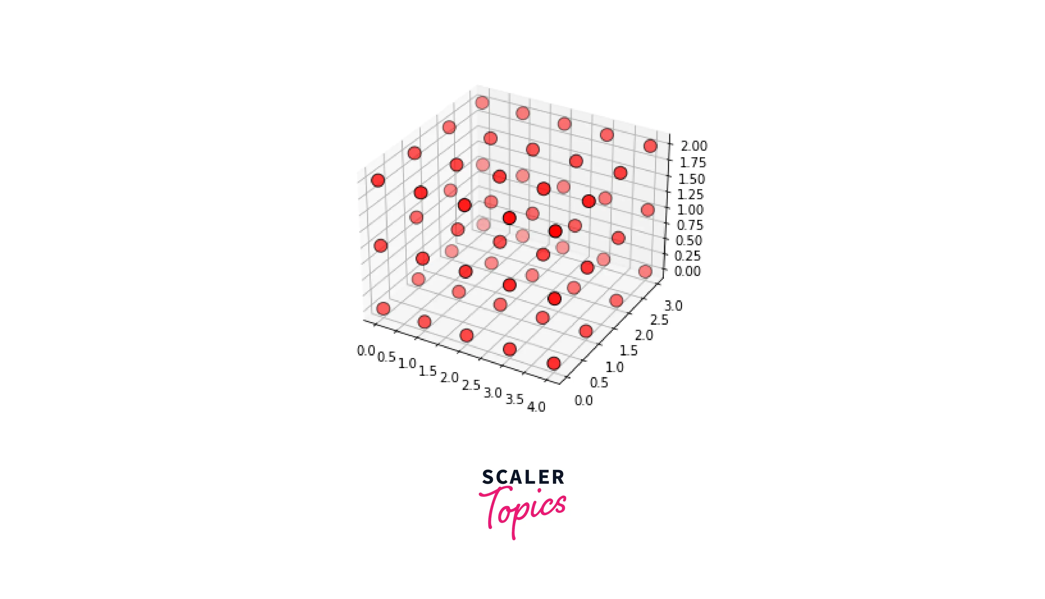
DataFrame
Using Pandas, we can create a data frame.
- After creating figures using the figure() method and defining projection in 3D, we have to create the pandas DataFrame. Then we use the np.random.rand() method.
- Using Pandas, we can produce a list of the axes of the data frame.
- Finally,we use the ax.scatter3D() method to get the required scatter plot.
Syntax and Parameters:
This is the general syntax for plotting data for a 3D data frame. Here,x,y, and z represent the data frame coordinates.
Now,let's go through an example,
Output:
Animation
Python, together with Matplotlib, allows for robust data visualization and exploration. In addition, the animation module works like magic for dynamic plotting.
Syntax:
Delve Deeper: Our Data Science Course is Your Next Step. Enroll Now and Transform Your Understanding into Practical Expertise.
Conclusion
- We discussed the key features of Matplotlib's 3D scatter plot.
- The ax.scatter3D() method of the matplotlib package is used to make a 3D scatter plot,after importing mplot3D.
- We can customize the color of the plots by passing parameters like Colorbar, Color by value, Depthshade, and background color in the plot function.
- A marker is a graphic object representing a dataset category in a scatter plot. We can customize the color, size and style of markers.
- We can customize the axes of a plot by adding or changing the axis limits,ticks, labels,title, legend etc.
- We can rotate the axis of a 3D scatter plot using view_init() method.This method takes two parameters: the elevation angle and azimuth angle.
- We can add text in a scatter plot with the ax.text() method.
- We can decrease or increase the transparency of a scatter plot by using the alpha parameter.
- We can change the size of a 3D scatter plot by using plt.figure() method and set_size_inches() method.
- We can also plot a 3D scatter plot using a pandas dataframe.