How to Customize Plots in Matplotlib?
Overview
Matplotlib is an open-source python library for data visualization and graph plotting. It is a powerful python library that provides visualization with many customization options. The purpose of any visualization is to communicate data insights effectively. Customizing the plots in matplotlib makes the plot more readable and highlights the key information.
Introduction
One of Python's most popular libraries for data visualization is Matplotlib. With a wide range of customization options, matplotlib offers a strong and effective toolbox for creating rich data representations. In addition, these options may be adjusted to highlight the information that needs to be expressed through the display.
Matplotlib uses an internal module, pyplot, to draw the plots. The pyplot module contains a function plot() that takes as an argument the data set to be visualized, the type of visualization to draw, and a set of parameters to customize the drawn plot. These customizations provide a way to change the axis labels, show or hide the gridlines, set the legends, and change the colors of the data drawn on the graph.
Scaler Placement Report and Statistics
Scaler learners achieved 2.5x salary growth with average post-Scaler CTC reaching ₹23L.
Defining Your Colors
Changing the default color in the data representation of matplotlib is useful customization. However, to change the color in the plots, we must first understand how to define the colors supported by matplotlib. Matplotlib supports multiple color notations. We discuss them below.
1. RGB or RGBA float tuple format
In this format, the color is defined as the combination of Red followed by Green followed by Blue, and optionally, an Alpha value is written as a tuple of float values ranging between 0 to 1.
Alpha - It represents transparency. The color becomes more transparent as alpha value decreases.
Example: RGB (0.1, 0.2, 0.5) RGBA (0.1, 0.2, 0.5, 0.3)
Transform Your Career
Choose from our industry-leading programs designed for career success
Modern Software and AI Engineering Program
Master full-stack development with AI integration

Modern Data Science and ML with specialisation in AI
Advanced data science techniques with AI specialization
Advanced AIML with Specialisation in Agentic AI
Deep dive into AIML with focus on Agentic systems
DevOps, Cloud & AI Platform Engineering
Build and manage AI-powered cloud infrastructure
AI Engineering Advanced Certification by IIT-Roorkee
Premier AI engineering certification from IIT-Roorkee
2. RGB or RGBA Hex strings
In this format, the color is defined as the combination of Red followed by Green followed by Blue and optionally an Alpha value is written in a hexadecimal string. The values of each colour intensity goes from 0x00(0) to 0xff(255). The string starts with the # symbol followed by the hex values. The hex values are case insensitive. Matplotlib also supports short-hand RGB values.
Example: RGB #fafafa or #FAFAFA RGBA #21fac3ee or #21FAC3EE Short-hand RGB #abc or #ABC
3. Grayscale Float String
In this representation, a float value ranging from 0 to 1 is written as a string. This value represents the color as the intensity of black.
Example: '0' - blackn '0.7' - light gray '1' - white
4. Single Character Shorthand
In this format, a set of defined colors are represented by a single alphabet. In this set one character corresponds to one color in the basic colors.
Example: 'b' - blue 'g' - green 'r' - red 'c' - cyan 'm' - magenta 'y' - yellow 'k' - black 'w' - white
5. X11/CSS4 Color Name
X11 or CSS4 is a set of standard strings containing color names with a corresponding RGB value already defined. These strings consist of common color names written without spaces for colors with 2 or more word names. These strings are not case-sensitive.
Example: 'Aquamarine' maps to #7FFFD4 'Cyan' maps to #00FFFF 'LightGray' maps to #D3D3D3 'LightGreen' maps to #90EE90
Turn Learning into Career Growth
How to Use Custom Colors in Different Plots
Here we look at various examples for customizing different plots with custom colors.
Scatter Plots
Scatter plots in matplotlib can be drawn using the scatter() function. The first two parameters of the scatter() function are the same length array representing x-axis and y-axis values. The parameter c= in the scatter() function is used to set the color of the points.
If the c= parameter has only one color value, that color is applied to the complete set of values.
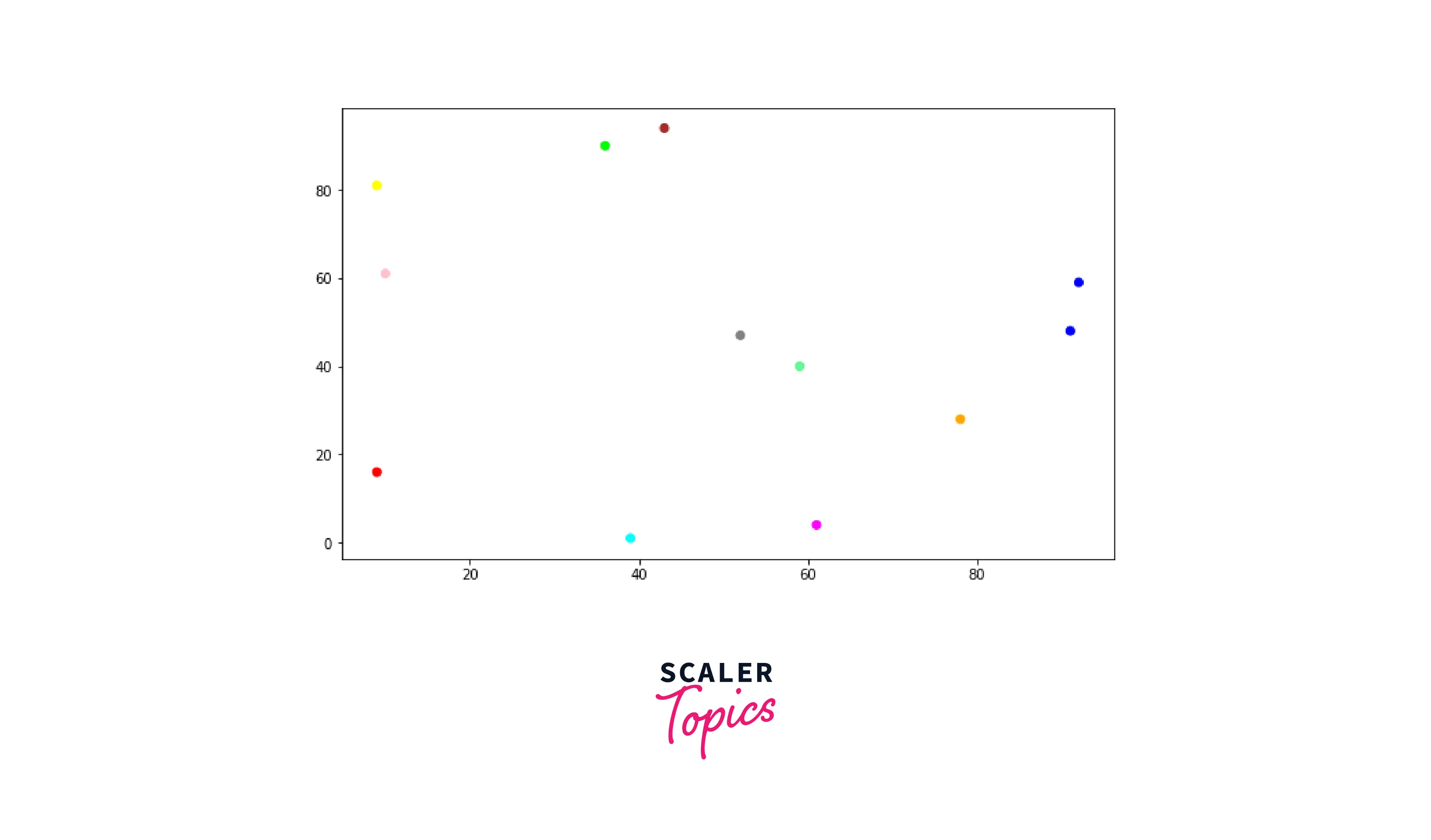
Example 1: Use Custom Color For a Complete Set of Points
Output:
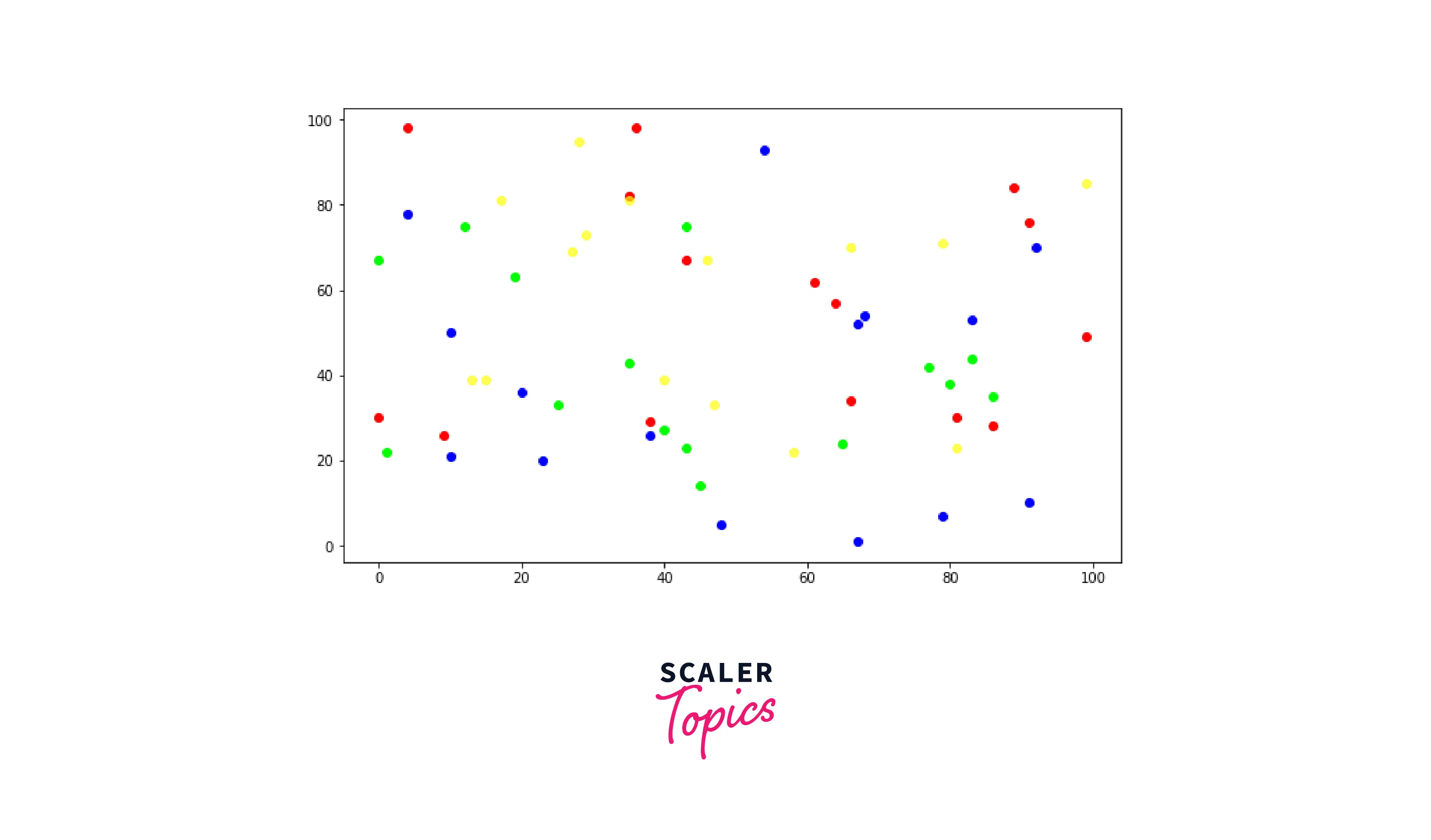 The c= parameter can also take an array of colors. The array must be the same length as the length of the x/y-axis values. Each color in the c= parameter array is applied to each point in the x-y pair point.
Example 2: Using Custom Color For Each Point
Output:
Pie charts
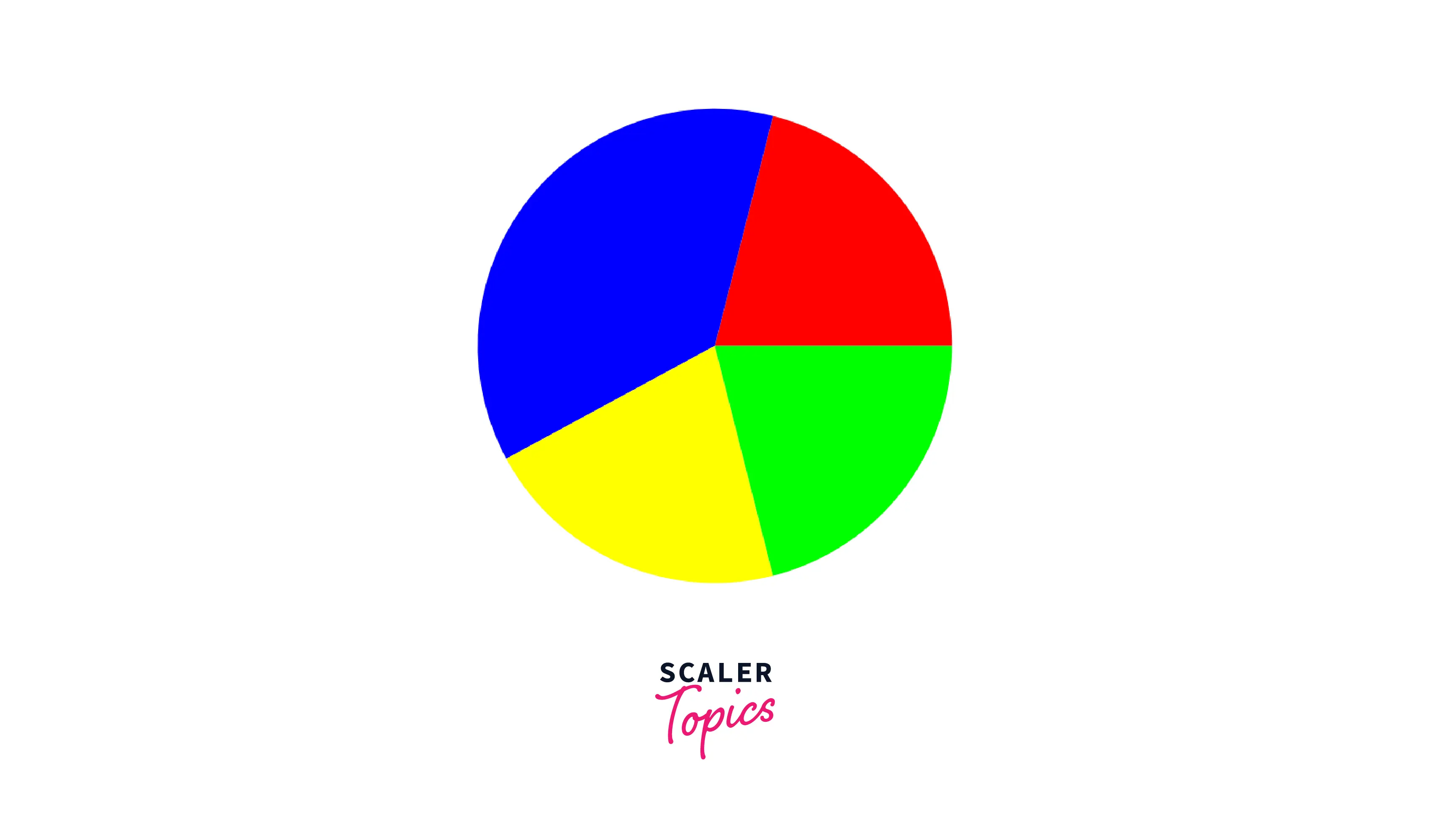
Pie charts in matplotlib can be drawn using the pie() function. The first parameter of the pie() function is the list of fractions to be created for the pie chart. The parameter colors= in the pie() function is used to set the color of the points.
The colors= parameter takes an array of colors. The array must be the same length as the length of the fraction list. Each color in the colors= parameter array is applied to the corresponding fraction on the pie chart.
Example: Custom Colors on Segments in a Pie Chart
Output:
Bar charts
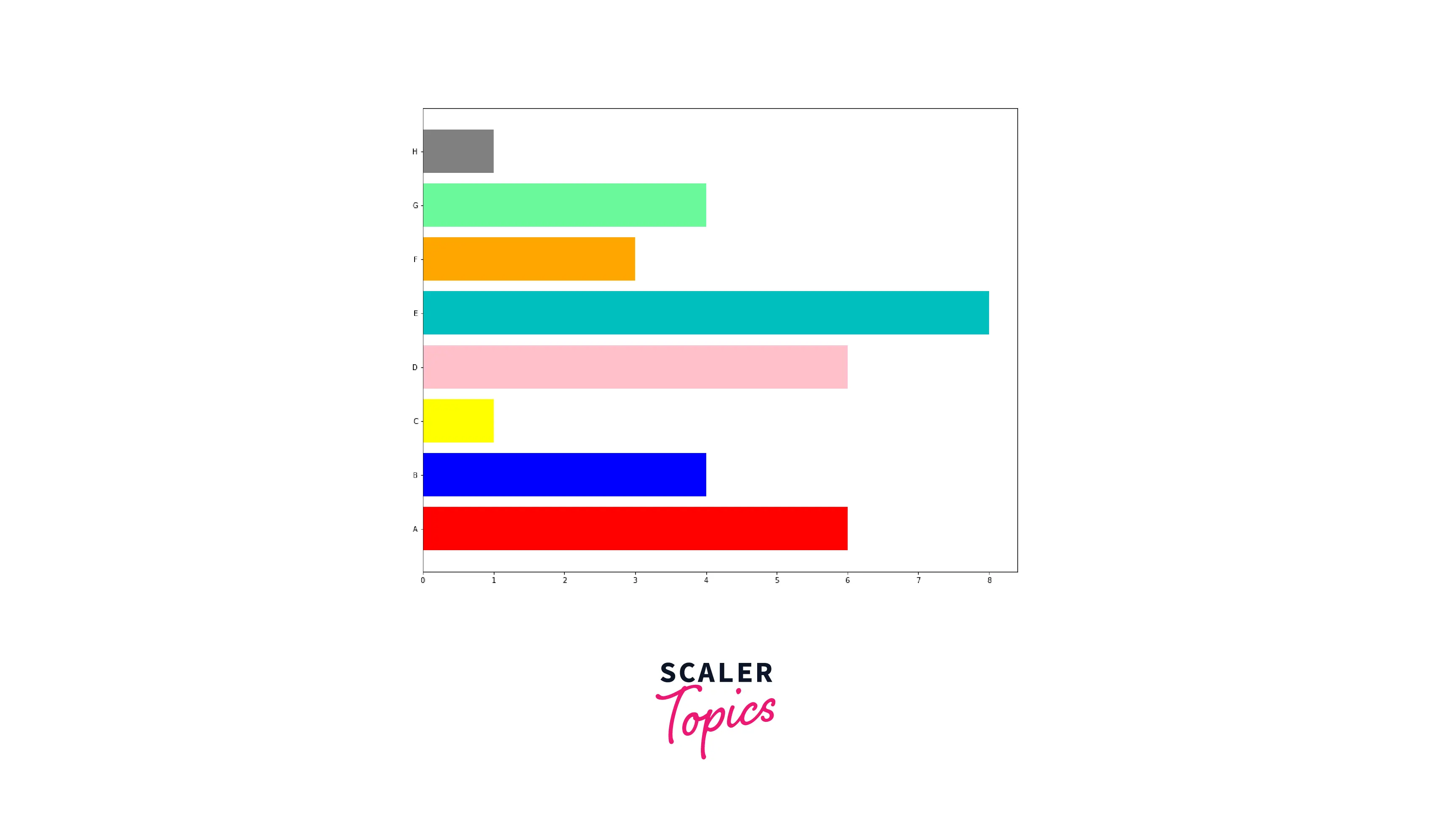
Bar charts in matplotlib can be drawn using the bar() and barh() functions. The bar() draws a bar chart with vertical bars and barh() draws a bar chart with horizontal bars.
The bar() and barh() function takes an argument color= which can be used to set the color of the bars in the plot.
Example 1: Custom Colors in the Vertical Bars Bar Chart
Output:

Example 2: Custom Colors in the Horizontal Bars Bar Chart
Output:

Example 3: Custom colors on Each Bar in a Bar Chart
Output:
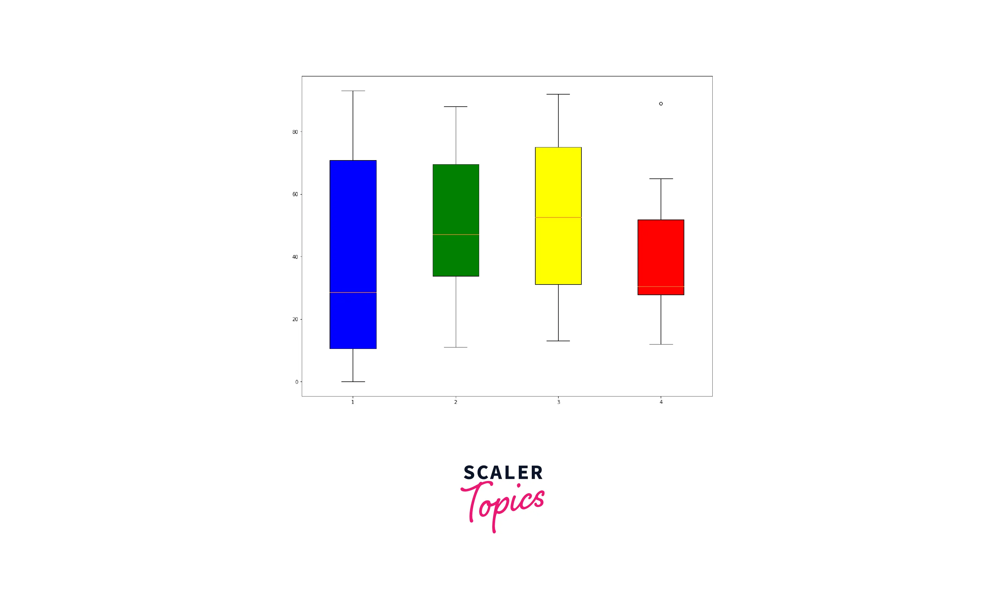
Boxplots
To draw boxplots in matplotlib, we use the boxplot() function. The data set provided as input to the boxplot() function is a two-dimensional array where each row contains the points corresponding to each box.
To use custom color in the boxplot, we need to call the set_facecolor() function for each box drawn.
The object for each box in the boxplot can be obtained from the ['boxes'] array inside the plot's boxplot(bp) object.
The set_facecolor() function has to be called for each box in the boxes array and custom color can be set by providing color value in supported formats.
Example: Custom Colors on Each Box Faces in a Box Plot
Output:
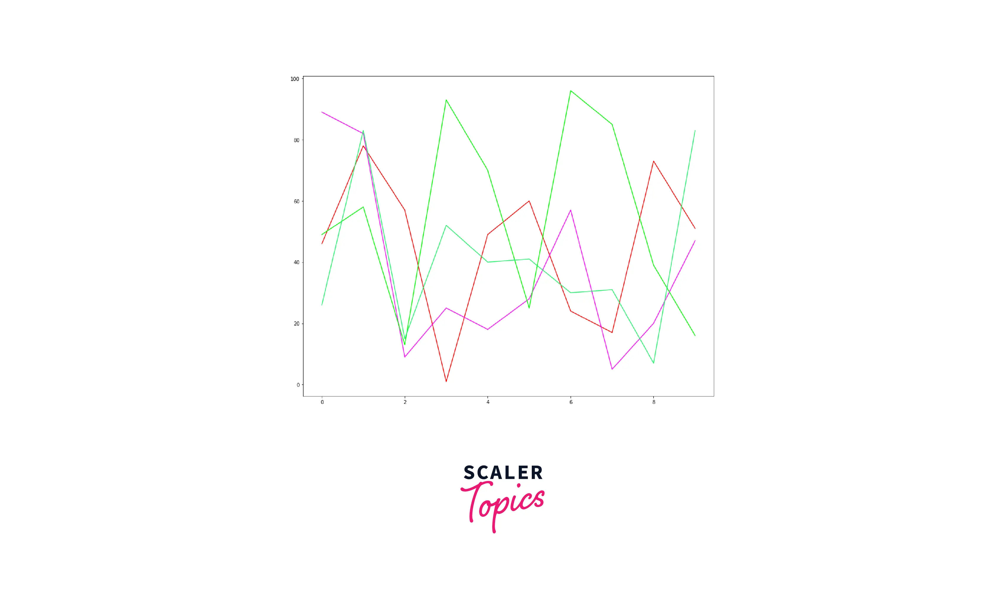
Line Charts
Line charts in matplotlib can be drawn using the plot() function. The plot() draws a polyline chart. The plot() function takes an argument color= which can be used to set the color of the corresponding polyline in the plot.
Polyline: A continuous line of one or more linked straight line segments that together form a shape is called a polyline.
Example: Custom color in a line chart
Output:
Conclusion
The key takeaways from this article are:
- matplotlib is a powerful data visualization python library.
- matplotlib provides various ways to customize the drawings.
- There are multiple ways to define custom colors that are supported by matplotlib:
- RGB or RGBA float tuple format
- RGB or RGBA hex strings
- Grayscale float string
- Single-character shorthand
- X11/CSS4 Color name
- Explored how to use custom colors in various visualizations:
- Scatter plots
- Pie charts
- Bar charts
- Boxplots
- Line Charts