Maps in Matplotlib
Overview
Maps have a huge relevance in the field of computer science. They assist us in determining relationships between two or more variables, enabling us to make wise decisions. Visualizing data on a map is highly helpful when working on data science since it offers us a different perspective on data analysis.
This article will cover maps in matplotlib and different ways to operate the Map API in a plot through Matplotlib.
Transform Your Career
Choose from our industry-leading programs designed for career success
Modern Software and AI Engineering Program
Master full-stack development with AI integration

Modern Data Science and ML with specialisation in AI
Advanced data science techniques with AI specialization
Advanced AIML with Specialisation in Agentic AI
Deep dive into AIML with focus on Agentic systems
DevOps, Cloud & AI Platform Engineering
Build and manage AI-powered cloud infrastructure
AI Engineering Advanced Certification by IIT-Roorkee
Premier AI engineering certification from IIT-Roorkee
Introduction
In traditional programming, mapping various variables with their values to determine their relationship was accomplished using simple data structures like arrays. In this article, we will try to solve this problem by using maps in matplotlib.
Apart from learning about maps in matplotlib, we will go over different APIs provided by matplotlib that help us to optimize and find correlations between elements quite easily in plots.
Scaler Placement Report and Statistics
Scaler learners achieved 2.5x salary growth with average post-Scaler CTC reaching ₹23L.
What is the Need for Maps?
As discussed above, maps help us to optimize and visualize two features/variables in a plot in matplotlib. The advantage of maps over linear data structures like lists and tuples is quick retrieval and accessing data. We must iterate through the whole data structure to get what we want when it comes to lists and tuples. When it comes to maps, we only need to find the key, and the key will help us to get the value. Hence, when it comes to categorization and segmentation problems, we tend to switch to maps over lists and tuples in matplotlib.
To take a real-life example of maps in matplotlib, let's assume we have a weather station of a country. Then, an overview of the distribution of rainfall and winds across the nation could be provided by a map representation easily as plots.
This is what a weather map looks like:

Different APIs Provided by Matplotlib
Matplotlib is a powerful library in Python for creating graphs and plots. Matplotlib can produce a wide range of graphs, plots, charts, histograms, and other visual representations.
The matplotlib library provides some APIs (Application Programming Interface) that allow us to use different functions and methods to visualize our data meaningfully as maps through plots. The most notable and popular API in matplotlib is the pyplot API.
Matplotlib.pyplot is a collection of functions that work as commands and works similarly to plotting functions in MATLAB. Each Pyplot function modifies a plot in some way. For instance, a function might produce a figure, a plotting region within a figure, some lines within a plotting area, label the plot, etc.
Features of Matplotlib Maps
Maps are a very efficient way to deal with complicated data, as it internally converts the complicated data into meaningful plots in matplotlib. This section will convert a two-dimensional matrix from its matrix state to its visual representation as a plot.
When we create maps in Matplotlib, we allow ourselves to be more expressive with our plots. We can change/edit our maps according to our needs. For example, if we want to highlight a specific area of a map, we can fill it using the fill() function provided by Matplotlib; we can show different contours between different states of a map using Matplotlib and so on.
To demonstrate an example, let's take a Mandelbrot set. A Mandelbrot set is a set that represents highly complicated complex numbers, and the importance is that the data is represented in the form of a fractal, a set of infinite complex patterns that are set across different scales. In a one-dimension plot, the Mandelbrot set looks something like this:

To represent Mandelbrot set in a matrix format, the 0s will represent the shorter circle, and the 1s will represent the larger circle.
Can't make sense out of it, right? Don't worry, maps will help us sort this issue out!
Explanation
After importing all the necessary libraries, we create an iter_count() function that will help us make iterations for creating our Mandelbrot set.
After creating iterations, we initialize X, Y and Z, which are the axes of our set. Then, with the help of loops, we fill the values in the Mandelbrot set of the plot.
Output:

As you can see, now we can infer decisions about the Mandelbrot set with the help of maps in matplotlib. It converted a two-dimensional array to a visual plot effortlessly.
Scaler Placement Report and Statistics
Scaler learners achieved 2.5x salary growth with average post-Scaler CTC reaching ₹23L.
Applications of Matplotlib Maps
- Representation
With the help of maps, we can easily visualize data better than in a linear way as a plot. This allows us to infer decisions from it efficiently. Matplotlib provides us with inbuilt libraries to create maps, such as pyplot() and Basemap().
Here's an example in which we create a plot as a world map using Basemap()
Output:

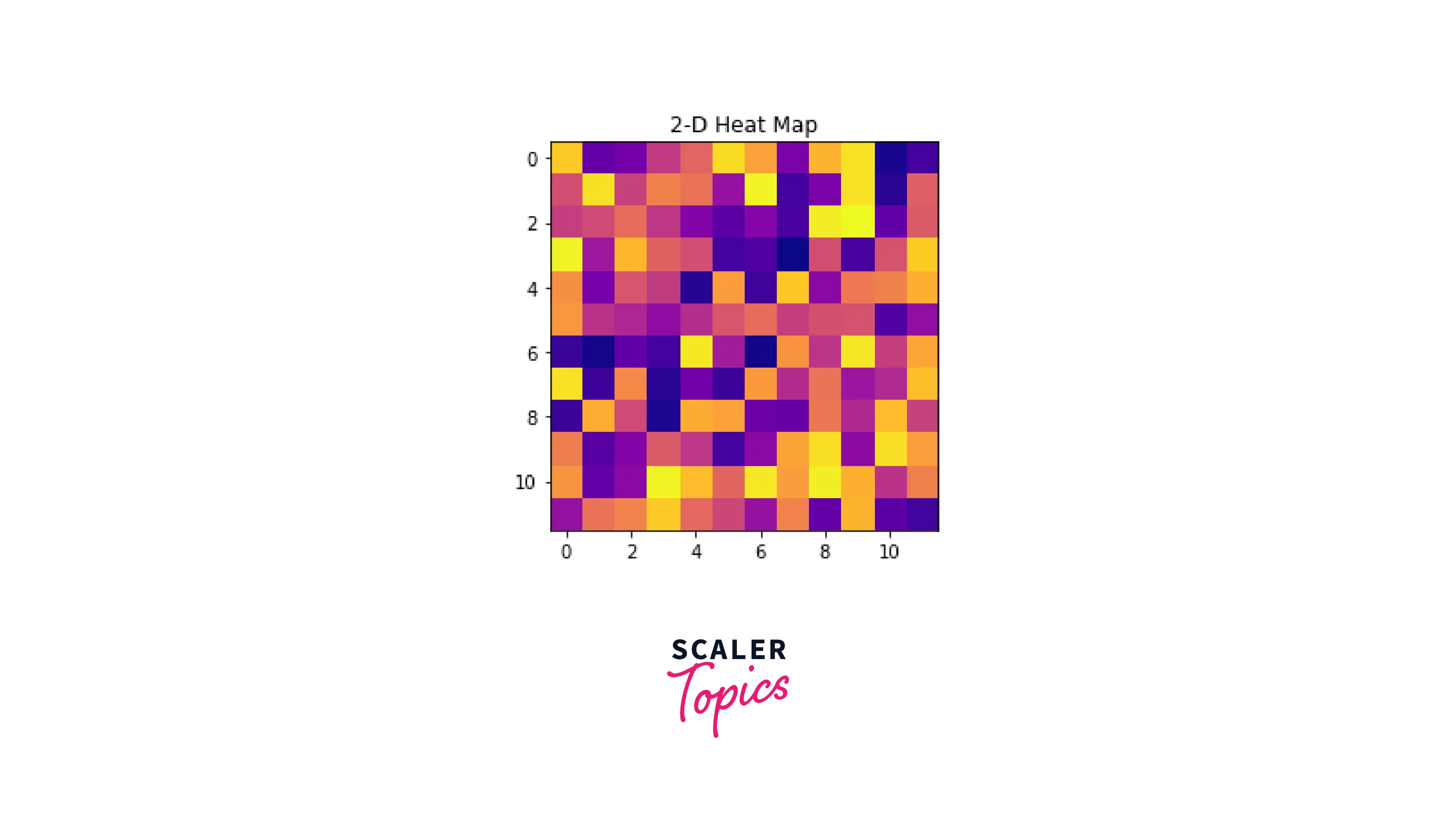
- Heatmaps
Heatmaps in Matplotlib is used to describe the population/density of a region or a country. Matplotlib offers a lot of APIs to plot heatmaps. In this example, we will use the pyplot API to create a heatmap.
Output:
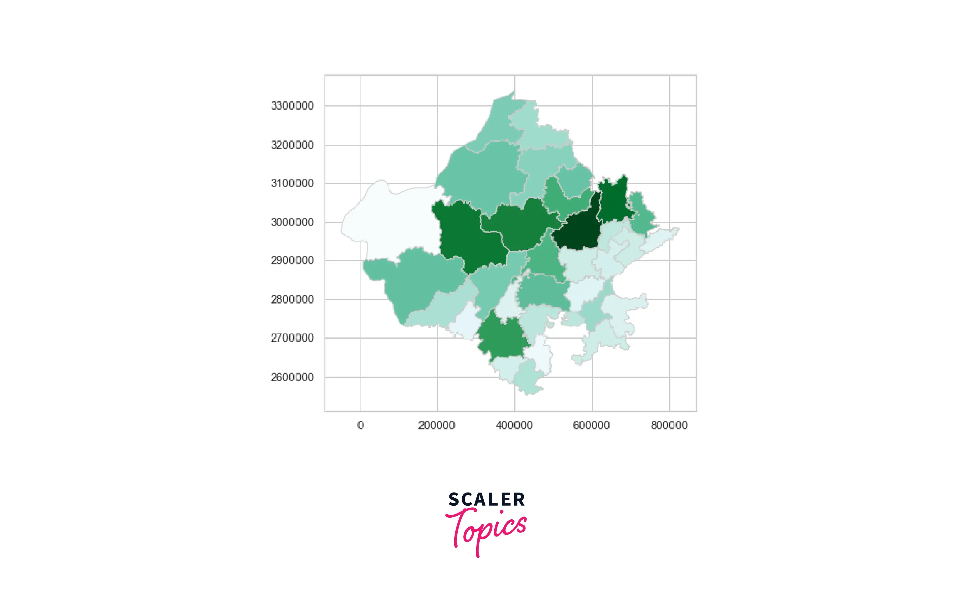
- Weather APIs
Regarding matplotlib, there are many options to choose from to make decisions from our data and convert it into plots. However, generating maps related to weather analysis is one of the most paramount features of maps in matplotlib. Due to the fast and easy approach in matplotlib, we can create maps representing continents and countries as plots.
Here's a dataset that contains three-dimensional data which contains the name of the place, the latitude, and the longitude:
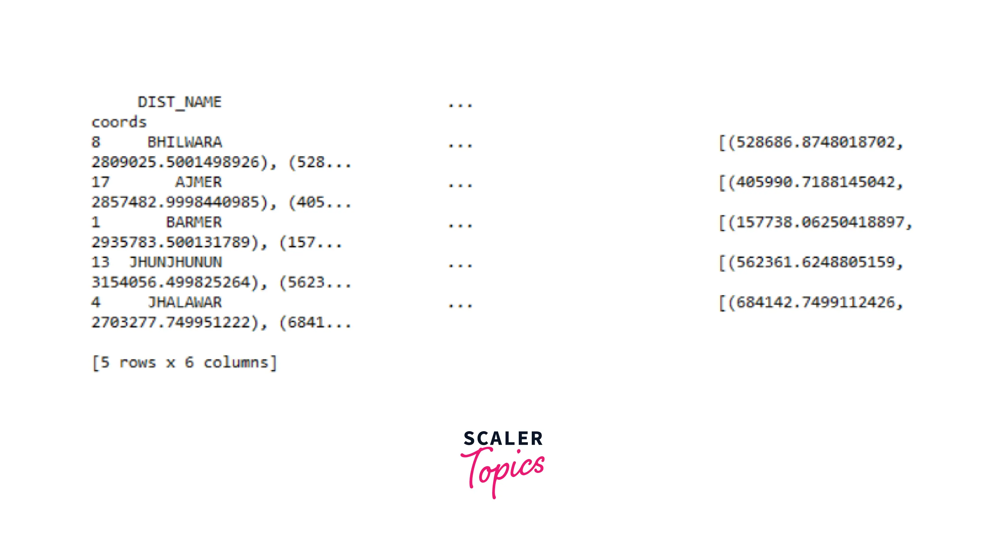
Code
On visualizing this data using maps, we can generate something like this:
Output:
Conclusion
- In this article, we covered maps, a tool that helps us to optimize and visualize two features/variables as plots in matplotlib.
- Apart from this, we covered the basic need for maps and how they are better than representing data linearly.
- We went through the most popular API in matplotlib for maps, pyplot(), used to create meaningful plots.
- Moreover, we covered the different features and applications regarding maps in matplotlib. We also saw a real-life example in which we converted a three-dimensional array into a map as a plot.