Introduction to 3D Figures in Matplotlib
Overview
In the extensive field of applications in Python, Data visualization has to be one of the areas where many libraries are developed. Matplotlib happens to be the number 1 choice when it comes to data visualization. Initially, matplotlib was developed for plotting two-dimensional plots. But, recently, Matplotlib has also extended its capabilities to offer 3D plotting libraries!
Introduction
Without data visualization, we would not be able to interpret data meaningfully. We'll be stuck trying to remember and imagine data points in our minds. 3D plots in Matplotlib help us to communicate our ideas and inferences effectively to our target audience, be it professors or a bunch of investors. 3D plotting will get you covered!
Need for 3D Figures in Matplotlib
Now that we have covered why 3D plotting in Matplotlib is a useful data-visualization skill let's cover the need for learning 3D plotting.
In 2D plots, we can categorize and segment two axes; X and Y axes. With the help of a 2D plot, we can successfully show the relation between two axes. But what if we wanted to take things a step further?
With the help of 3D plotting, we can now show and explore relationships between 3 axes; X, Y, and Z axes.
Now that we have covered the need for 3D plots in Matplotlib let us discover the various functions and methods presented to us in Matplotlib!
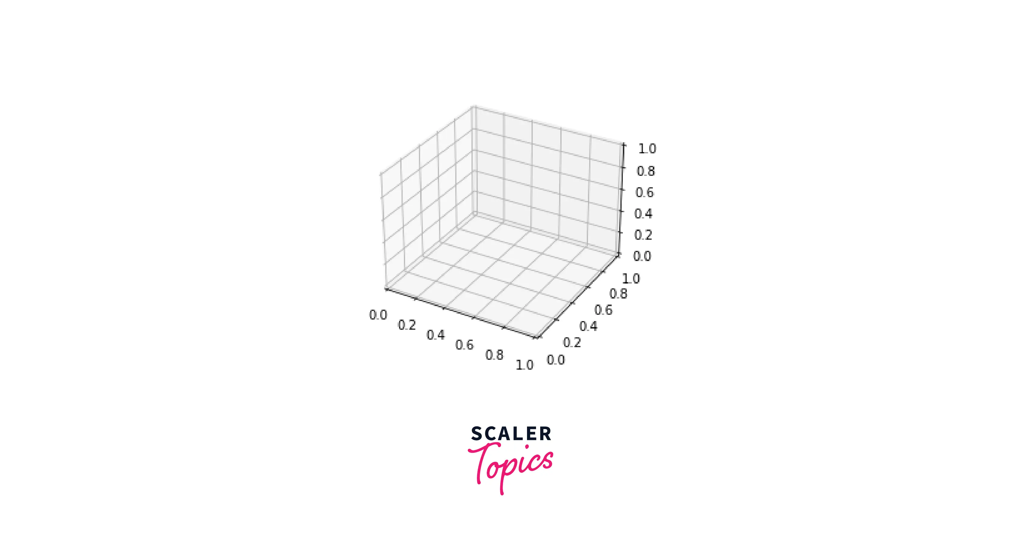
Creating an Empty 3D Plot
The starting point of creating 3D plots in Matplotlib is to first create an empty canvas. After creating the canvas, we can generate figures from it. When we specify that the plot's projection will be in "3D" format, we also describe the axes of our 3D plot. This assists in creating the 3D figure of empty axes on the canvas.
Output:
Now that we have created a basic and empty 3D plot in Matplotlib let us go on to create 3D plots using the MPL Toolkit!
Transform Your Career
Choose from our industry-leading programs designed for career success
Modern Software and AI Engineering Program
Master full-stack development with AI integration

Modern Data Science and ML with specialisation in AI
Advanced data science techniques with AI specialization
Advanced AIML with Specialisation in Agentic AI
Deep dive into AIML with focus on Agentic systems
DevOps, Cloud & AI Platform Engineering
Build and manage AI-powered cloud infrastructure
AI Engineering Advanced Certification by IIT-Roorkee
Premier AI engineering certification from IIT-Roorkee
Important 3D Plots Using Matplotlib
3D plots in matplotlib are created using the MPL Toolkit. This library provides us with basic 3D plotting features. The package that helps us create 3D plots in the MPL Toolkit is the mplot3d package.
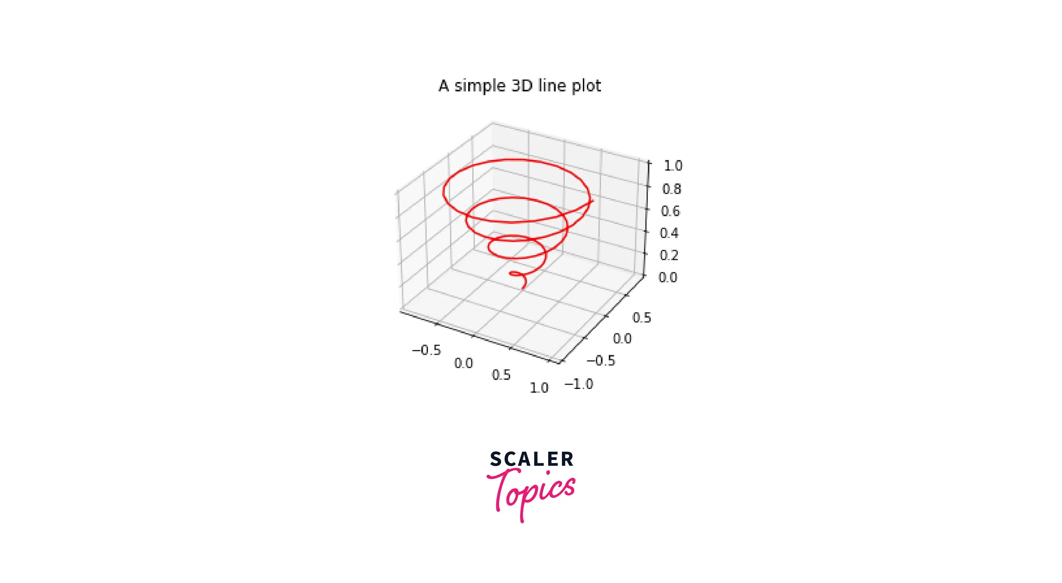
3D Lines and Plots
Plotting lines and empty plots with the mplot3d package is fundamental to creating 3D plots using matplotlib. To understand this in-depth, we'll create a 3D plot using Matplotlib:
Output:
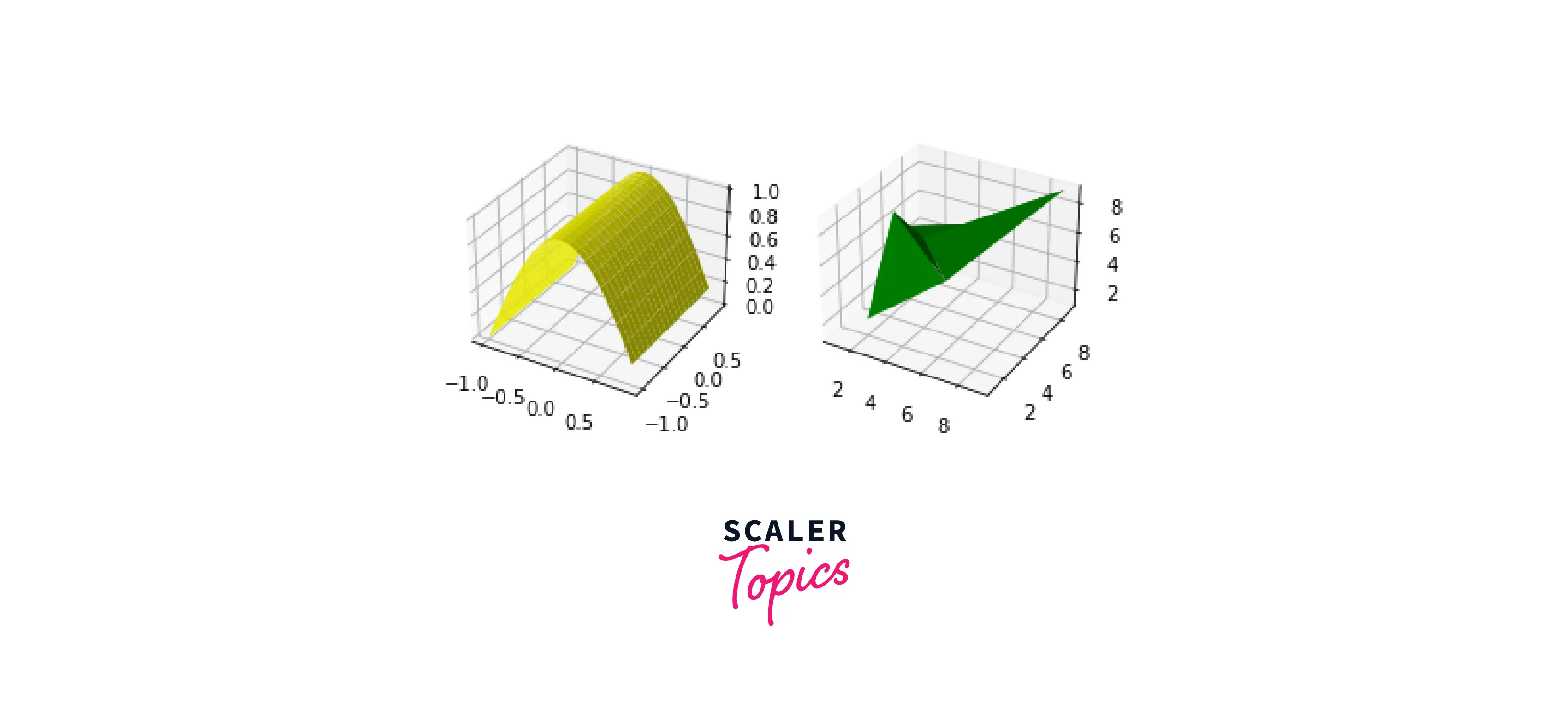
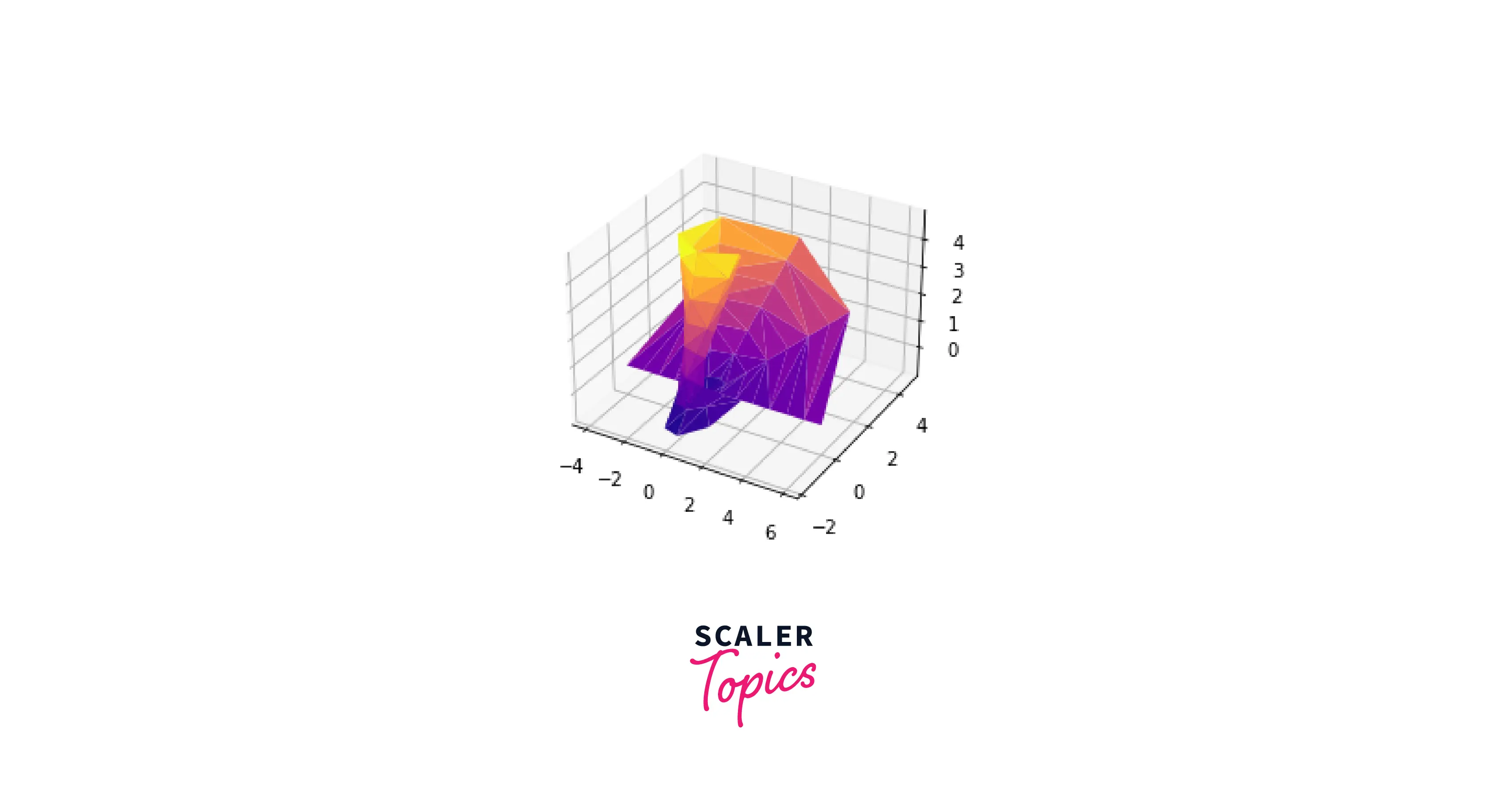
Surface and Tri-surface Plots
We will look at how to create surface and tri-surface plots using Matplotlib. Surface plots are a variation of normal 3D plots, which are filled in nature. In the example below, we will create two subplots; one will contain a surface plot, and the other will contain a tri-surface plot.
Output:
Contour and Filled Contour Plots
Now, we will be looking at Contour and Filled Contour plots. These plots allow us to visualize data in a contour view. Since these plots are similar, we will subplot them.
Output:
Scaler Placement Report and Statistics
Scaler learners achieved 2.5x salary growth with average post-Scaler CTC reaching ₹23L.
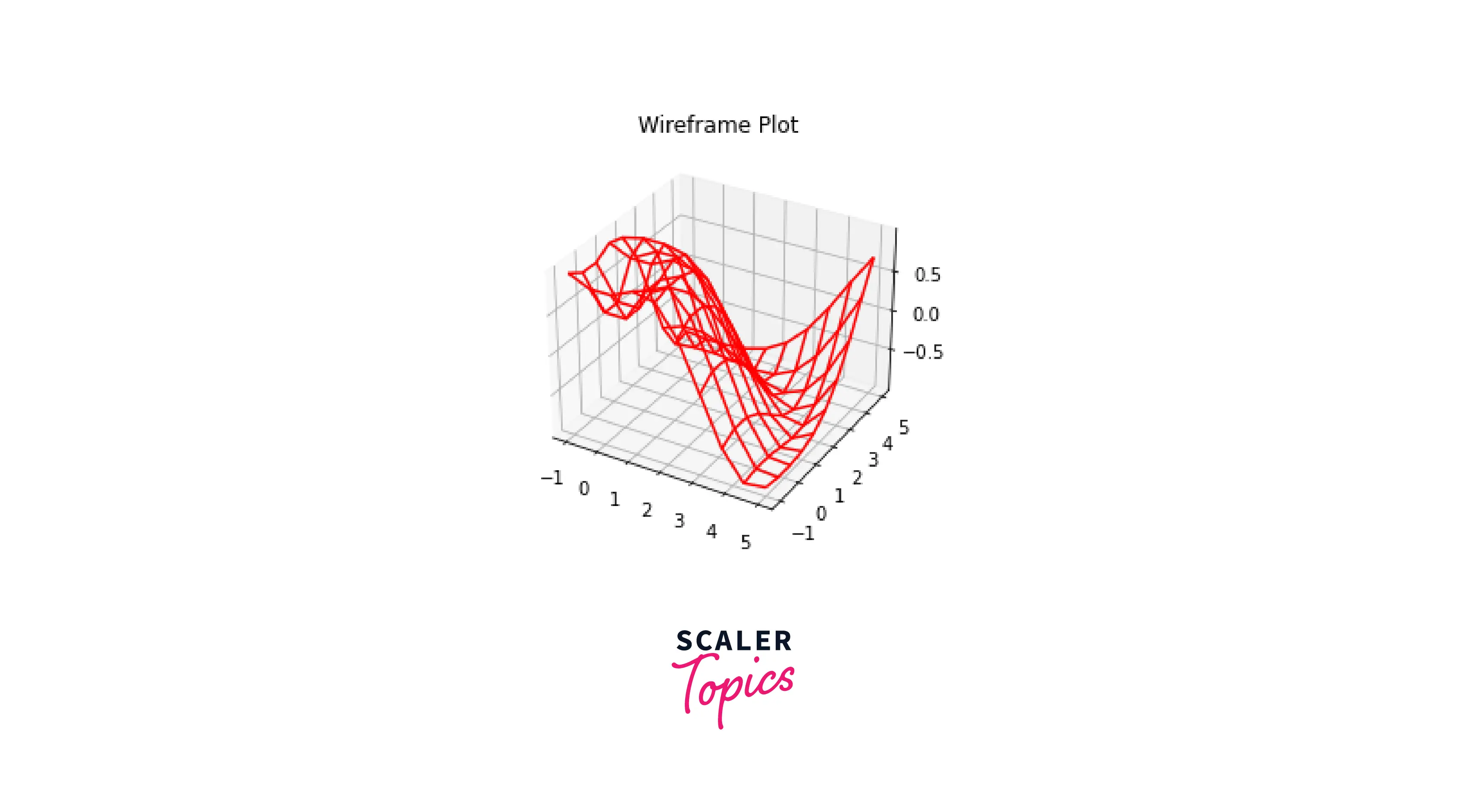
Wireframe Plots
A wireframe plot is a 3D plot in Matplotlib that works based on gridded data. It takes in the grid value and plots it on a 3D scale.
Output:
Turn Learning into Career Growth
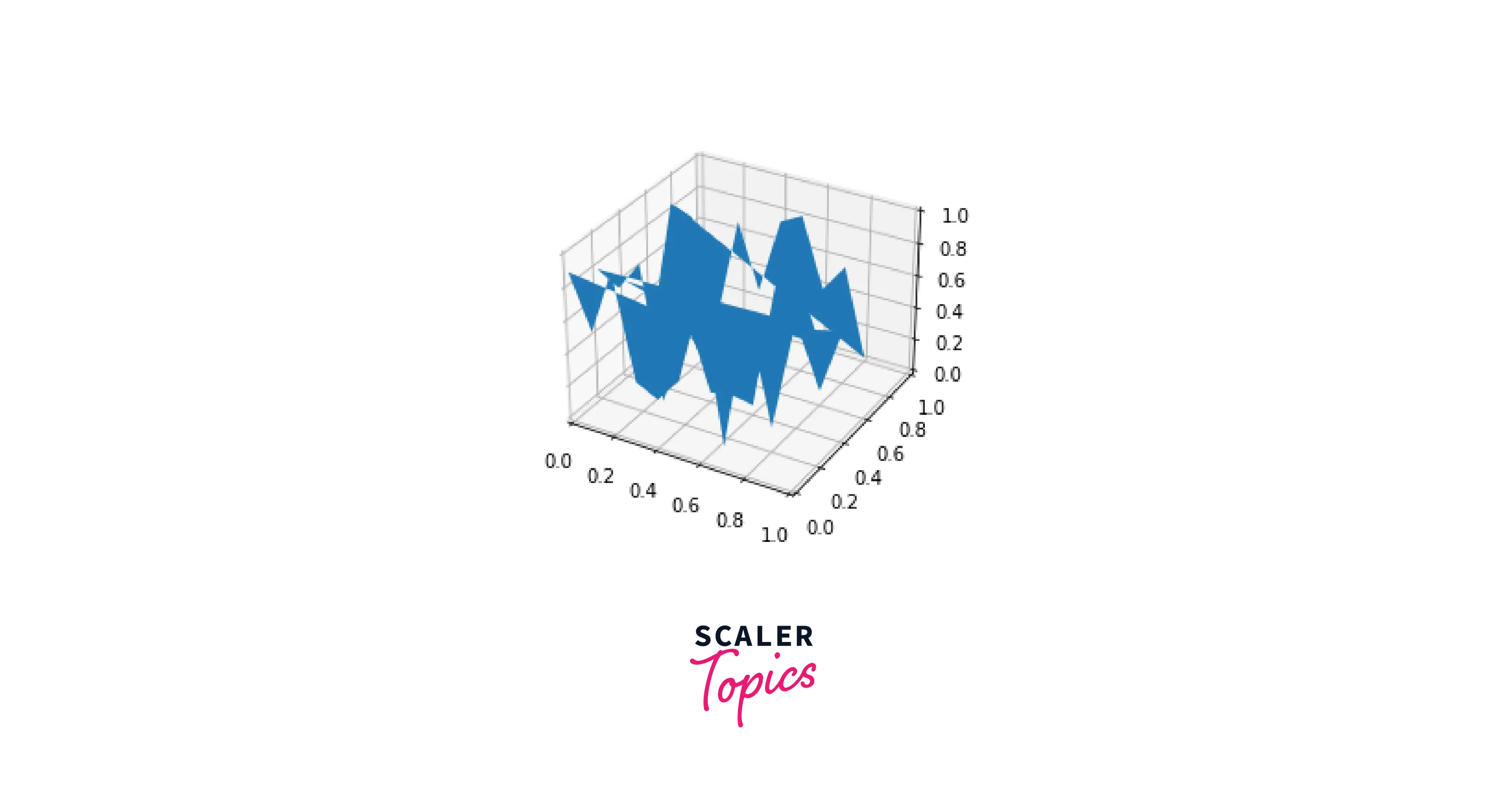
Polygon Plots
The polygon plot in Matplotlib is a bit different from the other 3D plots. In Polygon plots, we plot a continuous set of points at different axes points of the z-axis.
Output:
Quiver Plots
We can plot a 3D field of arrows to define the specified points using a quiver plot. Then, the arrow can be modified according to our requirements.
Output:
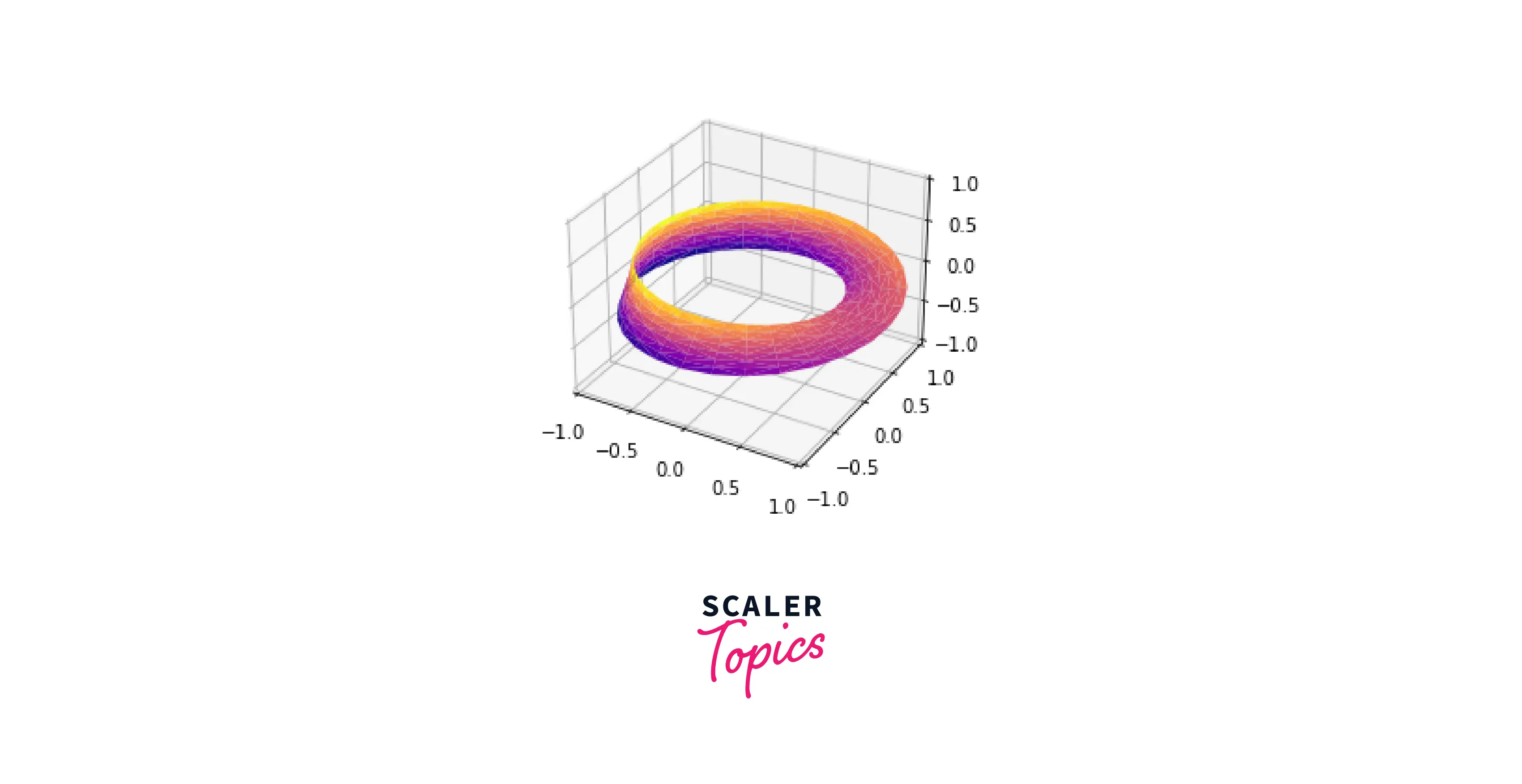
Mobius Strip
A paper strip attached into a loop and half twisted** is called a **Möbius strip`. However, despite its appearance, it only has one side! Here, we'll use the three-dimensional tools of Matplotlib to visualise such an object. Its internal angle ranges from 0 to 2π around the loop, and its width ranges from -1 to 1.
Output:
Customizing a 3D Plot in Matplotlib
Now that we have learned how to create some important 3D plots in Matplotlib let us understand how to customize a 3D plot according to our needs.
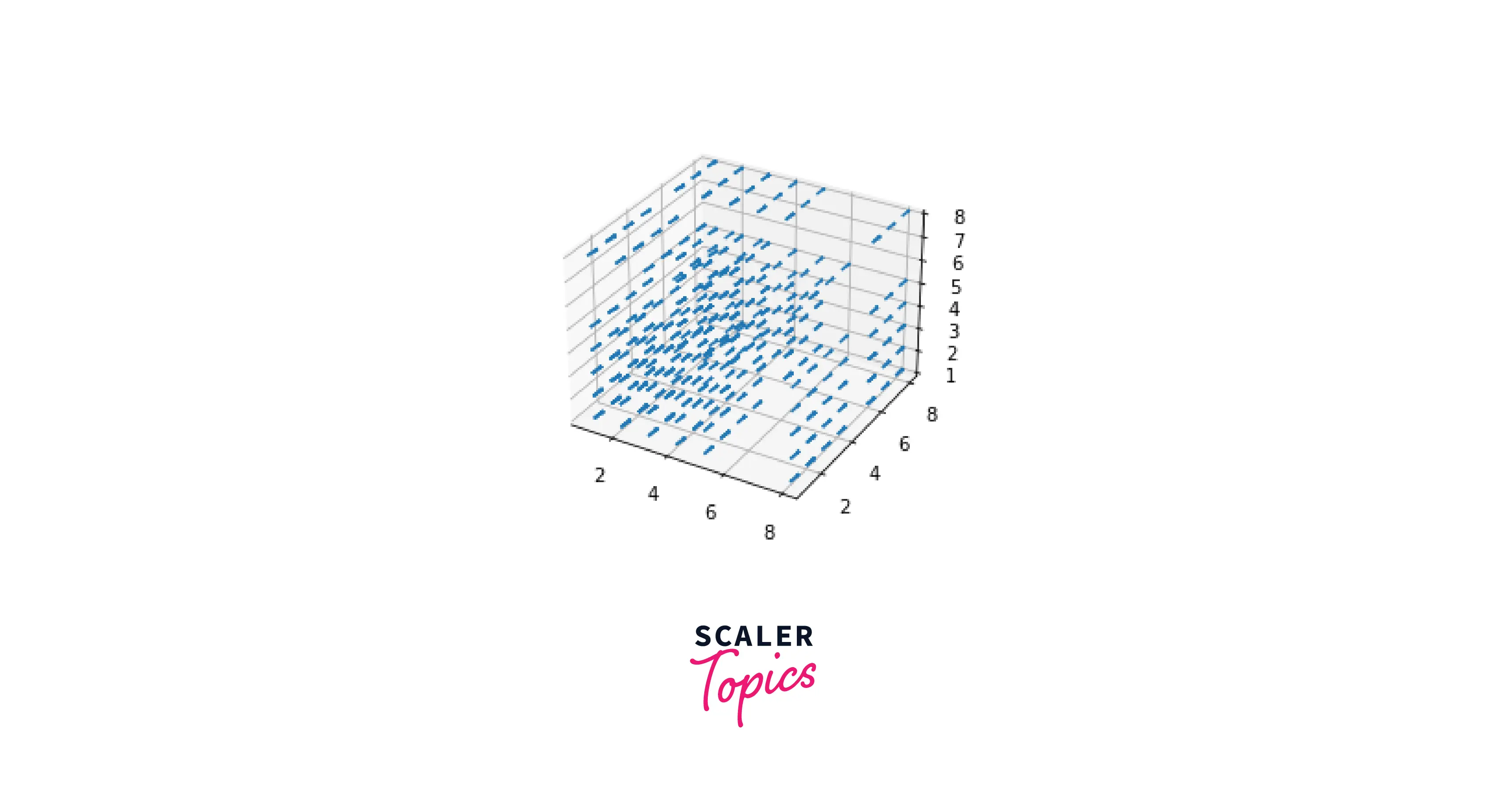
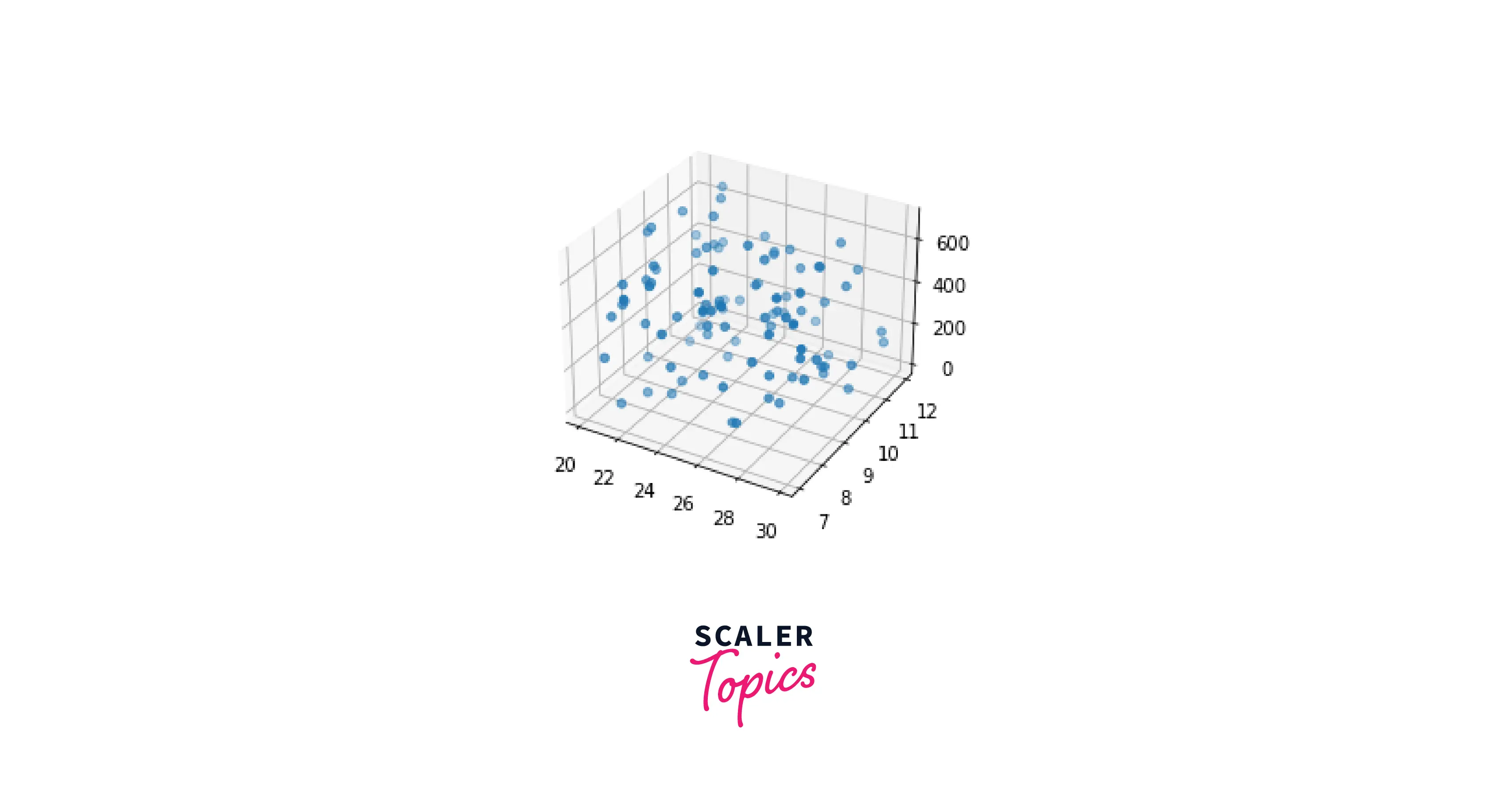
To demonstrate this process, we will use a 3D scatter plot. Then, we will use the random() function in the NumPy library to fill its values.
Output:
-
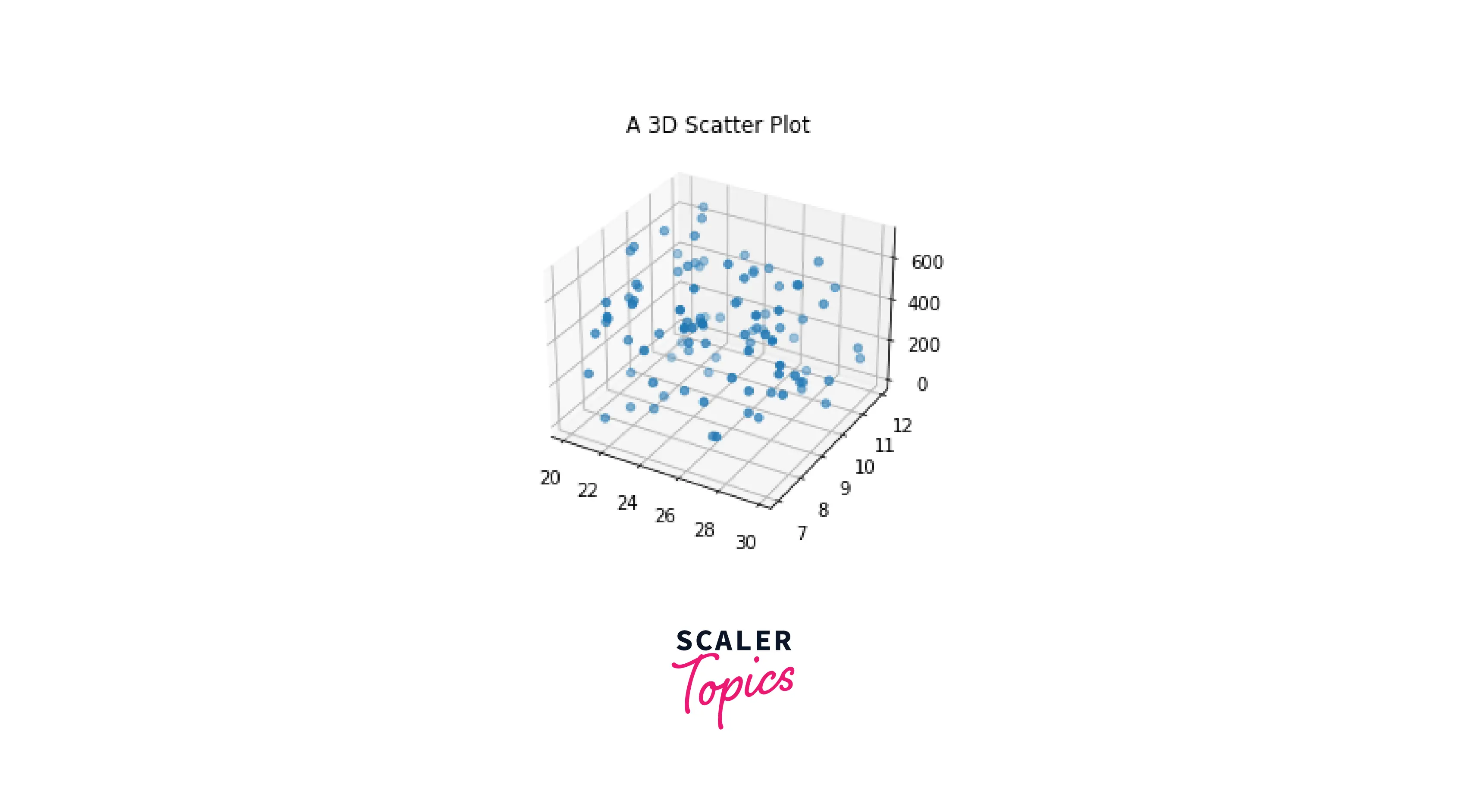
Adding a title
To add a title, we simply use the set_title() function in Matplotlib.
Output:
-
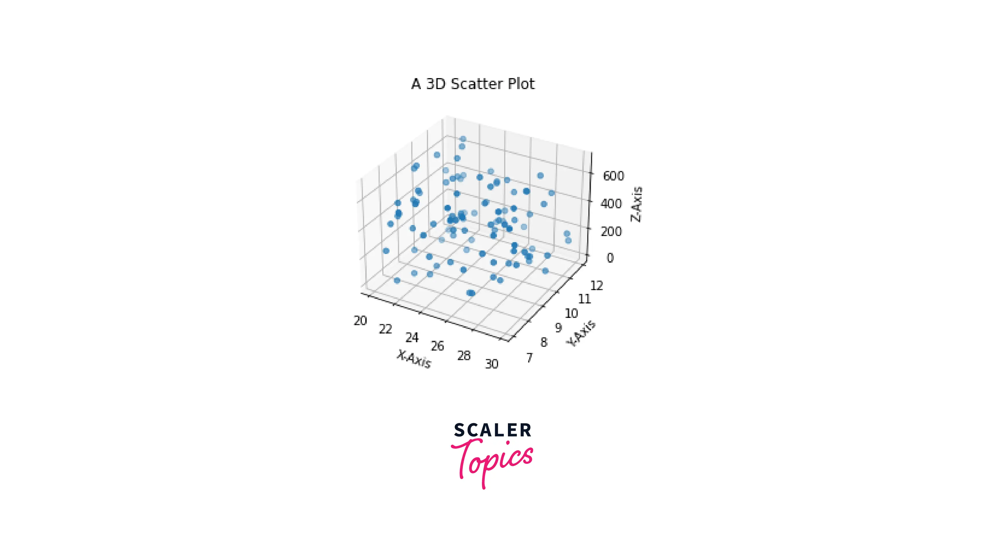
Adding Axes Labels
To set axis labels, we will use the set_xlabel(), set_ylabel() and set_zlabel() functions in Matplotlib.
Output:
-
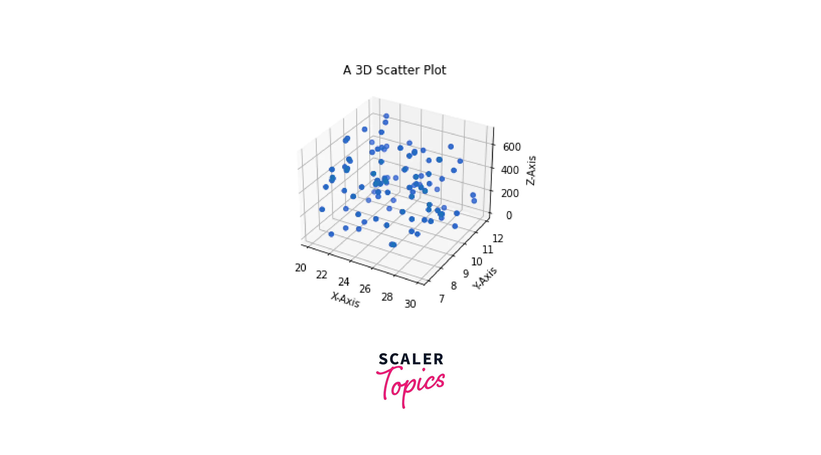
Modifying Markers
We can change the type of markers in our 3D plots by changing the markers parameter in scatter() method.
Output:
-
Modifying the Axes Limits and Ticks
The default range and interval of the values on the axes are established based on the input values. However, we can change them to reflect our chosen values.
Output
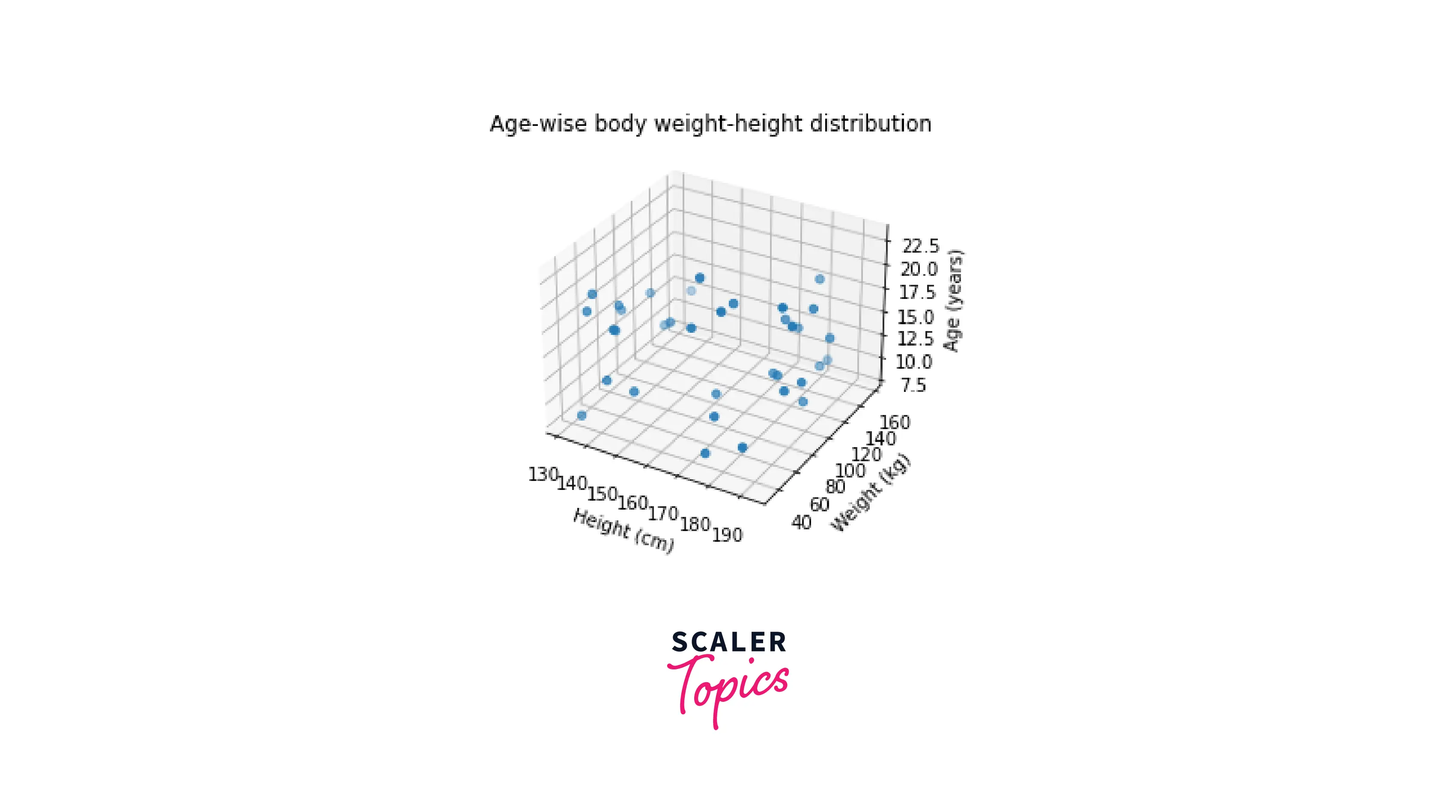
We can also modify the ticks by using the set_xticks(), set_yticks(), and set_zticks() functions.
Output:
-
Change the size of the plot
We can change the size and layout of our 3D plot in Matplotlib by using the set_size_inches() function.
-
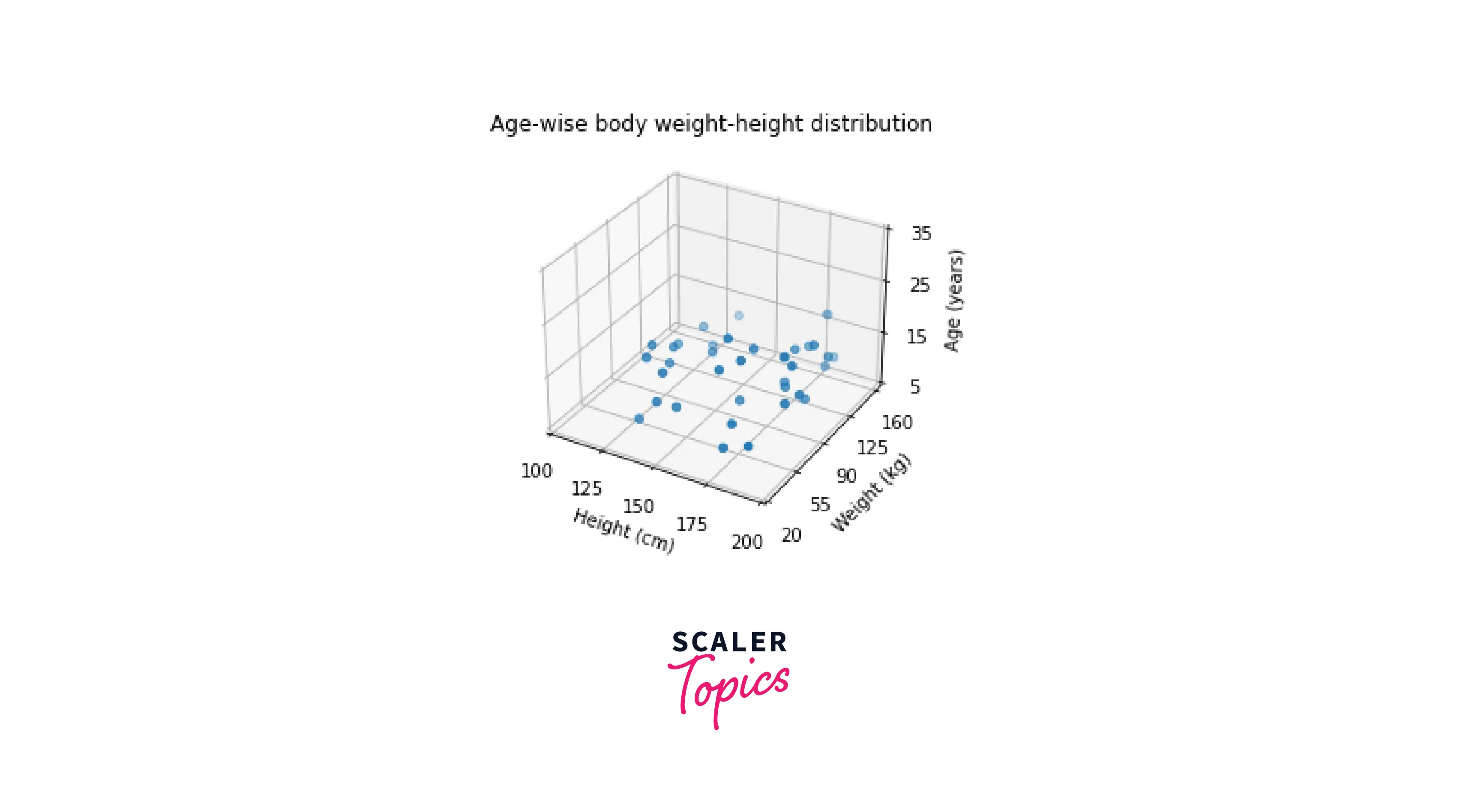
Turn off/on gridlines
In some cases, we don't require the gridlines, as they could crowd the plot, and the important features won't be visible. This can be done by setting the grid() function to False.
Output:
-
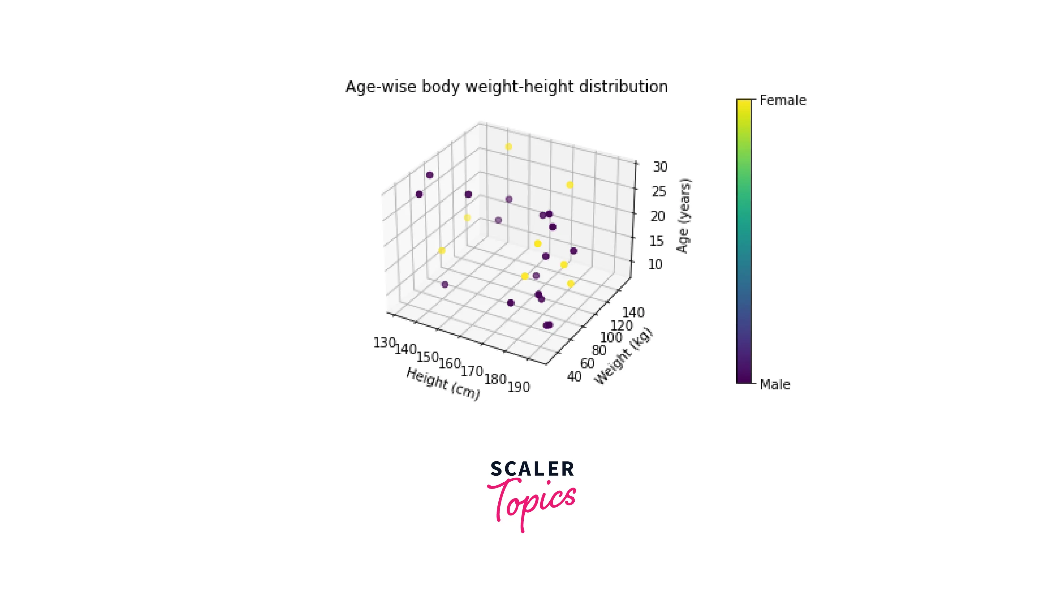
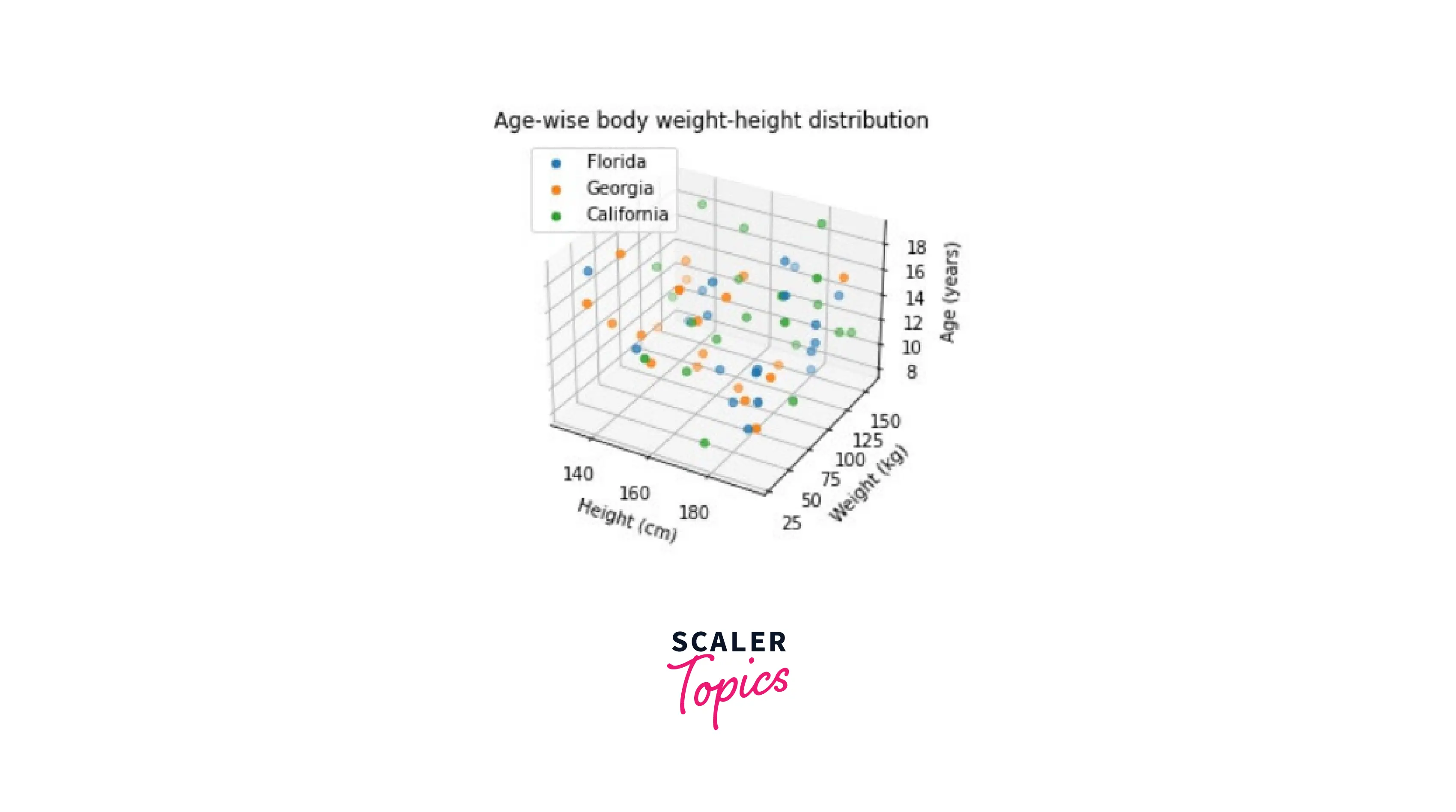
Set 3D plot colors based on class
If we have a problem statement, we must categorize classes on a scatter plot. We can achieve this by plotting each class with a different color.
To identify a class from a color, we will plot a colorbar, which will contain the color with the respective name of the class.
Output:
-
Adding a legend
Adding a legend in a plot is always useful, as it helps us to identify the various data points in a plot. In addition, this helps us to generate inferences quickly and efficiently.
We use the legend() function in Matplotlib to generate a legend.
Output:
-
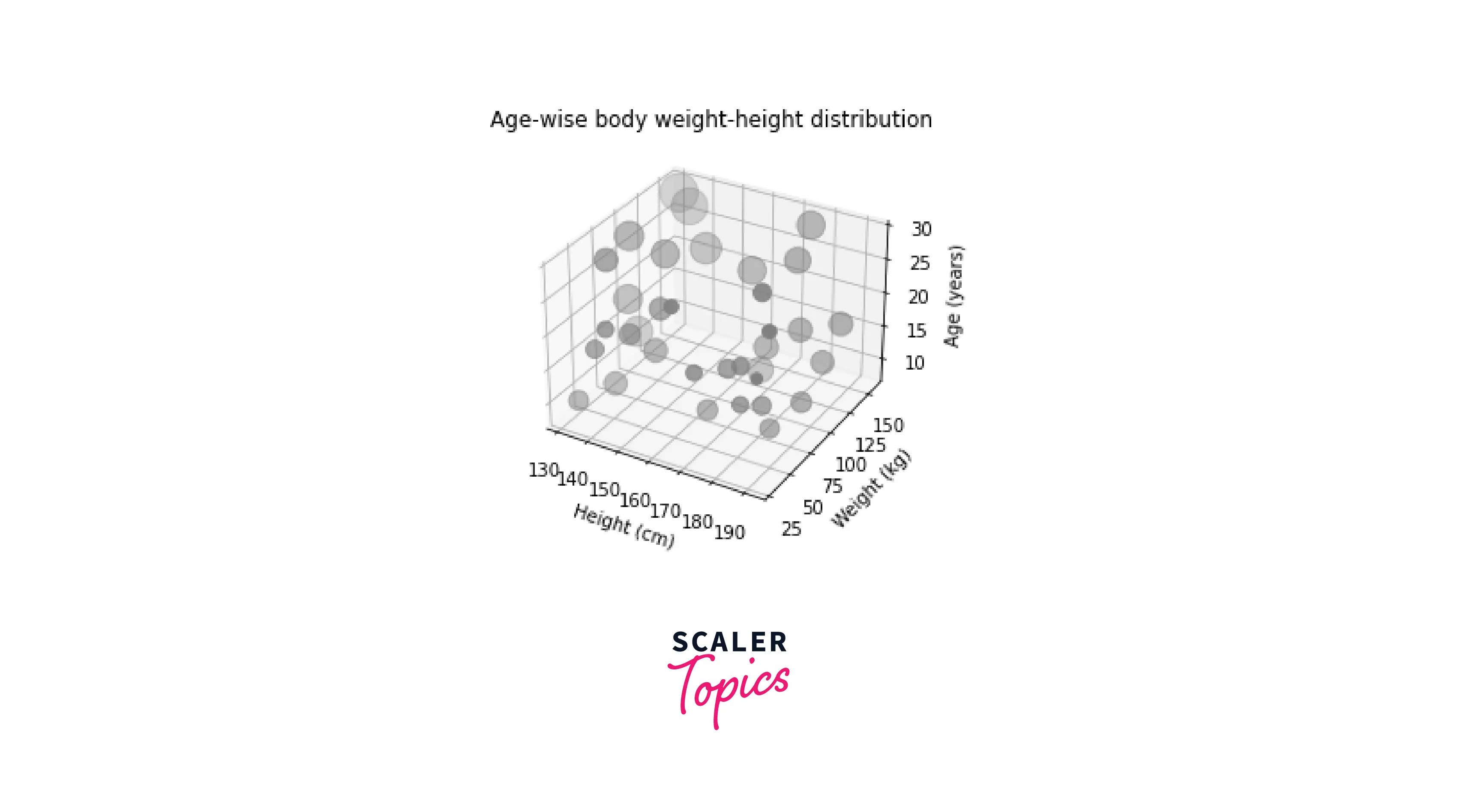
Plot markers of varying sizes
All point markers in the scatter plots we have seen thus far have had fixed sizes.
By providing custom values to the scatter plot's parameters, we can change the size of the markers.
Output:
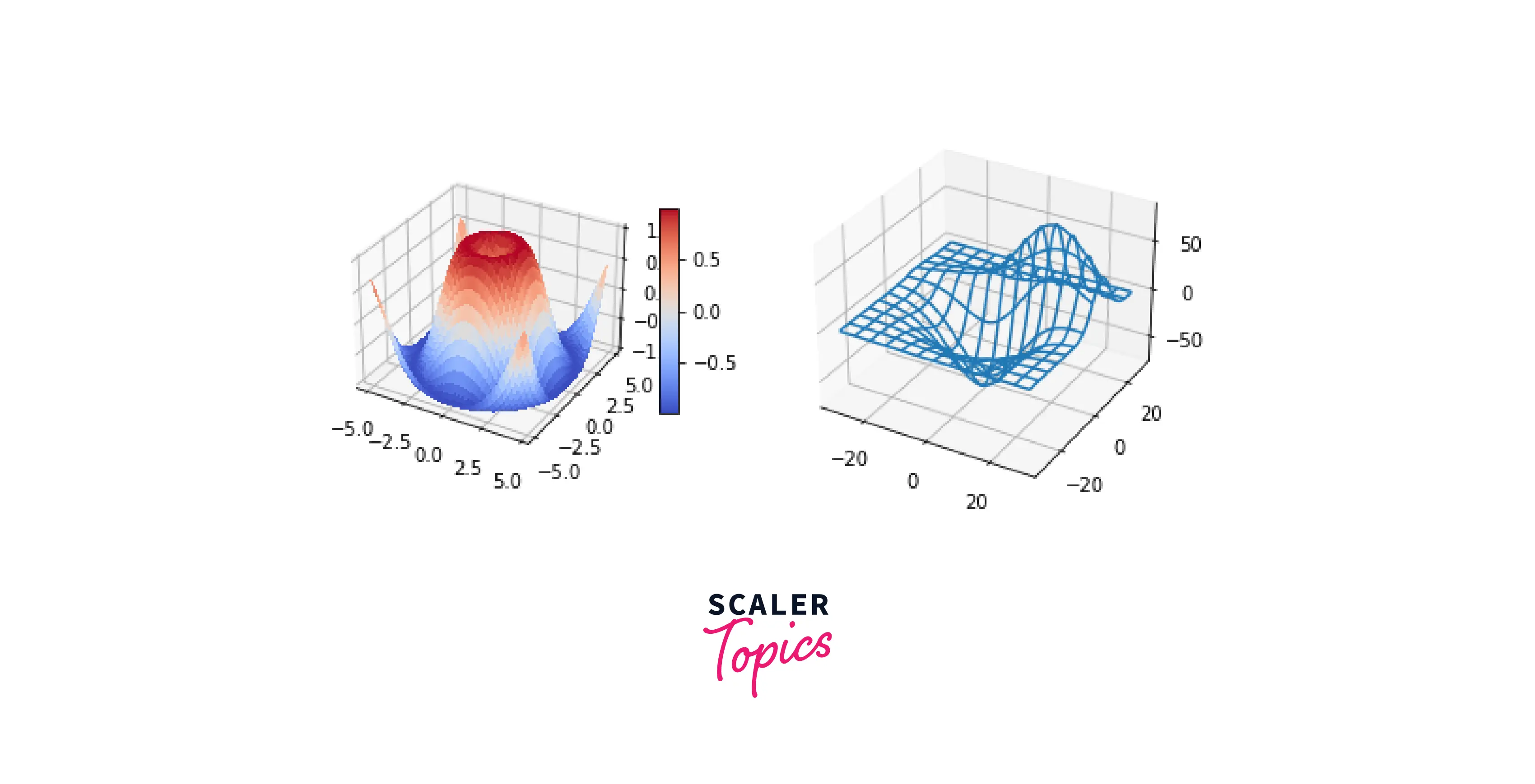
Subplotting 3D Figures in Matplotlib
When it comes to data visualization, comparing plots has to be one of the most important features of Matplotlib. Creating various subplots of 3D plot is possible in Matplotlib using the add_subplot() function.
Output:
Examples of 3D Plotting
Here are some additional 3D plotting examples in Matplotlib:
-
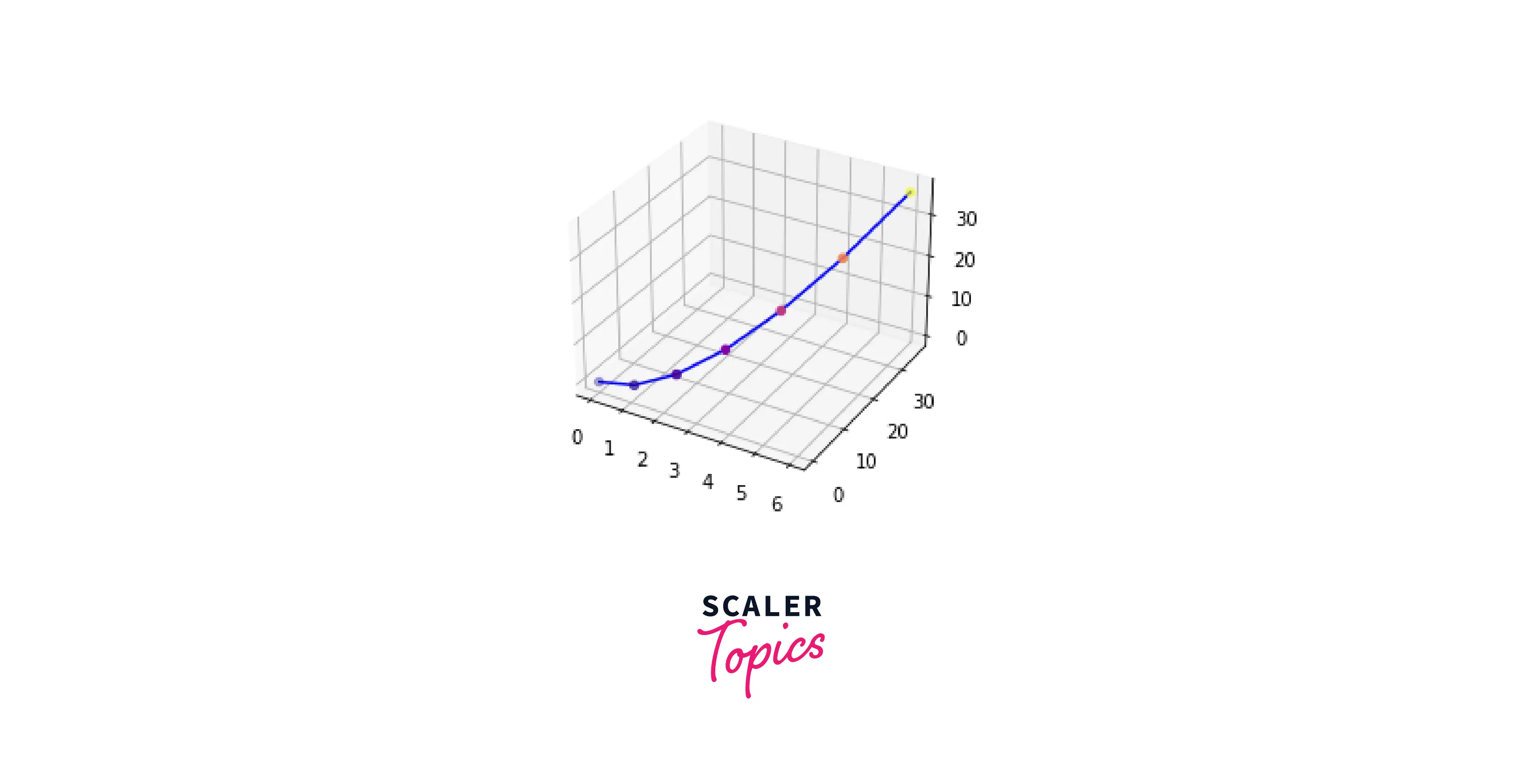
Simple Curve in a 3D Plot
Output:
-
Creating a Mobius Strip
Output:
Conclusion
- In this article, we covered what 3D plots in Matplotlib are and their purpose.
- We covered the main difference between 2D and 3D plots; 3D plots allow graphing 3 axes simultaneously.
- To start things off, we learned how to create an empty 3D plot in Matplotlib.
- To further increase our knowledge in 3D plots, we learnt the essential 3D plots like Surface plots, Wireframe plots, Mobius Strips etc.
- To have complete access to our plots, we understood how to customize a 3D plot according to our needs in Matplotlib.
- We learned how to subplot 3D figures in Matplotlib for better visualizations.