How to add Axis Labels in Matplotlib
Overview
Matplotlib provides the libraries and functions to add axis labels on a figure. Using the xlabel() and ylabel() functions, we can add the axis label on a figure and customize the axis labels' text properties. We will discuss all the functions to understand better the concept and which function to use according to the scenario. For example, in matplotlib's pyplot library, there are two functions: matplotlib.pyplot.xlabel() and matplotlib.pypot.ylabel() are used to add axis labels in matplotlib which take at least one parameter(string) as a label to the axis.
Axis Labels in Matplotlib
When we plot data in matplotlib on the X-Y plane, we sometimes need to define the variables on the axes, like a speed-time graph where speed is on the y-axis and time is on the x-axis. So, how do we mention these variables when we plot the graph on matplotlib? Axis labels in matplotlib are used to mention variables on the axis. So, the function required for labels in matplotlib is: matplotlib.pyplot.xlabel() for adding labels on x-axis and matplotlib.pyplot.ylabel() for adding labels on y-axis.
Scaler Placement Report and Statistics
Scaler learners achieved 2.5x salary growth with average post-Scaler CTC reaching ₹23L.
How to Add Axis Labels in Matplotlib
Syntax and parameter of X and Y axis label
For X-axis
matplotlib.pyplot.xlabel(xlabel, fontdict=None, labelpad=None, *, loc=None, kwargs)
For Y-axis
matplotlib.pyplot.ylabel(ylabel, fontdict=None, labelpad=None, *, loc=None, kwargs)
Parameters:
| Parameters | Description |
|---|---|
| xlabel and ylabel: | datatype of this parameter is a string. Set the text of the label. |
| labelpad (optional parameter): | datatype of this parameter is float, and the default value is 4.0. Spacing in points from the Axes bounding box, including ticks and tick labels. |
| loc (optional parameter): | default value is 'center', which changes the label's position. |
| kwargs (optional parameter): | Text properties and label appearance. |
| Color: | to change the color of the label. |
| Fontsize: | to change the size of the label. |
| Horizontalalignment: | to change the horizontal alignment of the label {'right','left', 'centre'}. |
| Verticalalignment: | to change the vertical alignment of the label {'right','left', 'centre'}. |
| rotation: | to change the rotation of the label. |
| fontweight: | to change the text weight of the label {a numeric value in range 0-1000, 'ultralight', 'light', 'normal', 'regular', 'book', 'medium', 'roman', 'semibold', 'demibold', 'demi', 'bold', 'heavy', 'extra bold', 'black'}. |
| fontfamily: | to change the font of the labels {'serif', 'sans-serif', 'cursive', 'fantasy', 'monospace'} |
| fontdict (optional parameter): | it changes the label's size, font, and size. |
Transform Your Career
Choose from our industry-leading programs designed for career success
Modern Software and AI Engineering Program
Master full-stack development with AI integration

Modern Data Science and ML with specialisation in AI
Advanced data science techniques with AI specialization
Advanced AIML with Specialisation in Agentic AI
Deep dive into AIML with focus on Agentic systems
DevOps, Cloud & AI Platform Engineering
Build and manage AI-powered cloud infrastructure
AI Engineering Advanced Certification by IIT-Roorkee
Premier AI engineering certification from IIT-Roorkee
How to Customize Axis Labels in Matplotlib
In matplotlib, we can customize the axis label by changing their color, position, size, etc. First, we will discuss the parameter mentioned below.
- Fontsize
- Color
- Rotation
- Labelpad
- Set_visible
- bold
Font Size of Axis Labels
Sometimes labels size is not scaled according to the graph. We can change its font size by passing the parameter font size in the xlabel() and ylabel() functions.
Syntax: For Changing the fontsize of the label
matplotlib.pyplot.xlabel(xlabel, fontsize)
Example:
Output:
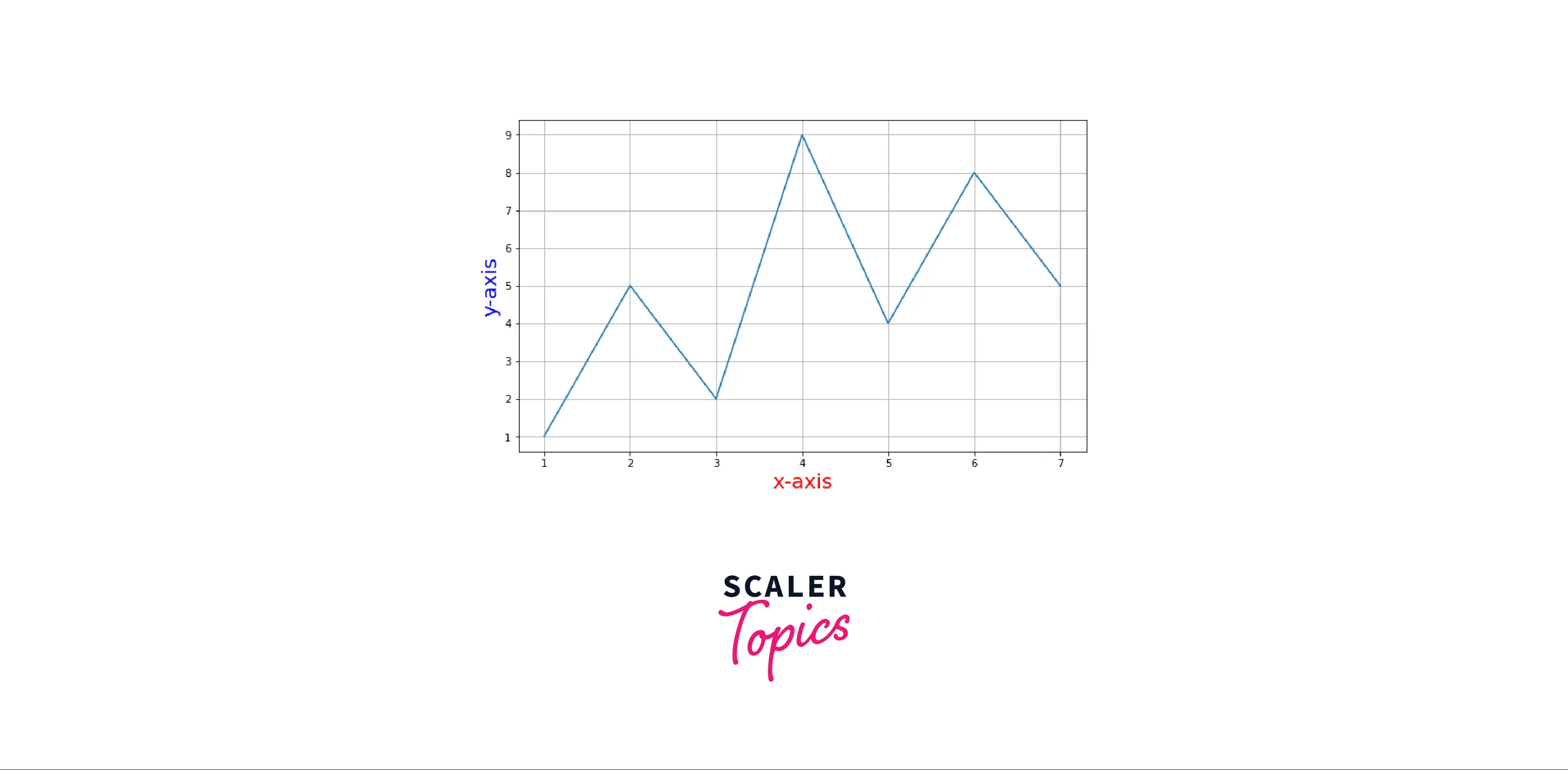
Color of Axis Labels
We can also change the color of the axis label by passing the parameter color in the xlabel() and ylabel functions.
Syntax: For changing the color of the label
matplotlib.pyplot.xlabel(xlabel, color)
or
matplotlib.pyplot.ylabel(ylabel,color)
Example:
Turn Learning into Career Growth
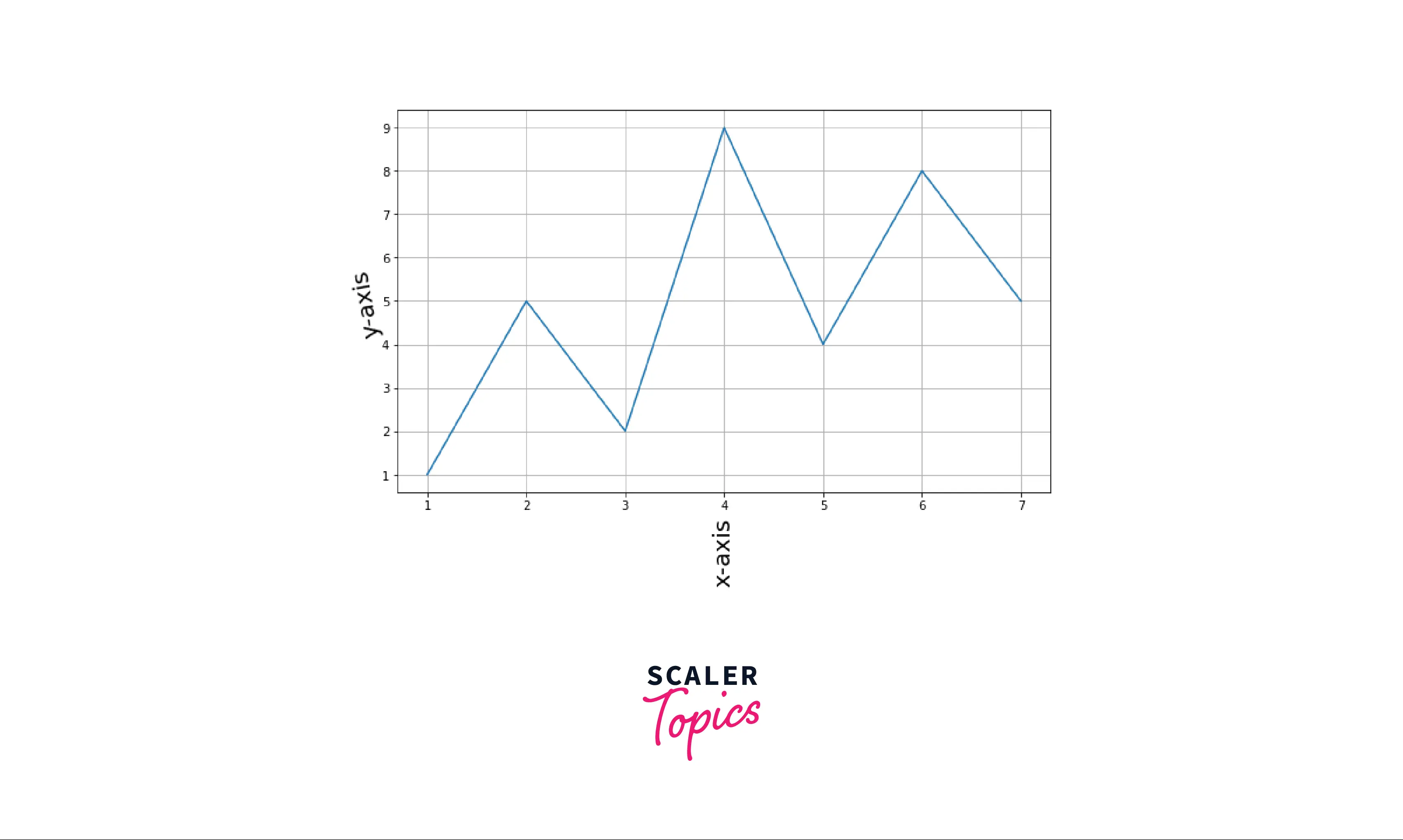
Rotation of Axis Labels
We can also rotate the axis label by passing the rotation parameter in the xlabel() and ylabel() functions.
Syntax: matplotlib.pyplot.xlabel(xlabel, rotation=)
or
matplotlib.pyplot.ylabel(ylabel, rotation=)
Example:
Output:
Matplotlib Axis Labels Examples
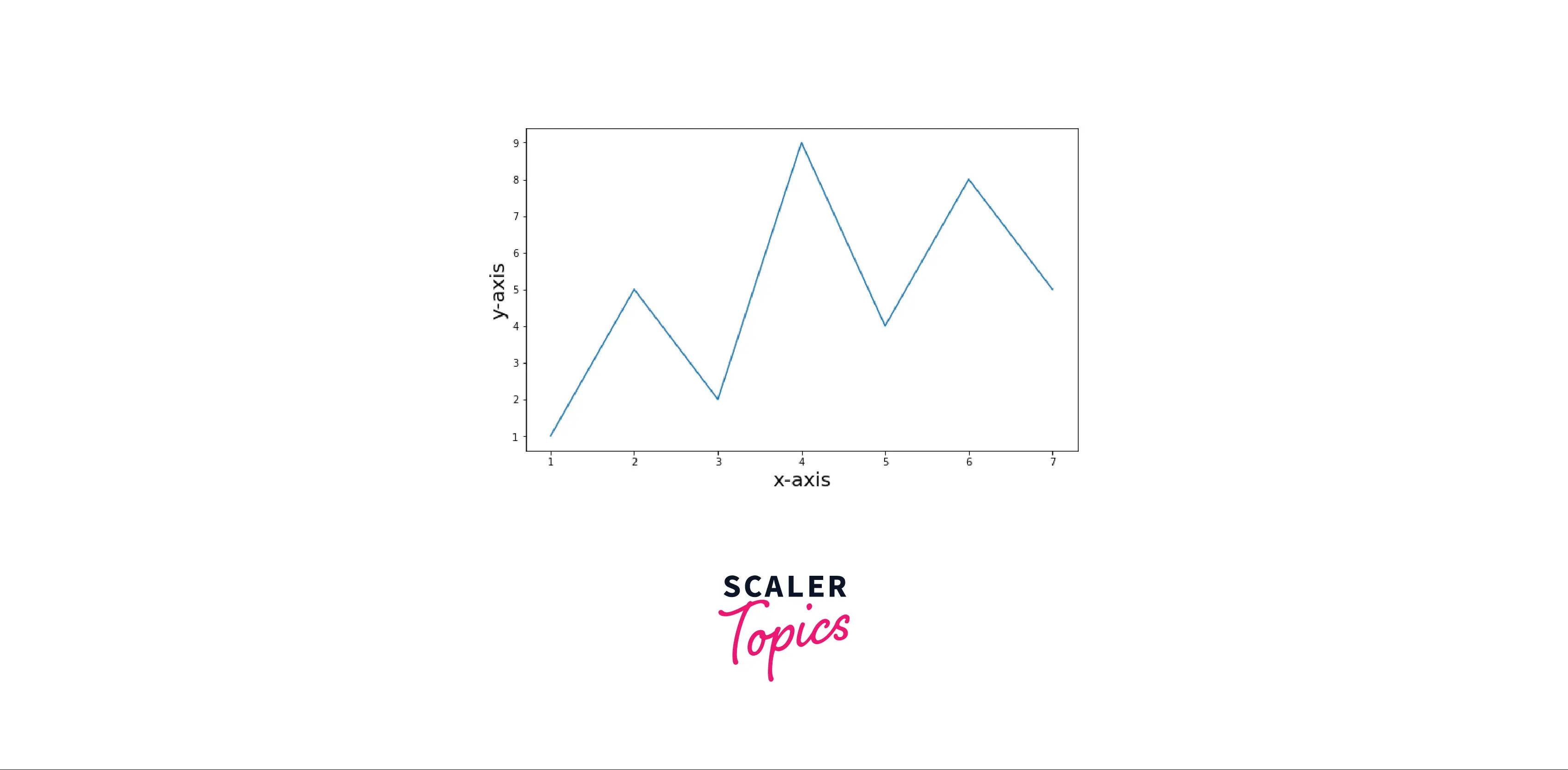
Some examples of matplotlib Axis labels for a better understanding of the topic. Example1: Simple plot with labels
Output:
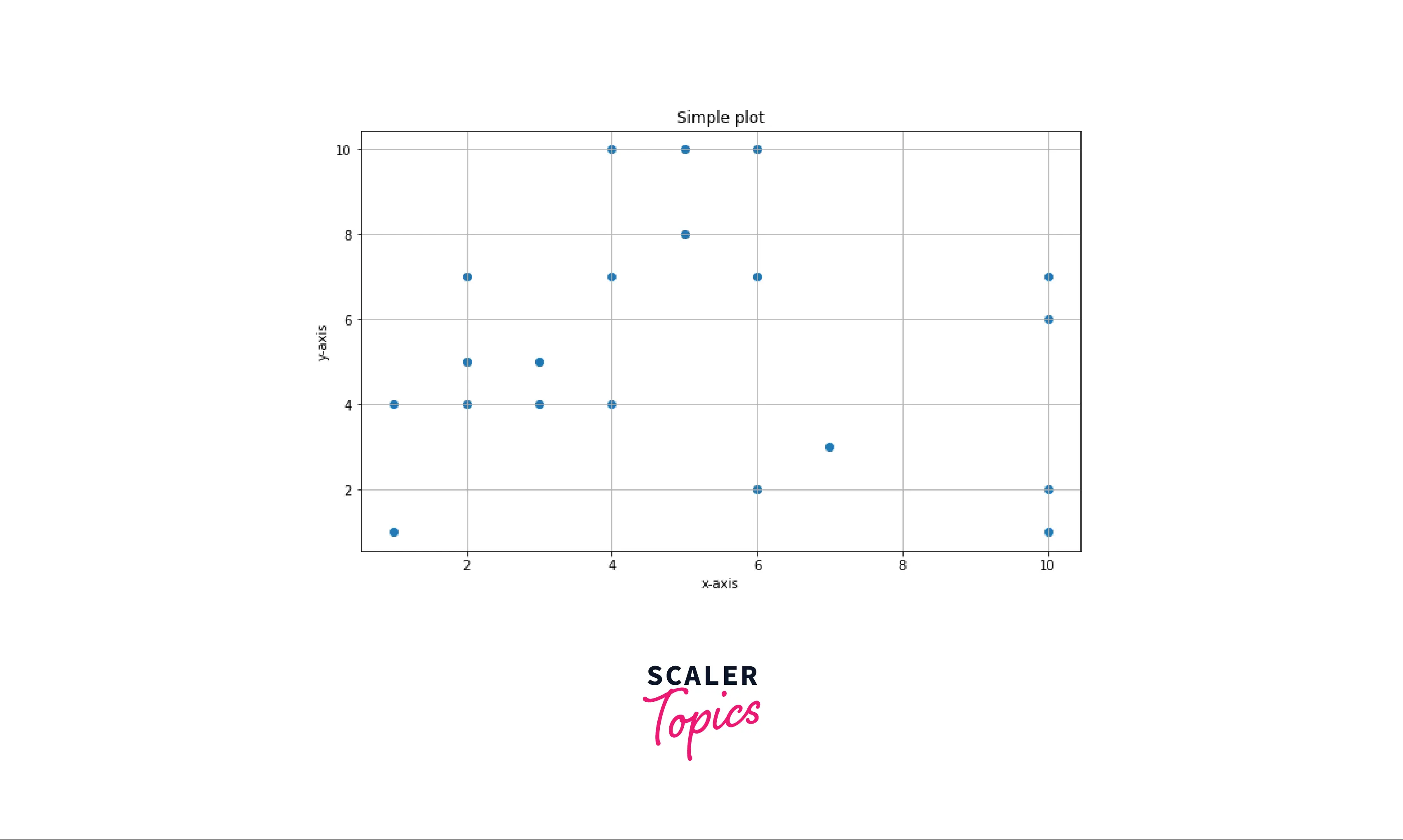
Example2: An interactive plot with axis labels Text properties of the Axis labels enhance visibility and make it more readable. By default, when we plot data on the graph axis, labels are not scaled according to the size of the graph, or sometimes tick labels overlap. We can avoid these issues by changing the labels' text properties.
Output:
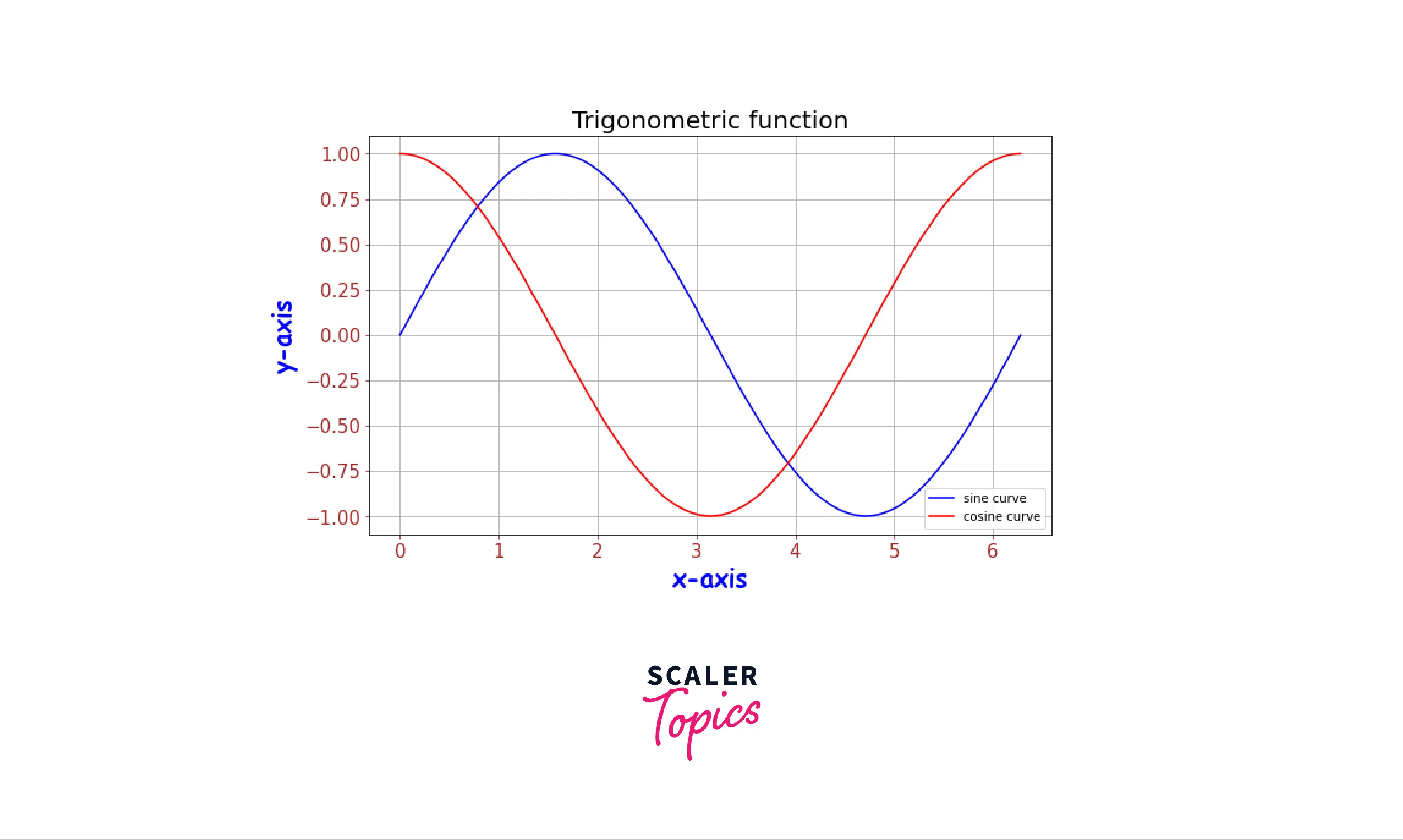
Code explanation:
- Importing the required modules.
- Using numpy.arange() function to generate a list of evenly spaced numbers between 0 to 2π and store it in the list x.
- Using trigonometric function, to generate y-axis data points numpy.sin(x) and numpy.cos(x) store it in list a and b respectively.
- As we have generated the data points, we use matplotlib.pyplot.plot() to plot the data on the graph with respective labels and color of the curves.
- Setting the title of the graph using the function matplotlib.pyplot.title().
- Setting the x-labels and y-labels with some parameters like weight of the labels is set to 'bold' and fontdict which takes a dictionary to set the text properties of the labels.
- As the tick labels are not scaled according to the figure, we use the function matplotlib.pyplot.xtick_params() to change the text properties of the tick labels like size, color.
- matplotlib.pyplot.grid() is used to add grid on the graph.
Explore the Hands-on Applications of These Concepts in Our Data Science Courses. Enroll Now and Turn Theoretical Knowledge into Practical Mastery.
Conclusion
- Function required for adding the labels on the axis in matplotlib is matplotlib.pyplot.xlabel() and matplotlib.pyplot.ylabel().
- We can customize the labels' text properties by adding some parameters to the functions for adding the labels.
- Functions required to customize the tick labels on the axis in matplotlib are matplotlib.pyplot.xticks(), ax.set_xticklabels(), matplotlib.pyplot.setp() and ax.tick_params().
- Some examples to avoid common mistakes when adding axis and tick labels on a graph.