Matplotlib Cheat Sheet
Overview
Data visualization is essential for presenting the insights gained and exploring the data. There is no denying that matplotlib is a simple and friendly library. However, things can sometimes get tricky, especially if you are new to this Python library.
Considering how extensive Matplotlib is, plenty of cheat sheets are available, especially for newbies, to make plotting easier. This Matplotlib Cheatsheet includes code samples and introduces the essentials to plot data with Python.
Matplotlib Cheatsheet
One of the most comprehensive and widely used Python plotting libraries is Matplotlib.
When we start plotting with this Python data visualization package, it will seem like there are quite a few aspects to consider. Seeing the amount of code required for some plots and not knowing where to begin or which components to use can be overwhelming. Fortunately, Matplotlib is very adaptable and contains many useful, built-in defaults that will be useful.
Here is a comprehensive Matplotlib Cheatsheet that includes most of the knowledge required for beginners and advanced learners.
Transform Your Career
Choose from our industry-leading programs designed for career success
Modern Software and AI Engineering Program
Master full-stack development with AI integration

Modern Data Science and ML with specialisation in AI
Advanced data science techniques with AI specialization
Advanced AIML with Specialisation in Agentic AI
Deep dive into AIML with focus on Agentic systems
DevOps, Cloud & AI Platform Engineering
Build and manage AI-powered cloud infrastructure
AI Engineering Advanced Certification by IIT-Roorkee
Premier AI engineering certification from IIT-Roorkee
Plot Anatomy and Workflow
Understanding how the core components are built will make working with Matplotlib much easier. Or, to put it another way, this is what a Matplotlib plot's anatomy looks like:
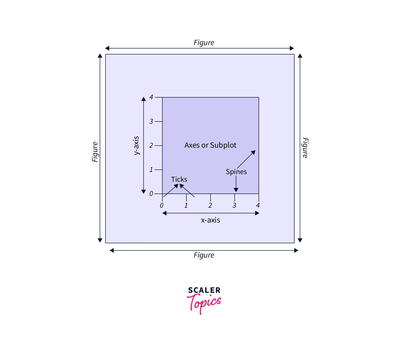
- The main window or page that everything is drawn on is called the figure.
- The region on which we plot data, along with any related ticks, labels, etc., is known as the axis. Most plotting takes place on the axes.
- Axes and Subplot are used alternately because we usually put up axes with a call to the subplot. This explains why Figures can have many Axes.
- Each axis can be customized with ticks and tick labels.
- The data space boundary is indicated by the spines, which are lines that connect the axis tick points.
Workflow
To create a plot using Matplotlib, follow these simple steps:
- Prepare the data
- Create the plot
- Plotting routines
- Customize the plot
- Save the plot
- Show the plot
Here is a sample code that illustrates each step:
Output:
Let’s discuss each of these steps in detail.
Preparation of Data
When we visualize data, we frequently work with data stored in arrays. As a result, we must perform operations on them, inspect the arrays, and modify them. So, when using Matplotlib, NumPy will come in handy.
1D data
2D data
Images
.npy is the file extension for numpy arrays and we can read them using numpy.load.
Some important Image functions are;
3D data
Creating the Plot
Okay, now let's make a matplotlib plot. The first step is importing the Matplot library.
Figure
The pyplot module's plt.figure() function also takes the figsize argument, which requires us to provide a tuple with the width and height of the figure in inches, for example, plt.figure(figsize=(3,4)). The same module's plt.subplots() function also accepts a figsize parameter.
Axes
Plotting is always done concerning axes. fig.add_axes()
In matplotlib, subplots can be created in three different ways:
- Using subplot() :
Here, we give three arguments to add_subplot(). The three arguments designate the number of rows (2), the number of columns (2), and the plot number (1). So it makes up one subplot.
- Using subplots(): It returns an array
- Using subplot2grid():
This function returns an axes object in a grid for a specific location and size.
Examples :
- Subplots side-by-side on the same figure
- Plots one on top of the other
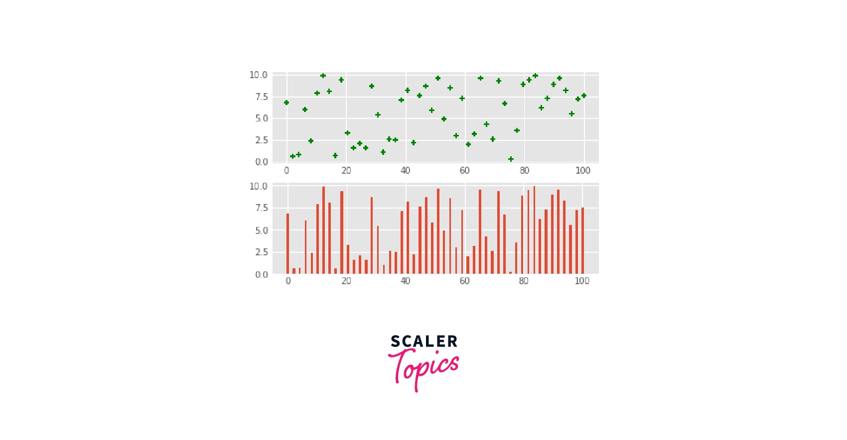
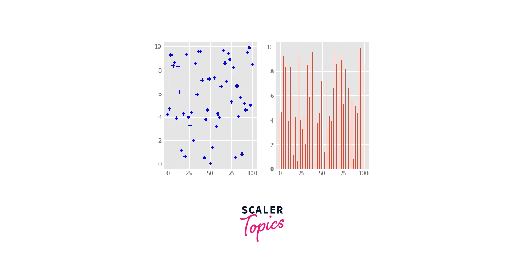
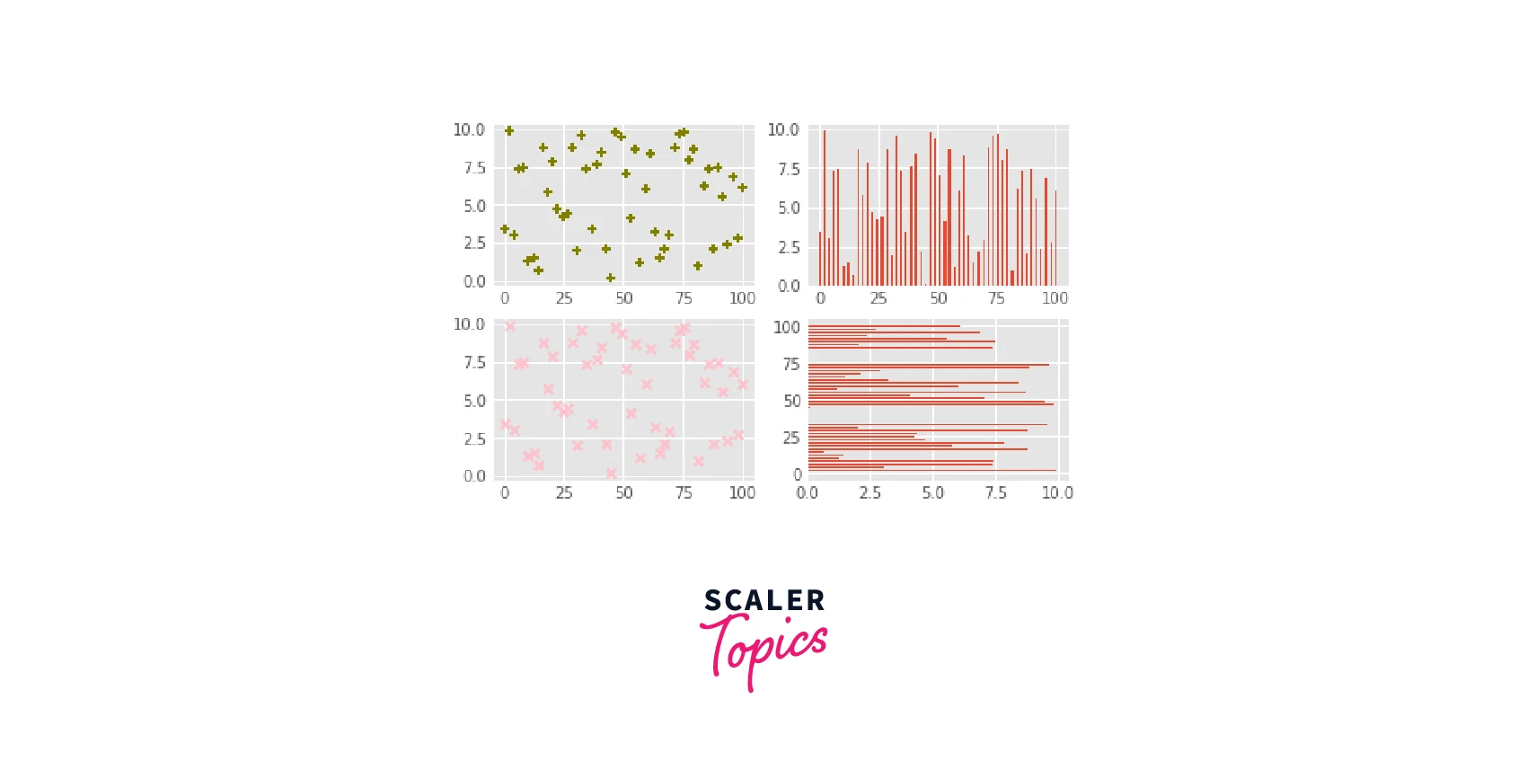
- The same data points plotted in 4 distinct ways, in 4 different subplots.
Plotting Routines
It's time to take a closer look at some plotting routines to start plotting the data. Check out the following functions as we begin working with various data.
1D Data
2D Data or Images
Vector Fields
Data Distributions
Turn Learning into Career Growth
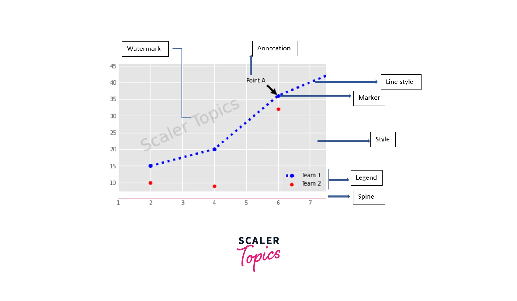
Customizing a Plot in Matplotlib
The fact that Matplotlib allows us to customize the plots in various ways is one reason why it stands out from other plotting libraries. In addition to changing the colors, it allows us to modify the markers, lifestyles and linewidths, text, legends, annotations, and the limits and layout of plots.
Colors, Color Bars & Color Maps
Markers
Linestyles
Text and Annotations
Mathtext
Limits, Legends & Layouts
Limits & Autoscaling
Legends
To change plot title and axes labels,
ax.set(title="A title", xlabel="x", ylabel="y") or ax.set_xlim(), ax.set_ylim() or ax.set_title().
We can also use fig.suptitle() to add a title to the plot. If we are going with the default setting, then we have to use plt.title(), plt.xlabel(), and plt.ylabel().
Ticks
Subplot Spacing
Axis Spines
Here is an example of a customized plot.
Interactive plots
Adding just one line of code, %matplotlib notebook, can make every matplotlib plot interactive in a Jupyter notebook. Only Jupyter Notebooks support this.
Adding watermarks:
We can use the text() function.
The figimage() function of matplotlib allows an image to be used as a watermark.
Show Plot
How do we save this figure? what happens if we don't like it? Well, then we can start over by clearing the image.
Save Plot
Close and Clear
Scaler Placement Report and Statistics
Scaler learners achieved 2.5x salary growth with average post-Scaler CTC reaching ₹23L.
Conclusion
- This matplotlib cheat sheet discusses some basic functionalities of Matplotlib.
- The workflow of creating a plot in Matplotlib is: Preparing the data, Creating the plot, Plotting routines, Customizing the plot, saving and showing the plot.
- NumPy assists with preparation of data and creation of plots is done using the pyplot module.
- The specifics of initializing the figure and the plot's axes have been covered.
- There are various plotting routines for 1D and 2D data, images, data distributions and vector fields.
- Basic Plot customizations were discussed, focusing on plot legends and text, Markers, Lifestyles, titles, axes labels, plot layout, etc.
- We can display a plot using plt.show(), save a figure with plt.savefig(name.png), and close figures/plots using plt.close().
Of course, for those who don't know how to use Matplotlib, this Matplotlib cheat sheet may be the extra motivation they need to eventually start using Matplotlib for data visualization in Python.