Matplotlib Heatmap
Overview
Python's Matplotlib offers a 2-D data visualization tool called Matplotlip heatmap, which can represent the magnitude of a phenomenon. Matplotlib heatmaps represents this magnitude in the form of colors.Different data values are represented by different colours. Functions like imshow() in matplotlib makes the production of heatmaps, particularly easy.
Introduction
A 2-D Matplotlib Heatmap is a tool for data visualization that aids in displaying the magnitude of a trend in the form of colors. Using Matplotlib, we can create 2-D Heatmaps in Python.
Heatmap is an excellent representation that aids in understanding data intensity. It’s made possible by utilizing a variety of hues and gradients. The term “heatmap” is also used to describe the shading matrix. The Correlation between different datasets can also be observed using matplotlib heatmaps.
Plotting 2-D Heatmaps can be done in various ways, some of which are discussed below.
How to Make a Heatmap with Matplotlib in Python?
Transform Your Career
Choose from our industry-leading programs designed for career success
Modern Software and AI Engineering Program
Master full-stack development with AI integration

Modern Data Science and ML with specialisation in AI
Advanced data science techniques with AI specialization
Advanced AIML with Specialisation in Agentic AI
Deep dive into AIML with focus on Agentic systems
DevOps, Cloud & AI Platform Engineering
Build and manage AI-powered cloud infrastructure
AI Engineering Advanced Certification by IIT-Roorkee
Premier AI engineering certification from IIT-Roorkee
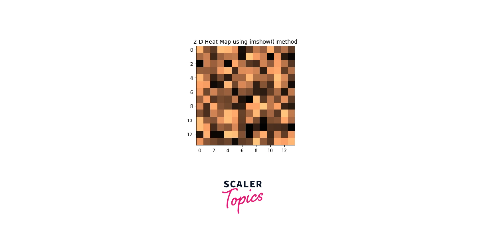
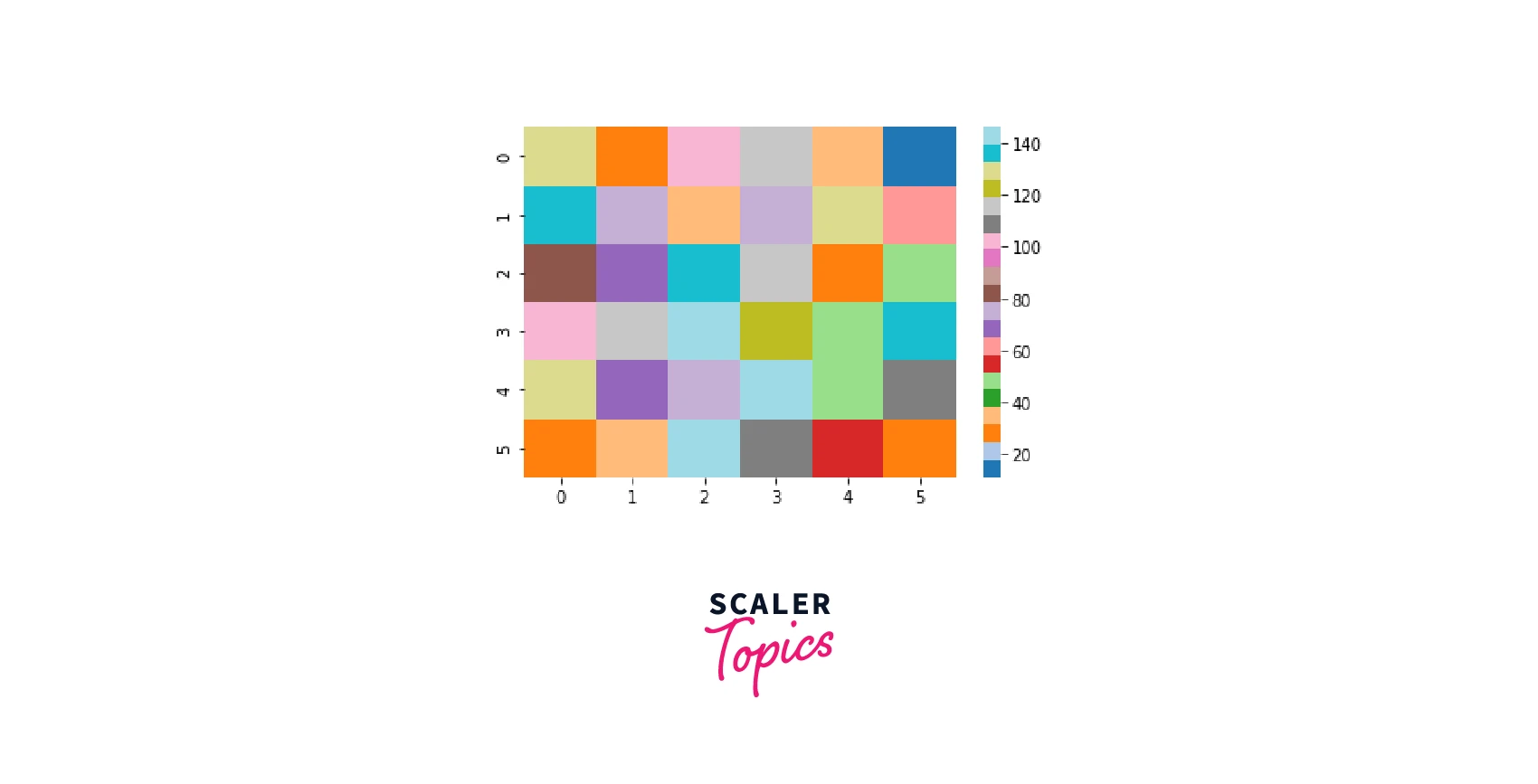
Using matplotlib.pyplot.imshow() Function
The imshow() function in pyplot module of matplot library is used to display data as an image, i.e. on a 2D regular grid inorder to create heatmaps.
Syntax:
Parameters
- X : array-like or PIL image The image data.
- cmap : str or Colormap;(default: 'viridis') The Colormap instance of the plot.
- norm : str or Normalize The normalization method used to scale scalar data to the [0, 1] range before using cmap to map to colours.
- vmin, vmax : float, optional Vmin and Vmax define the data range that the colormap covers when using scalar data and no explicit norm.
- aspect: {'equal', 'auto'} or float,(default: 'equal') The aspect ratio of the plot axes.
- interpolation: str, (default: 'antialiased') The interpolation method used.
Example :
We will get the following matplotlib heatmap,
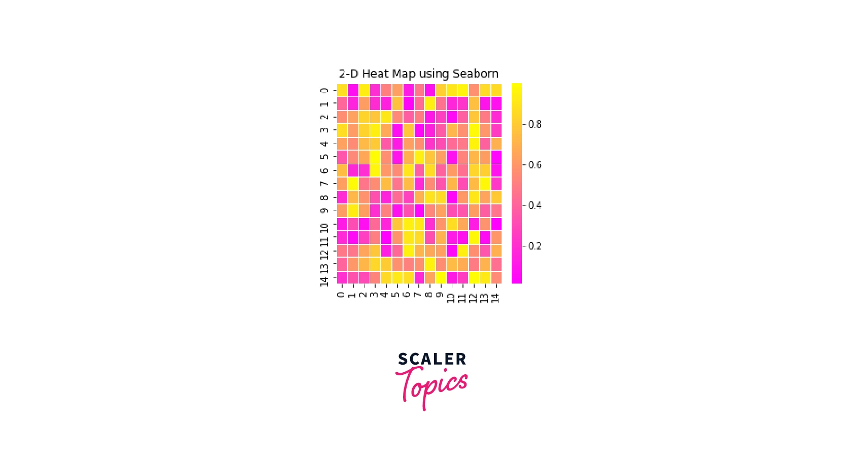
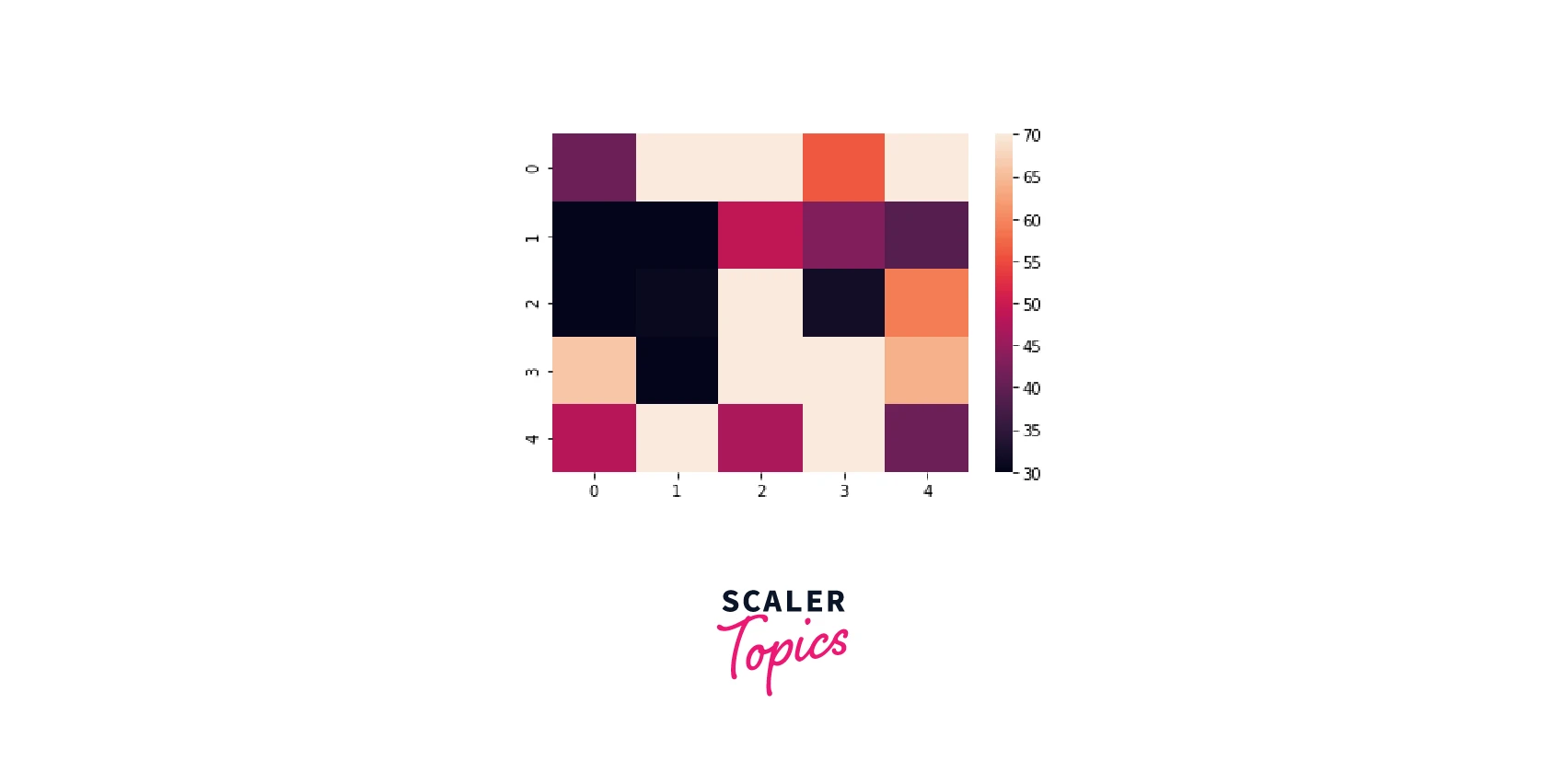
Using Seaborn Library
Seaborn library is an open-source Python library built on Matplotlib, used for data visualization and exploratory data analysis. This library is closely integrated with Pandas.
Syntax:
Parameters:
- data: required Input the value as a 2D or rectangular numpy array or pandas DataFrame.
- vmin, vmax : floats, optional Anchoring values for the colormap.
- cmap: Matplotlib colormap ; list of colors, optional
- center: float, optional The value at which the colormap should be centred when plotting divergent data.
- annot: bool or rectangular dataset, optional If True, enter the data value in each cell.
- fmt: str, optional Code for string formatting to be used when adding annotations.
- cbar: bool, optional Colorbar.
- cbar_ax: matplotlib Axes, optional Axes for drawing the colorbar.
Example :
Output:
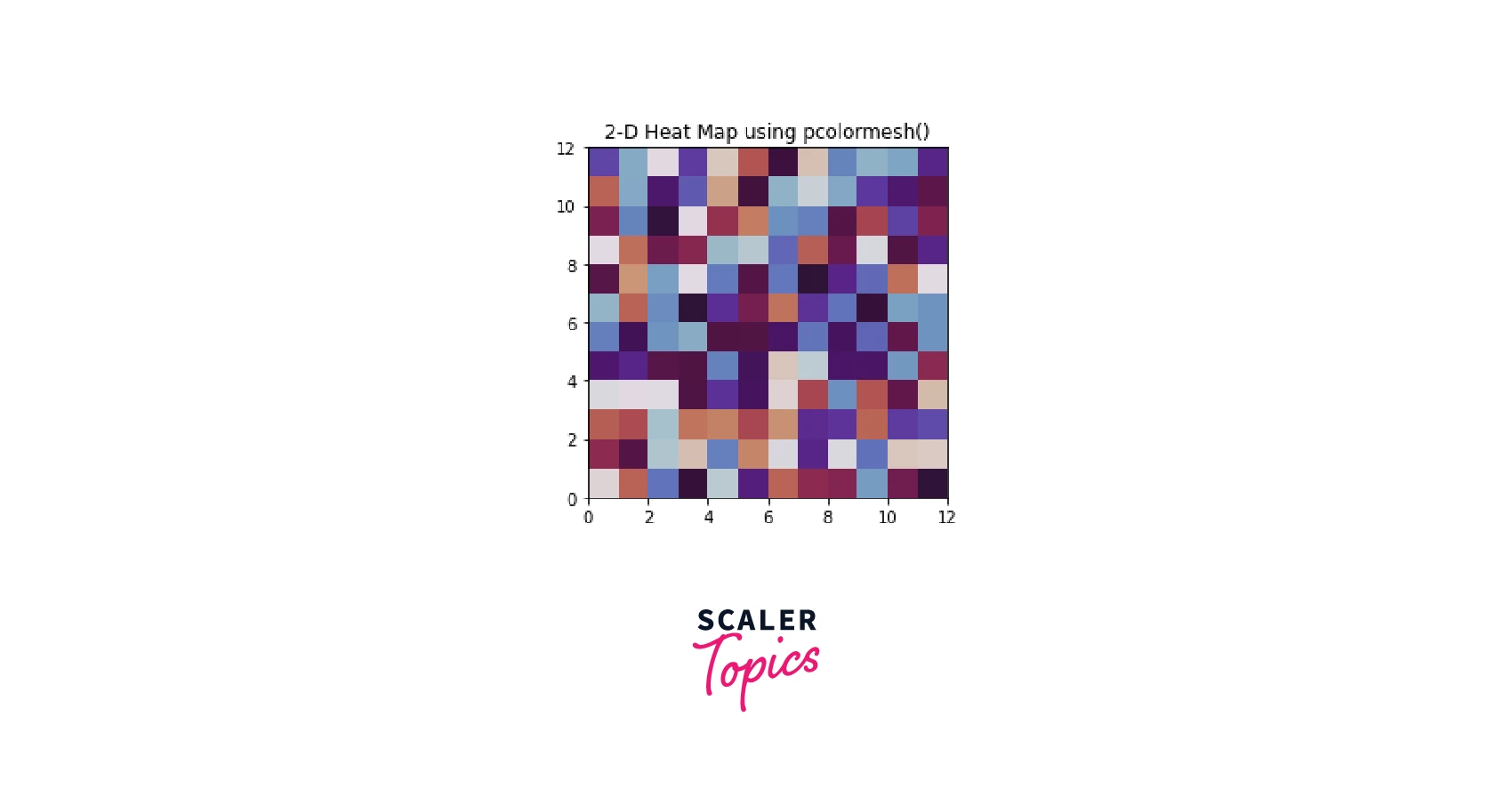
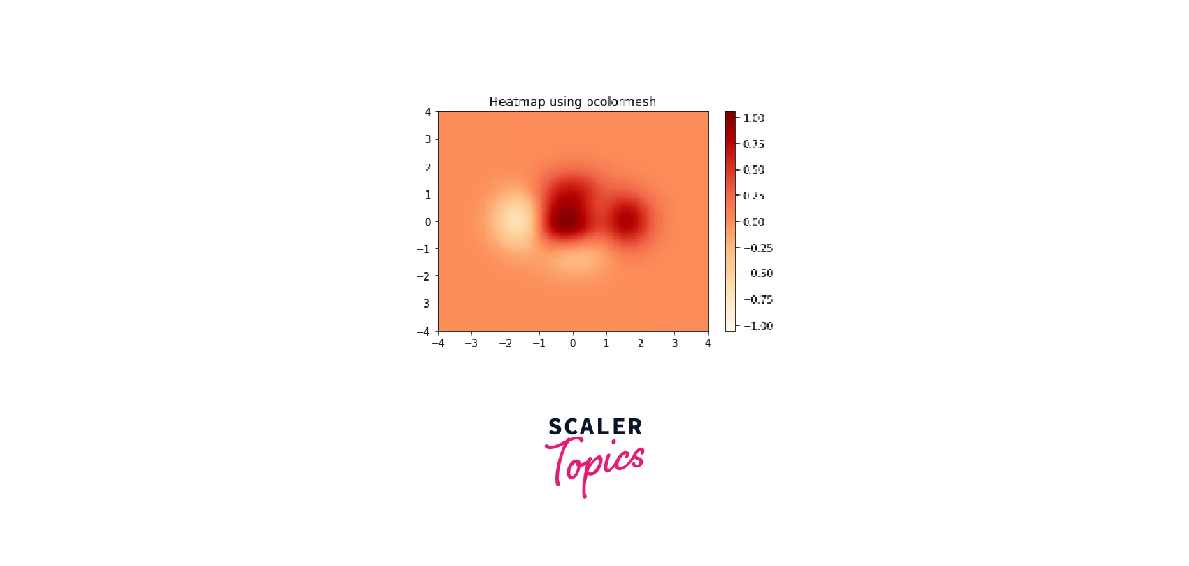
Using matplotlib.pyplot.pcolormesh() Function
The pcolormesh() function in pyplot module of matplotlib is used to create a pseudocolor heatmap with a non-regular rectangular grid.
Syntax:
Example :
Output:
Using the Helper Function Code Style
In this method, we create a function that takes the data, row and column labels, and arguments to customize the matplotlib heatmap.
Along with the mentioned, we can also create a color bar in this case and place the labels accordingly. Furthermore, for improved contrast with the pixel color, the annotations must be given distinct colors based on a threshold.
Using the annot (annotation) parameter of the sns.heatmap() function, we may display data, such as numbers, on each cell of the Python seaborn heatmap.
Finally, we can disable or enable the spines of the surrounding axis and divide the cells into a grid using white lines.
This technique of customizing the matplotlib heatmap enables us to keep the actual plot building process quite concise.
Turn Learning into Career Growth
How to Customize Matplotlib Heatmap?
Add Axis Tick Labels to Heatmap in Matplotlib
The tick values are the locations along the axis where the tick marks appear. In Matplotlib heatmaps, we can add the tick labels using set_xticks() and set_yticks() functions.
For example,
Add Color Bar Legend to Heatmap in Matplotlib
Using the figure parameter, we can add a color bar legend to make the range of numerical values and the colours of the heatmap.colorbar() function easier to comprehend. Sometimes the colour bar can be a little bit larger than the heatmap. In this case, shrinking the size of the colour bar is required.
cbar = ax.figure.colorbar(im,ax = ax,shrink=0.6)
We can also use cbar_kws method to add colorbars in matplotlib heatmaps.Setting other parameters for the colour bar, like formatting or tick frequency, can be handy.
We observed that because the default value of the colour bar (cbar) is bool True, every time the Python Seaborn heatmap creates, the colour bar (cbar) also creates. So, if we pass bool value as False to the function,we can hide the colorbar.
sns.heatmap(example_df, cbar = False)
Change the Color Palette to Heatmap in Matplotlib.
The goal of implementing matplotlib heatmaps, which is to make data interpretation simple using colours, could be undermined by selecting the wrong color palette. This may occur, for example, if the colours do not naturally flow into one another or if the colour palette is chosen in a way that it does not accurately reflect a rise or fall in the value that the colours are intended to represent.
Each set of data calls for the use of a colour palette that may depict it visually in the most understandable way. As a result, we must select a color palette that fits our use case or data sets the best.
Always choose colors that complement one another.
Matplotlib's imshow() function creates a heatmap by default using the Viridis colour palette. By passing the cmap parameter to the imshow() function, we can modify the matplotlib heatmap's color palette.
Here is an example to change the default color palette to “PuRd” -
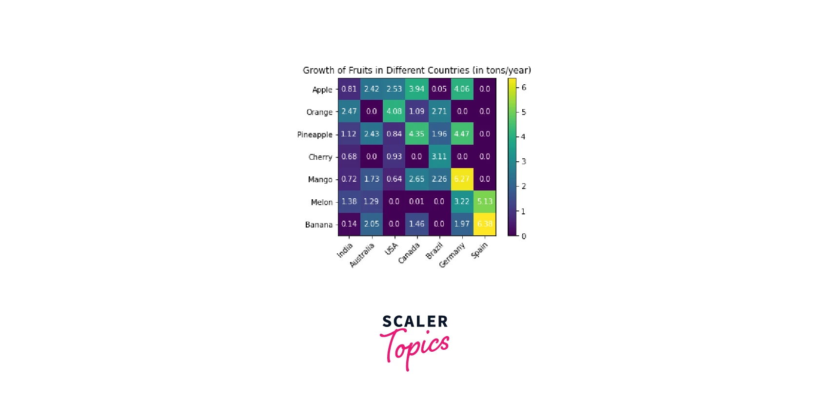
To sum up, let's go through an example which illustrates all the three customization methods we have discussed.
And here is the output.
More Examples
Example 1:
Output:
Example 2:
Output:
Example 3:
Output:
Applications of Matplotlib Heatmaps
Heatmaps are becoming increasingly popular as a data visualization tool across industries because they make it easier to understand complex numerical data, facilitating quicker and more effective decision-making.
- Among the most common applications for Matplotlib heatmaps is risk modeling.
- The primary goal of the Seaborn heatmap is to illustrate the data correlation matrix for feature selection to address business issues.
- Heatmaps help give the UX designers and digital marketers instructions on what changes the website needs to make to increase conversions by monitoring the user behaviour on webpages.
- Matplotlib Heatmaps assists in stock market analysts in visualizing current market patterns, team coaches in optimizing game strategies, athletes in planning their future game plan, consumers in visualizing their WiFi connectivity and spotting network breakers, etc. This is facilitated with Machine Learning and AI.
Heatmaps improve the visualization and consumption of numerical data for organizations and individuals across almost all industries.
Start Your Data Science Journey Today! Join Our Best Data Science Course and Unleash Your Analytical Potential. Enroll Today!
Conclusion
- Matplotlib 2-D Heatmaps is an amazing tool for data visualization that aids in displaying the magnitude of a trend in the form of colors.
- Matplotlib Heatmaps can be created using functions such as matplotlib.pyplot.imshow() and matplotlib.pyplot.pcolormesh().
- Seaborn library has a function called seaborn.heatmap() to create heatmaps.
- We can add label ticks in matplotlib heatmaps using set_xticks() and set_yticks() functions.
- By passing the cmap parameter to the imshow() function, we can modify the heatmap’s color palette.Always choose colors that complement one another.
- Using the figure parameter, we can add a color bar legend.
- We can also use cbar_kws method to add colorbars in matplotlib heatmaps.
- Matplotlib heatmap has a variety of applications across almost all industries.