Matplotlib Histogram

Overview
- The matplotlib.hist() method in Matplotlib can create histograms. A histogram is a bar graph with a frequency axis on the y-axis and bin ranges on the x-axis. It is a precise method for graphically representing the distribution of numerical data. Histograms can be produced using the hist() method from matplotlib pyplot. Bins can also be used to specify the graphic's expected number of bins or bin edges.
- A summary graph, called a histogram, displays the proportion of data points that fall into certain ranges. For example, you can choose your bin count and modify the borders of each bin using the hist() function in the matplotlib package. Additionally, you can design your containers with various widths and dimensions.
Note: Bins are also known as "intervals," "classes," and "buckets."
Transform Your Career
Choose from our industry-leading programs designed for career success
Modern Software and AI Engineering Program
Master full-stack development with AI integration

Modern Data Science and ML with specialisation in AI
Advanced data science techniques with AI specialization
Advanced AIML with Specialisation in Agentic AI
Deep dive into AIML with focus on Agentic systems
DevOps, Cloud & AI Platform Engineering
Build and manage AI-powered cloud infrastructure
AI Engineering Advanced Certification by IIT-Roorkee
Premier AI engineering certification from IIT-Roorkee
What is a Histogram in Matplotlib?
A histogram is a visual representation of data that is organized into groups. It is a precise way of displaying numerical data distribution graphically. It is a bar graph with the x-axis representing bin ranges and the y-axis representing frequency.
Parameters of Histogram in Matplotlib
To make a histogram, establish a bin for the ranges, divide the entire range of values into a series of intervals and count the values that fall into each interval. Bins are defined as non-overlapping, successive intervals of variables. To compute and create a histogram of x, use the matplotlib.pyplot.hist() function.
The parameters are supported by the matplotlib.pyplot.hist() method are listed in the table below:
| Attribute | Parameter |
|---|---|
| x | sequence of arrays or arrays themselves |
| density | Boolean values are contained in the optional parameter. |
| range | An optional parameter represents the upper and lower range of bins. |
| weights | This parameter can be an integer, a sequence, or a string. |
| bins | The optional parameter contains an array of weights with the same dimensions as the x bottom location of each bin's baseline. |
| histtype | The type of histogram [bar, bar stacked, step, stepfilled] is an optional parameter; the default is "bar." |
| align | An optional parameter controls the histogram plotting [left, right, mid]. |
| color | Sets the color or sequence of color specifications as an optional parameter. |
| rwidth | The relative width of the bars in relation to the bin width is an optional parameter. |
| log | Optional parameter for setting the log scale of the histogram axis |
| label | a string or a series of strings that can be used to match several datasets as an optional parameter |
Turn Learning into Career Growth
How to Create a Plot Histogram in Matplotlib?
Matplotlib is a Python toolkit for plotting visuals that includes several useful formatting and plotting features. The hist() function in matplotlib pyplot can be used to plot a histogram.
The syntax is as follows:
The variable you wish to create a histogram is represented by x, an array or sequence of numbers. The bins option can define the number of bins or bin edges wanted in the graphic (see the examples below).
Examples:
Let us look at several examples of plotting a histogram with the hist() method.
1. Histogram with default parameters in matplotlib Imagine we would want to make a histogram of 100 students' grades in a high school math class. We can use the hist() method from matplotlib pyplot. Let us see what we get using just the default parameters.
Output:
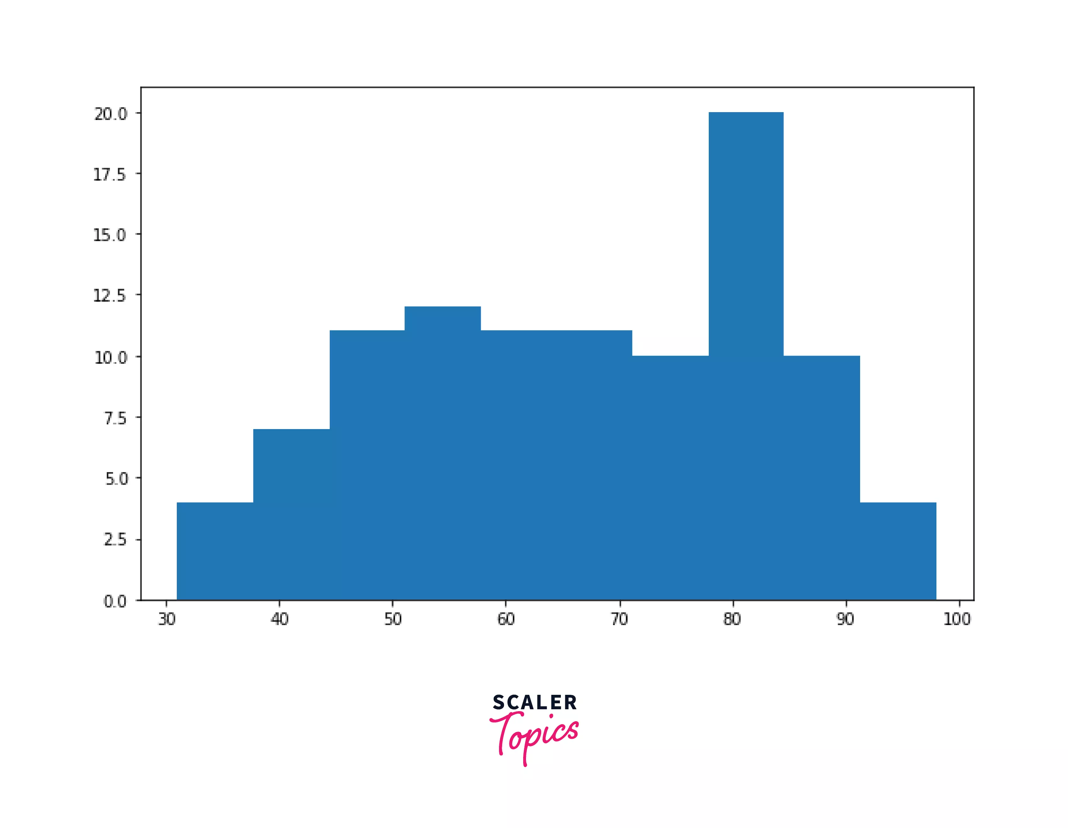
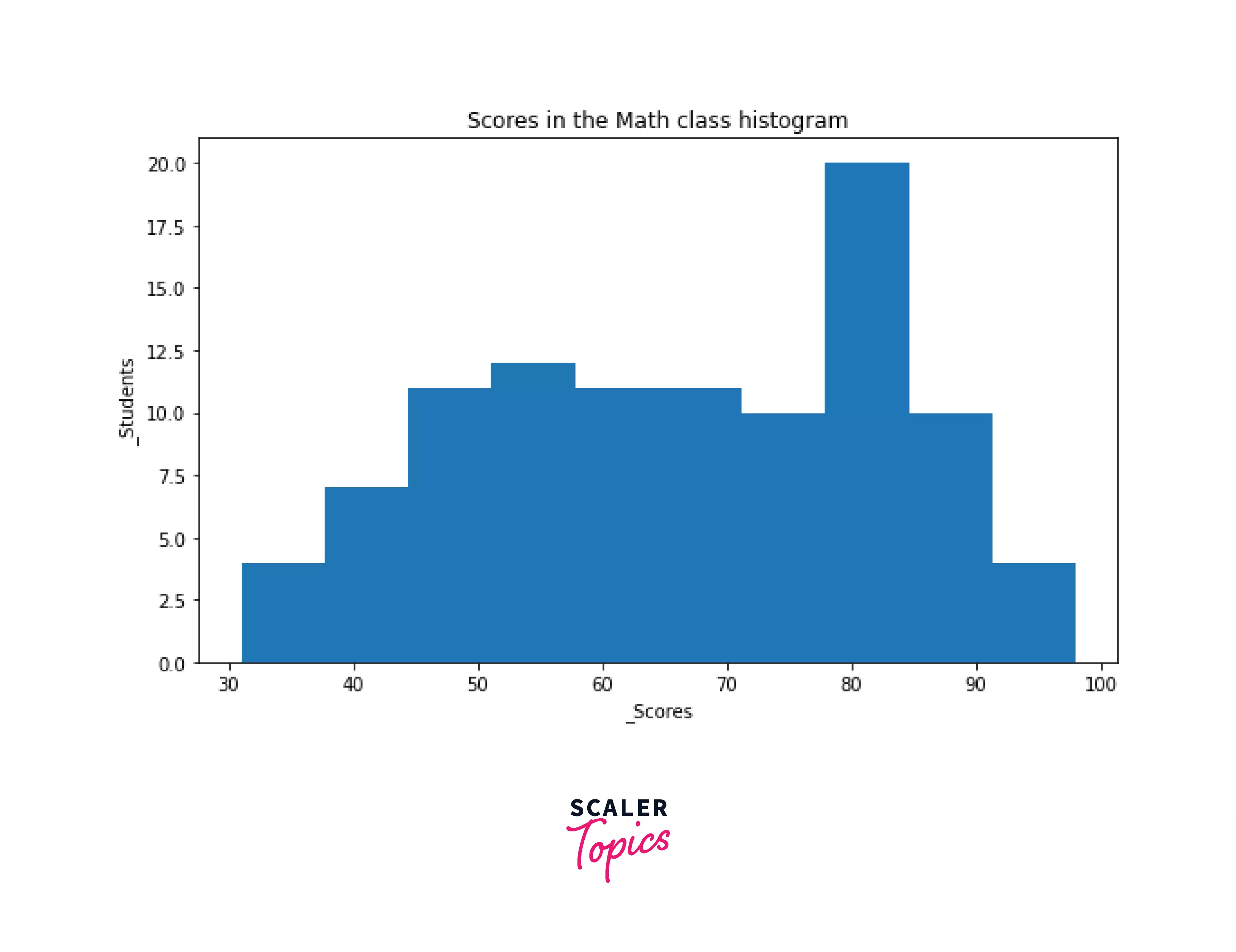
This histogram mimics a normal distribution, with many students scoring in the 60 to 80 range (closer to the mean) and frequency tapering at both ends. To make the above figure more understandable, we may add some basic formatting, such as axis labels and chart titles.
Output:
2. Histogram with probability densities instead of frequencies The density parameter, False by default, can be used to transform the values on the y-axis from frequencies to probabilities, with each bin indicating its probability density.
Output:
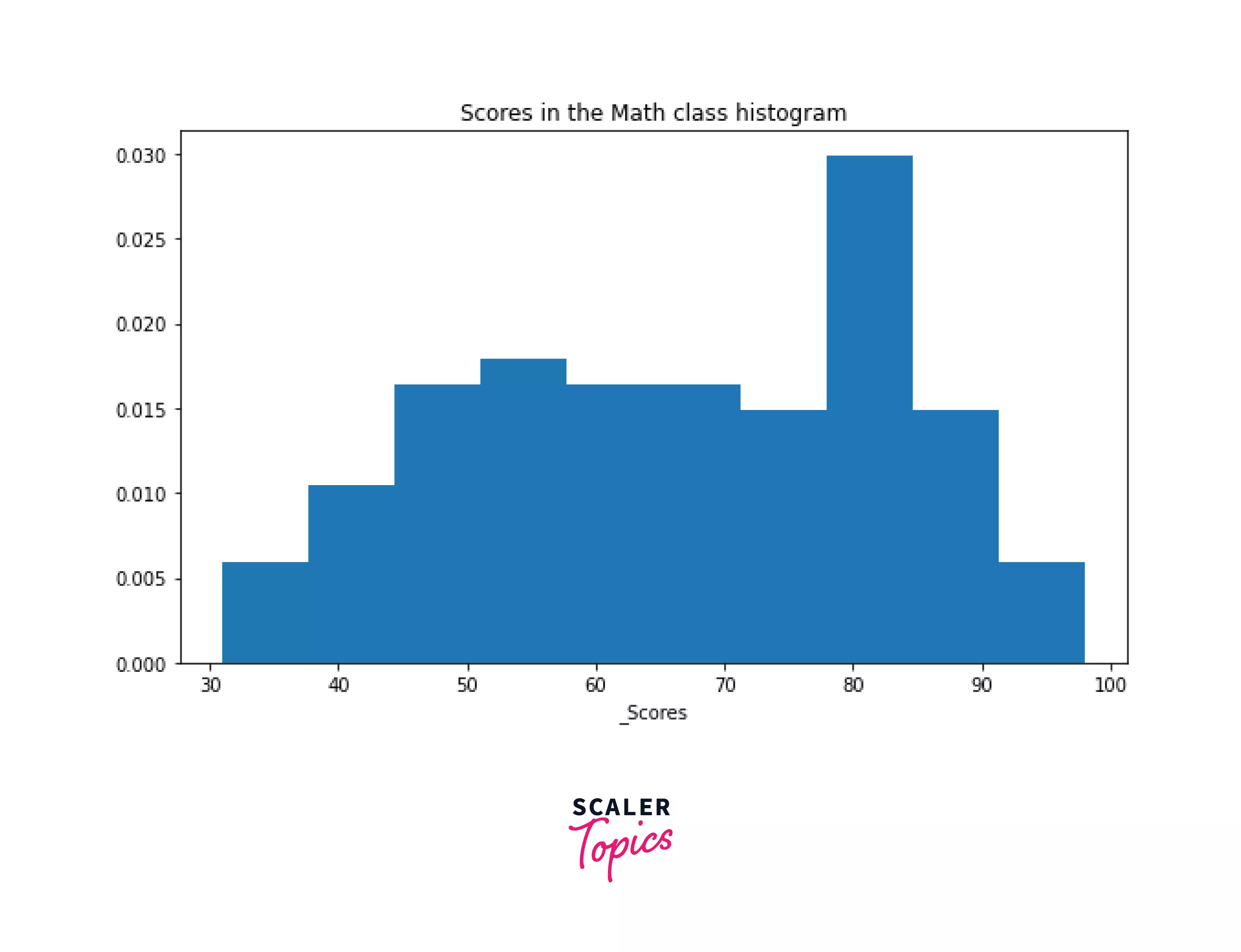
Each bin in the graph above reflects the "density" of the frequency concentrated in that bin. That is, for a bin, density equals the number of items inside the bin divided by the number of items outside the bin (total count x bin width)
3. Histogram with custom bin counts
The hist() function utilizes ten equal-width bins by default, as shown in the examples above. The bins argument allows selection of the bin count.
If we require the histogram to have 20 bins, for example:
Output:
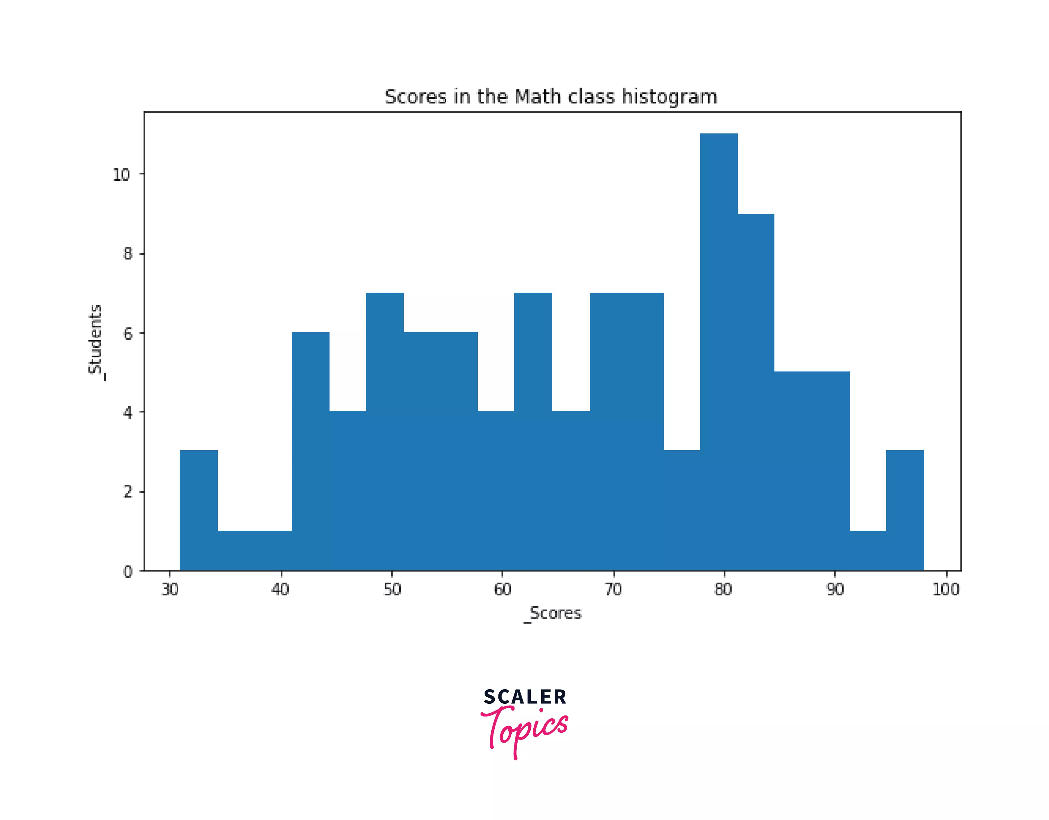
As you can see, the bins become thinner and more granular as the bin size increases. Also, except for the last bin, each bin's values include the lower bound and exclude the higher bound include, exclude. Both lower and upper boundaries are included in the final bin include, include.
4. Histogram with custom bin edges
Bin edges can also be created, which can be spaced unevenly. Instead of giving an integer to the bins parameter, pass a sequence of bin edges instead. If you want bins 0 to 15, 15 to 35, 35 to 50, 50 to 80, and 80 to 100, for example:
Output:
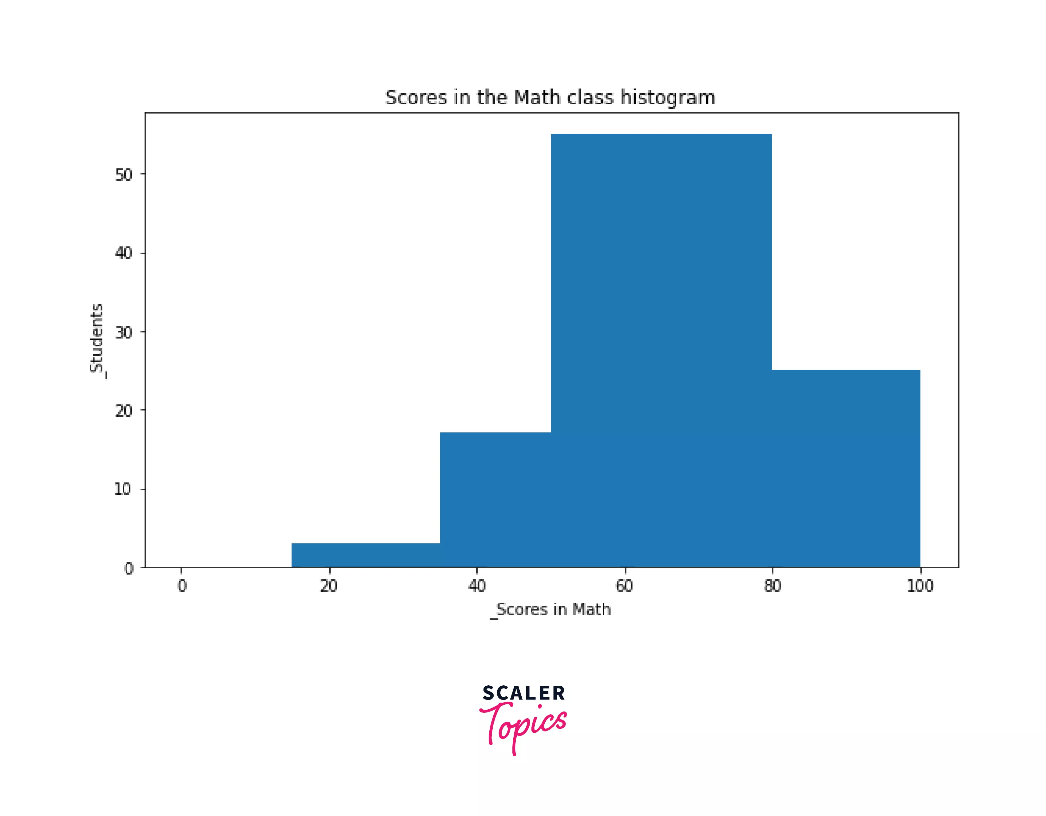
Because of the bin borders selected, the bins are not evenly spaced. The hist() method in Matplotlib also provides a variety of other options that you may use to customize your graphs further.
Matplotlib Histogram Examples
Let us now visualize and examine a histogram using more accurate data.
The titanic.csv file that you can download from this page will be used to plot a histogram. link.
The titanic.csv file contains the data set of titanic passengers. We will wrangel the tatanic.csv file using the Python pandas library and plot the histogram for the age of different passengers, then analyze the histogram result.
Output:
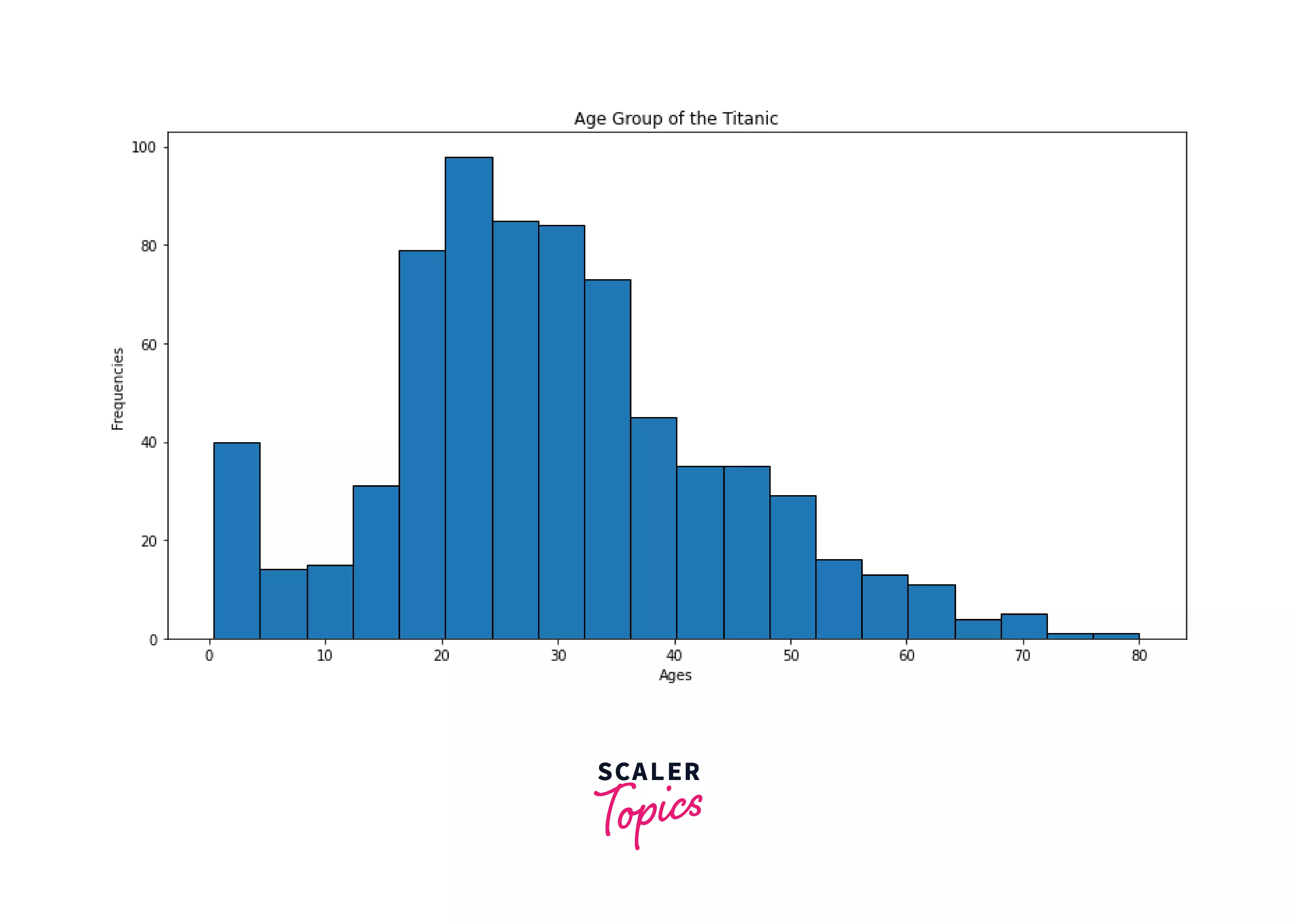
Analyze the Histogram Using the histogram, the code above shows the age range of each Titanic passenger. As seen in the histogram, most of the 891 passengers' ages fall between 20 and 30 years old. Therefore, the Titanic ship contained a large number of youngsters.
Conclusion
- In this post, you learned what a histogram is, how to make a plot histogram in matplotlib, and how to use histogram parameters in matplotlib.
- A histogram is a summary graph that shows how many data points fall into specific ranges. As a result, a rough approximation of the frequency distribution of the data is obtained.
- The histogram is one of the best graphical representations when analyzing scattered data sets. To determine the majority and minority of the data distribution, it employs the interval and their frequency. Therefore, statisticians and data scientists primarily use histograms to examine the distribution of numbers.