Matplotlib Pie Chart
Overview
We will learn about the Matplotlib pie chart in this tutorial. The purpose is to produce a pie chart using the data collected. Moreover, pie charts based on pandas data frames are also possible.
One of the most well-known and established tools for data visualization using Python is Matplotlib. For better data analysis, it offers a large range of charts and plots. For example, to create a pie chart, use the plot.pie() method, and to add a legend (description), use plot.legend().
What is a Pie Chart in Matplotlib?
A pie chart is a specific type of chart that uses pie slices (or wedges) to represent the relative sizes of the data. Therefore, it generates pie slices (wedges) representing data sets and a complete circle representing the entire space.
- It can also be defined as - A circular statistical diagram that only uses one data series to present.
- The entire pie chart represents the overall proportion of the provided data.
- The percentage of the data sections is represented in the pie chart by the area of the wedges.
- The length of the wedge's arc can be used to compute the wedge's area, which primarily depicts the percentage of that portion relative to the entire data set.
- Because they offer a fast summary, corporate presentations frequently use pie charts to show data on sales, operations, survey results, resources, etc.
Transform Your Career
Choose from our industry-leading programs designed for career success
Modern Software and AI Engineering Program
Master full-stack development with AI integration

Modern Data Science and ML with specialisation in AI
Advanced data science techniques with AI specialization
Advanced AIML with Specialisation in Agentic AI
Deep dive into AIML with focus on Agentic systems
DevOps, Cloud & AI Platform Engineering
Build and manage AI-powered cloud infrastructure
AI Engineering Advanced Certification by IIT-Roorkee
Premier AI engineering certification from IIT-Roorkee
Parameters of Matplotlib Pie Chart
| Attribute | Value |
|---|---|
| data | The array of data values to be depicted is represented by this parameter. Data/sum indicates the fractional area of each slice (data). The resulting pie will have an empty wedge with size = 1-sum if the sum(data) is less than 1, as the data values return the fractional area directly (data). |
| labels | This argument lists the string sequences that comprise each wedge's label. |
| autopct | This option, which takes the form of a string, assigns a numerical value to the wedge. |
| colors | The wedges are given colors using this option. |
| shadow | The wedges' shadow is produced using this option. |
Scaler Placement Report and Statistics
Scaler learners achieved 2.5x salary growth with average post-Scaler CTC reaching ₹23L.
How to Create a Pie Chart in Matplotlib?
Step 1: Collect the information for the pie chart
- You must first collect the information for the pie chart.
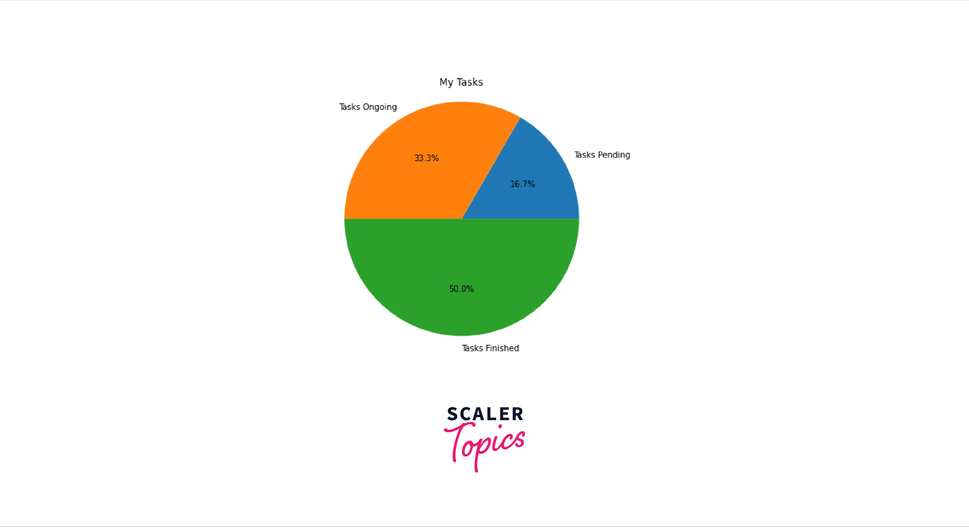
- For instance, if we have some data regarding the progress of tasks: Tasks Pending 200 Tasks Ongoing 400 Tasks finished 600
Step 2: Utilize Matplotlib to plot the pie chart.
- Next, use Matplotlib to plot the pie chart.
- The chart's plotting can be aided by using the code template below:
The full code for our example would seem as follows:
Output:
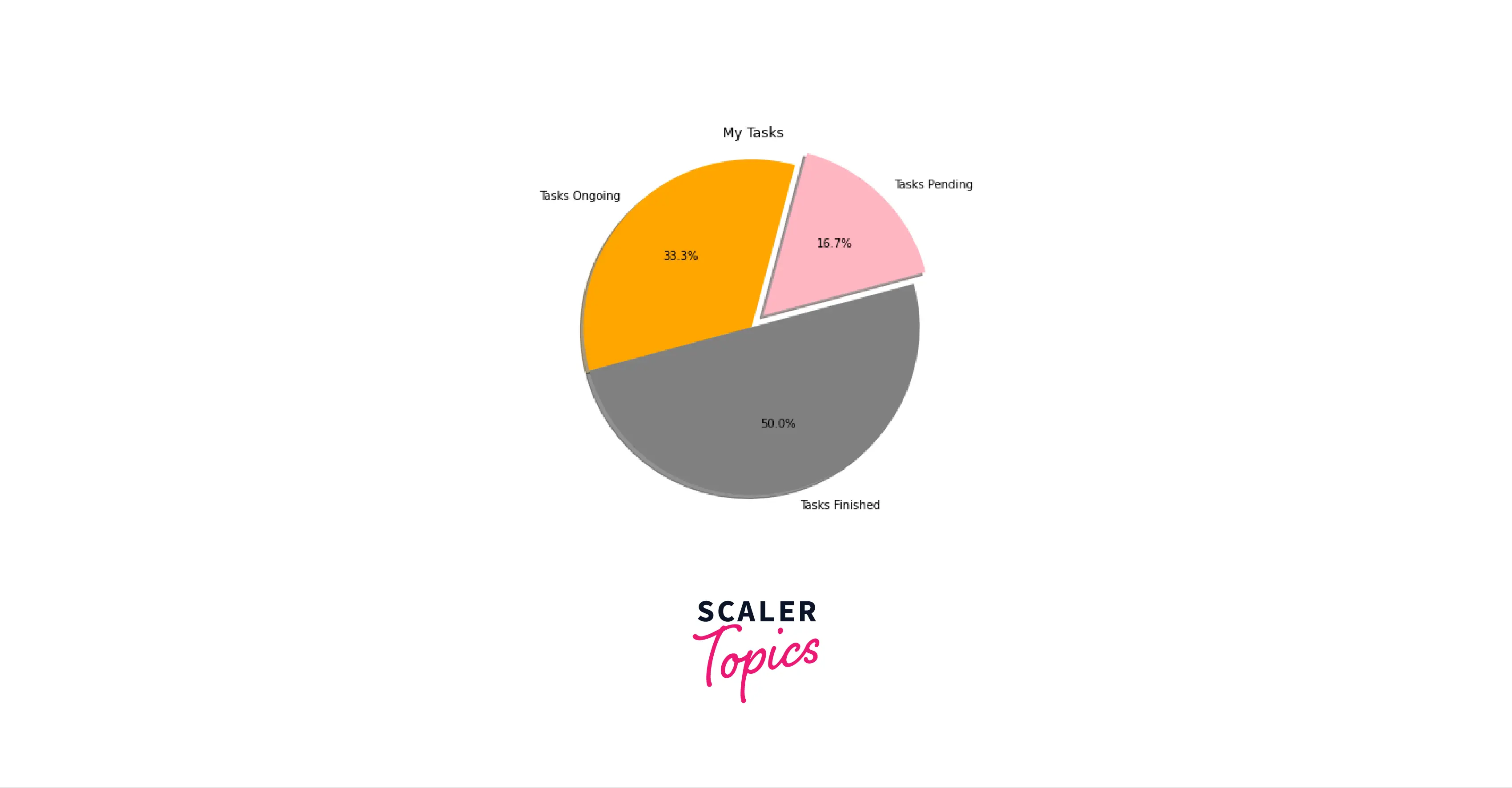
Step 3: Design the Chart The pie chart can be further customized by including:
- Start angle
- Shadow
- Colors
- Explode component
The following code can be used to create a stylized chart:
Output:
Using a Pandas DataFrame, Create a Chart
- Pie charts can also be made with a pandas DataFrame.
- In our example, the DataFrame would display the tasks data as follows:
Output:
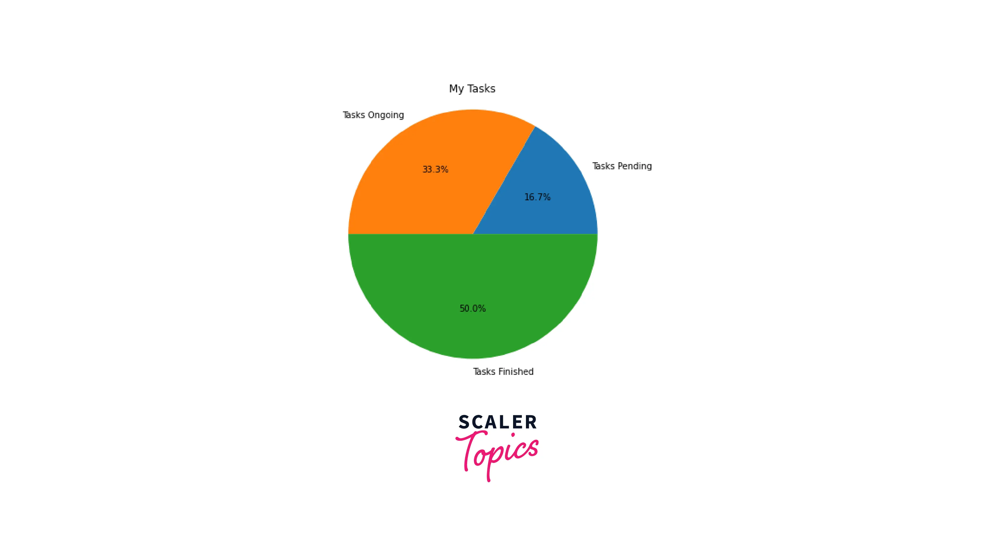
The whole Python code for generating the pie chart based on the data in the DataFrame is provided below:
Output:
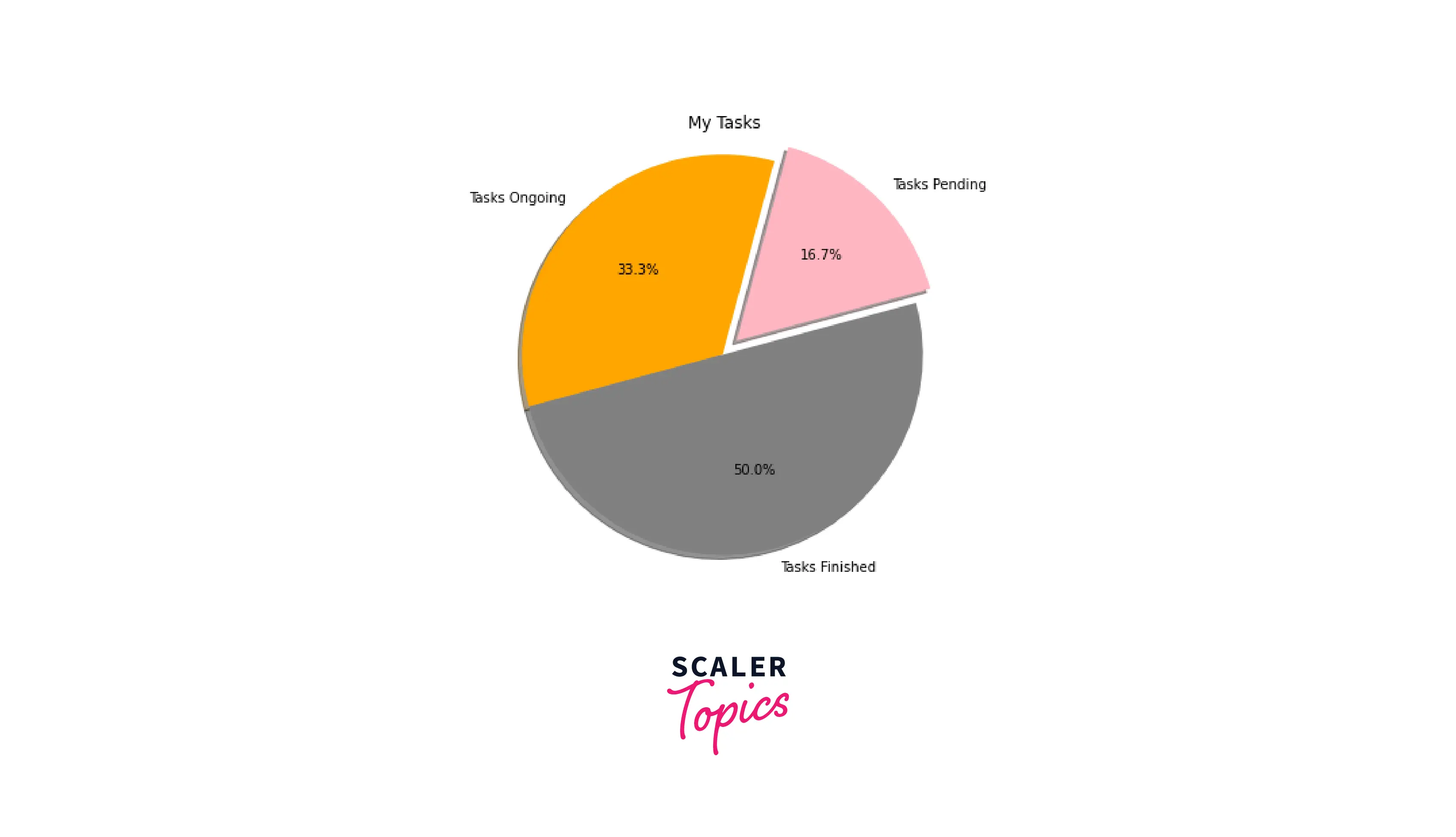
The chart can then be styled using the following syntax:
Output:
Customizing Pie Charts in Matplotlib
-
The Matplotlib.pyplot() was used to create the pie chart and can be modified in several ways.
-
The pie chart is rotated by the number of degrees indicated by the startangle parameter. In addition, the pie chart's x-axis is rotated in a counter-clockwise direction.
-
The shadow parameter of the pie() function can be used to create a shadow effect. If you pass, a shadow will appear below the pie chart's rim. The pie chart will not have a shadow by default because a shadow has the value False.
-
Using the wedgeprop parameter, the pie chart's wedges can be modified. The wedgeprop argument can be a Python dictionary containing name-value pairs specifying the wedge attributes like edgecolor and linewidth.
-
Theaxesframe is drawn around the pie chart when the frame option is set to true.
Output:

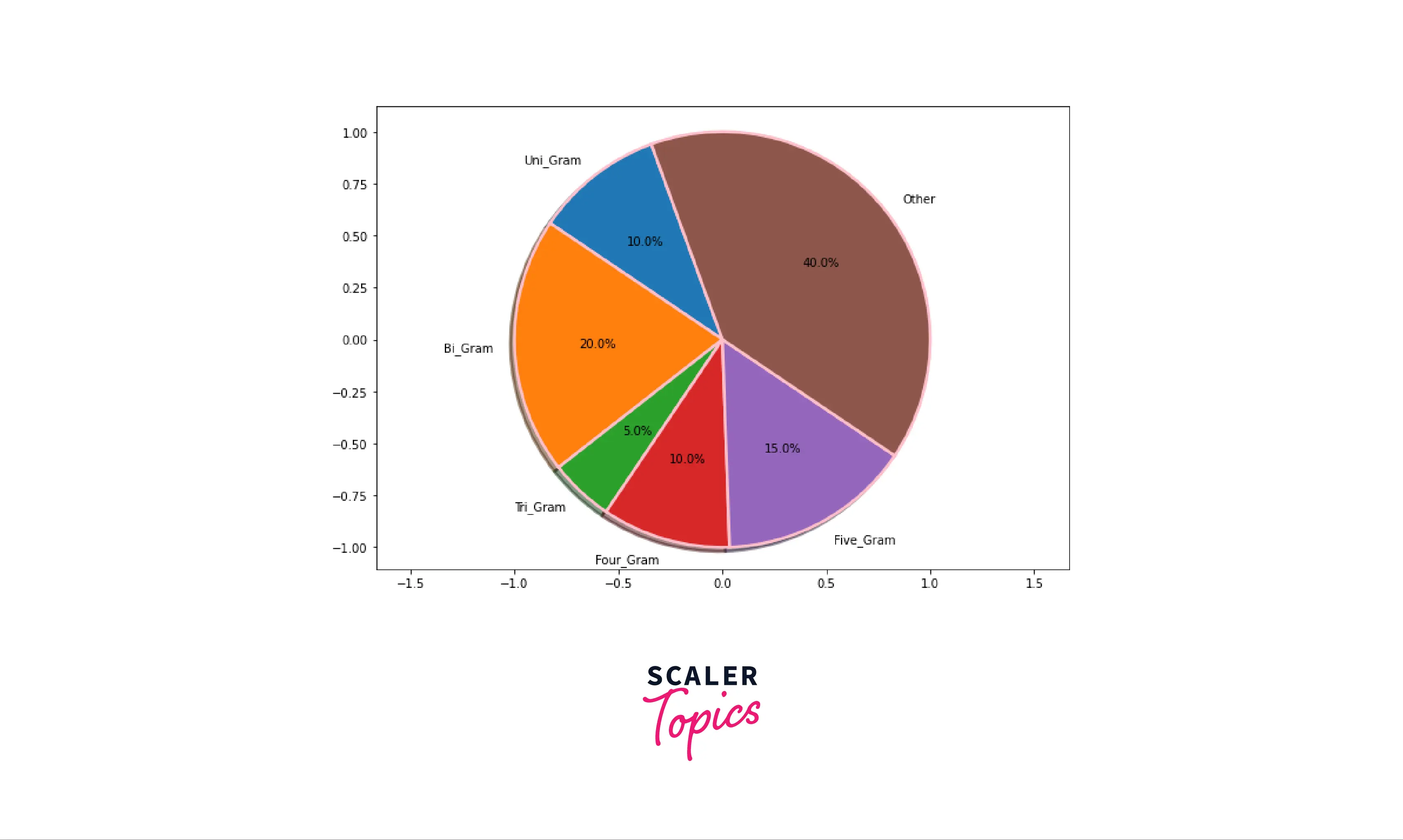
Matplotlib Pie Chart Examples
First, use the import matplotlib.pyplot as a plot command to get a plot from the matplotlib package. The plot.pie() method can then generate a plot. The following code generates a pie chart:
The following is the result of the code above:

Pie Chart Legend in Matplotlib
Use the plot.legend() function to add a legend. On top of the storyline, this adds a legend.
The outcome of the code above is as follows:
Conclusion
- This article demonstrated how to use Python to plot a simple pie chart using Matplotlib. After discussing basic pie charts, we moved on to customize them.
- A pie chart is usually helpful for comparing the relative importance of quantities. So even while this is not the favorite chart of the data visualization community, it does have its purposes.
- In matplotlib, we use the function plot.pie() to plot a pie chart.
- One of the first Python visualization tools, Matplotlib offers a large selection of graphs and charts for better analysis.