Matplotlib | Set the Axis Range
Overview
Truncating or expanding some plot boundaries is an essential feature in matplotlib, allowing us to be more creative and generate various inferences.
Axes can be positioned for the plot at any location in the figure. One figure can have several axes, although only one can include a certain axis object.
We can scale our plots more accurately by raising or lowering the scales by setting the axis range in our plots.
Transform Your Career
Choose from our industry-leading programs designed for career success
Modern Software and AI Engineering Program
Master full-stack development with AI integration

Modern Data Science and ML with specialisation in AI
Advanced data science techniques with AI specialization
Advanced AIML with Specialisation in Agentic AI
Deep dive into AIML with focus on Agentic systems
DevOps, Cloud & AI Platform Engineering
Build and manage AI-powered cloud infrastructure
AI Engineering Advanced Certification by IIT-Roorkee
Premier AI engineering certification from IIT-Roorkee
Introduction
One of the most popular Python packages for data visualization is Matplotlib. The ability to modify almost any element in Matplotlib's hierarchy of objects contributes significantly to its appeal.
In this article, we will go over different ways to set the axis range of our plots. Setting the range of axes in our plots helps us to scale our plots more efficiently, as we can increase/decrease the scales according to our liking.
Setting Axis Range in Matplotlib
a. How does it Work?
To understand how setting the axis range helps us, let's take an example:

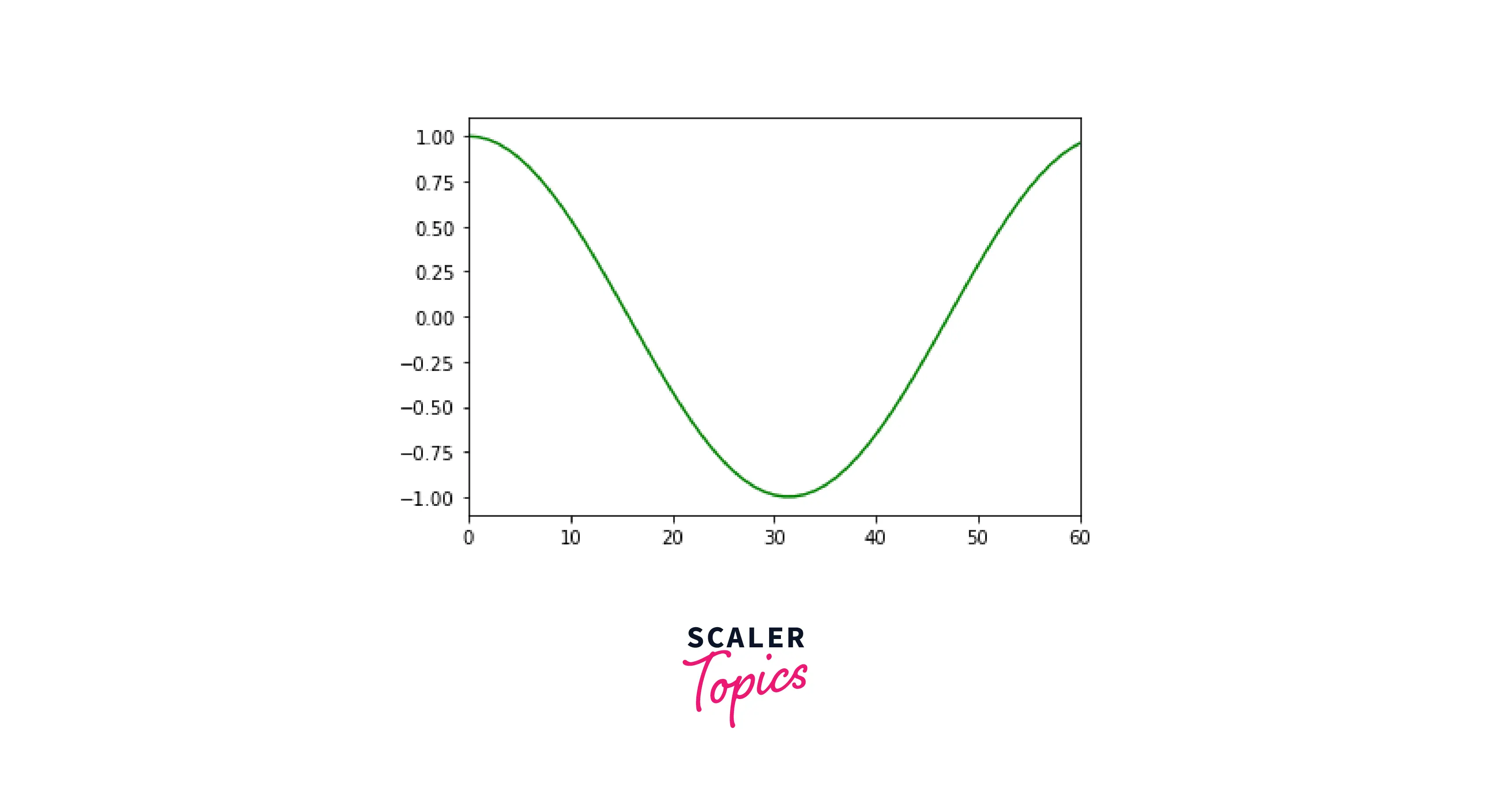
This is a simple plot of a cosine curve, and as you can see, the scales range from:
- 0 to 100: For X-Axis
- -1 to 1: For Y-Axis
In some cases, the given scale ranges would not be suitable. In these cases, there exists a need for a function that could restrict the ranges according to our criteria.
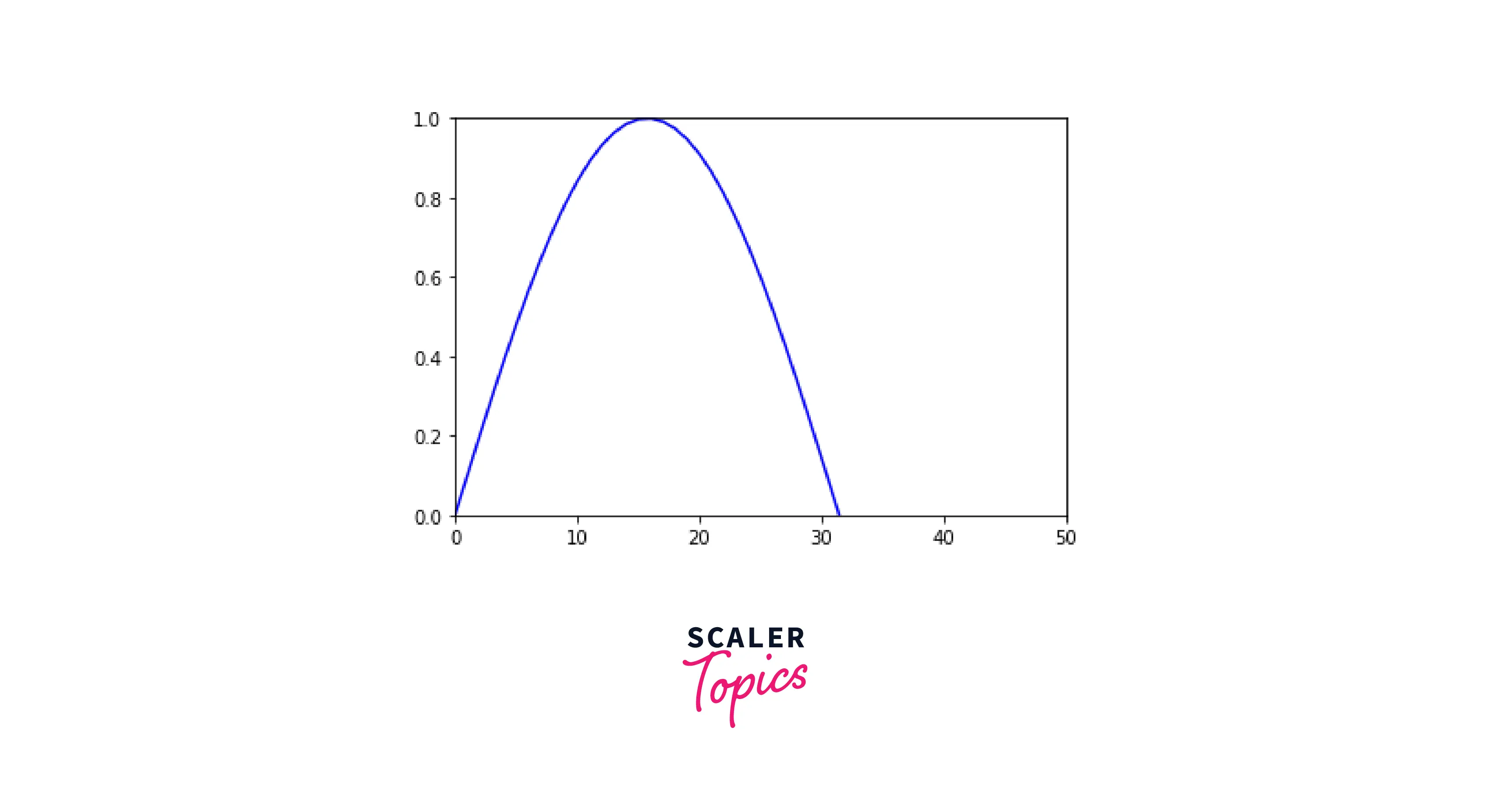
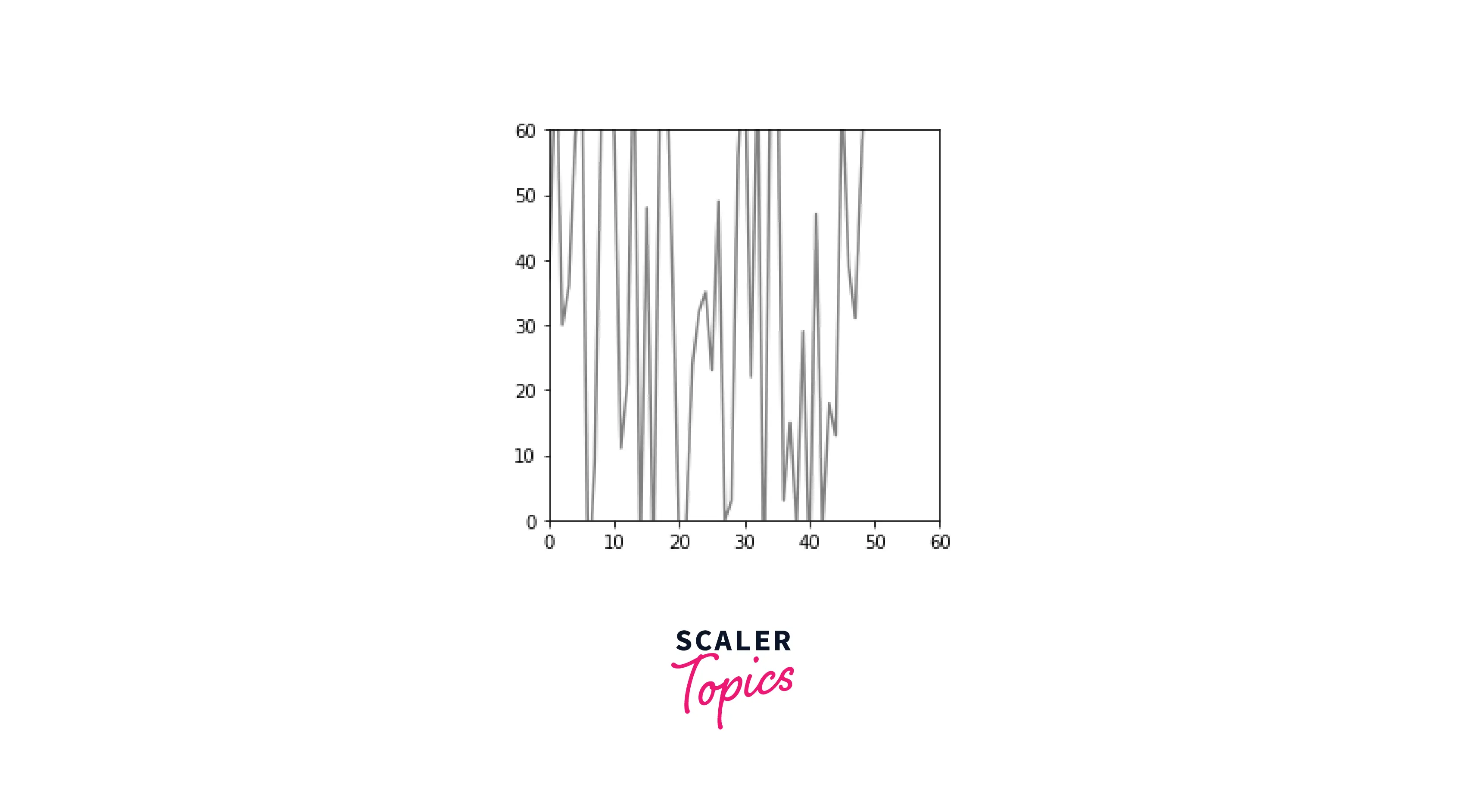
After changing the ranges, the plot would look something like this:
As you can see, we have changed the range for the X-Axis from 0 to 60. This feature will help us to scale our plots effectively.
b) Syntax
The functions we use to set the range are xlim() and ylim() for X and Y axes, respectively.
c) Parameters
a: The lower limit for the axis. b: The upper limit for the axis.
Turn Learning into Career Growth
How to Set Axis Range in Matplotlib?
Now that we have learned how to set the range of axes, we will try to implement that for different use cases:
a) Set Axis Range in a plot
- Using xlim() and ylim()
To demonstrate this example, we will put a custom range for a sine curve in matplotlib.
Explanation:
In this code, we use the arange() function to return values between 0 and 10 and have a contiguous space of 0.1. After creating the sine curve, we change the range of axes by using the xlim() and ylim() functions.
Output:
- Using set_xlim() and set_ylim() functions
Another way to set the range of axes is using the set_xlim() and set_ylim() functions.
These functions don't directly utilize the pyplot module like xlim() and ylim(), they are used with the axes of our plots.
Output:
- Using axis() method:
Using the axis() method, we can instantiate the x-axis and y-axis simultaneously.
To initialize our axes simultaneously, we need to pass our axes as a list in the axis() function. In the example below, we pass our axes ((0, 5) and (1, 15)) as a list.
Output:
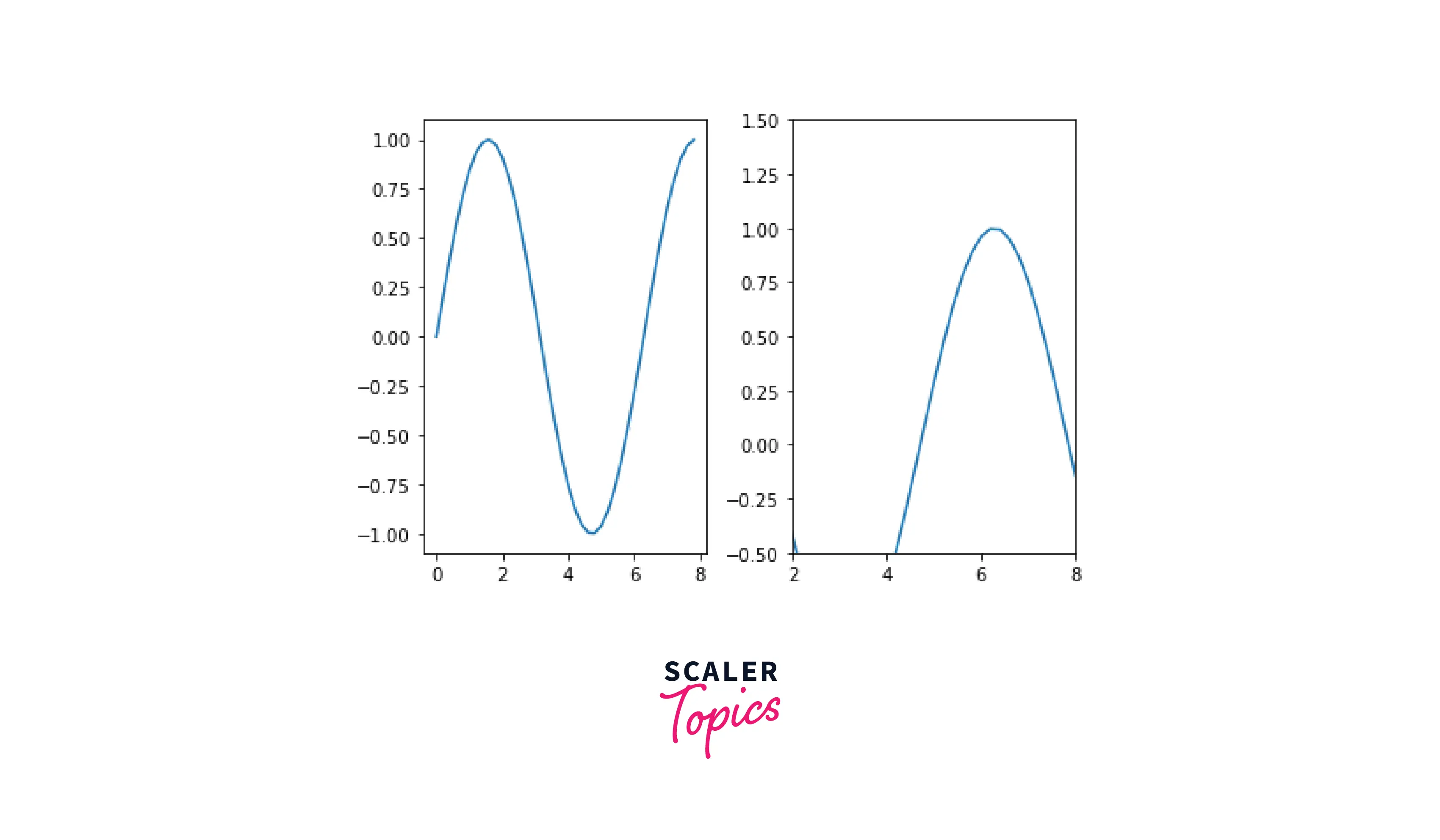
b) Set Axis Range in a Subplot
A subplot is essentially one of several plots on the same figure. To set custom ranges, we use the functions twice.
Explanation:
We create two subplots in a single frame, a sine curve, and a cosine curve respectively. After creating the curves, we use the xlim() and ylim() functions to set the ranges of the X and Y axes, respectively. Here, the range for the x-axis is from 2 to 8, and for the y-axis is -0.5 to 1.5.
Output:
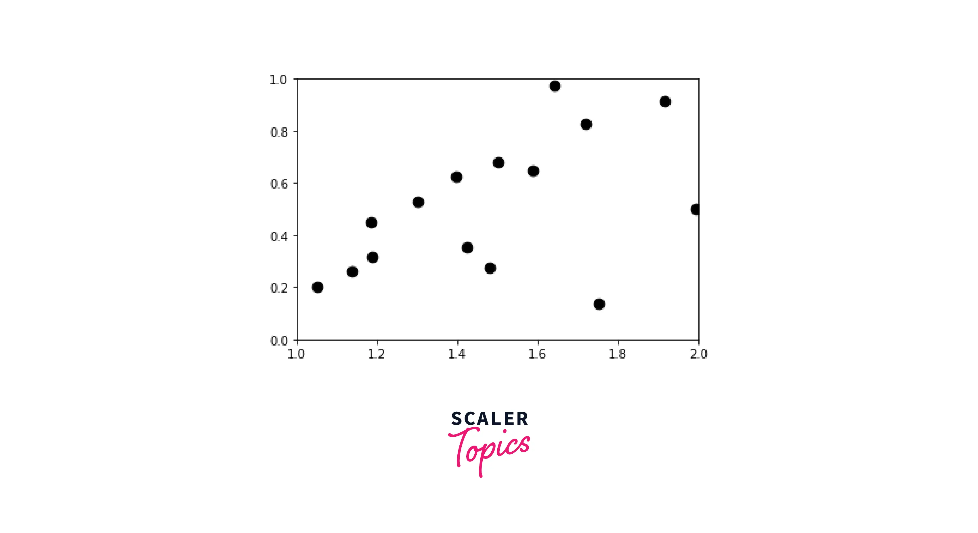
c) Set Axis Range in a Scatter plot
In this example, we will plot a scatter graph. After plotting, we will alter the original axes using the functions we went through in this article.
Explanation:
In this example, we have created a scatter plot using random numbers. After this, we use the xlim() and ylim() functions to set the ranges.
Output:
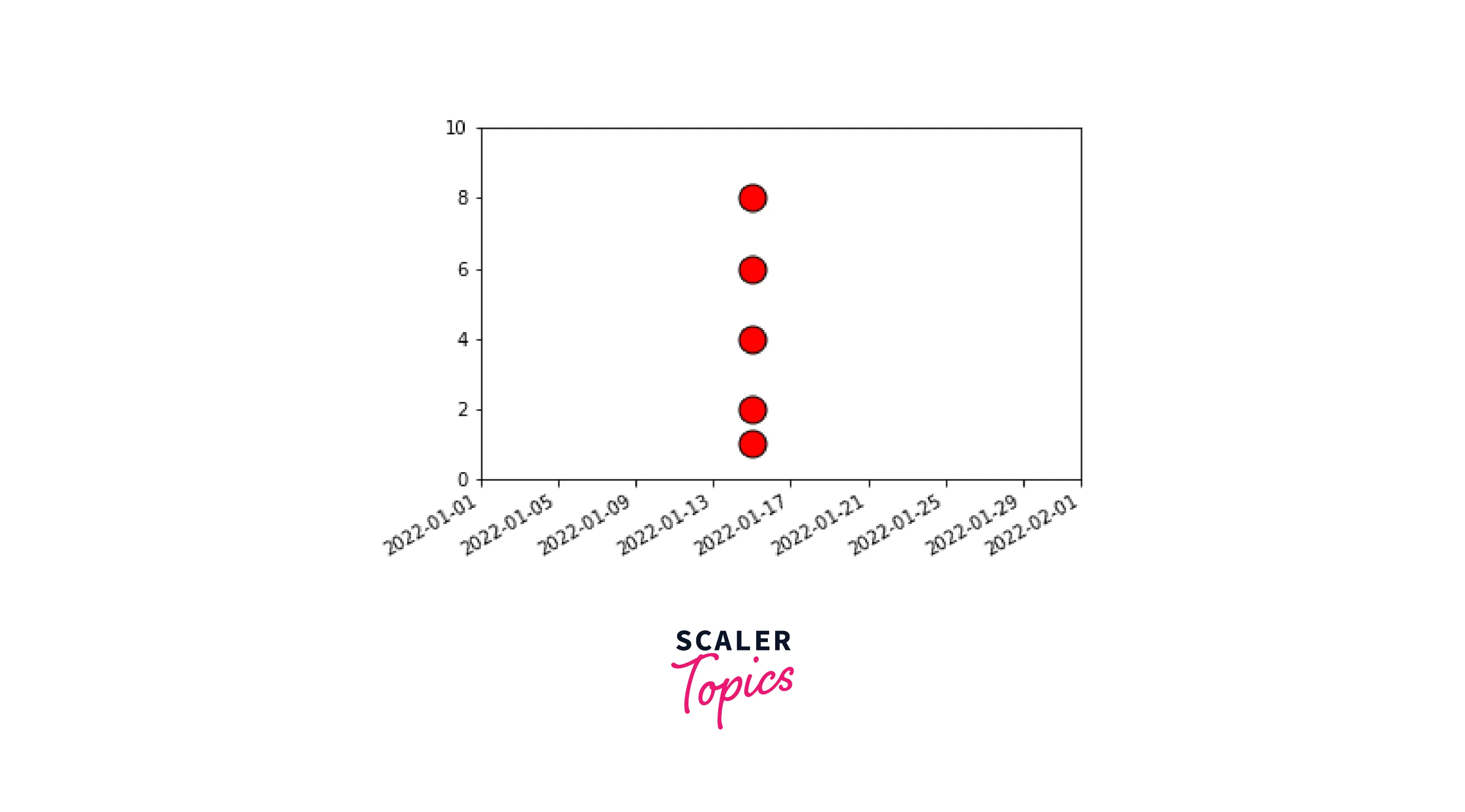
d) Set Axis Range in a Datetime plot
A plot in which either the x-axis is in a datetime format, or the y-axis is called a datetime plot.
Now, we will understand how to set the axis range of the datetime plot using matplotlib.
Explanation:
In this example, our x-axis ranges from 1-1-22 to 1-2-2022. We use the set_xlim() and set_ylim() to alter the original range.
Output:
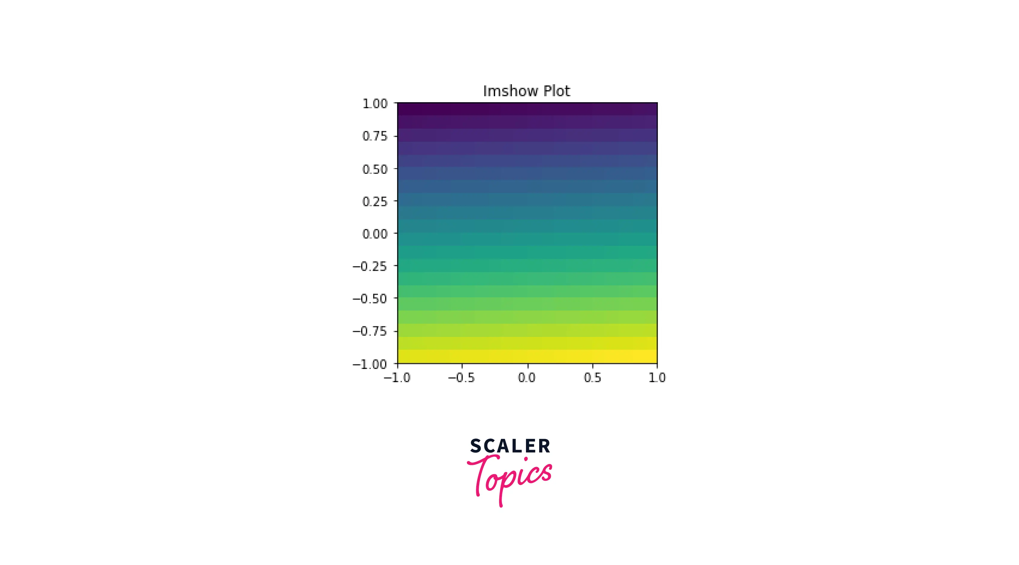
e) Set Axis Range using imshow() method
To change our axes using imshow() function, we need to pass an extra argument called extent.
By using extent, we define all of our axes in a single line of code. In the example below, the axes are: (-1 to 1 for the x-axis, and -1 to 1 for the y-axis).
Explanation Using the imshow() method, we'll change our axes from -1 to 1.
Output:
f) Set Axis Range using the same scale
In matplotlib, we can set the same scale axis limits at both axes.
Explanation
We utilize the set_aspect() function to set the aspect of the axis scaling. Here, the aspect is set to equal, which means that for both x and y, the scaling from data to plot units is the same.
Setting the same axes is important for our plots, as it helps to make our plots more uniform and easy to comprehend.
In the plot below, we can see that the limits of the x and y axes are the same.
Output:
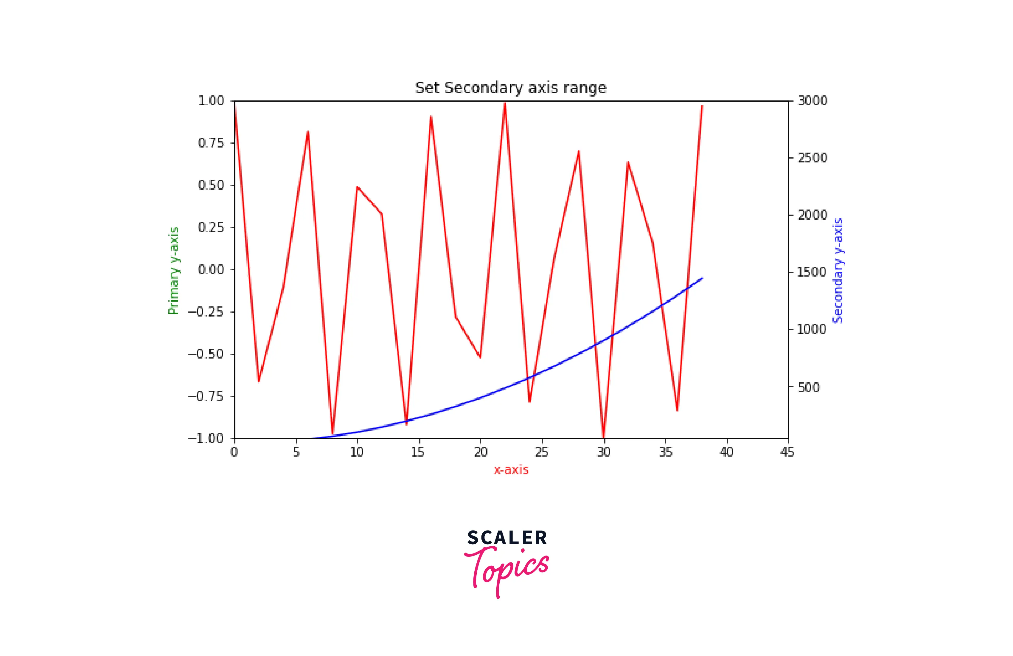
g) Set Secondary Axis Range
Using secondary axes, we will create two y-axes and set their range using set_xlim() and set_ylim() functions.
Explanation:
We use the twinx() function to create secondary axes. After setting up the secondary axes, we set the range by using set_xlim() and set_ylim() function.
Output:
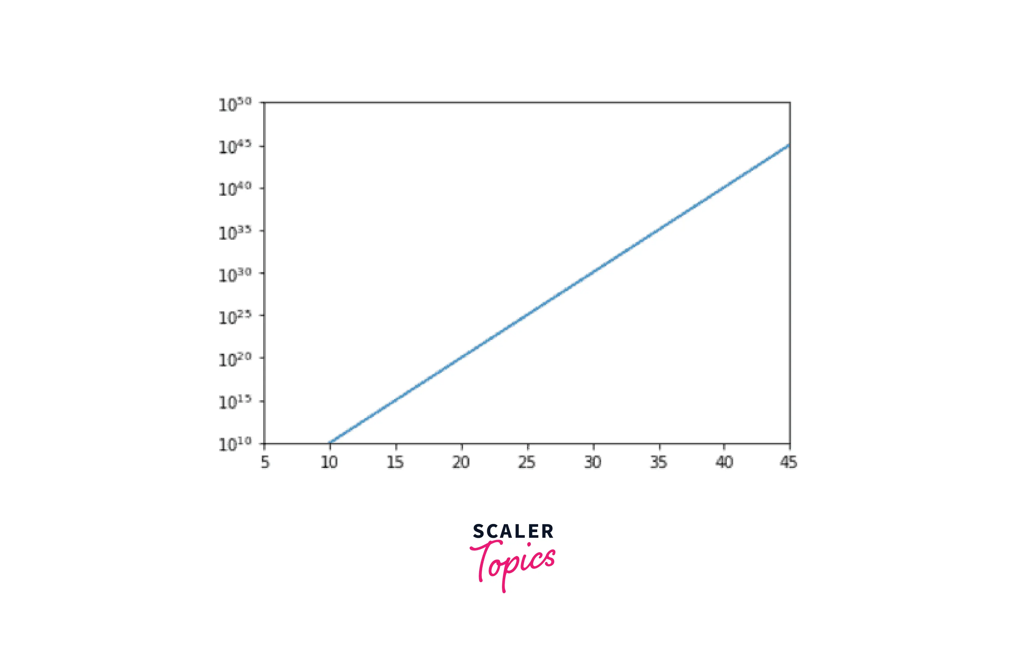
h) Set Axis Range for a logarithmic scale
In this section, we will learn how to modify the axes range for a logarithmic plot.
Explanation
First, we define the exponent data points in the "data" variable. Then, we set the log scale at the y-axis, using the yscale() function. Ultimately, we change the range of axes by using axis() that we learned earlier in this article.
Output:
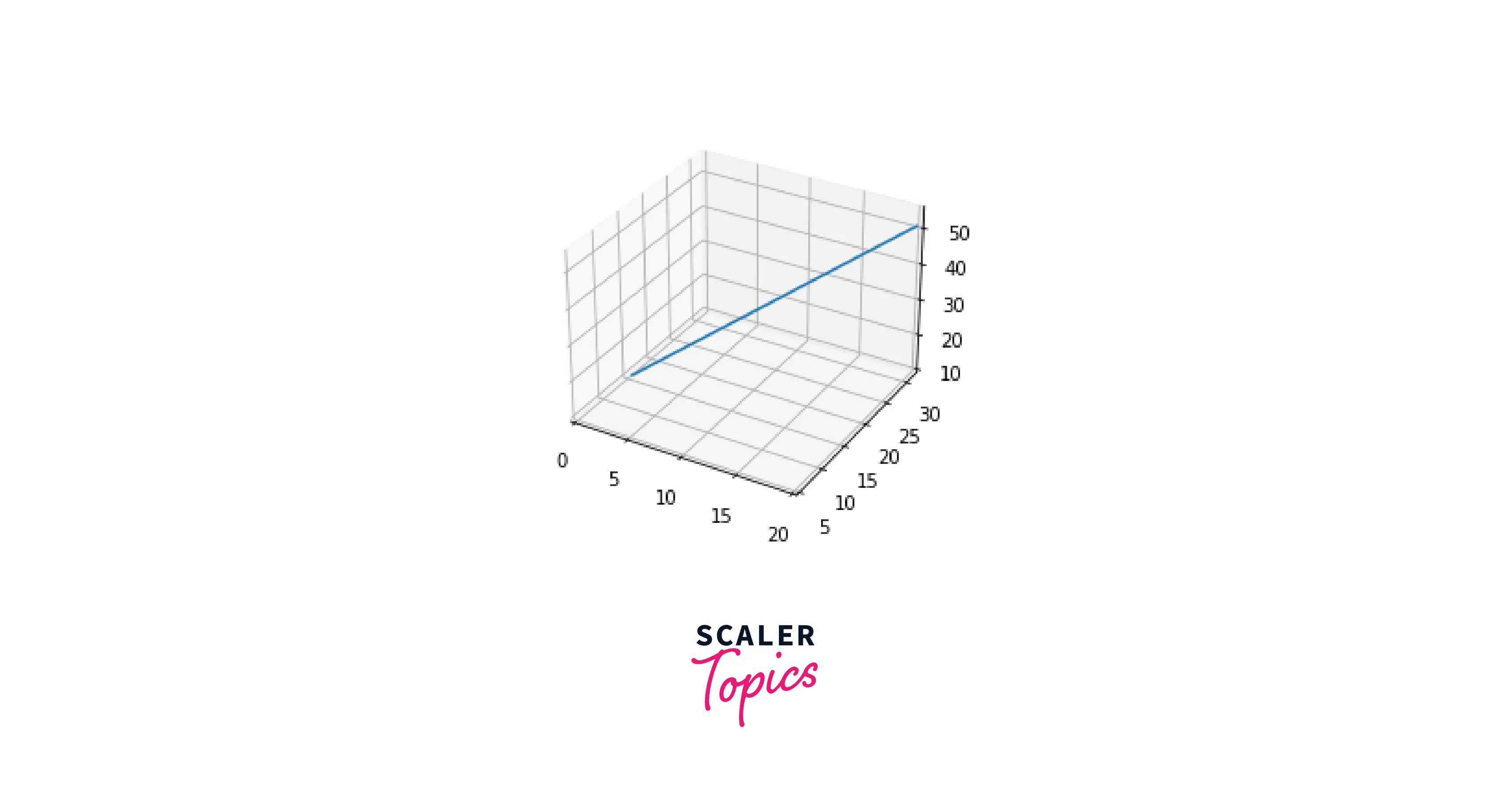
i) Set Axis Range in a 3D plot
This section will discover how to modify a 3D plot's axis limit.
Explanation
The lowest and maximum limits on each axis can be adjusted by using the set xlim(), set ylim(), and set zlim() routines.
Output:
Examples
Here are some additional examples, that will help you understand the concept of setting the axe's range of plots.
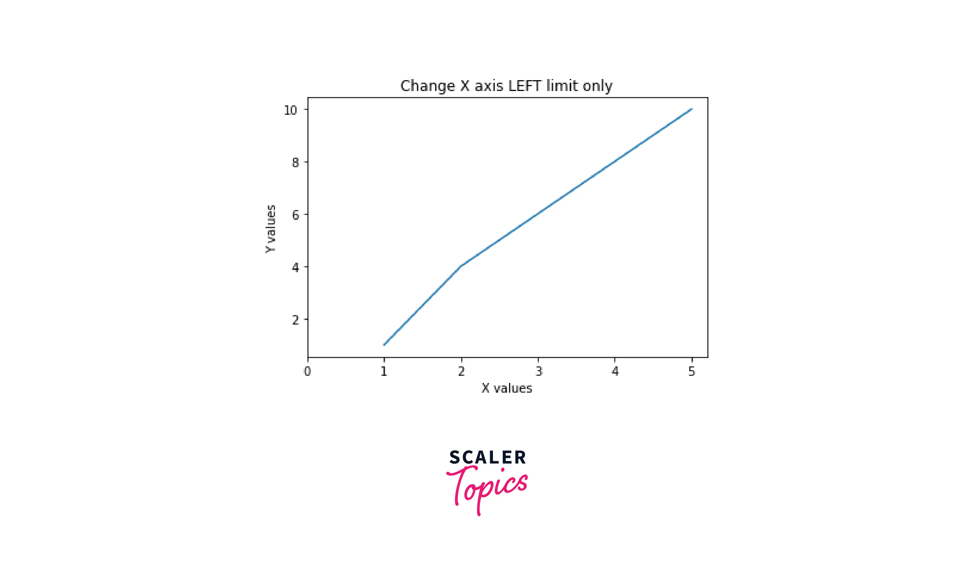
- Setting the X-Axis left limit
Output:
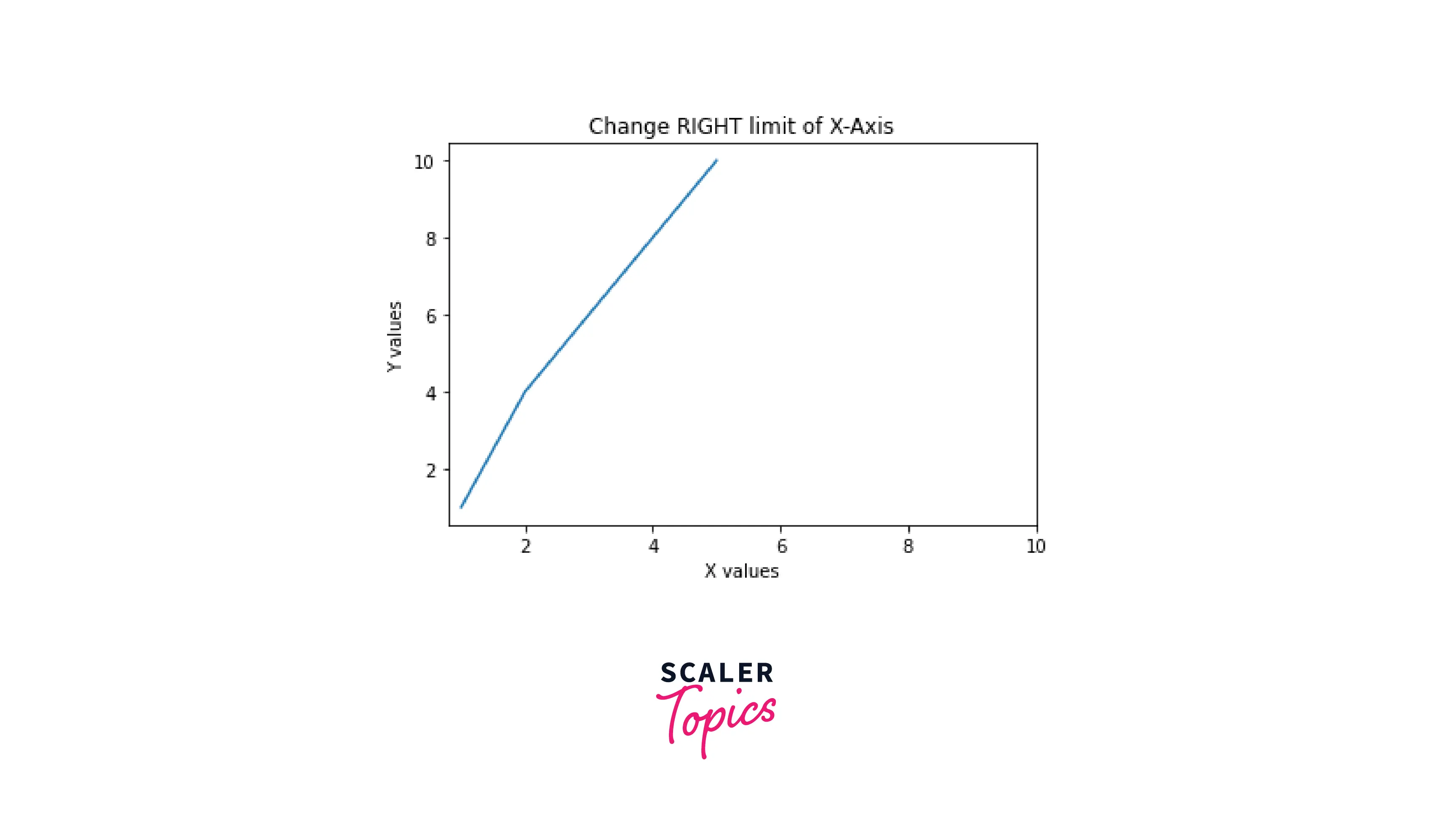
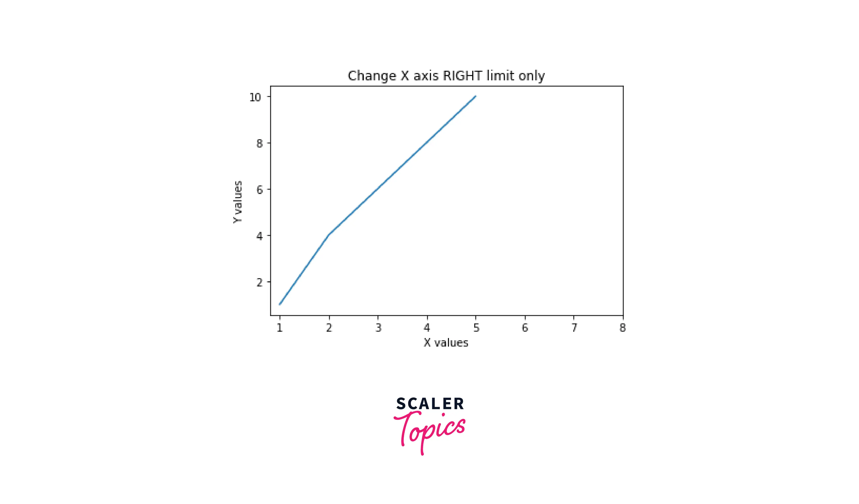
- Setting the X-Axis right limit
Output:
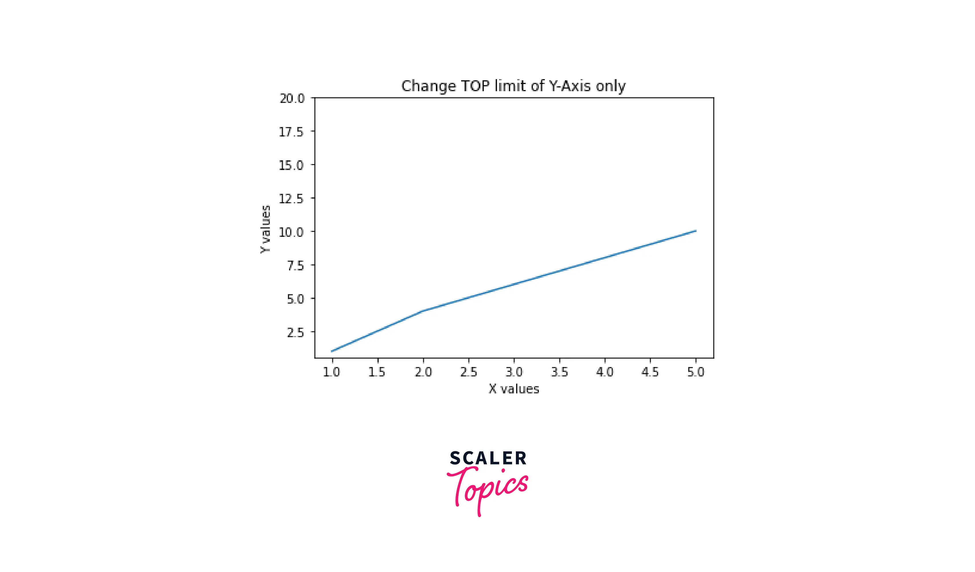
- Setting the Y-Axis top limit
Output:
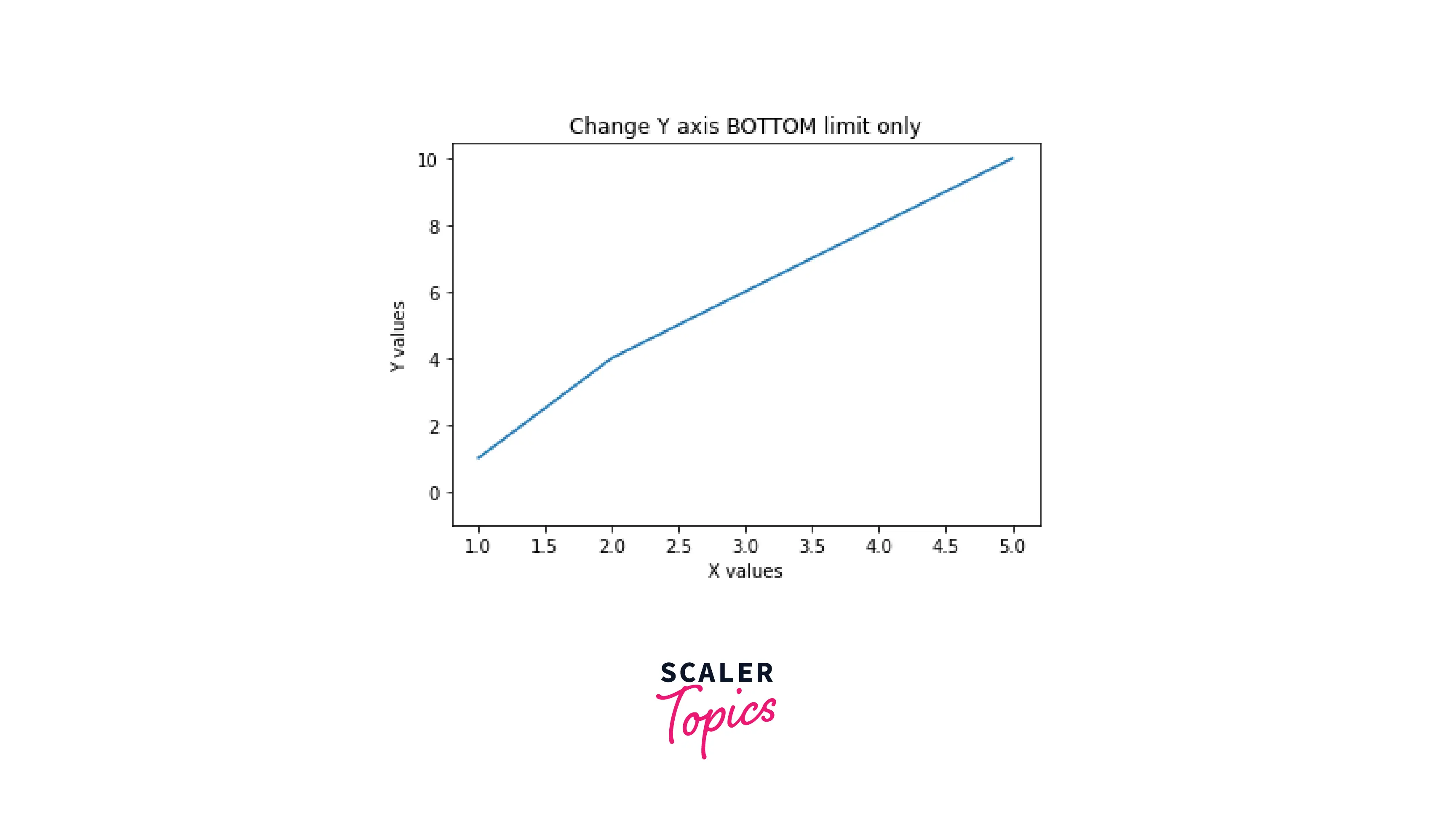
- Setting the Y-Axis bottom limit
Output:
- Setting the X-Axis right limit
Output:
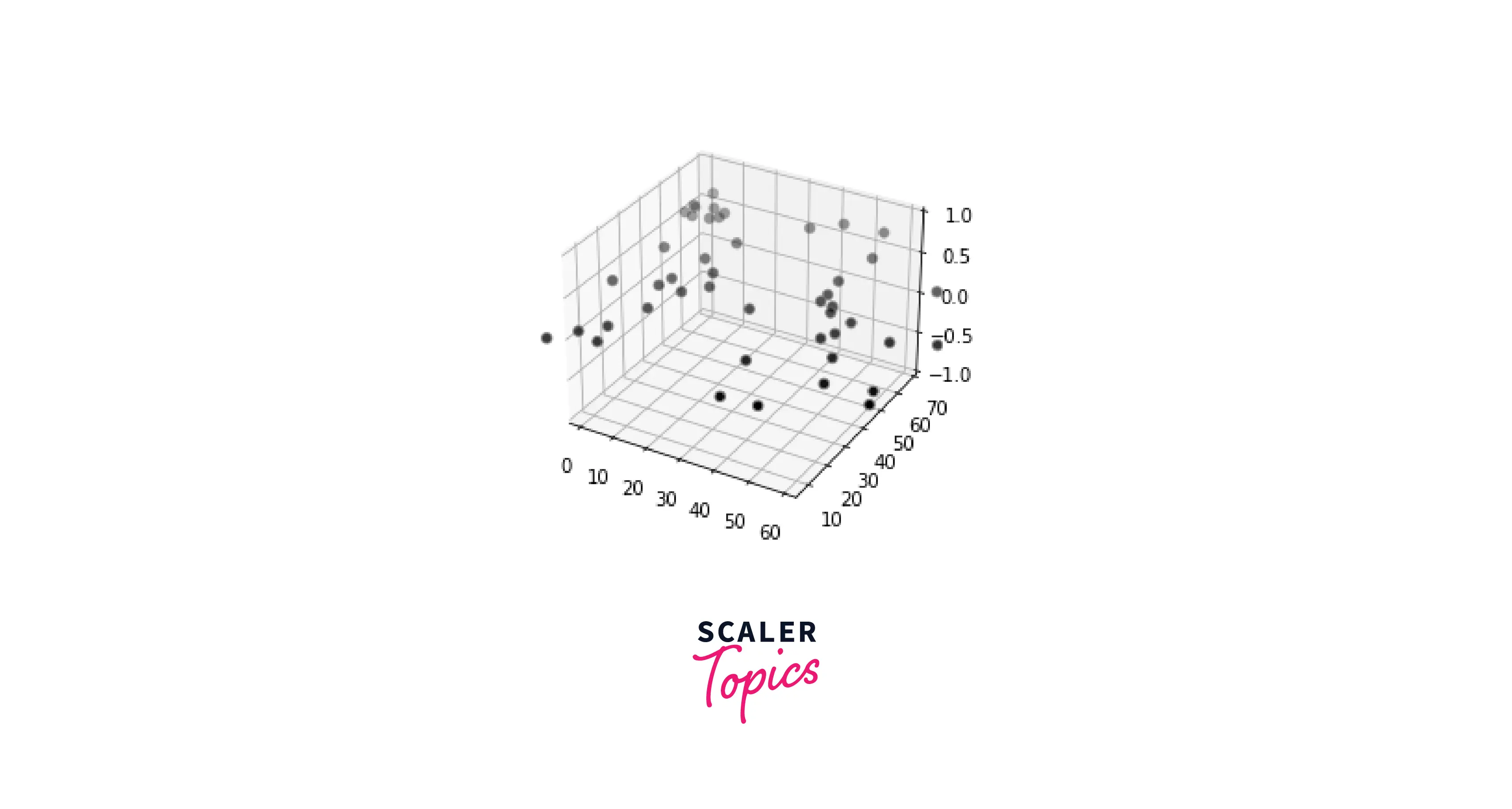
- Setting range of the axes of a three-dimensional scatter plot
Output:
Check Out This Best Data Science Course that Takes You Beyond the Basics Explored in This Blog. Enroll Now and Fuel Your Passion for Learning.
Scaler Placement Report and Statistics
Scaler learners achieved 2.5x salary growth with average post-Scaler CTC reaching ₹23L.
Conclusion
- In this article, we covered axes' ranges and how they work in matplotlib.
- We took some examples to demonstrate setting ranges in a plot using sine and cosine curves.
- We understood various methods to set the range of an axis, like xlim(), ylim(), axis(), and a lot more.
- Apart from this, we learned how to implement custom ranges on various plots, like subplots, scatter plots, datetime plots, etc.
- Lastly, we saw implementations of changing ranges on complicated plots like three-dimensional plots and scatter plots.