How to Add a Table in Matplotlib Figure?
Overview
This article explains how to make Matplotlib tables in Python using very basic and simple methods. Here, the matplotlib.pyplot.table() method and the pandas.plotting.table() method are the two main approaches that are covered.
By using the columns as the x-axis and the values as the y-axis, we can plot the matplotlib table. To create a table, we may also give a Pandas DataFrame and NumPy array as cellText parameters. Different ways to style and customize the matplotlib tables are also addressed.
How to Add a Table in Matplotlib Figure?
One of the things that could make a graph more useful is adding a table, and Python's Matplotlib has you covered. Fortunately, adding a matplotlib table doesn't require writing a lot of lines of code.
Even though matplotlib's major use is as a 1D, 2D, and 3D plotting library, it also assists us with small tasks like adding a data table to go with our charts.
Before we move on, it is essential to consider why we are adding a table to a chart. The basic goal of charting data visually is to explain the otherwise difficult-to-understand data values.
So, how to do it ?
We can use one of the two following methods to create Matplotlib tables.
Create a Table Using matplotlib.pyplot.table() Function
A matplotlib table can be created or added to axes using the matplotlib.pyplot.table() method. Columns are plotted on the x-axis and values are plotted on the y-axis for this table. The table is made out of a 2D grid that may be accessed using rows and columns.
Let’s look at the syntax, parameters, and return type of the method.
Syntax of Matplotlib Table
These parameters must be 2D lists, where the inner list defines the column values for each row and the outer list defines the rows. No other dimensional data can be passed to the function.
It is necessary to specify either cellText or cellColours as an argument to the matplotlib table function. The number of elements in every row must be the same.
Transform Your Career
Choose from our industry-leading programs designed for career success
Modern Software and AI Engineering Program
Master full-stack development with AI integration

Modern Data Science and ML with specialisation in AI
Advanced data science techniques with AI specialization
Advanced AIML with Specialisation in Agentic AI
Deep dive into AIML with focus on Agentic systems
DevOps, Cloud & AI Platform Engineering
Build and manage AI-powered cloud infrastructure
AI Engineering Advanced Certification by IIT-Roorkee
Premier AI engineering certification from IIT-Roorkee
Parameters
- cellText :
The texts to be entered into the table cells. - cellColours :
Defines the background colors of the cells. - cellLoc :
The alignment of the text within the cells can be defined. (default is ‘right’) - colWidths (optional) :
Specifies the column widths in units of the axes. - rowLabels (optional) :
The text of the row header. - rowColours (optional) :
Adds colors to the row header cells. - rowLoc (optional) :
defines the text alignment of the row header cells. (default is ‘left’) - colLabels (optional) :
The text of the column header. - colColours (optional) :
used to add colors to the column header cells. - colLoc (optional) :
Defines the text alignment of the column header cells. (default is ‘left’) - Loc (optional) :
This parameter is the position of the cell concerning the axis. - bbox (optional) :
This parameter defines the bounding box to draw the table into. - edges (optional) :
This parameter is used to define the cell edges to be drawn with a line. - **kwargs :
Used to control table properties. Optional parameters that let us modify how big the 2d list that's been passed as a parameter will be.
Return Type
The table which is constructed by giving the necessary data as arguments to the matplotlib.pylot.table() method is returned.
Scaler Placement Report and Statistics
Scaler learners achieved 2.5x salary growth with average post-Scaler CTC reaching ₹23L.
Implementation of Matplotlib Table
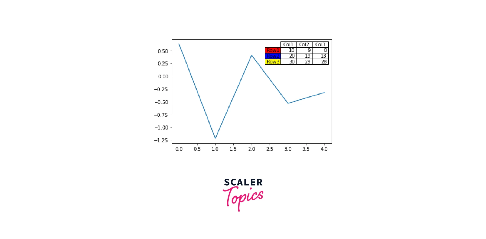
We import all the required modules first, and after that, we declare the datasets as a 2D list. The next step is to build a table object by providing the necessary parameters. Finally, the matplotlib interface is displayed using plt.show().
Here is an example,
Output :
Now, let's move on to the second method.
Create a Table Using pandas.plotting.table() Method
Using the plot() method, we can visualize a dataframe. To plot, however, we need a dataframe. The DataFrame() method of the panda's package can be used to generate a dataframe by just passing it into a dictionary.
This method creates the matplotlib table from the DataFrame df. Df loads the data into a pandas dataframe.The matplotlib table is created by calling pandas.plotting.table().The column names of df are passed as colLabels, while the values of df are passed as cellText. The rowLabels value serves as a label for the table's rows.
It is wise to style the fields differently to distinguish between the row names and column labels in the table.
Syntax of Matplotlib Table
Turn Learning into Career Growth
Parameters
- Ax :
Matplotlib axes object - Data :
DataFrame or Series - Data for table contents. - **kwargs :
To pass keyword arguments to matplotlib.table. It will utilize the data index or column name if, rowLabels or colLabels are not given.
Return Type
The Matplotlib table which is constructed by giving the necessary data as arguments to the pandas.plotting.table() method is returned.
Implementation of Matplotlib Table
Example :
Output :
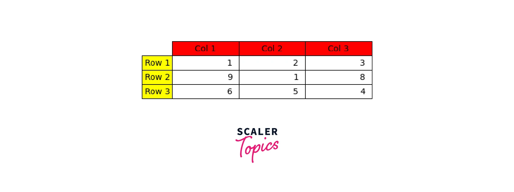
Here, we have used the parameters- rowColours and colColours to style the row labels and column labels with yellow and red colors, respectively, to separate the fields from the rest of the table.
Styling the Matplotlib Table in Python
The fundamental goal of styling is to improve readability for the end user. To more effectively convey knowledge, we can modify elements like the color and format of the data visualization.
We can customize the styling of a Matplotlib table by defining the required parameters in matplotlib.table.
Syntax
Most likely, we won't generate cells on our own. Use either Table. add cell or the tablefunction instead.
Scaler Placement Report and Statistics
Scaler learners achieved 2.5x salary growth with average post-Scaler CTC reaching ₹23L.
Parameters
- xy :
The position of the bottom left corner of the cell. - width : float Defines the cell width.
- height : float Defines the cell height.
- edgecolor : color Defines the color of the cell border.
- facecolor : color The cell background color.
- fill : bool Whether the cell background is filled.
- text : str The cell text.
- loc :
{'left', 'center', 'right'}, default is 'right' Defines the alignment of the text within the cell. - fontproperties : dict a dictionary listing the text's font characteristics. The keyword arguments taken by FontProperties support both keys and values.
- visible_edges :
str, default is 'closed' Defines the cell edges to be drawn with a line.
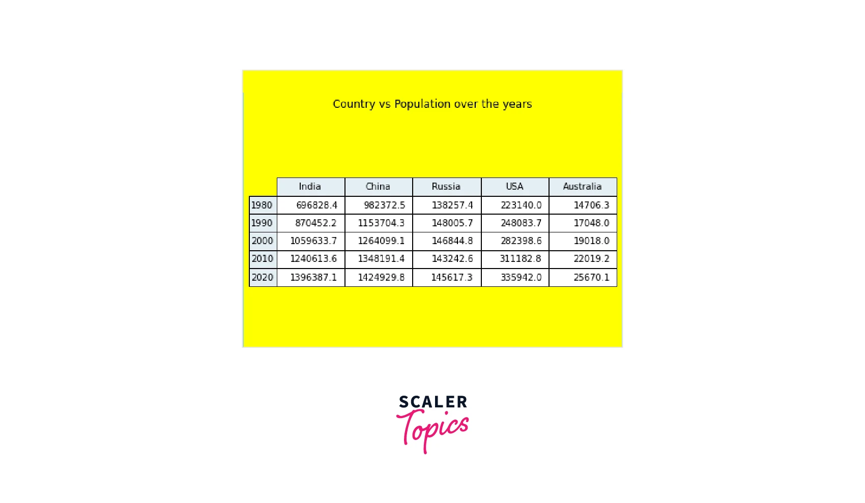
Example
Here is an example of a styled matplotlib table :
Output :
Apart from everything else, the first thing we probably notice when using matplotlib.pyplot.table is that the tables are unpleasant and poorly handle vertical cell padding. Second, alignment problems pop up often when we try to conceal the graph to only display the table grid, preventing us from receiving the perfectly formatted small table we sought after. To make the table look attractive, some effort is required.
Pandas can produce dataframes that look great inside Jupyter notebooks. It can even style these Pandas dataframes using the pandas.Dataframe.style library.
Conclusion
- In this article, we discussed two methods of adding a table in the Matplotlib figure.
- First, the method is matplotlib.pyplot.table()which returns a matplotlib table.
- The second method is creating a matplotlib table using the pandas.plotting.table() method. We covered its implementation with a suitable example.
- There are different ways to style a matplotlib table. We can change the attributes of font, border, background, text, etc.
- Styling of matplotlib tables can be done using the matplotlib table function by providing parameters like edgecolor, facecolor etc.
- To summarise, Matplotlib's built-in functions allow us to create informative tables in figures to visualize and comprehend data effectively.