Plotting Multiple Bar Chart
Overview
- In this tutorial, we will explore several methods to use Matplotlib for constructing multiple-bar charts in Python.
- Matplotlib multi-bar charts are a type of chart that has multiple bars. Users generate a plot on their screen using the display() method.
- We will learn to create horizontal and column bar charts using pandas and pyplot in Matplotlib.
Introduction
- This section will look at how to use matplotlib in Python to create multi-bar charts. Before diving into the topic, defining a multiple bar chart is important.
- Using bar charts, you can examine the many examples of each category by displaying numerical values on one axis and categorical variables on the other.
Scaler Placement Report and Statistics
Scaler learners achieved 2.5x salary growth with average post-Scaler CTC reaching ₹23L.
What are Grouped-bar Charts?
The link between various data variables is depicted using a multiple-bar graph. Before we start, let us define a multi-bar chart: Multiple-bar charts are essentially used to compare different things.
How to Plot a Multi-bar Chart?
The steps for creating multi-bar chart graphs are explained below:
- Library Definitions: For plotting multi-bar graphs and data visualization, import the pyplot library and the numpy and pandas libraries for data production and processing.
- Define your data: Define the x-axis, and y-axis values used to depict the data.
- Make a multi-bar graph: We can draw several bar charts using the matplotlib library's bar() technique.
- Make a Plot Visual: Users can generate a plot on their screen using the display() method.
Transform Your Career
Choose from our industry-leading programs designed for career success
Modern Software and AI Engineering Program
Master full-stack development with AI integration

Modern Data Science and ML with specialisation in AI
Advanced data science techniques with AI specialization
Advanced AIML with Specialisation in Agentic AI
Deep dive into AIML with focus on Agentic systems
DevOps, Cloud & AI Platform Engineering
Build and manage AI-powered cloud infrastructure
AI Engineering Advanced Certification by IIT-Roorkee
Premier AI engineering certification from IIT-Roorkee
Syntax of Multiple Bar Chart
Parameters of Multiple-bar Chart
The following are the parameters:
- x: indicate the bars' x-coordinates.
- height: The height of the bars is determined by the y-coordinates.
- width: the width of the bars must be specified.
- bottom: the y coordinates of the bar bases should be specified.
- align: The bars must be aligned.
Matplotlib multiple bar charts side by side
Multiple bar charts will be plotted side by side in this example using subplots.
- We import numpy and the matplotlib.pyplot package in the example above.
- Following that, we define the data that will be plotted.
- Then, we build a range of numbers with the np.arange() function.
- We generate two subplots side by side using the plt.subplot() technique.
- Use the plt.bar() function to make several bar chart graphs.
Output:

Matplotlib Multiple Horizontal Bar Chart
We will learn how to create grouped bar charts, also known as multiple bar charts, in the horizontal direction. To begin, we first understand the syntax for creating a horizontal bar chart:
The following are the parameters that were used:
- y: specifies the y bar's coordinates.
- width: the width of the bars must be specified.
- height: the height of the bars must be specified.
- left: give the x coordinates for the bars' left sides.
- align: the base is aligned with the y coordinates.
Consider the following scenario in which many horizontal bar charts are plotted:
- We use Pandas DataFrame to define data in the example above.
- The plot.barh() method is then used to create several horizontal bar charts.
- The plot is seen on the user's screen using the plt.show() method.
Output:

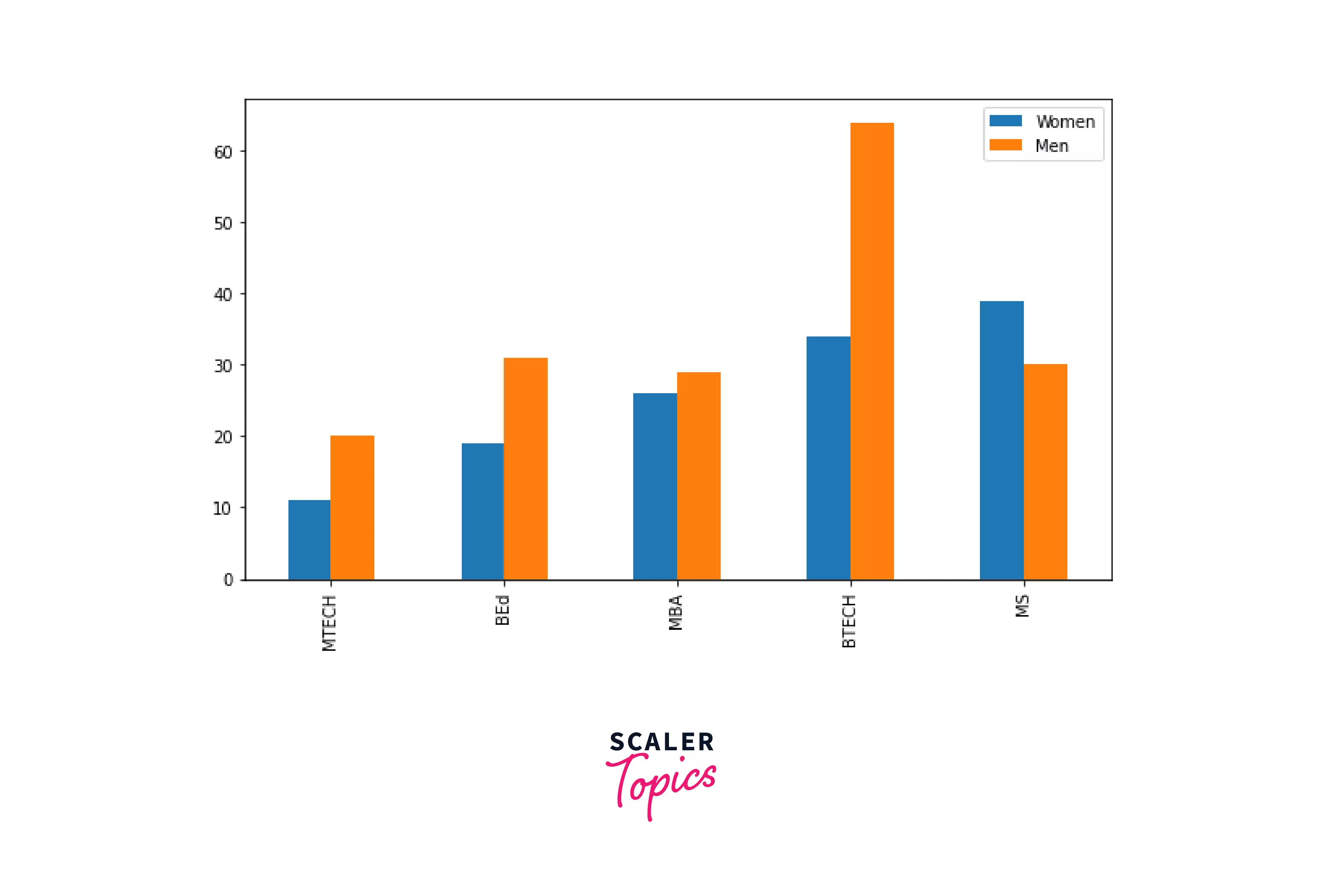
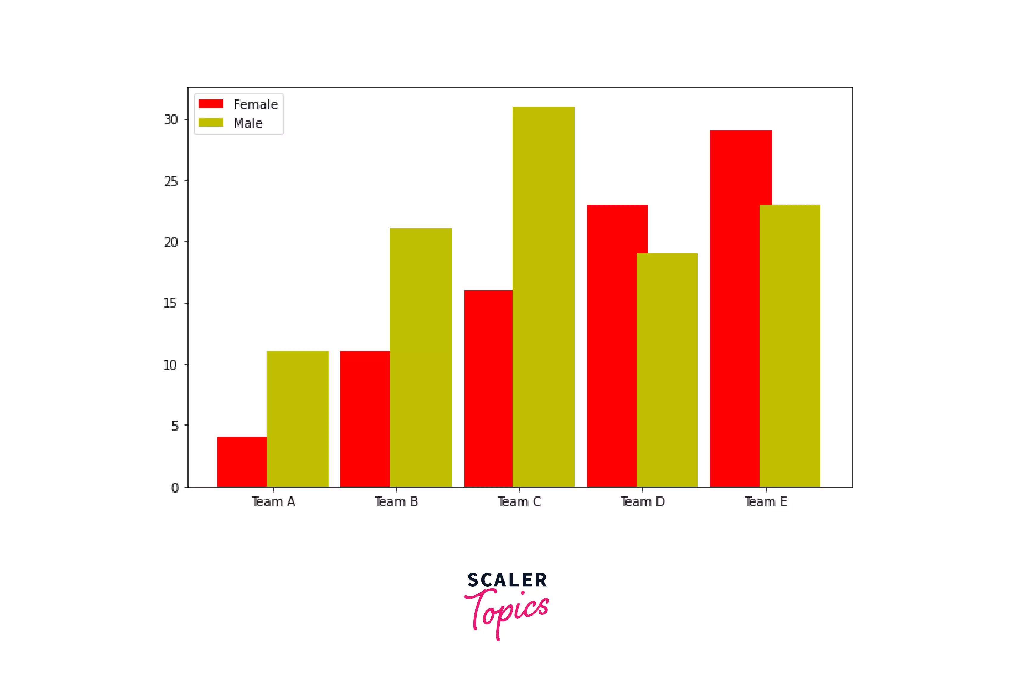
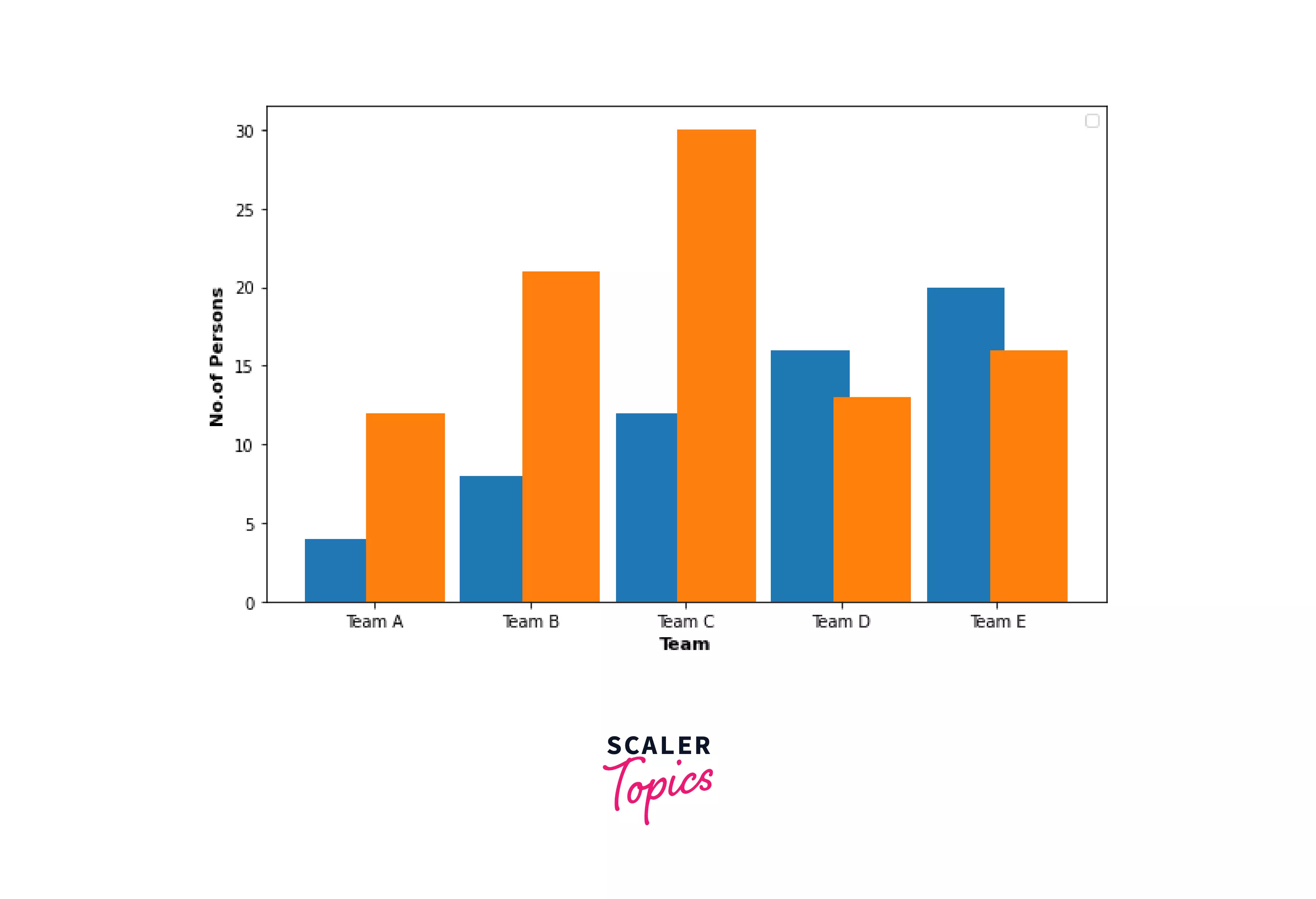
Matplotlib Multiple Bar Chart Pandas
In this tutorial, we'll learn how to use pandas DataFrame to plot numerous bar charts. Consider the following scenario:
- We import key libraries like pandas and pyplot in the example above.
- We then use Pandas DataFrame to define data.
- To make several bar charts, utilize the plot.bar() method.
Output:
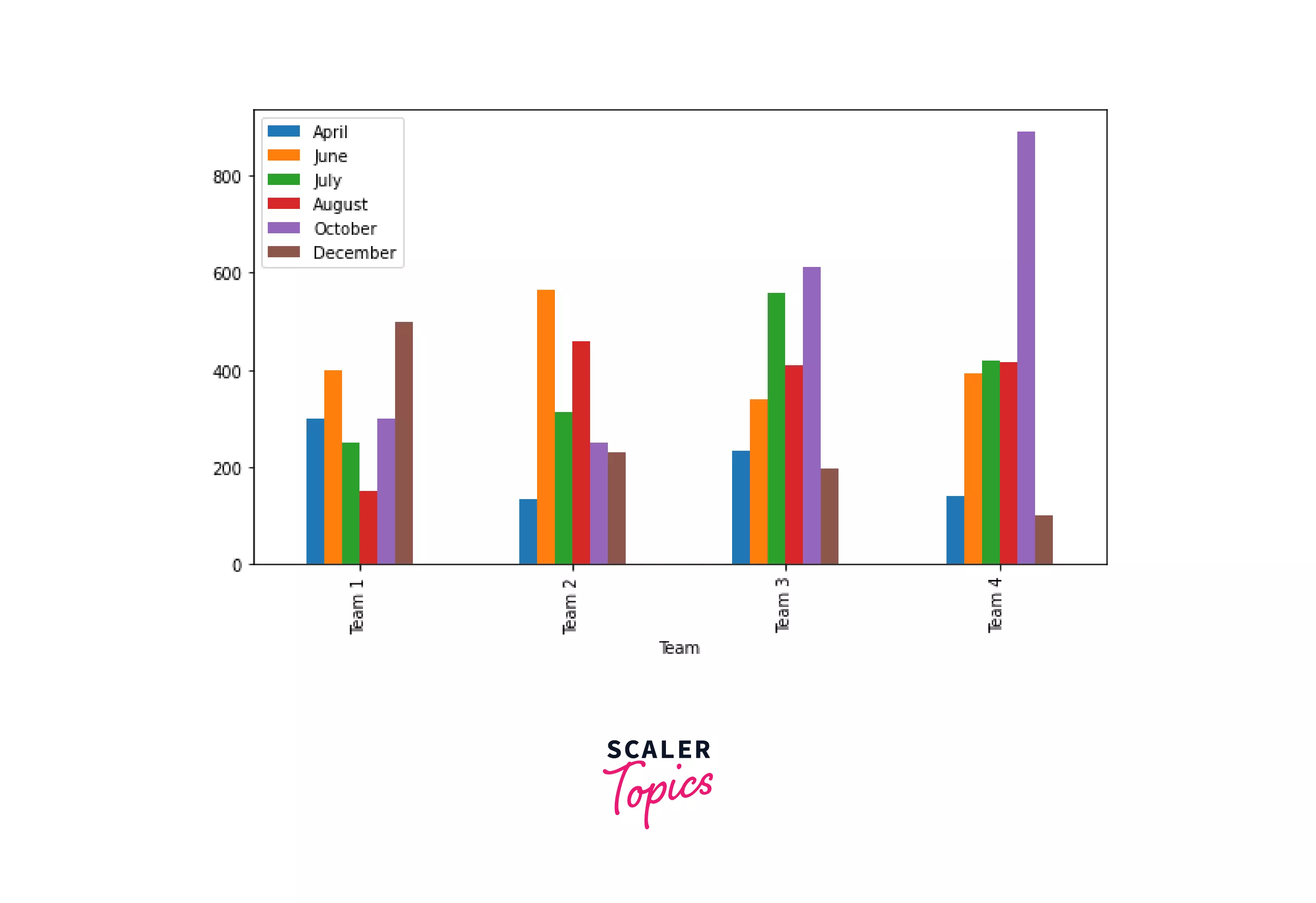
Matplotlib Bar Chart Multiple Columns
We are going to learn how to create a multi-column bar chart. The plot() method is used to create a bar chart, and the DataFrame object is used to define numerous columns.
Example: We will use the DataFrame object of Pandas to make many bar charts. Take this example of making a bar chart with five different columns.
- We import the pandas and pyplot libraries in the example above.
- Then we define data and make a DataFrame.
- The plot() function is then used to create a chart with 5 different columns. Finally, we use kind as a parameter to indicate that the plot is of the bar kind.
Output:

Turn Learning into Career Growth
Matplotlib Bar Chart Multiple Colors
In this example, we will make a grouped bar chart with distinctly colored bars.
We must supply color as a parameter and a list of different colors as values to change the colors of the bar.
The syntax to change color is given below:
The color option is used to change the color of the bars to our liking. Let us see some examples:
Example1:
In the preceding example, we generate a list of colors and provide it to the plot() method's color parameter to choose the color of the bars.
Output:
Example2:
We utilize two plt.bar() methods to produce numerous bars in the previous example, and we supply a color parameter to each function to alter the value of bars according to our preferences.
Output:
Matplotlib Overlay Two Bar Chart
We will learn how to overlay one bar inside another on a bar chart in this lesson. Let us look at an example of a two-bar overlay chart:
- We import the numpy and matplotlib packages in the example above.
- Following that, we define the data that will be utilized to create several bar charts.
- Then, we make a figure and add subplots using the add figure() method.
- The ax.bar() technique makes multiple bar charts where one bar is overlaid on top of another. Here, we split the breadth of a bar contained within another bar.
Output:

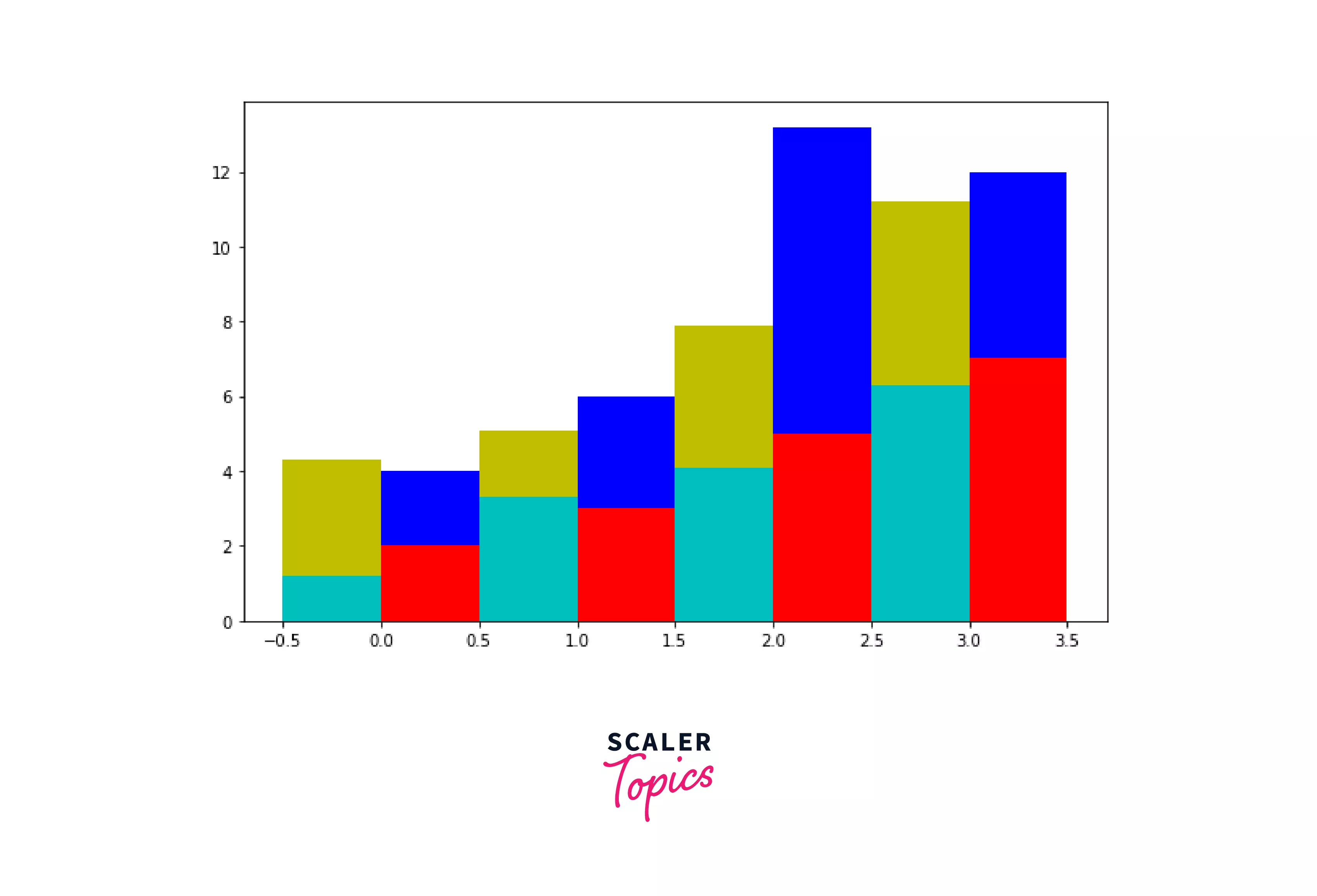
Matplotlib Multiple Stacked Bar Chart
We will learn how to make grouped stacked bar charts in this tutorial. To begin, we must first comprehend what a stacked bar chart is:
" A stacked bar chart is a graph that compares several aspects of a bigger picture. We can create a bar for each data set in a single category and arrange it one over the other when we have many data sets in a single category.
Let us have a look at an example:
- DataFrame is used to define data in the example above.
- Then, by stating data points in such a way that they generate stacked bars, we make a stacked multiple-bar chart.
Output:
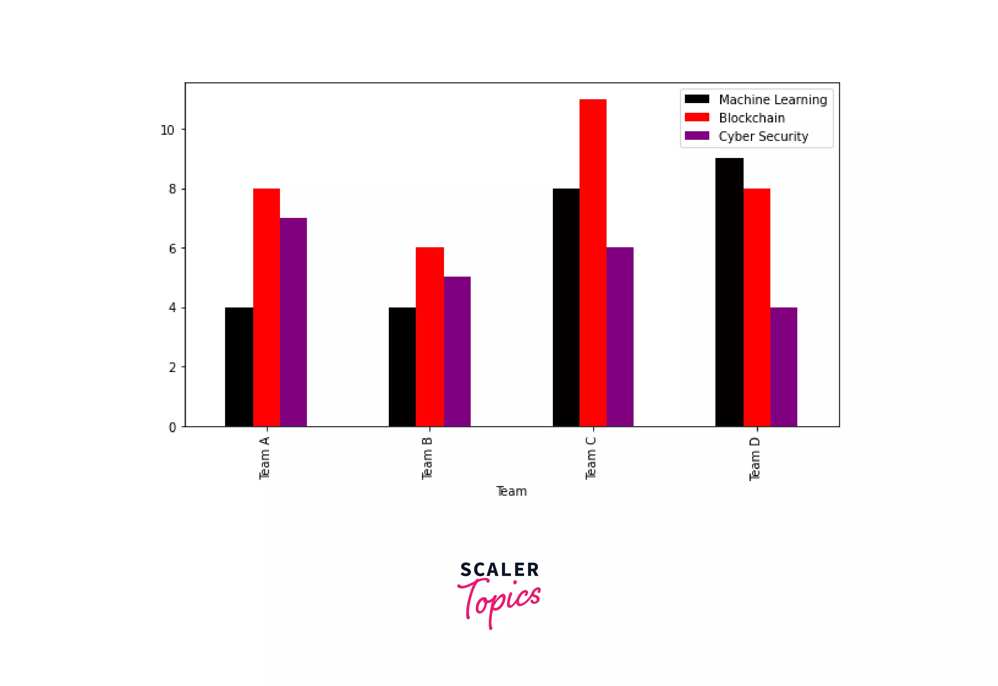
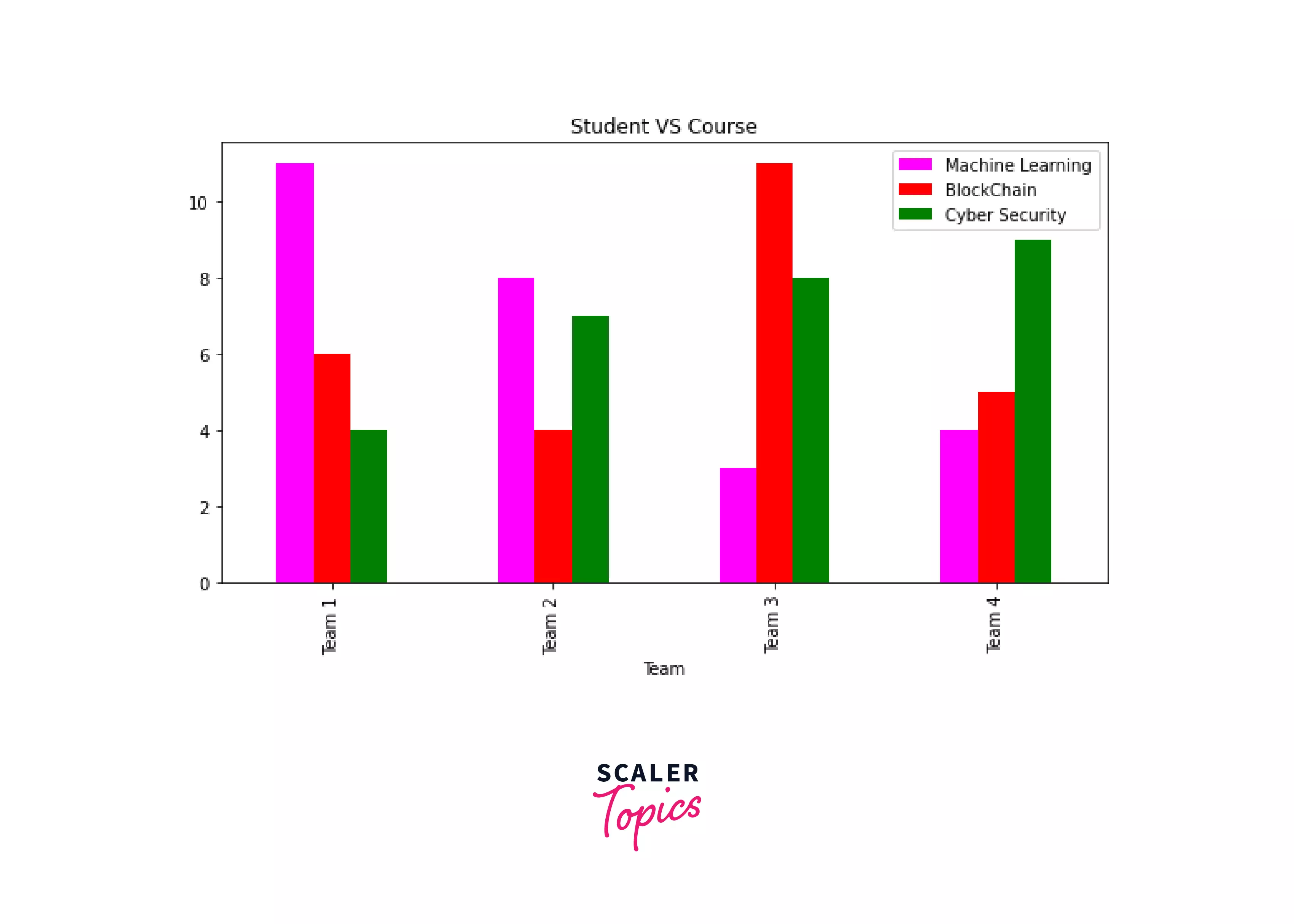
Matplotlib Bar Chart Multiple Groups
We are going to make a bar chart with numerous groups here. Multiple groups and columns have the same meaning. Let’s see an example where we draw a bar chart with multiple groups. Here, we create a bar chart with six groups.
- We import the pandas and matplotlib.pyplot libraries in the example above.
- After that, we will make a DataFrame.
- The plot() method is then used to create a bar chart with six distinct groups.
Output:
Matplotlib Multiple Bar Chart Labels
In this section, we'll learn how to add labels to several bar charts. The syntax to add labels:
Example:
- We use plt.xlabel() and plt.ylabel() to define labels on the x- and y-axes, respectively, in the example above.
- The plt.bar() technique builds several bar charts.
Output:
Matplotlib Multiple Bar Chart Title
We are going to make many bar charts with titles here. The title() function is used to add a title.
The syntax to add a title is given below:
Example:
- In the above example, we use plt.title() method to add a title to multiple bar charts.
Output:
Conclusion
- We learnt to make bar charts using pandas and pyplot in Matplotlib.
- This post covered examples of the "Matplotlib multiple bar chart."
- We also discussed side-by-side, multiple horizontal bar charts, multiple-bar charts utilizing pandas, multiple columns, color, overlay two bar charts, and adding titles and labels.