Scatter Plot in Matplotlib

Overview
Scatter plots are commonly used to depict the relationship between variables and use dots (coordinates) to show their relationship. The scatter() function in the Matplotlib Library used to plot a scatter plot.
Transform Your Career
Choose from our industry-leading programs designed for career success
Modern Software and AI Engineering Program
Master full-stack development with AI integration

Modern Data Science and ML with specialisation in AI
Advanced data science techniques with AI specialization
Advanced AIML with Specialisation in Agentic AI
Deep dive into AIML with focus on Agentic systems
DevOps, Cloud & AI Platform Engineering
Build and manage AI-powered cloud infrastructure
AI Engineering Advanced Certification by IIT-Roorkee
Premier AI engineering certification from IIT-Roorkee
What is a Scatter Plot in Matplotlib?
A Scatter plot is a plot in which coordinates are shown as markers(dots) on the graph. A Scatter plot is useful for showing the relationship between the variables.
In matplotlib, a scatter plot is implemented using the scatter() function, which takes at least two parameters, x-axis data and y-axis data.
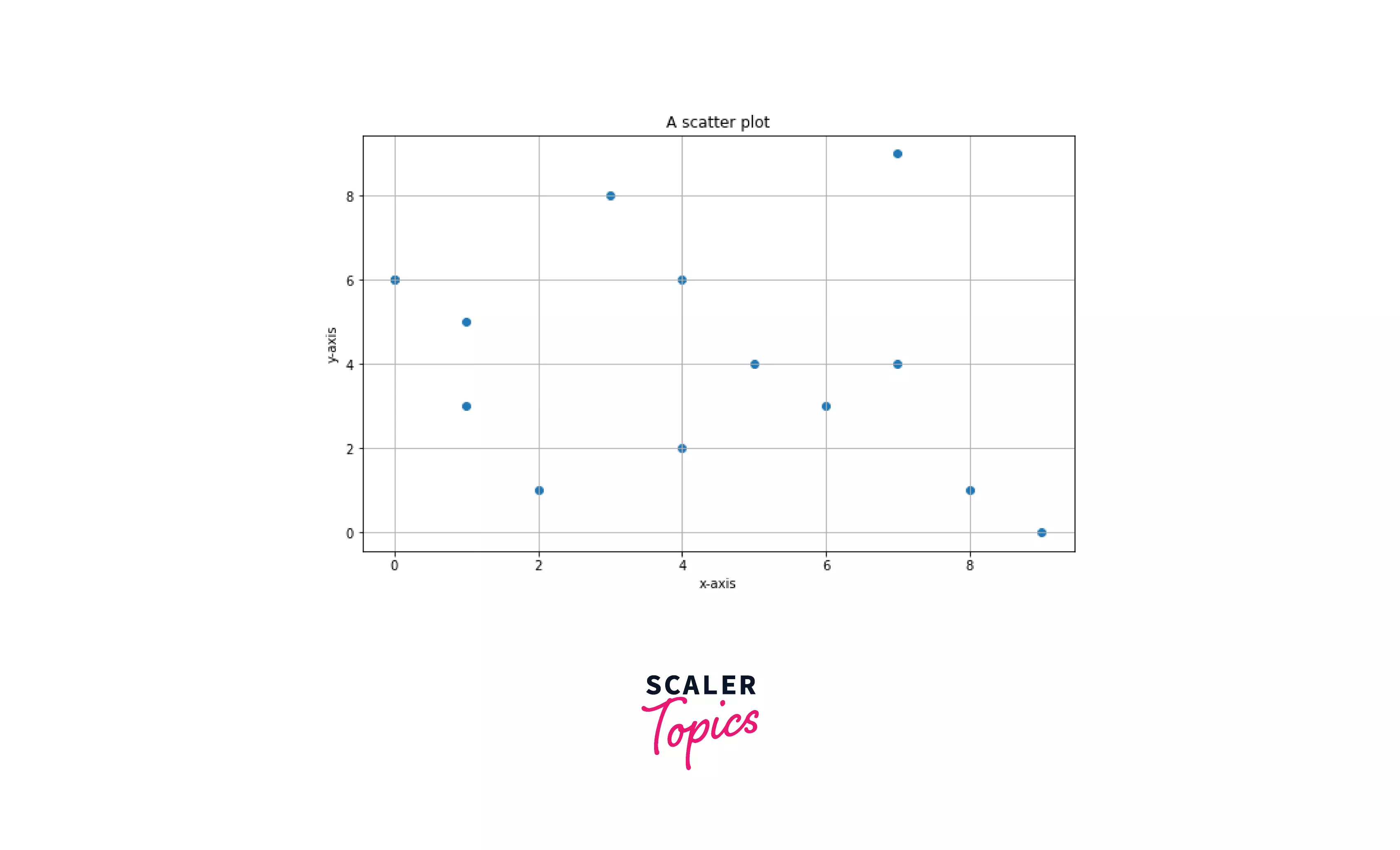
A scatter plot generated using matplotlib
Creating Scatter Plots in Matplotlib
Library required to use Scatter plot along with the syntax:
Function required to plot a scatter plot on a graph:
Parameter of the scatter() function
- x-axis value: A list containing x-axis data
- y-axis value: A list containing y-axis data
- s: The marker size in points 2
- c: Changes in the color of the marker can be a single variable or a list.
- marker: marker style
- alpha: Changes the blending value of marker ranges from 0 to 1.
- linewidths: modify the marker edge's linewidths.
This example showcases a simple scatter plot:
Output: Basic scatter plot in matplotlib

Code explanation:
Creating scatter plots in matplotlib
- Importing the required module.
- A scatter plot takes an array or list as data to plot the data on the graph x and y are the list of axis values.
- matplotlib.pyplot.scatter() or plt.scatter() is used to generate a scatter plot.
- matplotlib.pyplot.show() or plt.show() is used to show the plot.
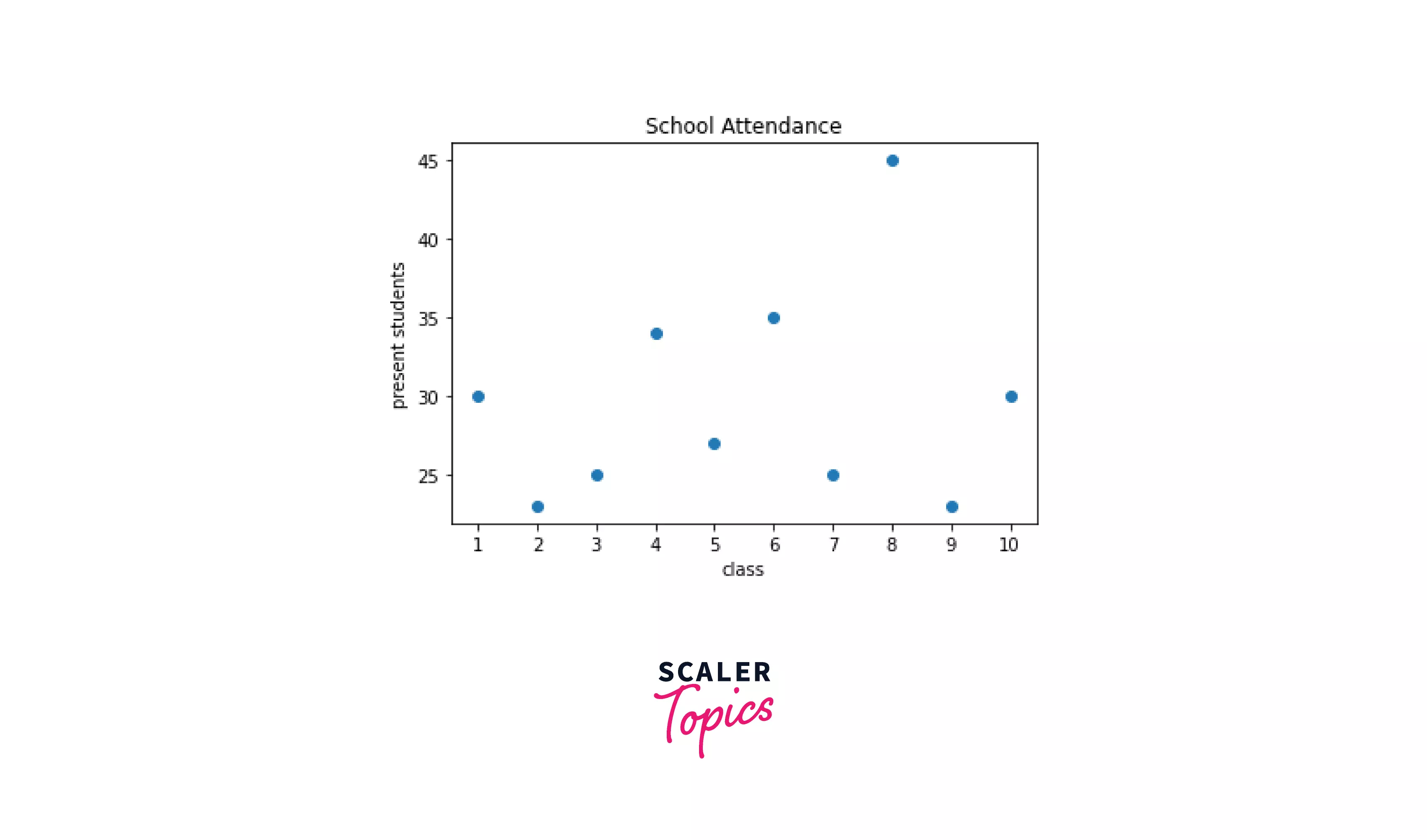
Example: Showing the relationship between the number of students present in each class
Output: Scatter plot showing the relationship between variables
Code explanation:
Scatter plot showing the relationship between variables
- Importing the required module.
- List "x" is data on the x-axis, and list "y" is data on the y-axis.
- Setting the x and y labels using the function Matplotlib.pyplot.xlabel() and Matplotlib.pyplot.ylabel().
- Set the plot title using the Matplotlib.pyplot.title() function.
- Matplotlib.pyplot.xticks(), which takes an array or list as an argument, is used to set the interval of the x-axis.
- Matplotlib.pyplot.scatter() is used to graph a scatter plot.`
- Matplotlib.pyplot.show() is used to show the plot.
Scatter() function takes many parameters, including marker size, the color of the dots, blending value, and linewidth. We can use different parameters to graph a detailed scatter plot.
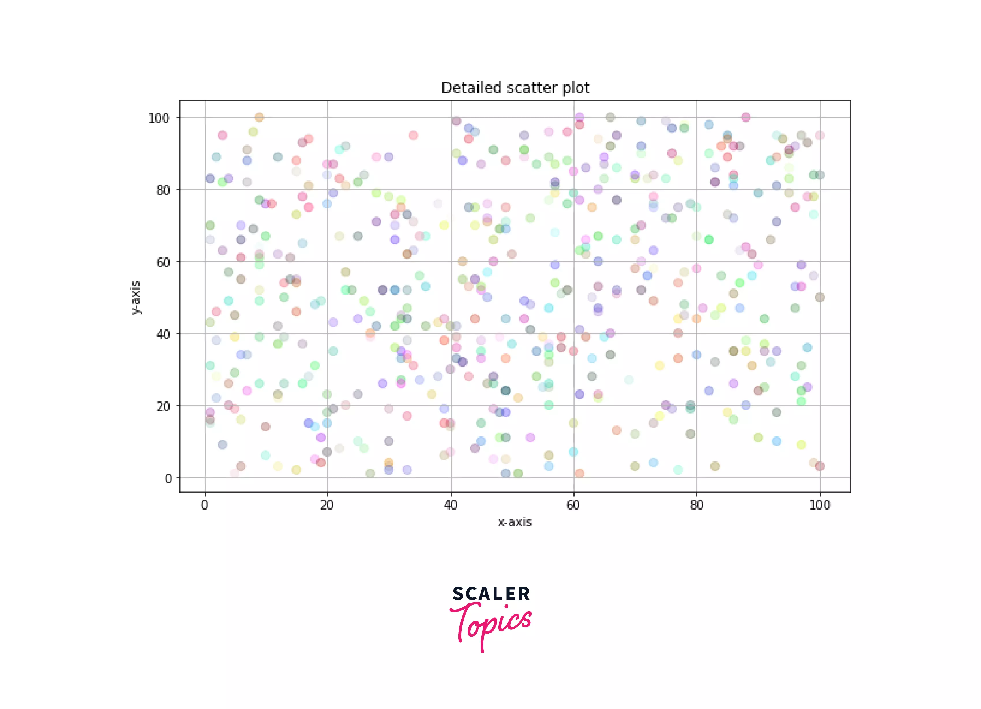
Example: A detailed scatter plot
Output: A detailed scatter plot
Code explanation:
Detailed scatter plot
- Importing the required module.
- matplotlib.pyplot.rcParams["figure.figsize"] is used to change the size of the graph and can be adjusted according to the data it holds.
- random.randint() generates a random number but a list of random numbers. We need to use a for loop with it.
- Matplotlib.pyplot.scatter() is used to plot a scatter plot where 's' is marker size, 'c' is color, and alpha is the blending value of the dots ranging from 0 to 1.
- In this example, a random color is generated for each dot using np.random.rand().
- Matplotlib.pyplot.grid() is used to show the grid in the graph.
- Matplotlib.pyplot.show() is used to show the plot.
Plotting Multiple Scatter Plots in Matplotlib
So there are two to Plot multiple scatter plots in matplotlib.
- Plotting data in the same graph.
- Using Subplots Plotting data in different graphs.
Turn Learning into Career Growth
Plotting data in the same graph
Multiple scatter plots can be graphed on the same plot using different x and y-axis data calling the function Matplotlib.pyplot.scatter() multiple times.
Example: Multiple scatter plots on the same graph
Output: Multiple scatter plots on the same graph

Code explanation: Multiple scatter plots on the same graph
- Importing the required module.
- x1,y1, and x2,y2 are the list of the data to visualize different scatter plots on the same graph.
- random.randint() generates a random number but a list of random numbers. We need to use a for loop with it.
- matplotlib.pyplot.scatter() function graphs two scatter plots.
- The first scatter plot has a red marker color, the linewidth is 2, the marker style diamond, the edge color of the marker is blue, the marker size is 70, and the blending value is 0.5.
- The second scatter plot has a marker color black, the linewidth is 2, the marker style pentagon, the edge color of the marker is red, the marker size is 150, and the blending value is 0.5.
- Matplotlib.pyplot.show is used to show the plot.
Plotting multiple scatter plots using subplots
Subplots in matplotlib allow us the plot multiple graphs on the same figure. Therefore, it can be used for multiple scatter plots on the same figure.subplot() function takes three arguments first and second arguments are rows and columns, which are used for formatting the figure. The third argument represents the index of the current plot.
Example: Multiple scatter plots using subplot
Output: Multiple scatter plot using subplots
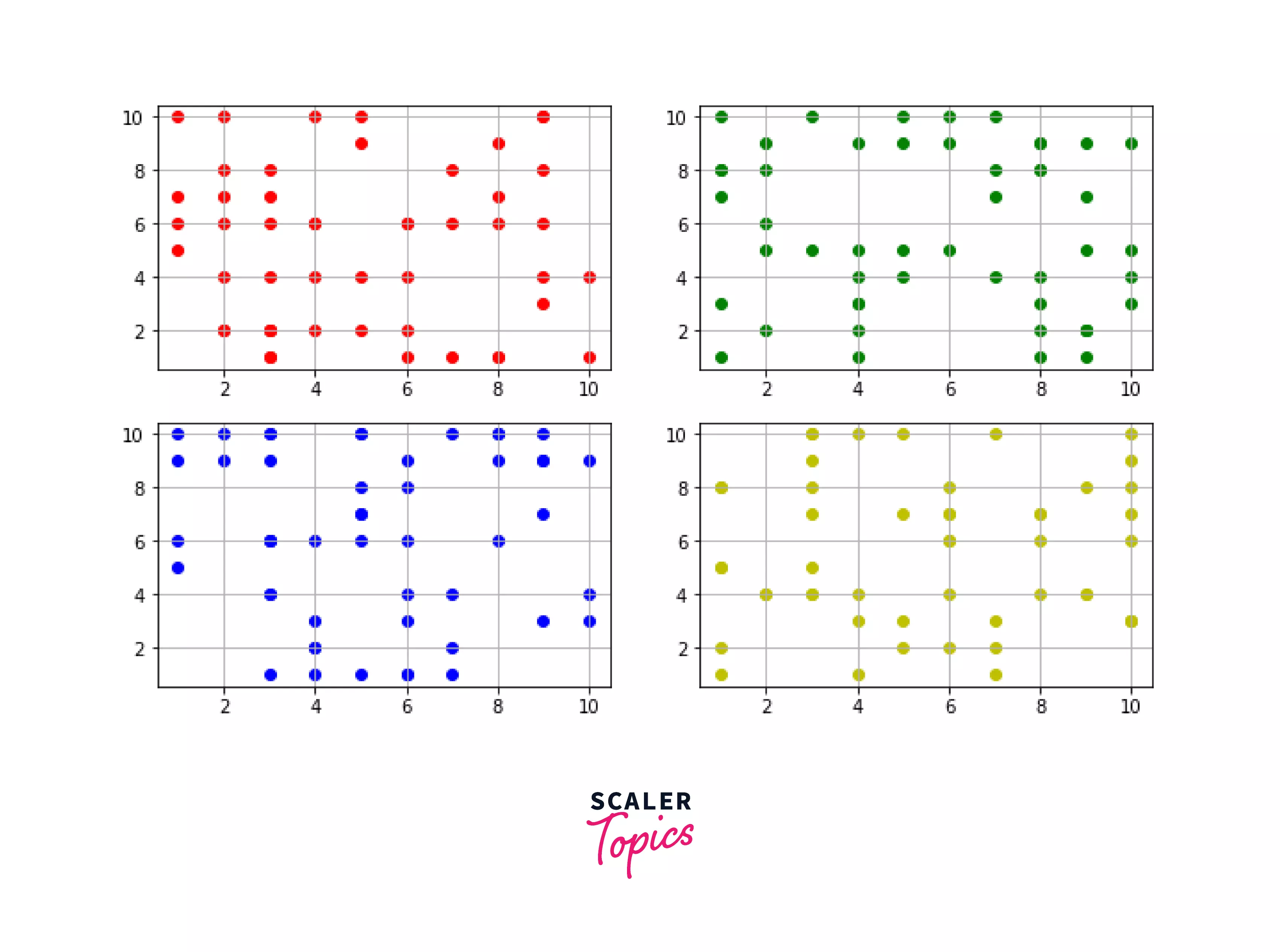
Code explanation: Multiple scatter plots using subplots
- Importing the required module
- matplotlib.rcParams["figure.figsize"] is used to set the size of the figure.
- matplotlib.subplot() plots multiple graphs on the same plot.
- (x1, y1), (x2, y2), (x3,y3), and (x4,y4) are the lists of values of the respective subplots.
- random.randint() and the for loop generate a list of random numbers.
- matplotlib.pyplot.scatter() is used to plot multiple plots on the same figure.
- matplotlib.pyplot.grid() is used to show the grid in the graph.
- matplotlib.pyplot.show() is used to show the figure.
Scatter Plot Examples
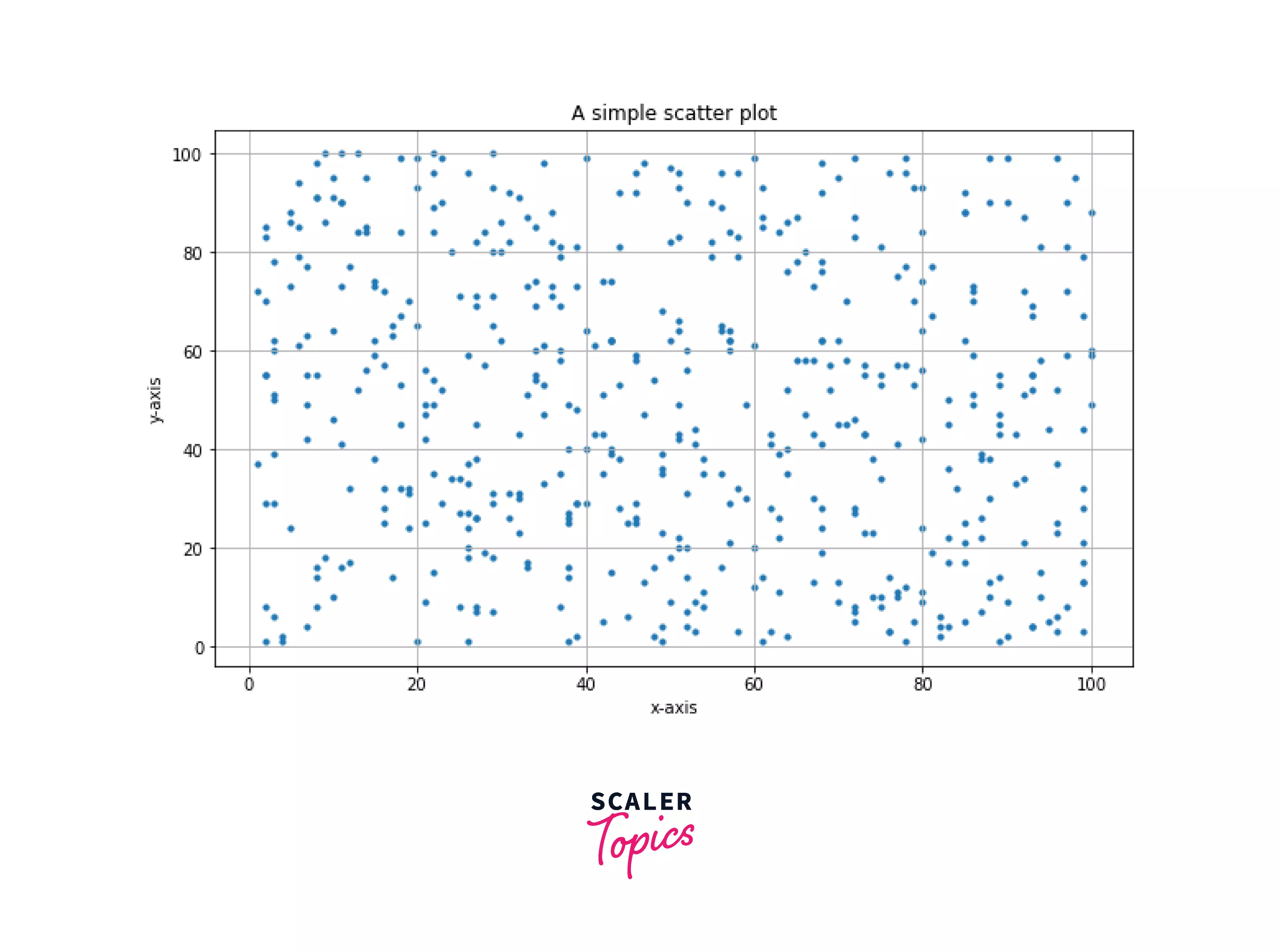
Example1: A simple scatter plot
Output:
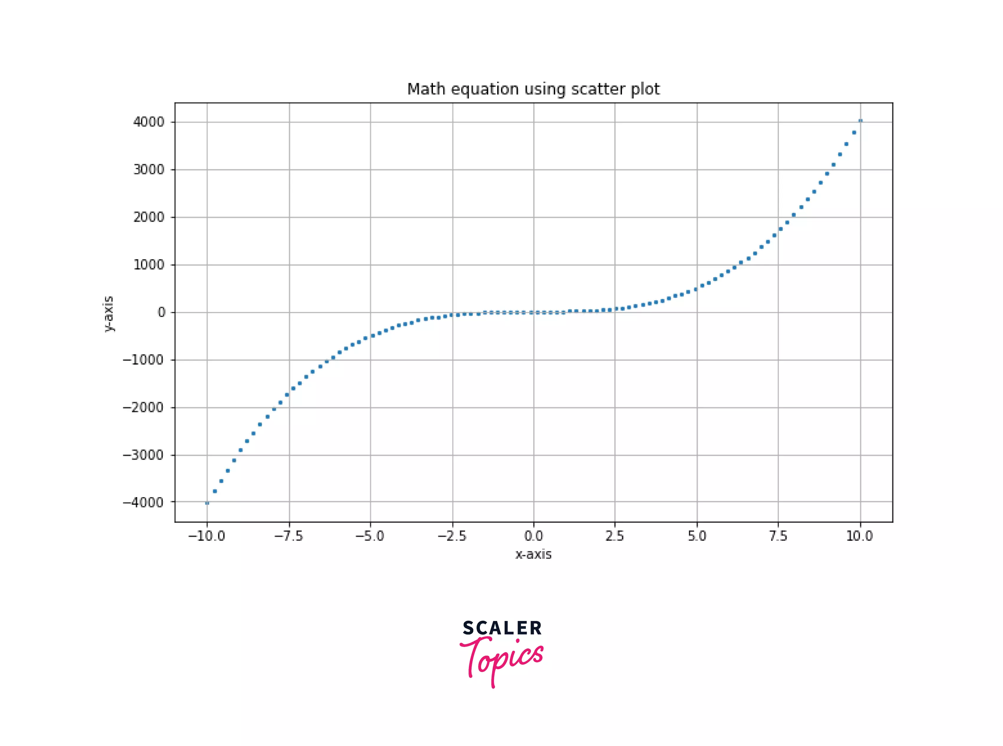
Example2: Math equation on the graph using scatter plot
Output:
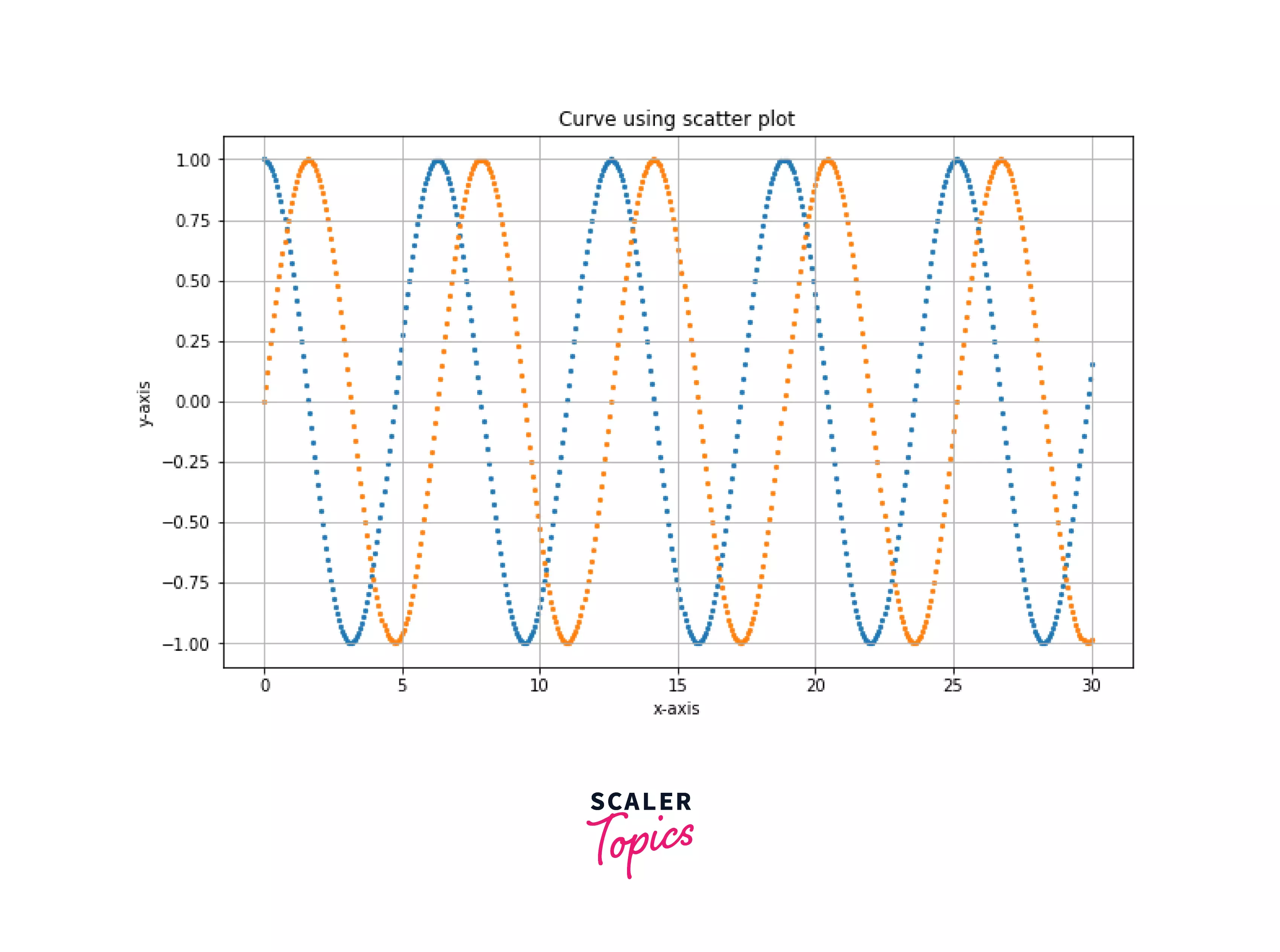
Example 3: Plotting trigonometric functions using scatter plot
Output:
Supercharge Your Data Science Career with Our Industry-Expert-Led Data Science Training Course. Enroll Now and Earn Your Certification!
Conclusion
- A Scatter plot is used to depict the relationship between variables and use dots to show their relationship
- Scatter() function takes at least two parameters to the plot.
- In the scatter() function, we can give more arguments to change the marker's shape, size, color, and area (dot).
- Plotting multiple scatter plots on the same figure can be done using the scatter() function multiple times or using subplots.