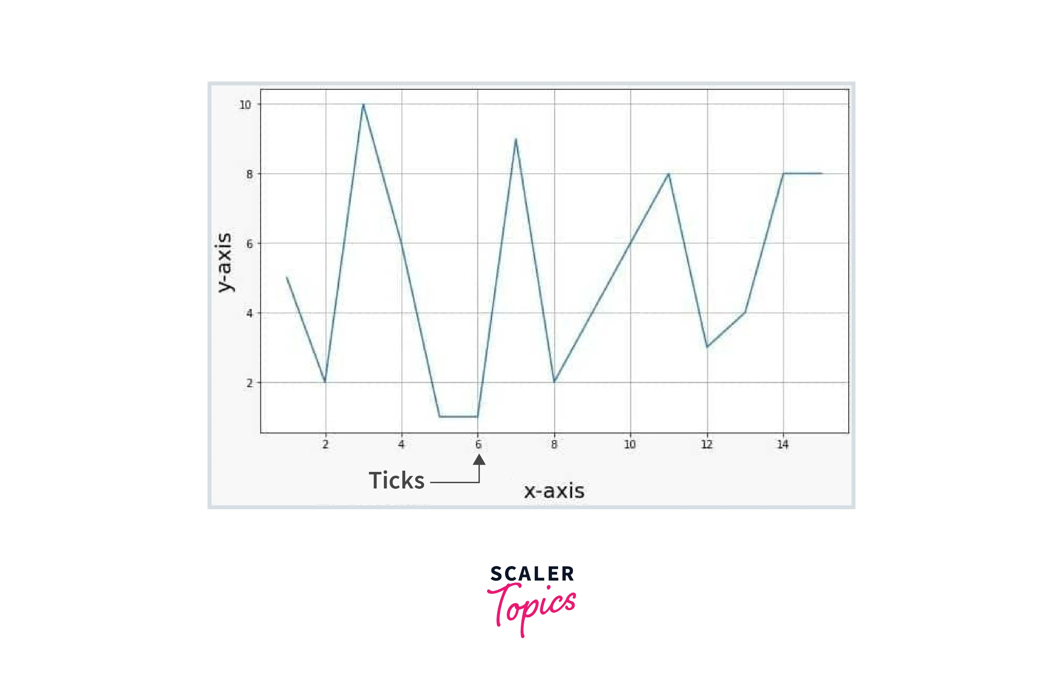
Ticks in Matplotlib
Overview
Matplotlib provides the libraries and functions to modify tick labels on a figure. When we plot data on a graph, tick labels are generated by default. Still, sometimes there is some need for customization, like tick labels are not scaled according to the graph, color is not appropriate, labels overlapping with each other, etc. Tick labels can be customized according to the need of the user, like font size, color, rotation, visibility, etc. There are many ways to customize the tick labels like matplotlib.pyplot.xticks(), ax.set_xticklabels(), matplotlib.pyplot.setp() and ax.tick_params(). We will discuss all the functions to understand better the concept and which function to use according to the scenario.
Ticks in Matplotlib
Ticks are the value on the axis to show the coordinates on the graph. It is the value on the axes by which we can visualize where will a specific coordinate lie on a graph. Whenever we plot a graph, ticks values are adjusted according to the data, which is sufficient in common situations, but it is not ideal whenever we plot data on a graph. So we will discuss the ticks in matplotlib and how we can customize it.
How to Add Ticks in Matplotlib?
By default, ticks are generated automatically when plotting data in matplotlib. First, we discuss the parameter and syntax of the function related to ticks.
Syntax:
- matplotlib.pyplot.xticks(ticks=None, labels=None, **kwargs)
- Axes.set_xticklabels(labels, *, fontdict=None, minor=False, **kwargs)
- Axes.tick_params(axis='both', **kwargs)
Parameters:
-
matplotlib.pyplot.xticks()
- ticks (optional parameter): The list of tick location
- label (optional parameter): The labels to place at a given ticks location.
- **kwargs: Text properties can be used to control the appearance of the labels.
-
Axes.set_xticklabels()
- label (optional parameter): The labels to place at a given ticks location.
- fontdict (optional parameter): A dictionary controls the appearance of the tick labels.
- minor (optional parameter): Whether to set the minor tick labels rather than the major ones.
- kwargs: Text properties can be used to control the appearance of the labels.
-
Axes.tick_params()
- axis: The axis to which parameters are applied
- kwargs: Text properties can be used to control the appearance of the labels.
How to Customize Axis Tick Labels in Matplotlib?
Sometimes we need to change the properties of the tick labels on the axis to make it more readable and clear, like we can change color, font size, etc.
Transform Your Career
Choose from our industry-leading programs designed for career success
Modern Software and AI Engineering Program
Master full-stack development with AI integration

Modern Data Science and ML with specialisation in AI
Advanced data science techniques with AI specialization
Advanced AIML with Specialisation in Agentic AI
Deep dive into AIML with focus on Agentic systems
DevOps, Cloud & AI Platform Engineering
Build and manage AI-powered cloud infrastructure
AI Engineering Advanced Certification by IIT-Roorkee
Premier AI engineering certification from IIT-Roorkee
Font Size of Tick Labels
We can change the font size of the tick labels by using these functions.
- matplotlib.pyplot.xticks(fontsize= )
- ax.set_xticklabels(xlabels, Fontsize= )
- matplotlib.pyplot.setp(ax.get_xticklabels(), Fontsize=)
- ax.tick_params(axis='x', Labelsize= )
Example1: Changing tick labels fontsize using xticks()
Output:
Example2: Changing tick labels fontsize using set_xticklabels()
Output:
Example3: Changing tick labels font size using setp()
Output:
Example4: Changing tick labels fontsize using tick_params()
Output:
Color of Tick Labels
We can also change the color of the tick labels. There are three ways to do it.
- matplotlib.pyplot.xticks(color= )
- ax.set_xticklabels(xlabels, color= )
- ax.tick_params(axis='x', colors= )
Example1: Changing color of tick labels using sticks()
Output:

Example2: Changing tick labels color using set_xticklabels()
Output:
Example3: Changing tick labels color using tick_params()
Output:
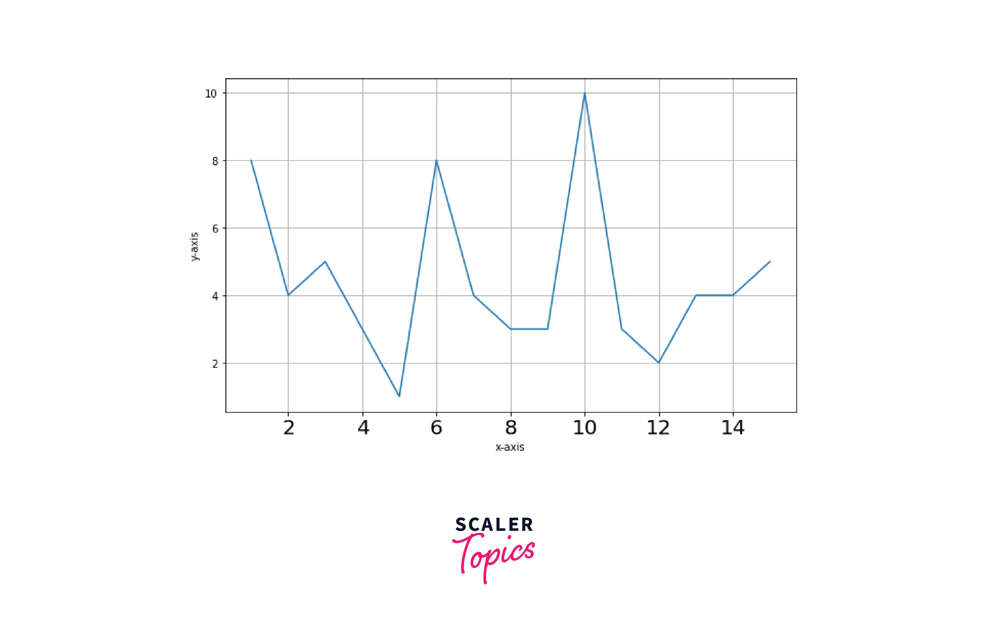
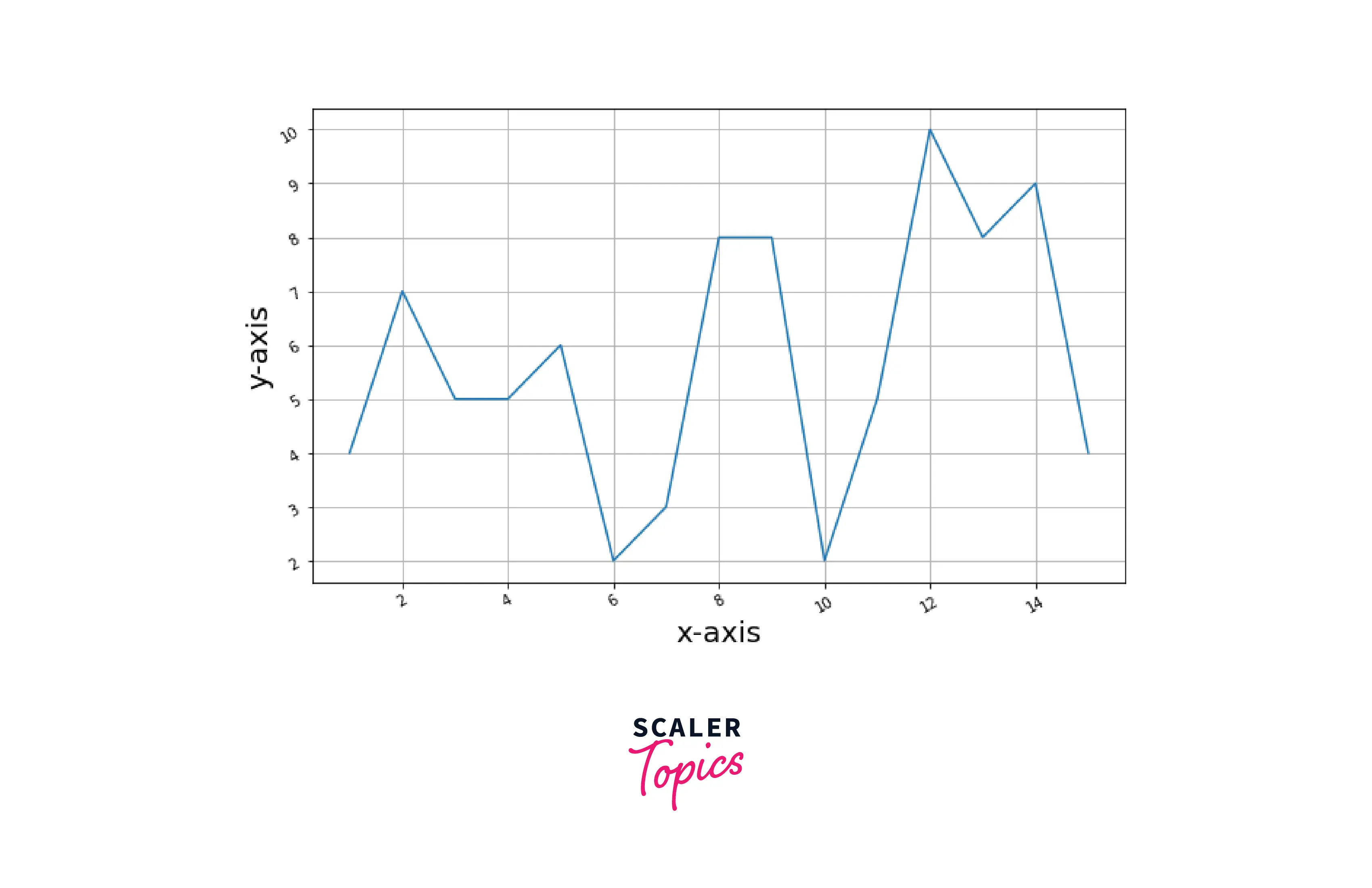
Controlling Tick Spacing
Ticks are generated automatically when we plot data in matplotlib, but we can also change the frequency of the tick labels using the functions xticks() and yticks().
Example:
Output:
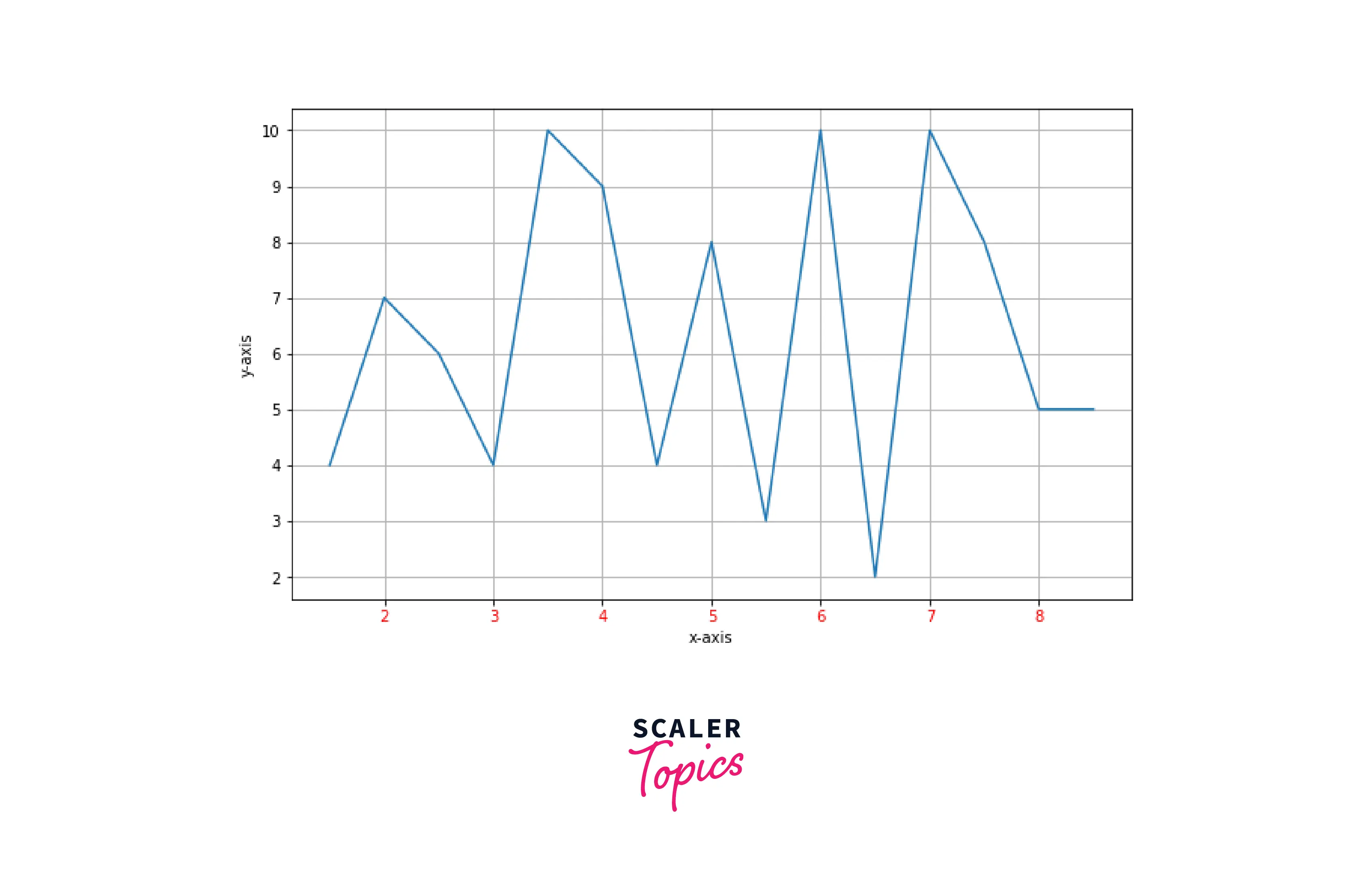
Controlling Tick Labeling
We can also label the ticks. Here is an example.
Output:
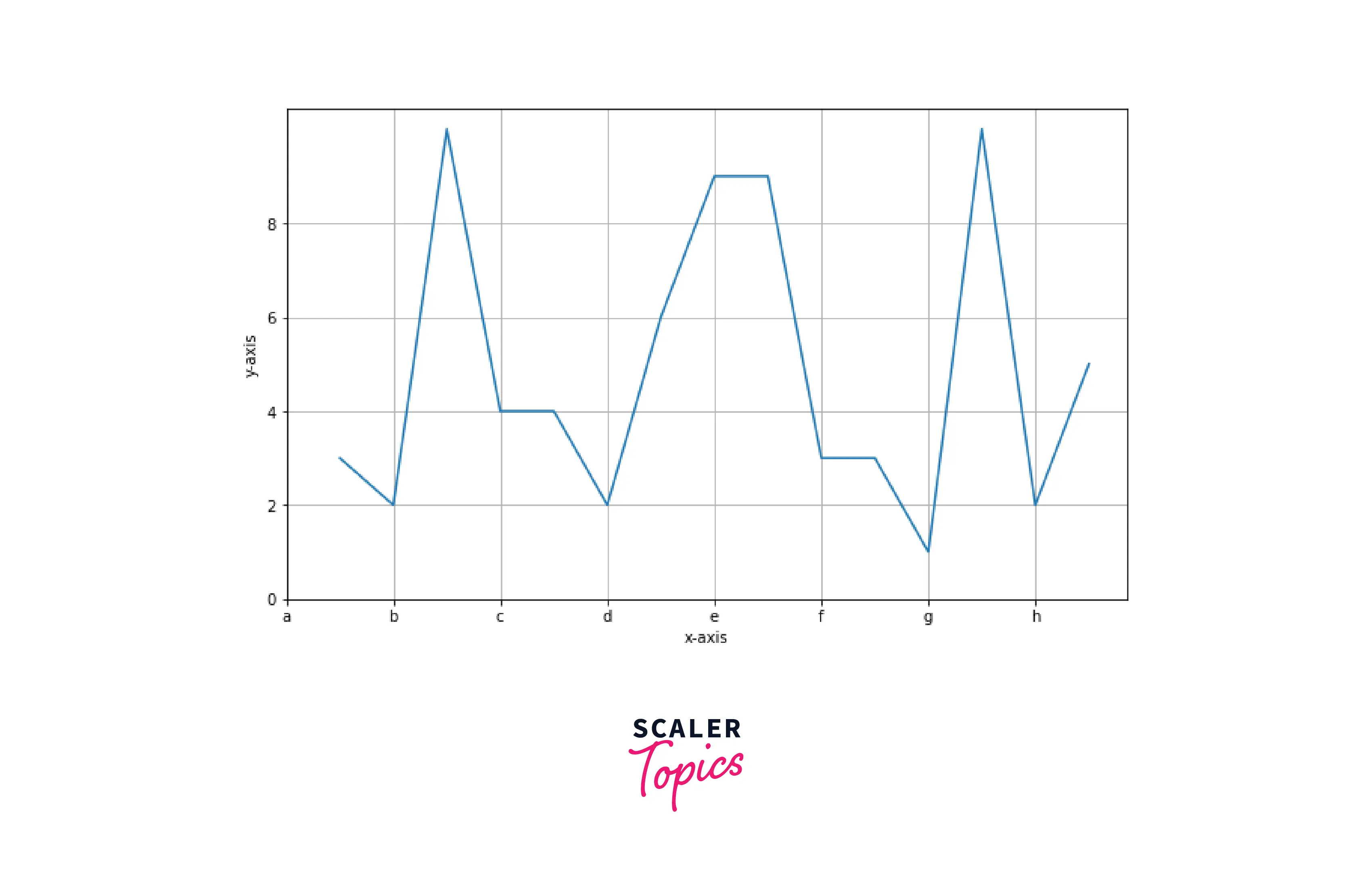
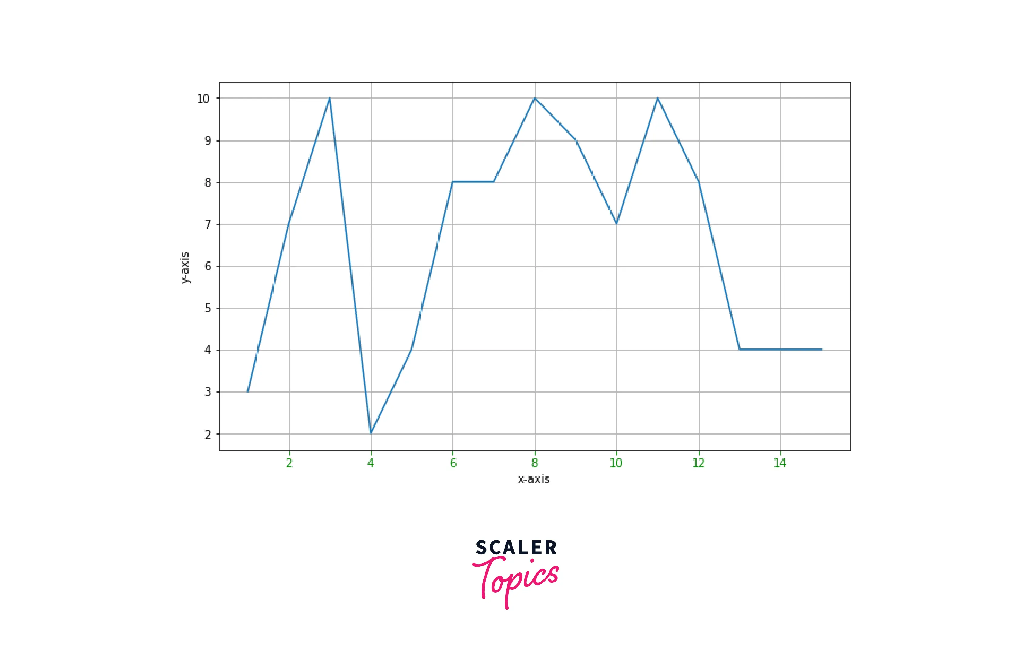
Rotation of Tick Labels
Sometimes tick labels overlap, so we can rotate them to make them more readable. There are three functions to do it.
- matplotlib.pyplot.xticks() and matplotlib.pyplot.yticks()
- matplotlib.pyplot.subplot().set_xticklabels() and matplotlib.pyplot.subplot().set_yticklabels()
- matplotlib.pyplot.tick_params()
Example1: Rotating the tick labels using xticks() and yticks()
Output:
Example 2: Rotating the tick labels using set_xticklabels()
Output:
Example3: Rotating the tick labels using tick_params
Output:
Turn Learning into Career Growth
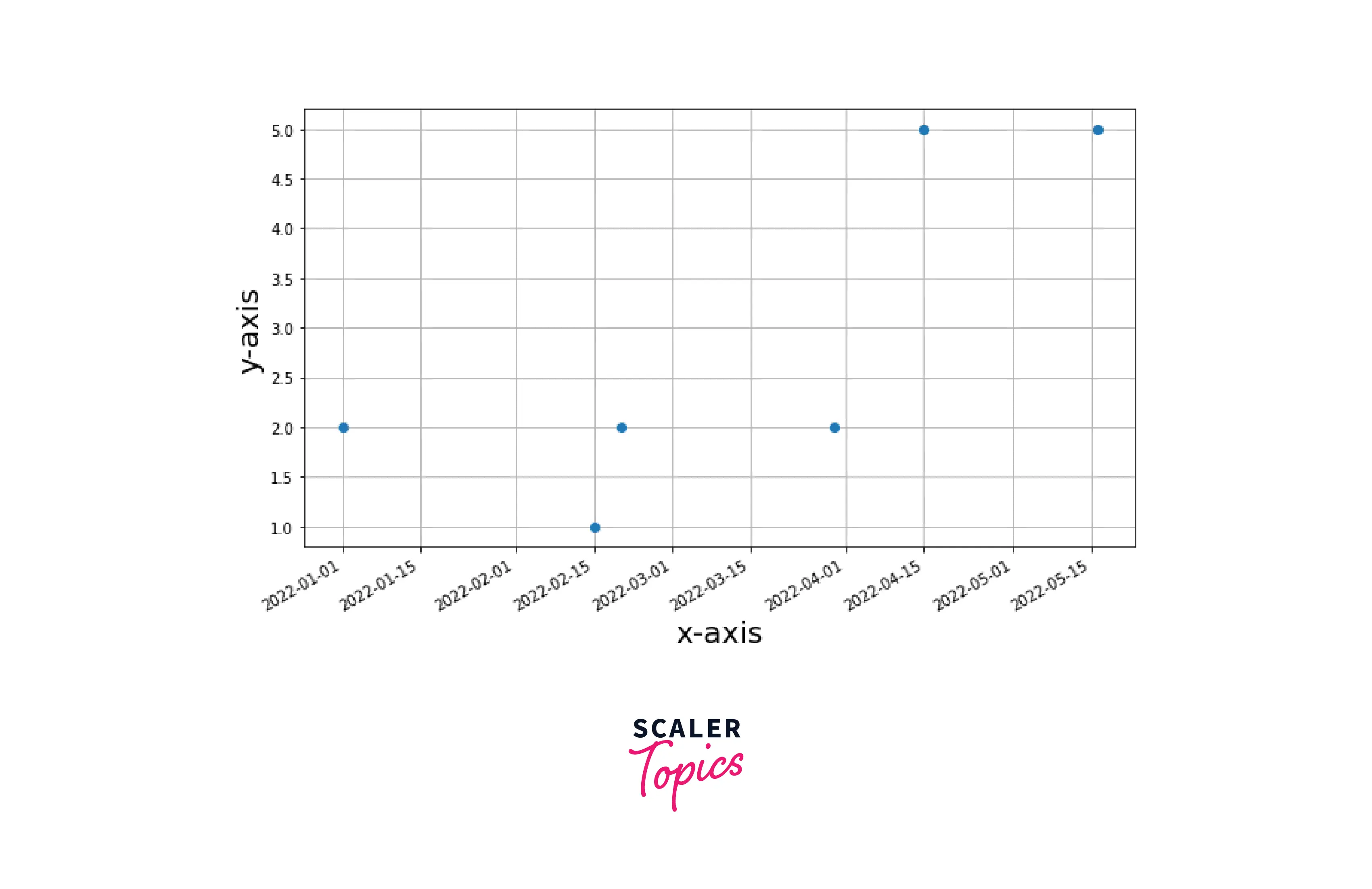
Dates as Tick Labels
We can also use the date as a tick label on x-axis. matplotlib.pyplot.plot_date() is the function to plot date on graph. The autofmt xdate() is used to format the date on x-axis.
Example:
Output:
Labelpad of Tick Labels
By adding the pad parameter, we can change the spacing between the axis and the tick labels using the tick_params() function. Example:
Output:
Setting Visibility of Tick Labels
We can change the visibility of tick and axis labels in the graph. There are three ways to do it.
- Using NullLocator() function
- Using set_visibile() function
- Passing empty list in xtick() and yticks() function
Example1: Using NullLocator() function
Output:

Example2: Using set_visibile() function This function also removes grid and axis labels along with tick labels
Output:

Example3: Passing empty list in xtick() and yticks() function
Output:
Making the Tick Labels Bold
We can be also bold the tick labels. There are two ways to do it.
- By using xticks() and yticks() functions.
- By using set_xticklabels() and set_yticklabels() functions.
Example1: By using xticks() and yticks() functions
Output:

Example2: By using xticklabels() and yticklabels() functions.
Output:
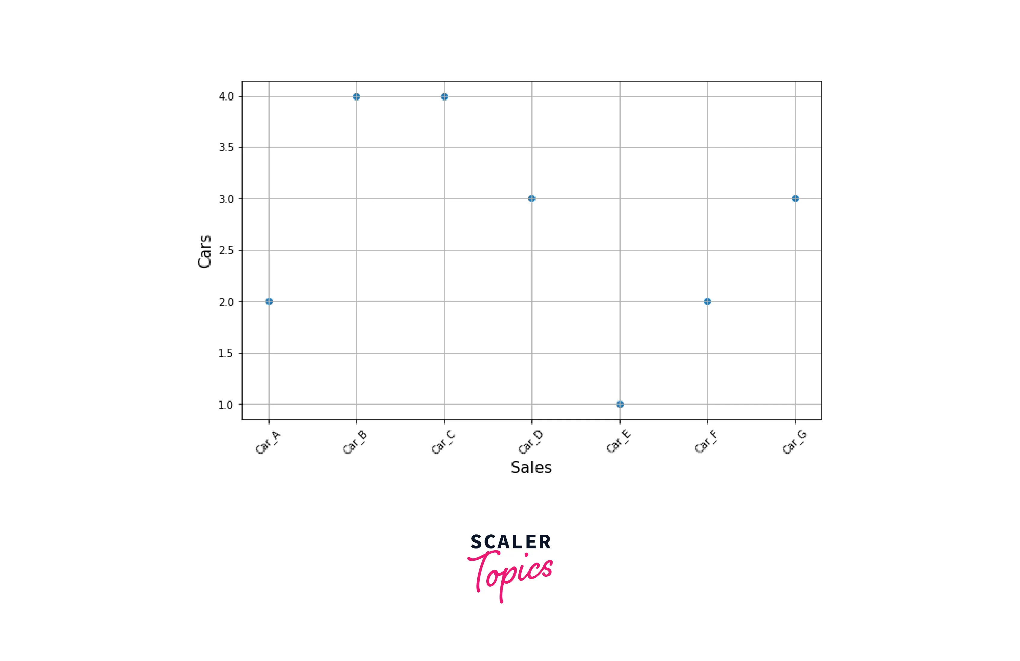
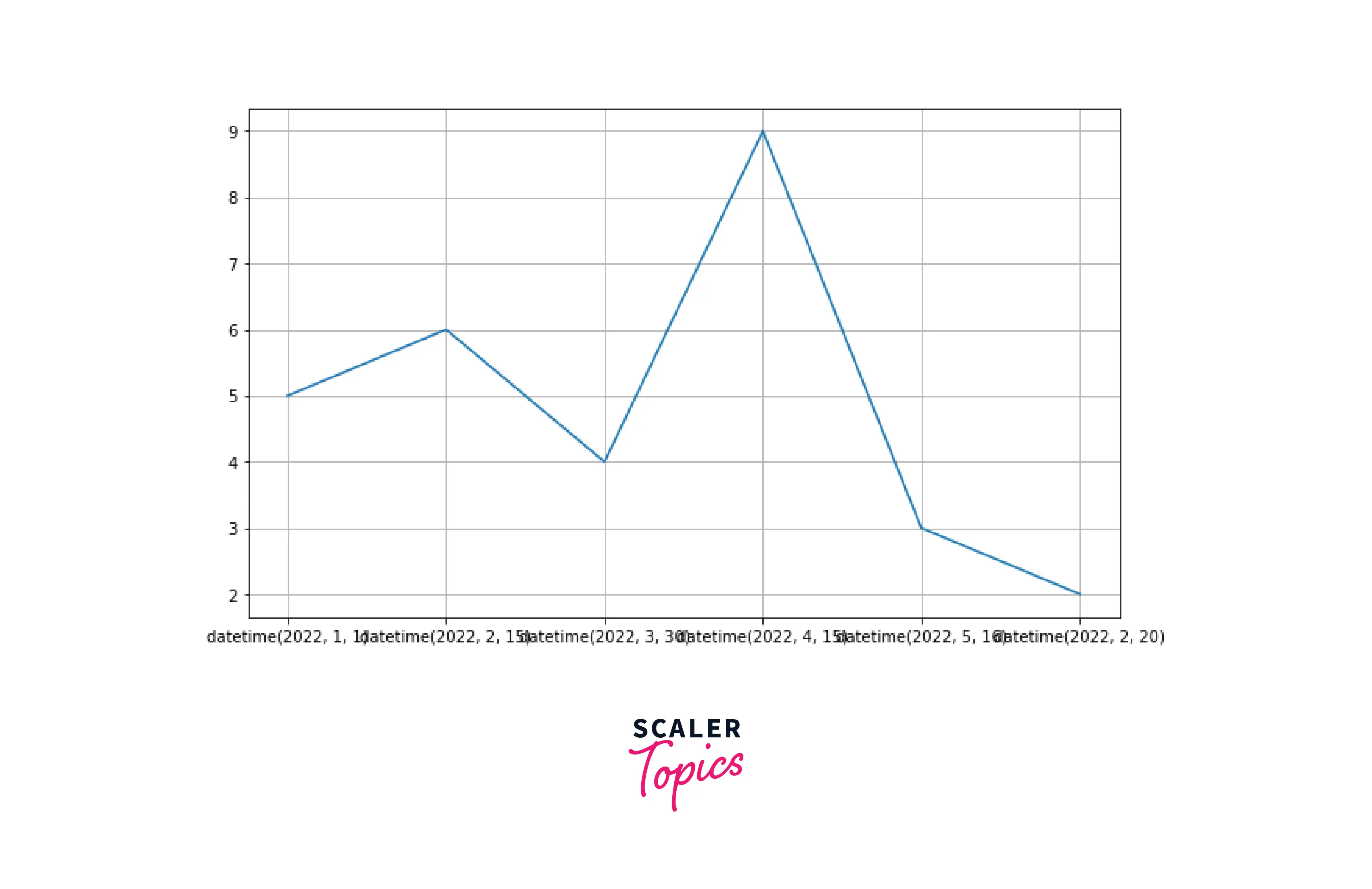
Overlapping in Tick Labels
When we plot data in a graph, sometimes the label of the x or y-axis overlaps. To make the graph look neat, we have to format the labels. We can use setp() function to rotate and align the labels to avoid overlapping.
Example1: Before using the function:
Output:
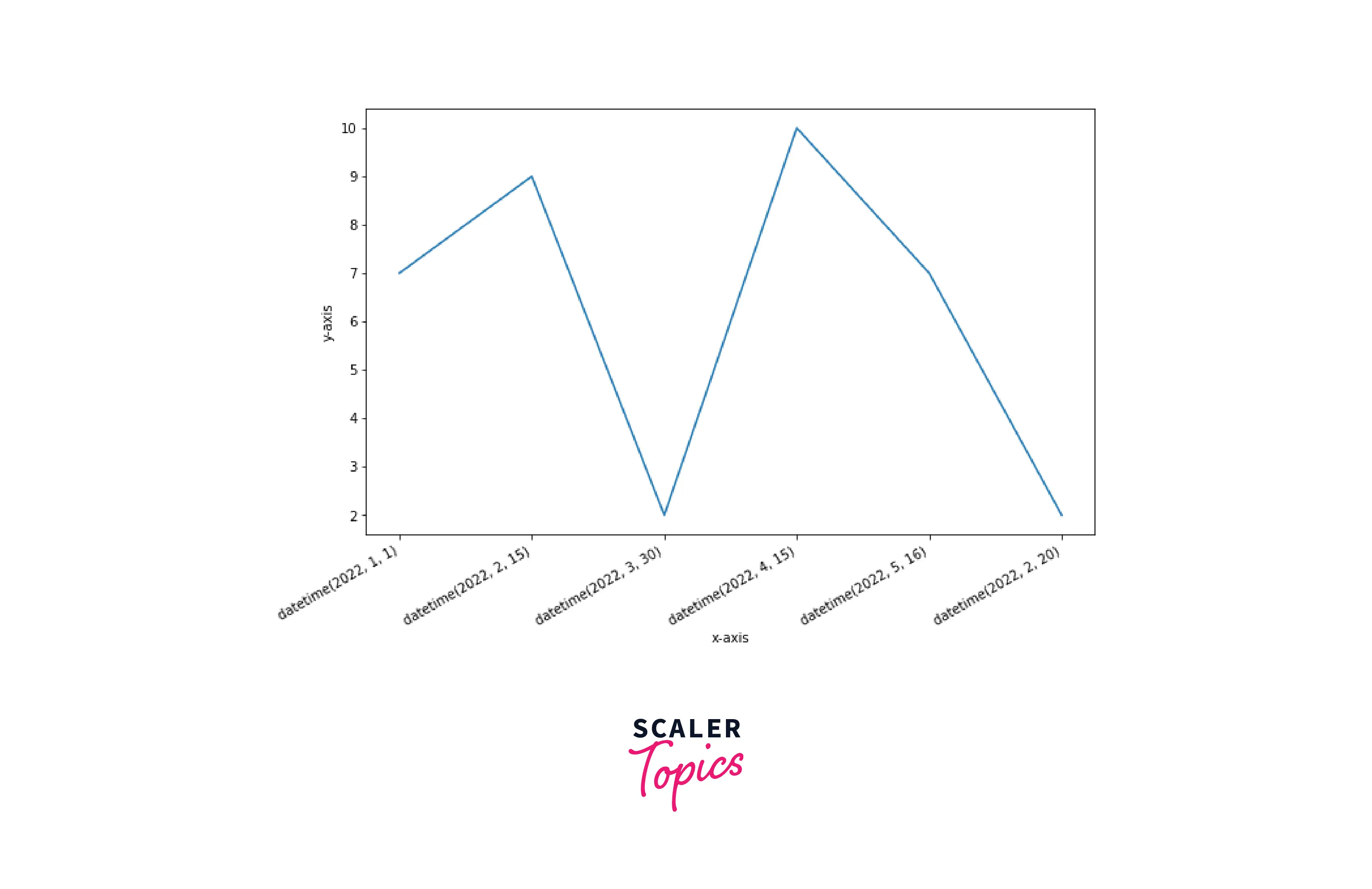
Example 2: Using the function setp() to adjust the x-axis labels
Output:
Scaler Placement Report and Statistics
Scaler learners achieved 2.5x salary growth with average post-Scaler CTC reaching ₹23L.
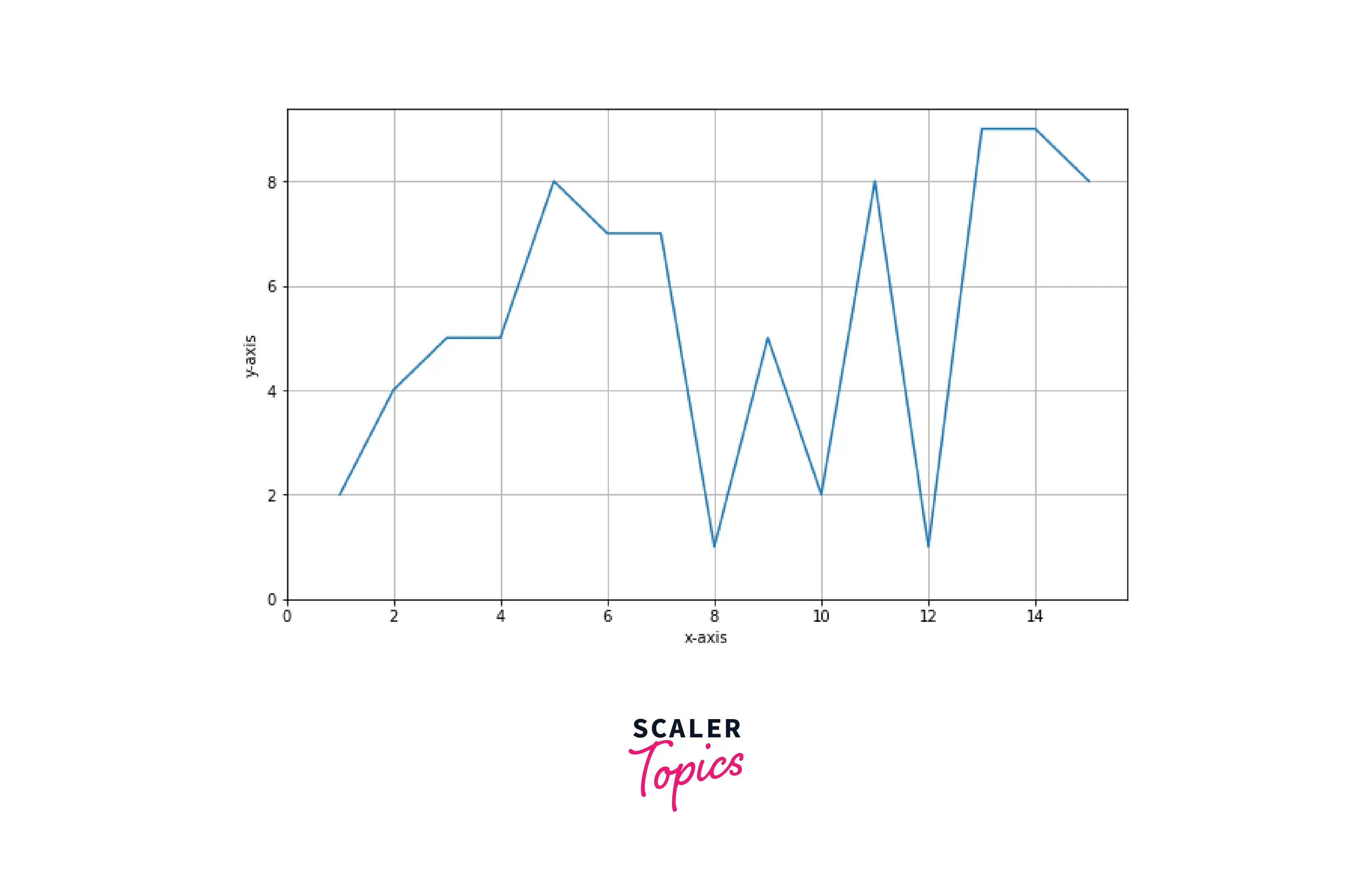
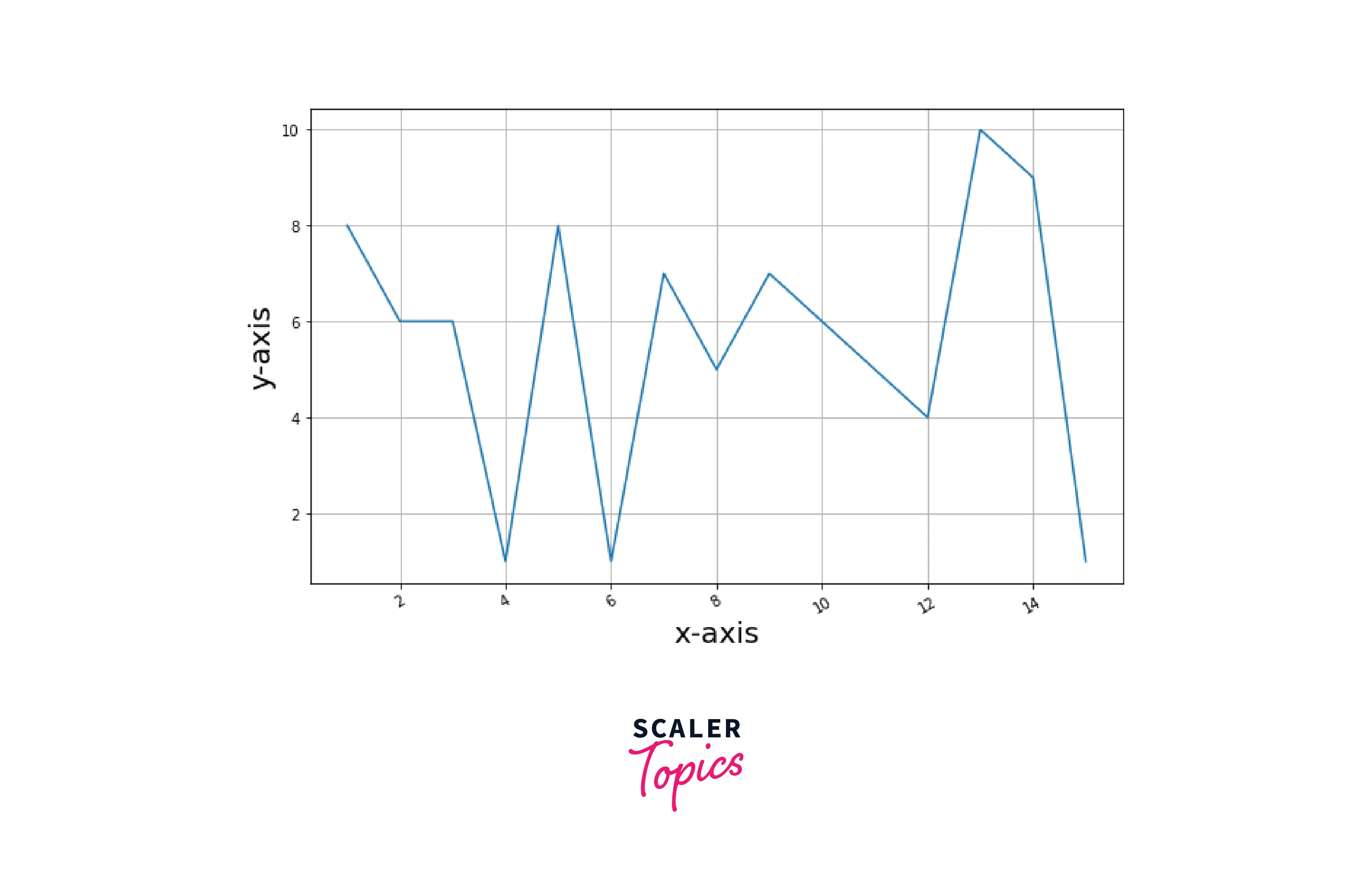
How to Set the Number of Ticks?
We can also specify the number of ticks on the axis. There is a function in pyplot by which we can change the number of ticks.
Syntax:
Output:

Supercharge Your Data Science Career with Our Industry-Expert-Led Data Science Training Course. Enroll Now and Earn Your Certification!
Conclusion
- Matplotlib automatically generates ticks in a graph, which is sufficient in the common situation but not ideal whenever we plot data.
- We can customize the tick labels in matplotlib.
- We can control the spacing and labeling of the tick label.
- Regarding text properties, we can customize the font size, color, rotation, visibility, etc., of ticks in matplotlib.