Violin Plots in Matplotlib

Overview
 Have you ever wondered, What is the best way to visualize a data set such that the interquartile range, median, and probability density are captured at once?
Violin plots make this task easy by summing up these things into a single visualization. The violin plot is a superset of a box plot combined with histogram data.
A violin plot represents all data that a box plot has: a marker showing the median, a bar representing the interquartile range, and all the data points of a given set.
What are Violin Plots in Matplotlib?
Matplotlib is one of the most popular python libraries used for data visualization. The popularity of matplotlib is because of its simple syntax and ease of programming. Matplotlib can create simple as well as complex graphs with a minimal amount of code.
Violin plots are used to visualize a numeric data set. They can be considered to have kernel density data combined over a box plot.
Consider the following violin plot
One can easily notice that the violin plot has all the data a box plot contains. It has both the upper and lower adjacent values, median, and mean of the data represented. In addition, the kernel density is also depicted in the figure using the blue bubble around the horizontal line.
The kernel density bubble tells the density of data at a point in Y-Axis. If the bubble is thicker at some value of Y-Axis, the density is higher at that point. For a narrow width or no width of the bubble, the density is very less or zero, respectively.
What does a Violin Plot Signify?
A violin plot is a combination of a box plot along with a histogram. A histogram shows the density distribution of data. A box plot shows the mean, upper adjacent value, lower adjacent value, and interquartile data. As seen in the figure below, the violin plot combines all these representations in one figure.
Here we can see
- The Median is represented by the white dot
- First Quartile is represented by the lower end of the bold bar
- The Third Quartile is represented by the upper end of the bold bar
- Lower Adjacent and Upper Adjacent Values are represented by the lower and upper end of the thin line
- The tubular bubble represents the density distribution of the data points
Transform Your Career
Choose from our industry-leading programs designed for career success
Modern Software and AI Engineering Program
Master full-stack development with AI integration

Modern Data Science and ML with specialisation in AI
Advanced data science techniques with AI specialization
Advanced AIML with Specialisation in Agentic AI
Deep dive into AIML with focus on Agentic systems
DevOps, Cloud & AI Platform Engineering
Build and manage AI-powered cloud infrastructure
AI Engineering Advanced Certification by IIT-Roorkee
Premier AI engineering certification from IIT-Roorkee
Syntax of a Matplotlib Violin Plot
The violin plot in matplot lib is plotted using violinplot() function. The function is available under matplotlib.pyplot.violinplot() package.
The violinplot() function has the following syntax.
Parameters of a Matplotlib Violin Plot
The syntax above highlights that the violinplot() function takes only one mandatory parameter, which is a dataset.
The dataset is either a data frame containing columns or a sequence of vectors. One violin will be plotted for each column(or each vector) in the dataset.
The optional parameters of violinplot() are:
| Parameter | Function |
|---|---|
| positions | It is an array-like data. Its default value is [1, 2, ..., n] The items in the array denote the positions of the violins to be plotted. The values of positions are used as a reference to determine the limits and ticks of the violins. |
| vert | It takes a boolean value. Its default value is True If this is set to False, it creates a horizontal violin plot. |
| widths | It is an array-like data. Its default value is 0.5 widths can be a vector or scalar value that sets the maximum width of each violin. The default value of 0.5 means each violin will use half the width of available horizontal space. |
| showmeans | It takes a boolean value. Its default value is False When it is True the plot will contain a line representing the means. |
| showextrema | It takes a boolean value. Its default value is True When it is True the plot will contain a line representing the extrema. |
| showmedians | It takes a boolean value. Its default value is False When it is True the plot will contain a line representing the medians. |
| quantiles | It is an array-like data. Its default value is None It takes a list of floats values ranging between [0, 1]. The list should contain one float value for each violin. Each float value will determine the number of quantiles that will be rendered for the particular violin. |
| points | It is an integer with a default value of 100 This value sets the total number of points to be considered for the Gaussian kernel density estimation. |
| bw_method | It takes a string, whose values can be either scalar or callable The method used to calculate the estimator bandwidth. This can be scott, 'silverman', a scalar constant, or a callable. If a scalar, this will be used directly as kde.factor. If a callable, it should take a GaussianKDE instance as its only parameter and return a scalar. If None (default), scott is used. |
| data | It can have a value as an indexable object If the indexable object is provided then the values are interpreted as data. Therefore it can also accept a string as input. |
Examples of Violin Plot in Matplotlib
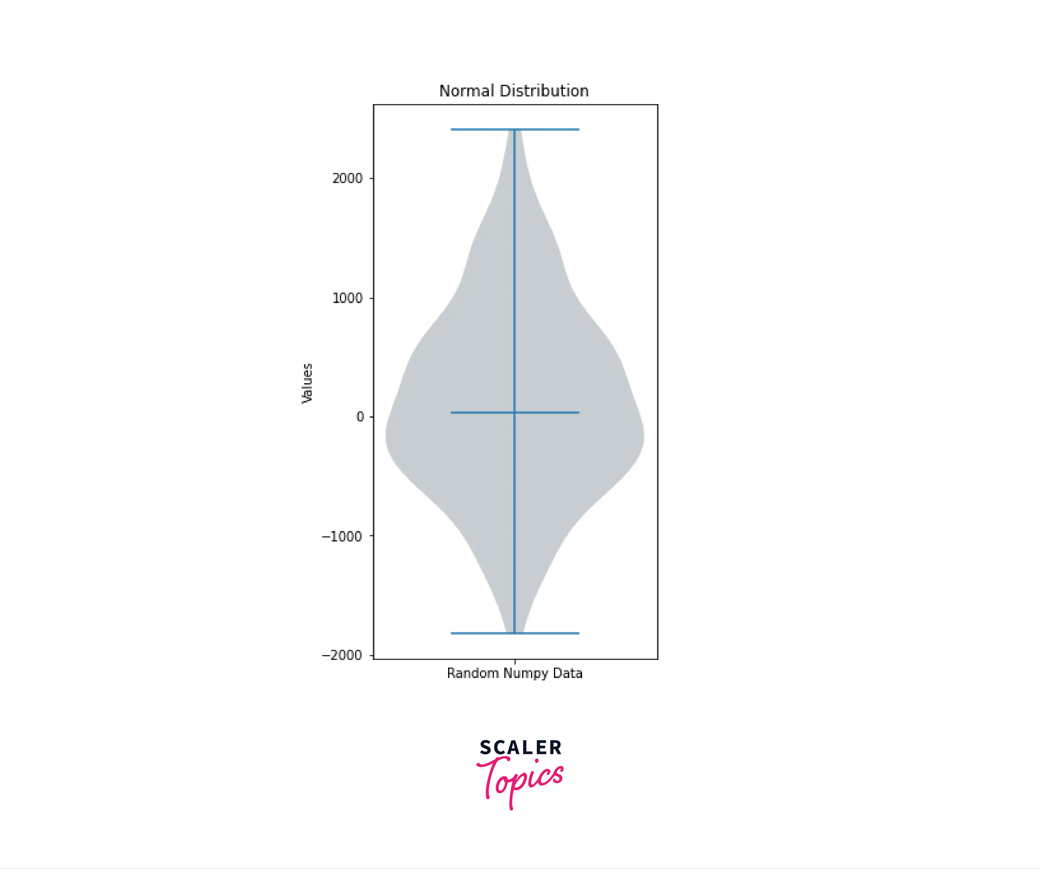
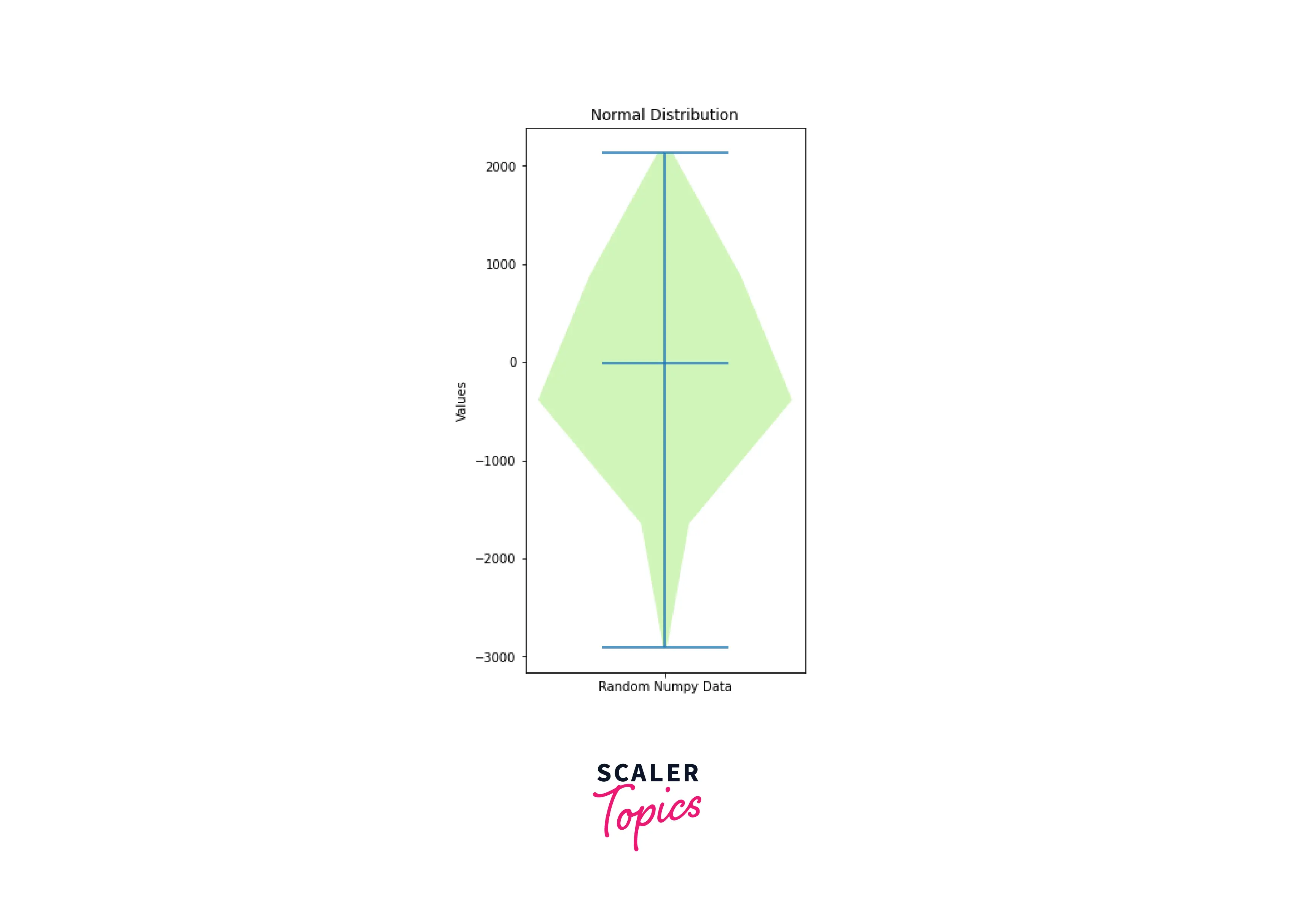
- We generate two violins using random numeric data generated by NumPy. The data is the plot using the matplotlib violinplot() function.
Output:
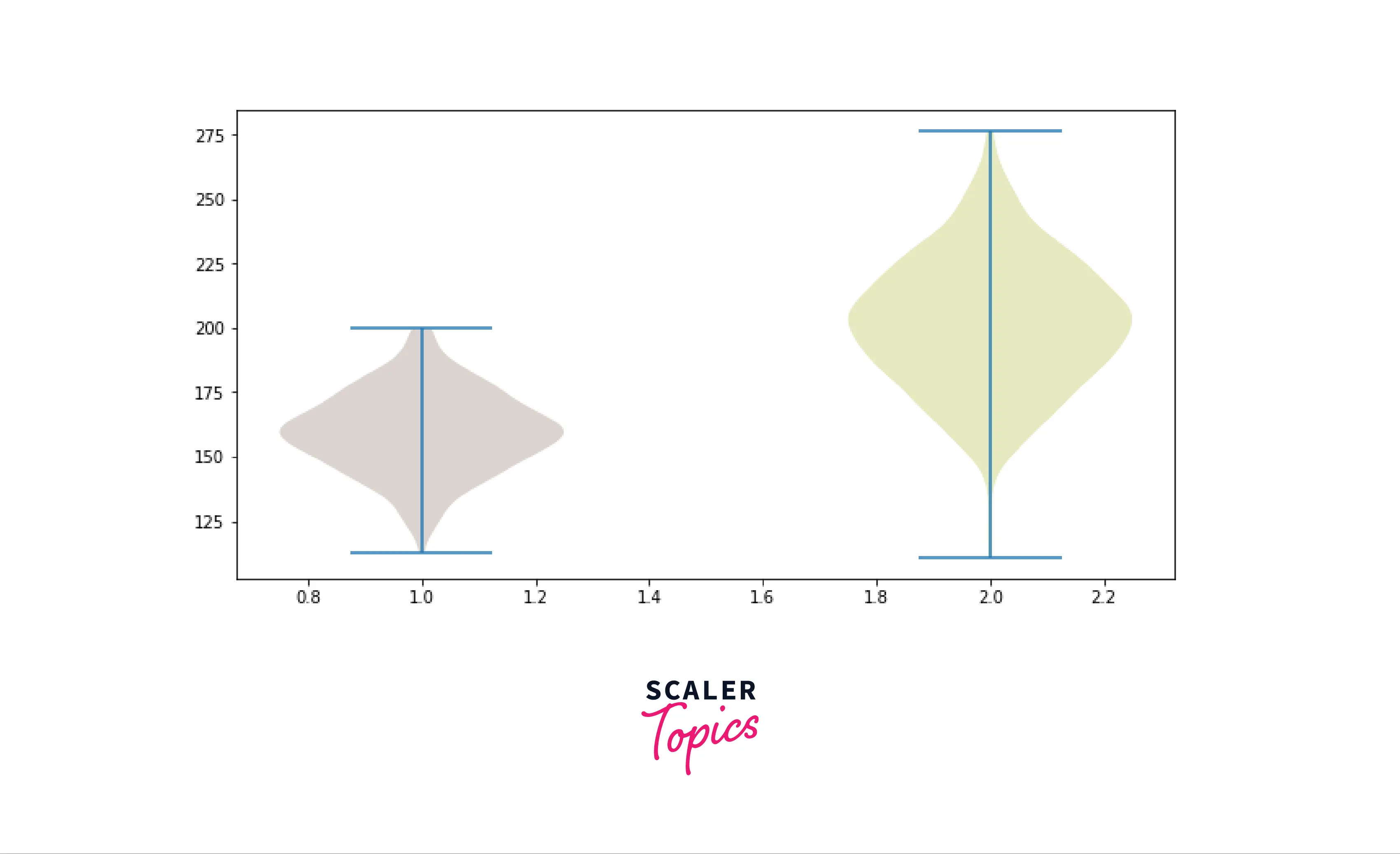
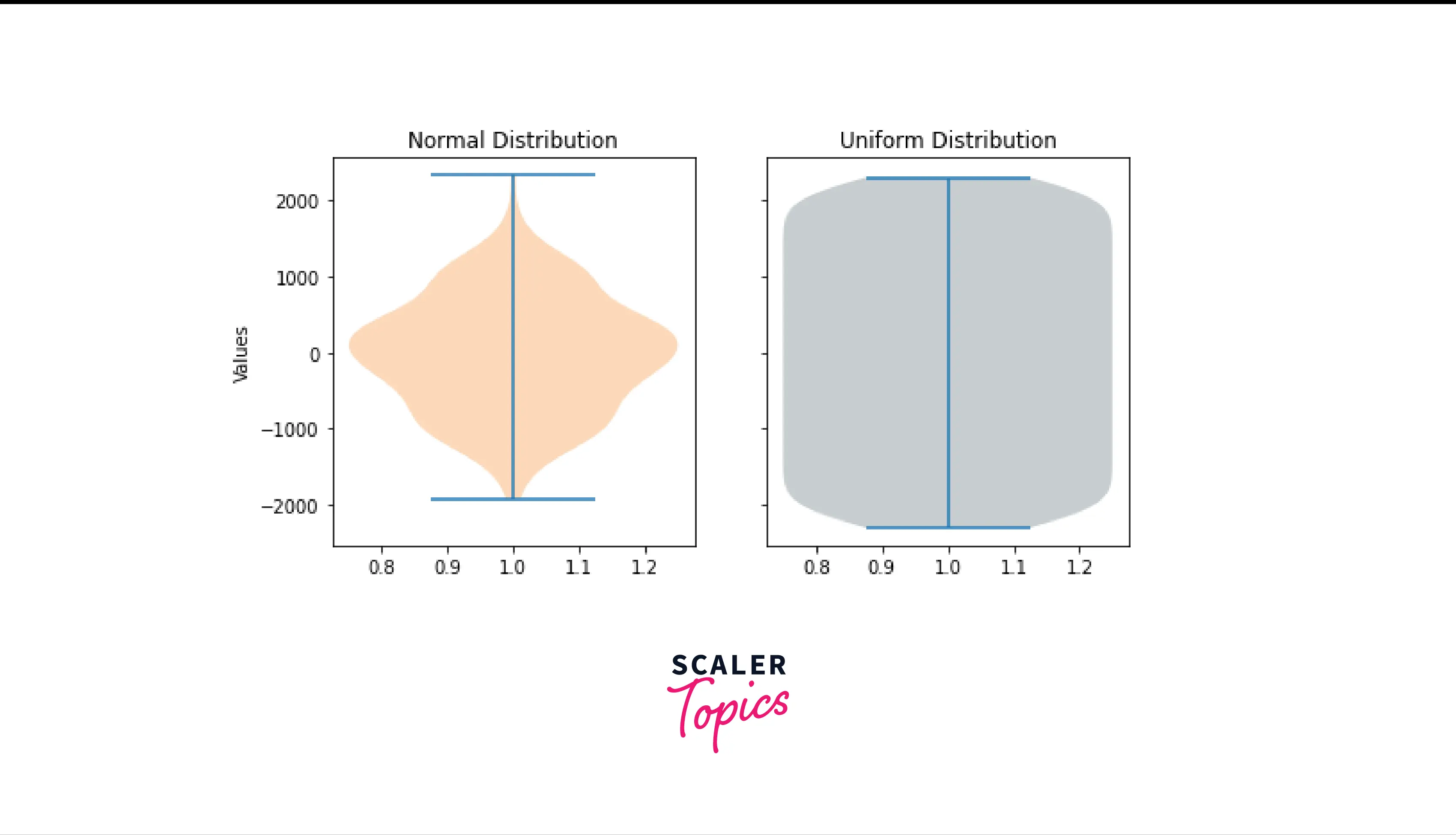
- We plot a violin plot to compare two data sets, one with normal data distribution(random values) and another with uniform data distribution(consecutive values)
Output:
Turn Learning into Career Growth
Customizing Violin Plots in Matplotlib
Following are a few ways to add customization to Violin Plots in Matplotlib.
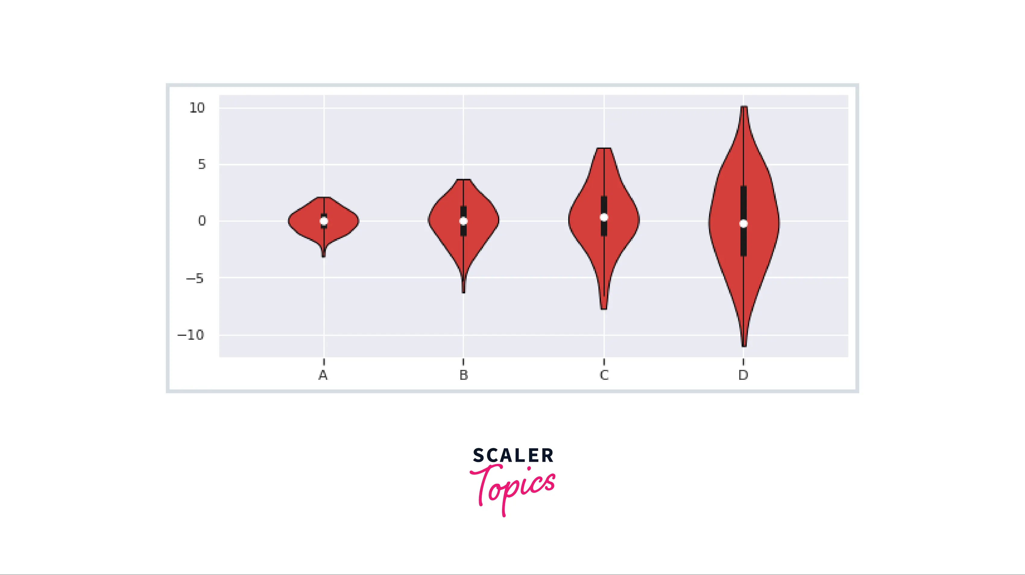
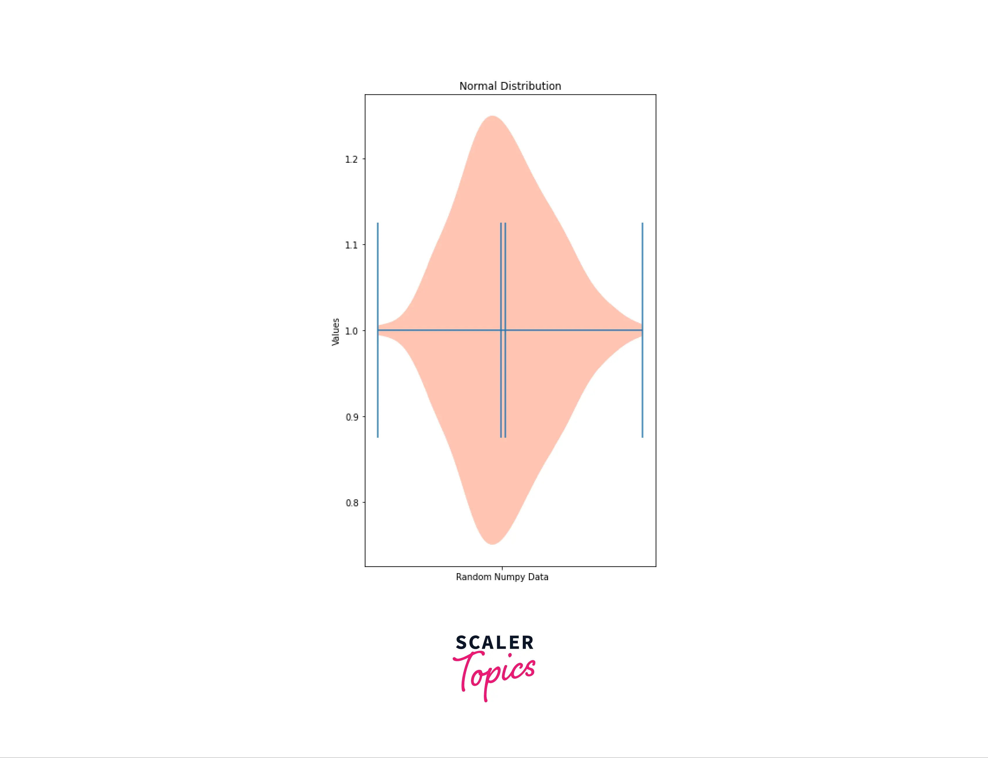
Adding X and Y Ticks
Graphs are more comfortable to interpret when one knows what kind of data each graph is representing. To add categorical information to the violin plot, labels on the x-axis are beneficial.
The labels on x-axis can be added using set_xticks() and set_xticklabels() functions.
Output:
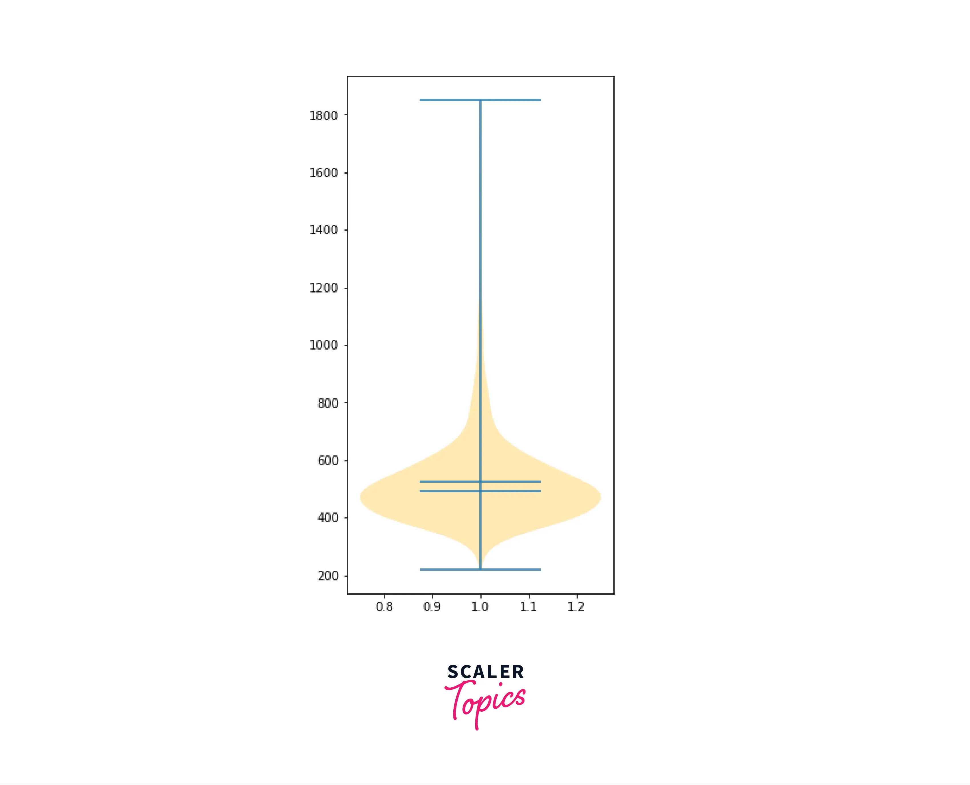
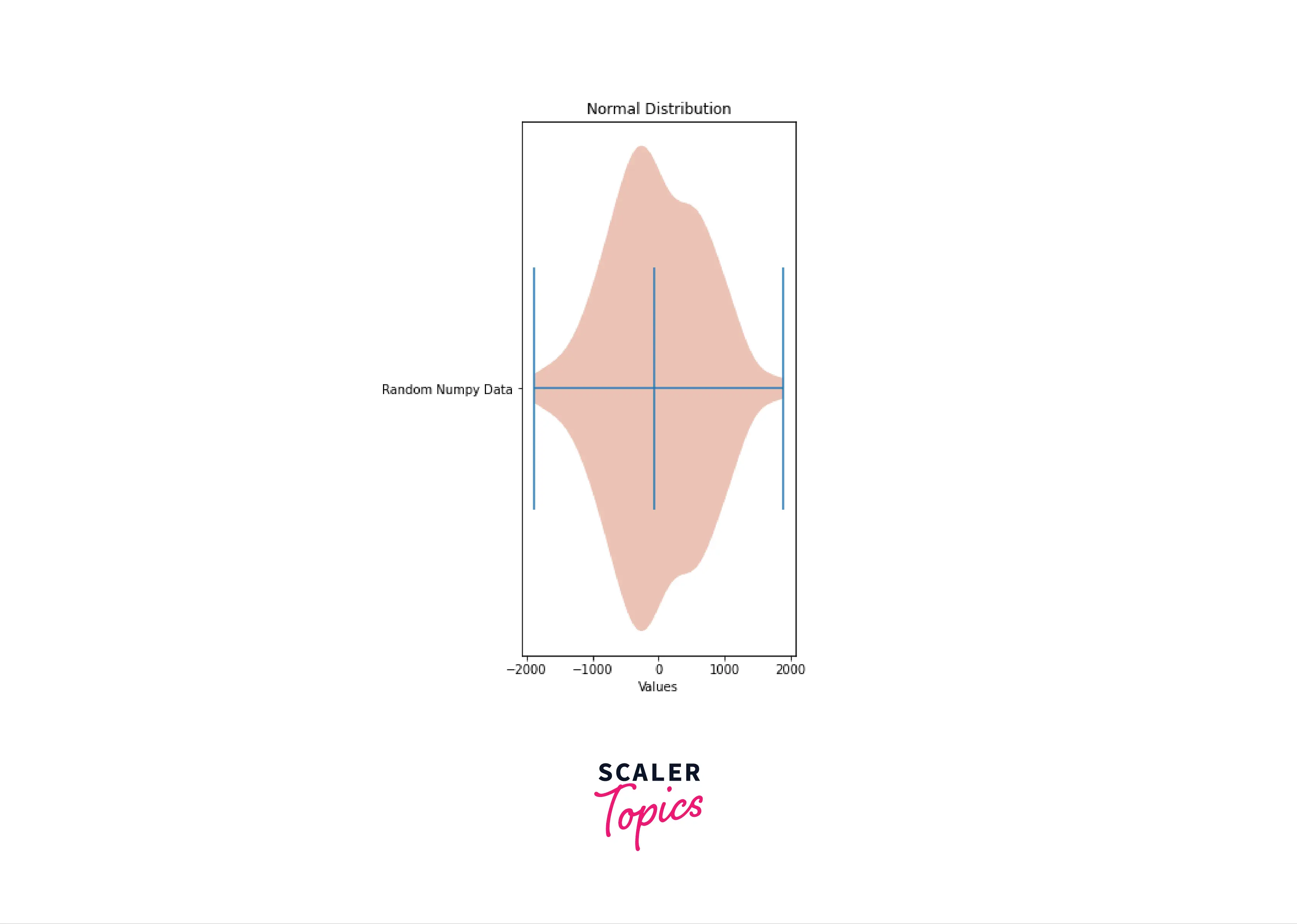
Plotting Horizontal Violin Plot in Matplotlib
To make the violin plot horizontal we need to set the parameter vert in violinplot() function to False. This will result in the violins being drawn horizontally.
Output:
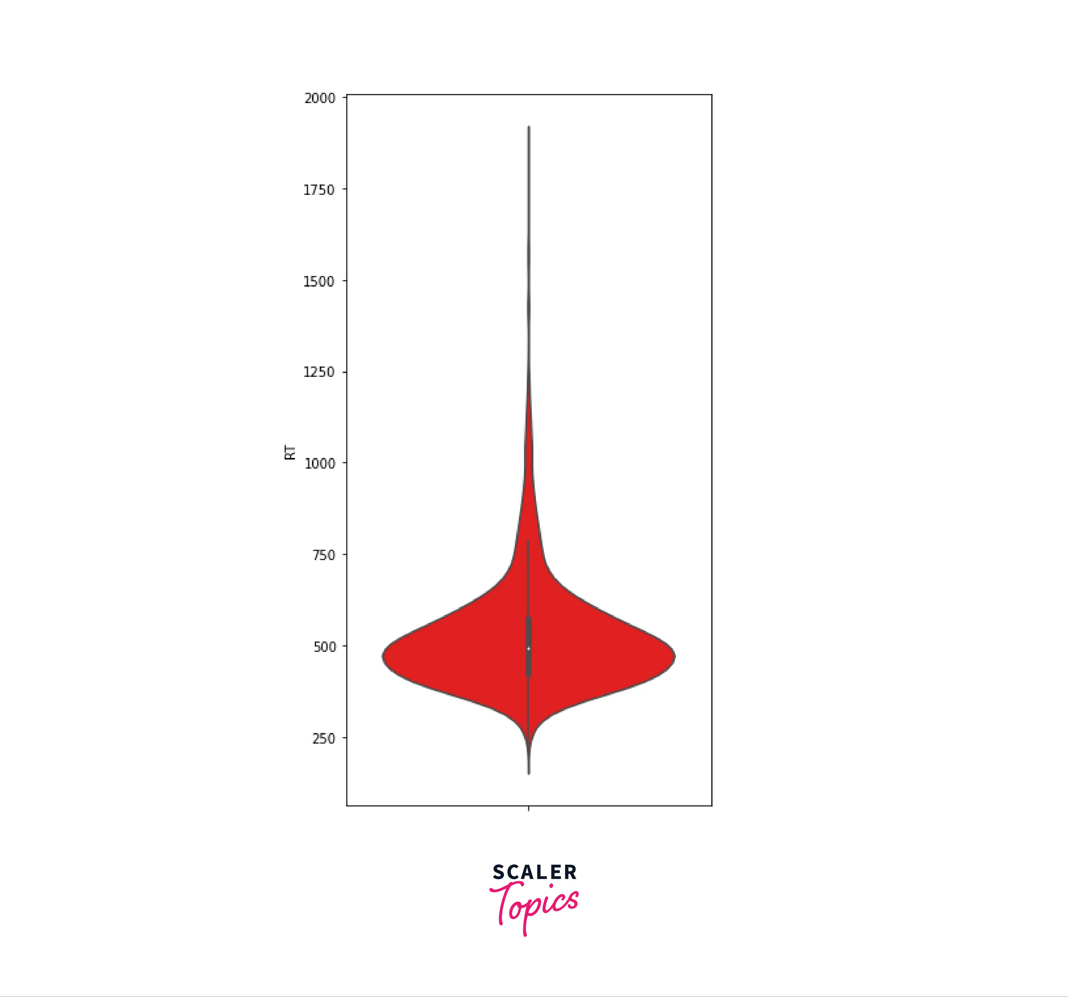
Showing Dataset Means in Violin Plots
We know that medians are an inherent property in a violin plot, but the matplotlib provides an additional option to calculate and represent the mean of the dataset. To show the mean on the violin plot we must set the parameter showmeans to True.
Output:
Customizing Kernel Density Estimation for Violin Plots
While generating the violin plot, the matplotlib library uses 100 points to calculate the Kernel Density Estimations. We can change the number of points by changing the value of thepoints parameter in violinplot() function.
Output:
Note: that a lesser value of the points will result in the distribution density representation being less accurate.
Conclusion
In this article, we have understood:
- What are violin plots in matplotlib
- The syntax and parameters of the violinplot() function in matplotlib
- Violin plots are more informative than box plots as they show kernel density distribution of data
- How to generate a violin plot from random NumPy data in matplotlib
- The customizations provided by violinplot() function
- Adding labels to each violin on the x-axis
- How to draw a horizontal violin plot
- Representing Mean value in a violin plot
- Customizing the number of points considered in kernel density estimation