Visualizing Non-uniform 2D Data
Overview
The science of analyzing unprocessed data to draw inferences about that information is known as data analysis. Many data analytics methods and procedures have been mechanized into mechanical procedures and algorithms that operate on raw data for human consumption. It is important as it helps developers and various businesses to optimize their models and performances. In this article, we will cover various ways of visualizing non-uniform two-dimensional data in Matplotlib.
Transform Your Career
Choose from our industry-leading programs designed for career success
Modern Software and AI Engineering Program
Master full-stack development with AI integration

Modern Data Science and ML with specialisation in AI
Advanced data science techniques with AI specialization
Advanced AIML with Specialisation in Agentic AI
Deep dive into AIML with focus on Agentic systems
DevOps, Cloud & AI Platform Engineering
Build and manage AI-powered cloud infrastructure
AI Engineering Advanced Certification by IIT-Roorkee
Premier AI engineering certification from IIT-Roorkee
Introduction
Using Matplotlib, we can visualize and generate information out of a lot of plots. To first learn about non-uniform 2D data, let's understand what data is.
The definition of data is "information and figures gathered together to make sense." Non-uniform data is the type of data that is not sorted or put in any necessary order. It is a bit tricky to work with these types of data, but we have some methods in Maths that help us to work around them, like Sampling and Probability Integral Transform. Well, more about them later.
Scaler Placement Report and Statistics
Scaler learners achieved 2.5x salary growth with average post-Scaler CTC reaching ₹23L.
How to Visualize Non-Uniform 2D Data?
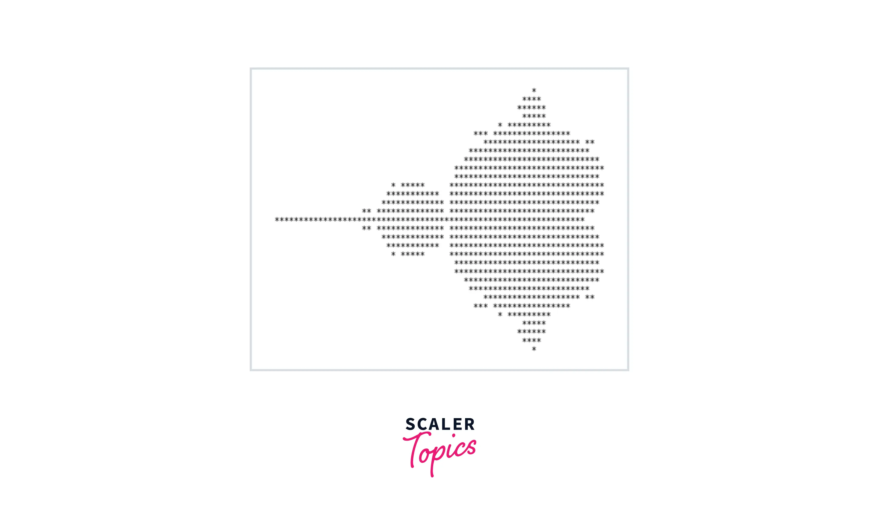
As we discussed earlier in this article, working with non-uniform 2D data might be a bit difficult. To demonstrate an example, let us take a Mandelbrot set. A Mandelbrot set is a set that represents highly complicated complex numbers, and the importance is that the data is represented in the form of a fractal; a set of infinite complex patterns, that are set across different scales. Here's what a Mandelbrot set looks like:
Output
With uniform data and uniform sampling functions, we get a perfect and precise Mandelbrot figure, as shown above. If we replace the data points of the Mandelbrot sets with some random values and use a random sampling function, we would have to deal with non-uniform 2D data. Let us dive into some ways by which we can deal with non-uniform 2D data using the features of Matplotlib.
Methods to Plot Non-Uniform Data
Turn Learning into Career Growth
Sampling
Without having to look into every person, sampling is a technique that enables us to learn information about the population based on data from a sample of that group. Sampling allows us to identify a population's features by directly observing only a small fraction (or sample) of the population, which allows us to draw inferences about populations from sampling.
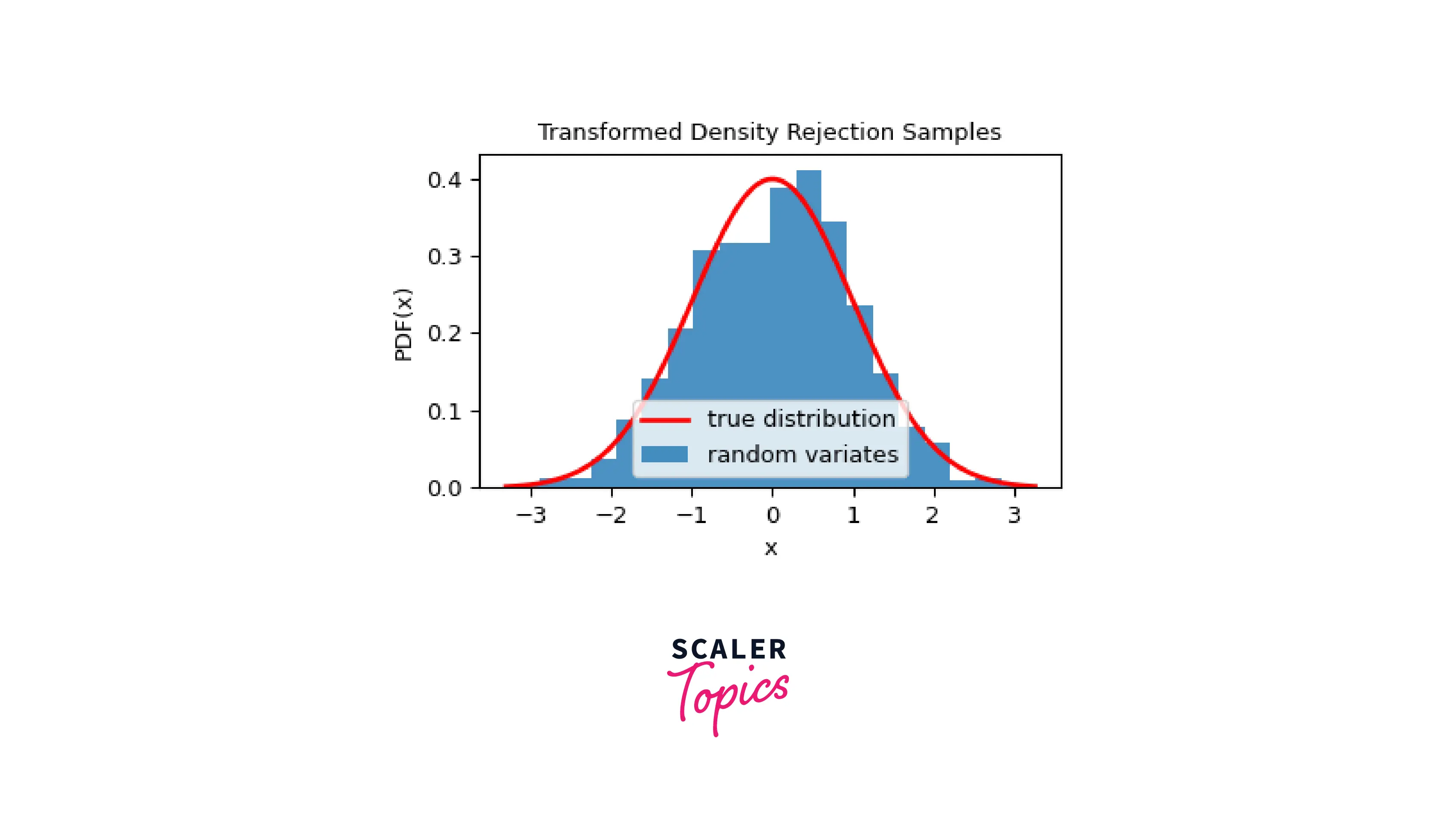
Using the TDR (Transformed Densit Rejection) method, we can easily sample non-uniform data of any dimension.
Output
Probability Integral Transform
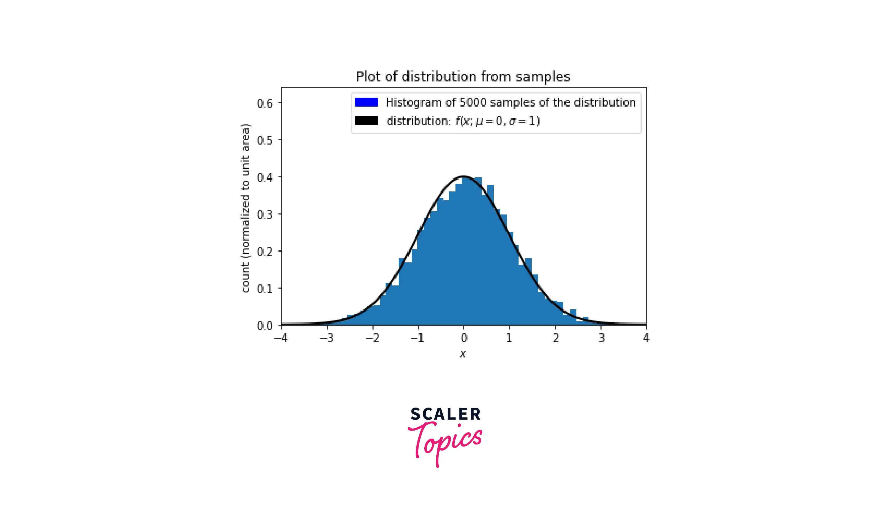
The probability integral transform pertains to the finding that data values can be transformed into random variables with a standard uniform distribution when they are treated as being random variables from any specified continuous distribution. This theorem is specifically made for distributions that are random in nature.
The result from PIT (Probability Integral Transform) is sometimes modified, to make the result a standard distribution, rather than a uniform distribution. One such example is the exponential distribution of random samples.
Output
Code Examples
In this section, we will harness the plotting capabilities of Matplotlib and visualize non-uniform two-dimensional data. Just as we saw a Mandelbrot set created by uniform data points, we will use random sampling to create a random-data Mandelbrot set using Matplotlib.
Output
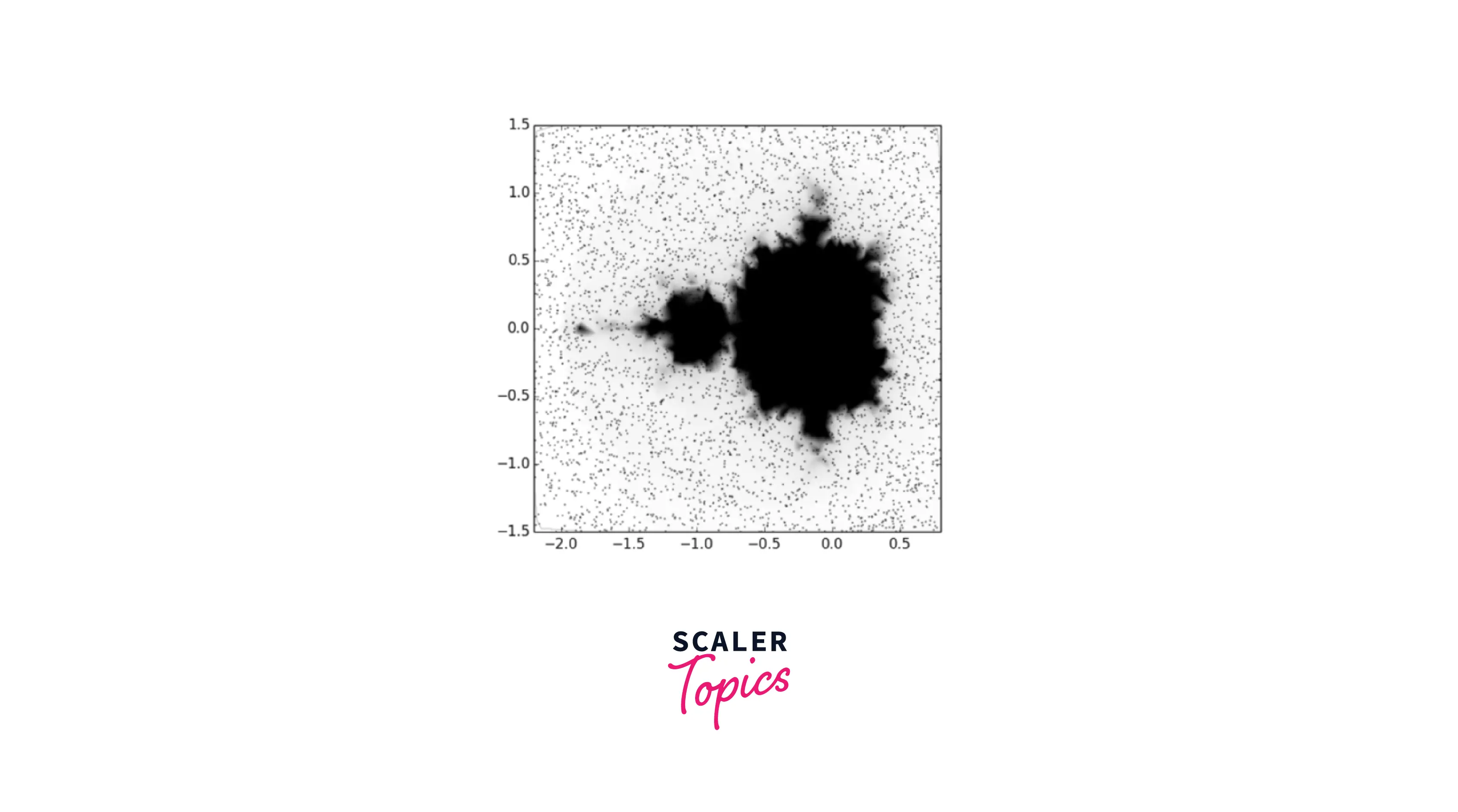
As we can see, the Mandelbrot set comes out to be a bit random and chaotic. This is because the sampling method we used was for random distributions. Using an adaptive sampling from Matplotlib, we can get a defined and high-resolution view of the displayed Mandelbrot set.
Conclusion
- In this article, we learned about non-uniform data; Non-uniform data is any type of data that has not been properly sorted or organized in a necessary manner.
- We covered the two methods that are used to visualize non-uniform 2D data; Sampling and PIT (Probability Integral Transform).
- To conclude, we went through code examples where we visualized non-uniform data using Matplotlib.