React MUI Accordion Surface
Overview
The React MUI Accordion Surface is a versatile component within the Material-UI library, designed to create collapsible and expandable content sections in React applications. It offers various variants, including simple, controlled, and customized accordions, catering to diverse design and functionality needs. With a straightforward syntax, developers can integrate accordions seamlessly into their projects, optimizing screen space, organizing information, and enhancing user experiences. Whether you're building a simple webpage or a complex web application, the Accordion Surface is a powerful tool for creating intuitive and interactive interfaces in the world of modern web development.
MUI Accordion Surface Variants
The Material-UI (MUI) Accordion Surface component offers several versatile variants to suit different design and functionality requirements. These variants allow developers to customize the behavior and appearance of the accordion according to their specific needs. Here's an overview of the commonly used MUI Accordion Surface variants:
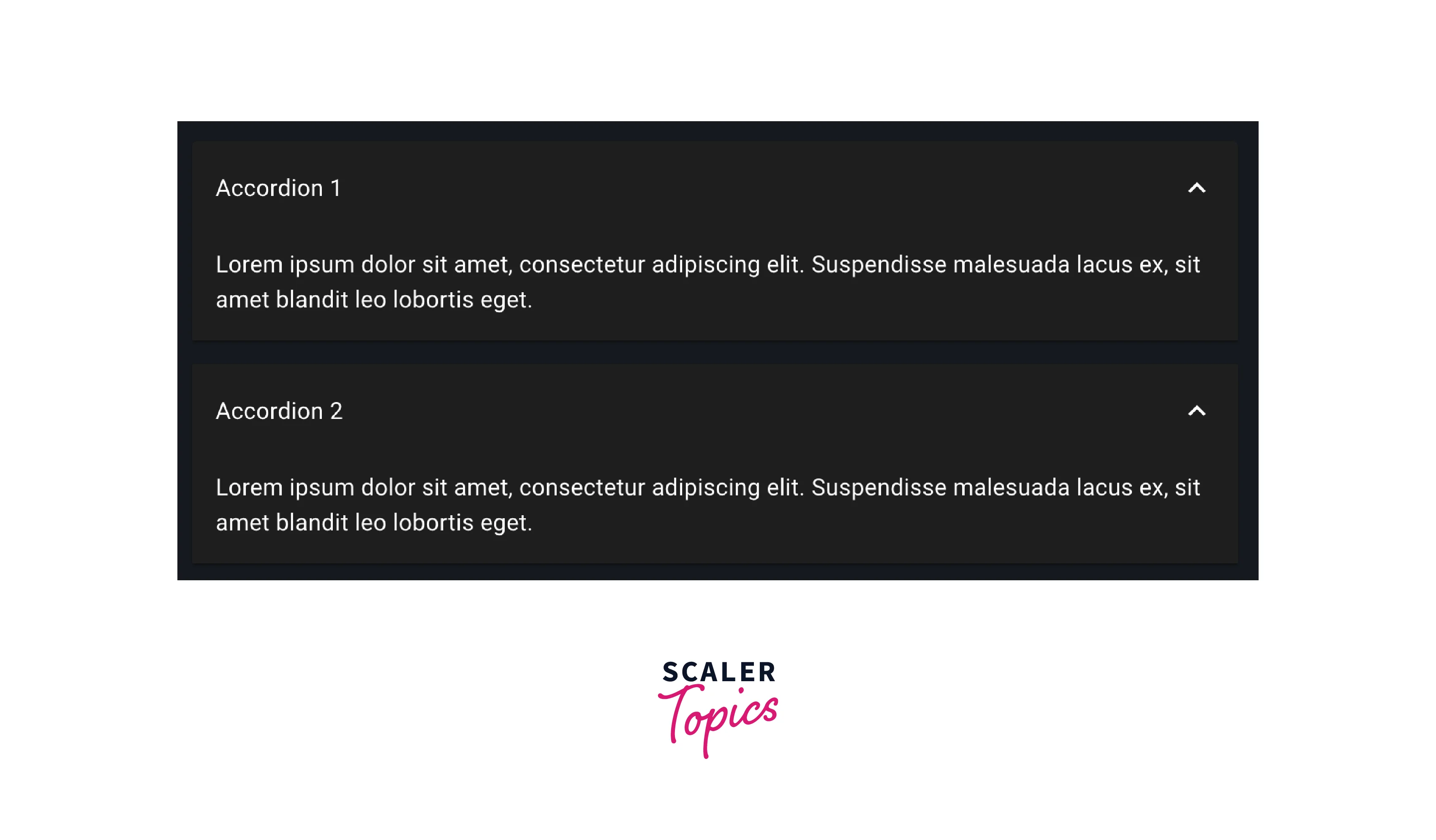
Simple Accordion:
- This is the most fundamental variant.
- It consists of a single accordion item with a header and a content panel.
- Users can expand or collapse the content by clicking on the header.
- Ideal for basic use cases where a straightforward collapsible section is needed.
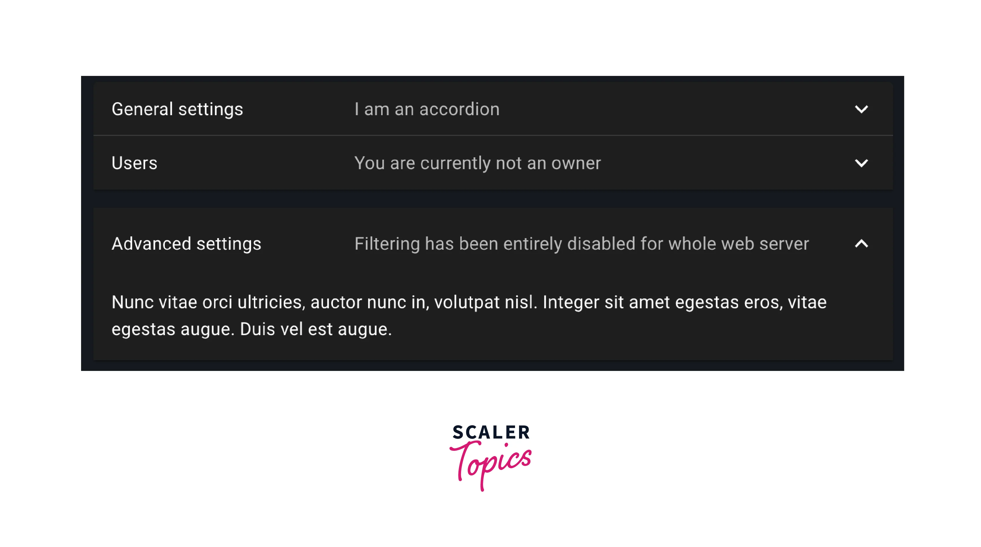
Controlled Accordion:
- Offers complete programmatic control over the accordion's state.
- Developers can open or close specific accordion panels through code.
- Useful for dynamic and interactive interfaces where accordion behavior depends on user actions or data.
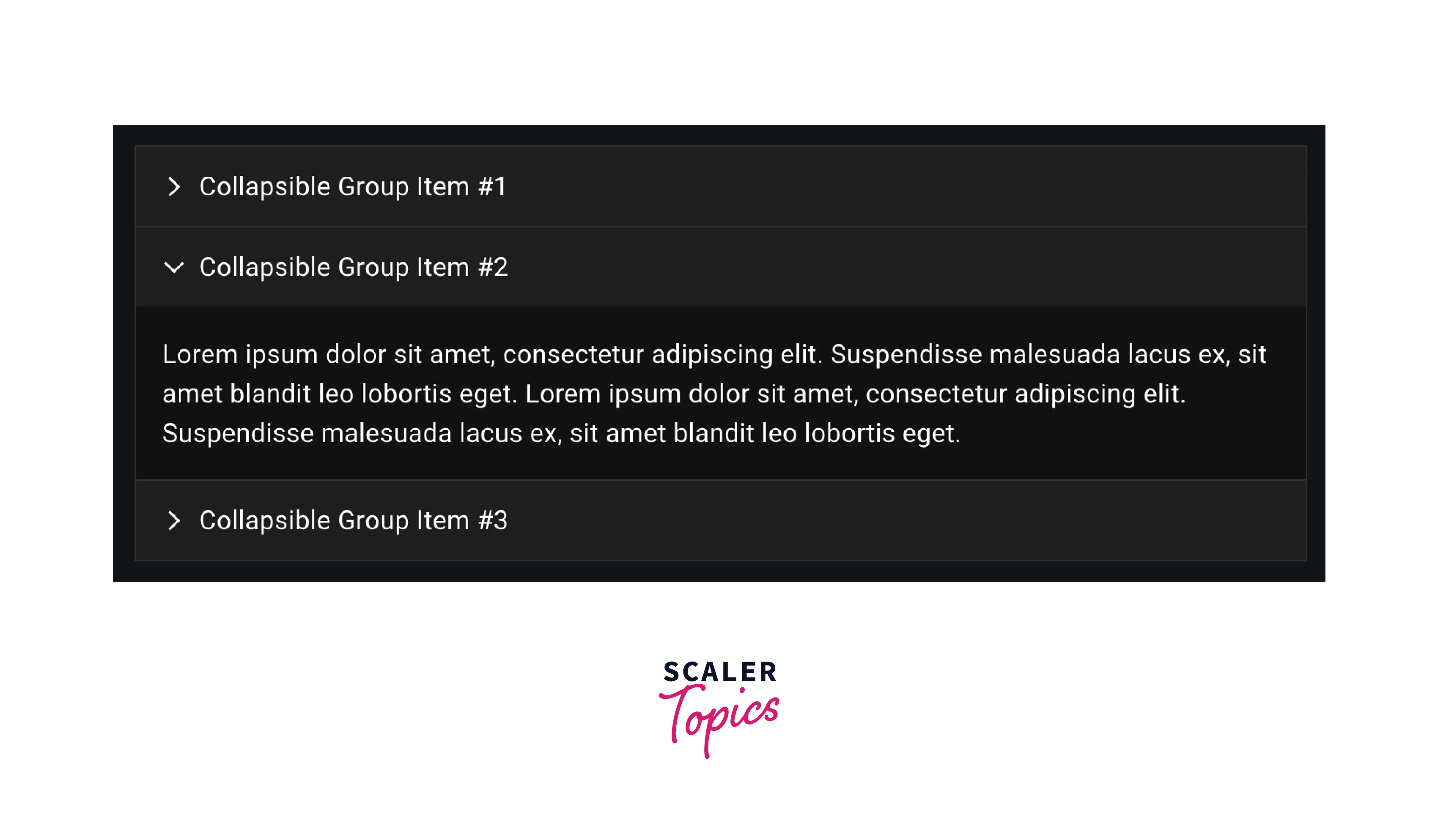
Performance:
- Designed with a focus on efficiency and speed.
- Utilizes lazy loading techniques to minimize initial page load times.
- Dynamically loads content within accordion panels only when they are expanded, reducing unnecessary network requests and improving overall page performance.
- Ideal for applications with a large amount of content or where optimizing load times is crucial for a smooth user experience.
Customized Accordion:
- Provides extensive customization options for styling accordions.
- Developers can modify colors, fonts, spacing, and other CSS properties to align the accordion's appearance with the application's design language.
- Ideal for ensuring that the accordion seamlessly integrates with the overall visual identity of the project.
- Each of these variants serves a unique purpose, allowing developers to create accordions that meet the specific requirements of their React applications, from simple collapsible sections to highly interactive and visually appealing user interfaces.
Syntax
To implement an Accordion Surface in your React application, you need to import the necessary components from Material-UI and use them in your JSX code. Here's a basic syntax example:
This code snippet demonstrates a simple Accordion component with a header and content section. You can expand or collapse the content by clicking the header.
Creating a React Application Project
Step 1: Set Up Your Development Environment
Before you start, make sure you have Node.js and npm (Node Package Manager) installed on your system.
Step 2: Create a New React App
Open your terminal and run the following command to create a new React application:
Replace my-accordion-app with your preferred project name.
Step 3: Install Material-UI
Navigate to your project directory and install Material-UI by running:
Step 4: Create an Accordion Component
Inside your project's 'src' directory, create a new component that will render the Accordion. You can use the syntax example provided earlier as a starting point.
Step 5: Use the Accordion Component
Integrate the Accordion component you created into your application's main view or any other relevant component.
Step to Run Application
Open a Terminal Window:
Open a terminal or command prompt on your computer. Ensure that you are in the root directory of your React application project.
Start the Development Server:
To launch your React application and the development server, run the following command:
This command starts the development server, and you'll see output in the terminal indicating that your application is running. By default, it will be accessible at http://localhost:3000.
Access the Application:
Open your web browser and enter the following URL in the address bar: http://localhost:3000
This will load your React application with the Material-UI Accordion Surface in action. You should be able to interact with the accordion, expanding and collapsing sections as needed.
Develop and Modify:
While the development server is running, you can continue to make changes to your React application's code. The development server automatically updates your application in real-time as you save changes, making it convenient for development and testing.
Stop the Development Server:
When you're done testing or developing your application, you can stop the development server by pressing 'Ctrl + C' in the terminal where the server is running. Confirm that you want to stop the server when prompted.
Following these steps will allow you to run and test your React application with the Material-UI Accordion Surface locally on your computer. You can make adjustments, expand its functionality, and fine-tune the user experience as needed during development.
Conclusion
- Accordion Surfaces provide a seamless way to present information, allowing users to expand and collapse sections as needed, reducing clutter, and improving usability.
- With various variants and extensive customization options, developers can tailor accordions to meet specific design and functionality requirements, ensuring a cohesive user interface.
- Accordions are effective for optimizing screen real estate, making them an excellent choice for responsive web design and mobile-friendly applications.
- Accordion Surfaces aid in establishing a clear content hierarchy by allowing you to categorize and prioritize information. Users can navigate and access relevant sections easily, enhancing the overall information architecture of your application.
- Controlled accordions empower developers to programmatically manage panel states, offering dynamic and interactive user experiences.
- The Accordion Surface seamlessly integrates with the Material-UI library, providing a consistent and visually appealing component for React applications, aligning with modern design principles and best practices.