React MUI Radio Input
Overview
Radio inputs are an essential part of any user interface, allowing users to make single selections from a list of options. When it comes to building modern and user-friendly web applications, React and Material-UI (MUI) have emerged as popular choices among developers. Radio inputs in React MUI (Material-UI) provide a sleek and accessible way to create interactive form elements. They are part of the broader Material-UI library, which offers a wide range of components and styling options to enhance the user experience.
Radio Input Variants
In Material-UI, radio inputs come in various flavours or variants.
The main variants include:
- Radio Group: A radio group is a collection of radio buttons where only one option can be selected at a time. This is the standard use case for radio inputs and is commonly used in scenarios like selecting a payment method or choosing a gender.
- Standalone Radio Buttons: Standalone radio buttons are used when you need independent radio inputs that are not grouped. Each button functions independently, allowing users to select multiple options. This variant is suitable for situations such as filtering multiple categories or selecting preferences.
- Size: Customizing the size of radio buttons is essential to match the design and layout of your application. Material-UI provides options for both small and large-sized radio buttons, allowing you to tailor them to your specific needs.
- Color: Material-UI enables developers to customize the colour scheme of radio inputs. You can choose from a predefined set of colours or define custom colours that align with your application's branding and style.
- Show Error: Error handling and validation are crucial aspects of form design. Material-UI provides mechanisms to display error messages associated with radio inputs, ensuring that users receive feedback when they make incorrect selections or provide invalid input.
- Customization: Material-UI offers extensive customization options for radio inputs. You can fine-tune the appearance, behaviour, and interactivity of MUI radio buttons and labels to align with your application's design requirements. This flexibility empowers developers to create unique and visually appealing interfaces.
- useRadioGroup: A useRadioGroup hook is a valuable tool provided by Material-UI to manage the state and behaviour of radio groups effectively. This hook simplifies the handling of interactions within radio groups, making it easier to manage the selection of options.
- Browser-Specific: When using Material-UI radio inputs, developers should be aware of potential browser-specific compatibility issues, especially with older browsers like Internet Explorer (IE). Material-UI is designed to maintain compatibility with modern browsers, but custom browser themes or older versions may not fully support its styling and features.
- API: Material-UI's API documentation offers detailed information on how to utilize and customize radio inputs effectively. Developers can refer to the official documentation to access comprehensive guidance, examples, and best practices.
Build an AI-First Career, Master the Complete Skillset
Choose from our industry-leading programs designed for career success
Modern Software and AI Engineering Program
Master full-stack development with AI integration


 +1000 more
Modern Data Science and ML with specialisation in AI
Advanced data science techniques with AI specialization
+1000 moreAdvanced AIML with Specialisation in Agentic AI
Deep dive into AIML with focus on Agentic systems
+1000 moreDevOps, Cloud & AI Platform Engineering
Build and manage AI-powered cloud infrastructure
+1000 moreAI Engineering Advanced Certification by IIT-Roorkee
Premier AI engineering certification from IIT-Roorkee

AI Forward Deployed Engineer Program
Full-stack engineering, production AI and client-facing consulting
+1000 moreSyntax
Here's a basic syntax example of how to create a Material-UI radio input:
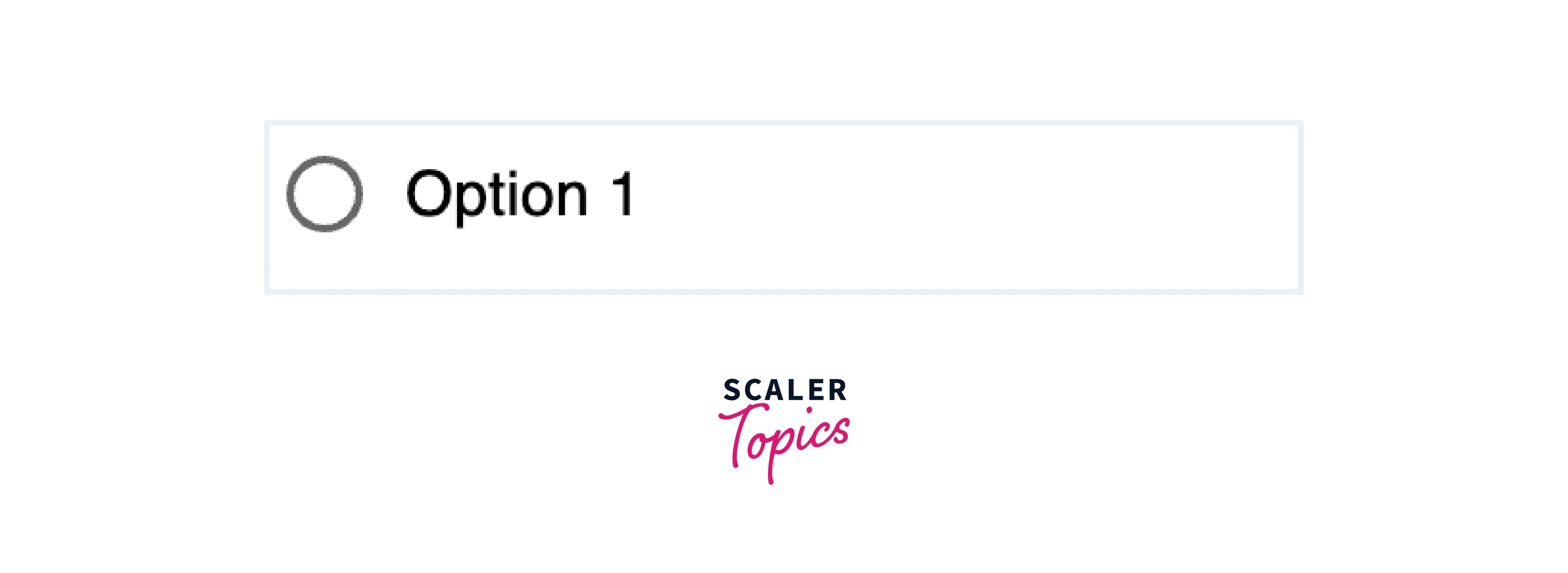
Note: onChange tracks changes in input fields like MUI radio buttons. When a user selects a different option, this event triggers a function you specify, allowing you to respond to the user's choice in your code.
Creating React Project
Step 1
To create a react app, you need to install react modules through the npm command.
Step 2
After creating your react project, move into the folder to perform different operations.
Step 3
After creating the ReactJS application, Install the required module using the following command:
How Scaler Transformed Careers in Different Fields
Scaler learners achieved 2.5x salary growth with average post-Scaler CTC reaching ₹23L.
 Google
 Amazon
 Microsoft
 Flipkart
 Adobe1200+ more
Project Structure
Let's discuss the typical project structure for a React application using the MUI Radio Input. This structure will help you organize your code and assets efficiently.
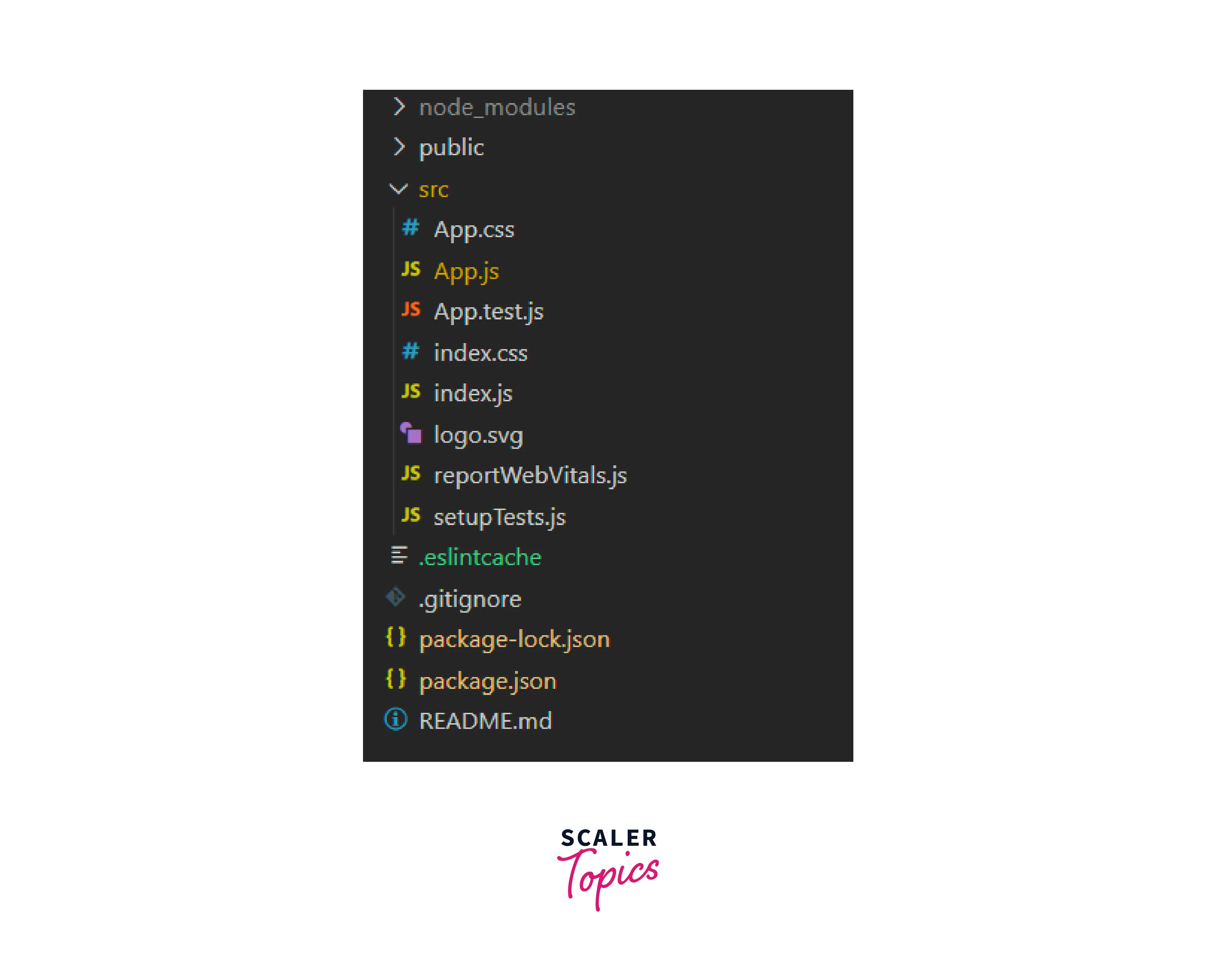
This project structure provides a clear separation of concerns, making it easier to develop, maintain, and scale your React application.
Steps to Run the Application
To run a React application created using create-react-app, follow these steps:
Step 1: Open a Terminal or Command Prompt
Open your terminal or command prompt on your computer. Make sure you're in the project directory where your React application is located.
Turn Learning into Career Growth
Step 2: Navigate to the Project Directory
If you're not already in the project directory, navigate to it using the cd command. For example:
Step 3: Start the Development Server
In your project directory, start the development server by running the following command:
This command will initiate the development server and open your React application in your default web browser. By default, it runs on port 3000.
Step 4: View Your React Application
Once the development server is up and running, your web browser should open automatically, displaying your React application. If it doesn't, you can manually open your browser and go to the following URL:
You should now see your React application running in your web browser.
Step 5: Development Workflow
As you make changes to your React application's source code (located in the src directory), the development server will automatically detect these changes and reload the application in your browser, allowing you to see your changes in real time.
Conclusion
- React MUI Radio Button and Inputs are a vital component of Material-UI for building interactive and accessible forms in React applications.
- They offer two primary variants: Radio Groups for single selections and Standalone Radio Buttons for independent choices.
- Customization options include size, colour, label placement, and error handling, allowing developers to adapt the inputs to their application's design.
- Material-UI prioritizes accessibility, ensuring all users, including those with disabilities, can effectively use radio inputs.
- Thorough documentation and an active community support Material-UI's adoption and facilitate development.
- By following the provided syntax and steps, developers can easily integrate and customize React MUI Radio Inputs in their projects, enhancing user experiences in forms and beyond.