Visualizing Time Series Data
Overview
A time series is a collection of data points recorded over a certain period. Time series analysis is applied in many spheres for predicting future events from historical data. Pandas provide useful tools for creating, formatting, resampling, shifting, decomposing, and visualizing time series data. The main components of a time series can be extracted by decomposing the data. Using pandas in combination with dataviz Python libraries allows visualizing time series data on line charts, bar plots, rolling mean plots, autocorrelation plots, box plots, or heatmaps and capturing crucial insights from the data.
Introduction
A time series is a collection of data observations recorded at different points in time over a certain period. Such observations are usually taken at equal time intervals (hourly, daily, weekly, etc.) but can also be gathered irregularly (e.g., tracking of a website's visits).
Time series analysis is commonly used for predicting future events from historical data. Here are some fields of its application with examples:
- finances (stock market)
- Sales (sales volume)
- Marketing (webpage visits)
- healthcare (COVID cases)
- Science (precipitation measurements)
- logistics (taxi rides)
Visualizing time series data is an essential step of time series analysis. It helps us clearly see strategic trends in the data and capture crucial insights that otherwise would be hidden from us.
When visualizing time series data, we put the time on the x-axis (since it's an independent variable) and the data points on the y-axis.
Pandas Time Series Data Structures
The pandas library is widely used for data analysis tasks in Python. In particular, it provides useful and flexible built-in tools for working with time series data structures and applying vectorized operations on them. Such data structures are called DatetimeIndex objects:
Code:
Output:
with a single time data point referred to as a Timestamp:
Code:
Output:
Using pandas for working with time series data structures allows:
- creating time series
- converting string data to datetime of whatever format (as we saw above)
- resampling time series gave a specified period
- shifting time series along their time index
- decomposing time series into separate components
- visualizing time series data
To practice pandas techniques on time series data, let's use a free Kaggle dataset Daily Gold Price (2015-2021) Time Series. First, we'll download the dataset on our computer, read it in with pandas, and visualize its first five rows to get familiar with the data:
Code:
Output:
The dataset contains information on various types of prices, the number of traded shares (volume), and the change in share price. We're interested only in the Price (the closing price) and Date columns, so let's keep only them and check their datatypes:
Code:
Output:
To be able to efficiently work with time series data, let's convert the Date column from the object (string) to DateTime and set it as the dataframe index:
Code:
Output:
Time Resampling
Time resampling means rescaling time series data given a period and the method to be applied (mean(), max(), min(), etc.). For example, we can resample a time series from a daily to a monthly scale. Time resampling permits us to zoom the data in or out and investigate it from another perspective. Almost always, we need to zoom the data out – so-called downsampling. The opposite operation – zooming-in or upsampling – is rarely used, and it implies getting a lot of missing values to be filled in.
To conduct time resampling in pandas, the library provides the resample() function that has the rule parameter (the time-frequency value) and some optional ones. The most common possible values of the rule parameter are:
| Value | Meaning |
|---|---|
| 'H' | hourly |
| 'D' | daily |
| 'W' | weekly |
| 'M' | monthly |
| 'Q' | quarterly |
| 'A' | yearly |
In the above table, the values imply the end of the corresponding period. For the beginning of a period or any other specific point in time, please refer to the documentation.
Let's apply time resampling to our data. Currently, the data points are available on a daily scale. Let's rescale them by month. More precisely, we want to calculate the mean value by month:
Code:
Output:
Scaler Placement Report and Statistics
Scaler learners achieved 2.5x salary growth with average post-Scaler CTC reaching ₹23L.
Using Time Resampling to Plot Charts
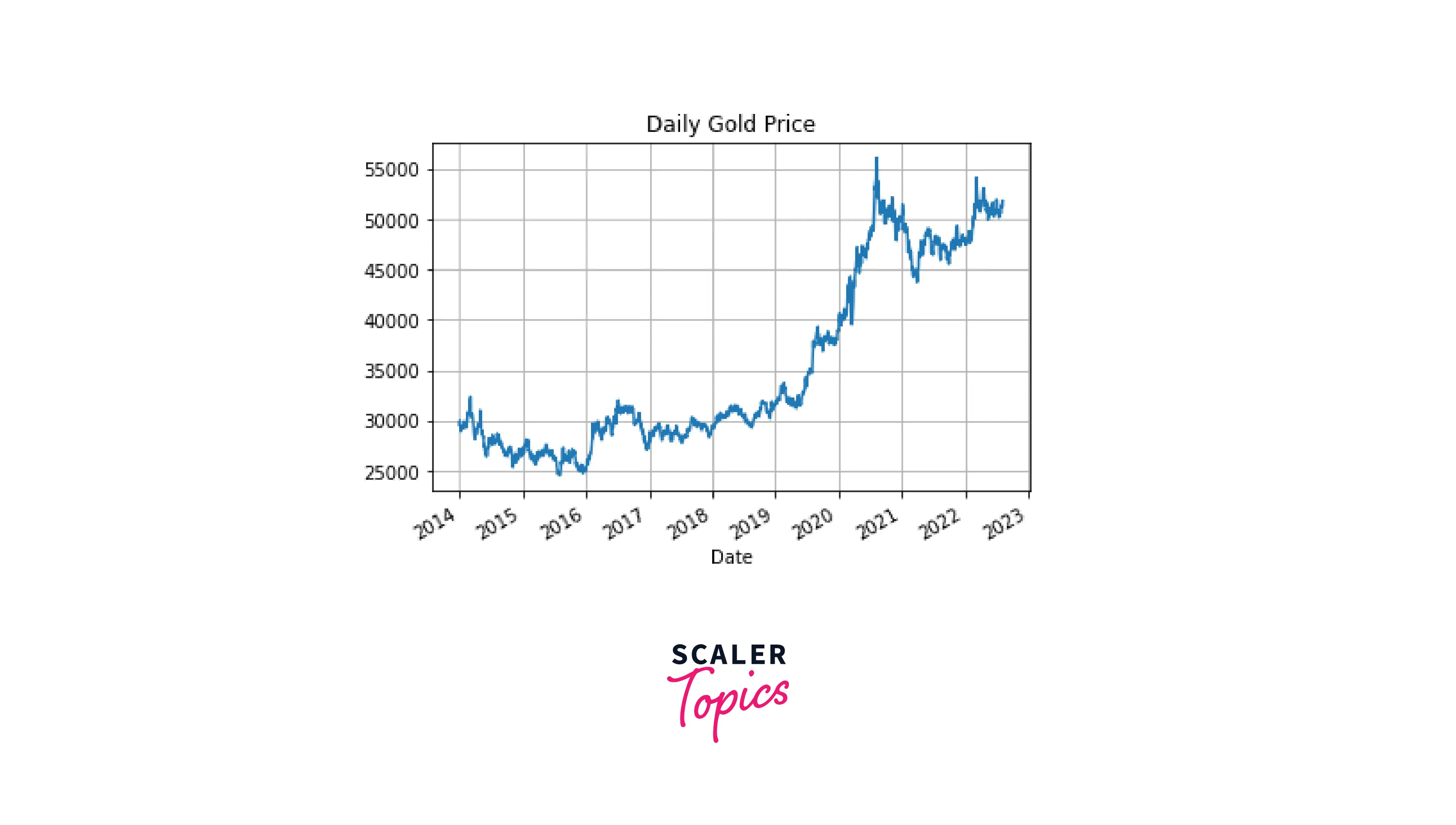
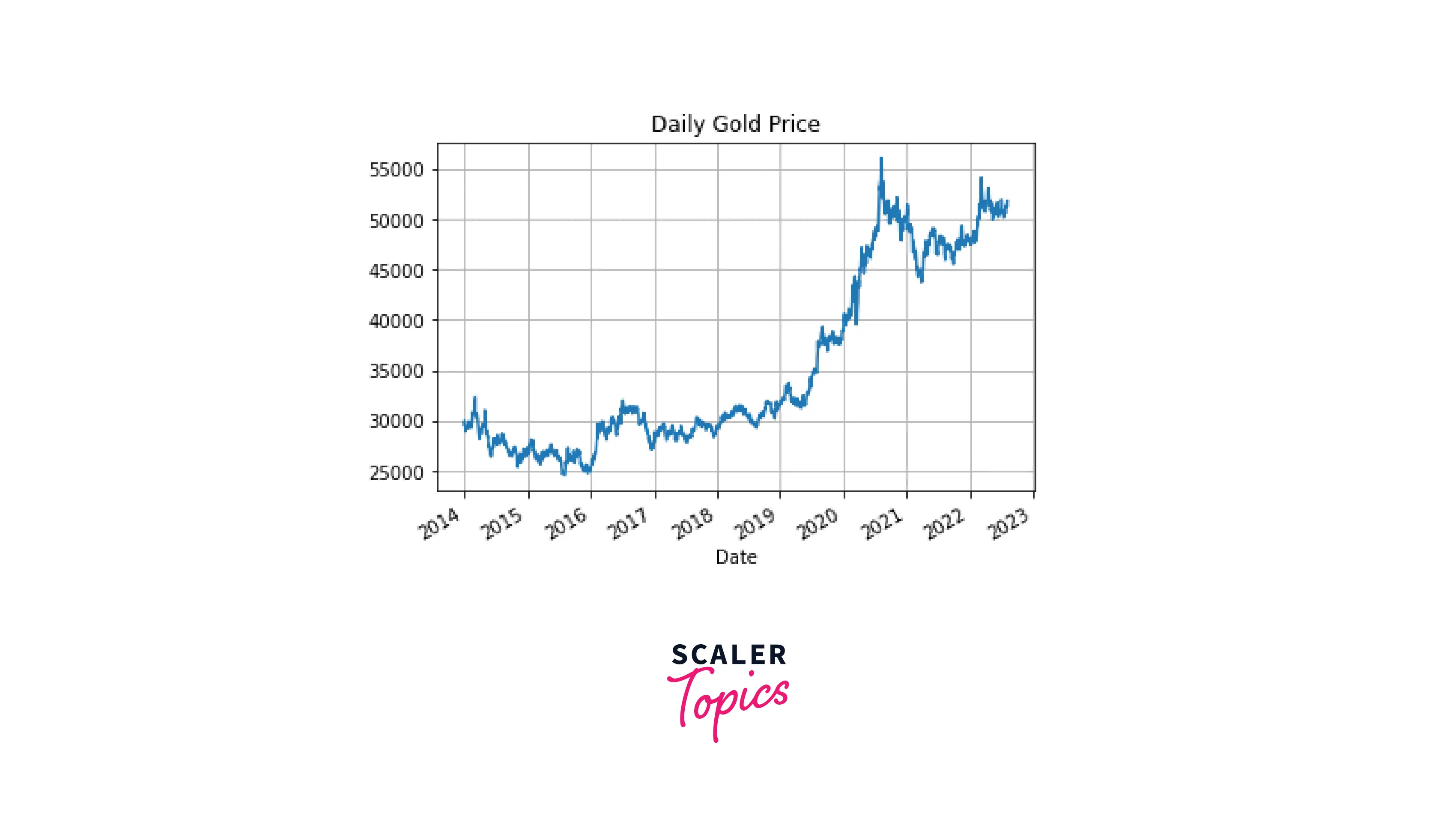
Now, let's try visualizing time series data in pandas. First, we'll plot the original closing price data:
Code:
Output:
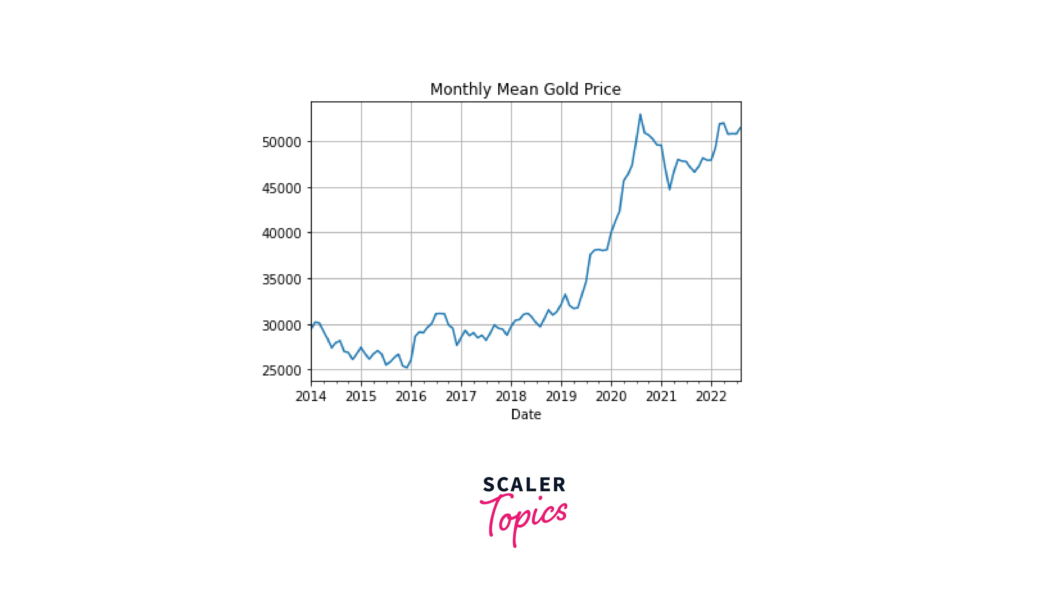
To visualize the resampled data, we don't need to create a new column in the dataframe. Instead, we can apply the plot() function of pandas directly on the piece of code we used in the previous section for time resampling:
Code:
Output:
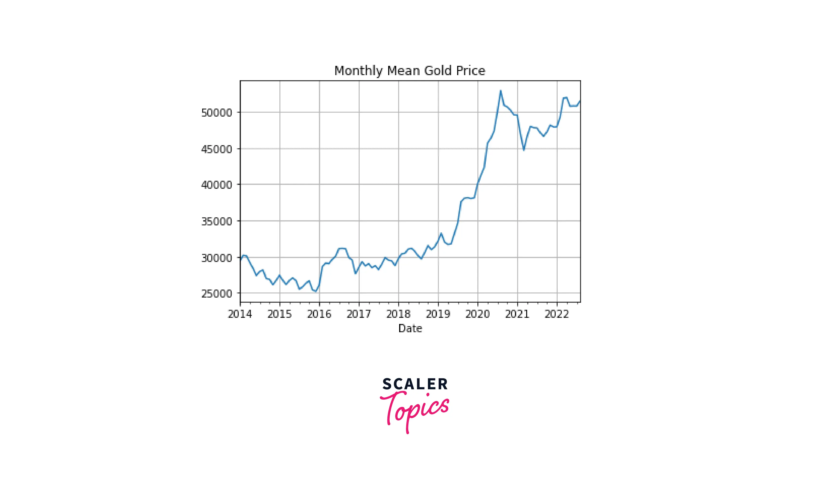
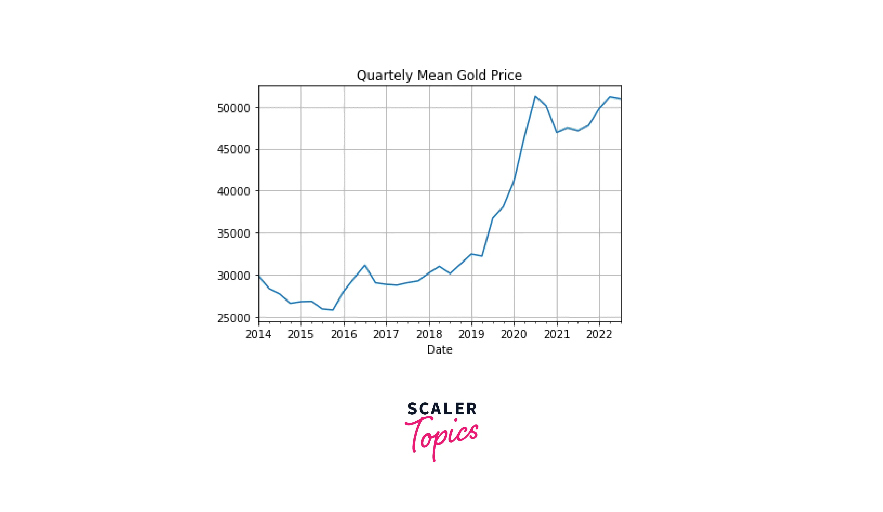
We can clearly see that the plot for the data resampled by month looks much smoother than the one for the hourly data. As expected, further reducing the sampling frequency (e.g., time resampling by a quarter) will result in an even smoother plot:
Code:
Output:
Transform Your Career
Choose from our industry-leading programs designed for career success
Modern Software and AI Engineering Program
Master full-stack development with AI integration

Modern Data Science and ML with specialisation in AI
Advanced data science techniques with AI specialization
Advanced AIML with Specialisation in Agentic AI
Deep dive into AIML with focus on Agentic systems
DevOps, Cloud & AI Platform Engineering
Build and manage AI-powered cloud infrastructure
AI Engineering Advanced Certification by IIT-Roorkee
Premier AI engineering certification from IIT-Roorkee
Time Shifting
Time shifting is another technique of time series analysis. It's used to move the data observations forward or backward along the time index. Correspondingly, there are two types of time shifting: forward and backward.
Shifting Forward
To shift the data points forward, we use the shift() method passing in the number of rows at which we want to move the data (the periods parameter). Compare the original first five rows of the dataframe:
Code:
Output:
with the ones we would obtain after applying shifting forward by two periods:
Code:
Output:
The value from the first row is now placed in the third row, the one from the second row – in the fourth row, and so on, while the first two rows now contain NaN values.
Shifting Backward
To shift the data points backward, we use the same shift() method, only that we add a minus sign to the number of periods. Compare the original last five rows of the dataframe:
Code:
Output:
with the ones we would obtain after applying shifting backward by three periods:
Code:
Output:
Decomposition of Time Series
A time series usually contains the following components:
- Observed data – the actual data
- Trend – the global, long-term tendency in the data behavior
- Seasonality – predictable periodic fluctuations in the data (e.g., the volume of ice-cream sales is expectedly higher in summer than in winter)
- Noise – a residual part after extracting the other components from the data that can't be related to either the trend or seasonality.
To get all the above components from the time series data, we need to decompose it. There are two types of models used for this operation: additive and multiplicative. Let's consider them separately.
Additive Model
This is a linear model that implies that the components are added together, as its name suggests:
y(t) = Level + Trend + Seasonality + Noise
Above, the level is the mean value of the time series.
An additive model shows seasonality of the same amplitude and frequency. This means that the fluctuations around the trend don't vary over time.
Turn Learning into Career Growth
Multiplicative Model
This is a non-linear model that implies that the components are multiplied together, as the model's name suggests:
y(t) = Level * Trend * Seasonality * Noise
A multiplicative model shows irregularities in seasonality meaning that the fluctuations around the trend vary over time.
Let's decompose our gold price data. For this purpose, we'll use the time series analysis tool of the statsmodels library, a convenient package for visualizing time series data components:
Code:
Output:
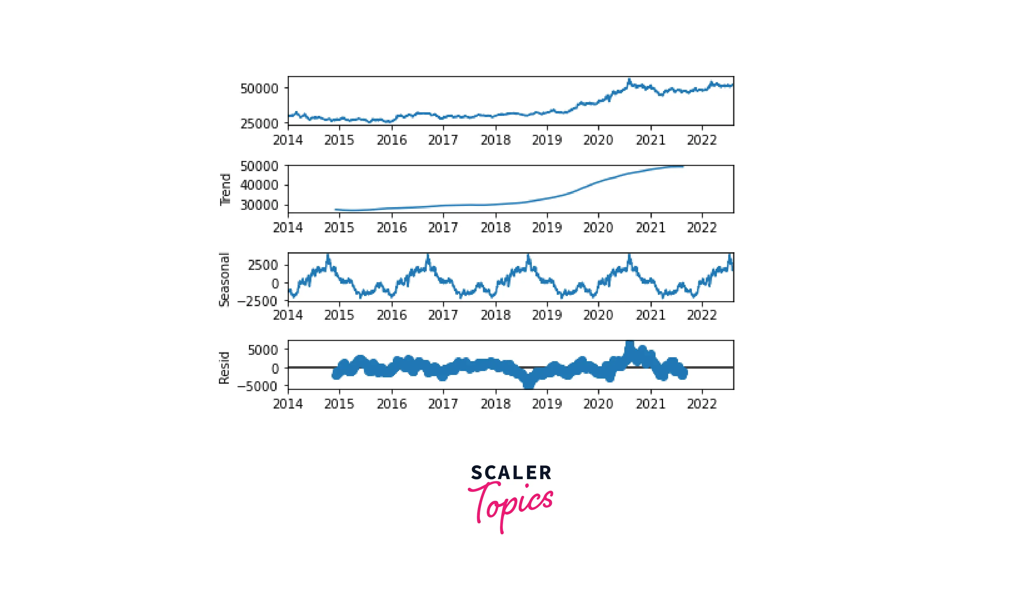
With just one line of code, we extracted all the components of our time series and displayed them on the same plot. We can see that the data demonstrates an evident seasonality. Also, there is a clear upward trend in gold prices.
Scaler Placement Report and Statistics
Scaler learners achieved 2.5x salary growth with average post-Scaler CTC reaching ₹23L.
More Examples
Let's practice different kinds of plots for visualizing time series data.
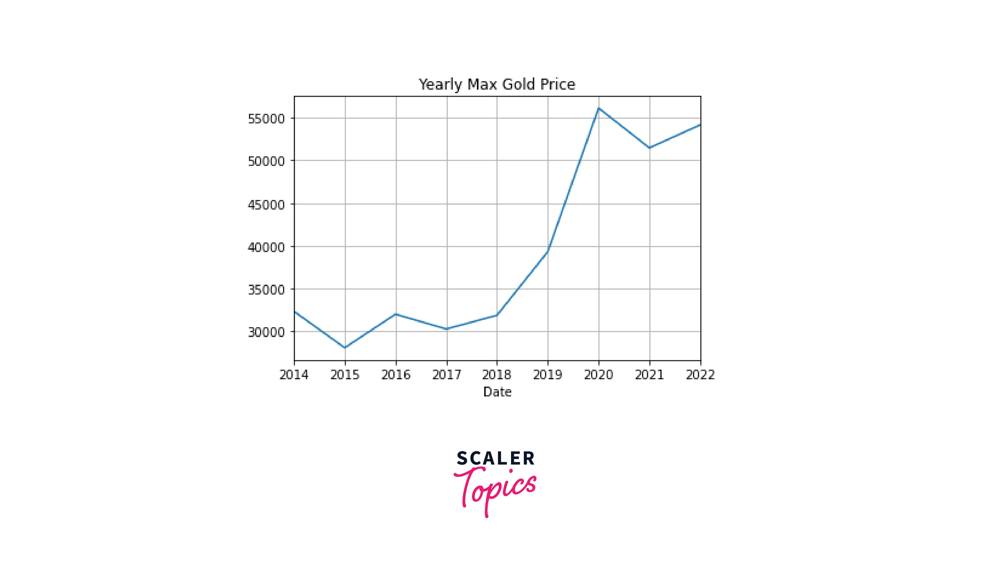
Line Chart
Code:
Output:
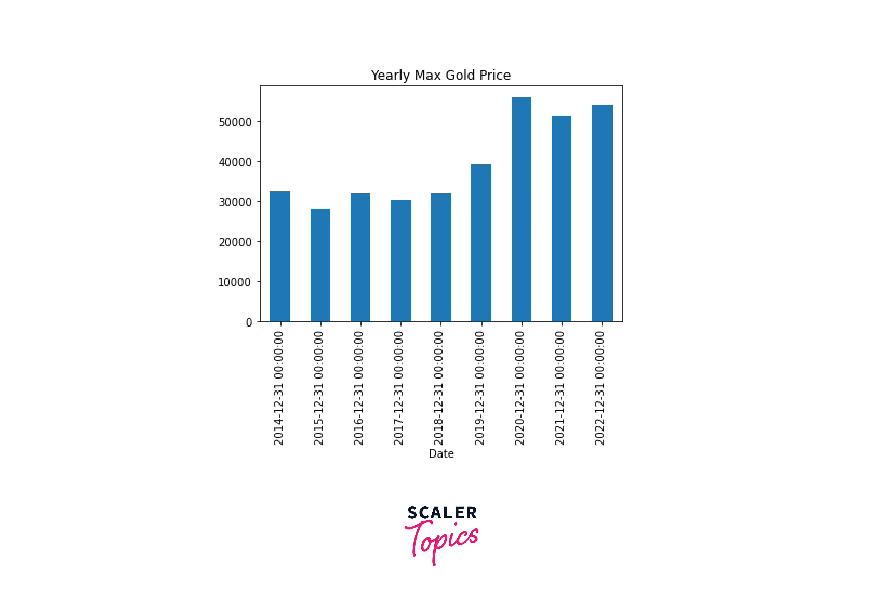
Bar Plot
For time series data, we should plot the time on the x-axis and hence use a vertical bar plot.
Let's display the same information as on the previous plot (the maximum gold price by year) on a vertical bar plot:
Code:
Output:
Rolling Mean Plot
In this kind of plot, the window of a predefined size rolls from the beginning to the end of the data along the time index, takes the mean value for each window imprint, and then these values are plotted against time. Unlike it was with time resampling, in this case, the original frequency of the data is preserved, but the noise is smoothed out.
Compare the original data:
Code:
Output:
with the resampled time series by month:
Code:
Output:
and a rolling mean plot with a window of 30 days:
Code:
Output:
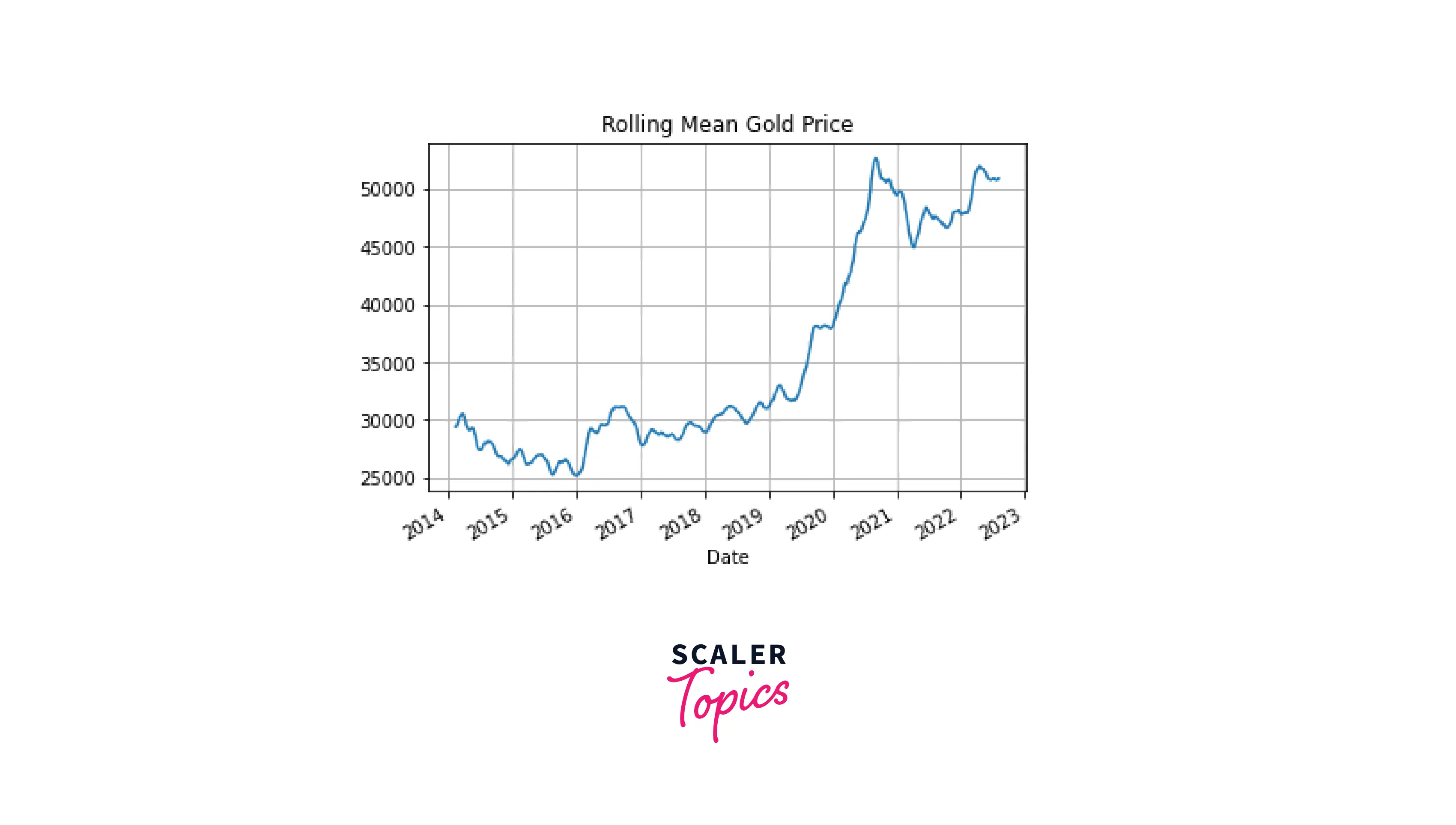
The last plot has the same frequency as the one for the original data but it's much smoother. In addition, it's also smoother than the plot for the resampled data by month (note some sharp peaks on the second plot).
It's possible to use rolling windows with aggregation functions other than mean(), such as median(), sum(), max(), etc.
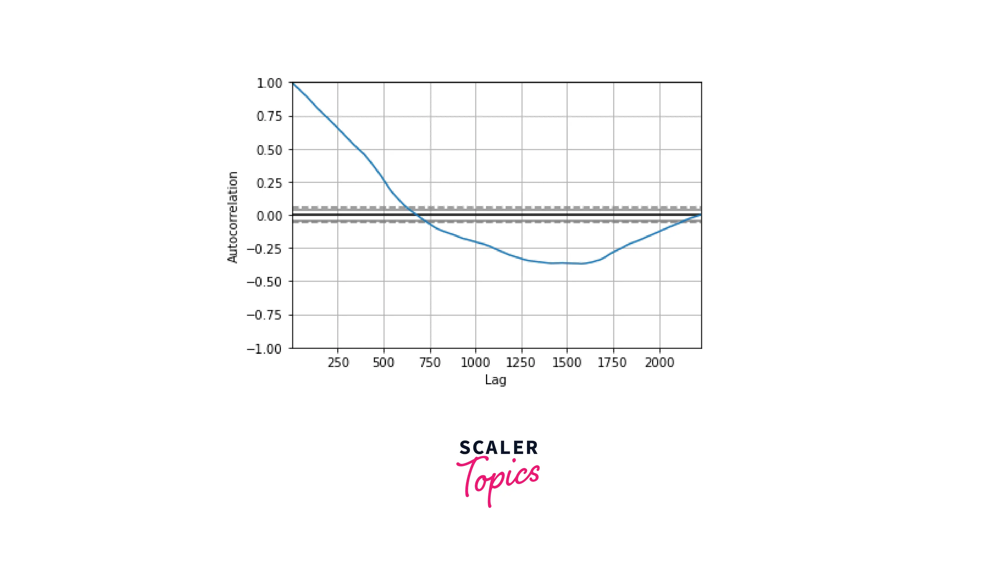
Autocorrelation Plot
This kind of plot for visualizing time series data shows the relationships between any data point of a time series and the rest of the values. In other words, it helps estimate the degree of data randomness. The autocorrelation can vary from +1 (100% positive correlation) to -1 (100% negative correlation).
Code:
Output:
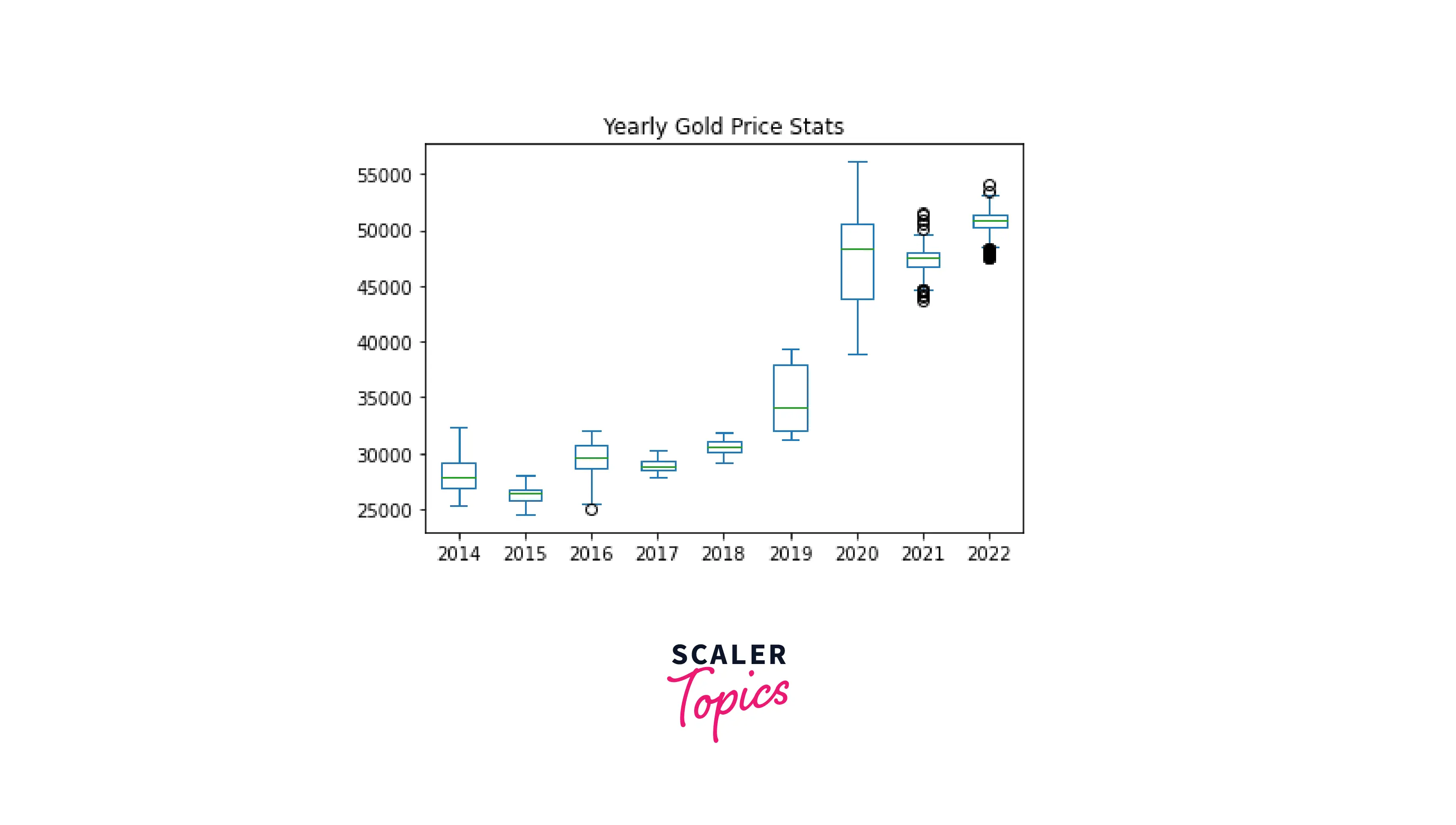
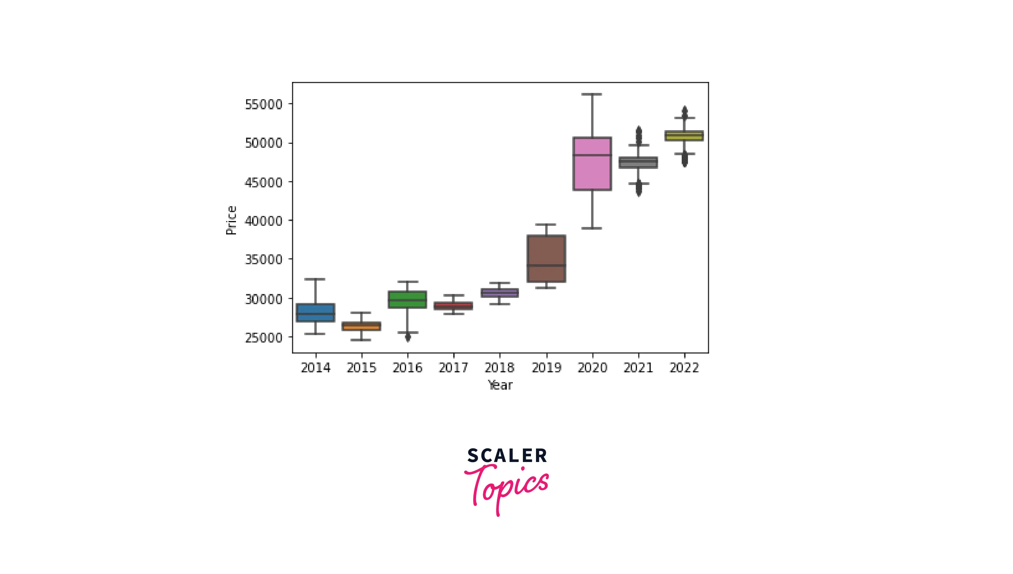
Box Plot
Box plots are used for displaying the major descriptive statistics of the data. These include the minimum, maximum, and median values, the first and third quartiles, and outliers (if present).
For visualizing time series data, we can create box plots by a certain period. Let's display gold price statistics by year:
Code:
Output:
In this case, using pure pandas for visualizing time series data requires several steps and hence looks a bit overwhelming. Instead, adding the functionality of the seaborn library makes the code more compact and elegant:
Code:
Output:
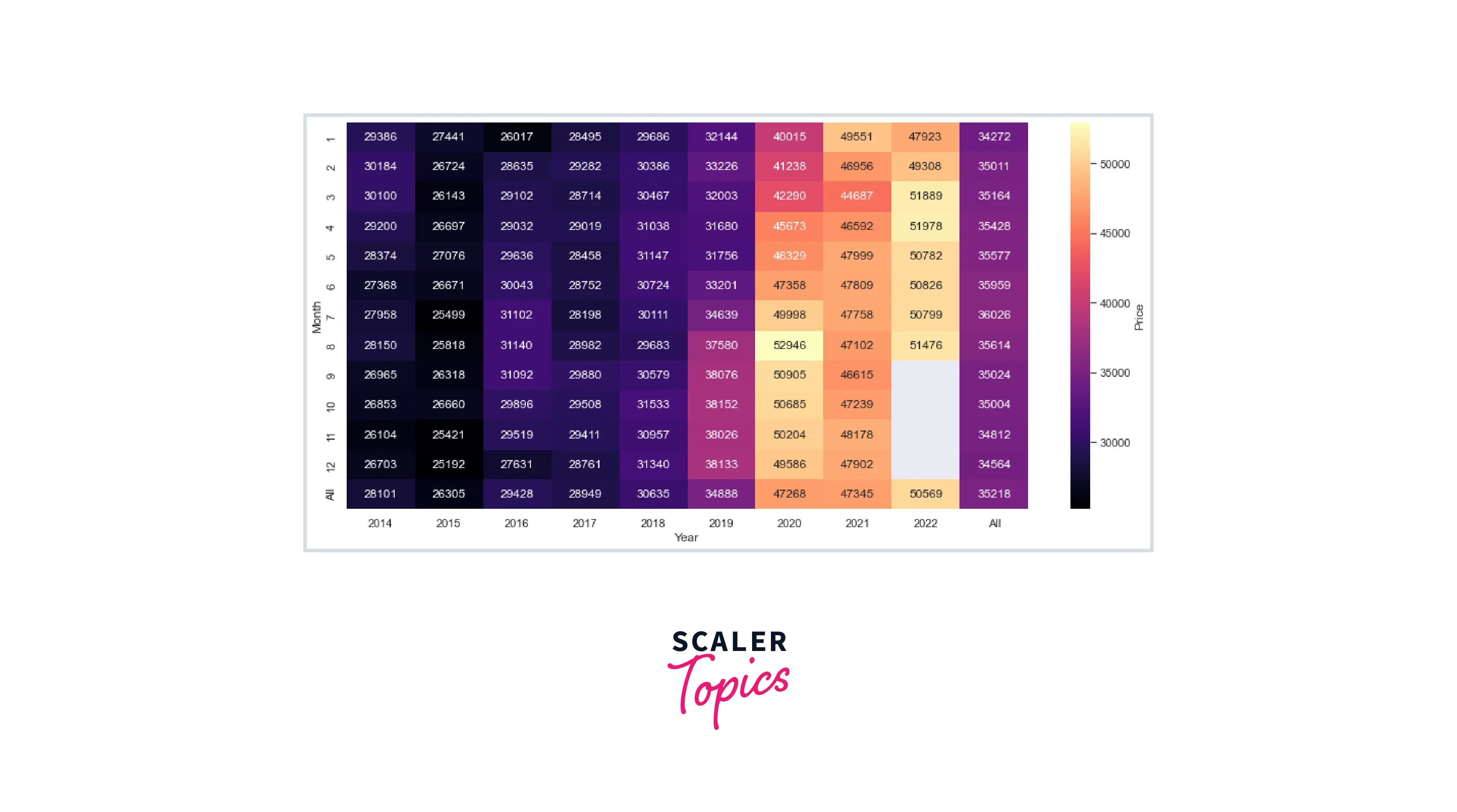
Heatmap
Heatmaps allow visualizing time series data in three dimensions: by two different types of periods and the data range itself. Using a colormap gives the effect of the third dimension.
For our dataset, let's consider gold price variations by month and by year simultaneously. For this purpose, we'll use pandas again in combination with seaborn:
Code:
Output:
Conclusion
- A time series is a collection of data points recorded regularly or irregularly over a certain period.
- Time series analysis is used for predicting future events from historical data and is applied in finances, sales, marketing, science, healthcare, etc.
- Visualizing time series data helps capture crucial insights.
- Pandas provides useful tools for working with time series: creating, formatting, resampling, shifting, decomposing, and visualizing time series data.
- The main components of time series – the observed data, the underlying trend, data seasonality, and the noise – can be extracted and visualized by decomposing the data using an additive or a multiplicative model.
- There are various types of plots for visualizing time series data, such as line charts, bar plots, rolling mean plots, autocorrelation plots, box plots, or heatmaps.
- Using pandas in combination with seaborn or other dataviz libraries helps make the code more elegant and readable and the plot – better customized.