PCH in R Programming
Overview
PCH, or Plotting Character, is a pivotal aspect of R programming that profoundly influences data visualization. It refers to the customizable symbols representing data points in scatter plots and related graphical displays. By assigning specific numerical codes to these symbols, PCH in R enables the modification of point shapes, enhancing the visual clarity and interpretability of plots. With a diverse range of PCH symbols available, programmers can tailor visuals to convey precise information effectively. In this article, we explore the significance of PCH in R programming, its utilization, and its role in creating insightful data visualizations.
Build an AI-First Career, Master the Complete Skillset
Choose from our industry-leading programs designed for career success
Modern Software and AI Engineering Program
Master full-stack development with AI integration


 +1000 more
Modern Data Science and ML with specialisation in AI
Advanced data science techniques with AI specialization
+1000 moreAdvanced AIML with Specialisation in Agentic AI
Deep dive into AIML with focus on Agentic systems
+1000 moreDevOps, Cloud & AI Platform Engineering
Build and manage AI-powered cloud infrastructure
+1000 moreAI Engineering Advanced Certification by IIT-Roorkee
Premier AI engineering certification from IIT-Roorkee

AI Forward Deployed Engineer Program
Full-stack engineering, production AI and client-facing consulting
+1000 moreAll PCH Symbol
PCH in R programming plays a crucial role in allowing you to customize the appearance of data points in your plots. These symbols are essentially numerical codes that represent various shapes. Each shape has a unique code, and by specifying the appropriate PCH value, you can change the shape of data points in your scatter plots and other visualizations.
Here's a breakdown of some commonly used PCH symbols and their associated shapes:
- PCH 0 - Square (■):
Representing stability or specific data features, this shape is denoted by the code 0. - PCH 1 - Circle (●):
The default symbol for data points, depicted by the code 1. - PCH 2 - Triangle Pointing Up (▲):
With code 2, this shape signifies growth or positive trends. - PCH 3 - Plus Sign (+):
Indicating particular data points of interest, recognized by the code 3. - PCH 4 - Cross (✚):
Denoting critical intersections, symbolized by the code 4. - PCH 5 - Diamond (♦):
An alternative to circles or squares, represented by the code 5. - PCH 6 - Triangle Pointing Down (▼):
Code 6 corresponds to a triangle pointing downward, often indicating decline or negative trends. - PCH 7 - Square Cross:
Represented by code 7, this shape combines a square with a cross. - PCH 8 - Star (★):
Suitable for drawing attention to noteworthy observations, symbolized by the code 8. - PCH 9 - Diamond Plus:
Indicating significance or unique data points, recognizable by the code 9. - PCH 10 - Circle Plus:
Represented by code 10, this symbol combines a circle with a plus sign.
PCH Value for Different Shapes
To assign a specific PCH symbol to your data points, you need to specify the appropriate numerical value corresponding to the desired shape. Below is a table illustrating some common PCH values and their associated shapes:
| PCH Values | Shape |
|---|---|
| 0 | square |
| 1 | circle |
| 2 | triangle point up |
| 3 | plus |
| 4 | cross |
| 5 | diamond |
| 6 | triangle point down |
| 7 | square cross |
| 8 | star |
| 9 | diamond plus |
| 10 | circle plus |
| 11 | triangles up and down |
| 12 | square plus |
| 13 | circle cross |
| 14 | square and triangle down |
| 15 | filled square |
| 16 | filled circle |
| 17 | filled triangle point-up |
| 18 | filled diamond |
| 19 | solid circle |
| 20 | bullet (smaller circle) |
| 21 | filled circle blue |
| 22 | filled square blue |
| 23 | filled diamond blue |
| 24 | filled triangle point-up blue |
| 25 | filled triangle point down blue |
Examples
To better understand the practical applications of PCH in R programming, let's explore a couple of illustrative examples that showcase how PCH symbols can be used to enhance data visualizations.
How Scaler Transformed Careers in Different Fields
Scaler learners achieved 2.5x salary growth with average post-Scaler CTC reaching ₹23L.
 Google
 Amazon
 Microsoft
 Flipkart
 Adobe1200+ more
Example - 1: Visualizing Competitors' Performance
Imagine you have a dataset containing the performance metrics of different competitors in a market. You want to create a scatter plot that showcases both their sales and profit figures. By using different PCH symbols for each competitor, you can distinguish them effectively. Let's see how this can be achieved:
Output:
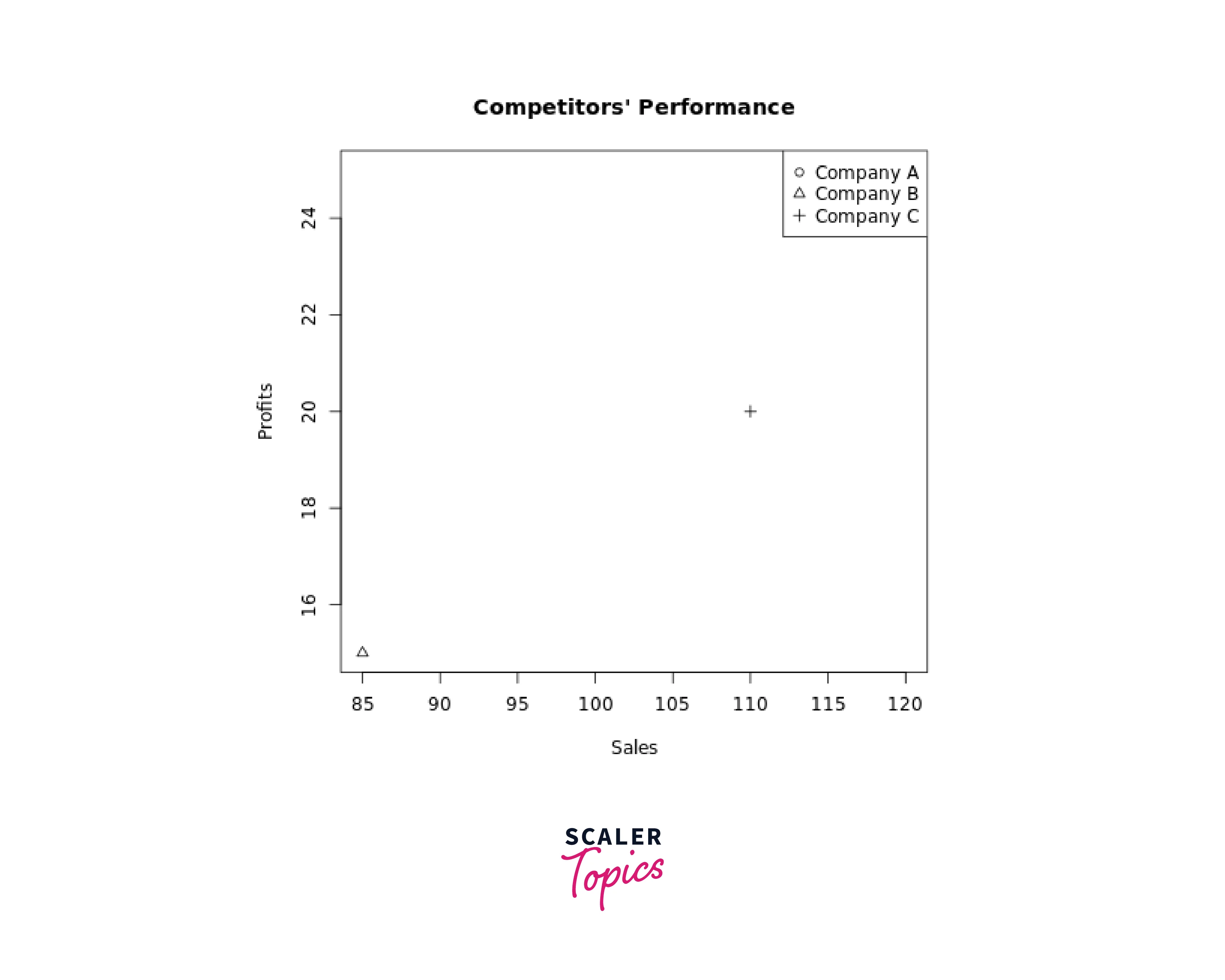
In this example, each competitor is represented by a different PCH symbol, making it easy to identify their positions on the plot.
Example - 2: Analyzing Customer Ratings
Suppose you have customer ratings for three different products, and you want to compare their performance. You can use PCH symbols to represent each product's ratings visually:
Output:
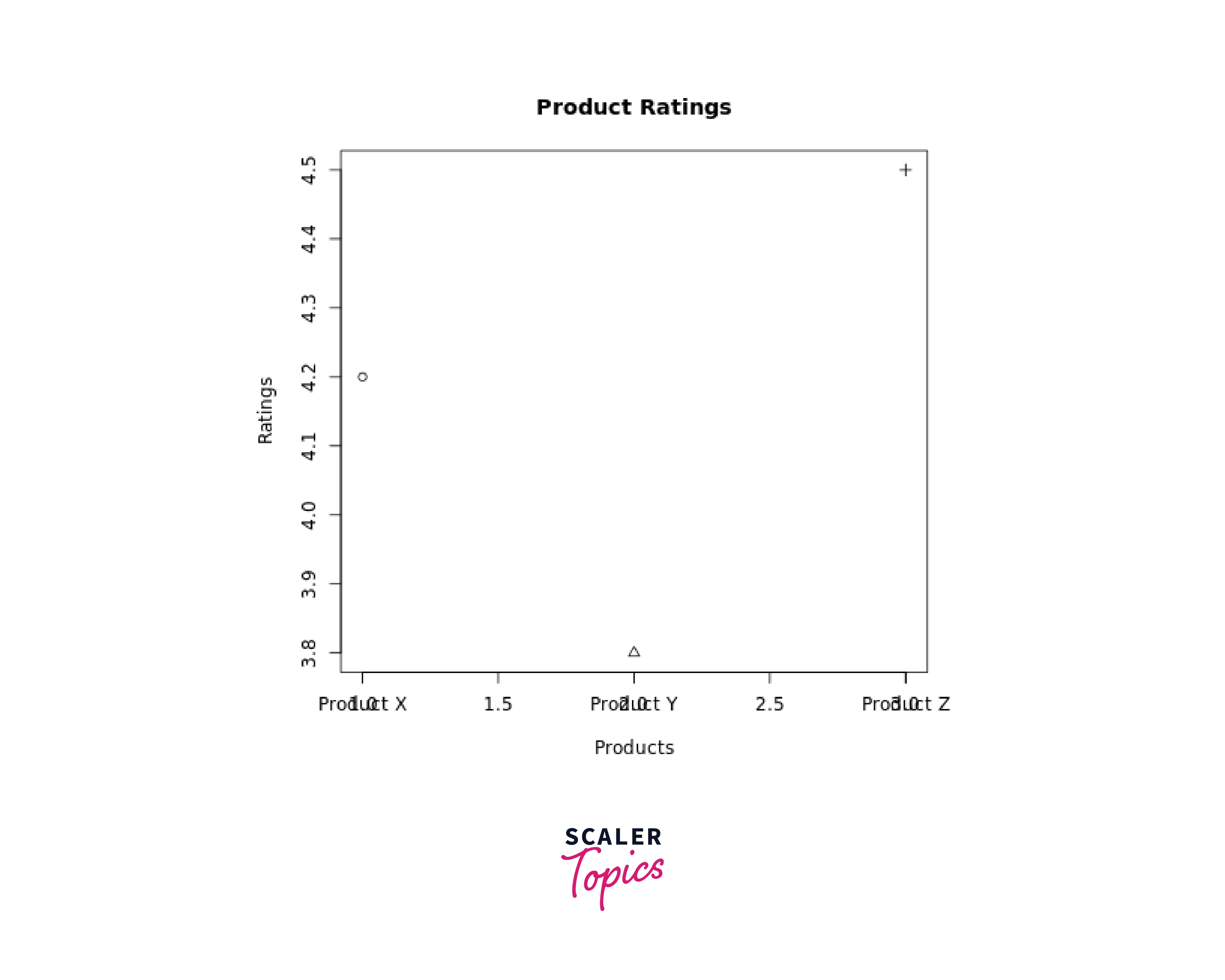
In this case, a scatter plot is created where each product's rating is represented by a different PCH symbol. The x-axis corresponds to the different products, and the y-axis represents the ratings. By specifying pch = 1:3, we assign distinct PCH symbols to each product's data point.
Turn Learning into Career Growth
Example - 3: Time Series Analysis
For time series data, PCH symbols can be used to mark specific data points or events. Consider stock prices over time:
Output:
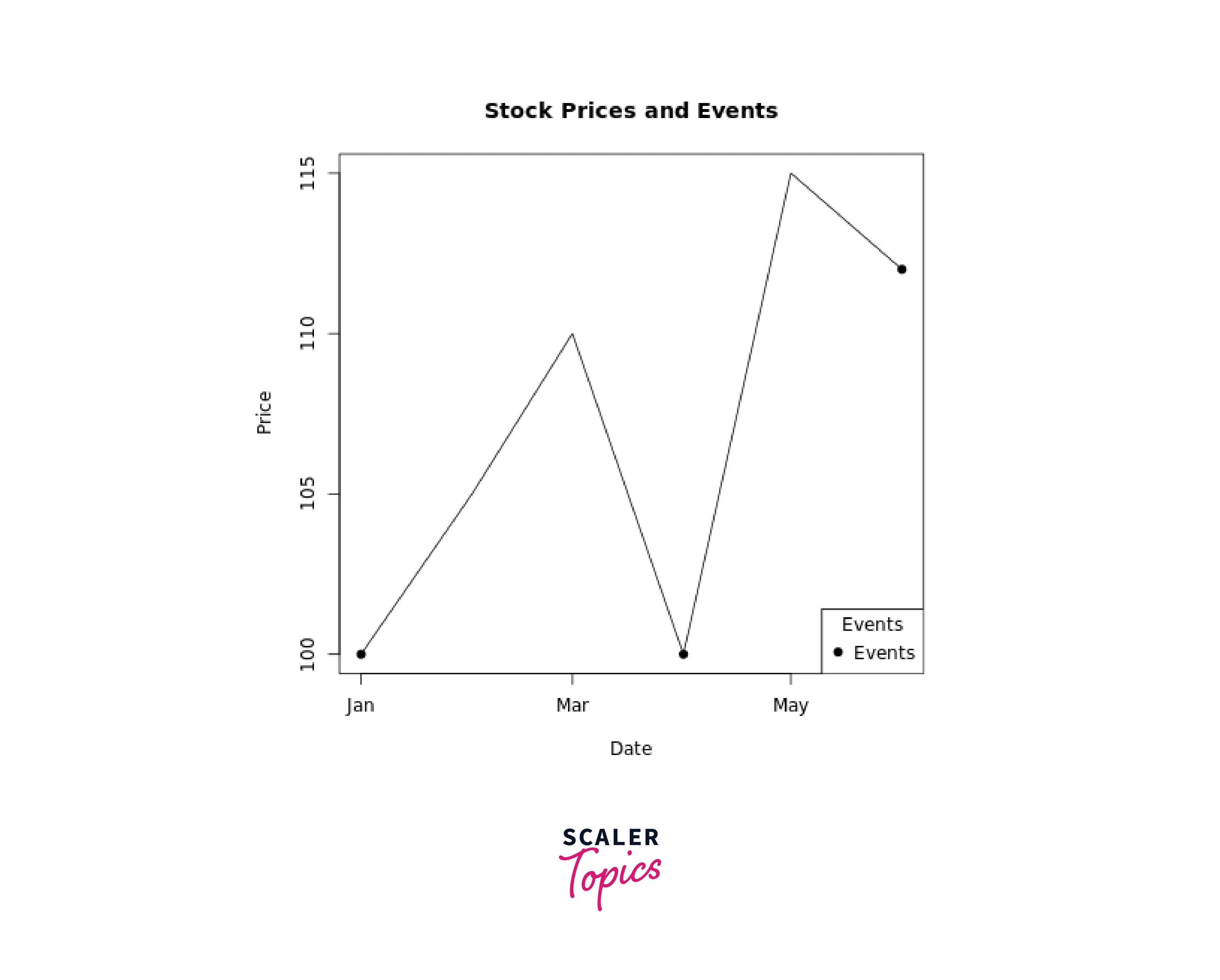
Here, PCH symbols (in this case, filled circles) mark events that influenced stock prices.
Example - 4: Categorical Data Visualization with Colorful PCH Symbols
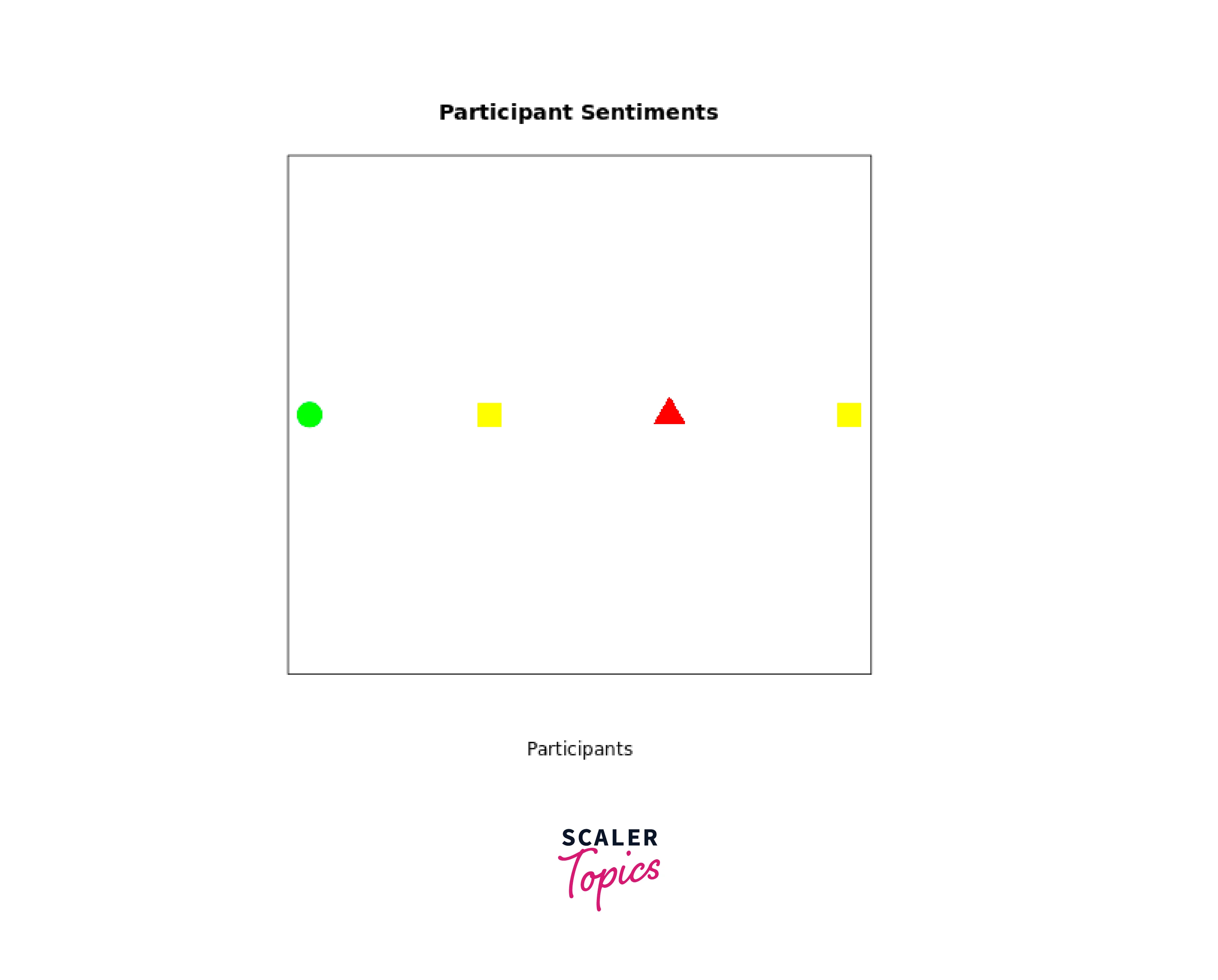
Suppose you have survey data that categorizes responses into three different sentiment levels: positive, neutral, and negative. You want to create a scatter plot that displays these sentiments, and you'd like to use colorful PCH symbols to make the plot visually appealing and informative.
Output:
Conclusion
- PCH in R empowers users to customize data points' appearance in scatter plots, making visuals more distinct and informative.
- With a range of PCH in R programming like circles, squares, and stars, data representation can be tailored to convey specific meanings.
- From differentiating competitors' performance to marking significant events, PCH in R enriches various types of plots.
- By incorporating colorful PCH symbols, you can add vibrancy and context to your visualizations.
- PCH-driven visuals facilitate clearer communication of insights, contributing to better data-driven decisions.