R - Pie Charts
Overview
Pie charts are circular visual representations that divide a dataset into different sectors, where each sector represents a particular category's proportion in the data. They offer a quick and easy-to-understand visual summary of categorical data. With R's powerful visualization libraries, generating pie charts has become a straightforward process.
Build an AI-First Career, Master the Complete Skillset
Choose from our industry-leading programs designed for career success
Modern Software and AI Engineering Program
Master full-stack development with AI integration


 +1000 more
Modern Data Science and ML with specialisation in AI
Advanced data science techniques with AI specialization
+1000 moreAdvanced AIML with Specialisation in Agentic AI
Deep dive into AIML with focus on Agentic systems
+1000 moreDevOps, Cloud & AI Platform Engineering
Build and manage AI-powered cloud infrastructure
+1000 moreAI Engineering Advanced Certification by IIT-Roorkee
Premier AI engineering certification from IIT-Roorkee

AI Forward Deployed Engineer Program
Full-stack engineering, production AI and client-facing consulting
+1000 morePie Chart in R
In R programming, we can utilize various libraries to generate a wide range of charts and graphs. Among these visualizations, a popular one is the pie chart in R, which visually represents values as slices of a circle, each distinguished by different colors. Each slice is labeled with a description, and the corresponding numeric values are displayed within the chart. Despite their prevalence, it's important to note that pie charts are not extensively recommended in the R documentation due to their limitations.
Instead, data visualization experts often advocate for alternatives such as bar charts or dot plots. The rationale behind this preference is that people tend to measure length more accurately than volume, making bar charts and dot plots more effective for conveying data insights.
In R, creating pie charts is straightforward with the help of the "pie()" function. This function takes positive numbers as input in the form of a vector and offers additional parameters to control various aspects of the chart, including labels, colors, titles, and more.
Syntax
The basic syntax for creating a pie chart in R is as follows:
Parameters
- x: A vector or matrix containing numeric values representing the proportions of different categories.
- labels: A vector of character strings providing labels for each category. These labels will be displayed alongside the chart slices.
- col: An optional parameter to specify the colors of each slice in the pie chart.
- main: An optional parameter to set the title of the pie chart.
How to Create a Pie Chart in R?
How Scaler Transformed Careers in Different Fields
Scaler learners achieved 2.5x salary growth with average post-Scaler CTC reaching ₹23L.
 Google
 Amazon
 Microsoft
 Flipkart
 Adobe1200+ more
Simple Pie Chart
Suppose we have the following data:
Code :
Creating a simple pie chart in R involves a few easy steps. Let's go through them:
Code :
Output :
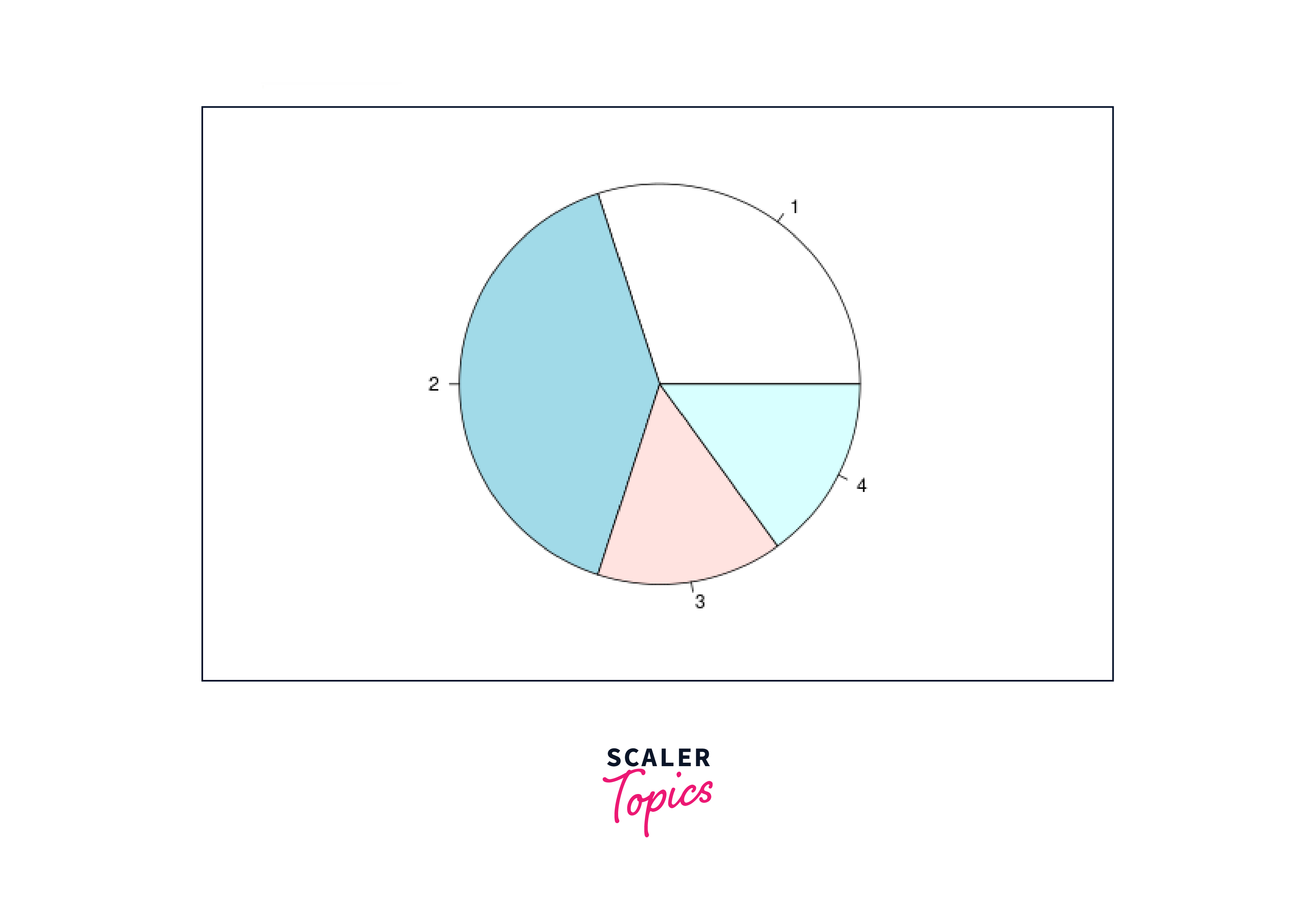
The pie chart is produced in a clockwise orientation from the provided data. Different colour slices are automatically added. Pastel colours are the default. However, the graph does not provide much information. Let us now add a title and a colour.
Pie Chart with Title and Colors
One of the key features we can utilize is adding a title to the pie chart. This can be achieved by passing the "main" parameter to the "pie()" function, which will set the title accordingly.
Additionally, we have the option to employ a vibrant rainbow color palette while drawing the chart, enhancing its visual appeal. To do this, we use the "col" parameter and ensure the length of the palette matches the number of values in the chart. The "length()" function is handy in determining the appropriate size for the palette.
To better understand these customization methods and create an attractive pie chart with a title and colored segments, let's consider the following example:
Code :
Output :

By incorporating the "main" and "col" parameters into the "pie()" function and utilizing the "rainbow()" function to generate a suitable color palette, we can produce an appealing and informative pie chart. This example showcases how simple adjustments can greatly enhance the visual impact of pie charts in R.
Turn Learning into Career Growth
Slice Percentage and Chart Legend
Pie charts in R offer two additional properties that can further enhance data visualization: slice percentage and chart legend. By displaying the data in the form of percentages, we can provide a clearer representation of the relative proportions of each category in the pie chart. Moreover, we can include a chart legend to help viewers understand the meaning of each slice in the chart.
To show the data as percentages, we can easily achieve this by using the "paste()" function within the "labels" parameter of the "pie()" function. This allows us to display both the category labels and their corresponding percentages in each slice.
Creating a chart legend can be accomplished using the "legend()" function, which requires specifying the coordinates (x and y) to position the legend, the text for the legend, the colors for filling the boxes beside the legend text ("fill"), the colors for the line and points beside the legend text ("col"), and the background color for the legend box ("bg").
Let's illustrate these methods with a practical example:
Code :
Output :
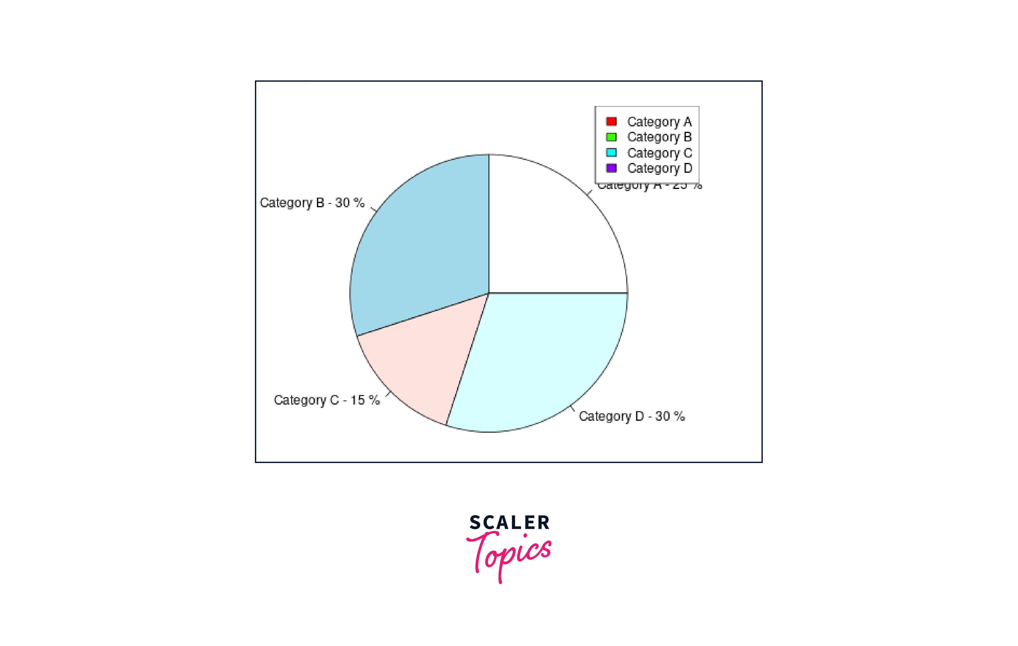
In this example, we utilize the "paste()" function to display the category labels along with their respective percentages in the pie chart. Additionally, we use the "legend()" function to position the chart legend in the top-right corner and provide appropriate colors and text for the legend items.
3D Pie Chart
R offers the capability to create captivating three-dimensional pie charts using the "pie3D()" function from the plotrix package. This function serves as an extension of the traditional "pie()" function, maintaining the same parameters for easy usability.
To create a 3D pie chart, you need to install and load the plotrix package, which provides the necessary tools for generating visually appealing 3D visualizations. Once the package is installed and loaded, you can employ the "pie3D()" function to create stunning three-dimensional representations of your data.
Let's delve into an example to better grasp the process of creating a 3D pie chart using the "pie3D()" function:
Code :
Output :
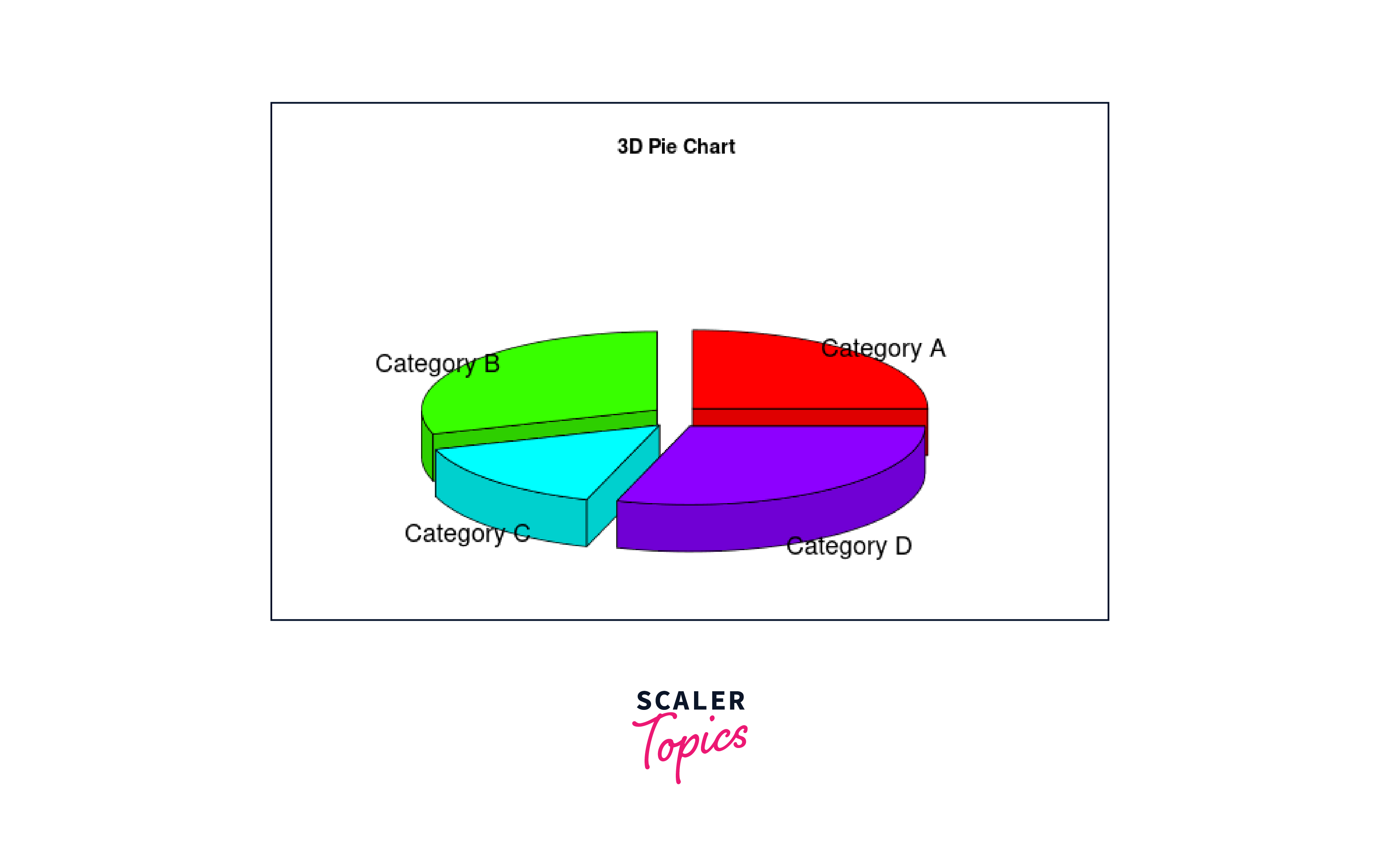
In this example, we first install the plotrix package using the "install.packages()" function and subsequently load it into our R environment with the "library()" function. Then, we define the sample data for the 3D pie chart, including category labels and their corresponding values. The "pie3D()" function is then used to generate the three-dimensional pie chart, with the "labels" parameter providing category labels and the "main" parameter setting the chart's title. Additionally, the "explode" parameter is employed to create a slight separation between the chart's slices, enhancing visual clarity.
By following these steps, we can effectively create visually striking pie charts in R, further expanding your data visualization options and making your presentations more engaging and informative.
Pie charts are a common but often controversial type of data visualization. They are particularly popular for showing the distribution of a variable as proportions of a whole. However, many experts caution against their use for several reasons, and even the R documentation doesn't extensively recommend them.
Why Pie Charts are Not Extensively Recommended in R Documentation
R is a language built by statisticians, for statisticians, and places a heavy emphasis on accurate and effective data visualization. Given the above limitations, it makes sense that pie charts would not be extensively recommended in R's official documentation. R's visualization libraries are geared towards more flexible and interpretable chart types like bar charts, box plots, and scatter plots, among others.
Human Perception and Misinterpretation
As noted earlier, human beings are generally better at comparing lengths than angles. When we look at a bar chart, we can easily see which bar extends further along a common axis and by roughly how much, making comparisons more accurate. In a pie chart, however, we have to compare angles, which our brains are not as adept at doing, especially when the differences in angle are slight.
Moreover, the farther away a slice is from being either a perfect half-circle or a full circle, the harder it becomes for people to make accurate judgments about its size relative to the other slices. This limitation is not present in bar charts where each bar is judged independently along a common scale.
In summary, while pie charts can be visually appealing and provide a good high-level overview of data in some cases, they have several limitations that make them less ideal for many data visualization tasks. That's why they're not as heavily promoted in R documentation compared to more versatile and interpretable chart types.
Conclusion
This article taught us:
- Pie charts are valuable tools for presenting categorical data in a visually engaging manner.
- We can create various types of pie charts in R using the "pie()" function from the base graphics package and the "pie3D()" function from the "plotrix" library for 3D visualization.
- By experimenting with colors, titles, percentages, and chart legends, we can tailor pie charts to effectively communicate insights from our data.