Top 15 Power BI Project Ideas for Practice (2023)
Overview
In the dynamic landscape of data analysis and business intelligence, Power BI has emerged as an essential tool for businesses and professionals aiming to utilize the potential of data-driven decision-making. Whether you're a seasoned data analyst or a newcomer to the field, engaging in practical projects and hands-on experience can significantly enhance your Power BI skills. This article compiles a comprehensive list of top Power BI projects that cater to various skill levels and industries. Engaging in these Power BI projects will provide you with hands-on experience, sharpening your data analysis and Power BI skills for excellence in this dynamic field.
What is Power BI?
- Power BI, a business intelligence and data visualization platform developed by Microsoft, enables users to connect to various data sources, transform and model data, and create interactive visualizations and reports.
- With its user-friendly interface and advanced features, Power BI enables businesses to derive actionable insights from large volumes of data, make data-driven decisions, and gain a competitive edge.
- Whether analyzing sales trends, monitoring KPIs, or discovering hidden patterns, Power BI empowers users at all levels to explore, visualize, and share data seamlessly and efficiently.
What is Power BI Used For?
Here are a few of the key applications Power BI is used in organizations -
- Data Visualization - Power BI is used to create visually appealing and interactive dashboards that help present complex data in an easily understandable format.
- Business Intelligence - It enables businesses to gather insights from various data sources, aiding in informed decision-making and strategic planning.
- Data Analysis - Power BI facilitates the analysis of large datasets, enabling users to identify trends, patterns, and correlations for better understanding.
- Report Generation - It streamlines the process of generating detailed and customized reports, automating routine reporting tasks.
- Data Collaboration - Power BI allows teams to collaborate on data projects, share insights, and work collectively on data-driven projects.
How To Do Visualization in a Power BI Project?
Visualizing data effectively is a cornerstone of Power BI projects. You can begin by importing your data from various sources like databases, CSVs, spreadsheets, or online platforms. Once your data is loaded into Power BI, you can select from a wide range of visualization options, including charts, graphs, maps, and tables. You should choose the appropriate visualization type based on the nature of your data and the insights you want to convey. For instance, you could choose a column chart to showcase product sales across different months, a pie chart representing the percentage distribution of sales by product category, or a map to visualize regional sales performance.
Customization is key - you also have the flexibility to customize the appearance of your visualizations by adjusting colors, fonts, and labels to ensure they align with your project's theme and branding. For instance, if you're analyzing customer feedback, you might want to use a sentiment analysis visualization that color-codes sentiments as positive, neutral, or negative.
You can also use filters and slicers to enable interactivity, allowing users to explore data subsets and uncover specific trends. To enhance storytelling, create a dashboard by arranging multiple visualizations on a single canvas. Utilize features like drill-through and tooltips to provide additional context and detail. For instance, users could click on a particular product category to see detailed sales figures.
Regularly preview and fine-tune your visualizations to achieve clarity and impact. By mastering the art of visualization, you can transform raw data into compelling narratives that drive meaningful insights and decisions.
15 Power BI Project Examples
Within this article, you'll find a compilation of 15 Microsoft Power BI projects. These Power BI projects are organized into three tiers - beginner, intermediate, and advanced. Feel free to select any of these Power BI projects to enhance your proficiency in the realm of Data Science and Analysis through hands-on practice. Let’s explore these Power BI projects in the subsequent sections.
Beginner-Level Power BI Project Basic Examples
In this section, we've compiled a selection of Power BI projects tailored for beginners. Engaging with these simple Power BI projects will provide you with insight into the applications of business intelligence and pave the way for a prosperous journey as a budding data scientist.
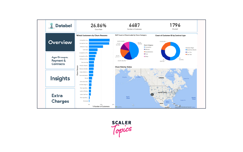
Customer Churn Analysis
The Customer Churn Analysis project is a simple and popular example that helps you learn how to use Power BI. This project focuses on studying customer behavior, specifically when they churn, that is, stop using a service or buying a product. By looking at the sales and profits of products in different regions, you can understand which areas are doing well and distribute profits effectively. The goal is to determine how to keep customers engaged and prevent them from leaving. To do this, you'll create different types of visual displays, like charts and graphs, that show how sales change over time and how different products perform.
You can use a dataset from Kaggle to perform a Customer Churn Analysis that contains information about different customers. This project is perfect for beginners who want to grasp Power BI's capabilities.
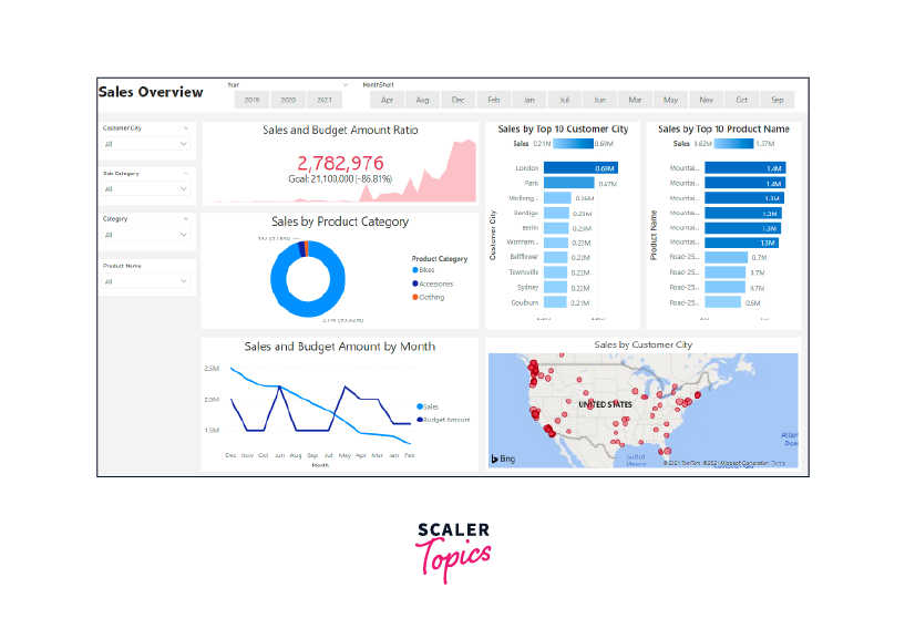
Product Sales Data Analysis
Analyzing sales data is crucial for businesses to understand how well they're doing. But when there's a lot of data, it can be a hard task to keep track. This project helps companies by looking at their sales info and showing which products are making the most money.
Using a dataset provided by Microsoft, you'll connect it to Power BI and perform data cleaning to remove irrelevant records to only focus on the important info. Then, you can make visual displays like Pie Charts, Bar Charts, and more to help everyone see the sales info clearly. This way, companies can make better decisions about their products and sales strategies.
Scaler Placement Report and Statistics
Scaler learners achieved 2.5x salary growth with average post-Scaler CTC reaching ₹23L.
Marketing Campaign Insights Analysis
The Marketing Campaign Insights Analysis project aims to demonstrate how well different marketing campaigns and product groups are doing. It helps marketing managers understand which campaigns are successful.
You can work with a dataset from Kaggle containing marketing data. By creating a data visualization dashboard using Power BI, you can show information like how much money is spent on each category, how well campaigns are performing, and key highlights of the campaign. You can use charts like Bar Charts and Column Charts, as well as features like Smart Narratives to highlight important points. This project is great for beginners and gives marketing managers useful campaign insights.
Scaler Placement Report and Statistics
Scaler learners achieved 2.5x salary growth with average post-Scaler CTC reaching ₹23L.
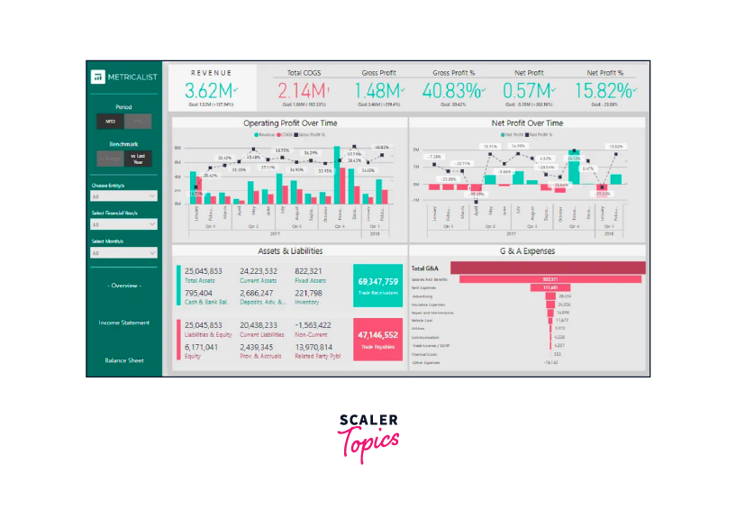
Financial Performance Analysis
The Financial Performance Analysis is a fascinating project for people new to Power BI. In this project, you'll focus on improving how a company that offers accounting services analyzes its finances. The goal is to ensure they can quickly get the important financial data they need. This project could involve moving from using Excel for financial reports to using Power BI dashboards. This change would help clients see their financial situation better and how well they're doing. It's a great way to learn Power BI while helping a company become more efficient in understanding its finances. For this project, you can download and use the data from Kaggle.
Transform Your Career
Choose from our industry-leading programs designed for career success
Modern Software and AI Engineering Program
Master full-stack development with AI integration

Modern Data Science and ML with specialisation in AI
Advanced data science techniques with AI specialization
Advanced AIML with Specialisation in Agentic AI
Deep dive into AIML with focus on Agentic systems
DevOps, Cloud & AI Platform Engineering
Build and manage AI-powered cloud infrastructure
AI Engineering Advanced Certification by IIT-Roorkee
Premier AI engineering certification from IIT-Roorkee
Healthcare Sales Analysis
This Healthcare Sales Analysis project is designed for the Animal Healthcare industry to keep track of product sales for treating minor animal species. It helps businesses compare sales between different cities and see how well their products are selling. The project can create a detailed report on which types of products are selling the most and how sales are changing over time. You can use a dataset about pharmaceutical sales from Kaggle.
In Power BI, you can use different types of visuals like Tables to display sales by product type, Column Charts for monthly sales trends, and Bar Charts for comparing sales in different cities. You can also explore features like Treemaps, Cards, and Smart Narratives.
Intermediate-Level Power BI Project Ideas
If you're already familiar with the Power BI data visualization tool and are eager to enhance your data analytics skills, particularly as a Data Scientist or Data Analyst, consider these Power BI projects to enrich your resume -
Anomaly Detection in Credit Card Transactions
Our first Power BI project idea is about detecting anomalies or unusual activities in credit card transactions, known as "Anomaly Detection." Anomaly Detection is a way of using machine learning to find transactions that are different from the norm and might be suspicious. There are three methods to do this - supervised (when you have labeled data), semi-supervised (for normally behaving data), and unsupervised (for data without labels).
For this project, you can use the credit card dataset by Delaware, available on their open data platform, or the credit card fraud detection dataset from Kaggle. First, you bring the dataset into Power BI desktop, maybe using a web connector. Then, you can use Power BI to train a system to identify anomalies, or you can use a pre-trained model. To label outliers in Power BI, you'll need to run a Python script in the Power Query Editor, using the get_outliers() method from PyCaret library. Lastly, you can use Power BI Dashboard to display your findings. You could also train your anomaly detection model in another tool/IDE and then use Power BI to label the anomalies. To visualize the results, the Power BI dashboard offers various tools like Line Charts, Bubble Charts, and TreeMaps.
AutoML Cashflow Optimization for Insurance Company
AutoML, short for automated machine learning, is a method that automates the time-consuming, iterative, and complex steps of machine learning. It helps data experts quickly create effective machine learning models. The main aim of any AutoML solution is to find the best model based on how well it performs.
In this project related to business intelligence, you'll use a dataset from Kaggle about medical costs. The task is for an insurance company that wants to better predict patient expenses using factors like patient details and health risks. This way, they can manage their finances better. The first step is using Power BI Desktop to open and copy the dataset. Then, you'll run a Python script using Power Query, where you can train, compare, and evaluate performance of different models with the compare_models() method from PyCaret library. This helps you see which model works best. You can also use the automl() function to find the top-performing model. For the final dashboard, you can use Power BI to create visuals like Bar Charts, Bubble Charts, and Tables to display the results.
Global Health Expenditure Analysis
This project focuses on using clustering analysis with PyCaret in Power BI. Clustering is a way to group similar data together to understand patterns and structures.
For this project, you can work with the health spending data from the WHO Global Health Expenditure database. This dataset covers health expenses as a part of each country's GDP for more than 200 countries from 2000 to 2018. You can use the K-Means clustering algorithm to group the data. Once you load the data into Power BI Desktop and create the clustering model, you can visualize the clusters on a Power BI Dashboard. For an overview page, you can use visuals like Filled Maps and Bar Charts, while for a detailed look, you can use Point Maps. This project is a great way to learn how to use clustering to understand health spending patterns across the globe.
Analyzing Loan Applications
This project involves examining data from loan applications to uncover hidden 'topics,' which help evaluate the impact of specific loan types on the default rate. This is done by using a technique called Latent Dirichlet Allocation (LDA) topic modeling in Power BI. Topic modeling is a way to figure out the main themes in a set of documents.
For this task, you can work with the Kiva dataset available on GitHub. This dataset includes information about loans from 6,818 potential borrowers that were accepted. It contains details like loan amounts, borrower nationality, gender, and some text data from their applications. Once you bring this dataset into Power BI Desktop and train your model, you can visualize the results on a Power BI dashboard. You can use features like Word Clouds, Pie Charts, Bar Charts, and Scatter Charts to show the topics and their impact. This project helps you explore how different factors affect loan defaults using advanced techniques in Power BI.
Interactive Visualization of Movie Sales
The movie sales visualization project is a really fun Power BI project idea. The goal is to take data about how much money movies make and make it into a cool interactive display. You can use the IMDb dataset that covers the years 2006 to 2016, available on IMDb and Kaggle. This dataset has info about movies with a score of 6 or more on IMDb, including Budget, Gross earnings, Genre, and Scores.
You can make a special Radial Bar Chart and use Slicers to choose Genre, Country, and score range directly in Power BI. This lets you see things like the Average Score and how much money movies made in the selected group. By using a Histogram on the scores with filters for year and genre, you can show how often certain IMDb scores appear. A KDE plot is another neat feature that shows a density graph, helping you understand the average rating for a specific genre and how scores are distributed over time.
Advanced-Level Power BI Project Ideas
Lastly, we've compiled a selection of advanced Power BI projects with datasets, tailored for professionals seeking intriguing challenges to further elevate their Power BI skills.
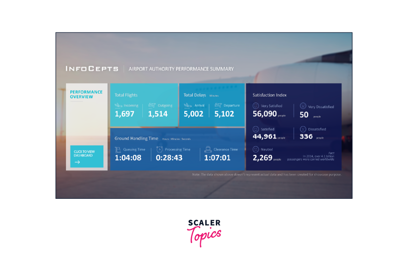
Airport Authority Data Analysis
The Airport Authority Data Analysis project is all about understanding important airport information. This includes the total flights (coming and going), delays (arrivals and departures), time for ground operations, and even passenger feedback. All these details can be shown on a dashboard's main page. This project's purpose is to help airport managers make quick decisions based on data, especially during flight changes, emergencies, or delays.
To do this project, you can use the Airline Delays and Cancellation dataset from Kaggle. This dataset covers airline data from 2009 to 2018, giving insights into trends over time. For flight analysis, you can use Power BI visuals like Cards, Bar Charts, Flow Maps, TreeMaps, and Tornado Charts. To show passenger feedback, Bar Charts, Column Charts, or Cards might work well. This project gives you the chance to learn how Power BI can help manage airport operations effectively.
Covid-19 Insights Analysis
The Covid-19 Insights Analysis is a highly popular Power BI project choice. It's about taking a deep look at the key parts of the Covid-19 pandemic - the current situation and details about different countries. You'll make a dashboard that shows important info about cases (active, deceased, and recovered), mortality rates, and recovery rates for each country and over time. This dashboard might also have a summary of the main KPIs (key performance indicators) and in-depth analysis on separate pages.
For this project, use the Covid-19 dataset from Kaggle. To visualize the data in Power BI, you can use features like Bar Charts, Point Maps, Line Charts, and Column Charts for the main overview. For a closer look at case categories, Doughnut Charts work well. And if you want to analyze cases by country, Decomposition Trees are a good option. Heat Maps can also make your dashboard more informative and engaging. This project lets you learn how Power BI can help understand Covid-19 data in a meaningful way.
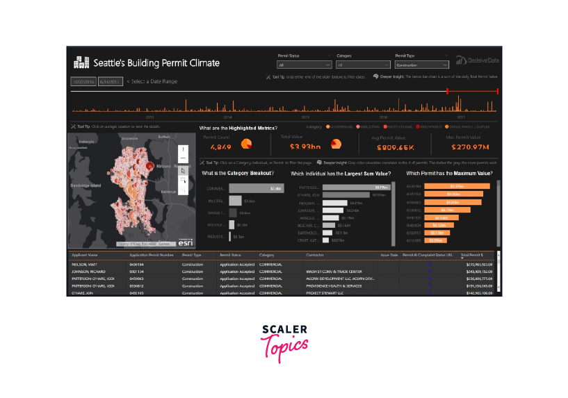
Construction Permit Data Analysis
The Construction Permit Data Analysis project aims to help construction companies get a deep understanding of the industry. This means looking closely at specific details and exploring important events. You can focus on things like how investments grow over time, where investments are focused, and if they're influenced by factors like Category, Contractor, or Individual. You'll also study the market's status and which categories, individuals, and permits play a big role.
For this project, use the Seattle building permits dataset from Kaggle. To visualize data in Power BI, you can use tools like Regional Maps, Pie Charts, Bar Charts, Tables, and Cards for the main page. For more details, Bar Charts and Line Charts can show how contractors compete and how different categories are growing. This project helps you see how Power BI can provide insights into the construction permit industry.
Turn Learning into Career Growth
Global Energy Trade Analysis
The Global Energy Trade Analysis is one of the really unique Power BI projects. It's all about understanding the exchange and production of energy worldwide. This project touches on several areas, like the growth of wind energy and comparing economies based on energy use.
To tackle this special project, you can use the international energy statistics dataset from Kaggle. Your resulting dashboard could show energy stats on things like production, exchange, and usage of different energy sources. You'll cover both conventional and non-conventional energy sources, as well as new and renewable ones. For this dashboard, Power BI offers visuals like Bar Charts, Flow Maps, and Cards for an overview. And for specific sections, you can use Ribbon Charts, Treemaps, and more Bar Charts. This project teaches you how Power BI can provide insights into the complex world of global energy trade.
Life Expectancy Data Analysis
The Life Expectancy Data Analysis project is about understanding what affects life expectancy. It looks at things like vaccinations, deaths, money, social aspects, and other health-related factors. This helps a country figure out what leads to lower life expectancy. It also helps them decide where to focus efforts to increase how long people live.
To do this, you can use the life expectancy dataset from the World Health Organization (WHO) on Kaggle. Power BI offers visuals like Gauge Charts, Pie Charts, Line Charts, and Point Maps to give an overview. For country-specific details, you can use Tornado Charts, Doughnut Charts, and Treemaps. This project teaches you how Power BI can provide valuable insights into life expectancy and health-related issues.
Power BI Projects Github
Here are some unique and interesting project concepts from GitHub that can help you grasp the diverse ways Power BI can be used.
Twitter Analysis Dashboard
This project involves building a complete pipeline for analyzing Twitter data, from start to finish. To work on this Power BI project, you can get Twitter data from GitHub. The process involves extracting the data, changing it from JSON to CSV, and adding new attributes as needed. Using NLP analysis, you'll categorize the content of tweets and find out how positive or negative they are. Once the data is prepared, you can use Power BI to create detailed reports. To design the dashboard, you'll make use of different types of visuals like pie charts, bar graphs, line charts, tree maps, and doughnut charts, among others.

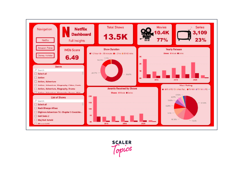
OTT Media Dashboard
This distinctive Power BI project involves displaying different kinds of data from various OTT platforms like Netflix, Hotstar, and Amazon Prime. To get started, you can obtain the OTT media platform dataset from GitHub. Use Power BI's Query Editor to clean and prepare the data. Once your data is set for visualization, you can showcase the information using a variety of visual tools like plots, graphs, cards, and more. This project helps you explore how Power BI can make OTT media data easier to understand and analyze.
AdventureWorks Database Analysis
For this project, you'll dive into the AdventureWorks data available on GitHub. The analysis and visualization process involves using Microsoft SQL Server Management Studio for querying data and Power BI for creating visual displays. Additionally, Microsoft Excel and Power BI's query editor can be used for in-depth analysis. This project helps you explore the AdventureWorks dataset and understand how to leverage various tools for analysis and visualization.
Power BI Report Examples
Here are a few compelling examples of Power BI reports that demonstrate the effectiveness of data visualization through the Power BI tool. These examples will help you comprehend the impact of using Power BI for visualizing data.
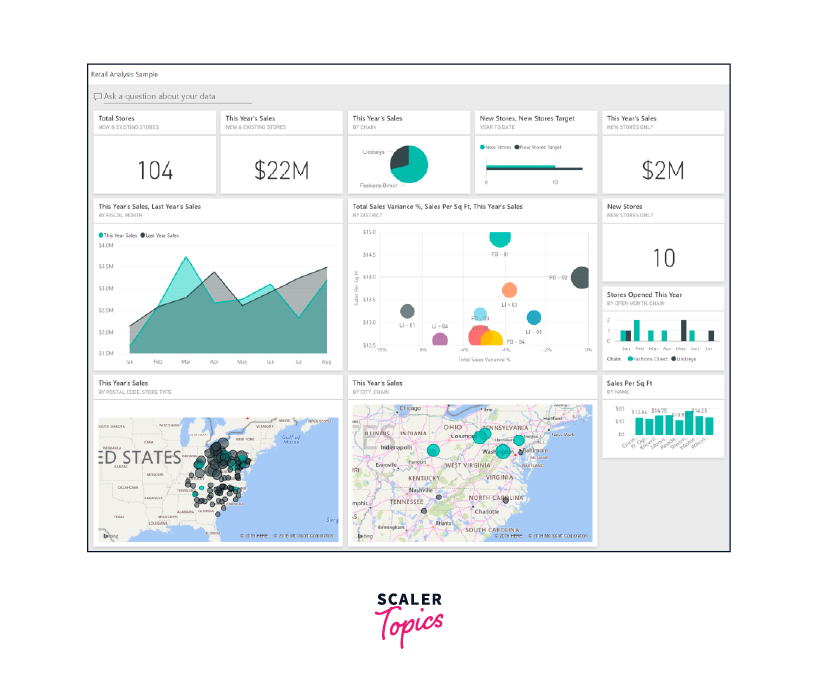
Retail Analysis Power BI Report
In this retail analysis report, you'll find a dashboard that examines sales data for products sold by different retailers across various regions. The dashboard includes insights into new store performance and a comparison between the current year and the previous year. This comparison covers key metrics like sales, units sold, gross margin, and variations.
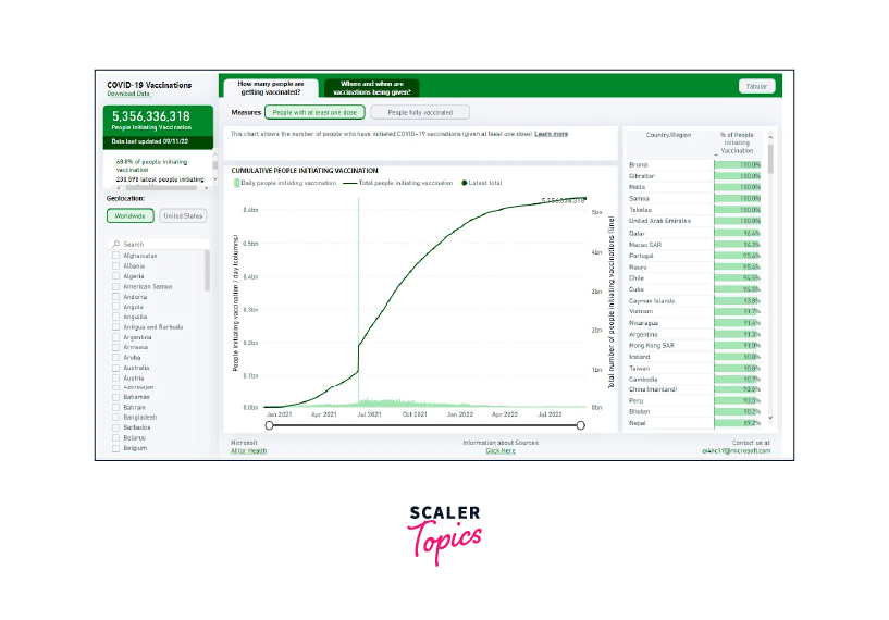
Global Covid-19 Analysis Power BI Report
Through interactive visuals using easily accessible data, the Global Covid-19 Analysis Report provides a comprehensive view of COVID-19 trends across the globe. The report features maps that display crucial aspects like Vaccination rates, Progress toward zero cases, Rt values, Spread Analysis, Testing rates, and Risk Levels.
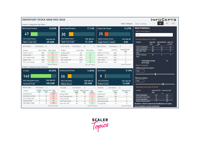
Inventory Stock Analysis Power BI Report
This report delves into inventory stock analysis, offering insights into stock inventory trends for the year 2018. With this interactive dashboard, you can make predictions about the "Availability of Stock" and "Time to Replenish Stock." These predictions are based on data from the fulfillment cycle and markdown variance, providing valuable insights for inventory management.
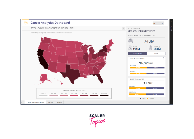
Cancer Analytics Power BI Report
The Cancer Analytics report provides both a concise overview and an in-depth analysis of cancer patients in the United States. Through this report, you can examine the mortality rates associated with various types of cancer, categorized based on multiple factors. By utilizing the Cancer Analytics Dashboard, you can make informed decisions regarding the increasing number of cancer patients in the country.
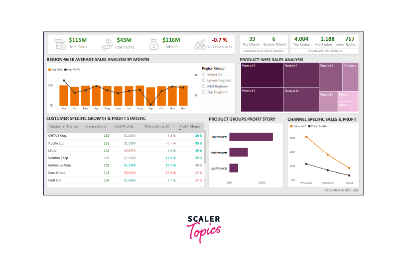
Customer Analysis Power BI Report
The Customer Analysis Report focuses on product sales and profits from local customers. This report is particularly valuable for those interested in analytics, as it provides insights into the distribution of customer profits and business expansion in different regions. The main attractions of the Customer Analysis report dashboard include visualizing cash inflow in specific regions and tracking turnover for different products among clients.
Master Data Visualization With These Power BI Projects
Whether you're a beginner or an expert, these real-time Power BI projects are designed to enhance your skills and help you master the art of integrating business intelligence into Data Science. By taking on these project ideas, you'll gain a deeper insight into using Power BI to adopt a data-driven approach across various data science fields, preparing you for potential job roles. If you're searching for free Power BI projects with solutions, platforms like GitHub or Kaggle offer great resources.
FAQs
Q. What projects can I do with Power BI?
A. You can explore a wide range of projects using Power BI to enhance your data analysis and visualization skills, as mentioned in this article. If you are a beginner to the Power BI, you can work on the Customer Churn Analysis and Product Sales Data Analysis. If you are at intermediate level, then you can experiment on the Anomaly Detection in Credit Card Transactions and Movie Sales Visualization. Advanced users of Power BI can work on Covid 19 and Twitter Analysis Dashboard to elevate their Power BI skills.
Q. How do you practice Power BI?
A. The best way to practice Power BI is through hands-on experience with various projects. Start by selecting projects that match your skill level, such as customer analysis, sales data analysis, or COVID-19 insights. This practical approach not only enhances your proficiency but also equips you with real-world problem-solving abilities using Power BI's tools and features.
Q. Where can I get practice data for Power BI?
A. You can find practice data on platforms like GitHub and Kaggle, where datasets related to various domains are available for free. These platforms offer a wide range of datasets that you can use to explore and develop your Power BI skills. Additionally, the Power BI service provides pre-built sample datasets, making it convenient to start practicing directly within the platform itself.
Conclusion
- Power BI projects, mentioned in this article, offer a diverse range of opportunities for both beginners and professionals to sharpen their data analysis and visualization skills.
- These projects provide hands-on experience in tackling real-world data challenges, enabling you to derive valuable insights and make informed decisions.
- The projects span various industries, from healthcare to finance, giving you a chance to explore and understand data dynamics across sectors.
- By mastering Power BI through these projects, you're preparing yourself to excel in the data-driven world and become job-ready in the realm of data science and business intelligence.