Colors in R
Overview
Colors play a significant role in data visualization, aiding in the effective communication of information. In the realm of data science, R stands out as a powerful programming language for statistical computing and graphics. With its extensive collection of packages and functions, R provides numerous options for manipulating and customizing colors in visualizations. This article explores the versatility of colors in R, covering the various methods and techniques available to create visually appealing and informative plots. From basic color handling to advanced color palettes and schemes, we delve into the world of colors with R.
Build an AI-First Career, Master the Complete Skillset
Choose from our industry-leading programs designed for career success
Modern Software and AI Engineering Program
Master full-stack development with AI integration


 +1000 more
Modern Data Science and ML with specialisation in AI
Advanced data science techniques with AI specialization
+1000 moreAdvanced AIML with Specialisation in Agentic AI
Deep dive into AIML with focus on Agentic systems
+1000 moreDevOps, Cloud & AI Platform Engineering
Build and manage AI-powered cloud infrastructure
+1000 moreAI Engineering Advanced Certification by IIT-Roorkee
Premier AI engineering certification from IIT-Roorkee

AI Forward Deployed Engineer Program
Full-stack engineering, production AI and client-facing consulting
+1000 moreR Colors
R, a versatile programming language for statistical computing and graphics, offers various options for working with colors. Understanding the capabilities of colors in R is essential for creating visually appealing and informative data visualizations.
Using Colors in R
Let's explore some techniques for using colors effectively in R visualizations.
Add Color to the Plot in R
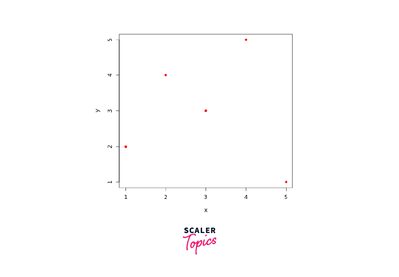
Adding colors to your plots can make them visually appealing and help distinguish different elements. In R, you can specify the color of points, lines, and other graphical elements using the col parameter in various plotting functions.
For example, let's create a simple scatter plot and assign a red color to the points:
In this example, the col = "red" argument sets the color of the points to red, and pch = 16 specifies that the points should be displayed as filled circles.
Output:
How Scaler Transformed Careers in Different Fields
Scaler learners achieved 2.5x salary growth with average post-Scaler CTC reaching ₹23L.
 Google
 Amazon
 Microsoft
 Flipkart
 Adobe1200+ more
Using Color Names to Change Plot Color in R
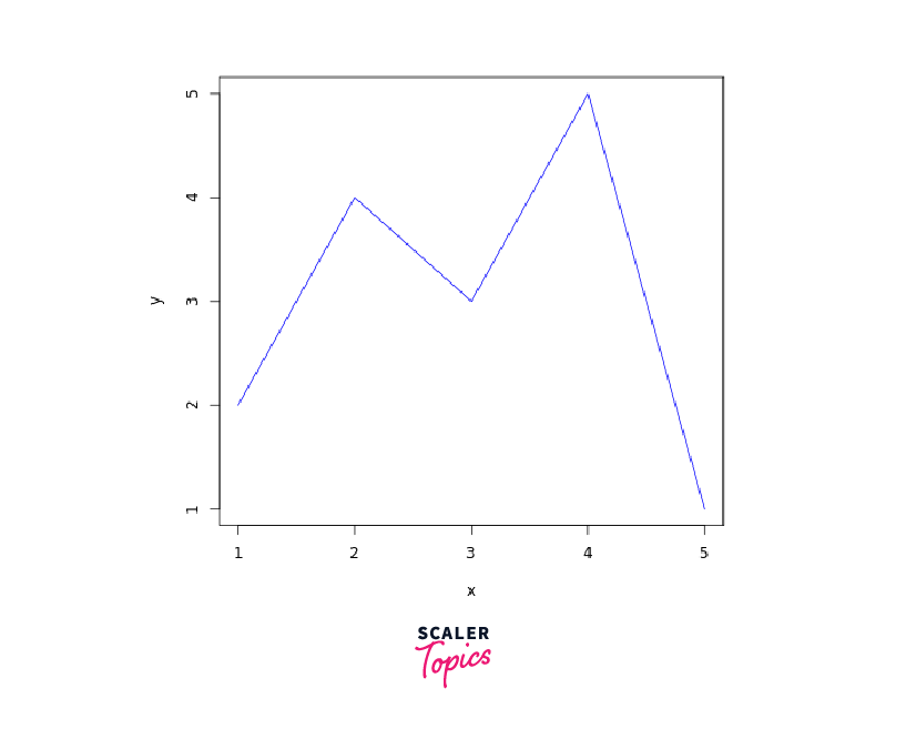
R provides a set of predefined color names that you can use to change the color of elements in your plots. These color names are intuitive and easy to remember. You can directly specify color names as values for the col parameter.
For instance, let's create a line plot and change the color of the line to blue:
In this example, the col = "blue" argument sets the color of the line to blue. The type = "n" argument in the plot() function creates an empty plot without points, allowing us to plot only the line.
Output:
Using Hex Values as Colors in R:
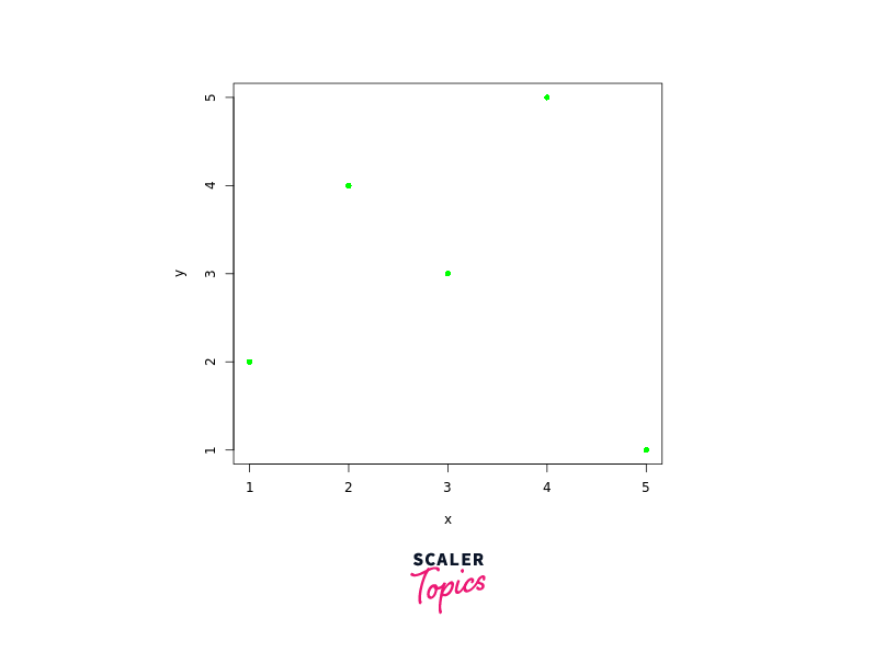
R allows you to specify colors using hexadecimal notation. Hex values represent colors using a combination of six digits, where the first two digits represent the red channel, the next two represent green, and the last two represent blue.
For example, let's create a scatter plot and assign a shade of green using a hexadecimal color value:
In this example, col = "#00FF00" sets the color of the points to green. The hexadecimal color #00FF00 represents a fully saturated green color with no red or blue.
Output:
Turn Learning into Career Growth
Using RGB Values to Color Plot in R
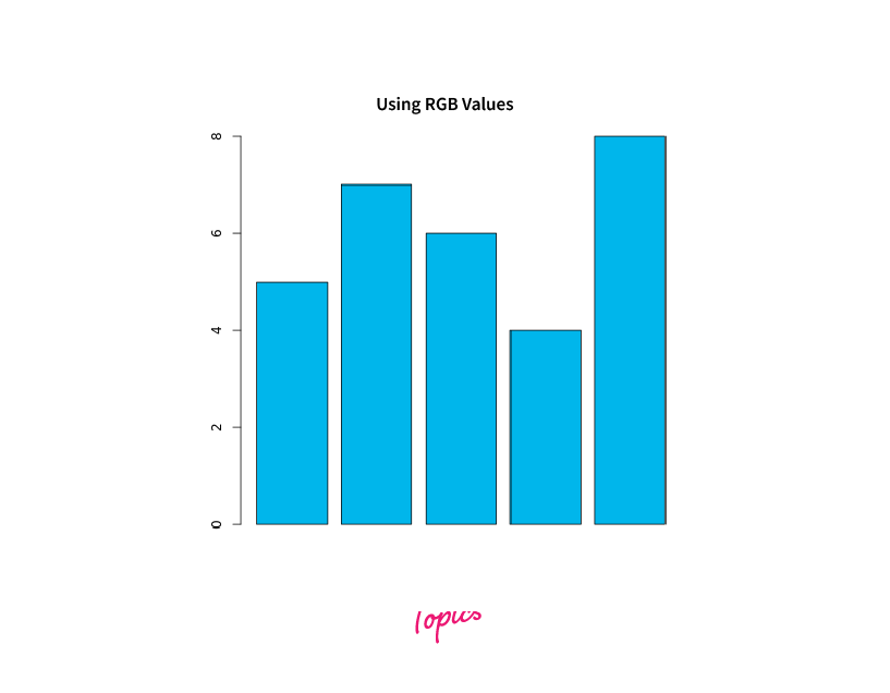
Using RGB values to specify colors in R provides precise control over the intensity of each color channel (red, green, and blue). By manipulating these values, you can create custom colors for your plots. Let's explore how to use RGB values to color plots in R.
To define colors using RGB values, you can use the rgb() function in R. This function takes arguments representing the intensity of each color channel, ranging from 0 to 255. Here's the syntax of the rgb() function:
We can directly pass rgb() to the col parameter as:
Output:
Color Cycling in R
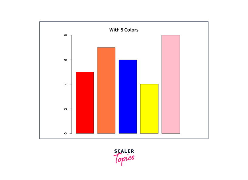
Color cycling refers to the automatic rotation or cycling through a set of colors in your plots. It is beneficial when visualizing multiple lines, points, or categories, allowing you to differentiate between them using distinct colors. R provides various methods for achieving color cycling in your visualizations.
One way to achieve color cycling is by specifying a vector of colors and using the rep() function to repeat the colors as needed. This ensures that each element in your plot is assigned a unique color from the vector.
Let's consider an example where we have two sets of data points represented by red and blue colors. We can use color cycling to assign alternating colors to the points:
In this example, we use points() to plot the data points. By specifying col = rep(c("red", "blue"), length.out = length(x)), we assign alternating red and blue colors to the points in both datasets. The length. out argument ensures that the colors are repeated appropriately to match the length of the dataset.

Color cycling can also be used with line plots, bar plots, or other visualizations where multiple elements need to be differentiated by color. Cycling through a set of colors allows you to create visually appealing and informative plots that clearly distinguish different categories or datasets.
Here's another example of using color cycling in R:
Output:
Color Palette in R
Color palettes provide a collection of colors that can be used to represent different categories or levels in your visualizations.
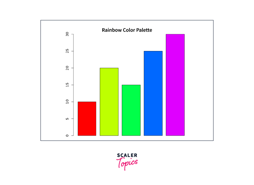
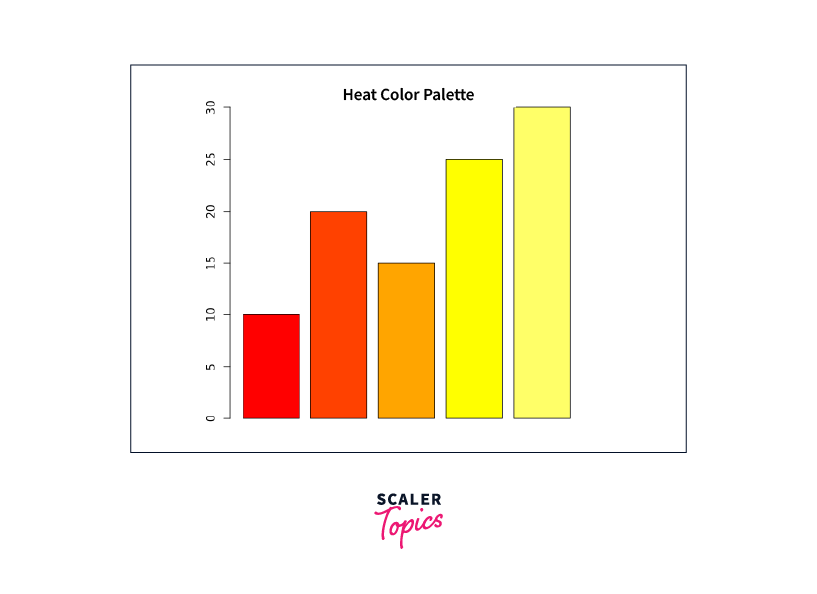
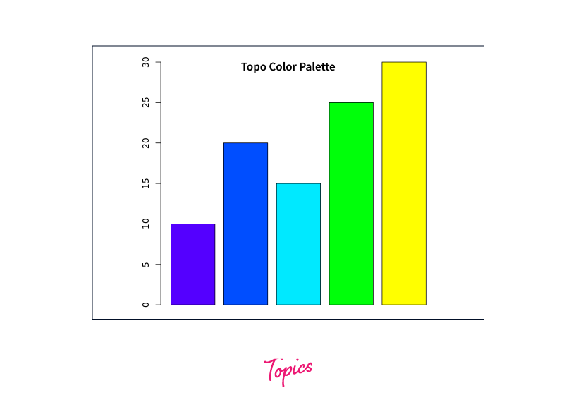
In R programming, four convenient built-in color palettes allow you to generate desired-length color vectors quickly. These palettes include rainbow(), heat.colors(), terrain.colors(), and topo.colors(). By specifying the number of colors needed, you can easily create color vectors using these palettes.
Let's consider an example:
Output:
In the given example, it's important to note that the hexadecimal color codes used are 8 digits long. The last two digits of the code represent the transparency level, with FF indicating full opacity and 00 indicating full transparency.
Here's an example demonstrating the usage of color palettes in R:
Output:

Conclusion
- Colors in R are a powerful tool for enhancing data visualization, allowing for effective information communication.
- R provides various methods for working with colors, including basic color handling using named colors, RGB values, and hexadecimal notation.
- Color palettes, such as those available in the RColorBrewer package, offer a wide range of pre-defined color schemes to represent different categories or levels in visualizations.
- Using color names, RGB values, or color palettes, R allows for precise control over color selection, ensuring visually appealing and informative plots.
- Color cycling techniques in R enable the automatic rotation or cycling through a set of colors, making it easier to differentiate between multiple elements in a plot.
- By leveraging the capabilities of colors in R, data scientists and analysts can create engaging and impactful visualizations that effectively convey insights.