Radio Button In HTML
 FREE
FREE

Overview
You may have filled many forms online requiring you to select an option out of a few options in which only one can be selected, like gender selection or a simple "yes or no " question. These options are made using radio buttons in HTML.
Introduction
These days almost all websites require HTML forms to collect user information. We can use different methods to take input from the users by using HTML <input> element. One such method is taking input by providing users with the options to choose from. We use HTML Radio buttons for this purpose we provide users a bunch of options out of which they can select their response.
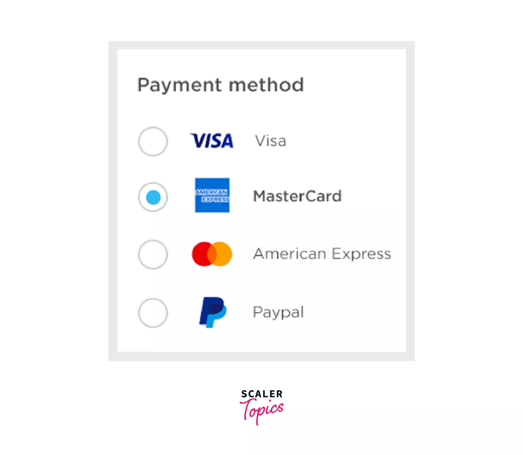
As in the above example, a radio button is used to ask the user about the payment options. A radio button is generally renderd as a small circle with a solid circle inside it when selected.
Scaler Placement Report and Statistics
Scaler learners achieved 2.5x salary growth with average post-Scaler CTC reaching ₹23L.
What Is Radio Button In HTML?
A radio button is a graphical control element that allows the user to choose only one of a predefined set of mutually exclusive options. The singular property of a radio button makes it distinct from checkboxes, where the user can select and unselect any number of items.
Syntax
To add radio buttons in a webpage, We use the <input> element with type attribute is set to “radio”. But it will create a rather simple radio button. So we use different Radio attributes present to us.
As shown in the example below, we used the name attribute to group the buttons together so that only one option can be chosen, without the name attribute we can not group different buttons together, therefore, user will be able to choose more than one option. The value attribute is used to send the value of the selected option to the server.
EXAMPLE
Output
Transform Your Career
Choose from our industry-leading programs designed for career success
Modern Software and AI Engineering Program
Master full-stack development with AI integration

 +1000 more
Modern Data Science and ML with specialisation in AI
Advanced data science techniques with AI specialization
+1000 moreAdvanced AIML with Specialisation in Agentic AI
Deep dive into AIML with focus on Agentic systems
+1000 moreDevOps, Cloud & AI Platform Engineering
Build and manage AI-powered cloud infrastructure
+1000 moreAI Engineering Advanced Certification by IIT-Roorkee
Premier AI engineering certification from IIT-Roorkee
Attributes for Radio Button
With global attributes that are used with <input> element, radio inputs also support the following attributes.
| Attribute | Description |
|---|---|
| Type | It indicates the input type, It is added to create a user defined button. In this case, the input type is set as "Radio". |
| Name | It indicates the name of input elements. Different radio buttons with the same name are grouped together. |
| Value | It sends the value of the selected option to the server. |
| Checked | It is used to select an option by default if nothing is chosen by the user. |
Examples
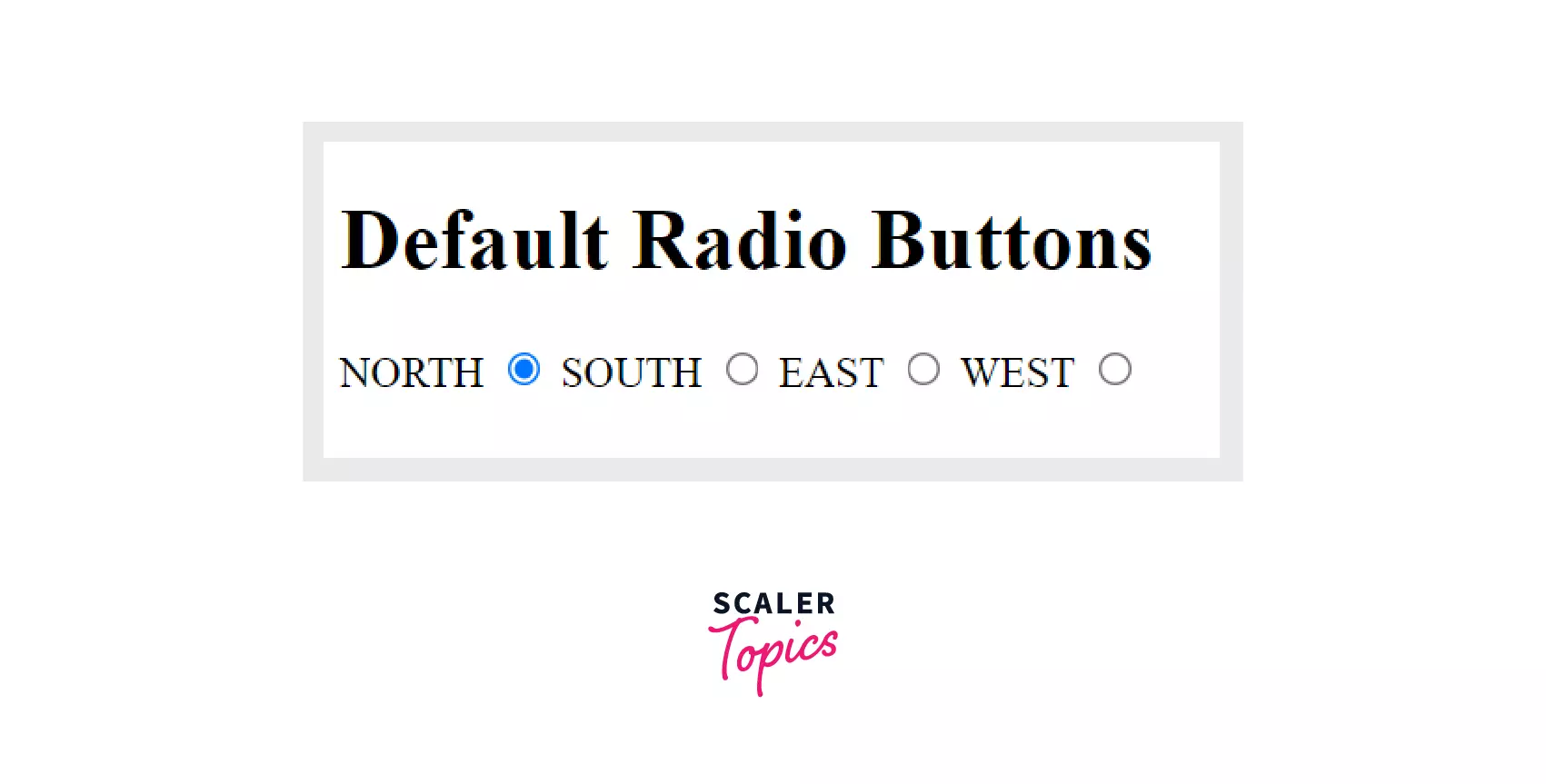
Example 1: Checked Radio Button
If from a group of options at least one option has to be selected in that case we use the checked attribute to set an option as the default value.
For instance, in the below example we must choose atleast one direction, and the option 1 that is the north direction is set as the default option.
Example
As we can see option1 i.e NORTH is selected by default.
Output
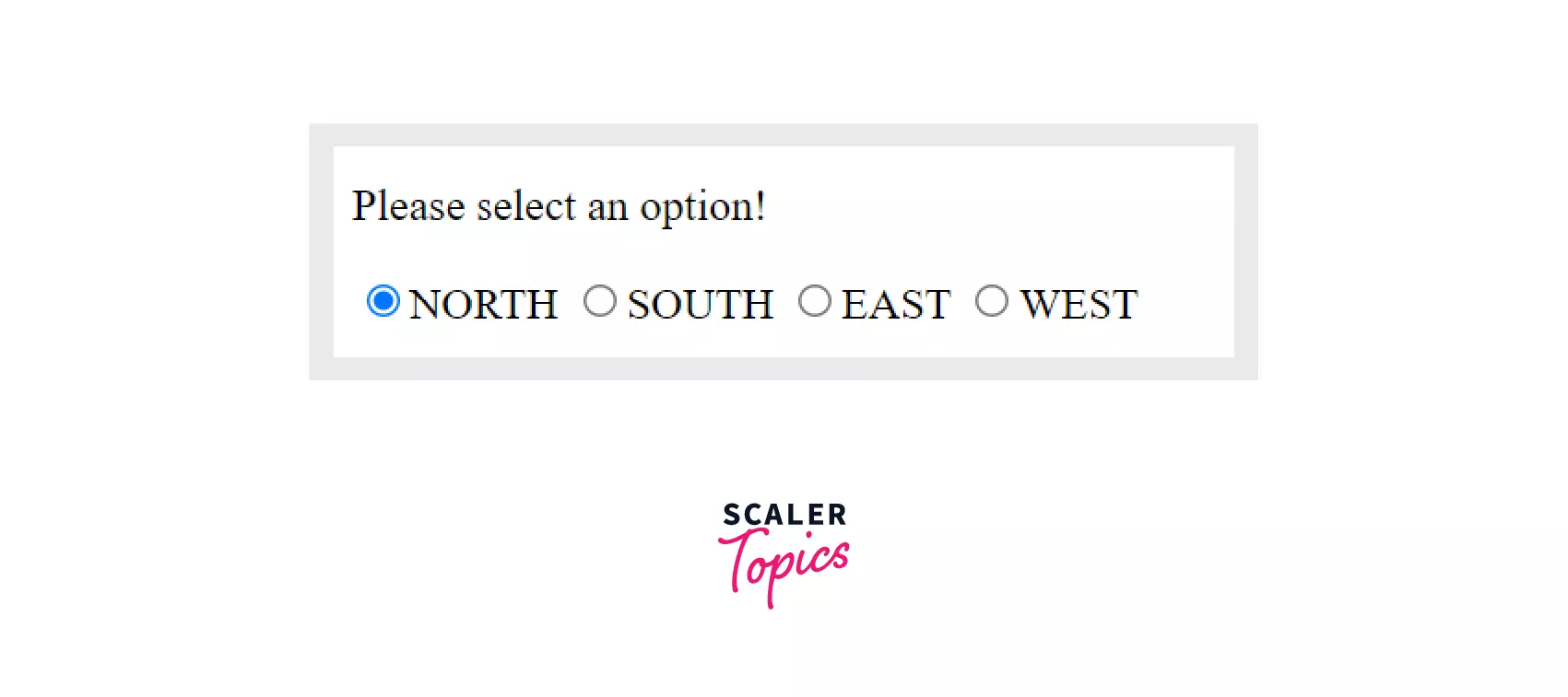
NOTE - When you set multiple options as default the latter one overrides the previous one in the code because you can set only one option as default.
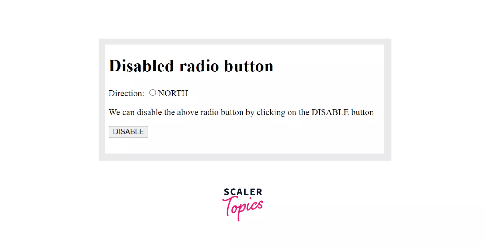
Example 2: Disabled Radio Button
We can disable a radio button by using the disabled property of HTML DOM. A disabled button is unclickable and unresponsive. A disabled radio button is rendered grey in color by the browser. The disabled attribute uses boolean values to decide whether a button should be disabled or not (disabled=true|false) true represents that button is disabled and false represents it is not disabled. By default disabled is set to false. We will use javascript for this. Javascript code is enclosed inside the script tags.
Example
Output
 After clicking on the button.
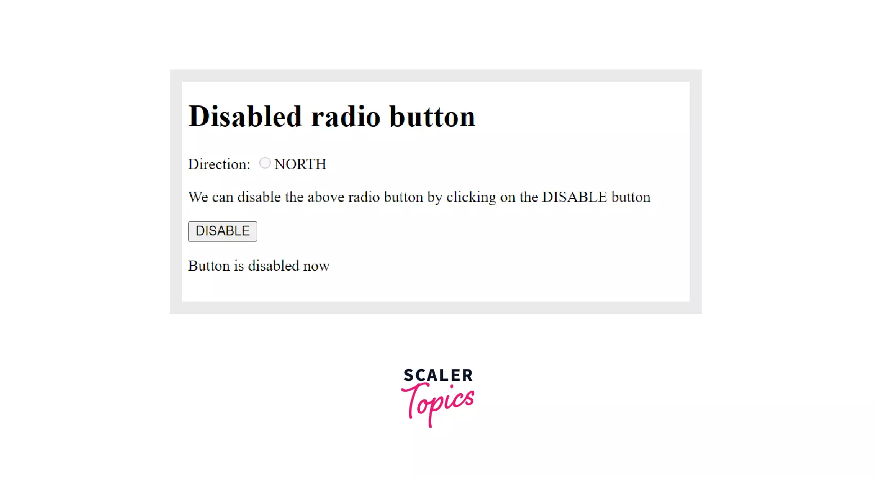
In the above example, we first created a button "direction" after that we created a DISABLE button which will disable the button by invoking the disable_button() method.
Then the disable_button() method will set the disabled property to true by accessing the radio button "Directions" using the getElementById() method as shown below.
Turn Learning into Career Growth
Example 3: Groups of Radio Buttons
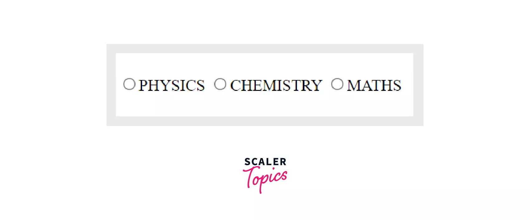
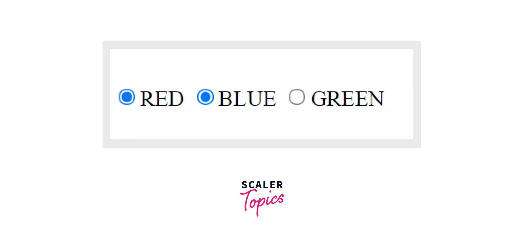
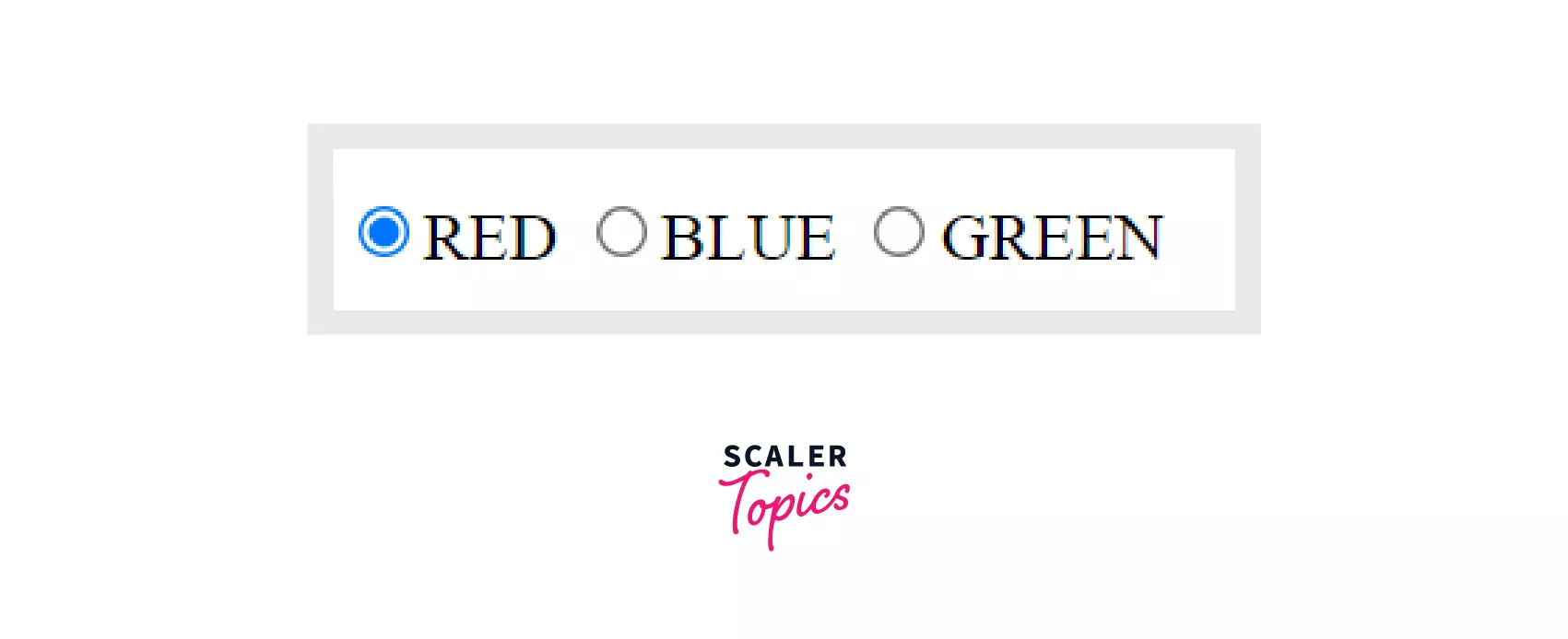
We make groups of radio buttons so that out of present options only one can be selected. We can put different radio buttons in a group using the name attribute. All the buttons in a group must have the same name attribute.
Example
Output
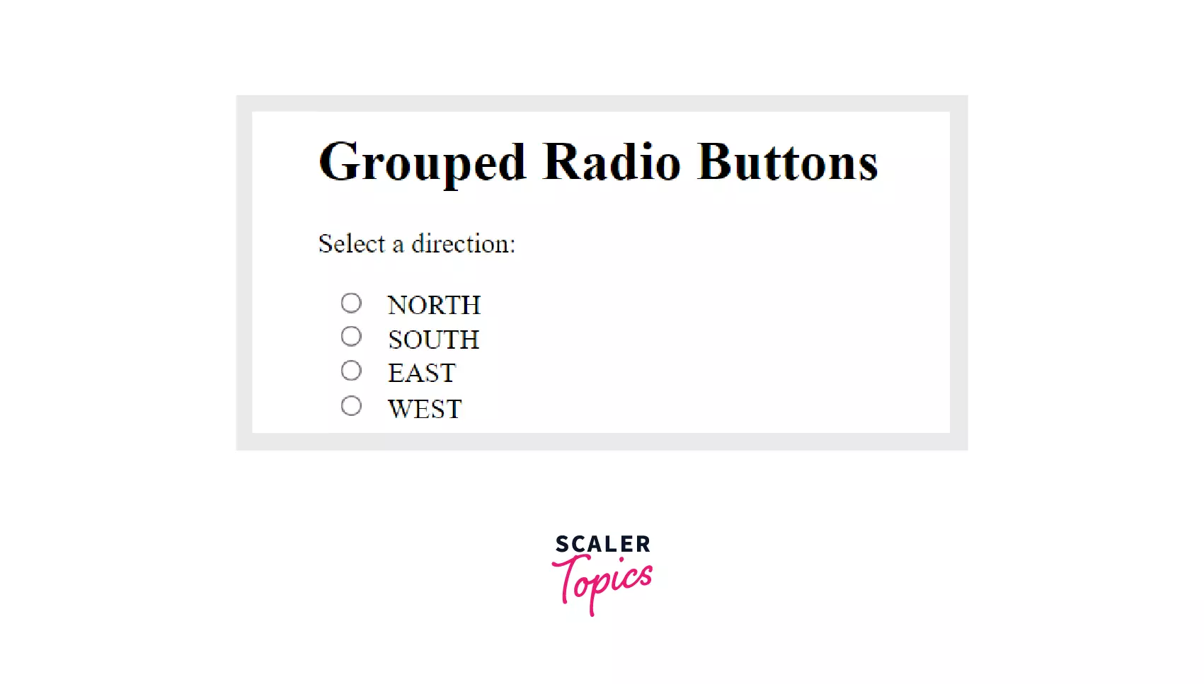 In the above example, we have grouped all four options in one group by keeping the name attribute same. Out of four options in the above example only one can be selected.
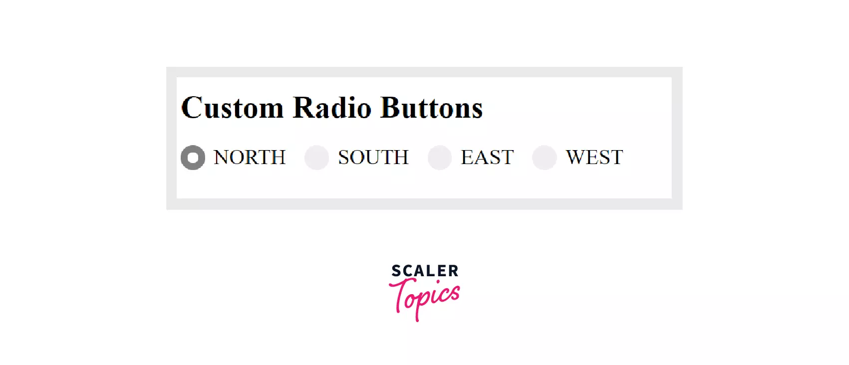
Example 4: Radio Button Style
There are a few disadvantages of the using default radio button style, for instance, different browsers have different appearances of the default radio buttons. We can tackle this problem by creating custom radio buttons using CSS.
Steps to create custom radio buttons:
a) Base HTML
This is the base HTML code for our radio button we will add CSS to style it further.
Output
b) Customizing the Container of Radio Buttons
In this we define font size, text alignment, position, etc for the radio buttons as shown below.
c) Hide the Original Radio Button
We have to hide the original radio button but keep it technically accessible. We can do this by simply setting the appearance attribute as none.
d) Custom Radio Button Style
In this section we will customize the radio boxes. we will define properties like background color, dimensions, etc. we will also add the hover effect which will give a specified background color on hovering the cursor over radio box.
e) Checked State
In this section we will style the radio box for checked state.
f) Putting it All Together
After combining the base HTML code with CSS we will get the following output.
Output
How To Add Radio Buttons In Form Using HTML?
We can add radio buttons in our HTML form using input element with type as radio, below are the few steps which we can follow:
Step1: Use <input> element with type specified as radio. for example:
Output
 Right now we can choose more than one option as our buttons because they are not grouped together so, to avoid that we can use the "name" attribute.
Step2: Using the name attribute, group the buttons together so that only one option can be chosen. For example:
Output
Step3: Use the value attribute to give a value to an option that is to be sent to the server. For example:
Now our radio button is complete and can be used in forms.
Radio Buttons vs Checkboxes
While both Radio buttons and checkboxes are used to take input from the user they are quite different from each other.
Some of the differences are listed below:
| Radio buttons | Checkboxes |
|---|---|
| Radio buttons are used when there are several options available but we want the user to select exactly one option out of them. | Checkboxes are used when a user can select one, many, or no options out of the available options. |
| All options are mutually exclusive. It means clicking on a non-selected option will automatically deselect the option which was previously selected. | All options are independent of each other. In this case, we can select as many options as we want it does not deselect the previously selected options. |
| A radio button should be represented as a small circle with a solid circle inside it when selected. | A checkbox should be presented as a square box with a checkmark when selected. |
| Radio buttons are created using <input> tag in HTML whith radio as the type attribute. | Checkboxes are created using <input> tag in HTML with type attribute as checkbox. |
| Radio buttons in HTML are used in the "Select one" type of menus. | Checkboxes are used in the "Select all that apply" type of menus or questions. |
Important Points To Note About Radio Buttons
- Radio buttons should be used when we want user to select from several options but only one option can be selected.
- You should always add the label tag for a more clickable area.
- Checkboxes and radio buttons are similar but in the radio button, we can select only one option whereas in checkboxes we can select multiple values.
- If no option is selected from the radio button group then the form data does not include that radio group.
Supported Browsers
| Chrome | IE | Opera | Safari | Firefox |
|---|---|---|---|---|
| YES | YES | YES | YES | YES |
Summary
- Radio buttons are used to collect user information. They are used when out of many options available to users only one can be selected.
- Checked radio button, Disabled radio button, and grouped radio button are a few examples of radio buttons.
- In the checked radio button we set an option as a default value if no option is selected using the checked attribute. In the disabled radio button, we make an option unresponsive using disabled attribute and in grouped radio button we group several options together by setting the name attribute same so that only one option in a group can be selected.
- Other than common input attributes, radio buttons have additional attributes such as Type, Name, Value, and Checked.
- We can add radio buttons in our HTML form using input element with type as radio.
- While both Radio buttons and checkboxes are used to take input from the user they are quite different from each other. For instance, in the case of radio buttons, only one option can be selected but when we use checkboxes we can select as many options as we want.
 Google
 Amazon
 Microsoft
 Flipkart
 Adobe1200+ more