ReactJS UI Ant Design Image Component
Build an AI-First Career, Master the Complete Skillset
Choose from our industry-leading programs designed for career success
Modern Software and AI Engineering Program
Master full-stack development with AI integration


 +1000 more
Modern Data Science and ML with specialisation in AI
Advanced data science techniques with AI specialization
+1000 moreAdvanced AIML with Specialisation in Agentic AI
Deep dive into AIML with focus on Agentic systems
+1000 moreDevOps, Cloud & AI Platform Engineering
Build and manage AI-powered cloud infrastructure
+1000 moreAI Engineering Advanced Certification by IIT-Roorkee
Premier AI engineering certification from IIT-Roorkee

AI Forward Deployed Engineer Program
Full-stack engineering, production AI and client-facing consulting
+1000 moreOverview
One way to achieve responsive user interfaces is by using ReactJS in conjunction with UI libraries like react antd image. In this article, we'll explore how to leverage Ant Design's Image Component to enhance your React applications with images.
Image Props
Here are some common props in react antd image:
- src (string): The source URL of the image to be displayed.
- alt (string): Alternative text for the image, which is important for accessibility.
- preview (boolean | object): An object defining how to preview the image or a boolean to enable or disable image preview.
- fallback (string): A fallback image source to display if the primary image fails to load.
- width (number | string): The width of the image. You can specify it as a number (e.g., 200) or a string with units (e.g., '50%').
- height (number | string): The height of the image. You can specify it as a number (e.g., 150) or a string with units (e.g., 'auto').
- onClick (function): A callback function triggered when the image is clicked.
- onLoad (function): A callback function triggered when the image has finished loading.
- placeholder (ReactNode): A React element to be used as a placeholder while the image is loading.
- previewPrefixCls (string): A prefix for the preview component's CSS class.
- fallbackPlacholder (ReactNode): A React element to be used as a placeholder if the primary image and fallback image both fail to load.
- zIndex (number): The z-index CSS property for the image component.
- crossOrigin (boolean | string): Specifies whether to use CORS for the image. Can be set to 'anonymous', 'use-credentials', or a boolean value.
- srcSet (string): A comma-separated list of image URLs to provide multiple sources for different resolutions or screen sizes.
- sizes (string): A hint to the browser about the size of the image, used in conjunction with srcSet.
- draggable (boolean): Specifies whether the image can be dragged.
- className (string): Additional CSS classes for styling purposes.
- style (object): Inline styles to apply to the image component.
Example :
How Scaler Transformed Careers in Different Fields
Scaler learners achieved 2.5x salary growth with average post-Scaler CTC reaching ₹23L.
 Google
 Amazon
 Microsoft
 Flipkart
 Adobe1200+ more
Creating React Application And Installing Module
To start using the react antd image Component in your React application, follow these steps :
- Step 1 : Create a new React application using Create React App or your preferred setup.
- Step 2 : Install the Ant Design library.
- Step 3 : Import the necessary components and CSS files.
In your src/index.js file:
- Step 4 : Import the Image Component in your desired React component.
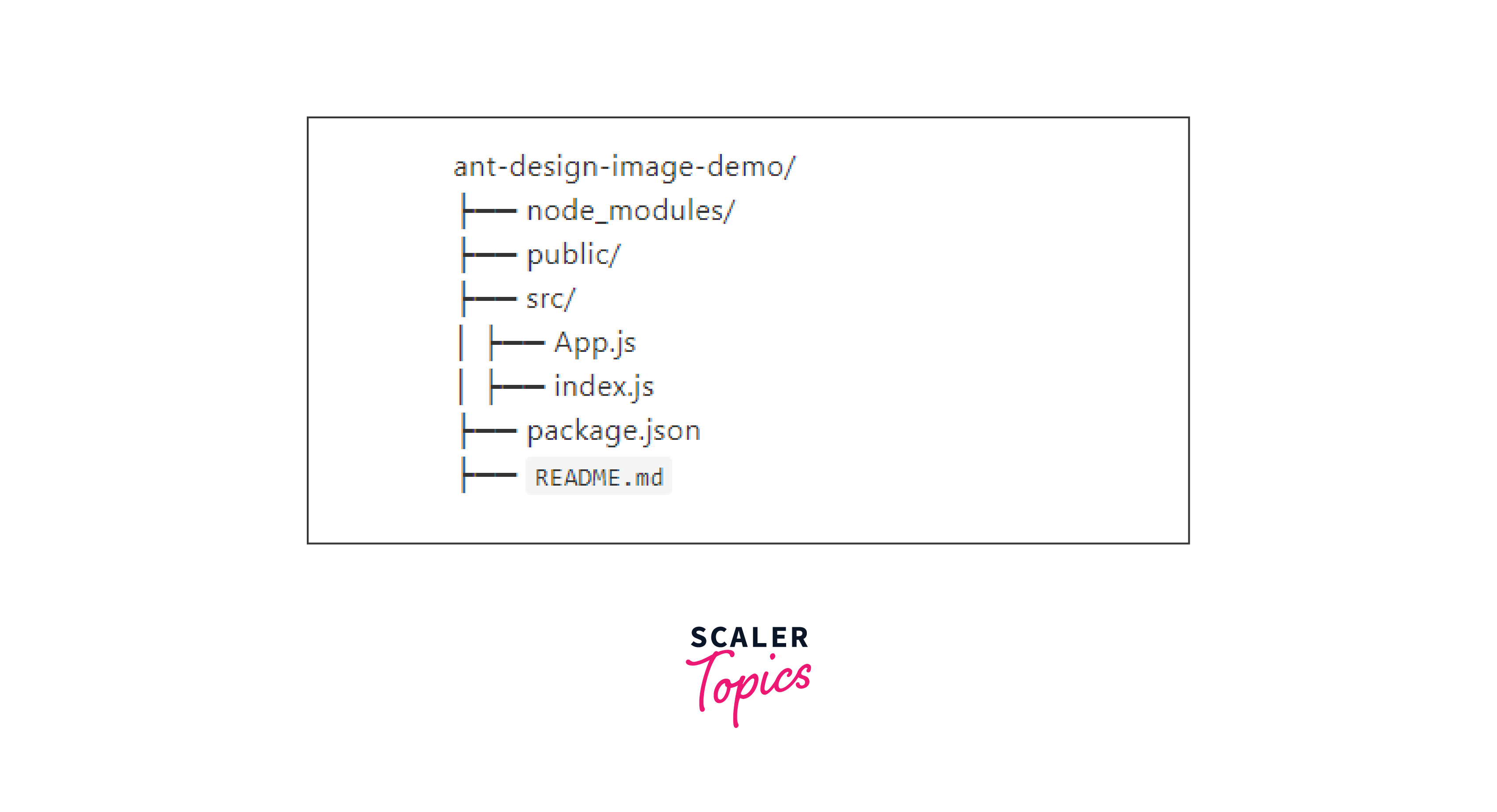
Project Structure
Your react antd image project structure should resemble this:
Turn Learning into Career Growth
Example
Now, let's put the Image Component to work with a practical example. Suppose you want to display a featured image for a blog post. You can create a component like this :

When you load an image from a different domain (cross-origin), the browser enforces certain security rules :
- Same-Origin Restriction
- CORS (Cross-Origin Resource Sharing)
In the context of Ant Design's Image component, the crossOrigin prop allows you to specify how cross-origin requests for the image should be handled. This prop accepts the following values:
- anonymous: This is the default value. It indicates that cross-origin requests for the image should be made without credentials (cookies, HTTP authentication, etc.).
- use-credentials: When set to this value, cross-origin requests for the image are made with credentials. This includes sending cookies and other authentication information.
Suppose you want to dynamically set the width and height of an image in a React component, then :
- Create a React Component :
- Use CSS for Responsiveness:
- Pass Props for Width and Height :
- CSS for Additional Responsiveness:
Step to Run Application
To run your React application and see the Ant Design Image Component in action, follow these steps :
- Step 1 : Start the development server.
- Step 2 : Open your web browser and visit http://localhost:3000.
You should now see your featured image displayed in the browser.
Conclusion
- It allows you to include alternative text (alt) for images, ensuring accessibility compliance.
- The component offers built-in support for image preview, making it easier for users to view larger versions of images. You can customize the preview behavior to suit your application's requirements.
- In cases where the primary image fails to load, you can specify a fallback image source.
- You can apply custom styling to the Image Component using CSS classes or inline styles.
- The component supports interactivity by allowing you to define callback functions like onClick, enabling you to implement actions triggered by user interactions with the image.
- You can dynamically set the width and height of the image, making it responsive to various screen sizes and layouts.
- The crossOrigin prop provides control over how the image handles cross-origin requests, important when working with images from different domains.